

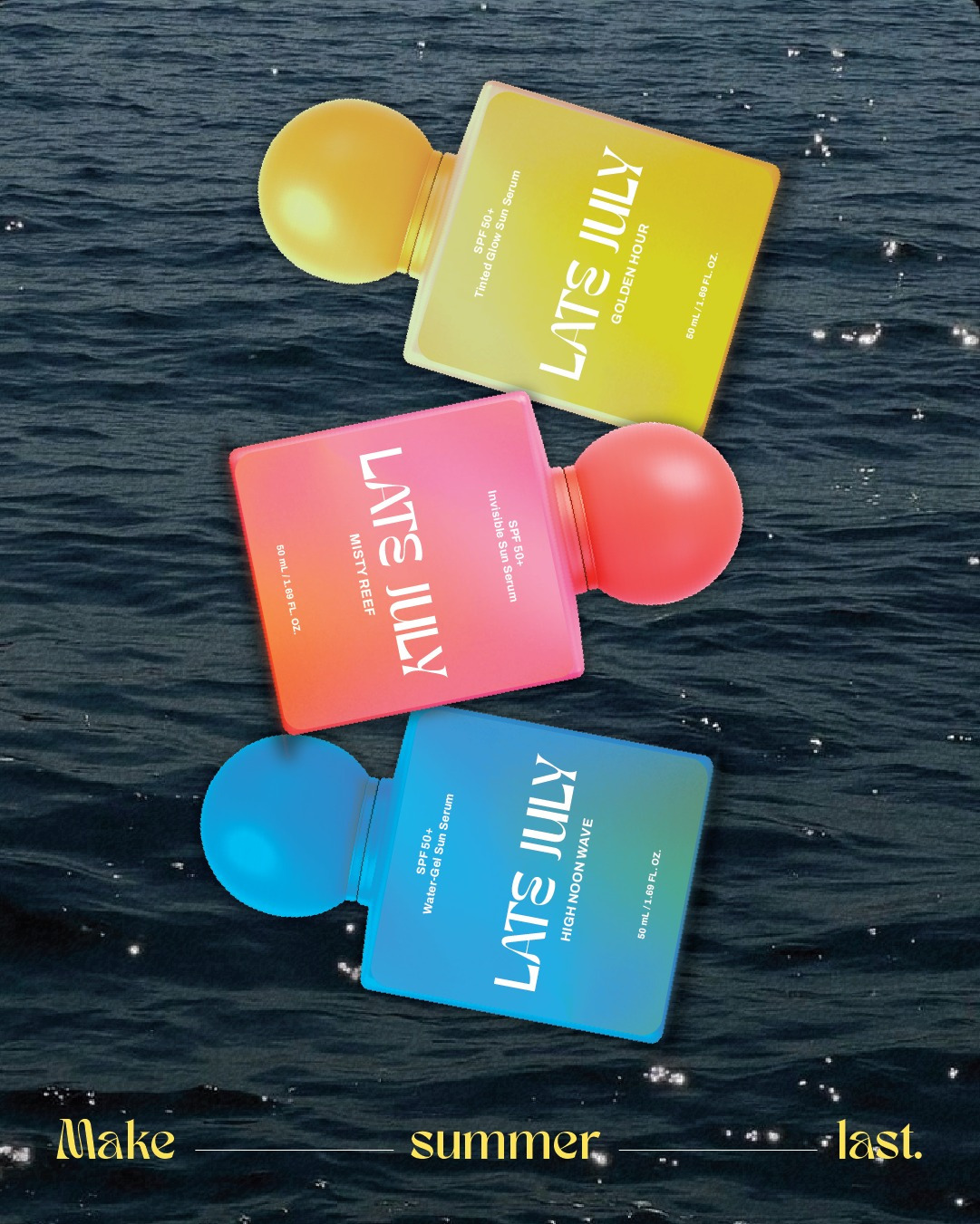
LATE JULY – Premium Sun Care Packaging
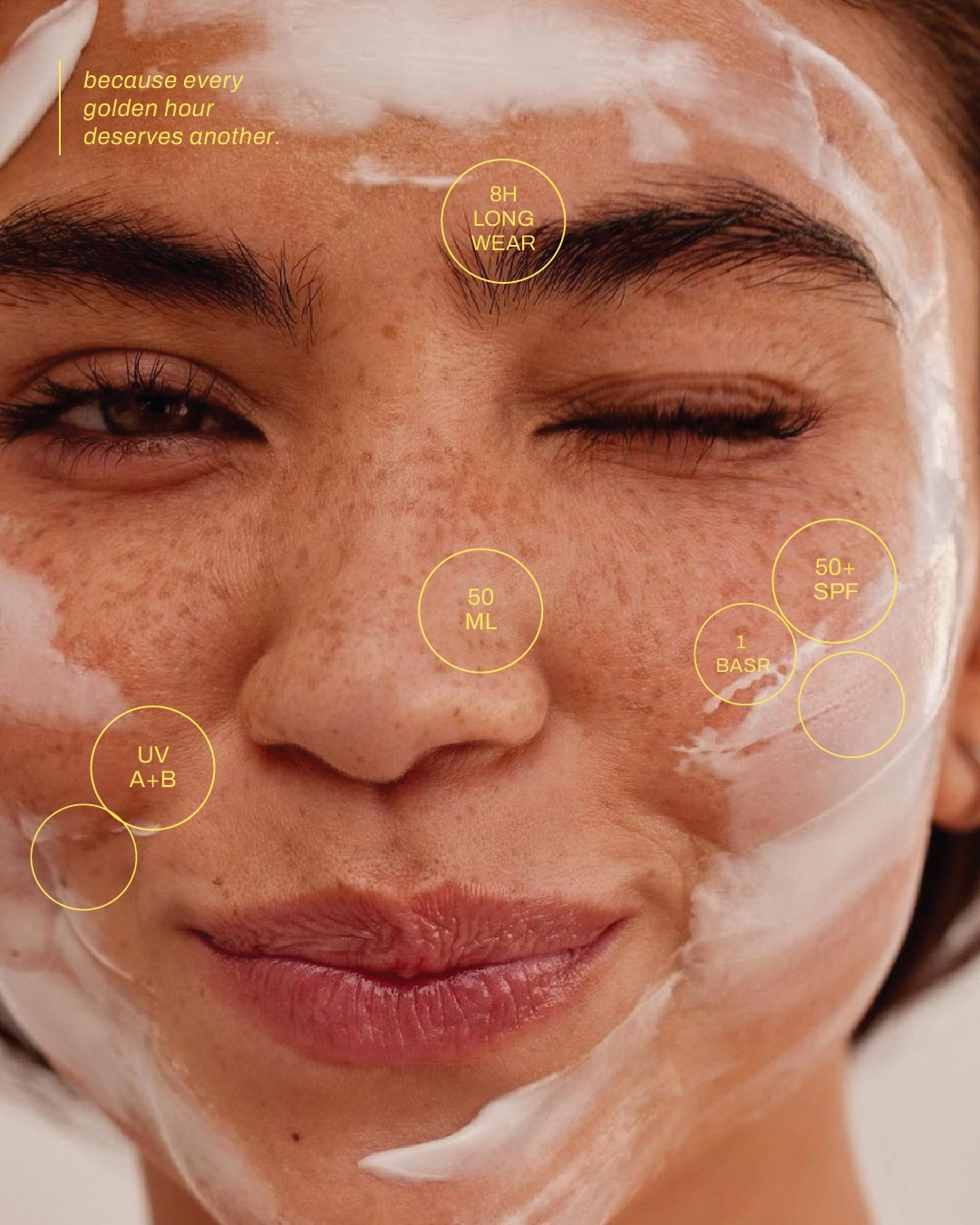
The ask was to design a packaging system for a conceptual premium sunscreen brand that repositions SPF as an everyday beauty essential rather than a seasonal necessity. The objective was to create packaging that feels equally at home on a bedroom vanity, in a beach bag, or while travelling, appealing to consumers who value both skincare performance and aesthetics.
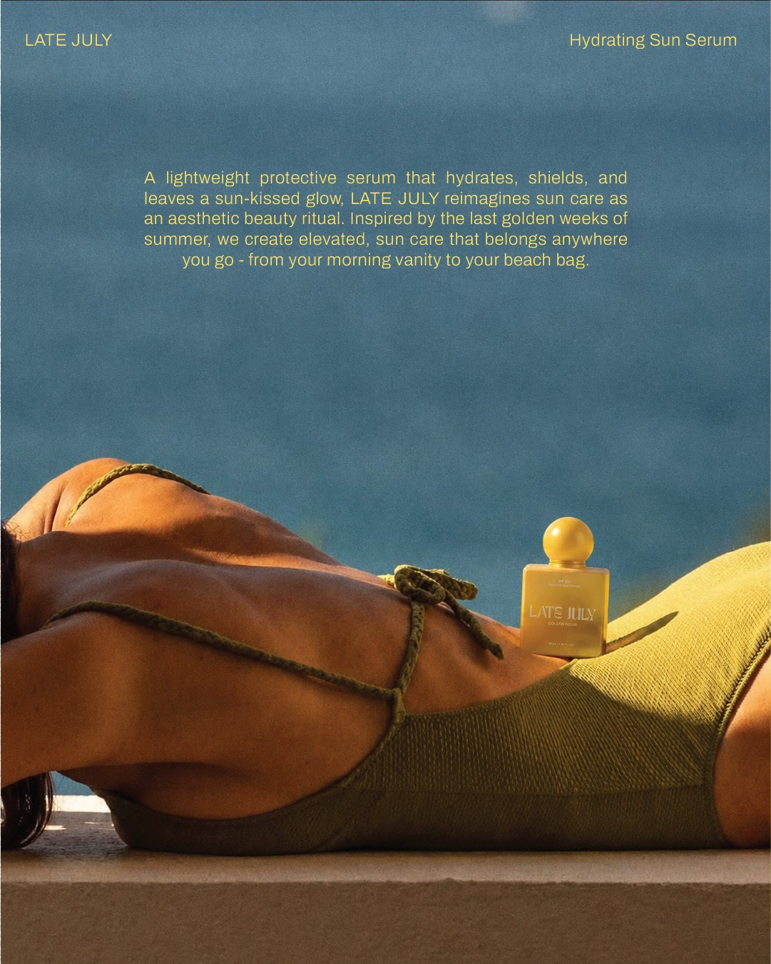
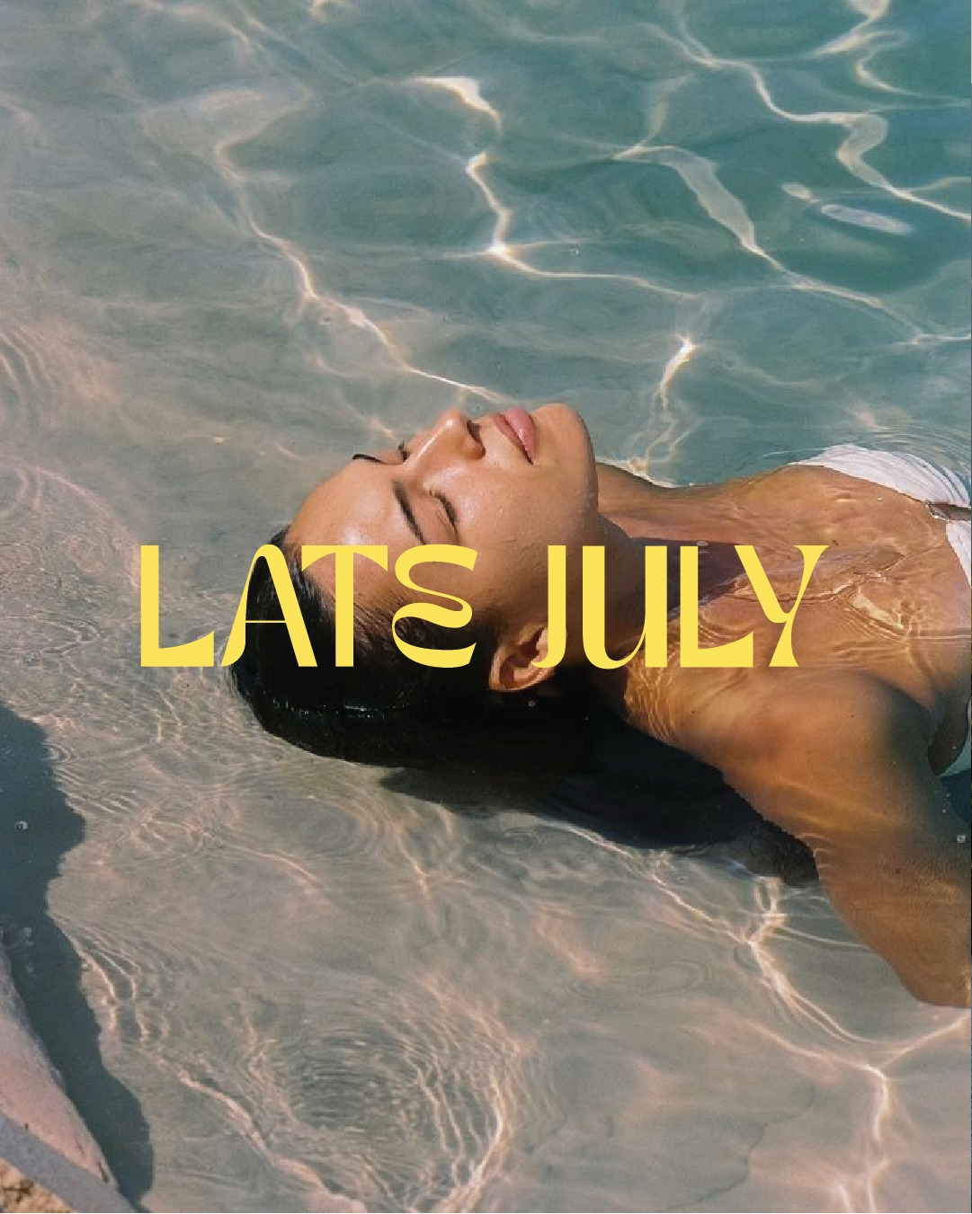
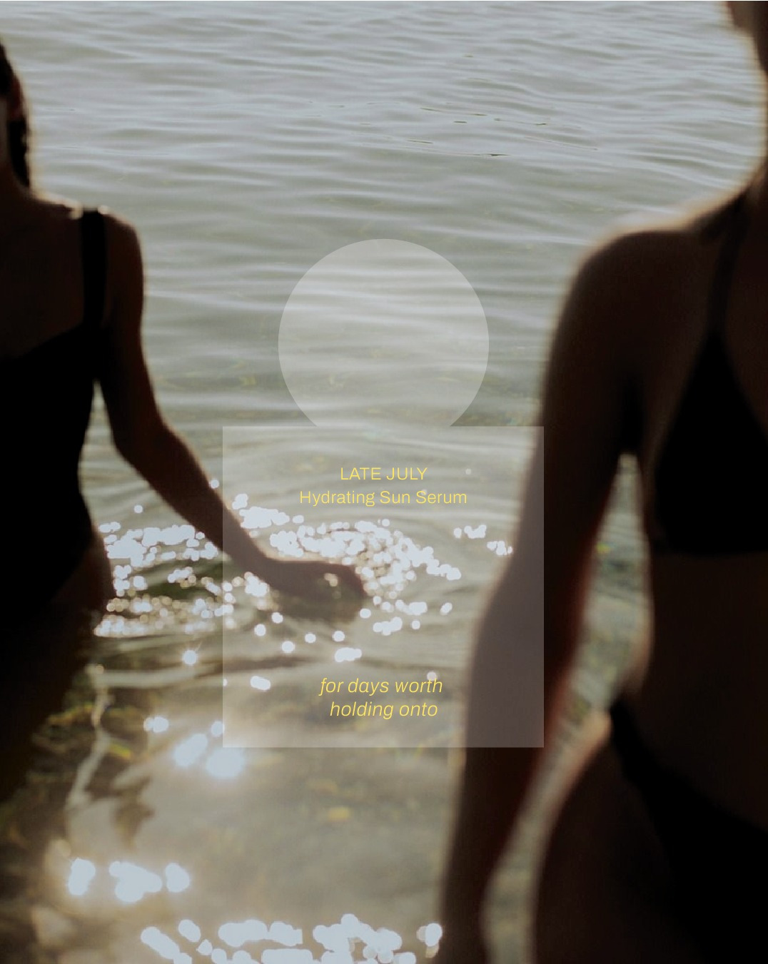
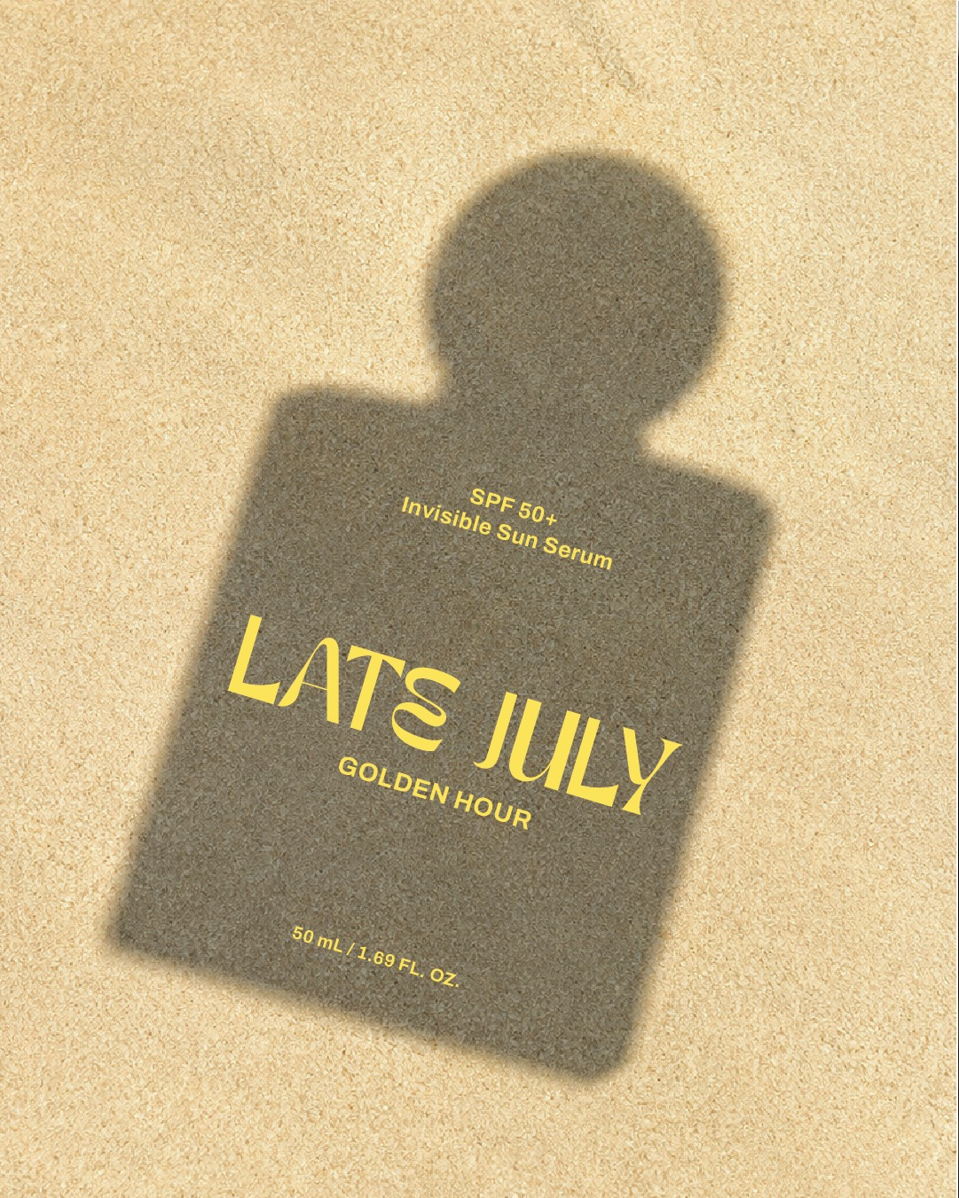
Inspired by the final golden weeks of summer, LATE JULY is built around the idea of holding on to those nostalgic summer days. Instead of relying on conventional beach-inspired graphics, the identity captures the warmth, nostalgia, and optimism associated with golden hour through colour, typography, and form.
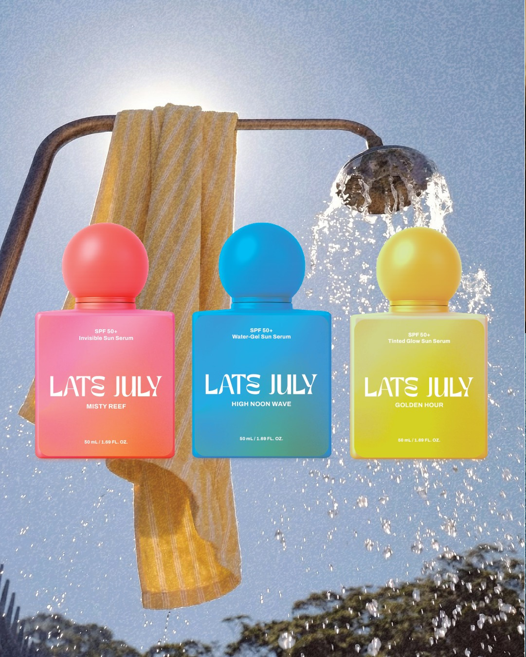
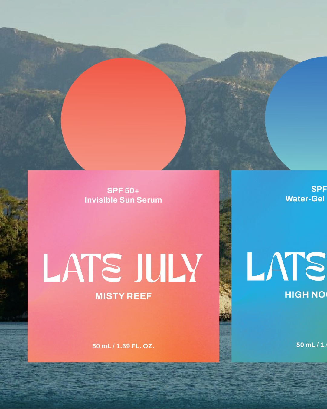
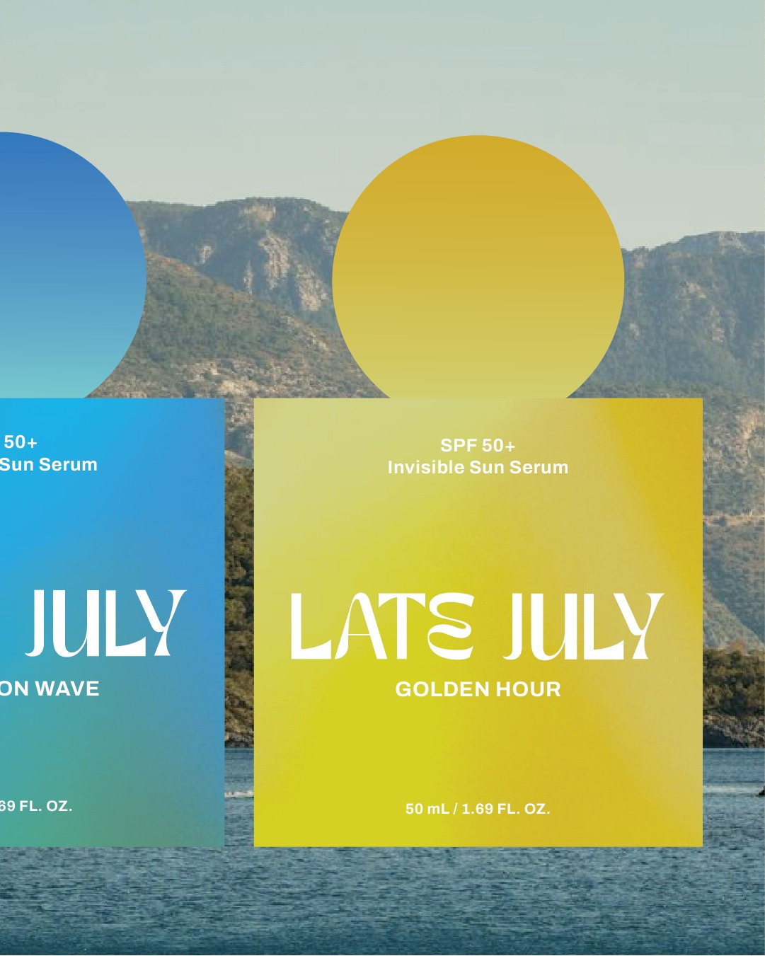
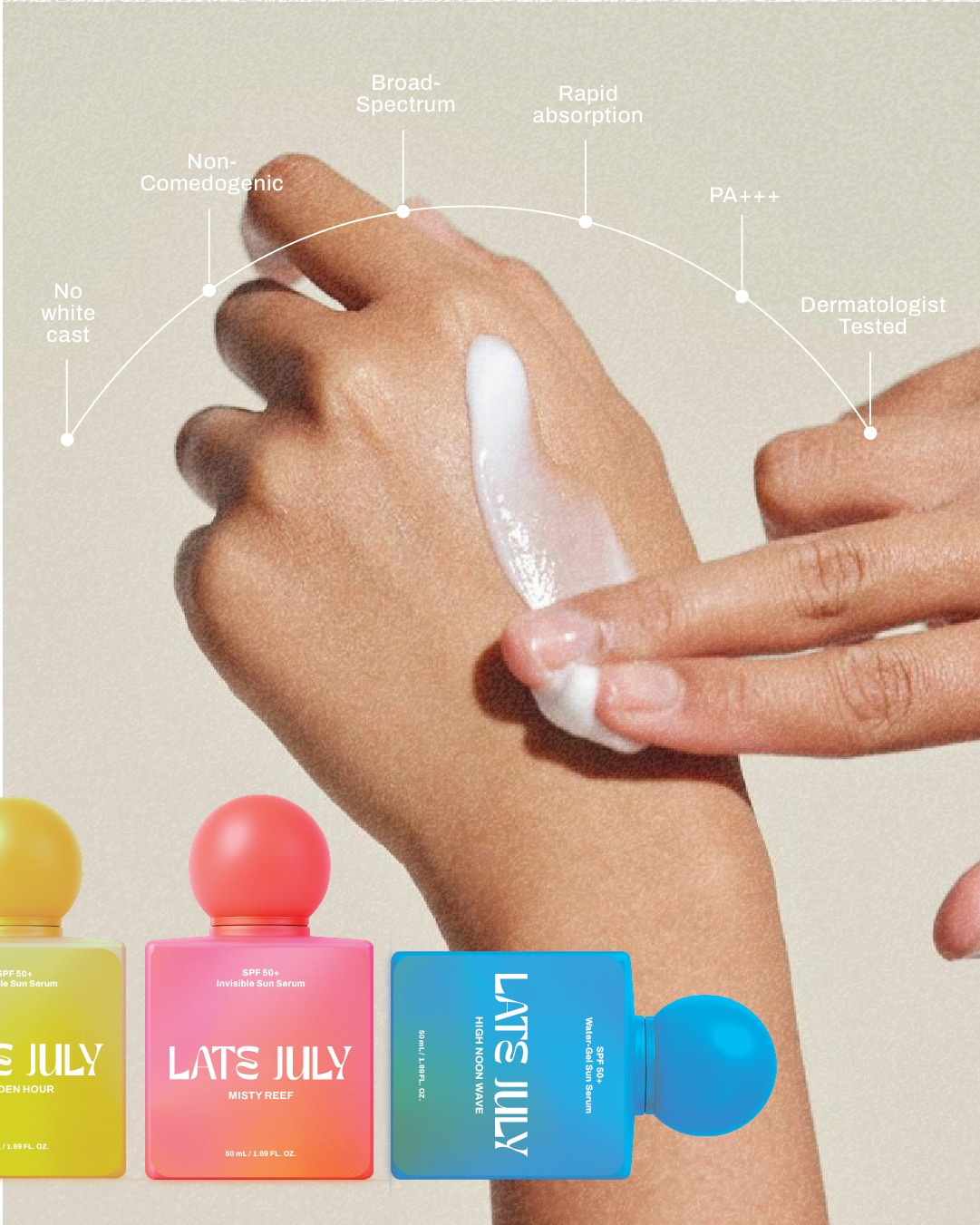
The packaging features a distinctive rounded cap paired with a clean rectangular bottle, creating an instantly recognizable silhouette across the product range. Vibrant gradients differentiate each formula while maintaining a cohesive family, reflecting different moods of summer—from soft sunsets to clear blue skies.
Designed with simplicity in mind, the minimal layout allows the bold form and colour palette to take centre stage, positioning the product as both a functional skincare item and a lifestyle object worthy of display.






This project is so well done!😍👏