Enlite: Branding & Can Packaging Design
Project Overview
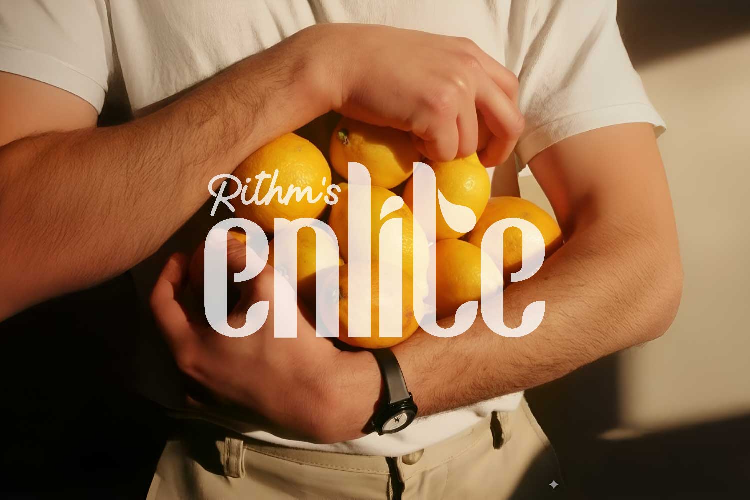
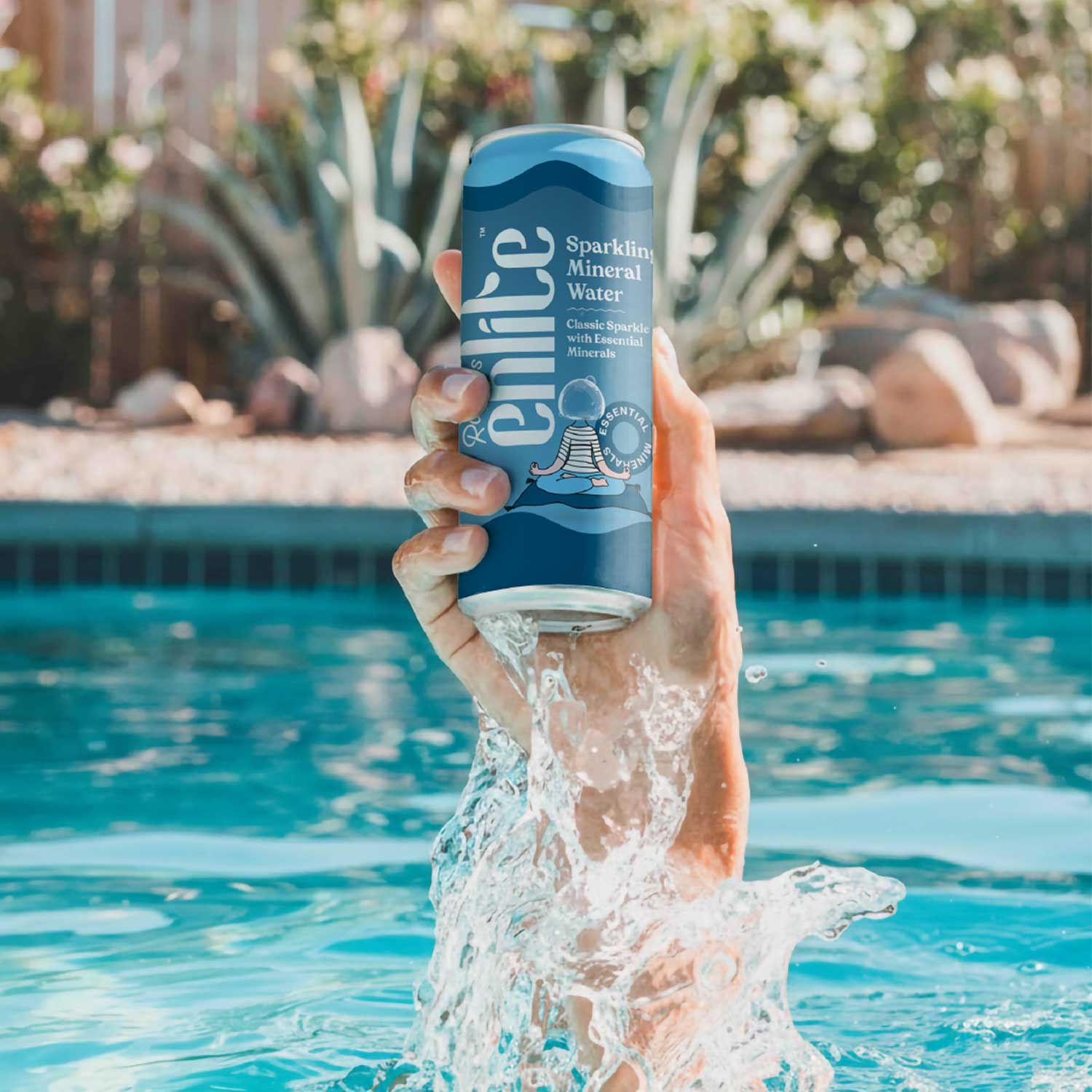
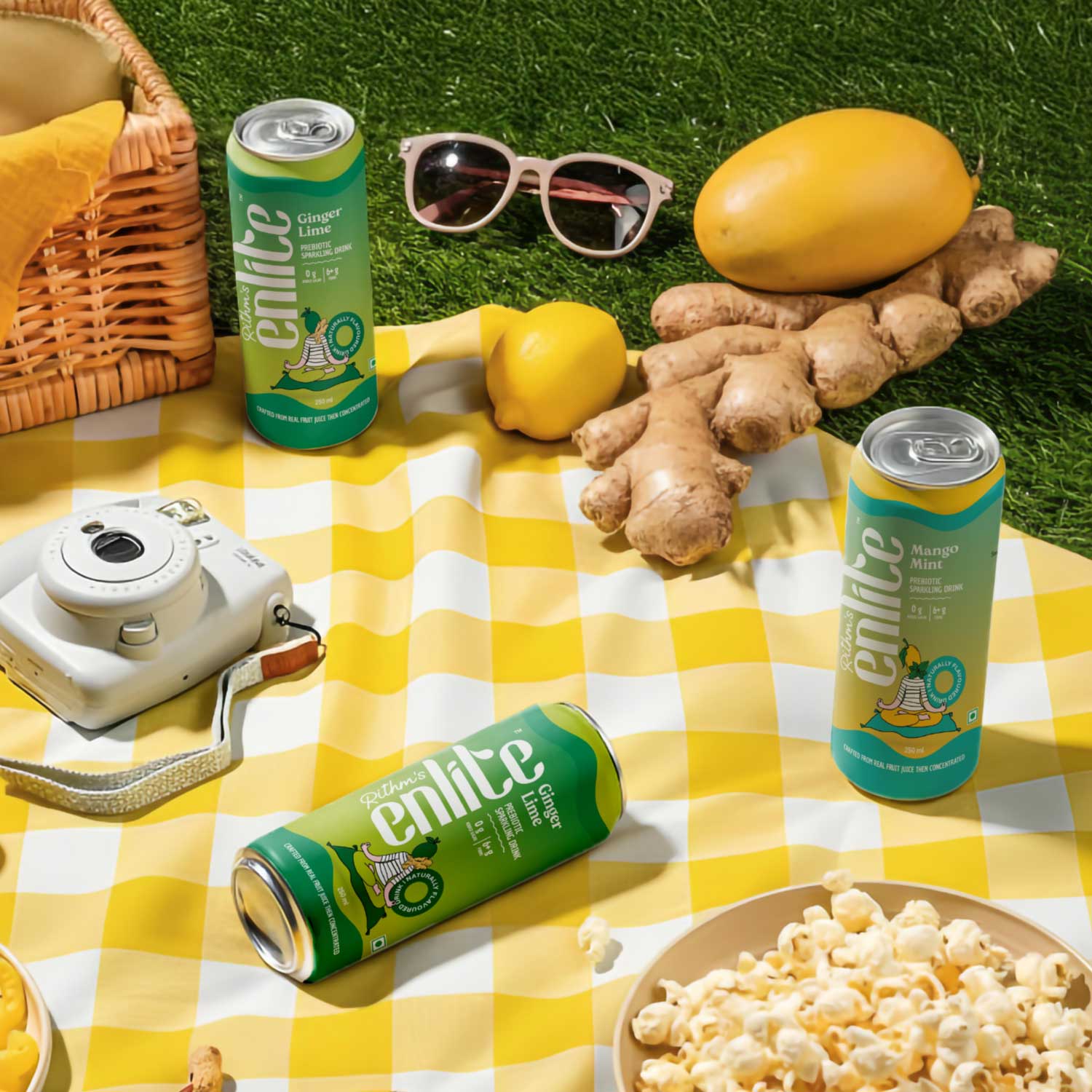
Enlite is a prebiotic soda that combines refreshing fizz with functional benefits. DN Designs was tasked with creating a visual identity and packaging design that reflects the brand’s clean, health-conscious positioning while making it stand out on shelves. The challenge was to communicate both wellness and enjoyment in a visually striking way.
Design Approach
Our team focused on:
- Visual Identity: Developing a bold, modern brand language that conveys clarity, vitality, and trust.
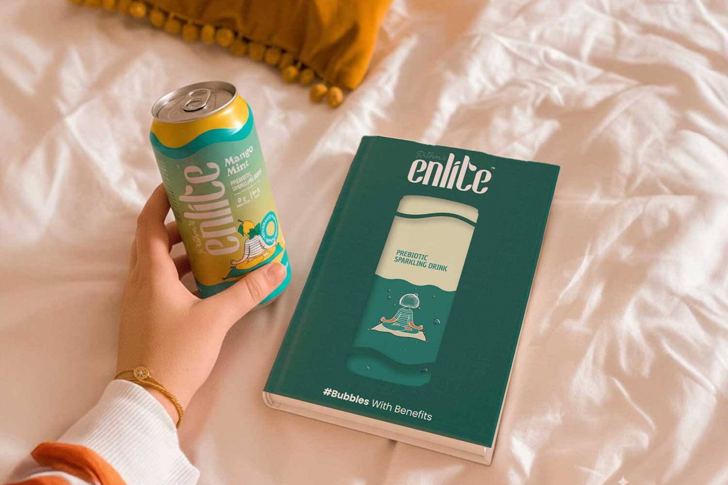
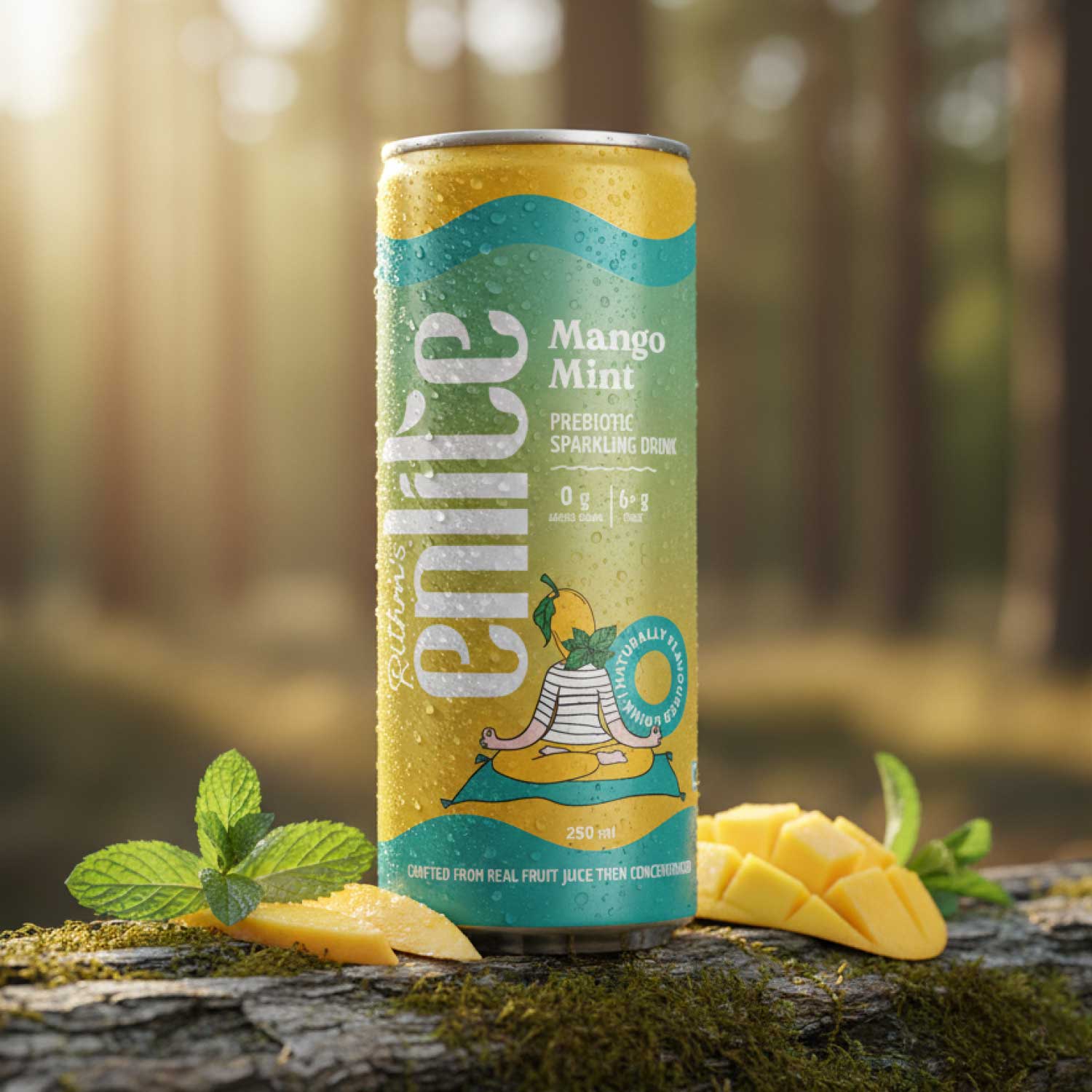
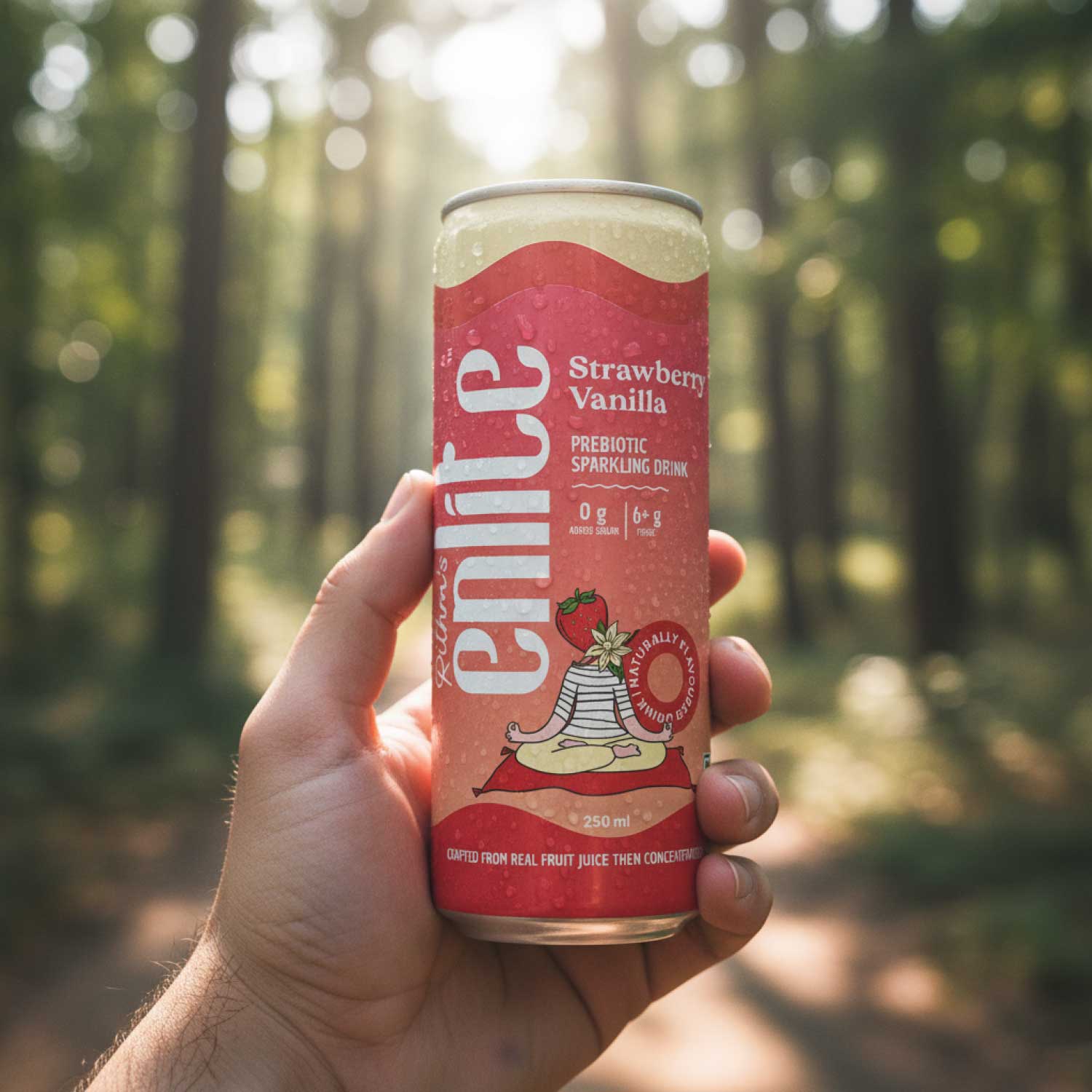
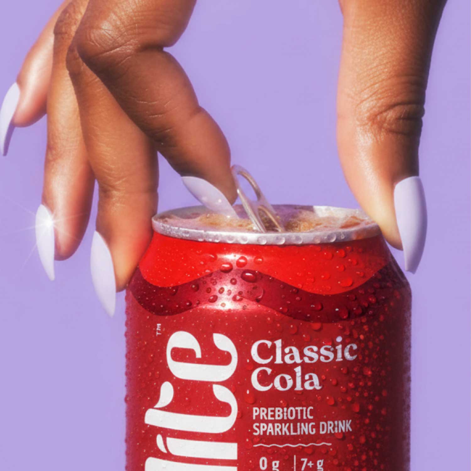
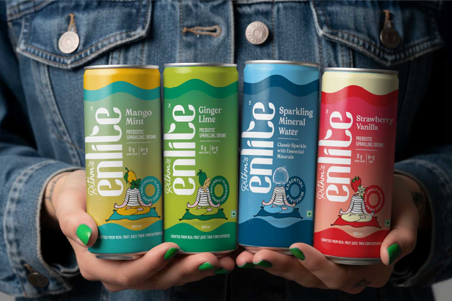
- Packaging Strategy: Creating shelf-ready designs with a minimalist yet vibrant aesthetic, highlighting the functional benefits (7g of fiber per can) and clean ingredients.
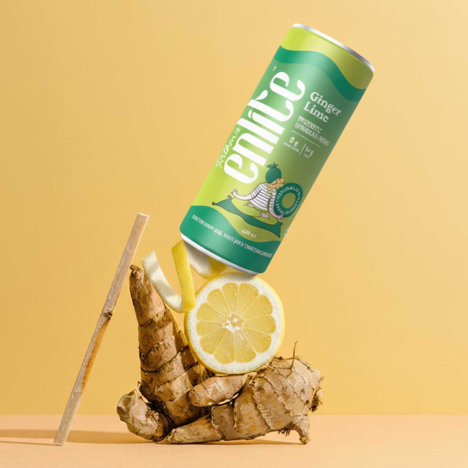
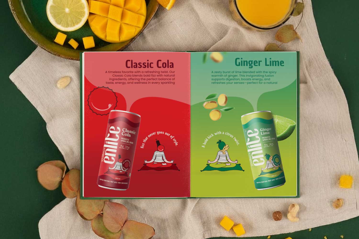
- Color & Typography: An energetic color palette paired with clear, approachable typography ensures instant brand recognition and a positive consumer experience.
- Flavor Differentiation: Each variant – Ginger Lime, Classic Cola, Mango Mint, and Strawberry Vanilla – has a distinct visual cue while maintaining brand consistency.
Creative Solutions
- Striking can designs that communicate wellness without feeling clinical.
- Cohesive visual elements across all touchpoints to reinforce brand story and authenticity.
- Packaging that balances aesthetics and functionality, ensuring shelf impact and consumer clarity.
The Outcome
Enlite’s packaging now reflects the brand’s purpose: clean, confident, modern, and mindful refreshment. The visual identity speaks for itself, capturing attention, inspiring curiosity, and building consumer trust at first glance.
Experience the Work
Explore the full Enlite case study, including detailed visuals and design insights, at: https://dndesigns.co.in/enlite-case-study/
Branding & Packaging Design by DN Designs
Turning strategic ideas into compelling consumer experiences through thoughtful, award-worthy design.