

Macerati
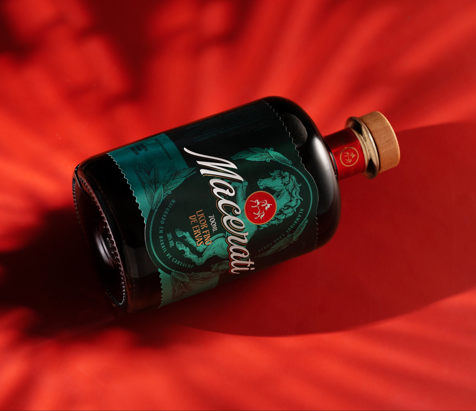
Macerati is a beverage developed by Casa Forte from an exclusive recipe created by master distiller Gabriel Spézia, combining more than 50 herbs and spices through a unique maceration process. Designed for special occasions and celebratory moments, the product required a visual identity capable of highlighting its uniqueness within the brand’s portfolio while reinforcing attributes such as complexity, sophistication, and artisanal tradition.
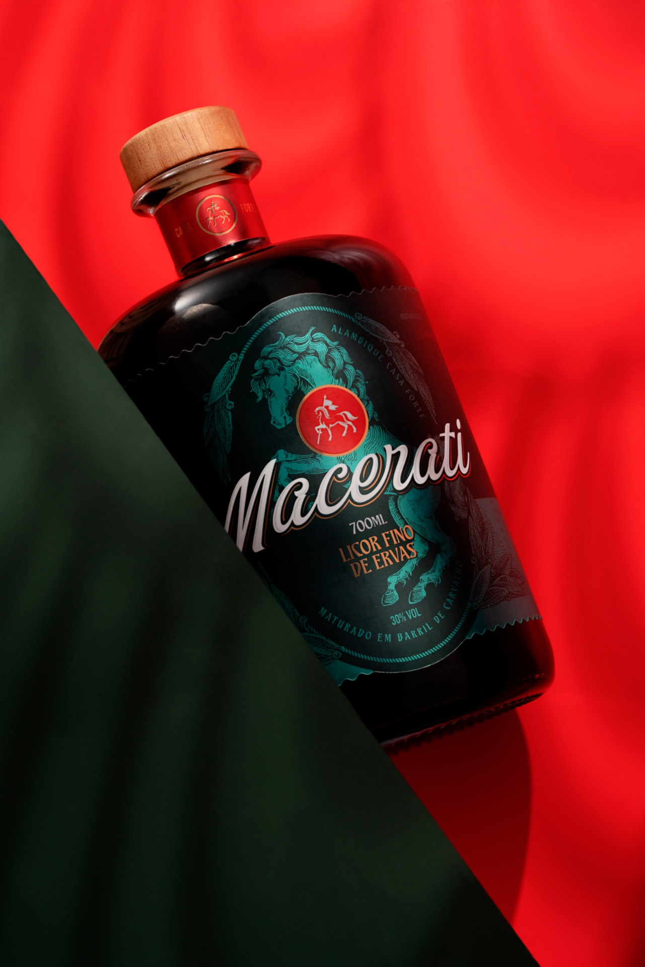
The main challenge was to create a strong and distinctive visual identity for a product with very particular characteristics without completely breaking away from Casa Forte’s established visual language. The packaging needed to communicate the beverage’s special nature, its unique production process, and its more ritualized consumption experience, while preserving elements already recognized by consumers, such as the horse symbol. Originally associated with the wild yeasts used in some of the brand’s products, the horse has become one of Casa Forte’s most recognizable visual assets over the years.
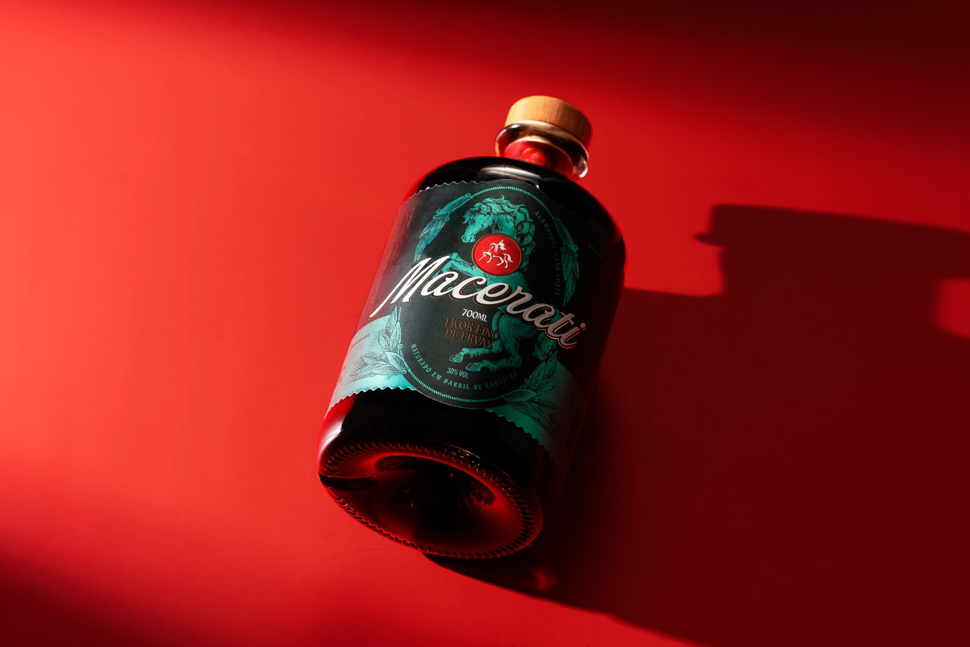
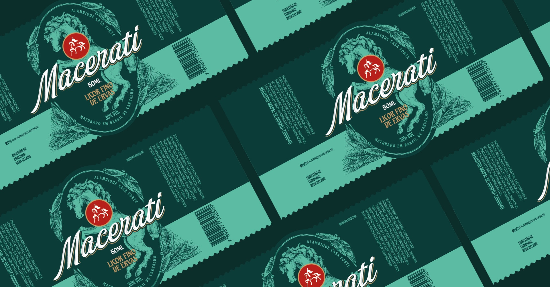
We developed a visual identity with a personality of its own, allowing Macerati to stand out within the brand’s portfolio while maintaining a clear connection to its origins. The design explores the contrast between green and red, creating a striking image that distinguishes the product on the shelf. The horse was reinterpreted within the product’s narrative, preserving an important Casa Forte visual asset, while the overall graphic composition reinforces the complexity, richness of ingredients, and artisanal character of the beverage.
The result is packaging with a distinctive visual presence, capable of generating immediate recognition and enhancing the consumption experience. Today, Macerati has become one of Casa Forte’s most successful products, demonstrating how a consistent visual identity can strengthen perceived value and elevate a product’s position within a brand portfolio.







Perfect design!