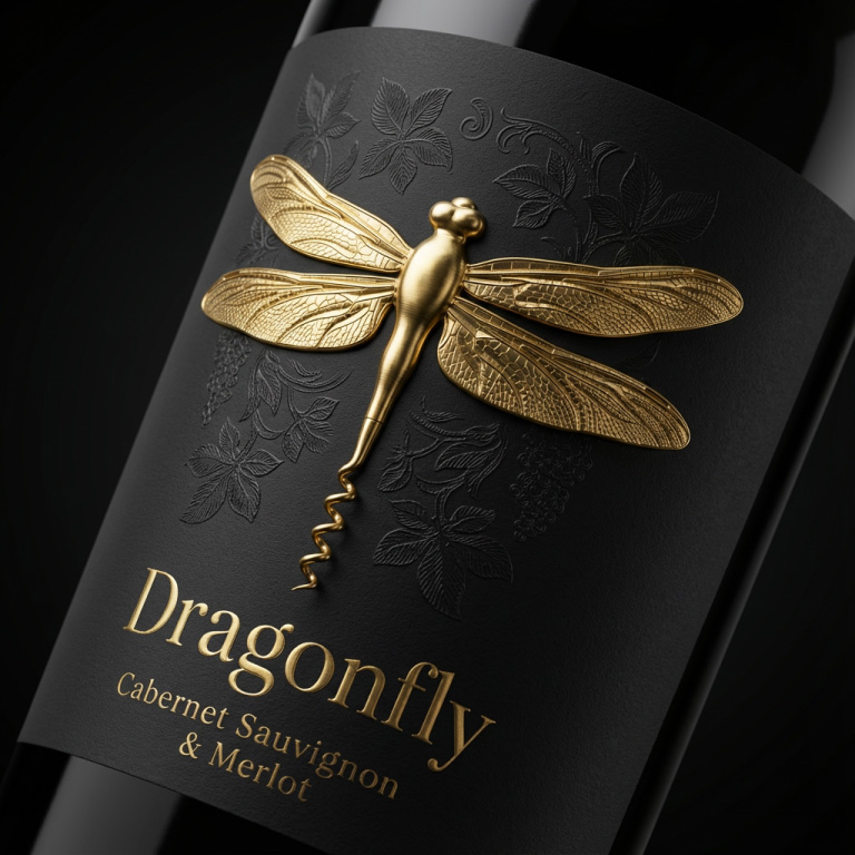
Dragonfly Wine Brand Design
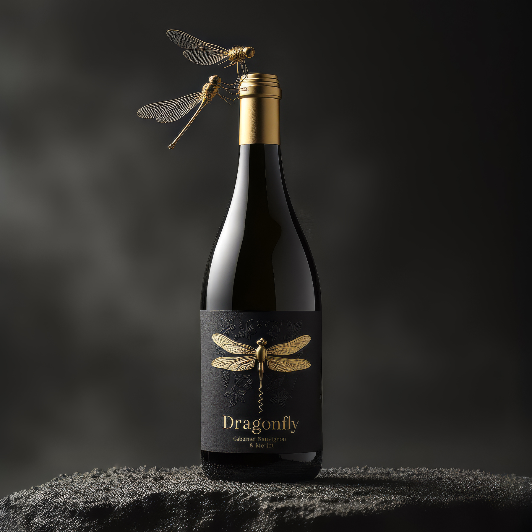
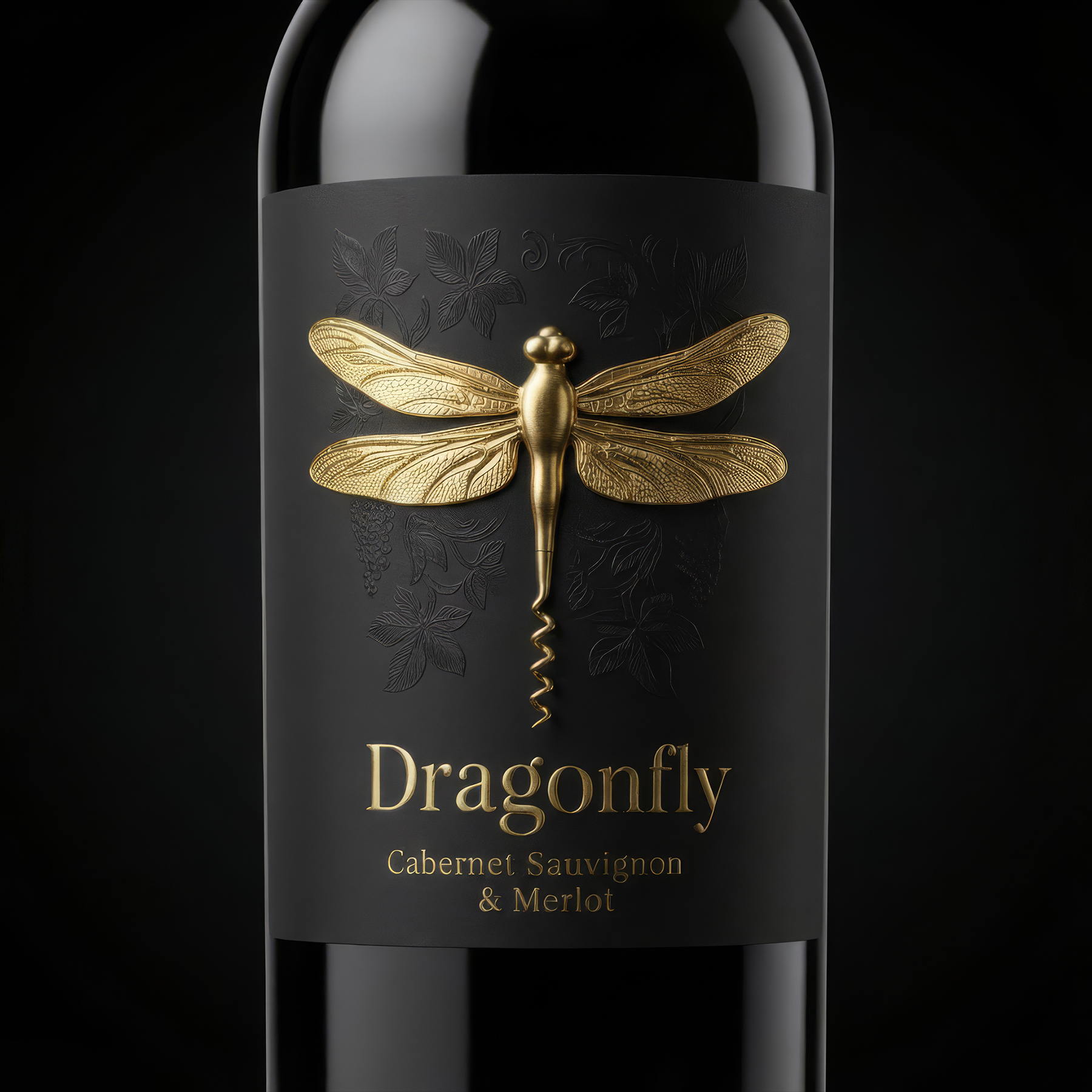
Dragonfly Wine explores how a brand symbol can evolve from a graphic element into a functional part of the product experience. The dragonfly, traditionally a sign of precision and lightness, is transformed into a corkscrew integrated into the bottle. Through this gesture, identity becomes action.
The project rethinks packaging as a participant in ritual. Opening the bottle is no longer separated from branding; the consumer directly holds the emblem, unfolding it and engaging with the mark physically. This creates a stronger bond between memory, touch and meaning.
A restrained visual language supports the transformation. The quiet label surface allows the metallic dragonfly to act as a sculptural focal point. The balance between minimalism and heritage cues aims to achieve longevity rather than seasonal novelty.
By embedding utility into symbolism, the design proposes that brand value can be created not only through visibility, but through performance at the most decisive moment of use.