

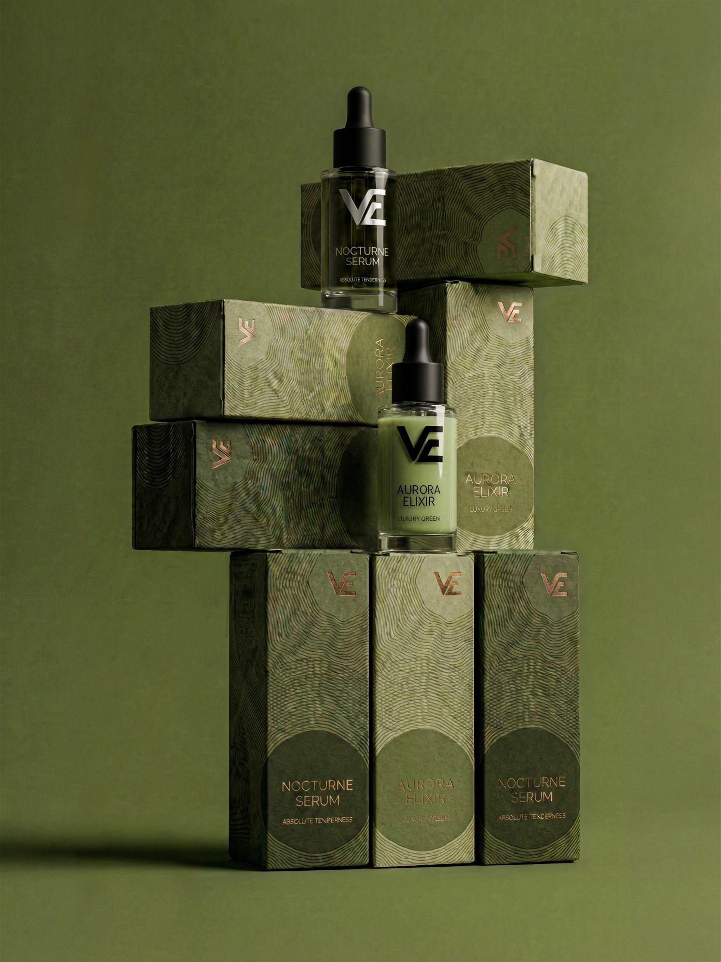
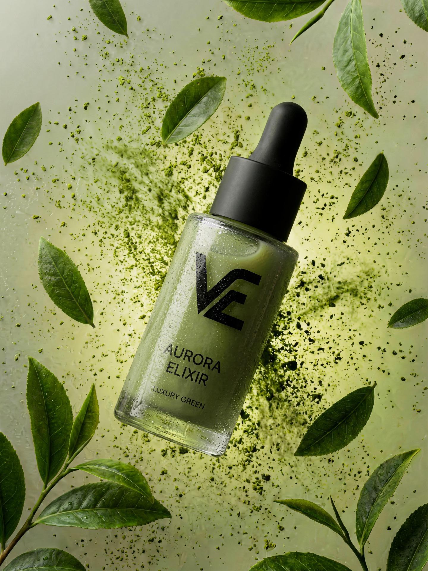
Aurora Elixir
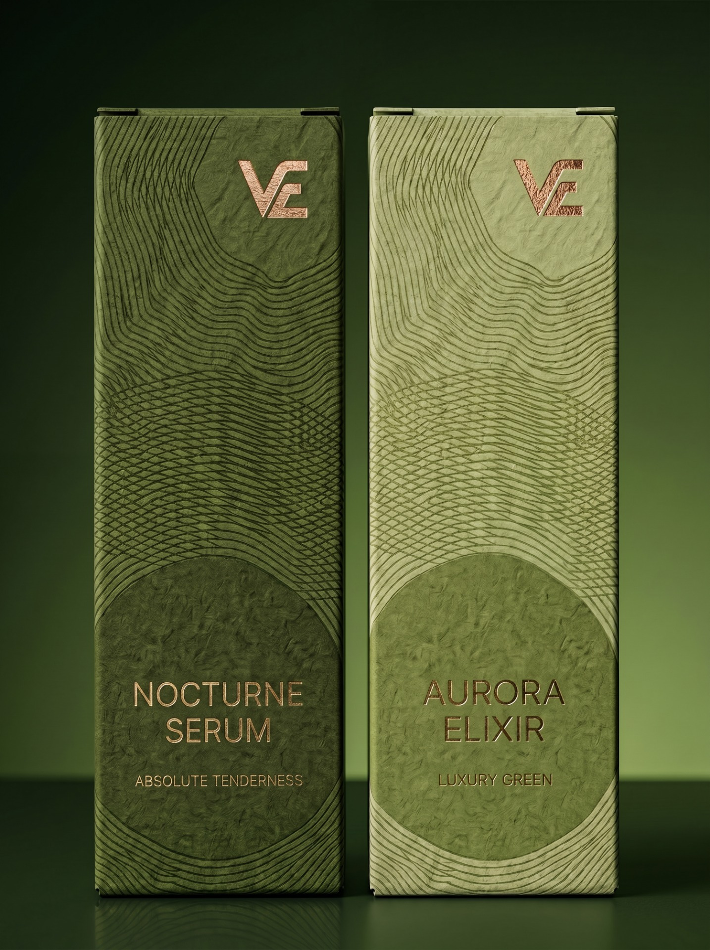
A packaging concept exploring the intersection of organic texture and architectural form. The design language draws from natural topography — layered contour patterns pressed into deep olive green, accented with rose gold foil detailing to signal premium positioning.
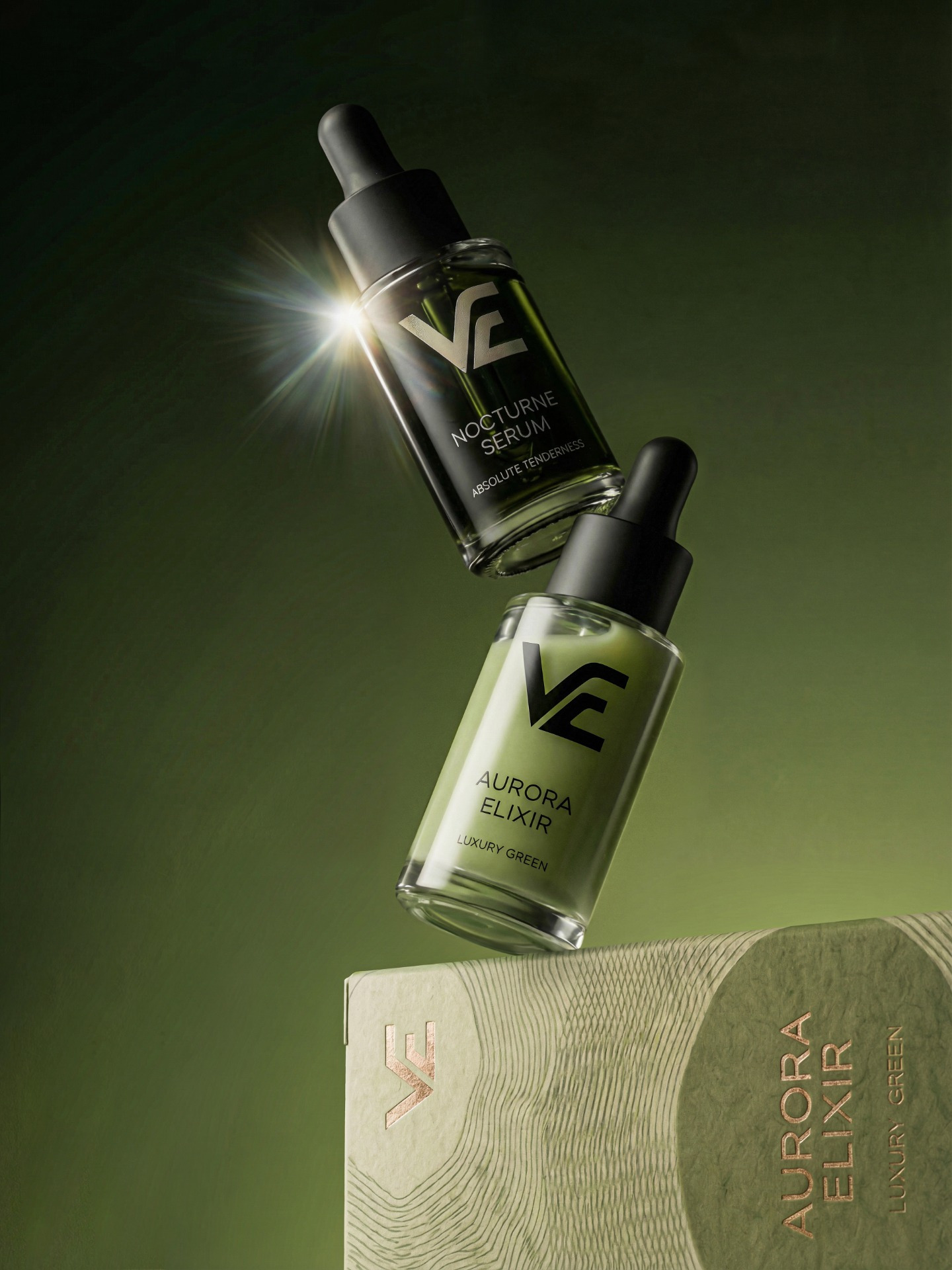
The structural composition was intentional: stacked volumes create a sense of weight and permanence, reinforcing the brand’s identity as something built to last — not trend-driven.


Related Posts





Leave a Comment