STAKU Craft Beer Packaging System Inspired by Veracruz
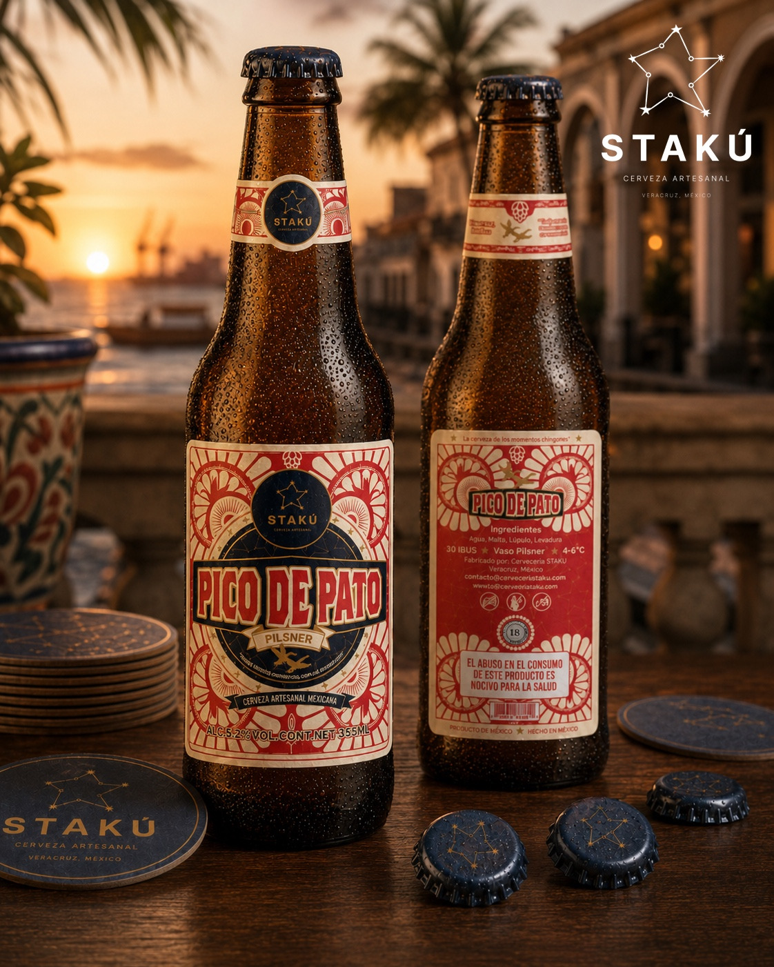
STAKU is a packaging system created for a craft brewery located in Veracruz, Mexico. The project was developed from a holistic packaging perspective, where each label functions as an individual piece with its own personality while remaining part of a cohesive and recognizable visual family.
The main challenge was to create a beer line with strong shelf presence that could communicate origin, craftsmanship, flavor differentiation, and regional identity without relying on the common visual clichés frequently found within the craft beer category.
The visual identity is rooted in the meaning of the word STAKU, which means “star” in the Totonac language, one of Mexico’s indigenous cultures native to the state of Veracruz. From this concept, the brand symbol was developed as a constellation, representing connection, community, and shared experiences. The constellation becomes the core element of the system and appears consistently throughout the labels, neck labels, bottle caps, coasters, and brand applications.
The label architecture is based on a symmetrical composition inspired by traditional Mexican sign painting, vintage graphic ephemera, playing-card structures, and the visual language historically associated with Veracruz’s port culture. This framework provides visual consistency across the range while allowing each beer to express its own character through color, symbolism, and atmosphere.
One of the most important graphic elements is the abstract representation of the Veracruz sun. The radial patterns surrounding each composition evoke the intense coastal light, tropical climate, and vibrant energy of the region. Beyond decoration, these solar structures organize the composition, generate rhythm, and establish a direct connection between the product and its place of origin.
Birds were selected as a key storytelling device throughout the system. Rather than functioning as dominant illustrations, they are integrated into the graphic architecture as symbolic elements connected to local landscapes and cultural references.
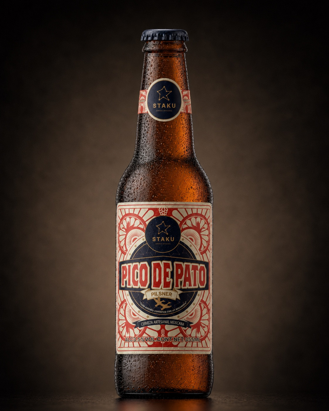
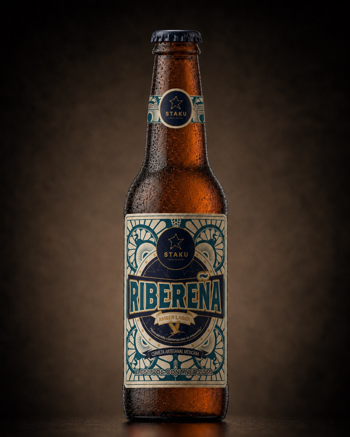
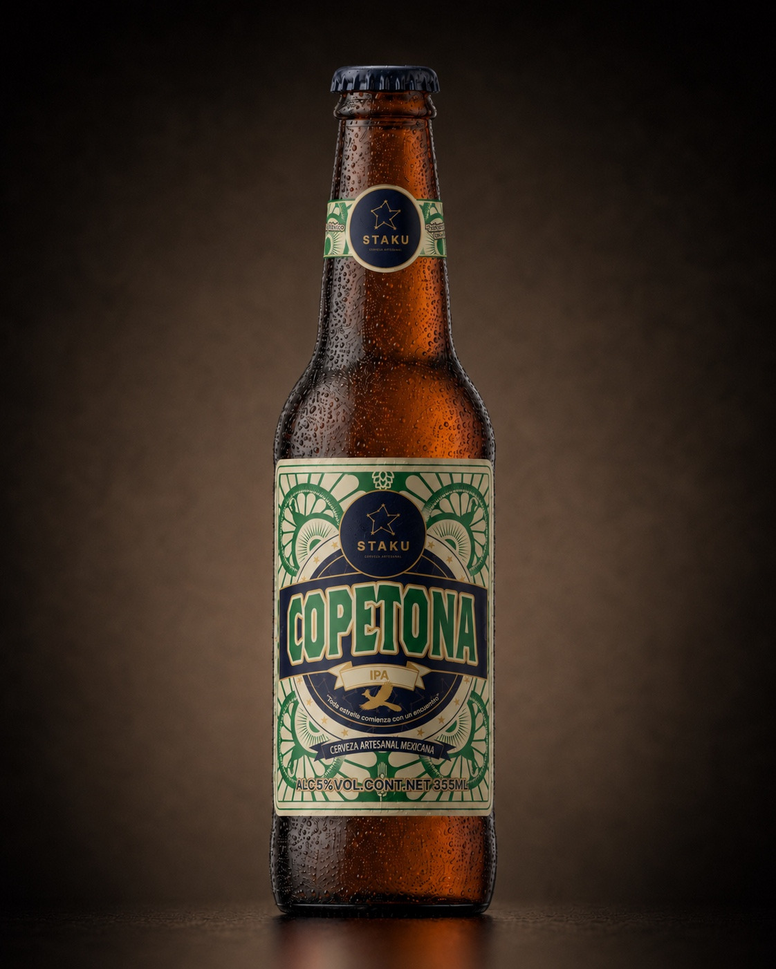
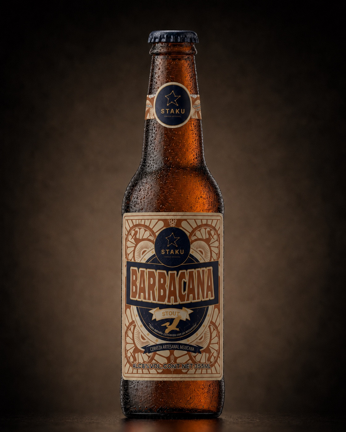
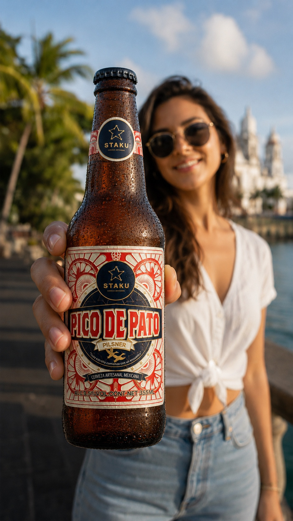
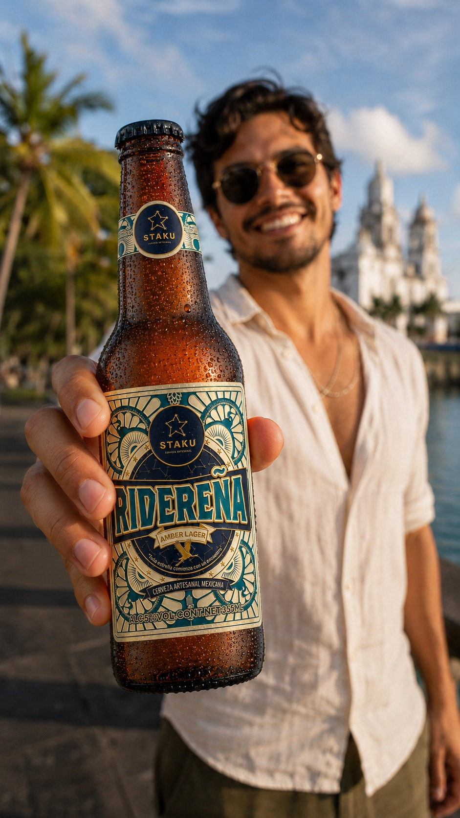
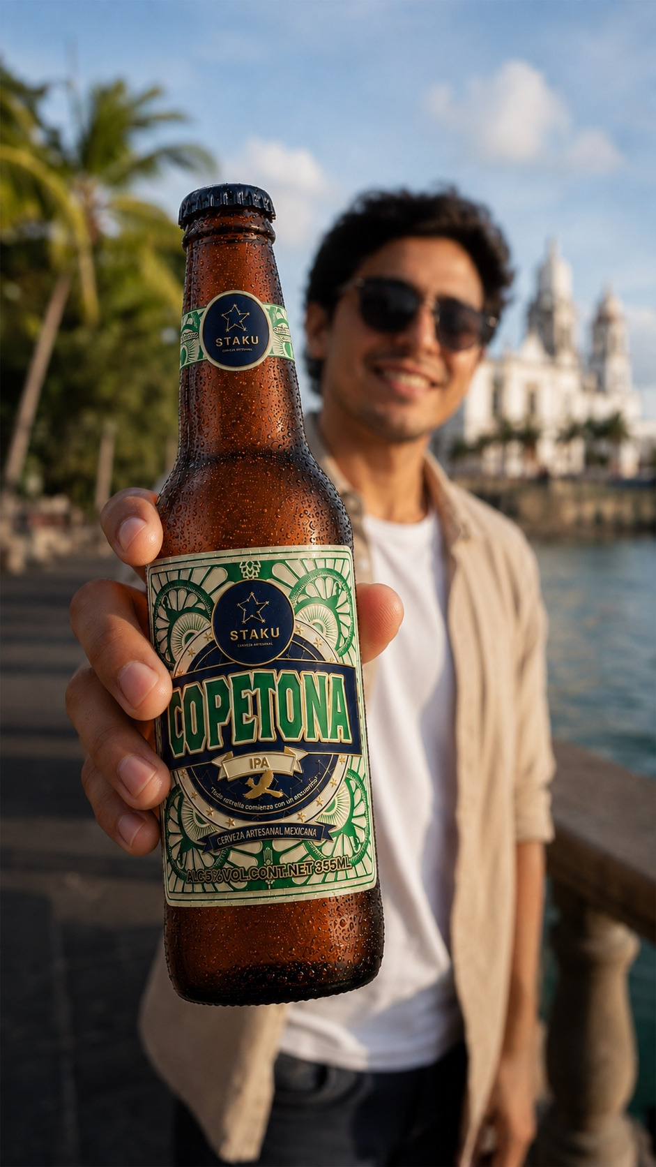
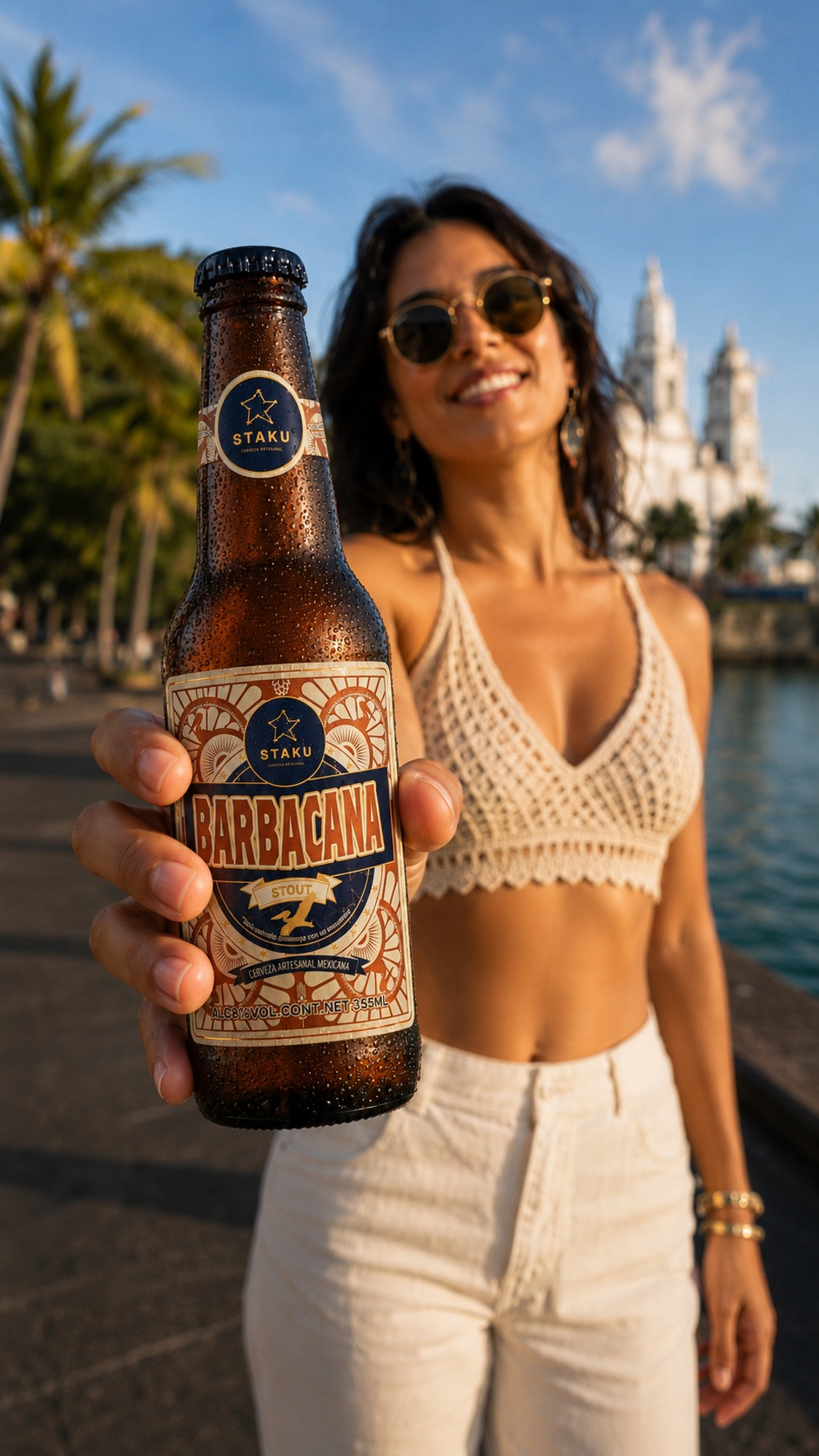
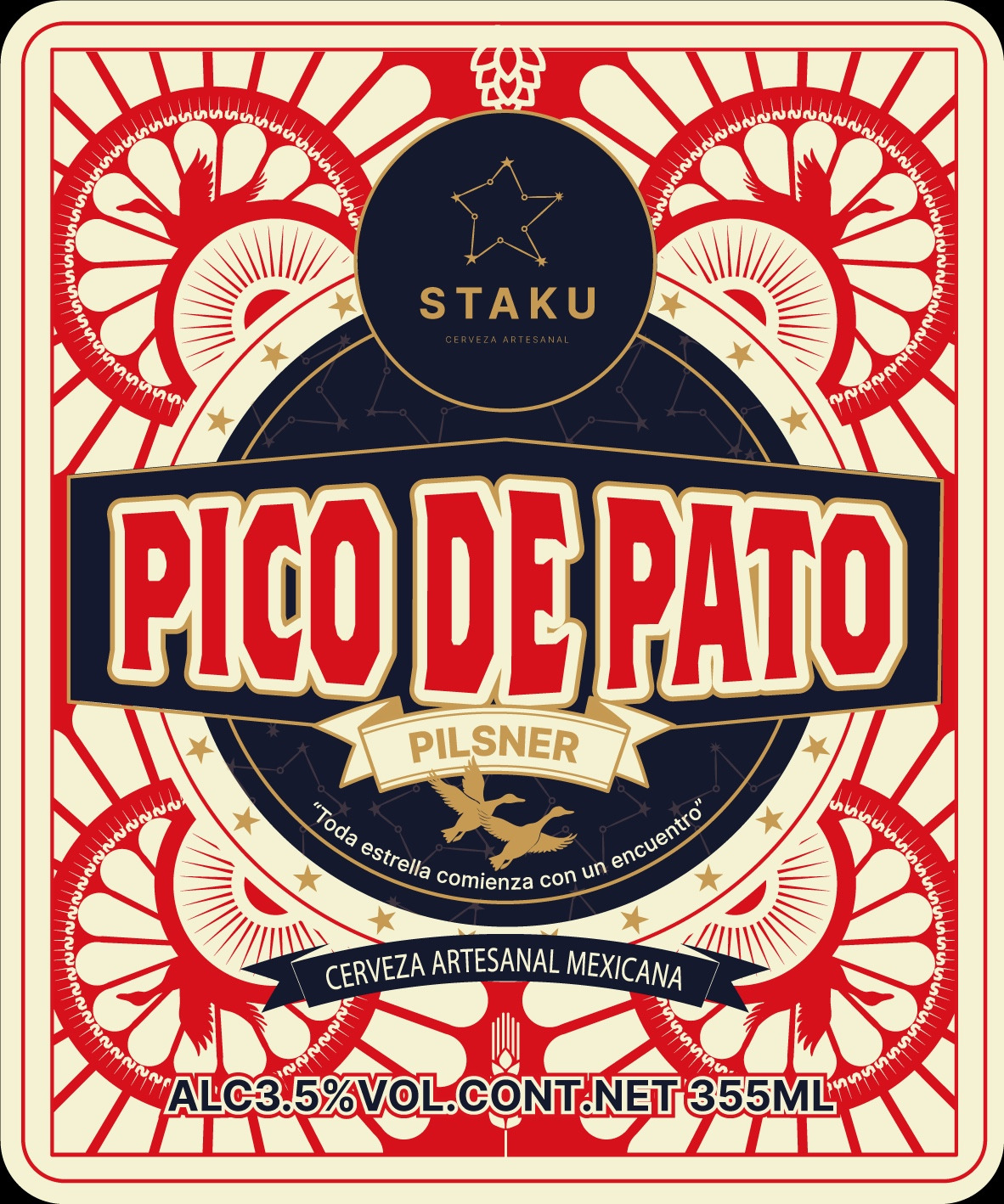
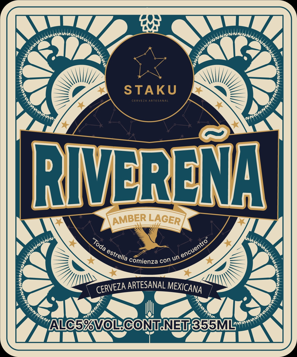
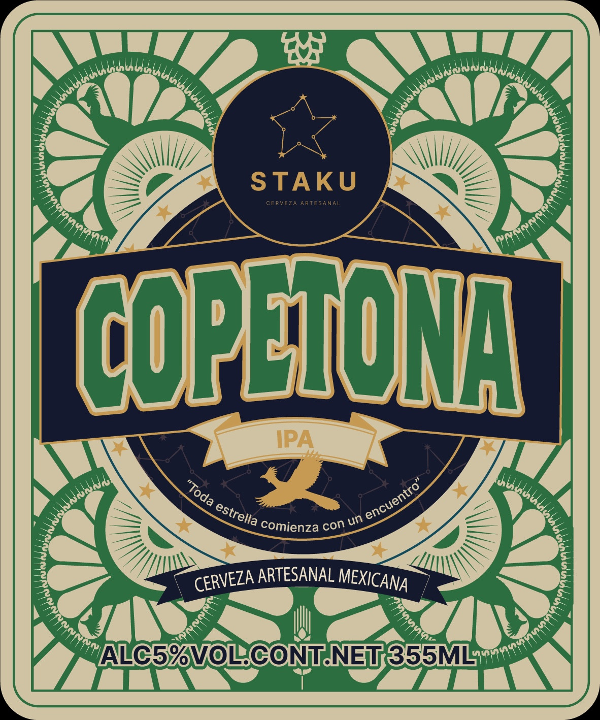
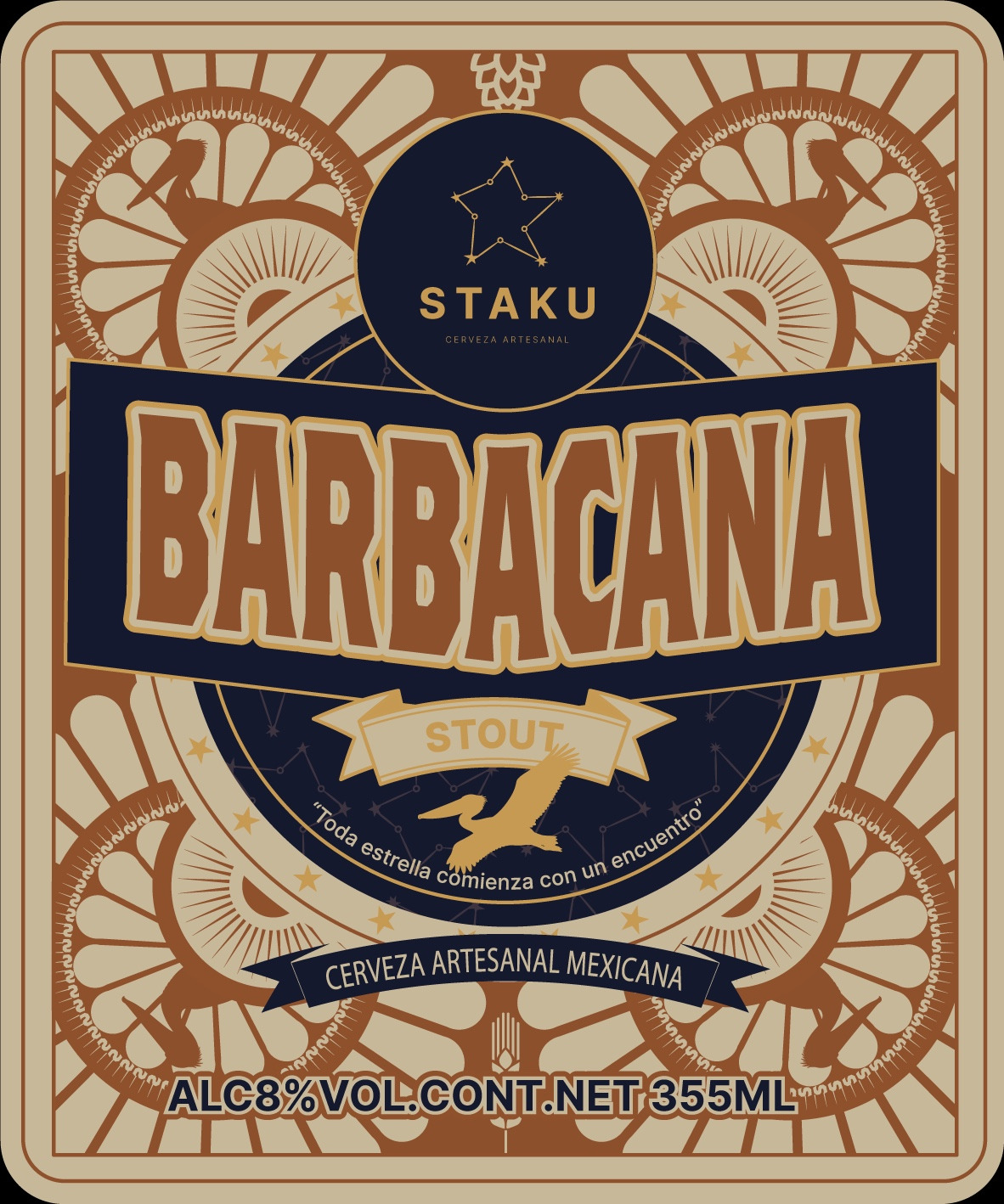
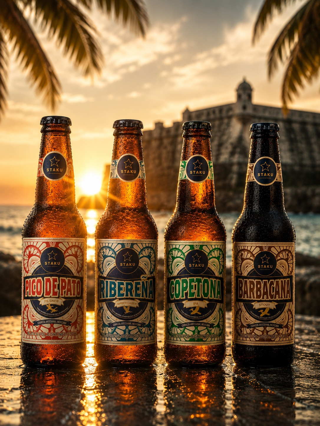
Pico de Pato features ducks, reinforcing a friendly, approachable, and refreshing personality. Ribereña incorporates herons, reflecting the rivers, wetlands, and coastal ecosystems of Veracruz. Copetona uses the chachalaca, a vibrant tropical bird whose energetic character aligns naturally with the expressive nature of an IPA. Barbacana incorporates the pelican, a bird deeply associated with port cities and coastal life, whose visual weight and presence complement the richness and depth of a stout.
Color plays a fundamental role in the system. Each beer is identified through a distinct color palette that helps consumers quickly differentiate styles while maintaining a unified family appearance. At the center of every label remains STAKU’s signature deep navy blue, representing the night sky, the constellation concept, and the master brand identity.
Pico de Pato uses vivid reds inspired by Veracruz’s colorful streets, local architecture, and warm coastal atmosphere. Ribereña adopts blue-green tones that evoke water, mangroves, and ocean breezes. Copetona employs tropical greens associated with vegetation, humidity, and hops. Barbacana utilizes copper, tobacco, and aged sand tones to communicate depth, roasted malt, wood, coffee, and cacao notes.
The typography was inspired by traditional Mexican hand-painted signage and vernacular lettering. Designed for strong shelf visibility and immediate recognition, the custom-inspired typographic treatment delivers a handcrafted character while maintaining clarity, structure, and consistency throughout the system.
The project intentionally avoids many of the predictable visual tropes commonly associated with Mexican craft beer packaging. Rather than relying on skulls, wrestlers, or generic folkloric imagery, the design builds its identity through more specific and authentic regional references: the coastline, the port, local bird species, sunlight, architecture, popular graphics, and everyday visual culture.
Each label was designed to operate on multiple levels of perception. From a distance, consumers immediately identify the brewery, beer name, and style. Upon closer inspection, additional layers emerge through the birds, constellations, radial structures, ornamental details, banners, and supporting graphic elements. This depth allows the packaging to remain engaging both on the shelf and in digital, social, and lifestyle environments.
The system was also developed with production flexibility in mind. It can be elevated through premium finishes such as textured papers, embossing, foil stamping, and specialty inks, but it can also adapt successfully to more accessible production methods and rustic printing techniques without losing its visual identity. This demonstrates that the strength of the project lies in the design system itself rather than in any specific finishing process.
The initial collection includes four beers: Pico de Pato Pilsner, Ribereña Amber Lager, Copetona IPA, and Barbacana Stout. Each product represents a different atmosphere within the Veracruz universe while sharing the same visual structure and brand language.
The result is a packaging system that combines contemporary design, regional storytelling, and Mexican graphic heritage. STAKU seeks to create a craft beer identity that feels authentic, coastal, approachable, and distinctive while delivering a strong visual presence across both physical and digital touchpoints.