Affogato Brand Design Creates a Collectible Packaging System for Rude Olive
In a category often dominated by predictable food cues and functional packaging, Rude Olive takes a different approach. Created for a grab-and-go olive brand, the identity embraces the unapologetic personality of the product itself: salty, briny, bold, and just a little unhinged.
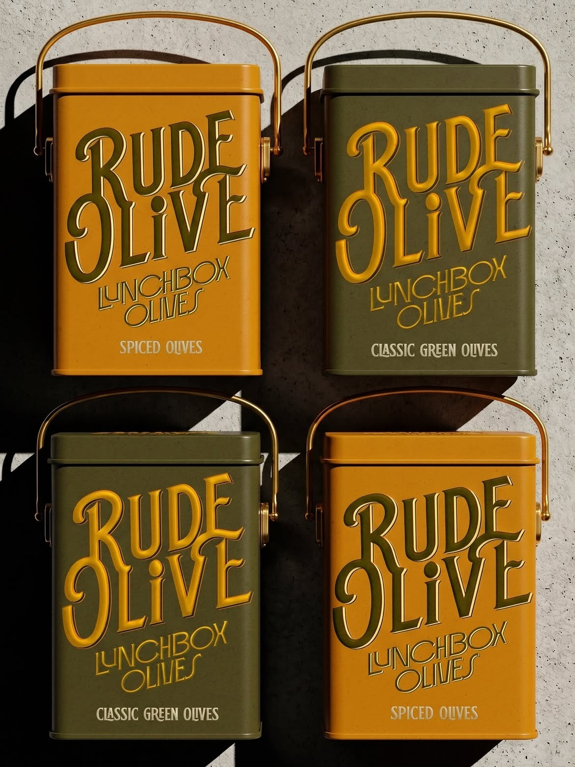
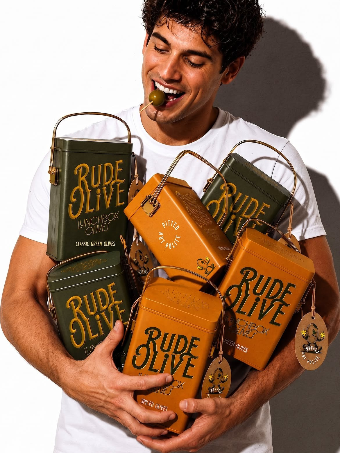
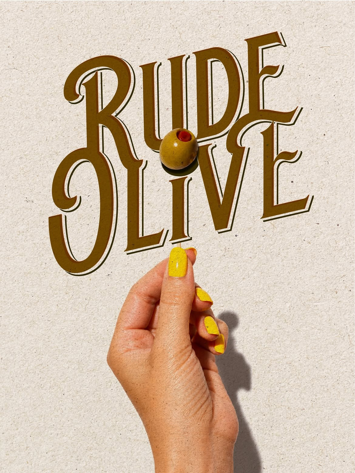
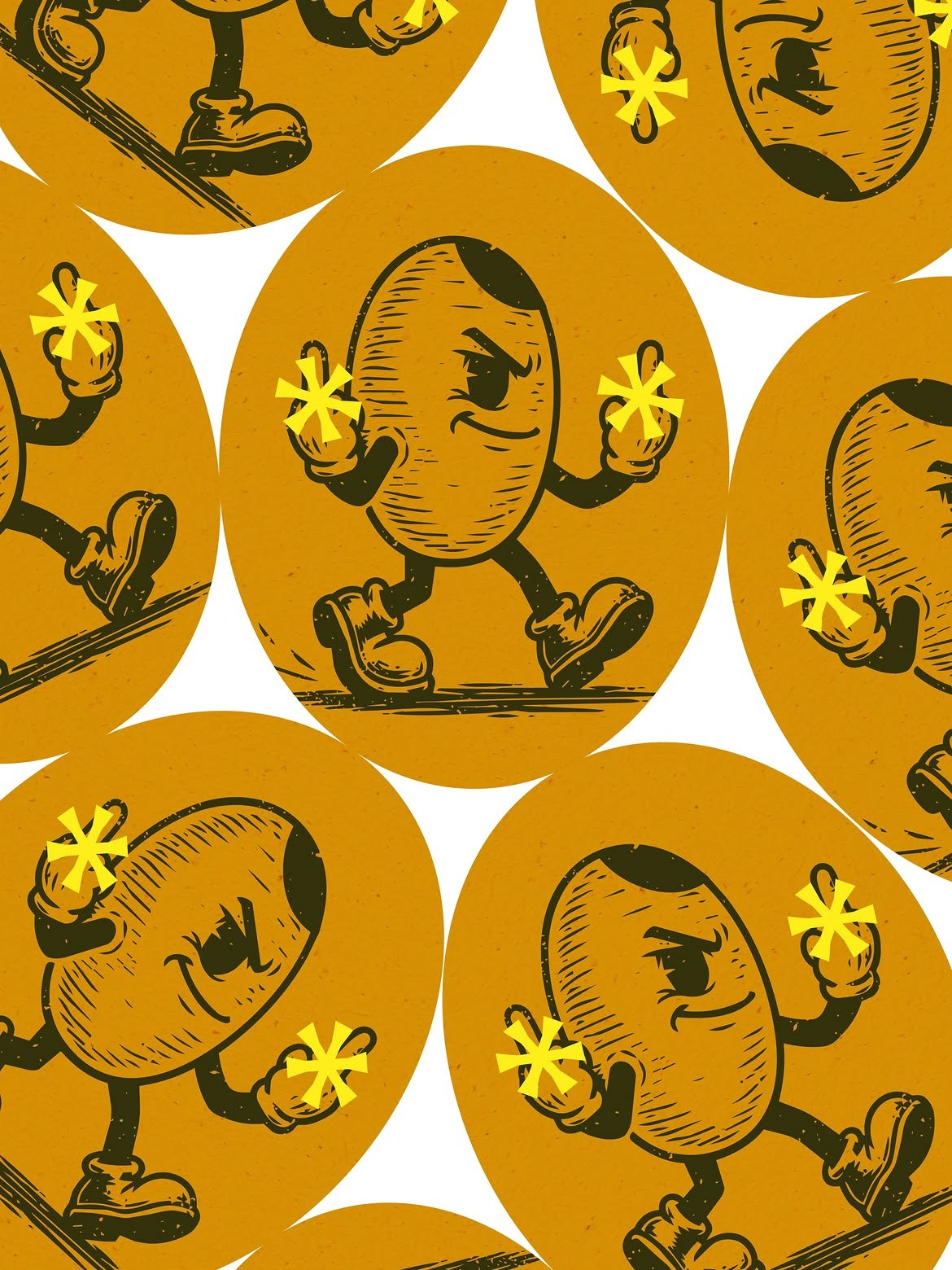
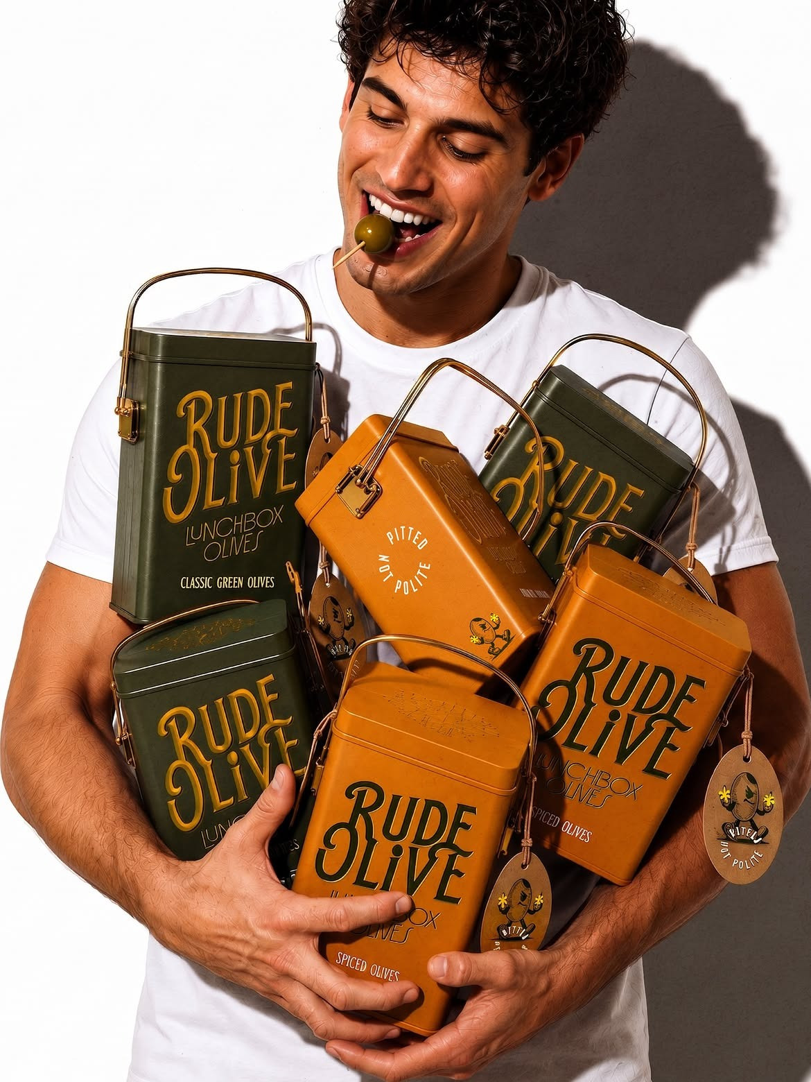
At the heart of the project is a custom-drawn wordmark that feels expressive and full of character. Its exaggerated curves and playful proportions give the brand a distinctive shelf presence, while retaining the confidence of a classic food label. To further amplify the personality, we developed a mischievous olive mascot, a not-so-polite character that embodies the irreverent spirit of the brand and appears across packaging and brand touchpoints.
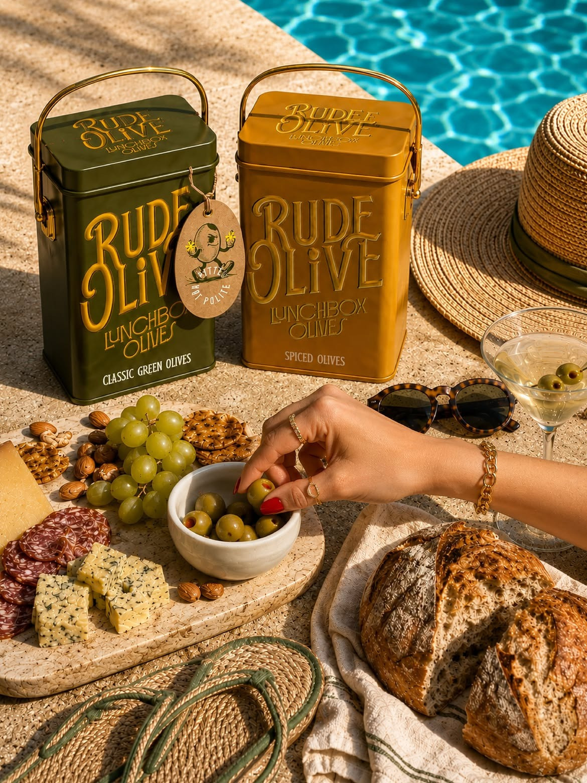
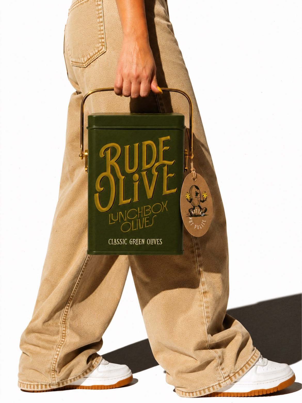
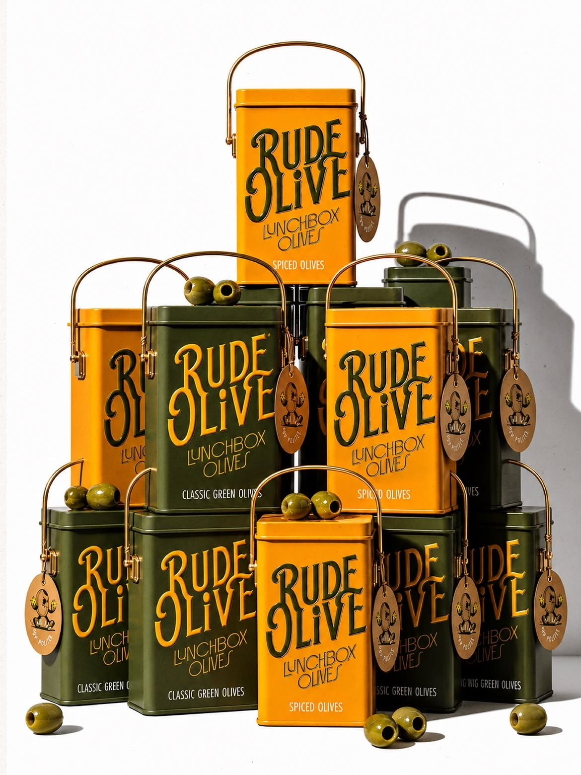
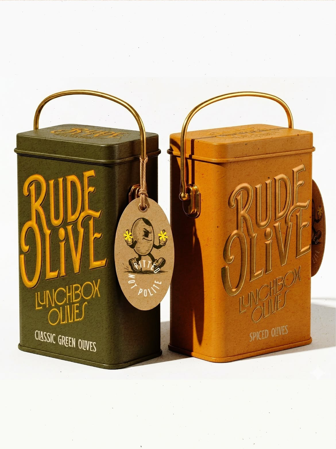
The packaging was designed around the idea of creating an object worth keeping. Rather than conventional disposable packs, the olives are housed in premium metal tins inspired by vintage lunchboxes. Complete with sturdy carry handles, embossed branding, and rich olive-green and mustard-yellow colourways, the containers transform a simple snack into a collectible lifestyle product. Long after the olives are gone, the tins are intended to find a second life on kitchen shelves, desks, and countertops.
Materiality played a key role in bringing the brand to life. The embossed typography creates depth and tactility, while the metal construction elevates the perceived value of the product. Combined with playful hanging tags and a bold visual language, the packaging balances nostalgia with contemporary appeal.
Rude Olive demonstrates how strong branding can turn an everyday pantry staple into a memorable experience. More than just a container for olives, the packaging becomes a conversation piece, celebrating flavour, personality, and a healthy disregard for being polite.