Olycan: Turning Canine Nutrition into a Platform for Brand Value
The dog food category is undergoing a clear transformation. Pet owners are increasingly looking for recognizable ingredients, transparent processes, and products that reflect the place their dogs hold within the family. Olycan responds with fresh, balanced meals, slow-cooked at low temperatures and made with human-grade ingredients. The creative challenge was to communicate preventive wellness without relying on clinical codes, inflated claims, or the familiar clichés of natural food branding.
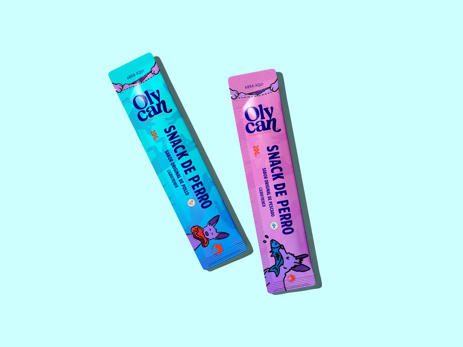
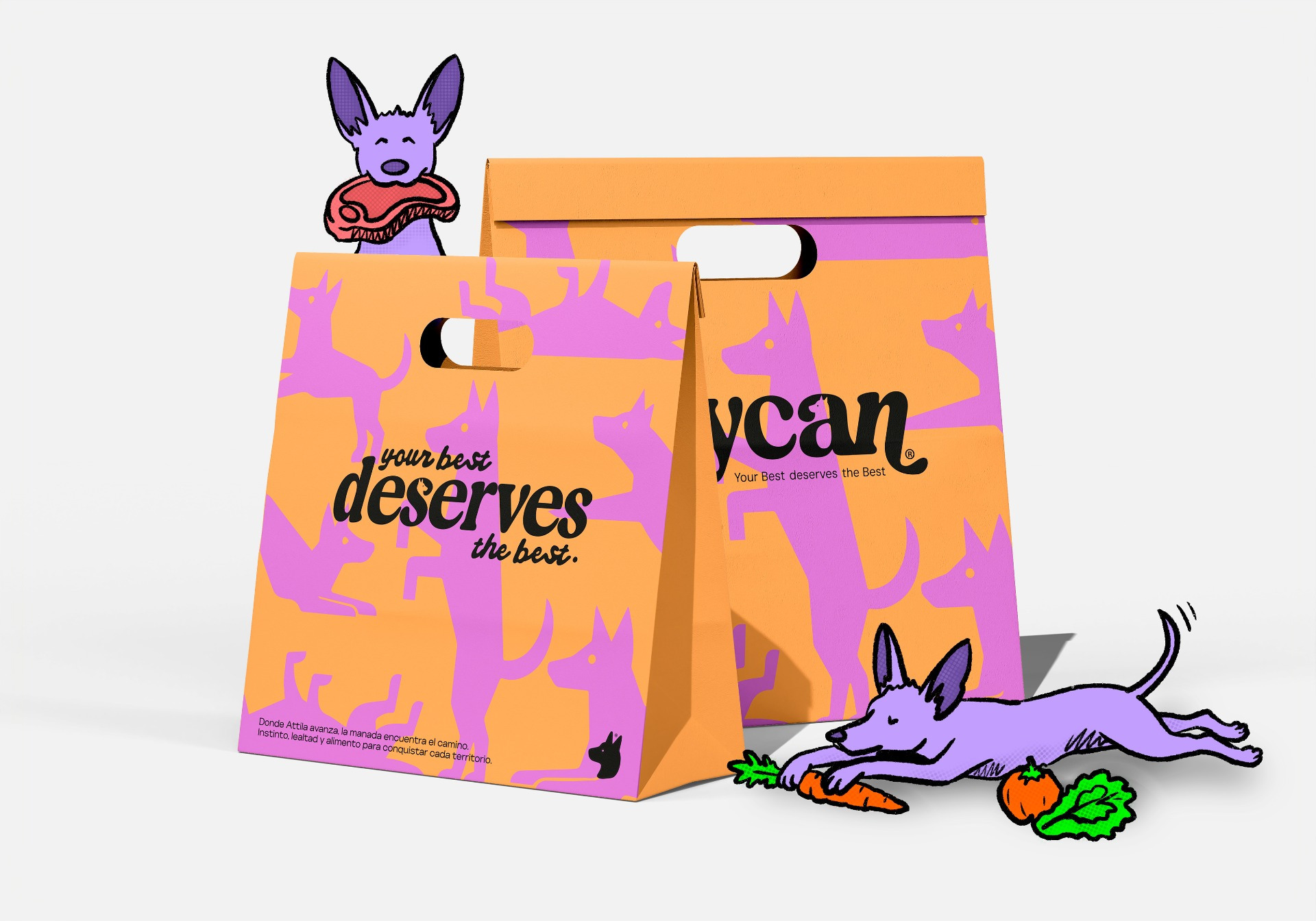
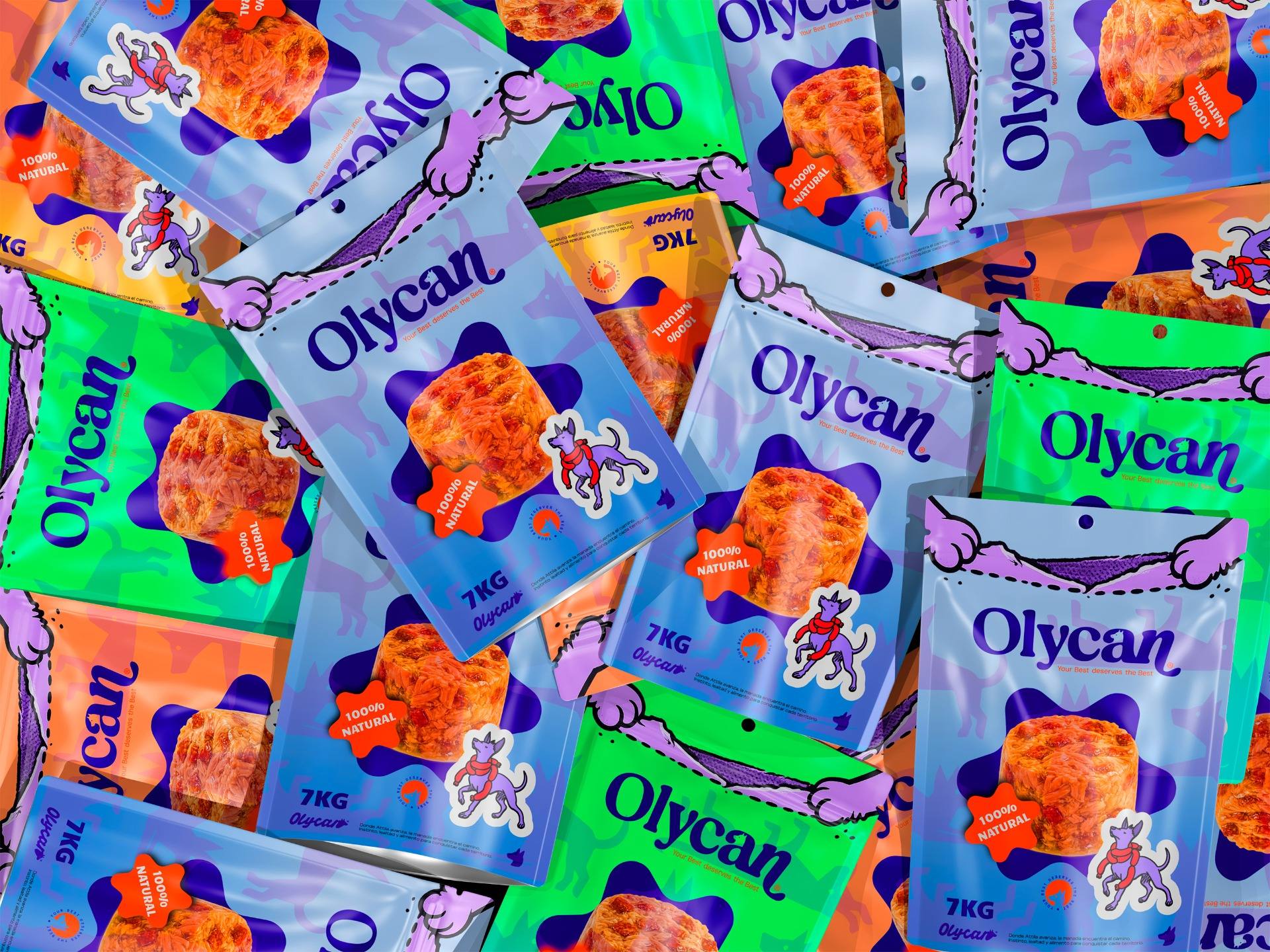
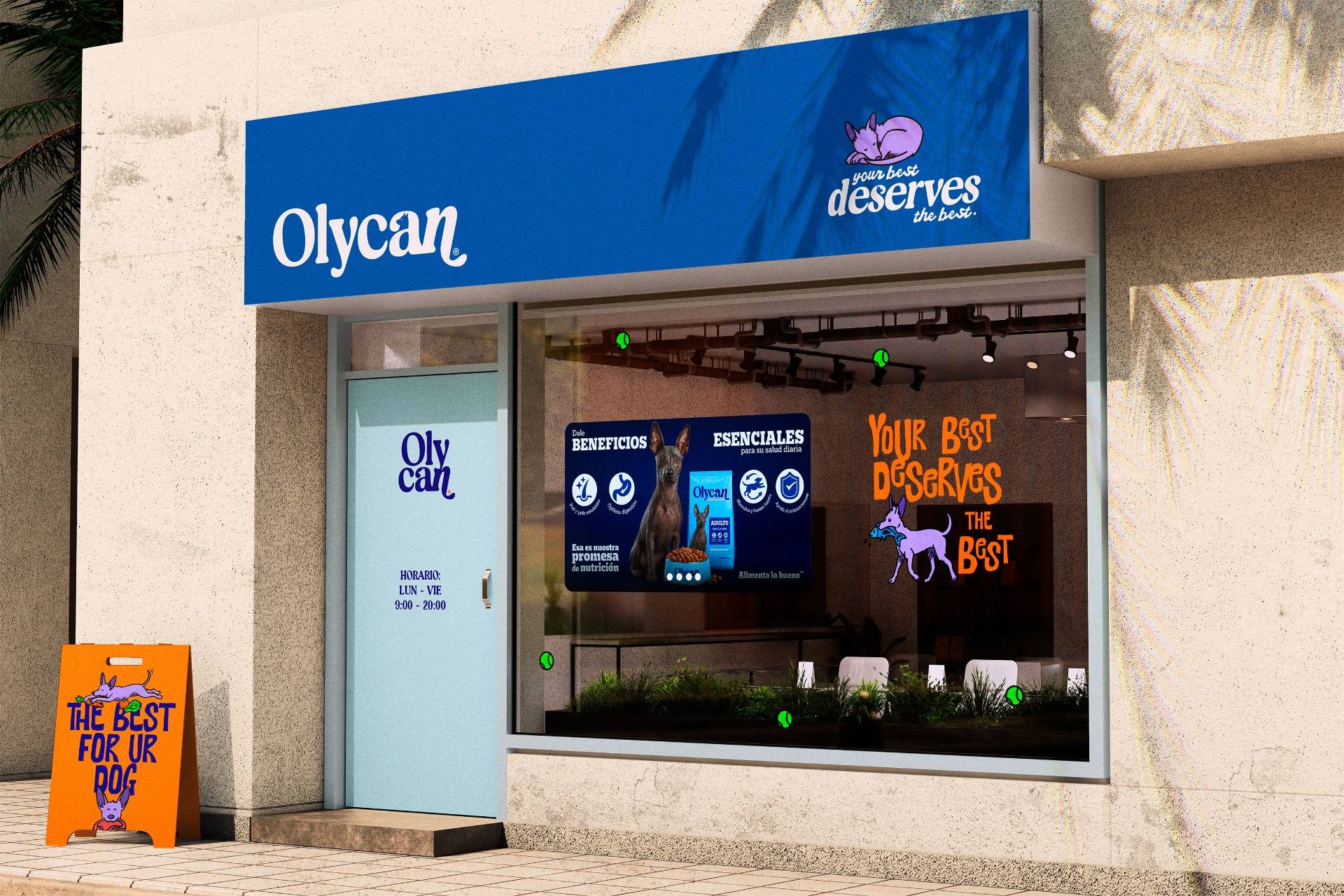
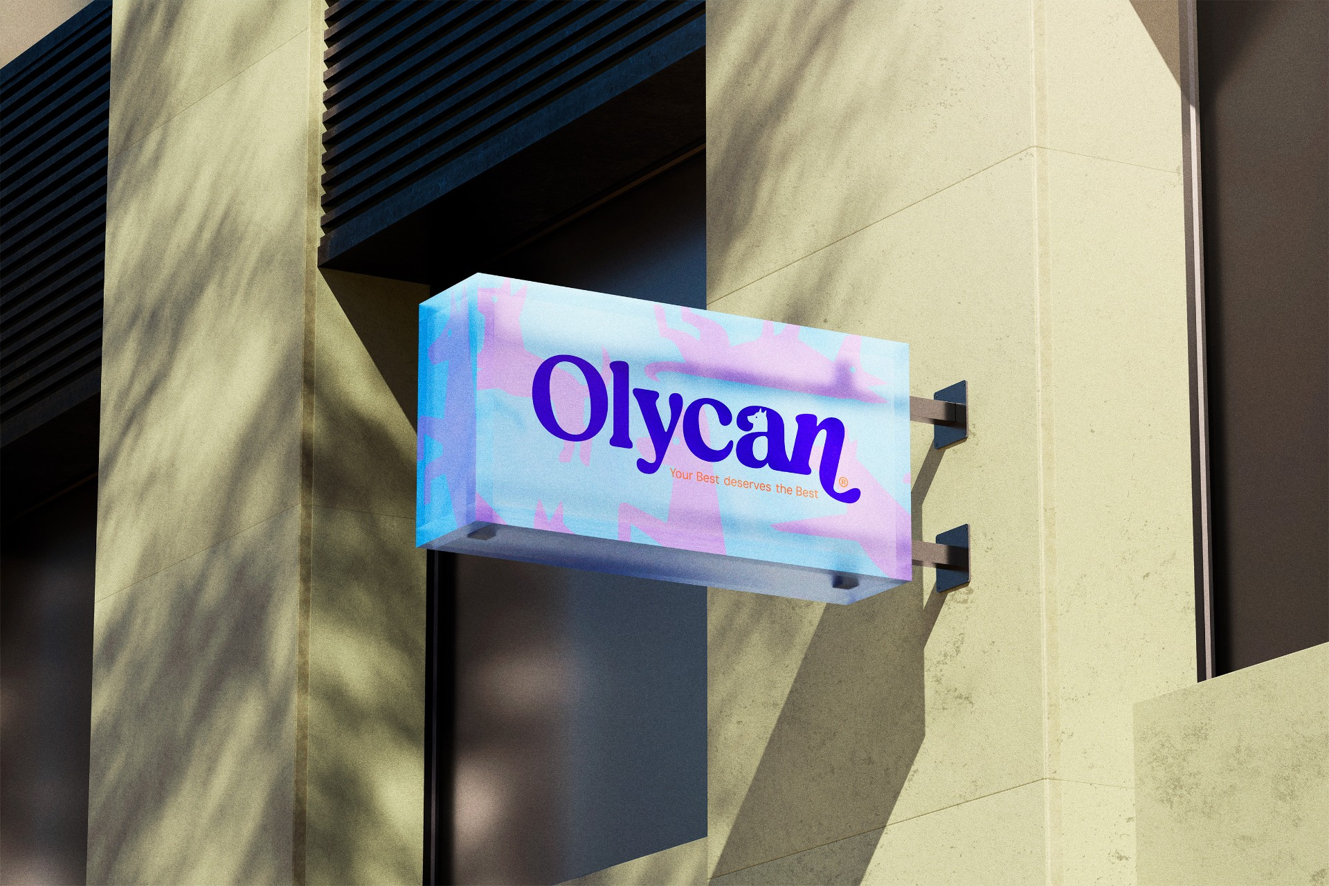
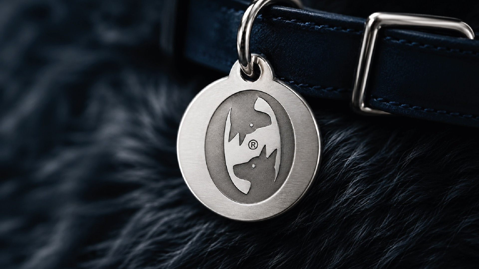
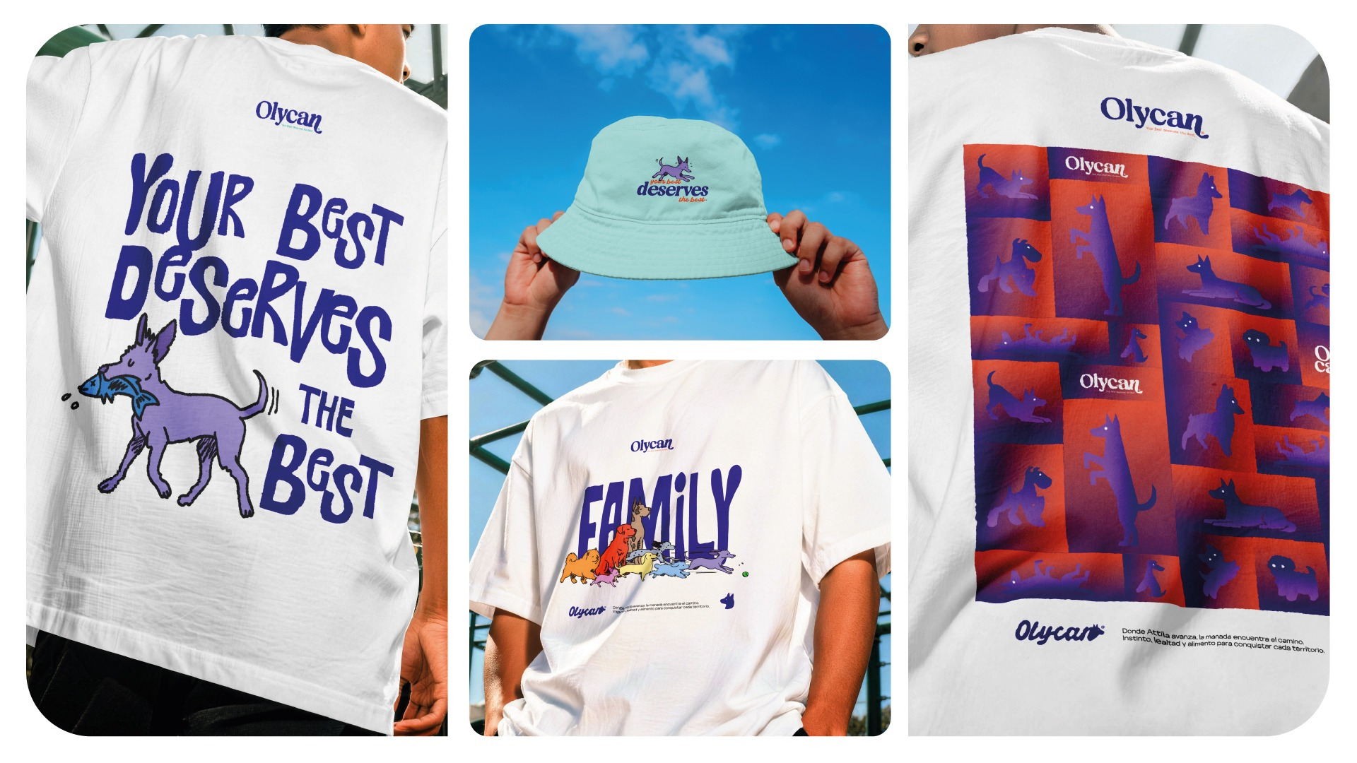
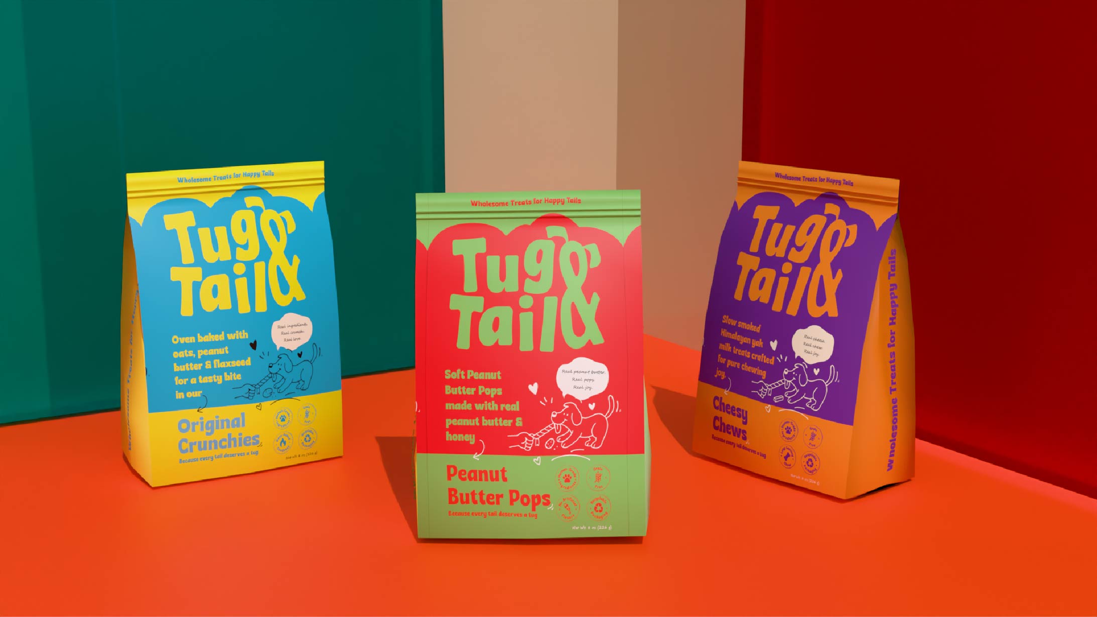
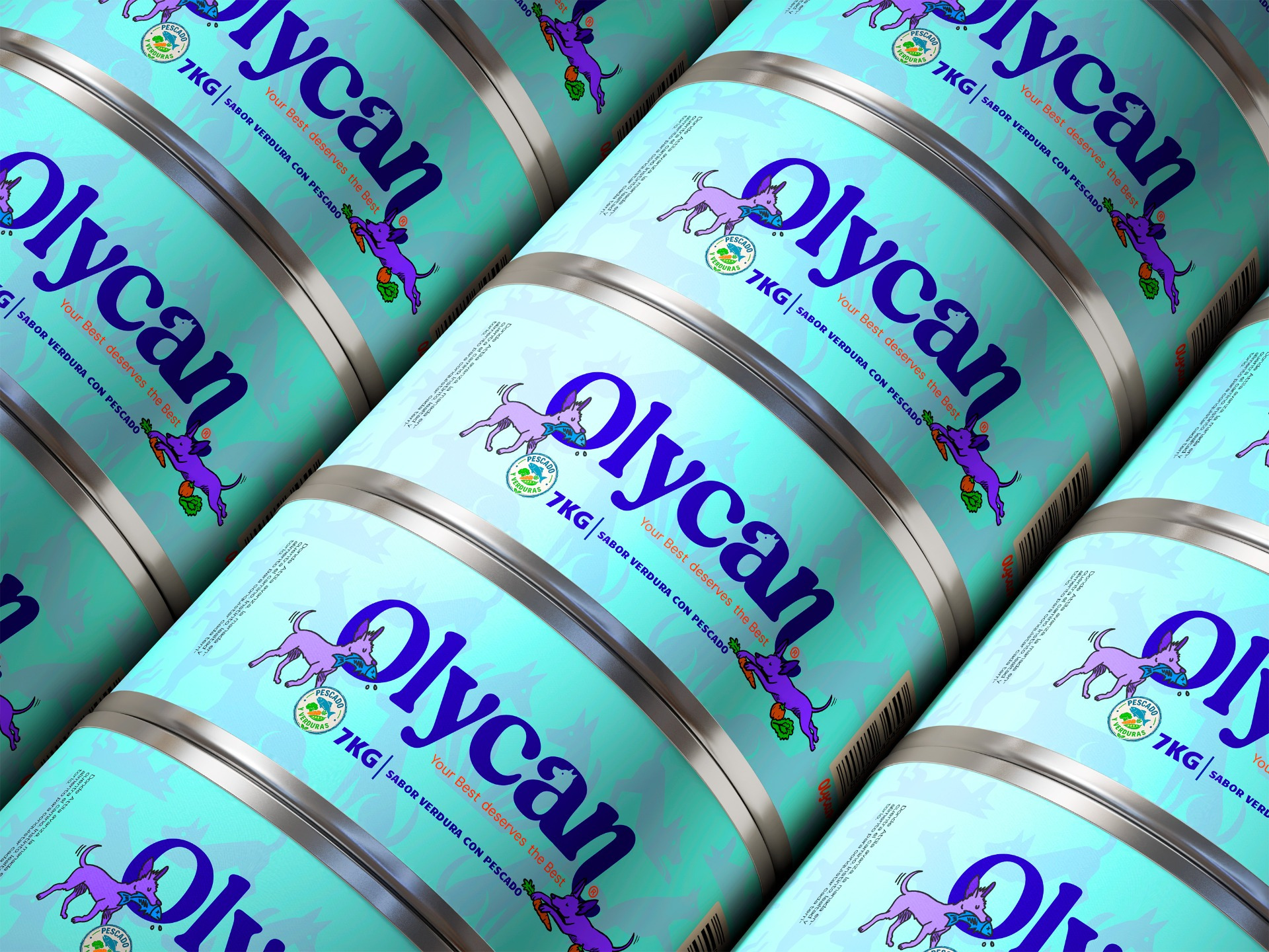
The strategy shaped a brand that feels approachable, sophisticated, and direct. Its name combines an aspirational quality with an unmistakable connection to the canine world, while the visual identity uses organic forms, typographic details inspired by paw prints and animal movement, and a vivid palette of indigo, orange, green, and lilac. The result moves away from the muted tones commonly associated with the category, creating an energetic, contemporary, and highly recognizable presence.
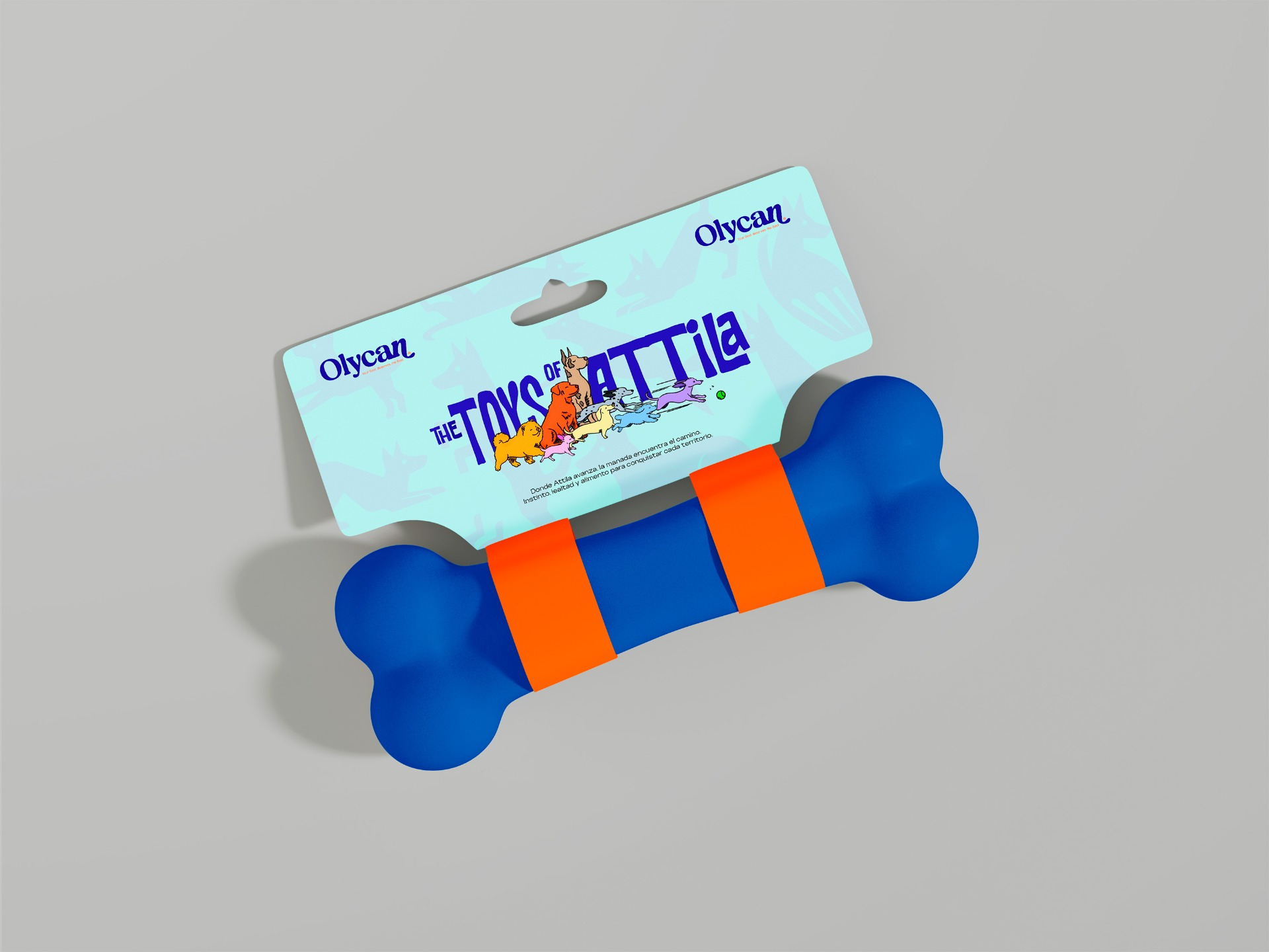
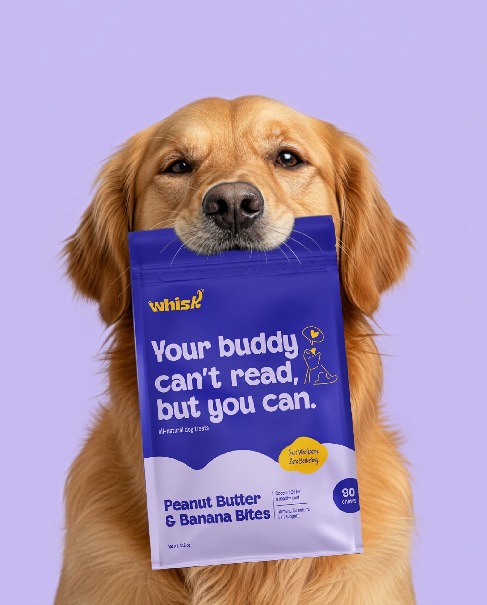
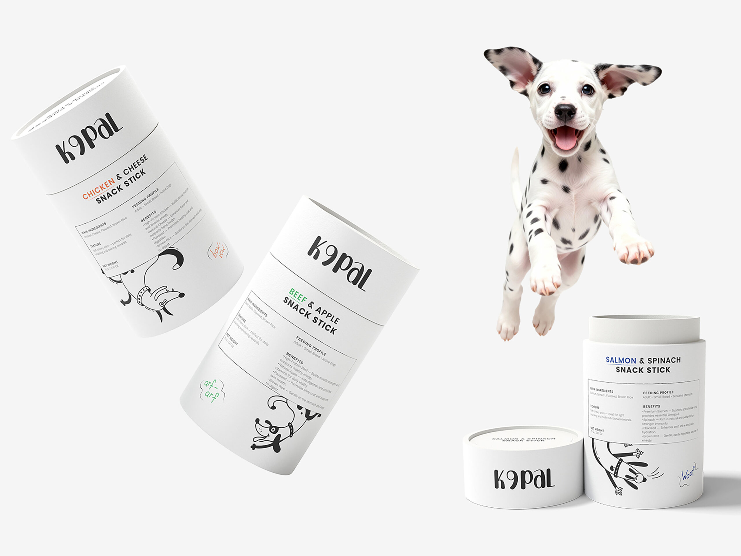
The packaging organizes recipes, proteins, and formats within a flexible system that can extend across retail environments, digital platforms, delivery services, and complementary products. Each element translates an abstract promise—better nutrition—into tangible signals of quality, clarity, and care. Olycan turns design into a commercial tool capable of differentiating the brand, structuring its offer, and building trust from the very first interaction.