


Rity’s Glow
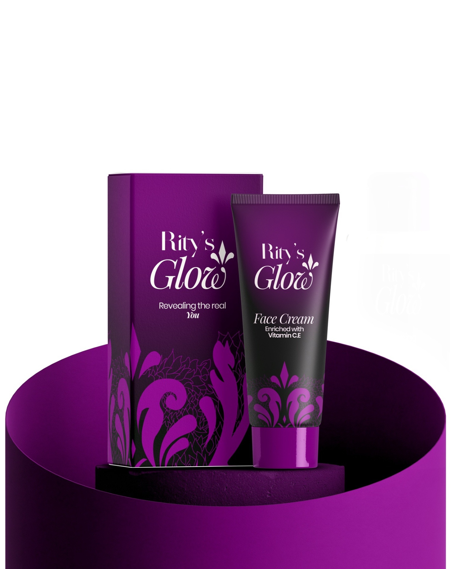
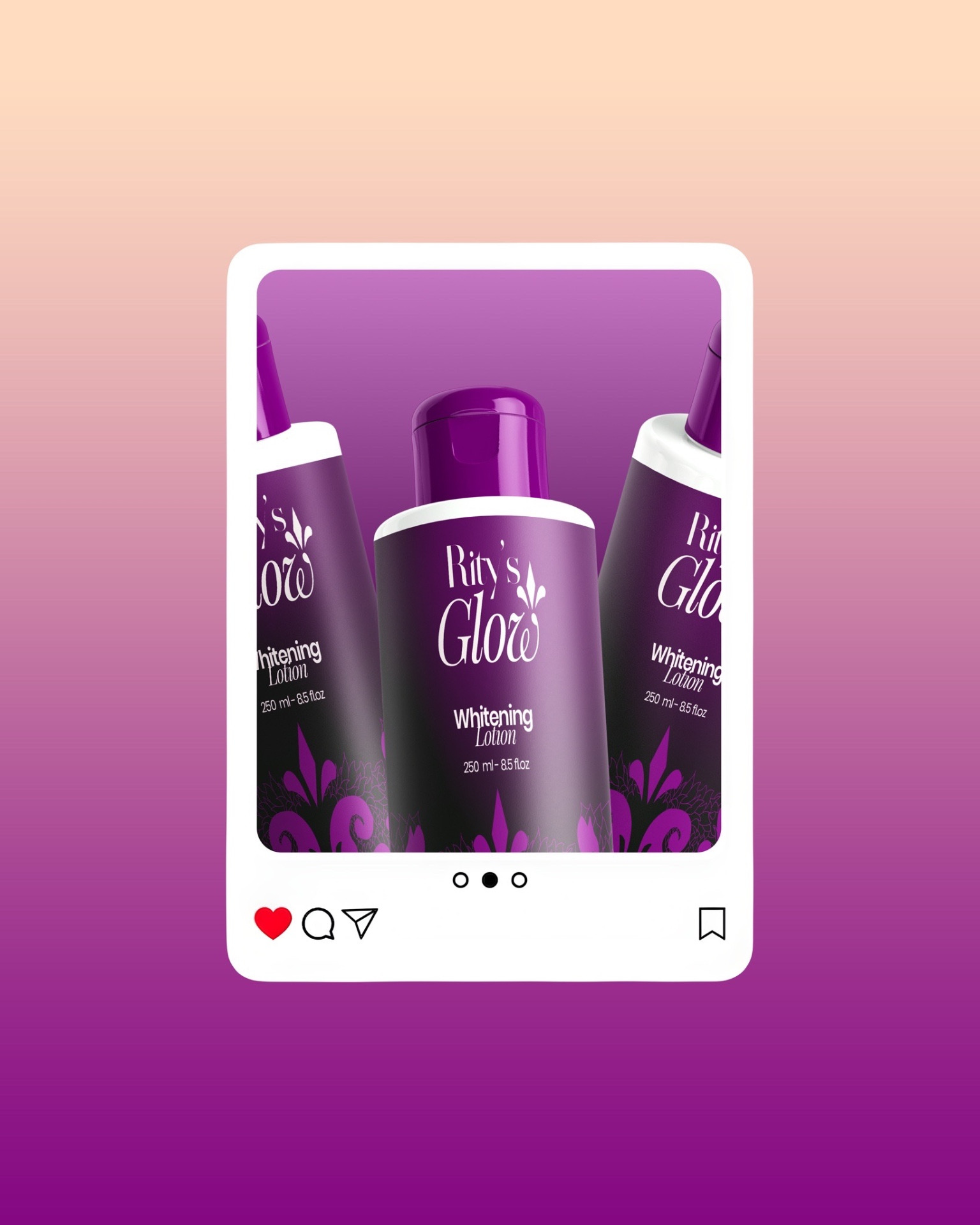
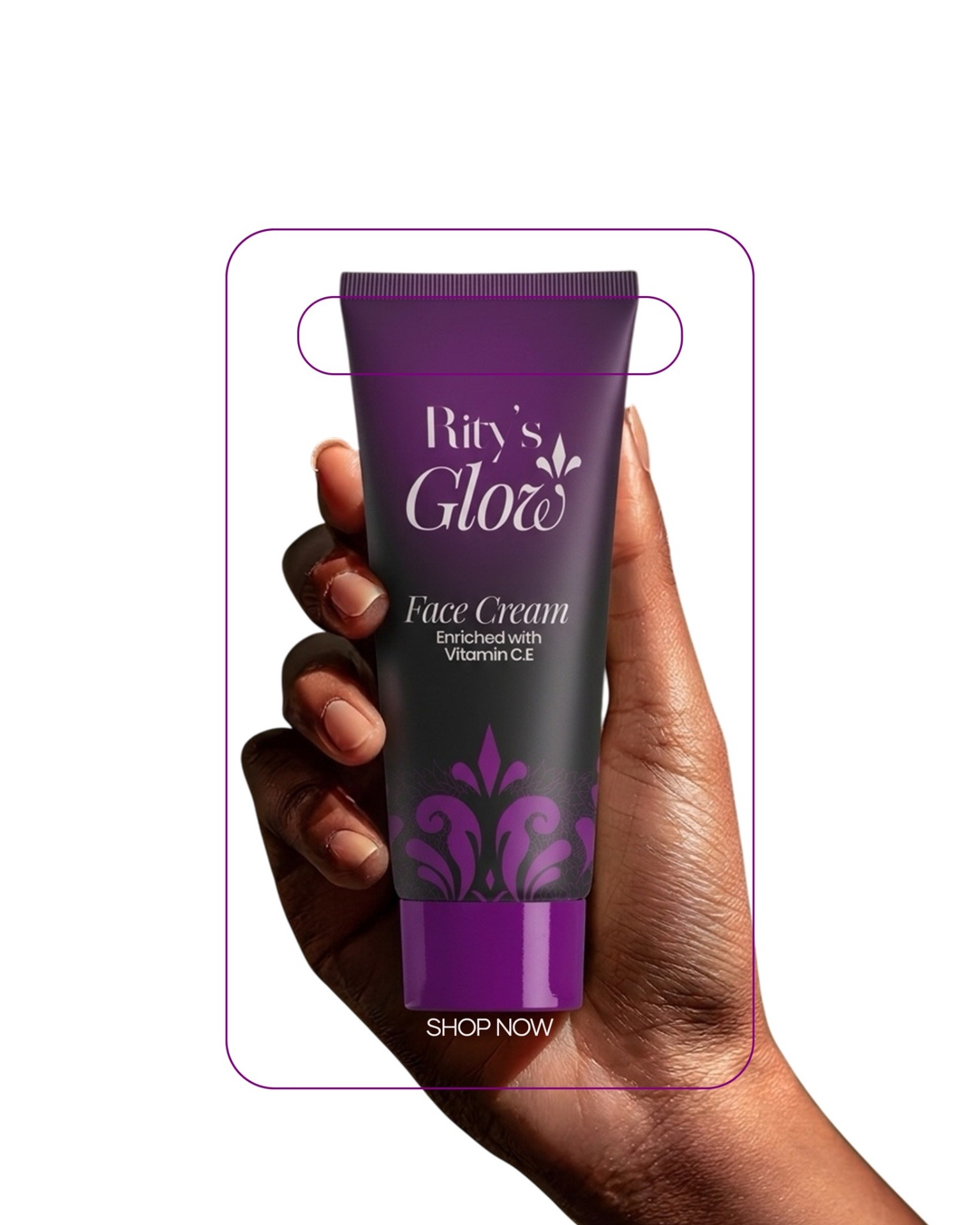
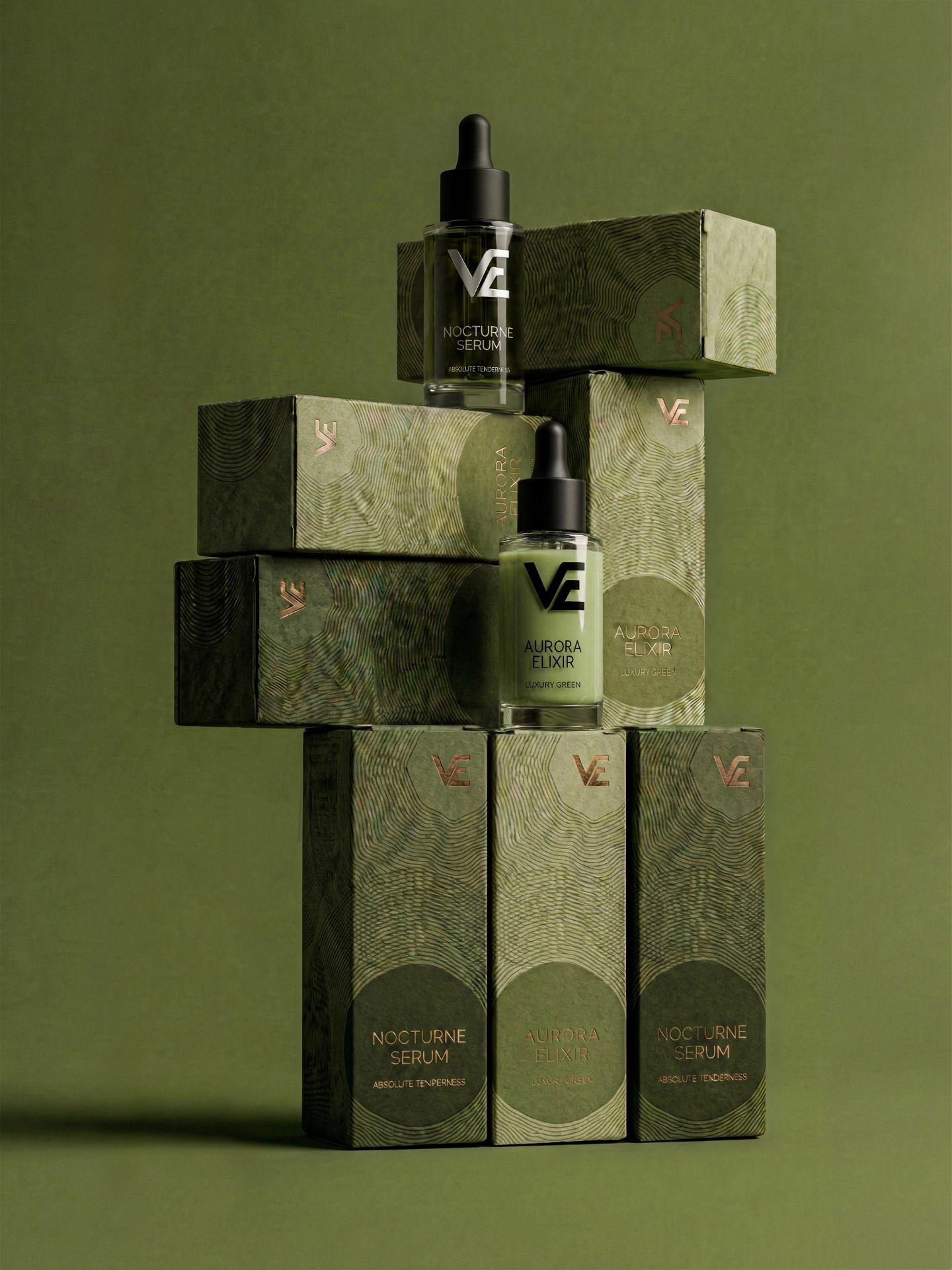
The idea was to create a packaging that simple but also felt premium, which is why the colors purple and black were used as it clearly depicts that.
The signage idea was gotten from carved stones (as it would look on a flat surface).

Related Posts







Leave a Comment