Sadie Skin – Building a Skincare Brand That Feels Calm, Considered, and a Little Unexpected
Somewhere between clinical skincare and overly “pretty” skincare, I felt there was room for something quieter.
That was the starting point for Sadie Skin.
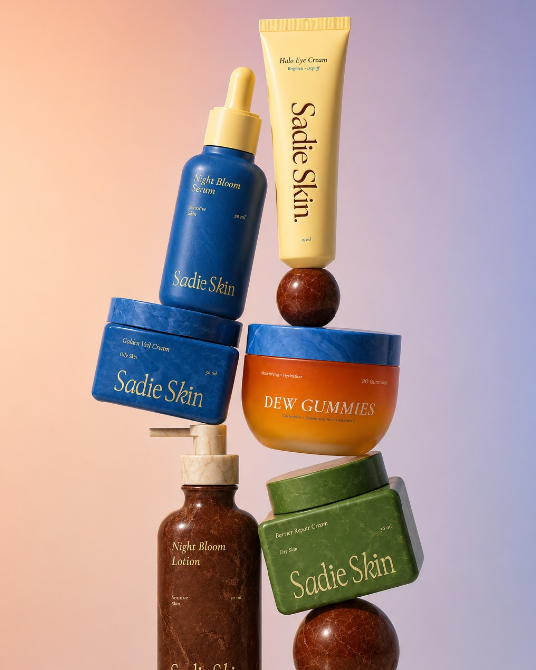
The brief was to create a skincare brand from scratch, with a visual identity that could feel contemporary and premium without falling into the usual skincare language of soft pastels, botanical illustrations and endless promises about “glowing skin.” I wanted Sadie Skin to feel like a brand with a point of view, calm, but not bland; considered, but not overly polished.
The first question I kept coming back to was: what would make someone want to leave this bottle on their bathroom shelf?
That question ended up influencing quite a lot of the project.
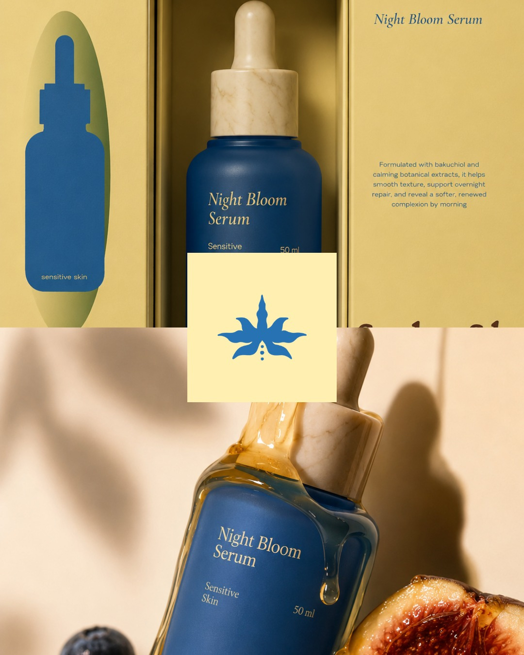
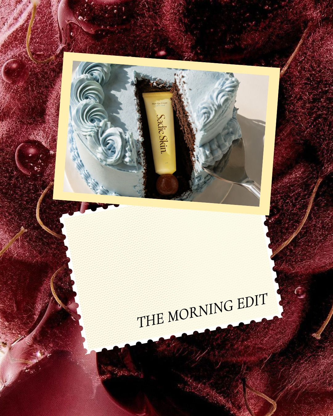
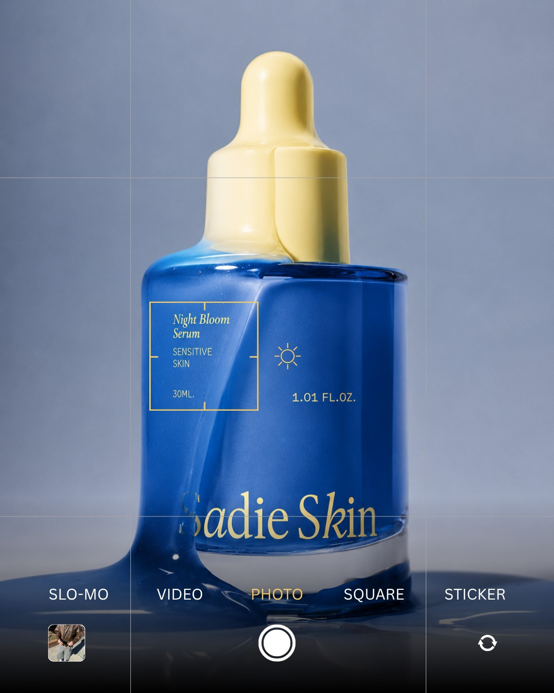
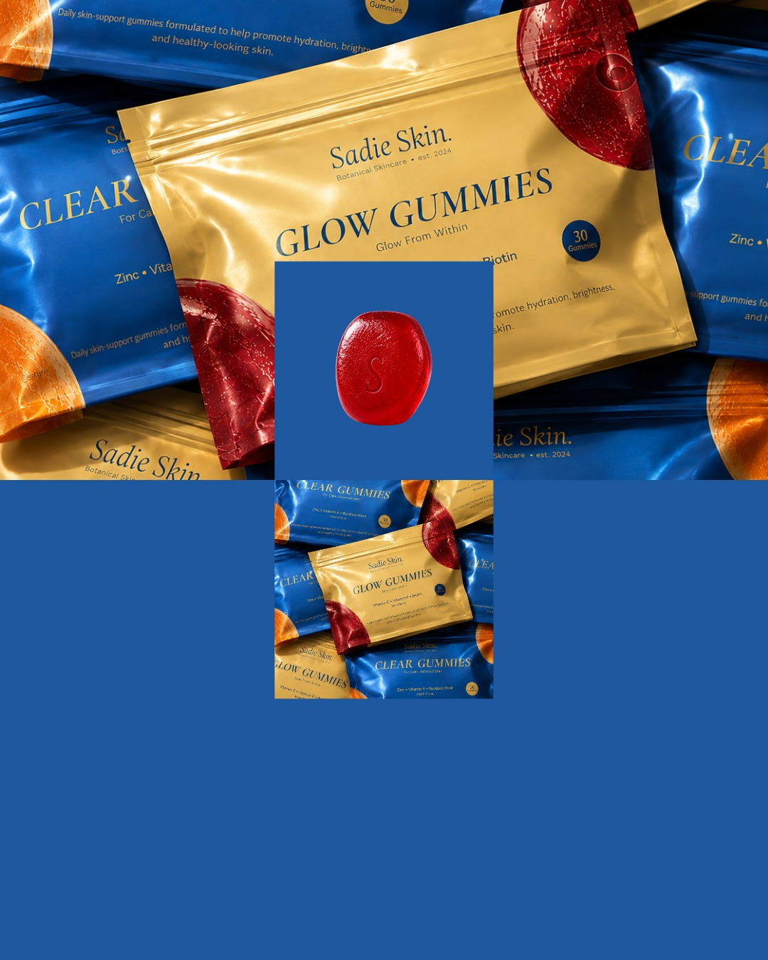
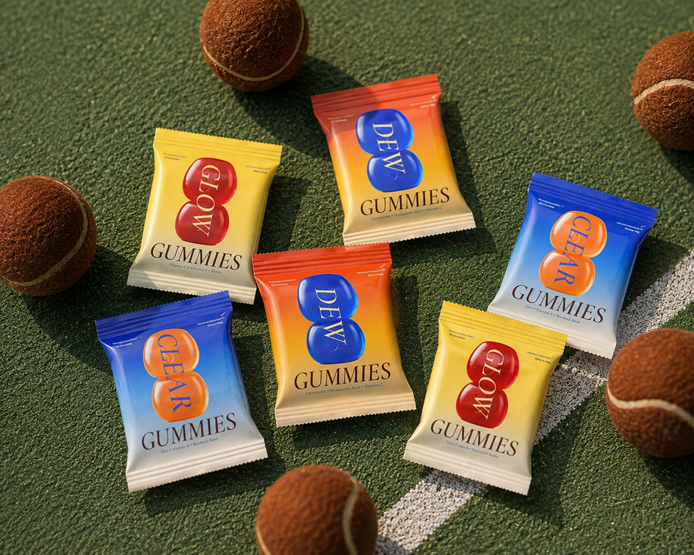
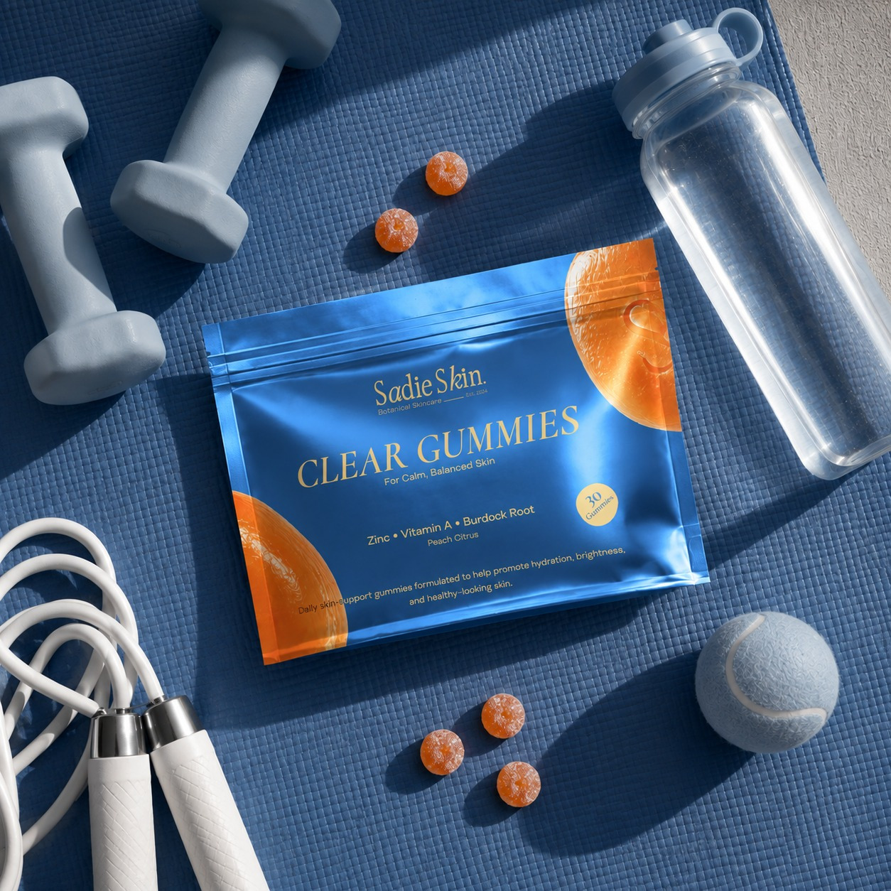
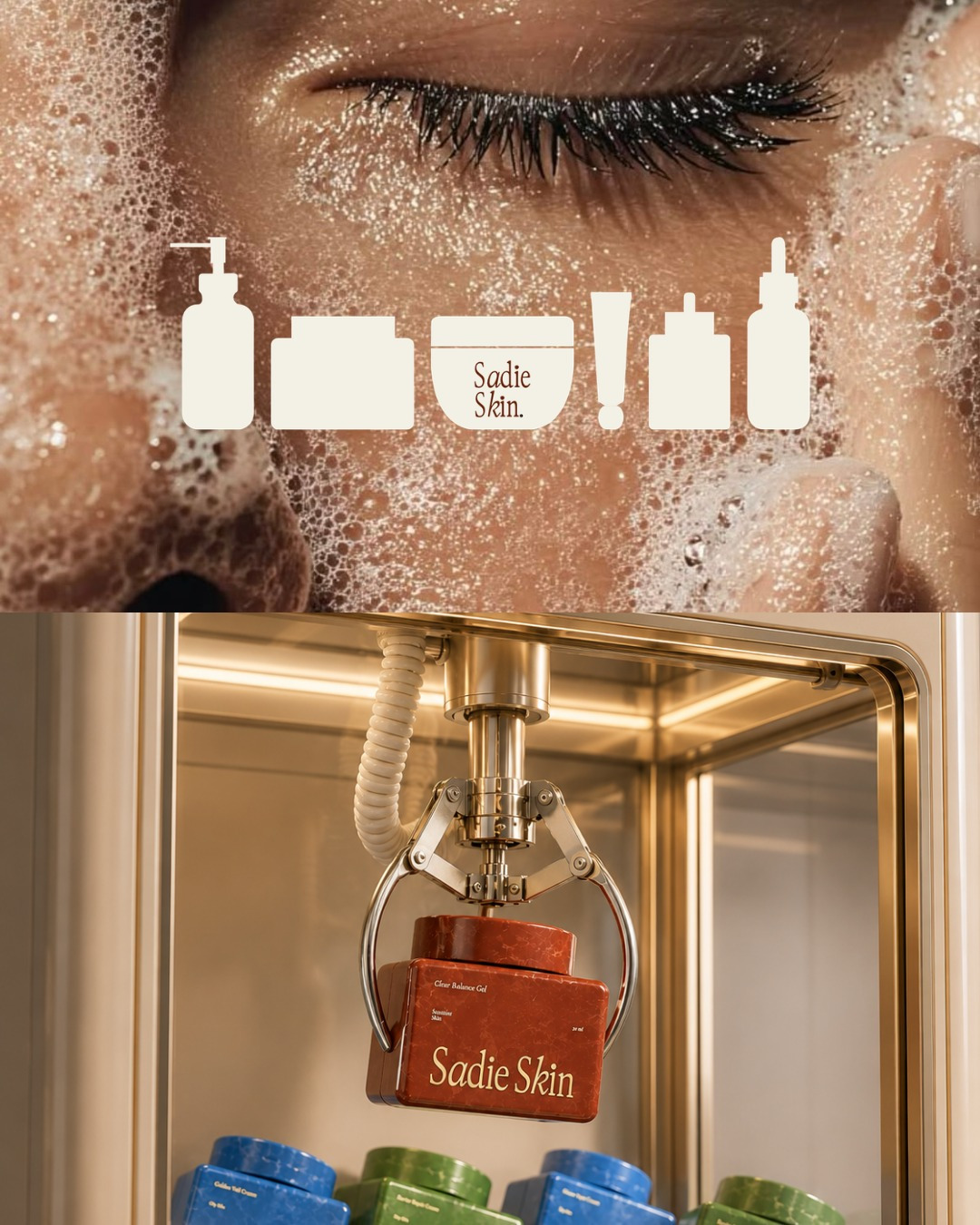
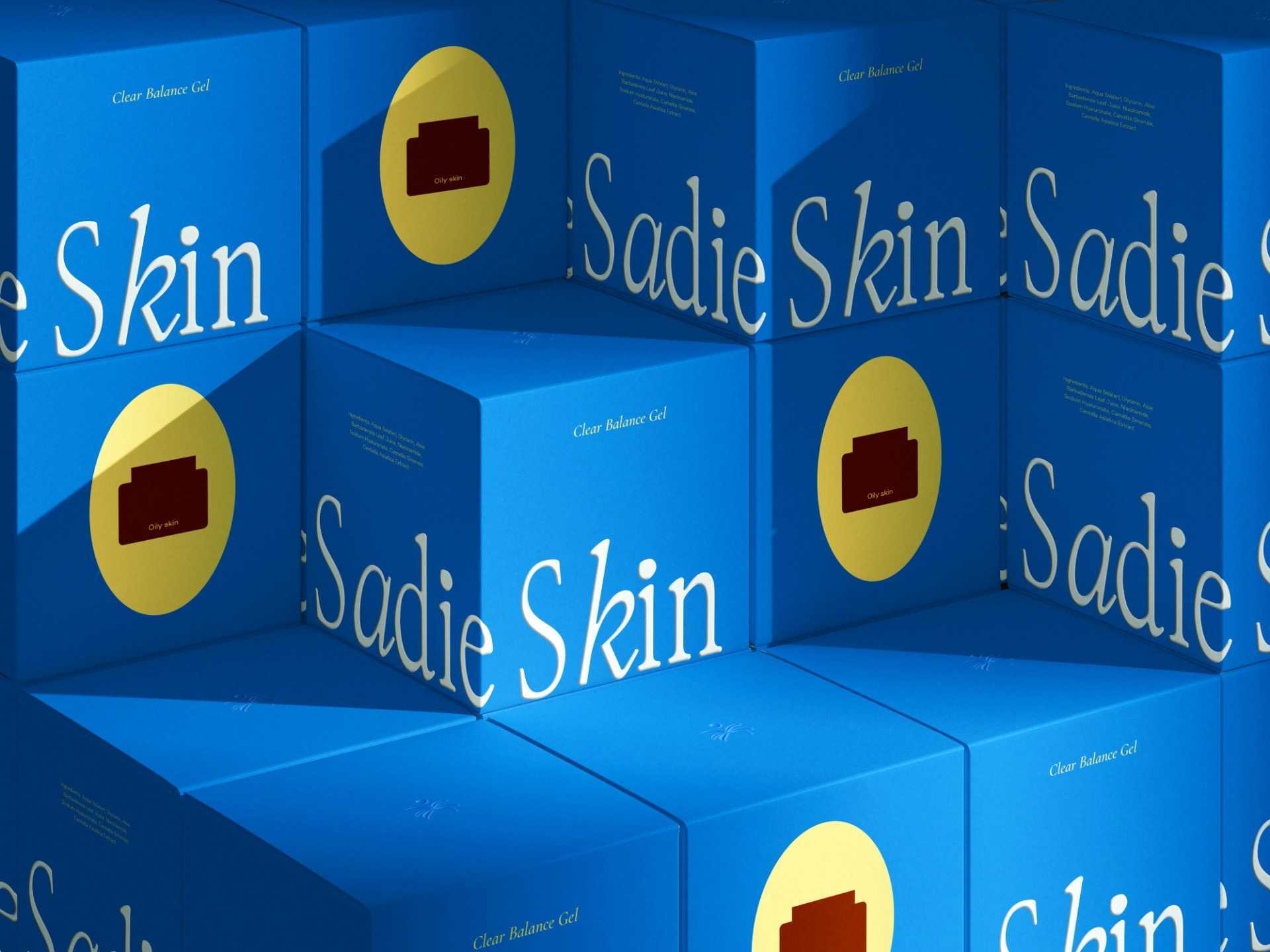
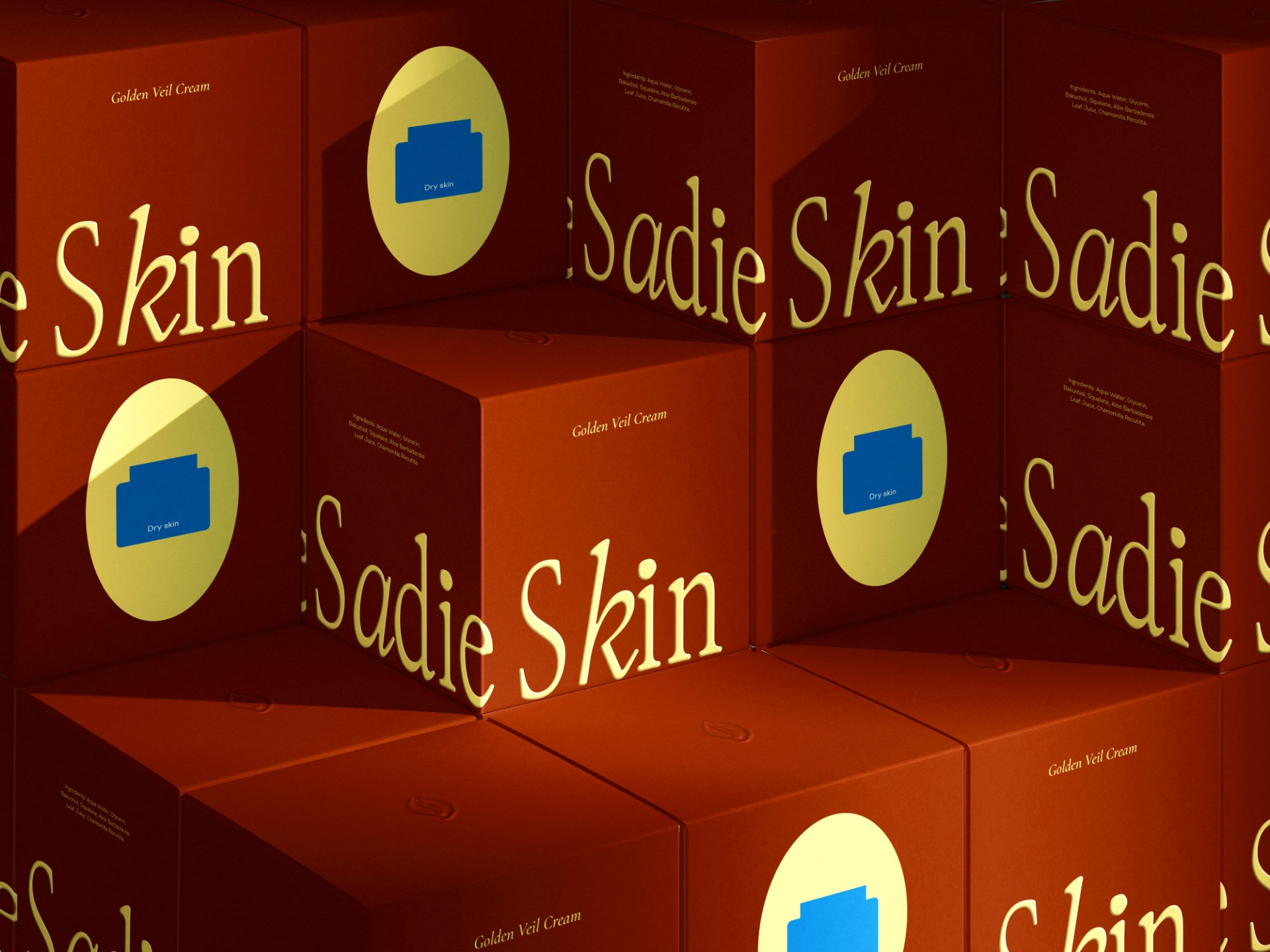
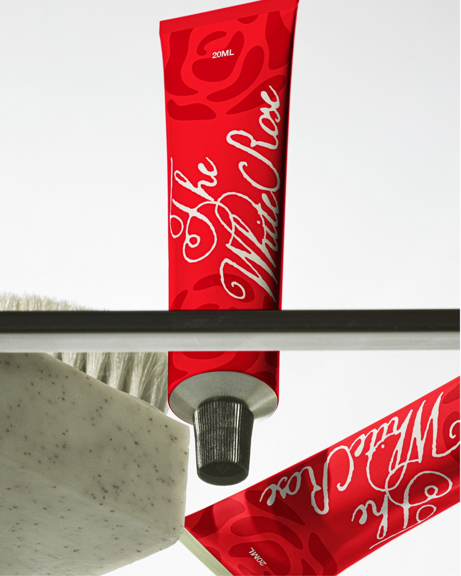
I developed the identity around a restrained colour palette, editorial typography and a slightly unexpected visual language. The packaging needed to communicate the product clearly, but still have enough personality to feel like something you might discover rather than something trying very hard to sell itself.
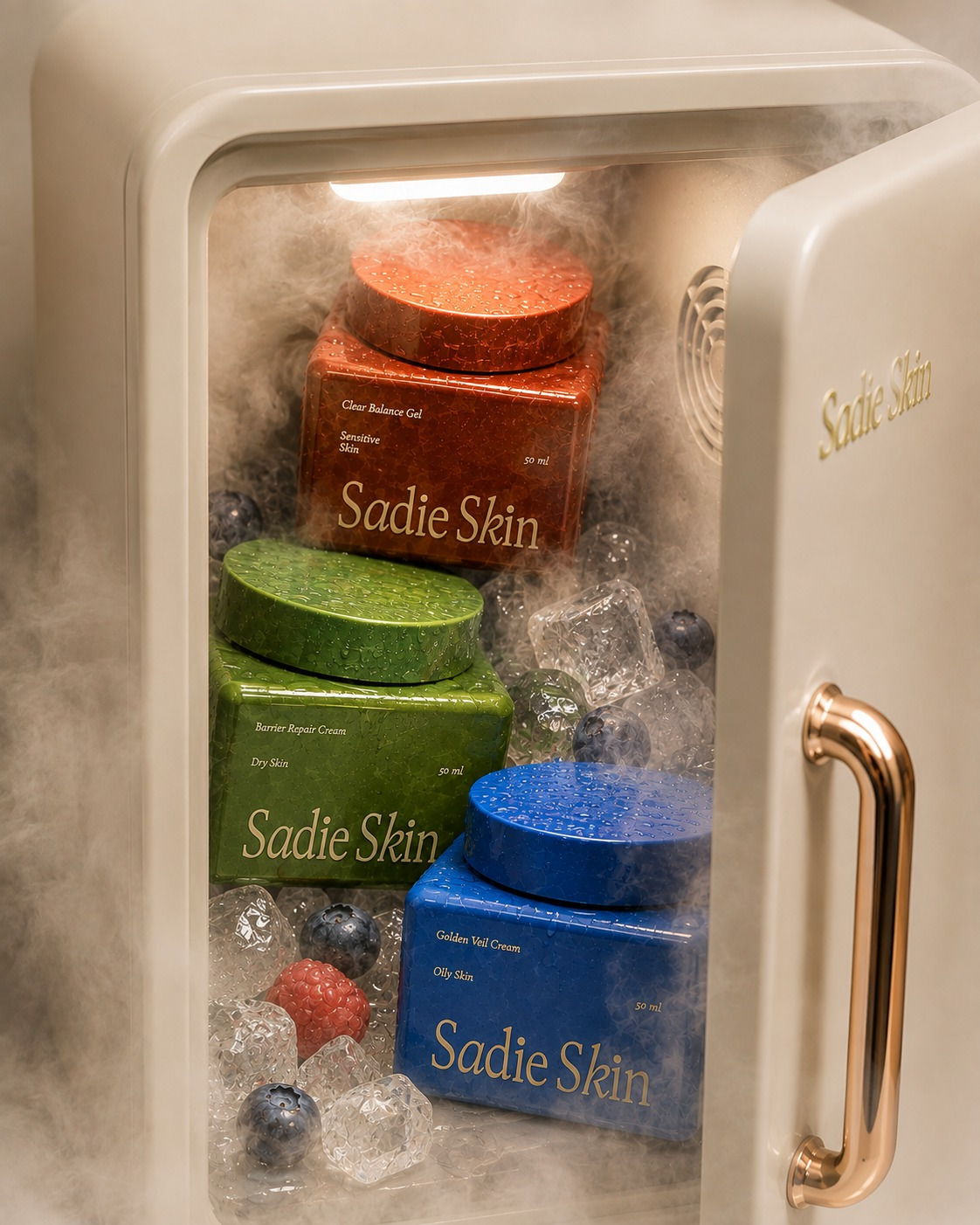
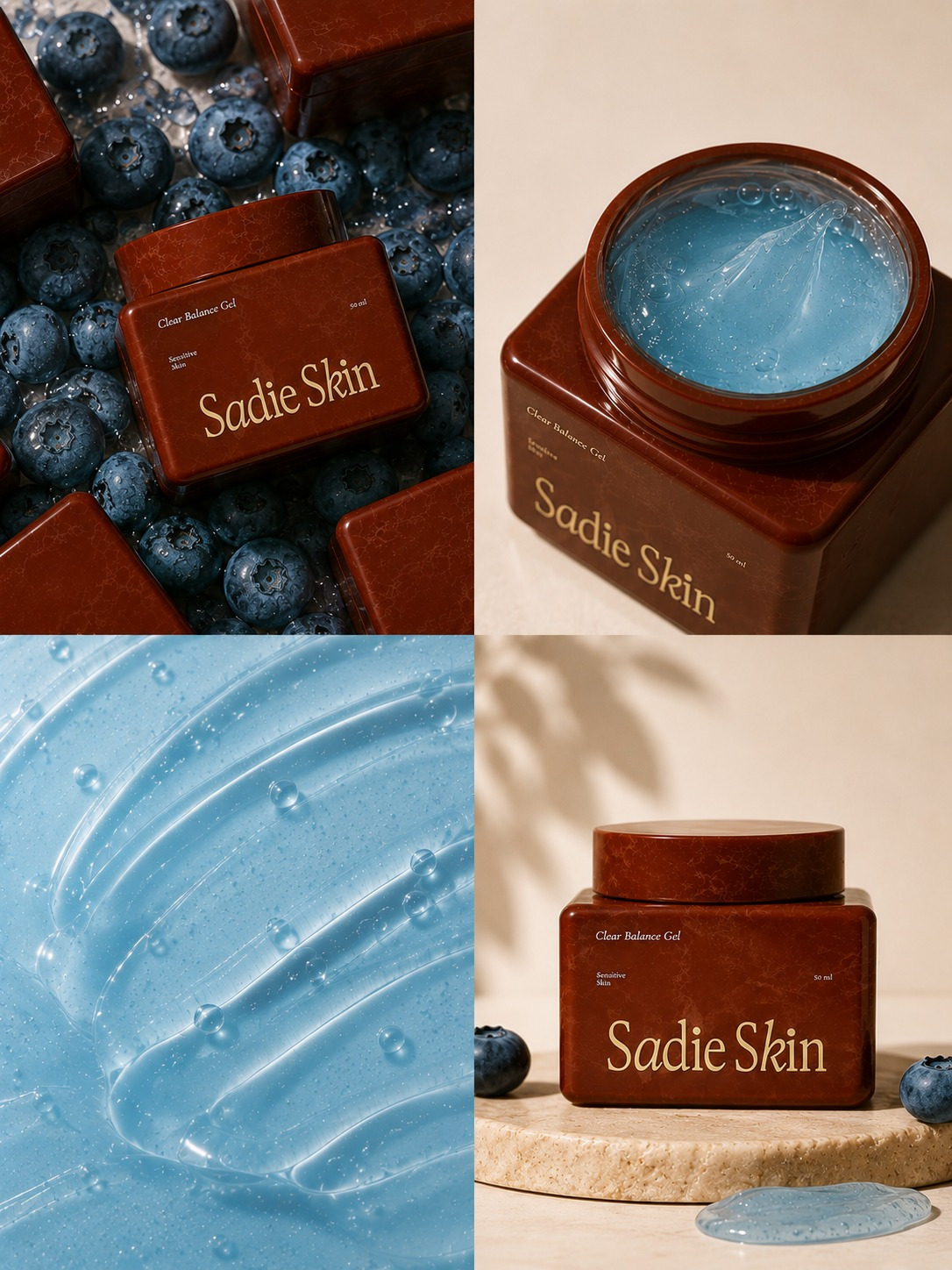
The Clear Balance Gel became the first product in the system. Its packaging uses a deep, warm brown against a softer neutral palette, giving the product a more grounded feel while keeping the overall identity light and approachable. The information hierarchy was kept deliberately simple, product first, explanation second.
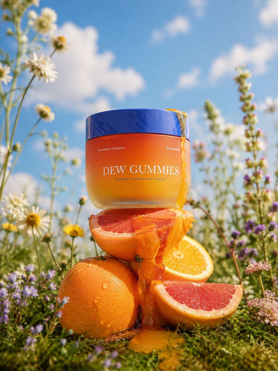
There was also an interesting part of the process that happened behind the scenes: AI was used as part of the visual exploration and product imagery, particularly to help build and test the world around the packaging. It wasn’t used to replace the design thinking or identity development. The brand, typography, layout, colour decisions and packaging system were developed from scratch; AI simply became another tool in the process of visualising the direction and seeing how the brand might live beyond a flat mockup.
And that, for me, was one of the more useful parts of working on Sadie Skin.
A packaging project rarely starts with “what should this look like?” It usually starts with a slightly messier question: what should this brand feel like when someone encounters it for the first time?
Everything else, the type, colour, imagery, packaging and little details, comes after that.