
1

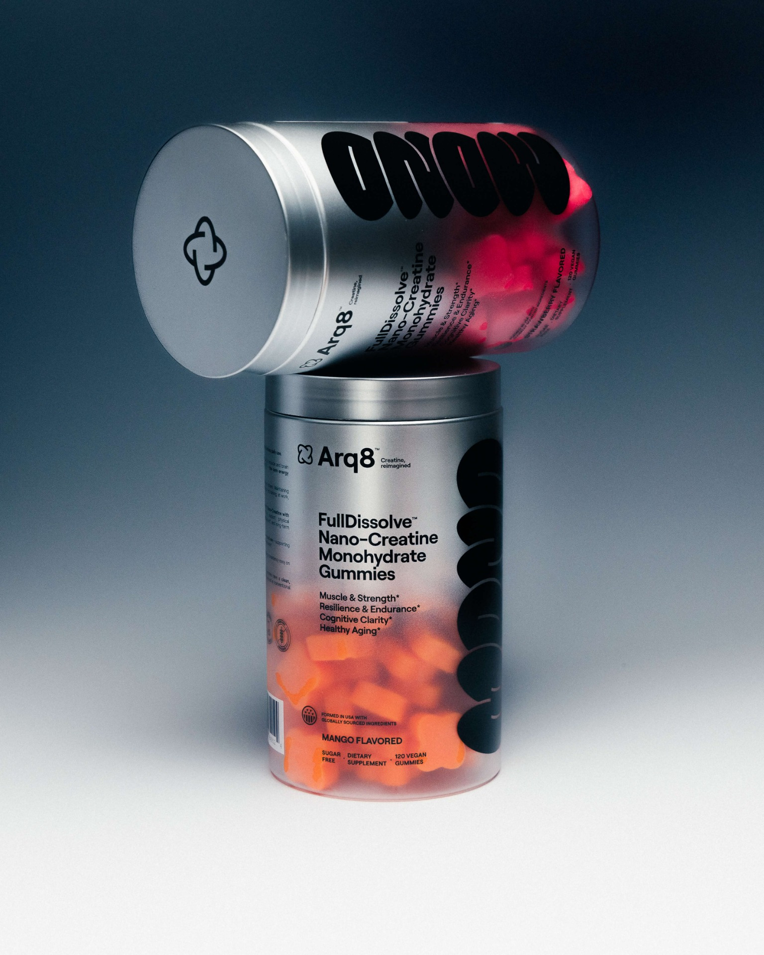
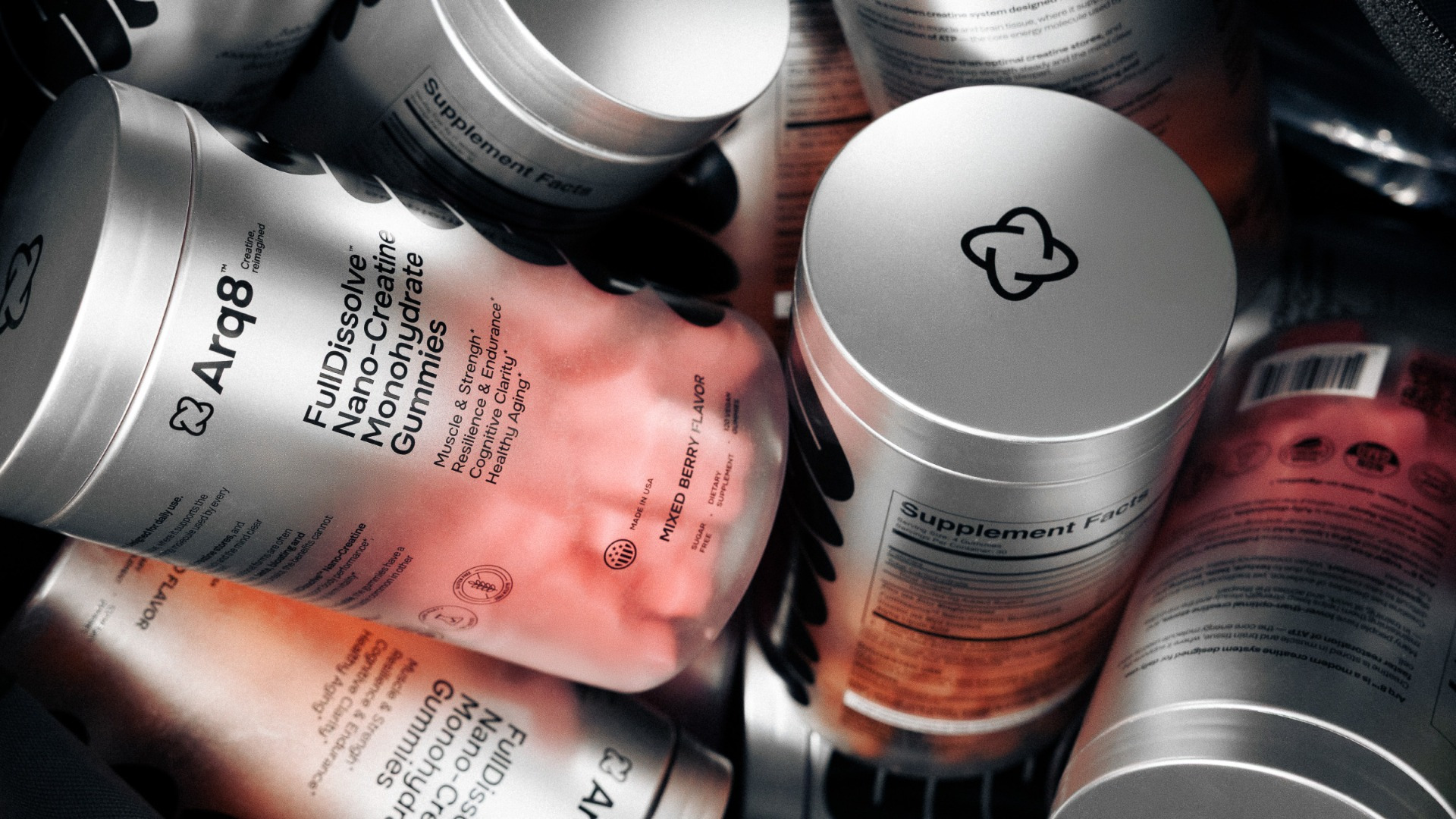
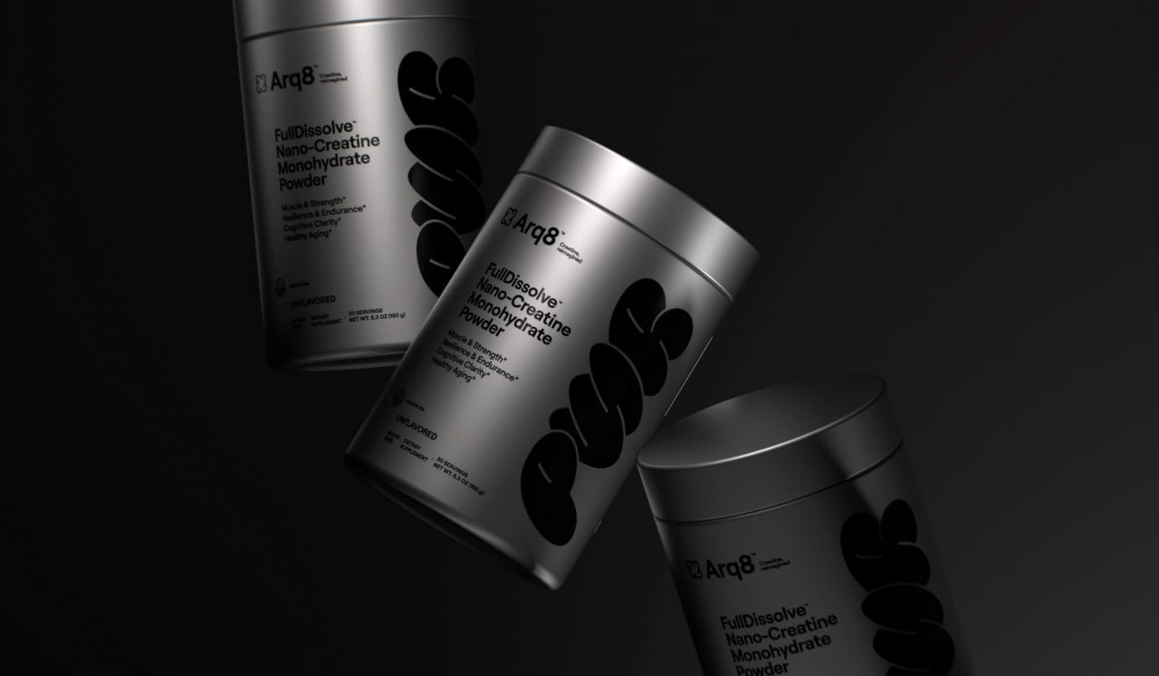
ARQ8 redefines creatine packaging for a new generation of wellness-conscious consumers. In a category traditionally dominated by hyper-masculine gym aesthetics or generic supplement design, the challenge was to create a system that feels both premium and accessible to a broader audience — from athletes to longevity-focused individuals.
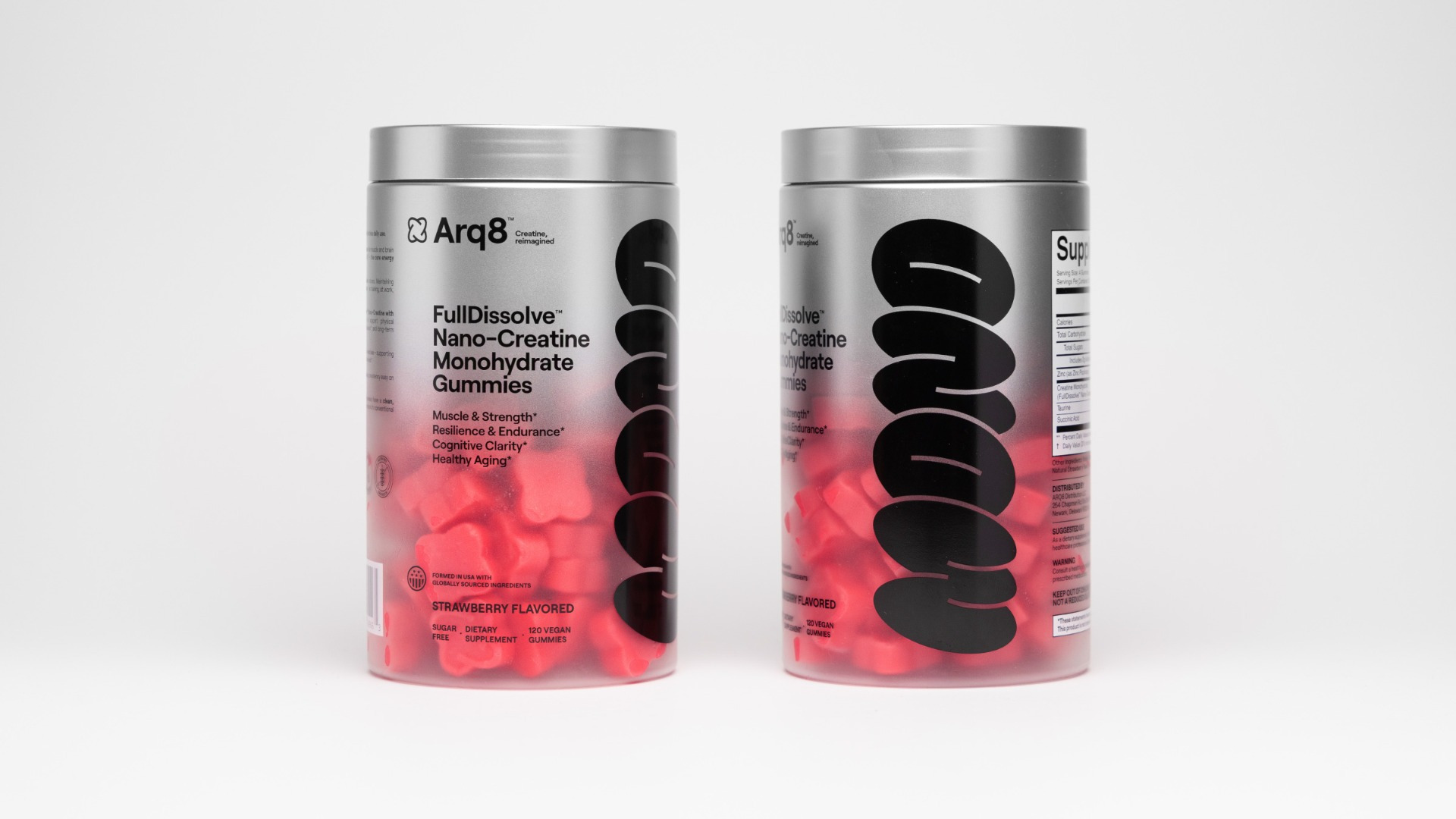
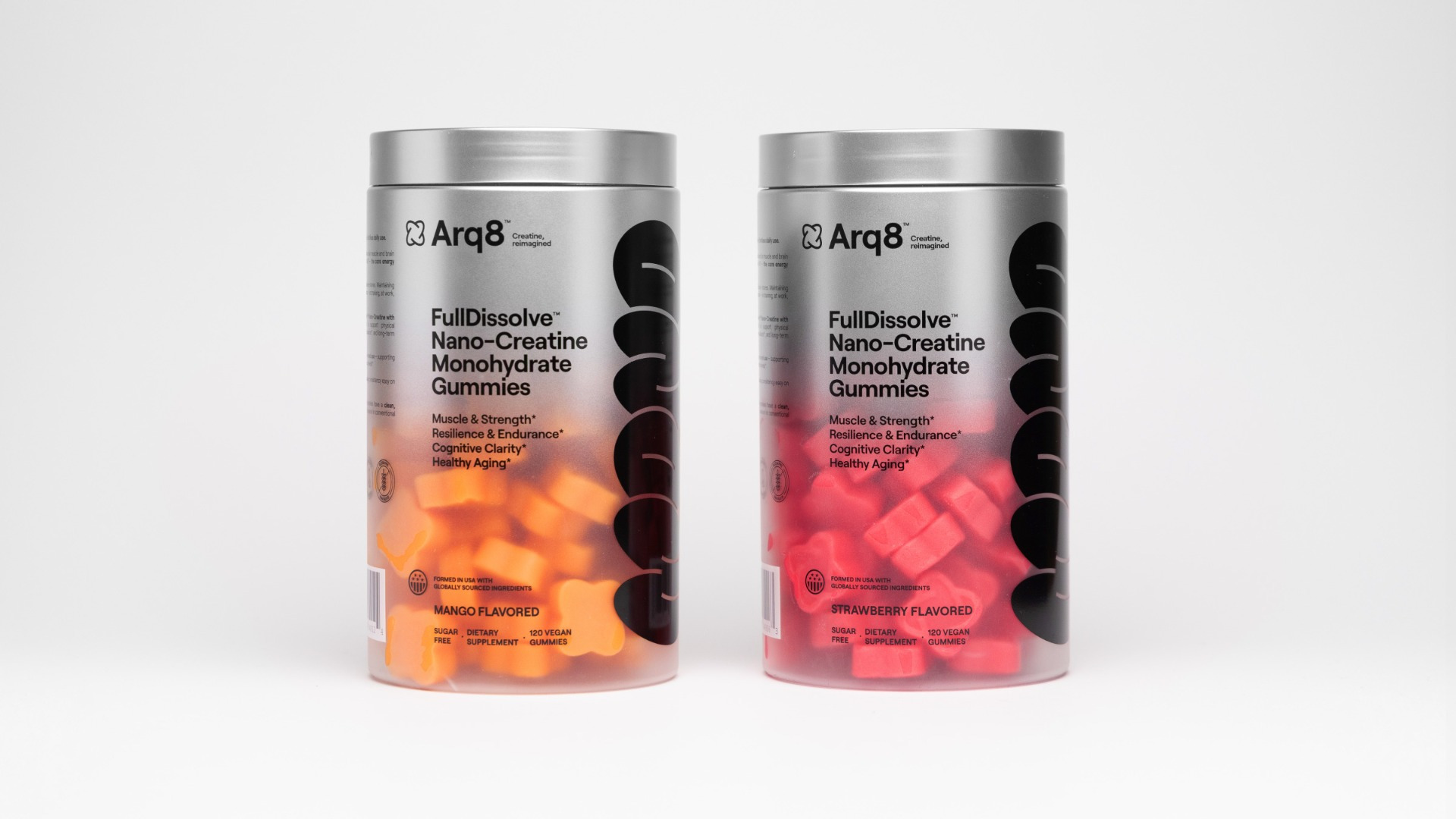
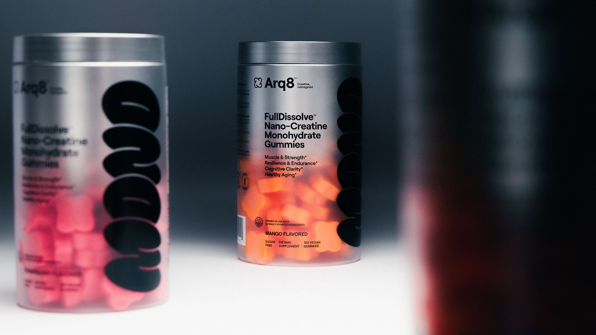
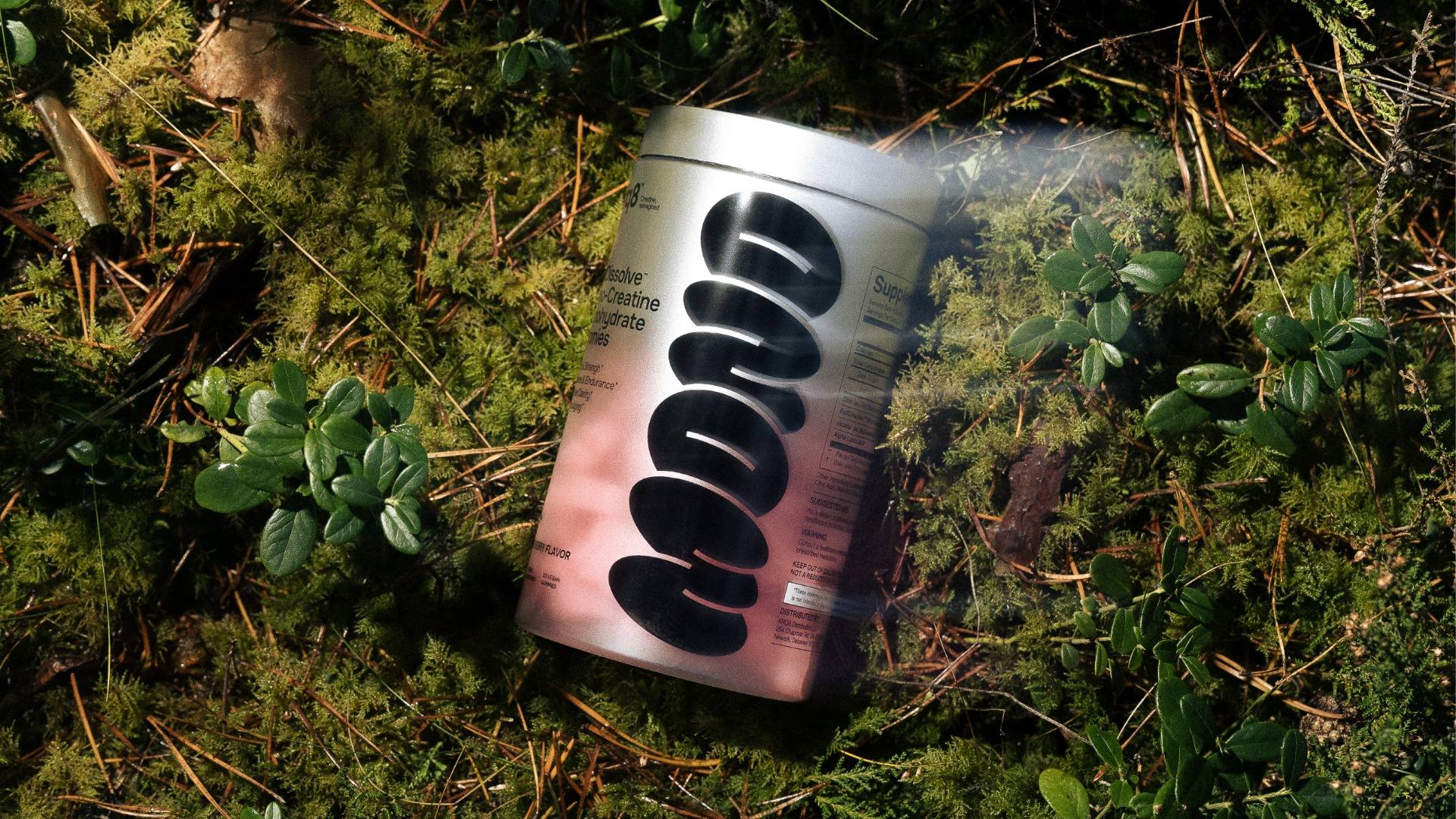
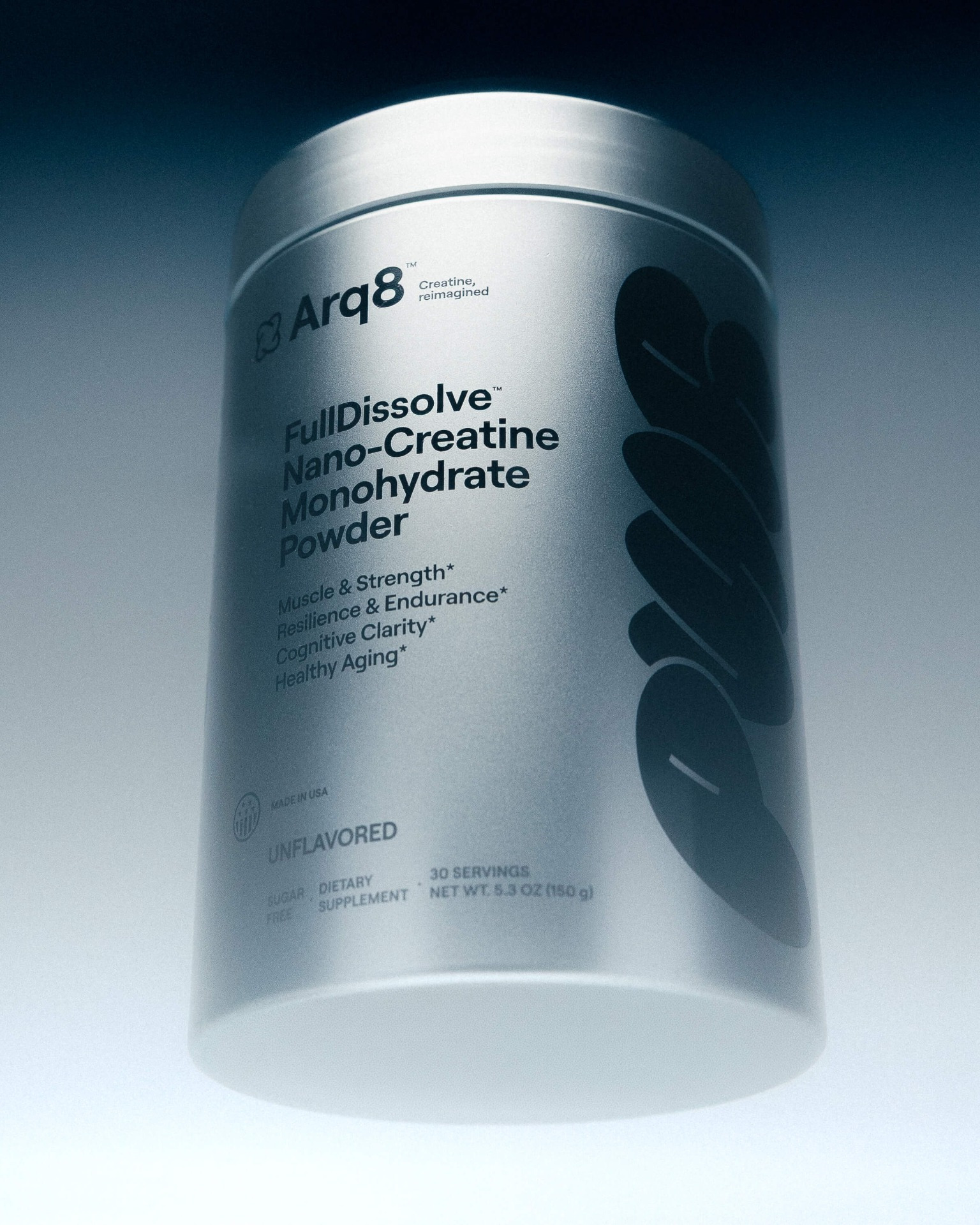
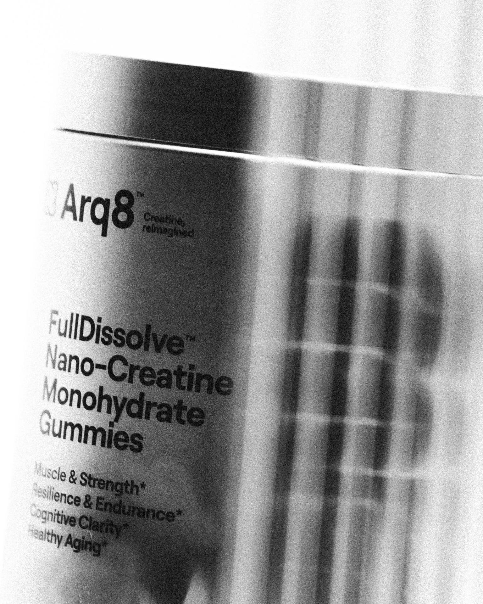
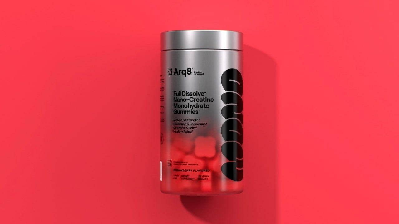
The visual identity and packaging system shift creatine away from performance-only positioning toward a more holistic, everyday wellness product. A monochromatic palette with chrome finishes conveys technological sophistication while maintaining a clean, minimal aesthetic.
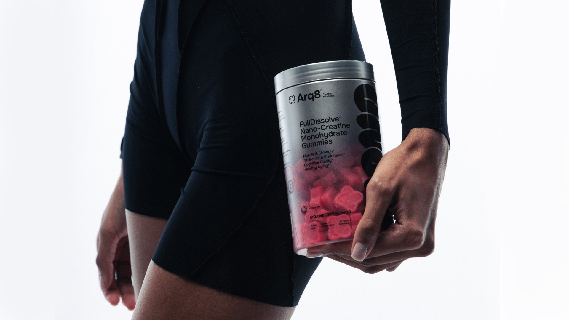
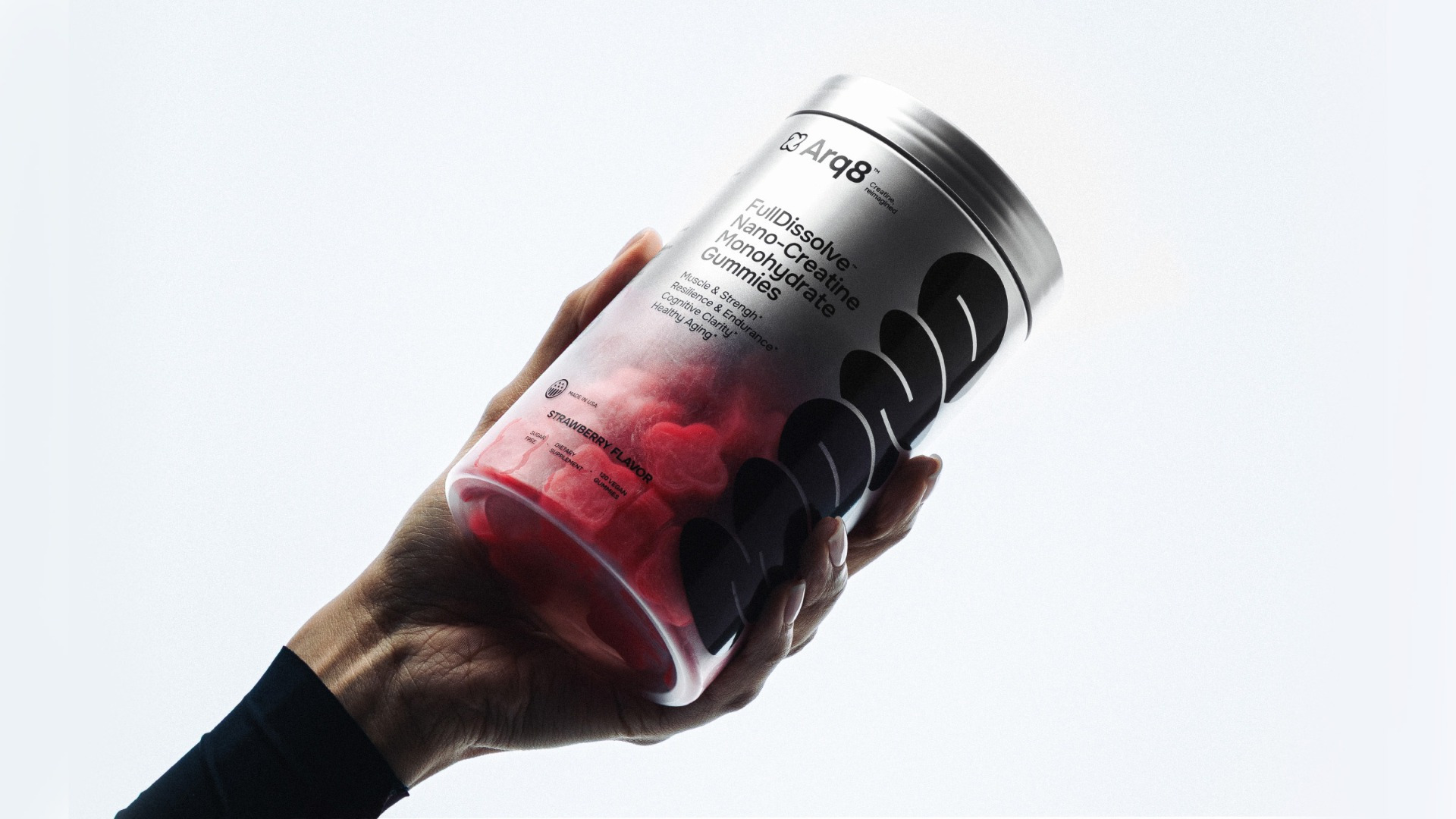
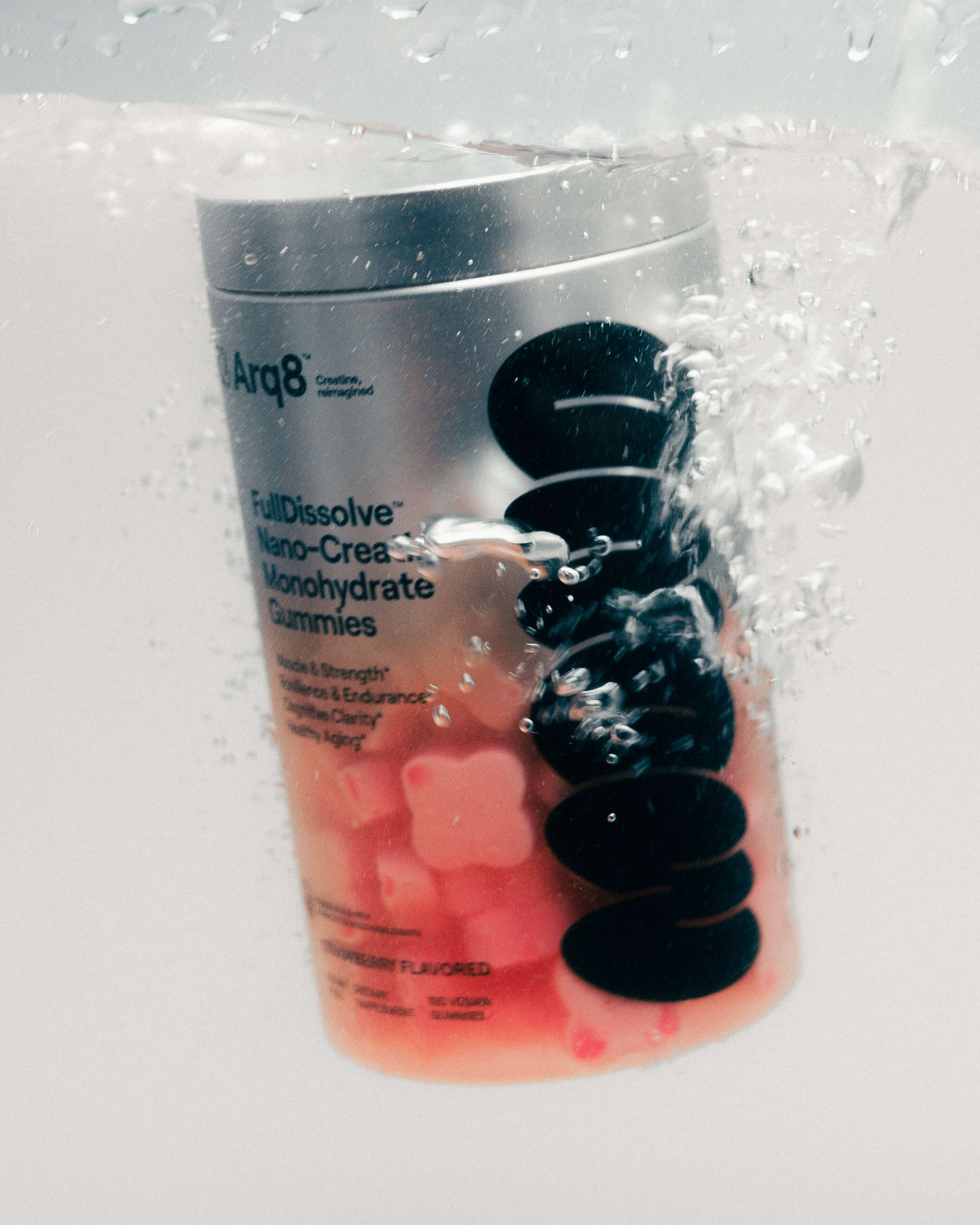
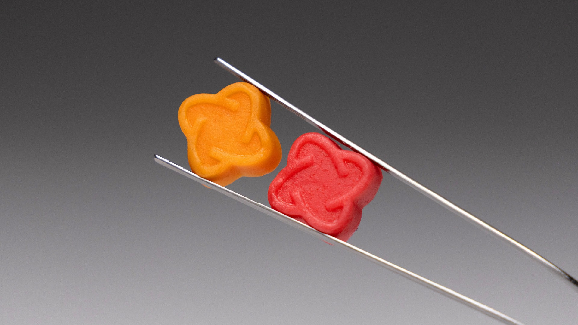
Both gummy and powder formats are designed with wide-mouth jars to ensure ease of use, whether reaching by hand or using a measuring scoop. For the gummies, custom atom-shaped pieces echo the geometric structure of the brand logo, creating a strong visual connection between product and identity. A frosted transparent window allows users to see the product and track portions.
The typography system is expressive yet restrained, supported by a clear information hierarchy that enhances readability. Rather than relying on traditional fitness clichés, the design draws inspiration from street sports culture — raw, energetic, and authentic.
The result is a packaging system that positions creatine beyond gym culture and into everyday performance and cognitive wellness, making scientific supplementation more approachable for a mainstream audience.
The project was developed by Sirka, a marketing agency working with DTC brands.