Casas Parmalli
Fresh pasta, artisanal tradition, quality that spans generations.
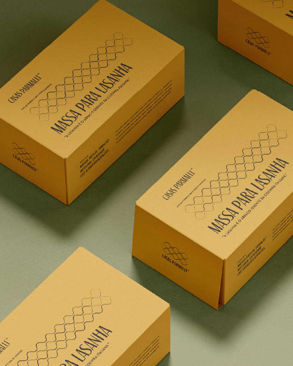
With the opening of a new location in São Paulo, in addition to the already established unit in Santo André, Casas Parmalli underwent a complete rebranding. The goal is to strengthen its artisanal essence, highlighting the Italian tradition of fresh, handmade pasta.
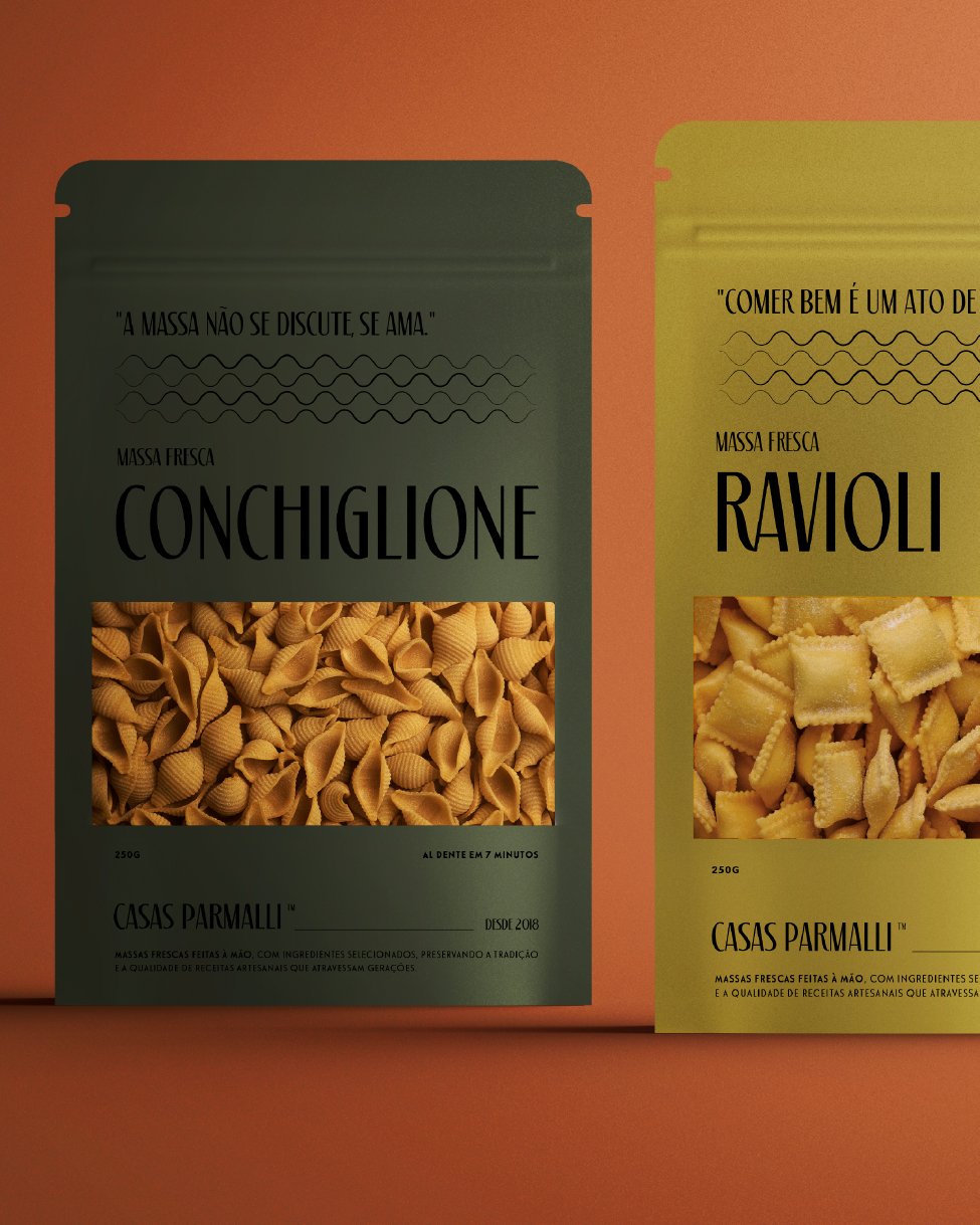
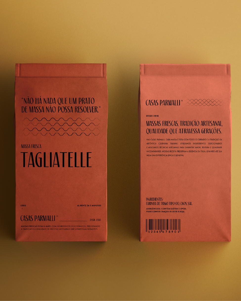
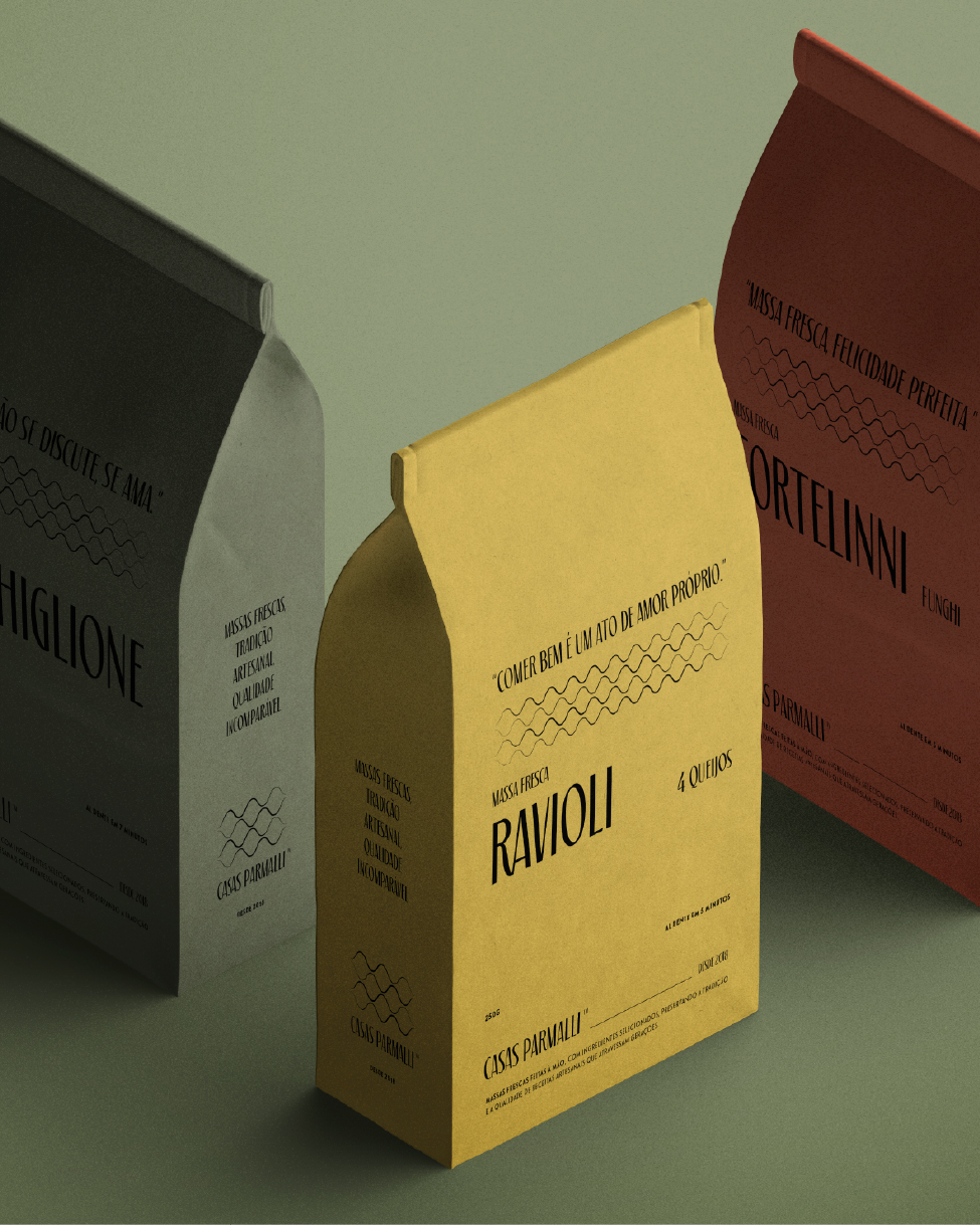
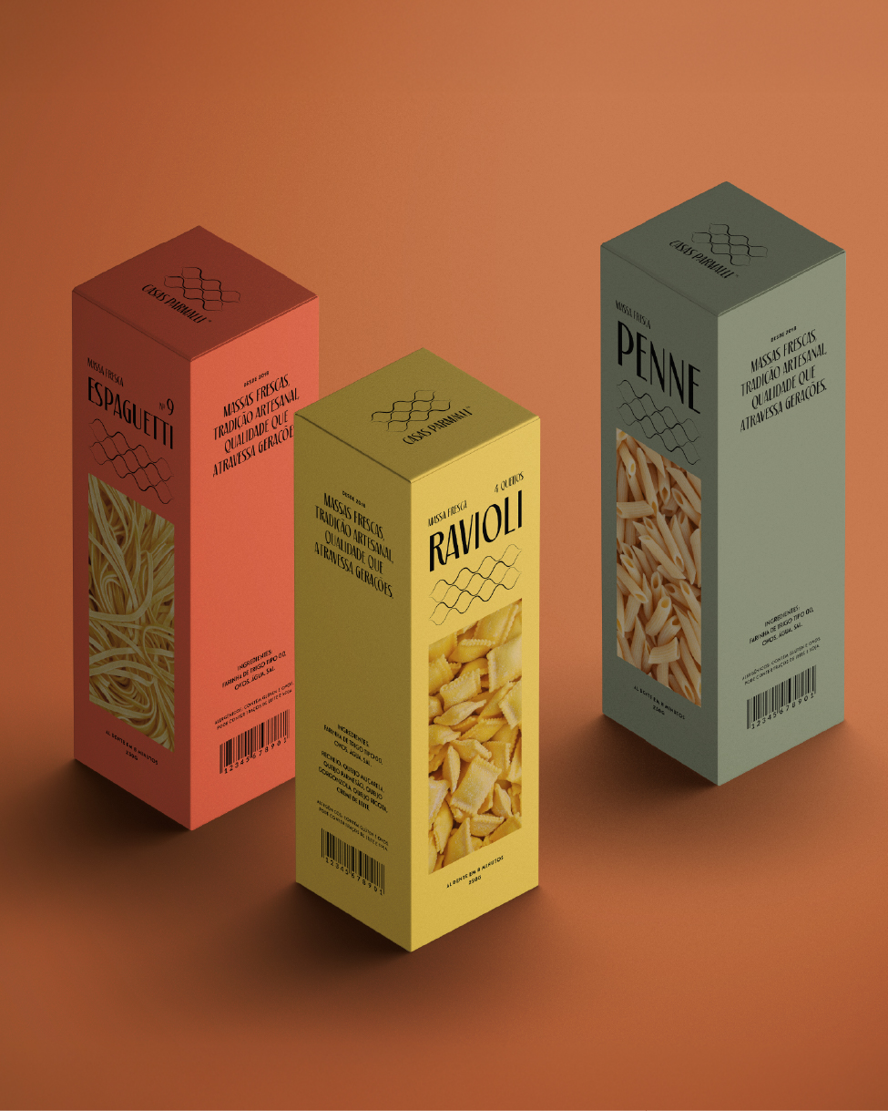
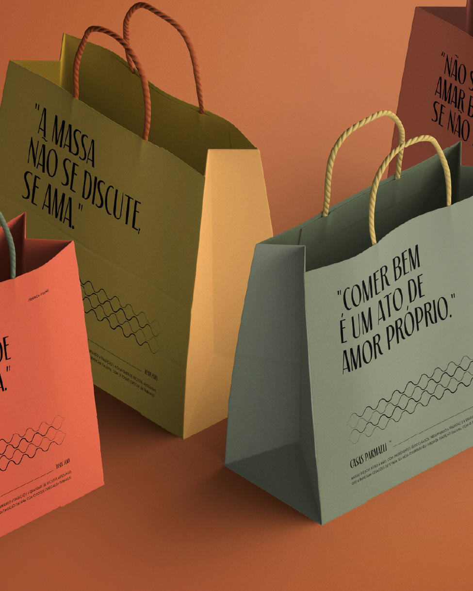
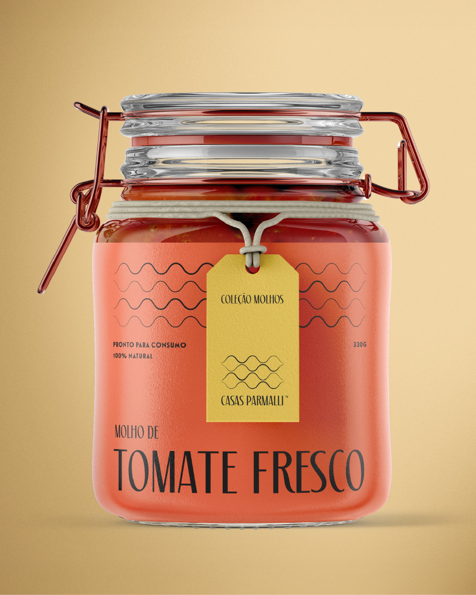
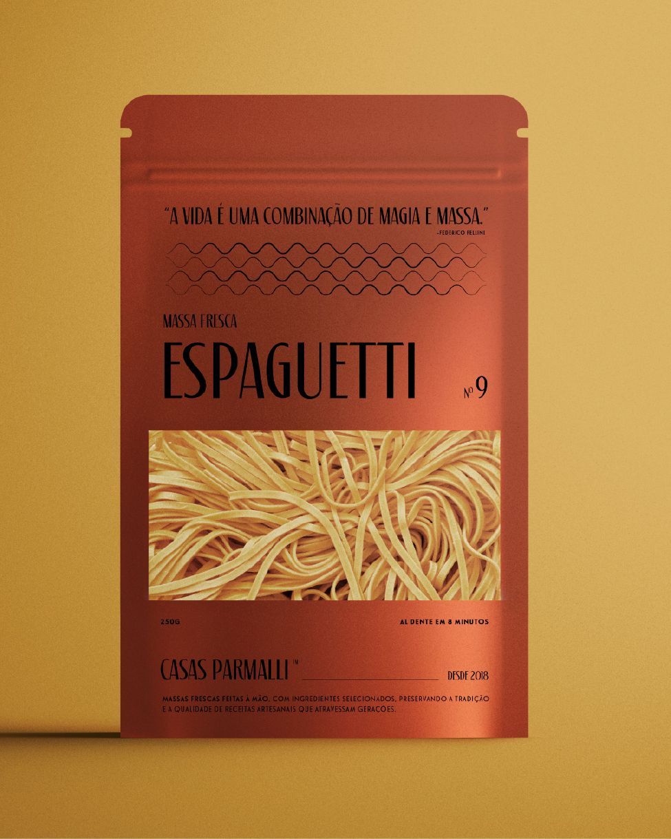
The new visual identity reflects this authenticity, redesigning not only the brand but also the packaging and all visual communication, ensuring an even more engaging experience aligned with its history.
Symbol, Typography, and Colors
The brand’s minimalist symbol was inspired by the wavy edges of lasagna pasta, the best-selling product, visually connecting the design to the essence of the brand.
To reinforce the artisanal and traditional identity, a serif typeface with vintage aspects was chosen, combined with Le Havre, a condensed sans-serif, creating a balance between classic and contemporary.
The color palette – olive green, golden yellow, and coral orange – was carefully selected to convey Italian tradition with a touch of modernity. By stepping away from conventional market tones, this choice gives Parmalli a unique and distinctive identity.