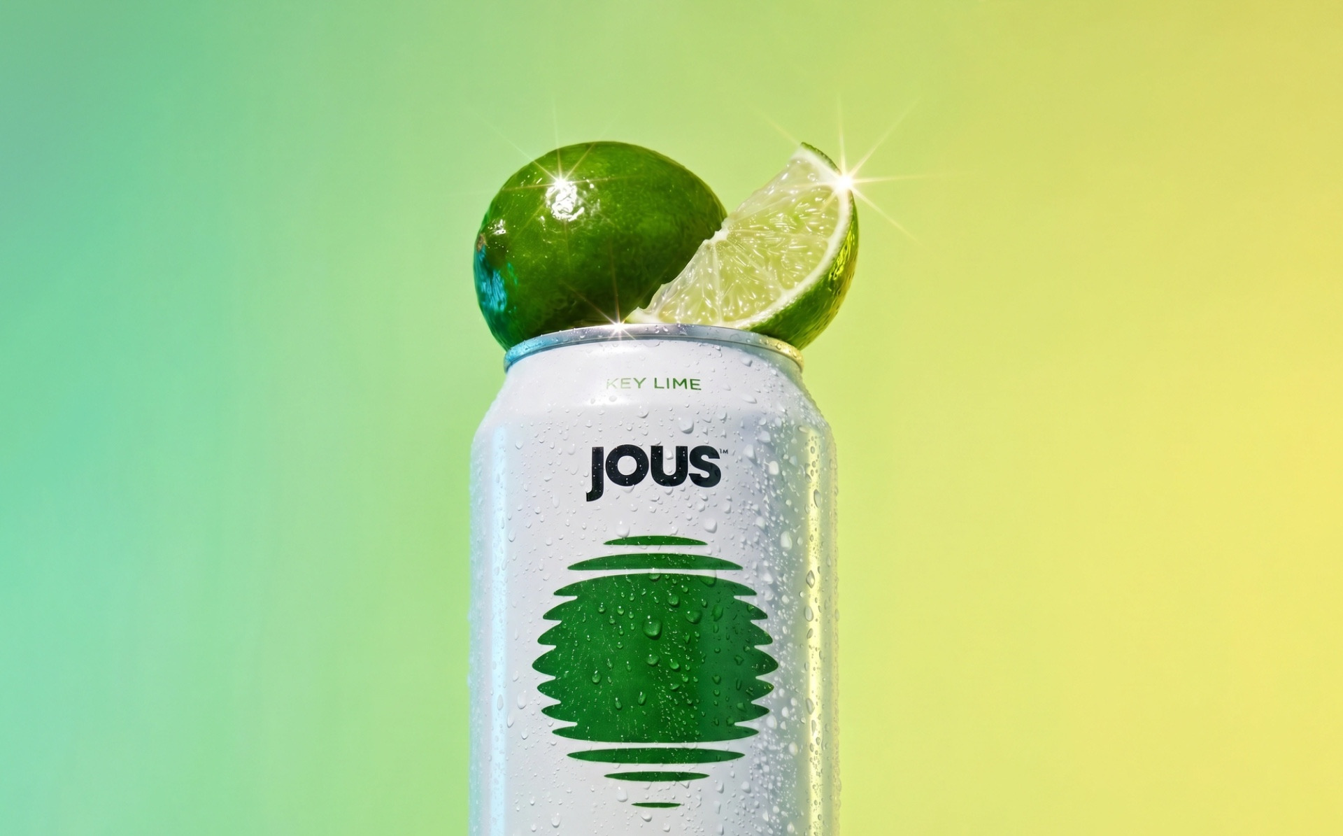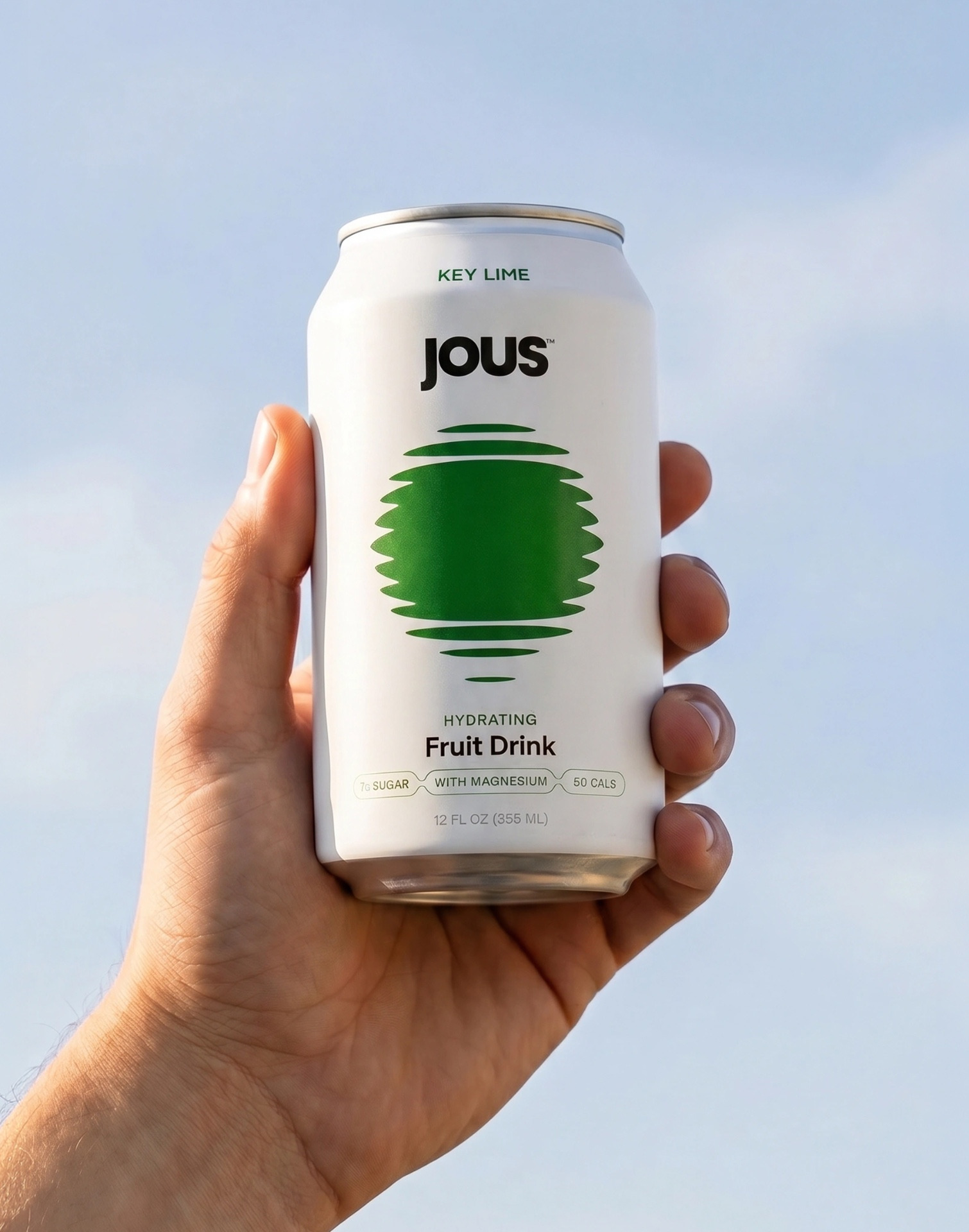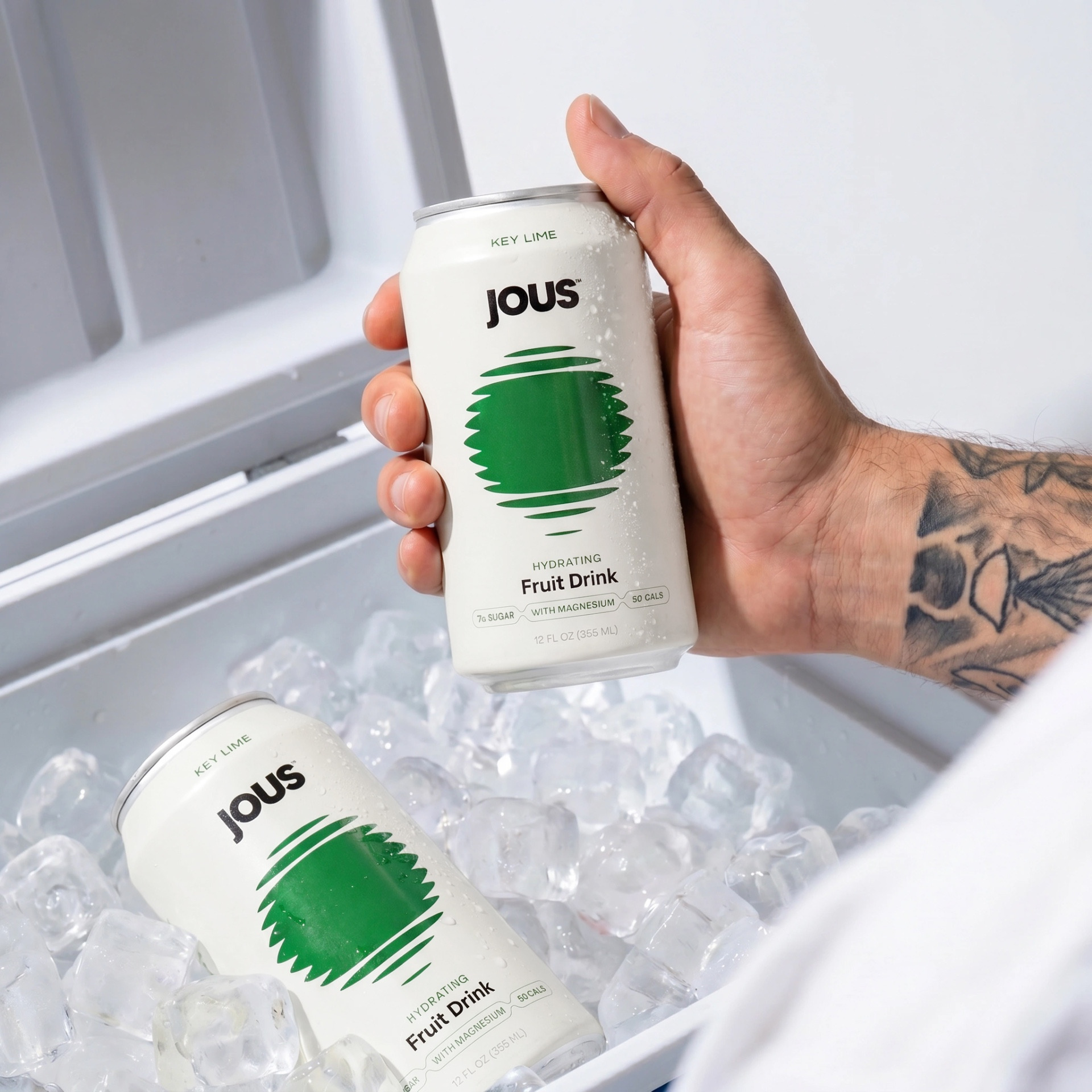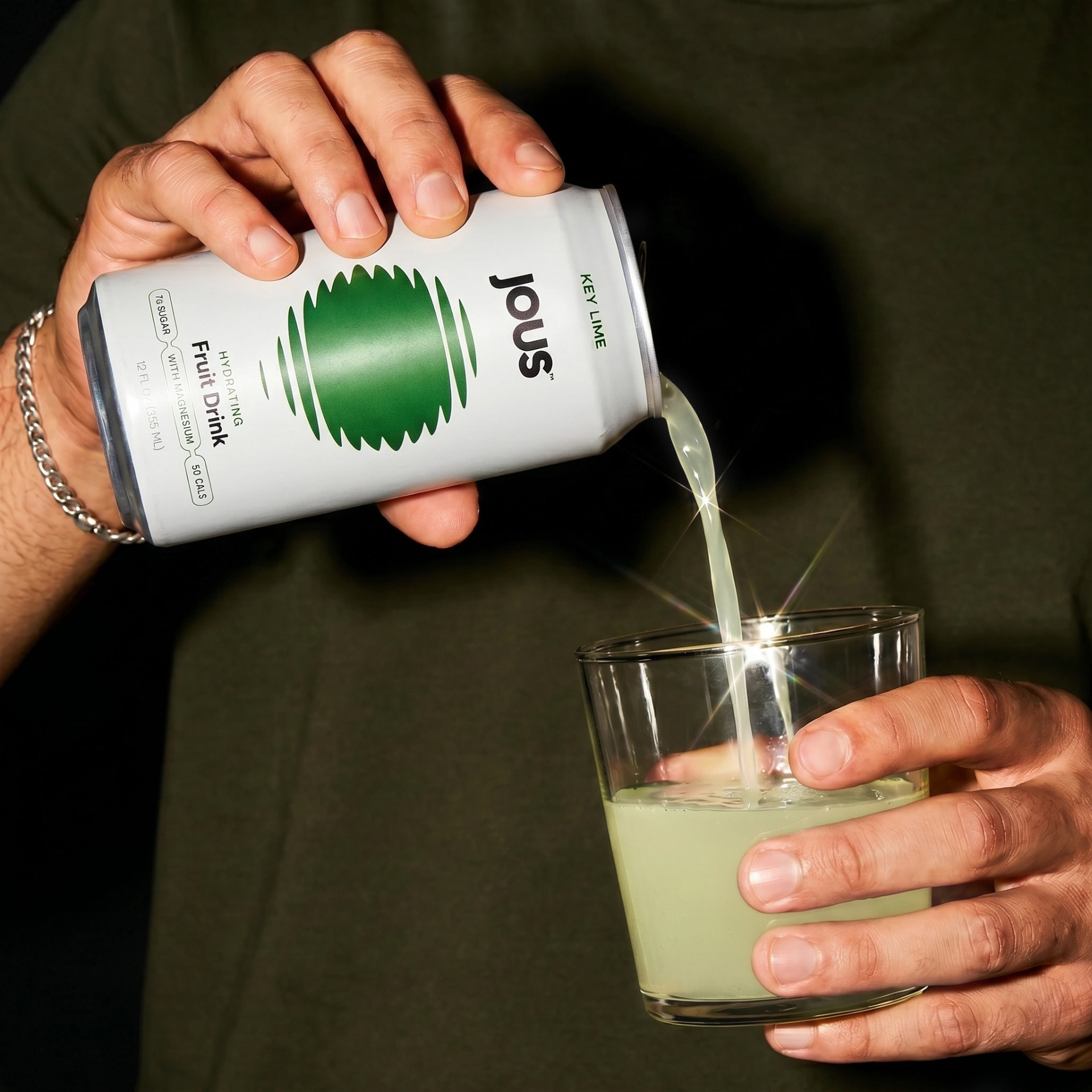
Creative agency Studio Unbound crafts brand identity and packaging for JOUS, a hydration brand designed for wellness and nightlife
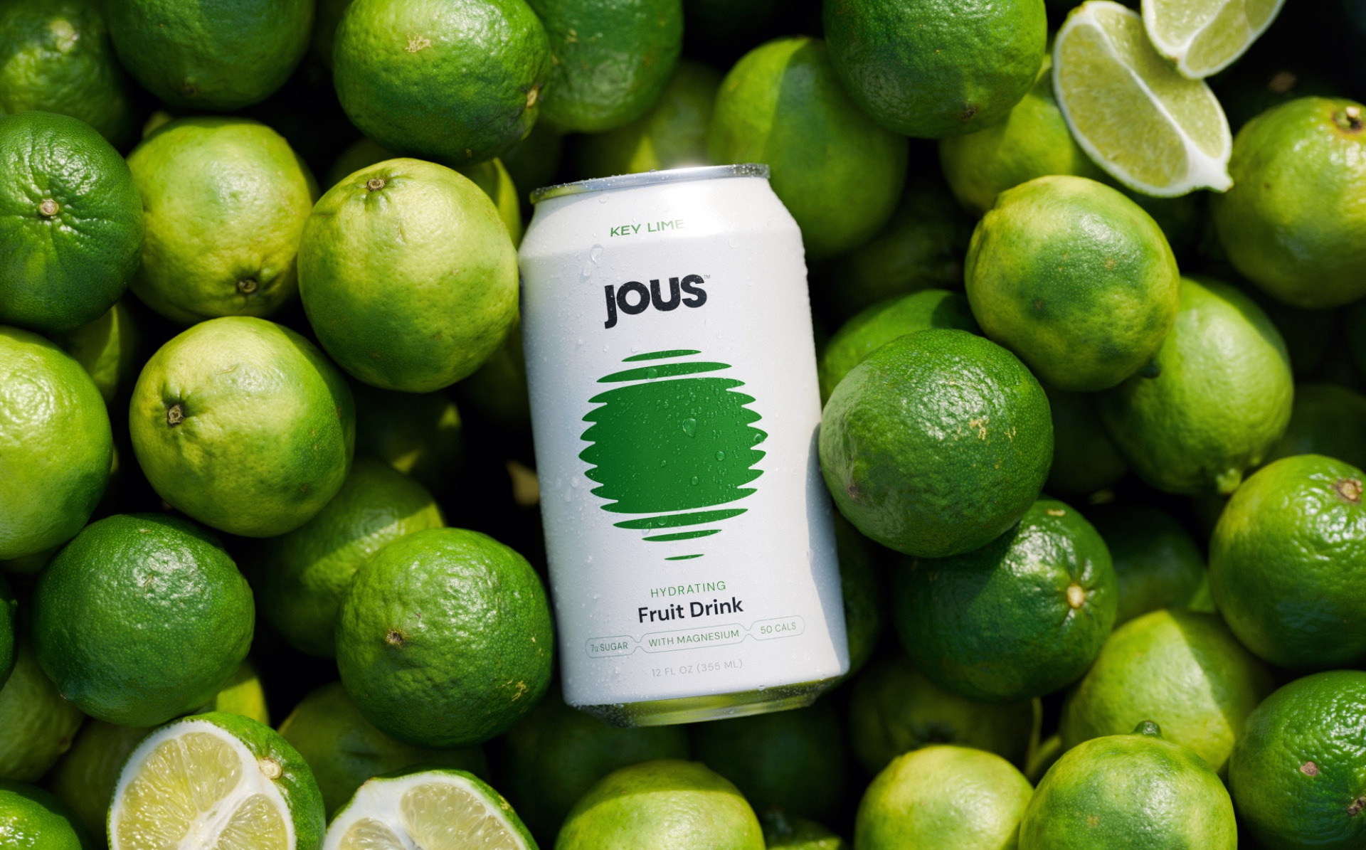
Studio Unbound has created the brand identity for JOUS, a hydrating fruit drink positioned at the intersection of wellness and nightlife, allowing consumers to enjoy fruit juice with a lower sugar content. Designed to feel equally at home with someone doing yoga on the beach as it does in a nightclub, the visual identity captures a duality between daytime calm and after-dark energy.
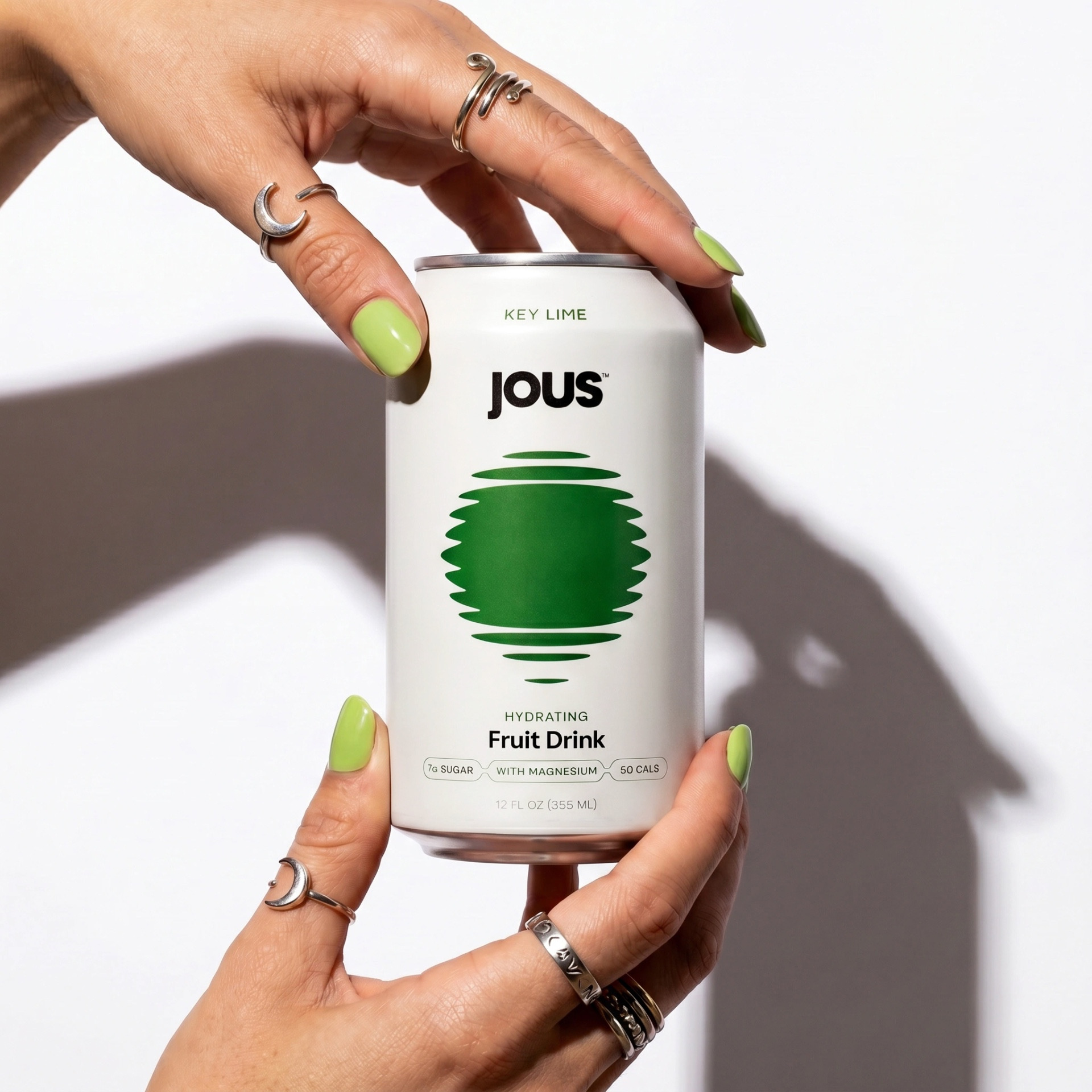
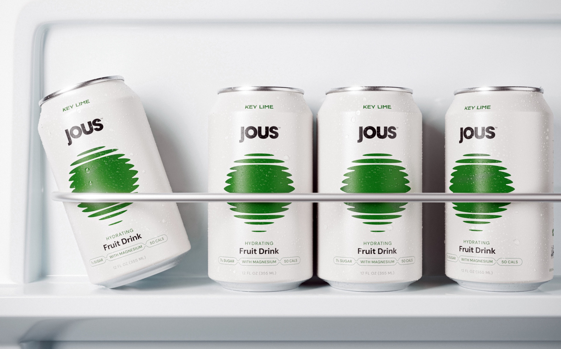
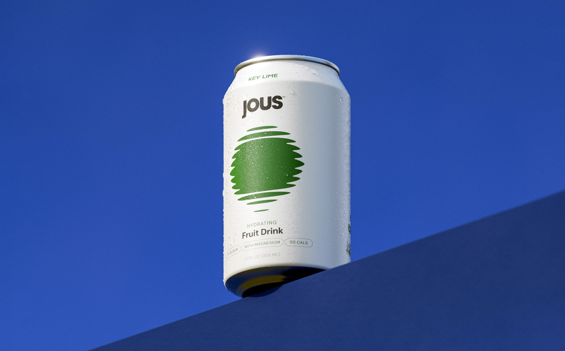
At the heart of the creative approach was a desire to challenge the visual conventions of the hydration category. Where competitors often rely on bright, highly saturated palettes and overtly energetic cues, the identity takes a more restrained and sophisticated route. A minimal, pared-back aesthetic signals the product’s health credentials while helping it stand apart on shelf.
Drawing inspiration from the visual language of house music, the identity channels a sense of movement, repetition and rhythm. Graphic elements reference club culture and sound systems, while maintaining the simplicity and precision associated with premium wellness products. This tension between hedonism and health forms the foundation of the brand world. It allows the product to also be seen as a mixer alternative within this landscape, due to its flavour and electrolyte profile.
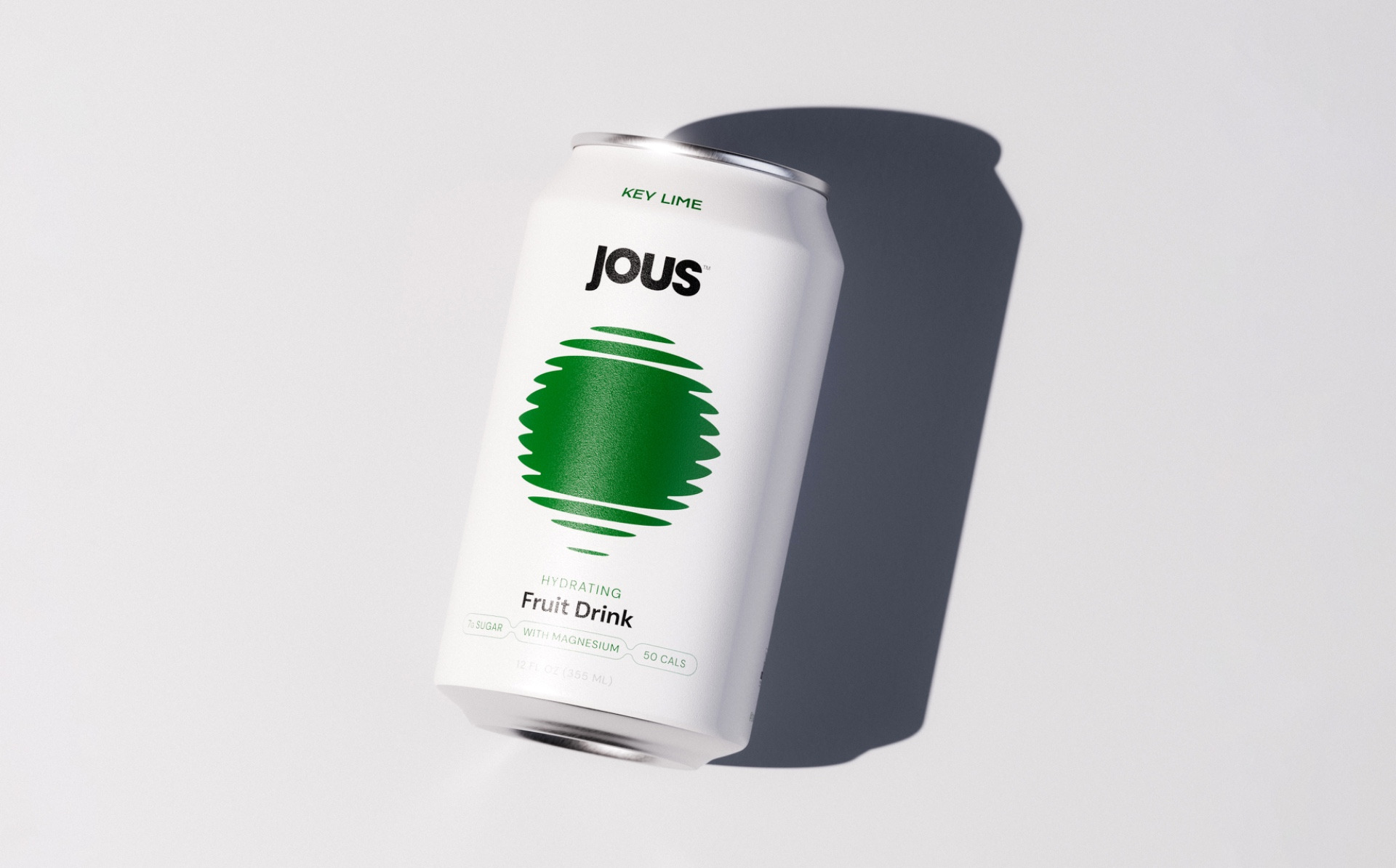
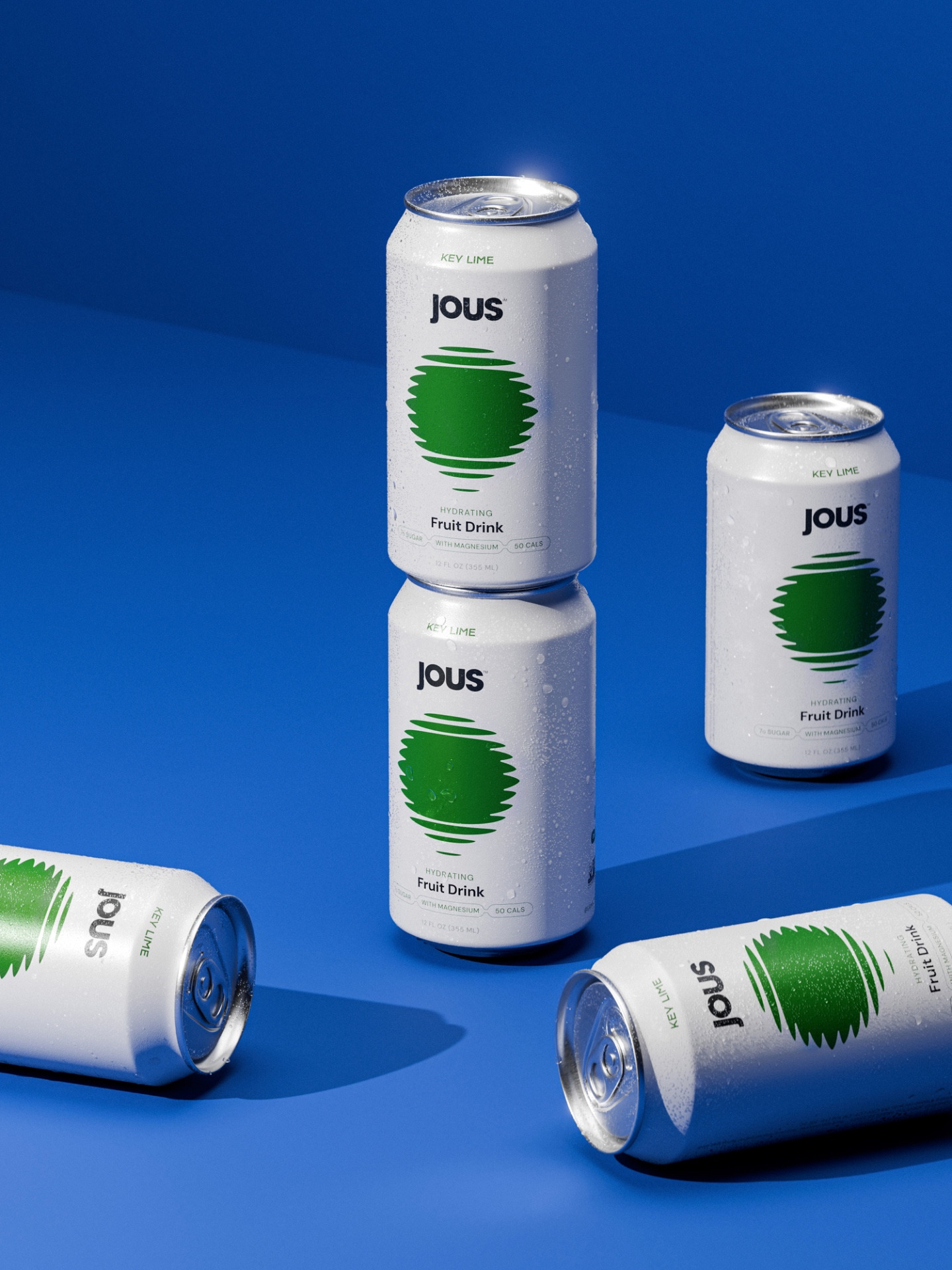
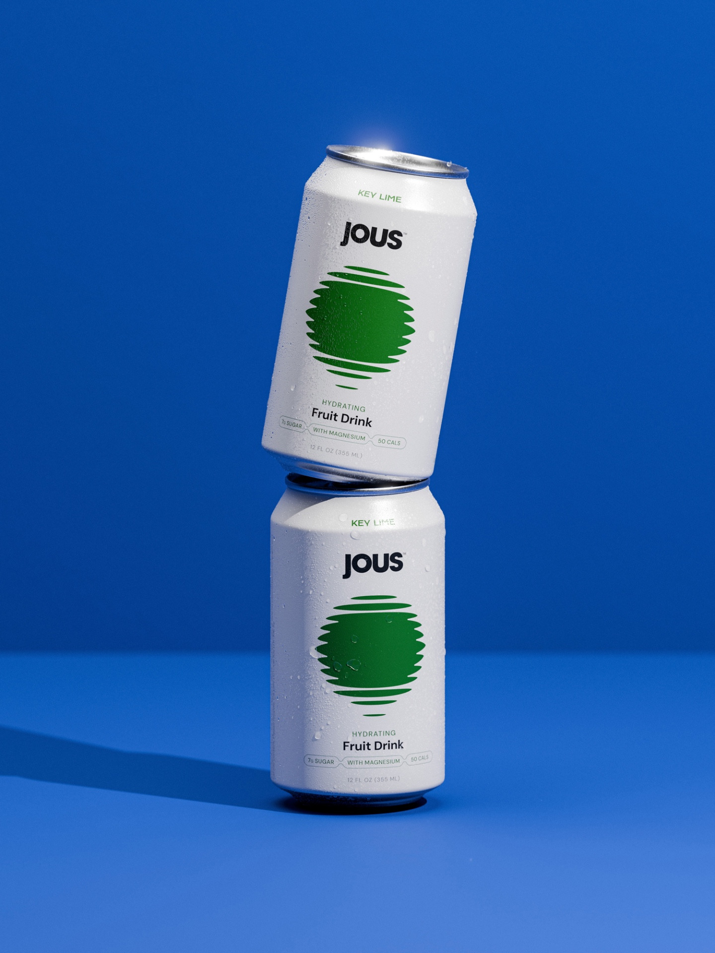
Central to the identity is the Jous icon, inspired by sunlight reflecting on water. The mark reinforces the product’s hydrating benefit while also evoking a lifestyle rooted in movement, energy and escapism. Designed as both a functional flavour symbol and emotive brand asset, it anchors the system across packaging and wider applications.
A distinctive pearl-toned base was developed as a core feature of the packaging. Chosen for its clean, almost luminous quality, the colour subtly communicates health and purity while creating a refined backdrop for each flavour variant to shine. The neutral foundation also establishes a flexible system for future range expansion, allowing new flavours to be introduced cohesively as the brand grows.
The result is a brand that moves fluidly between wellness and party culture, borrowing from the codes of both without being confined by either.
“We wanted the identity to capture a unique duality,” said Martyn Garrod of Studio Unbound. “The inspiration came from the energy of house music and the contrast between wellness and nightlife. Pairing that with a minimal, pearl-based packaging system gave JOUS a distinctive and versatile presence in a category that often feels visually overcrowded.”
JOUS Co-Founder, Camilo Ortiz stated “The Studio Unbound team brought a precise and thoughtful approach to the process. Martyn is an exceptional designer, and as a first-time founder, that level of guidance was invaluable in shaping both the brand and the wider vision.”