Disstroy – Branding
For Disstroy, a bold and high-energy drink brand, we developed a complete brand identity and packaging design system that fully embodies power, intensity, and rebellion. The brand was strategically conceptualized to connect with a fearless, high-adrenaline youth audience—individuals who thrive on breaking limits, challenging norms, and constantly pushing boundaries. Every element of the brand was designed to reflect this mindset, creating not just a beverage, but an attitude and a movement.
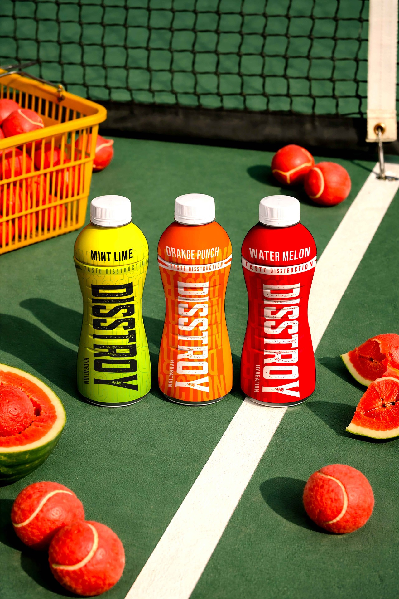
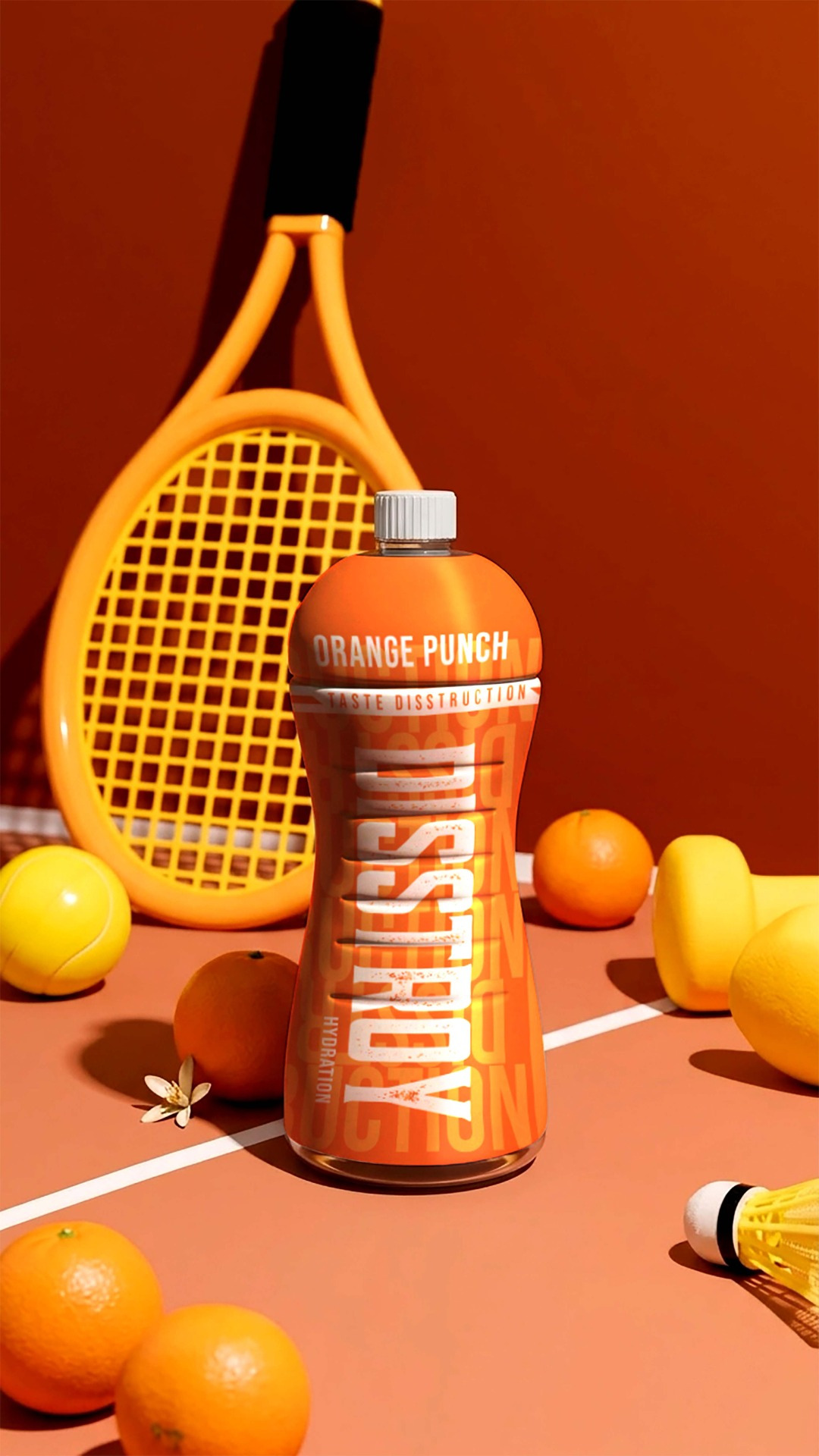
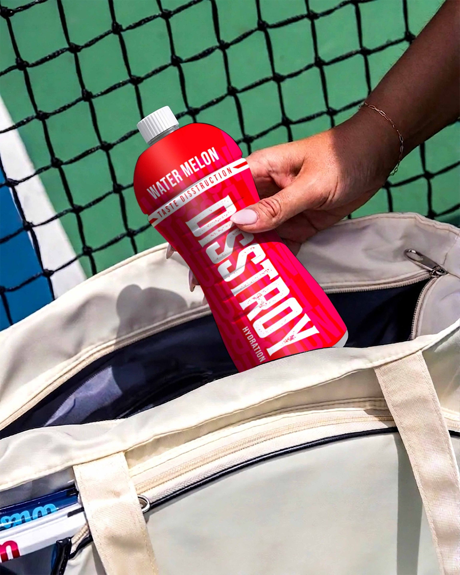
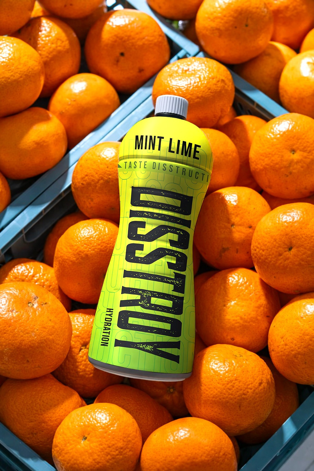
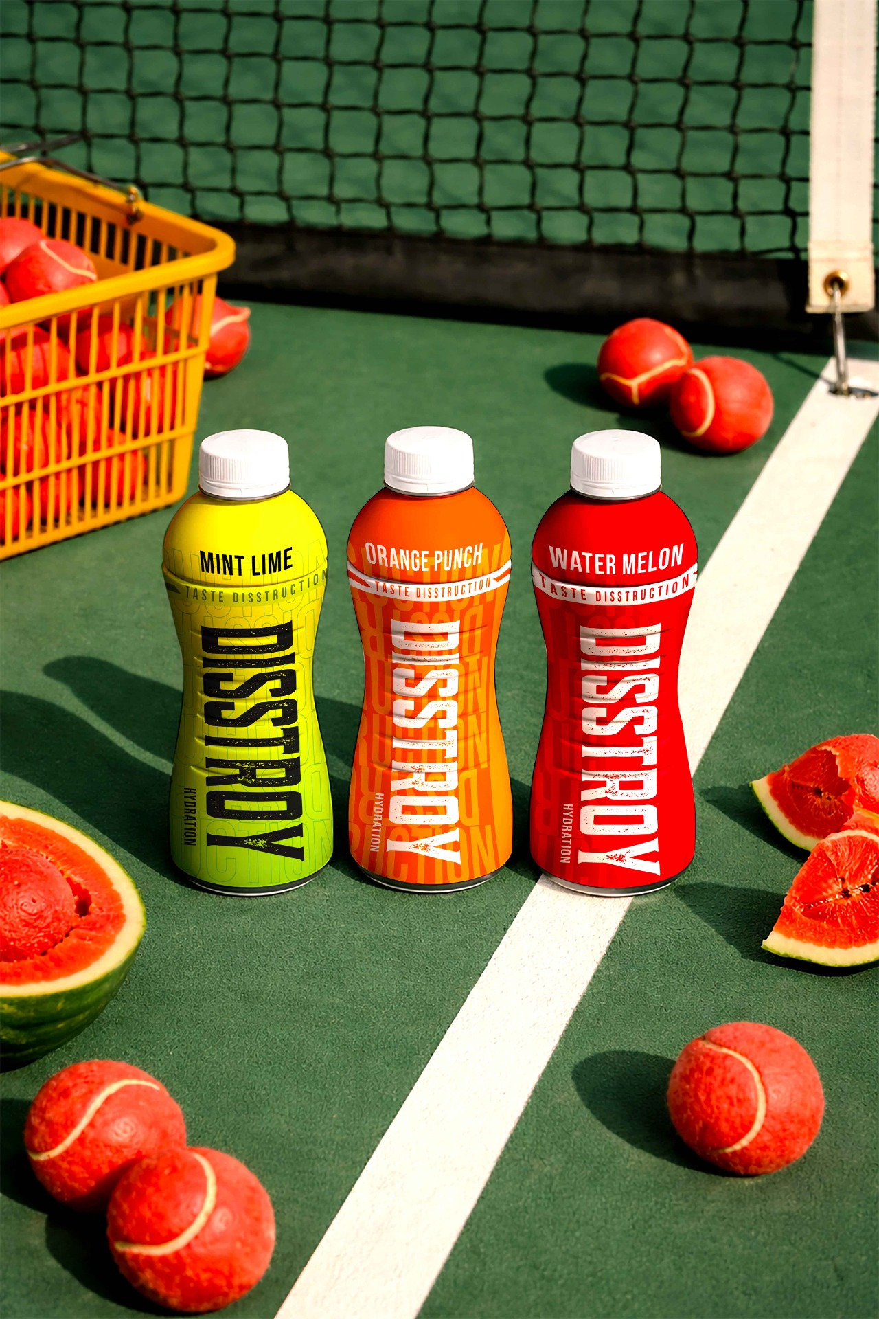
At the core of the identity lies a striking and unconventional visual language. We crafted strong, aggressive typography with a raw, almost disruptive character that mirrors the brand name itself. The letterforms were treated to feel dynamic and slightly distorted, symbolizing chaos, destruction, and unstoppable force. Complementing this is an electrifying color palette featuring high-contrast, high-voltage tones that immediately grab attention and evoke energy, danger, and excitement. These colors were carefully chosen to stand out both on shelves and across digital platforms, ensuring instant recall and recognition.
The graphic system further amplifies the brand’s personality. Edgy elements such as sharp textures, fractured patterns, and motion-inspired visuals were integrated to create a sense of impact and continuous movement. These design cues give the impression that the brand is alive, explosive, and constantly in action. The overall aesthetic is intentionally bold and slightly chaotic, reinforcing the idea of disruption and rebellion against the ordinary.
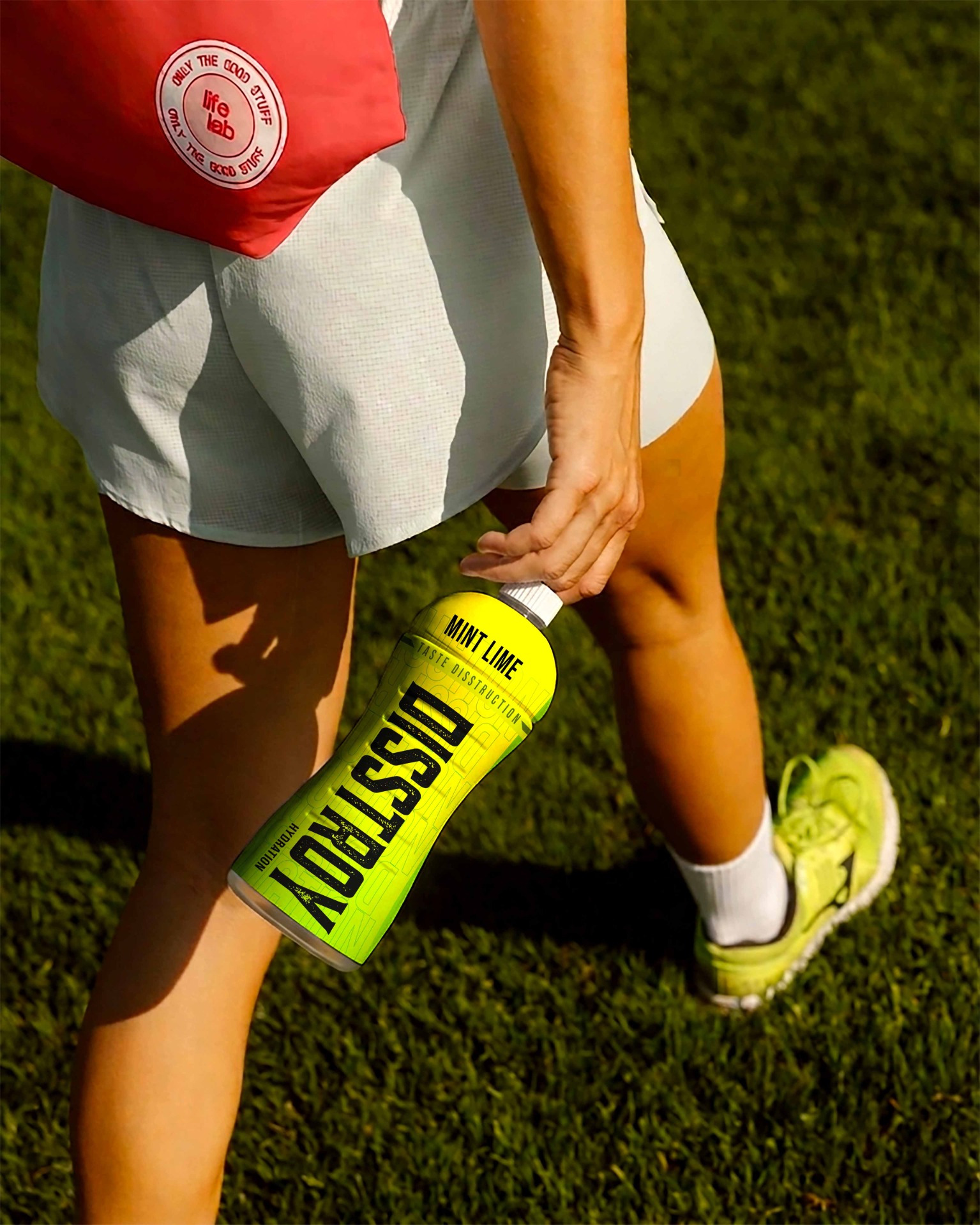
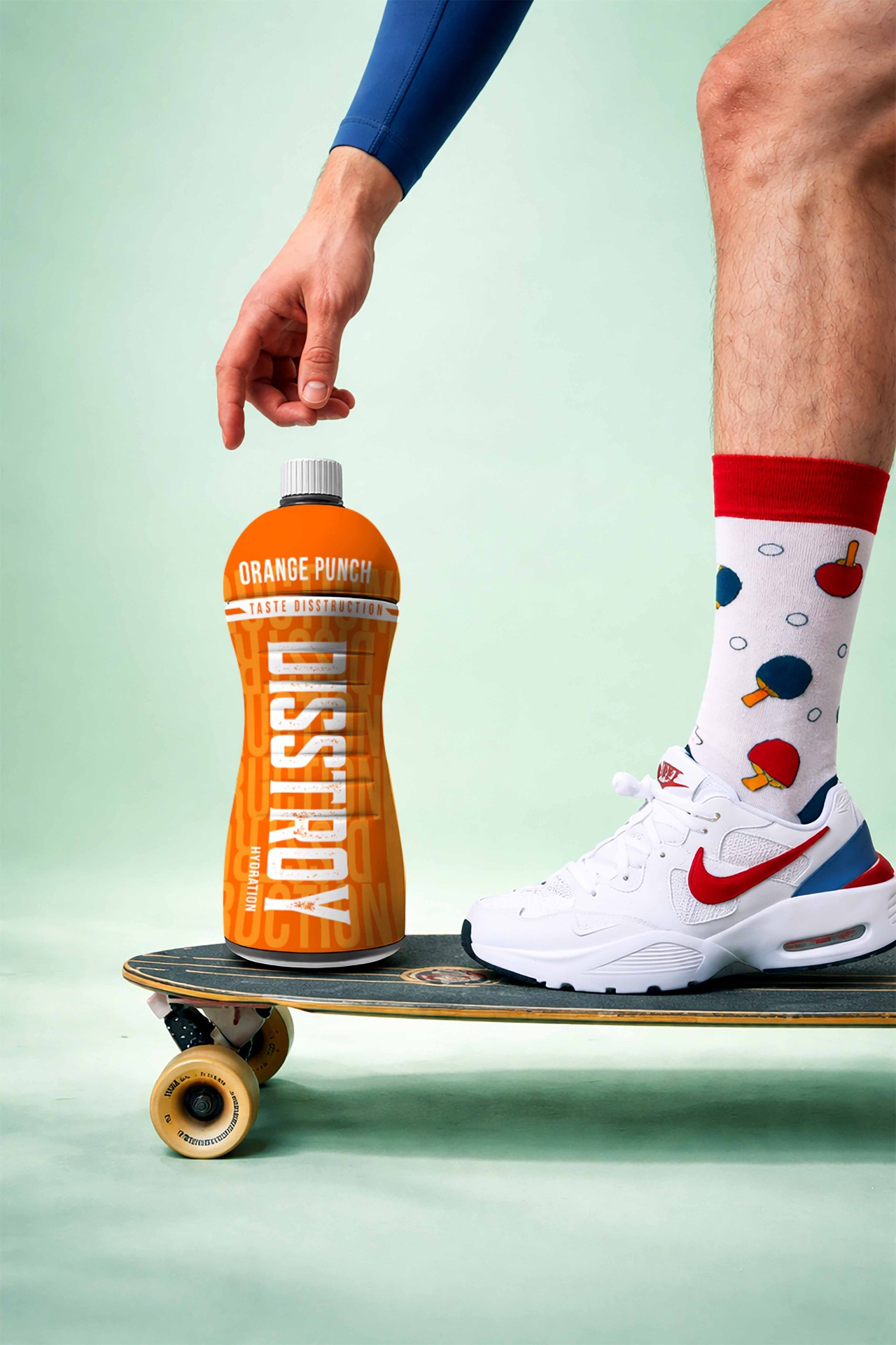
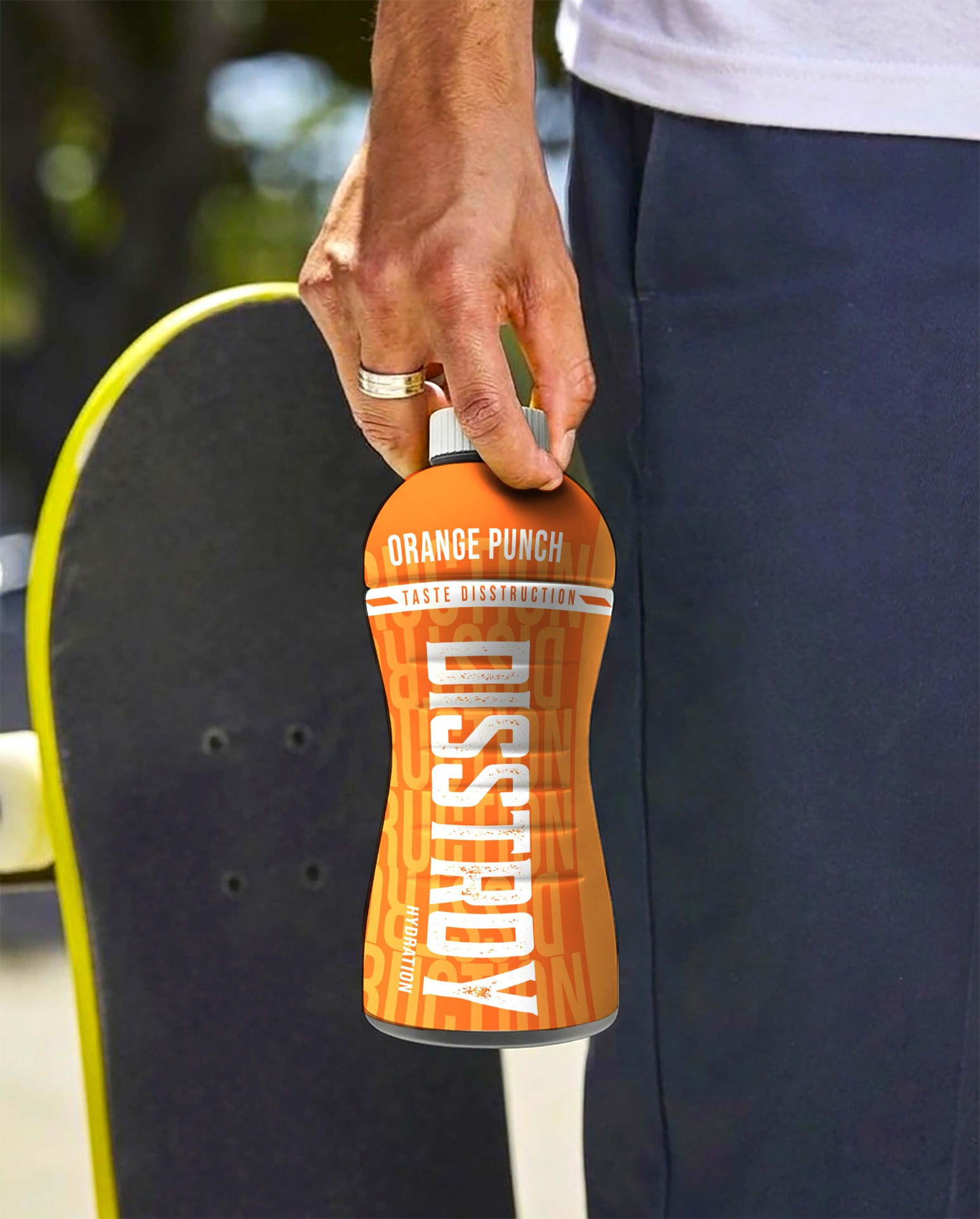
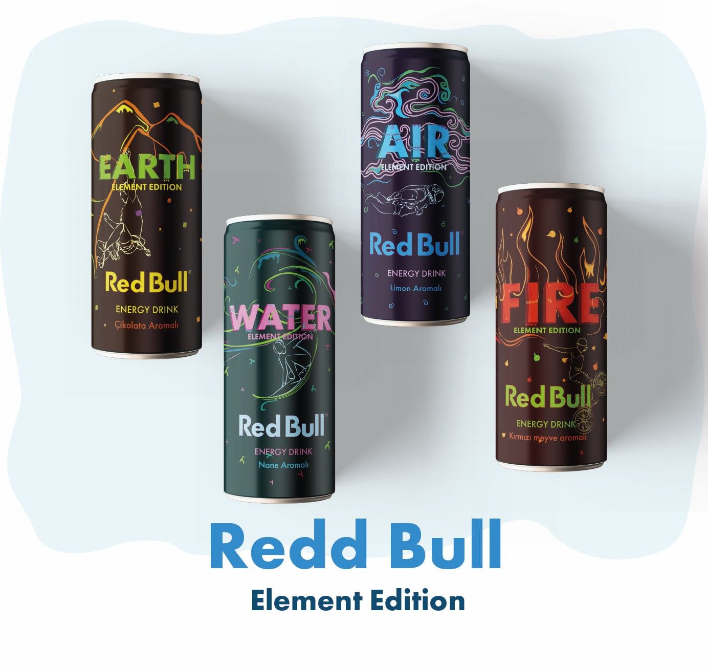
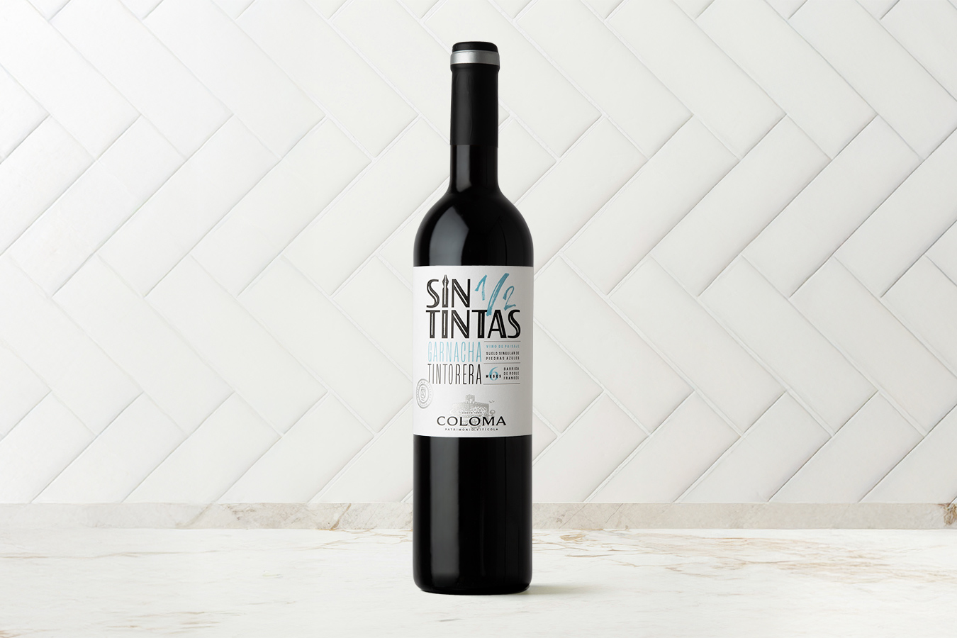
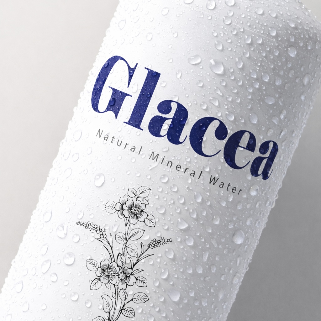
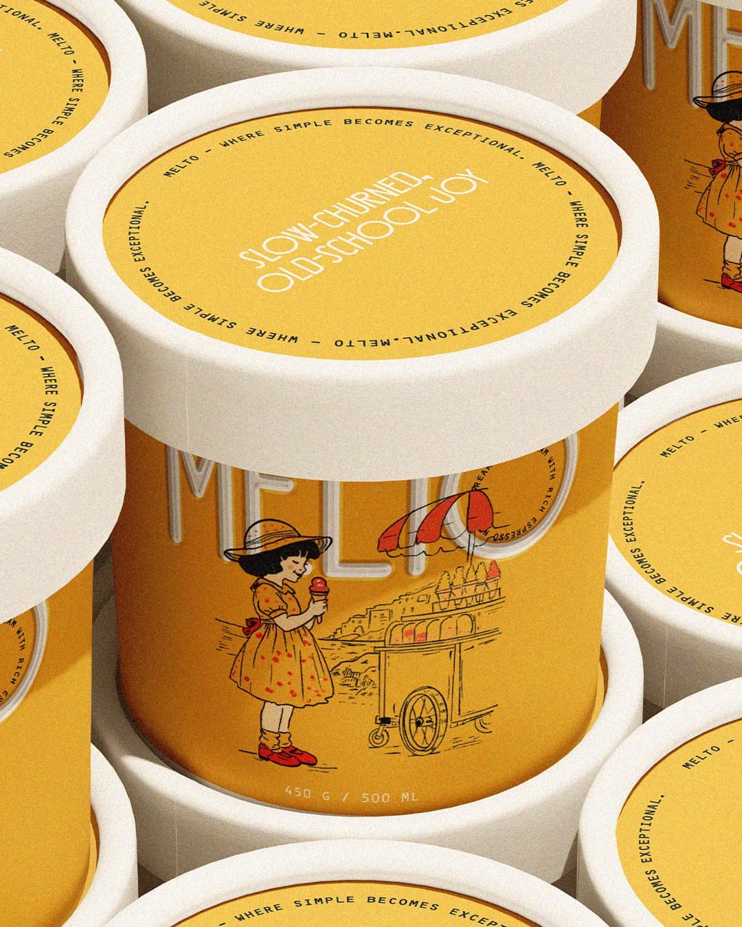
For the packaging, we translated this high-energy identity into a powerful on-shelf experience. The design commands attention with its bold presence, ensuring it cuts through the clutter of conventional beverage packaging. Each element—from layout to hierarchy—was crafted to deliver maximum visual impact while maintaining clarity. The packaging doesn’t just contain the product; it visually communicates the brand’s promise of intensity and performance. It feels like an extension of the energy inside, making the consumer experience start even before the first sip.
Special attention was given to scalability and consistency across SKUs, ensuring that the brand can expand while maintaining its strong visual core. The system allows for variations in flavors or product lines without losing its distinctive identity, keeping Disstroy instantly recognizable in any format.
Overall, the branding and packaging for Disstroy create a cohesive and immersive brand world that captures the essence of destruction, power, and unstoppable energy. It positions the brand as more than just a drink—it becomes a symbol of bold expression and fearless living, built to resonate deeply with a generation that refuses to settle and is always ready to go beyond limits.