Movida — Natural Deodorant Packaging
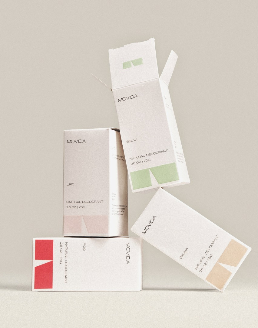
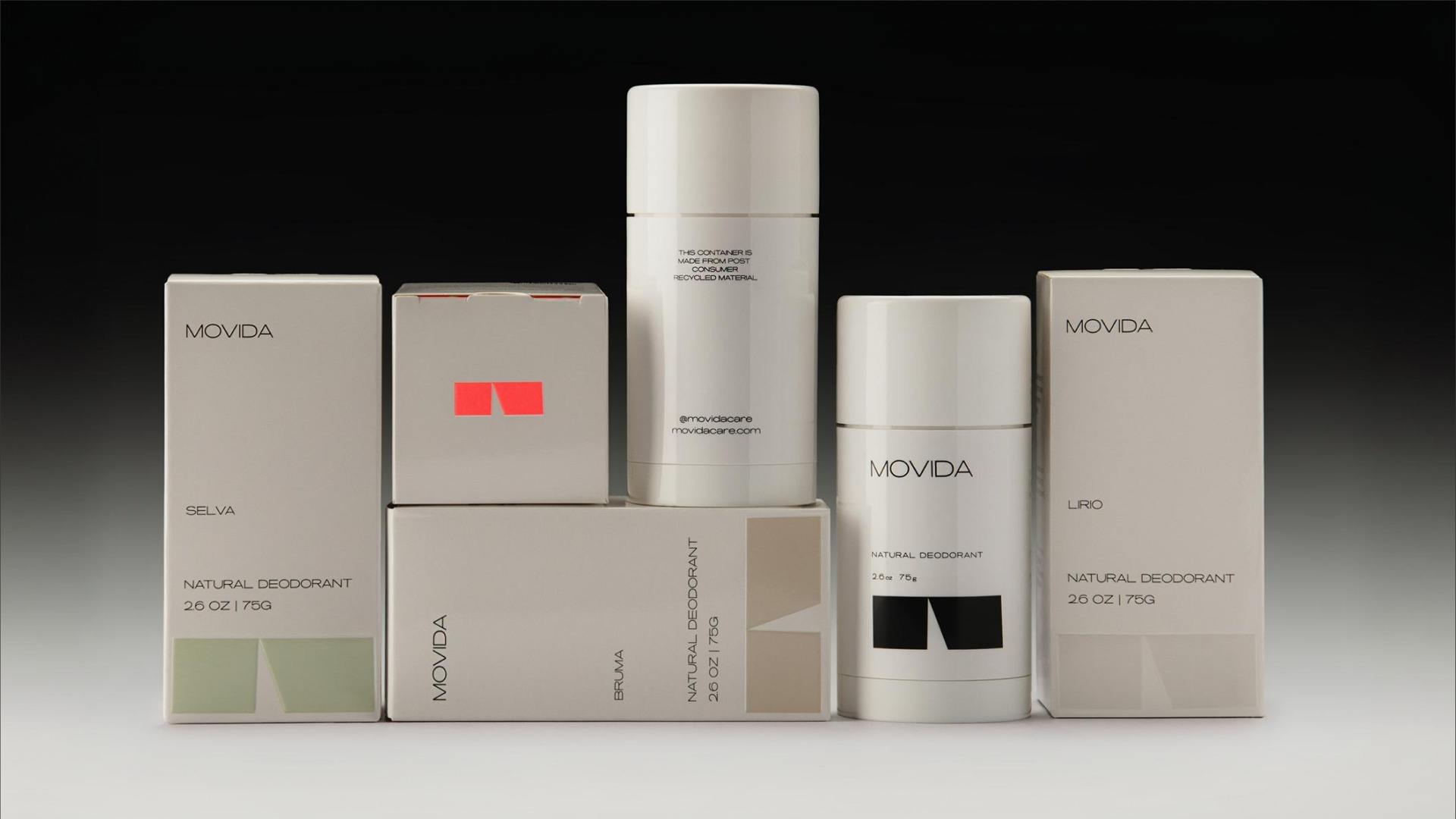
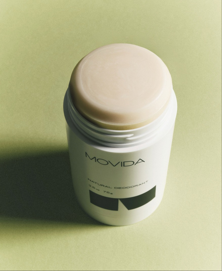
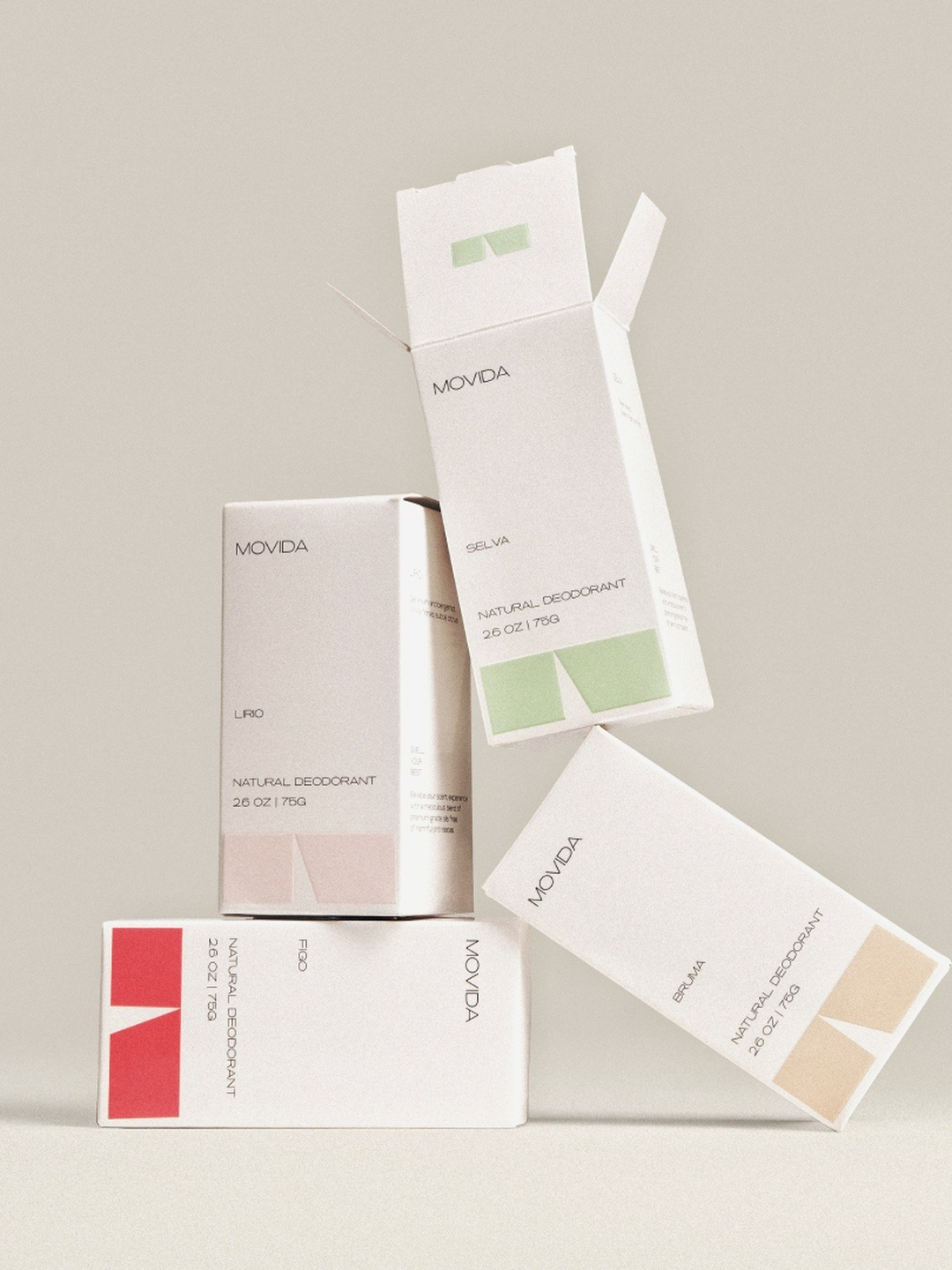
The brief was to create an identity and packaging system for a natural deodorant brand built around fragrance. Movida’s four scents were developed with the structure of perfume, and the design needed to give each one a distinct character while bringing the collection together as a recognizable family.
The idea began with the everyday ritual of applying deodorant. Movida approaches that moment as a small sensory pleasure, with scent, packaging, and imagery contributing to the experience. The visual direction reflects warmth, ease, and a slower pace, giving a familiar personal-care product a more considered presence.
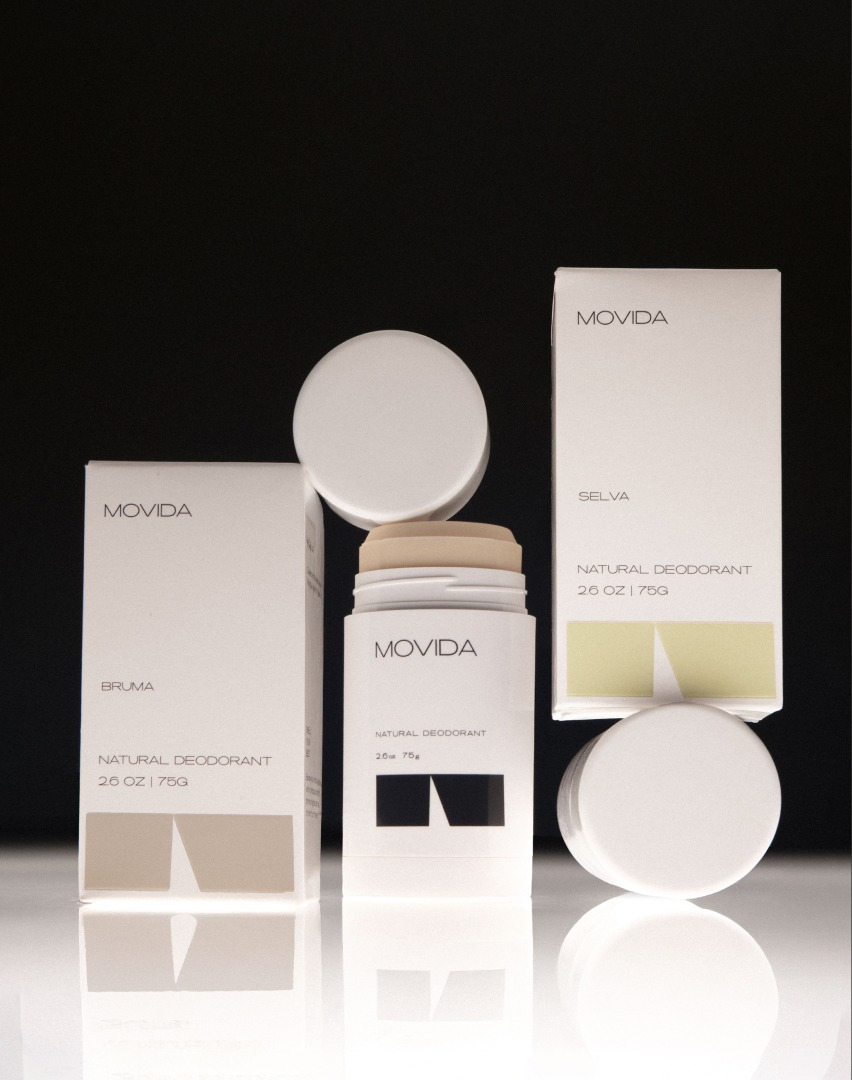
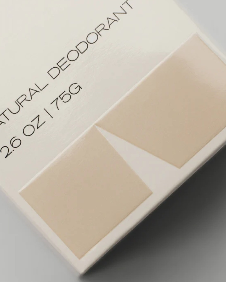
Designed by Vencho Miloshevski, with a logo by Kristina Atanasova, the system combines fine-lined lettering with a compact geometric symbol. Pale cartons and cylindrical sticks provide a quiet foundation, while distinct color accents distinguish the scents. Generous space and restrained typography allow the product names, graphic forms, and colors to carry the design.
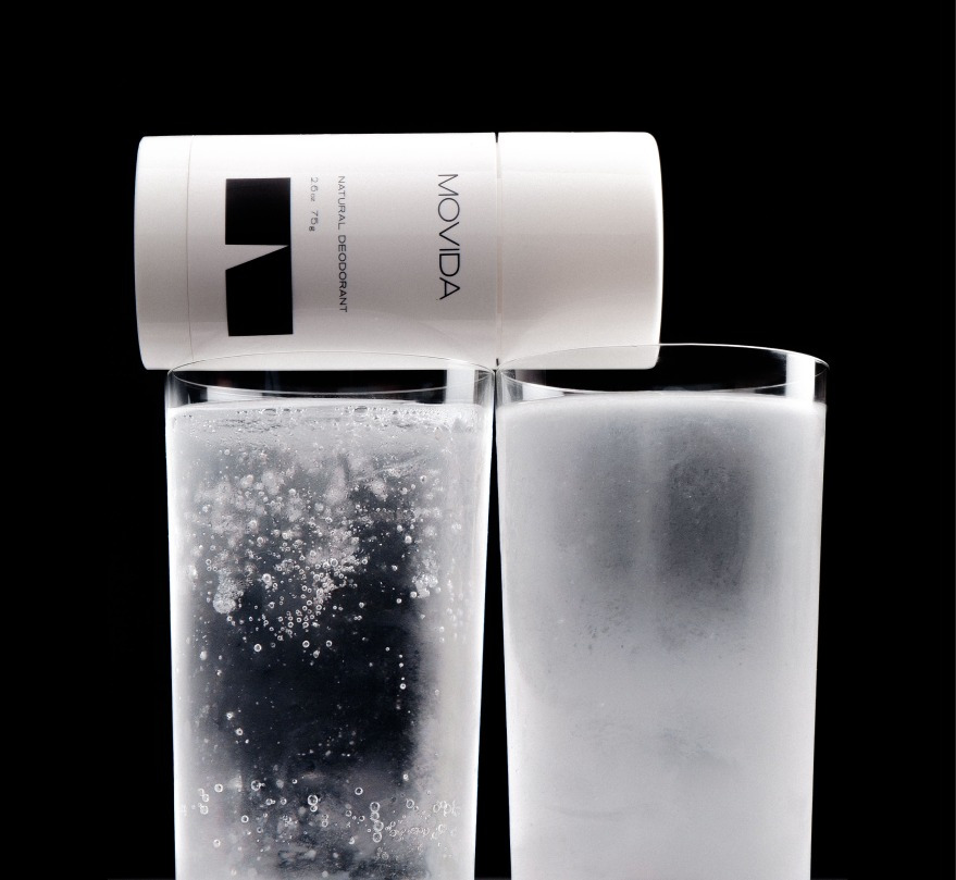
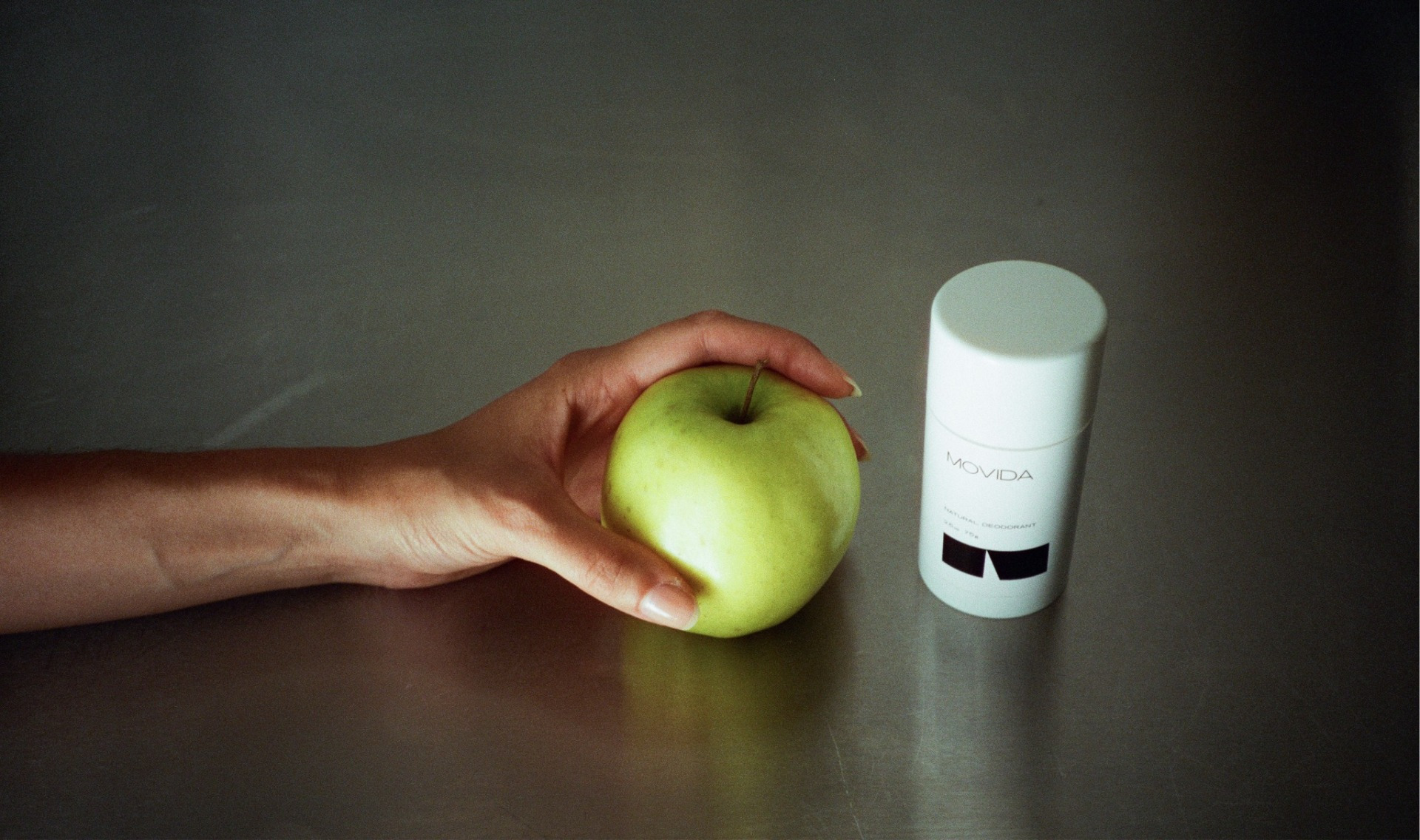
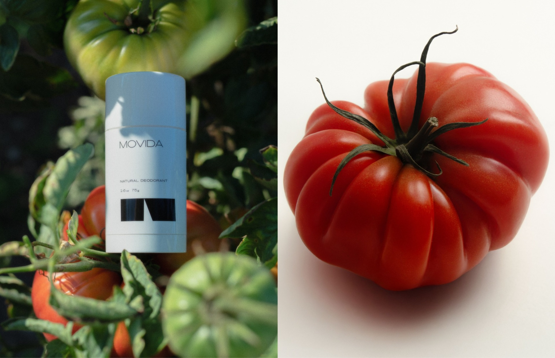
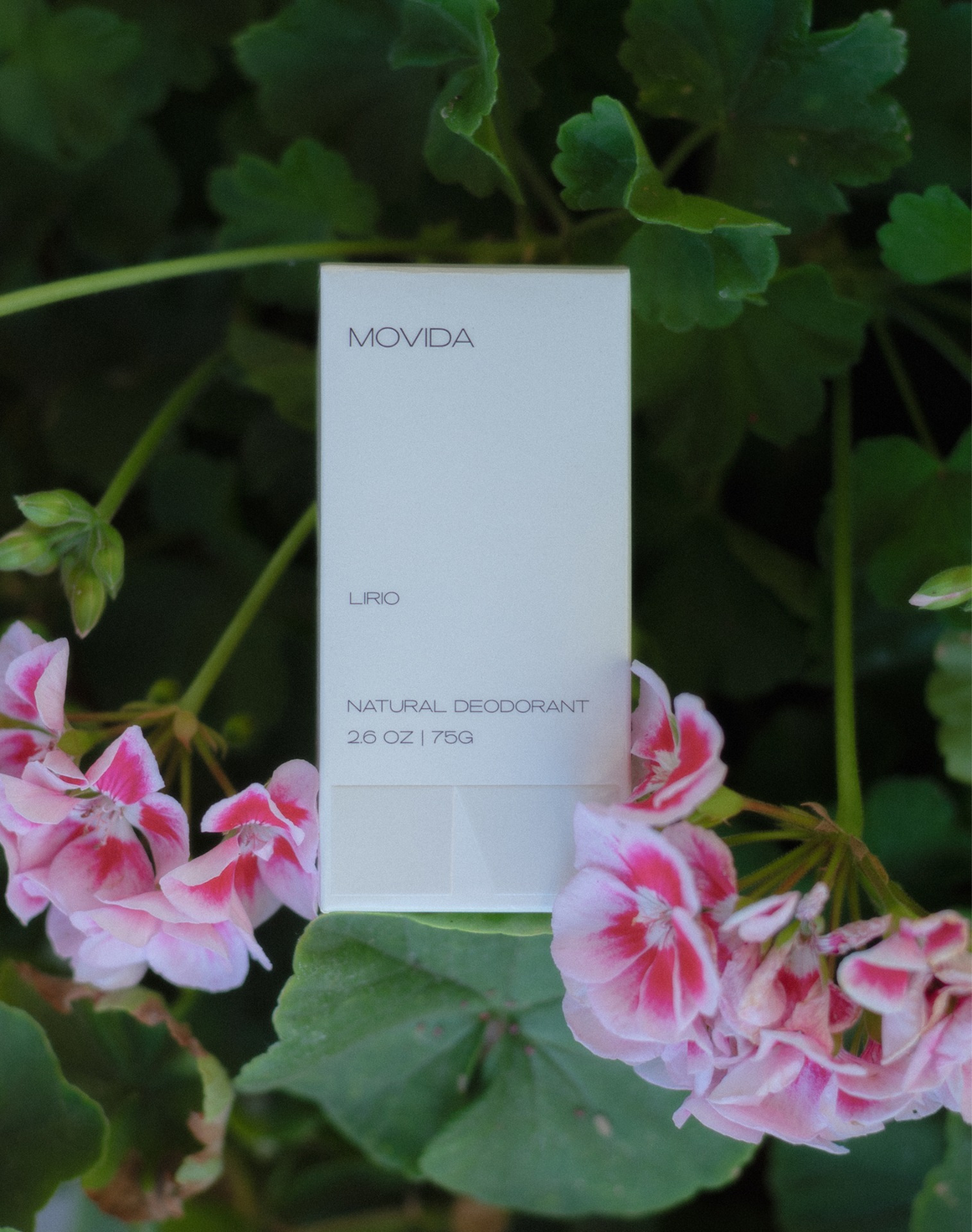
This restrained style gives the four fragrances room to express their individual personalities without fragmenting the range. The photography adds warmth and texture through foliage, flowers, fruit, and human gestures, balancing the precision of the packaging with more spontaneous, tactile surroundings.
Client: Movida Care LLC
Brand identity and packaging design: Vencho Miloshevski
Logo design: Kristina Atanasova
Website design: Viktoriia Shponka
Web design agency: Boooring
Photography:
Range hero and angled carton print detail: Anja Kalin.
Cartons as a group, products in context, single-stick hero, macro texture, and standalone tomato (right side of the paired image): Andriy Shurpin and Valerie Sagura.
Stick amongst tomatoes (left side of the paired image), carton amongst leaves and flowers, and model applying deodorant: Árpád Kossár.
Hand, apple, and product: Karin Golisová.