NOC – night time skincare packaging
What was the brief?
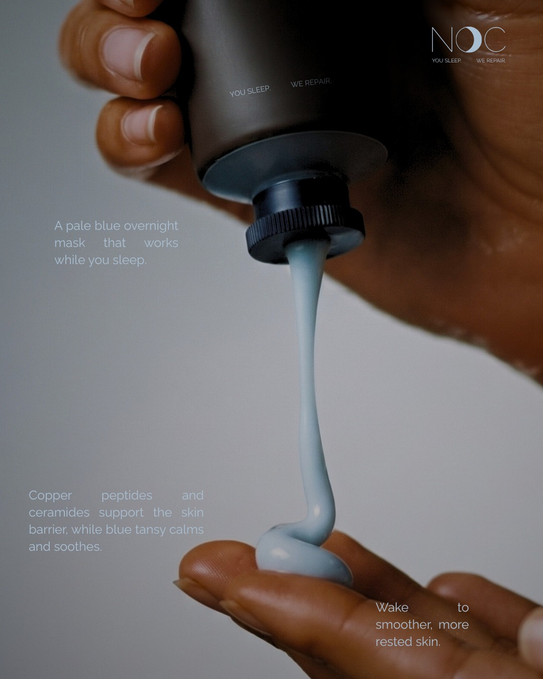
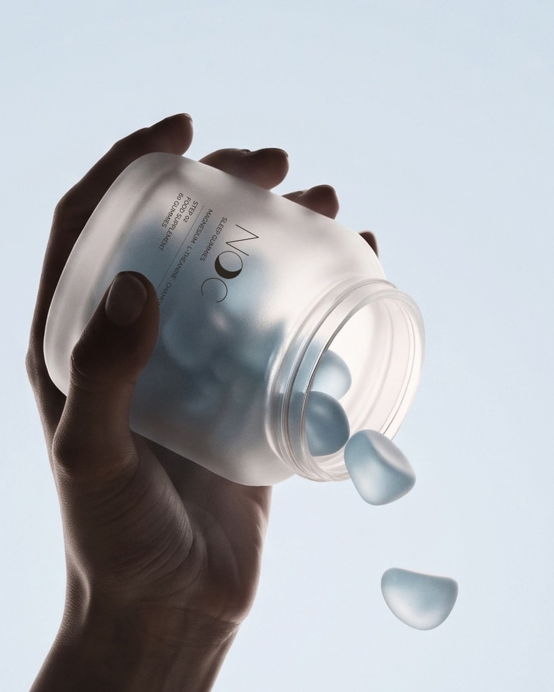
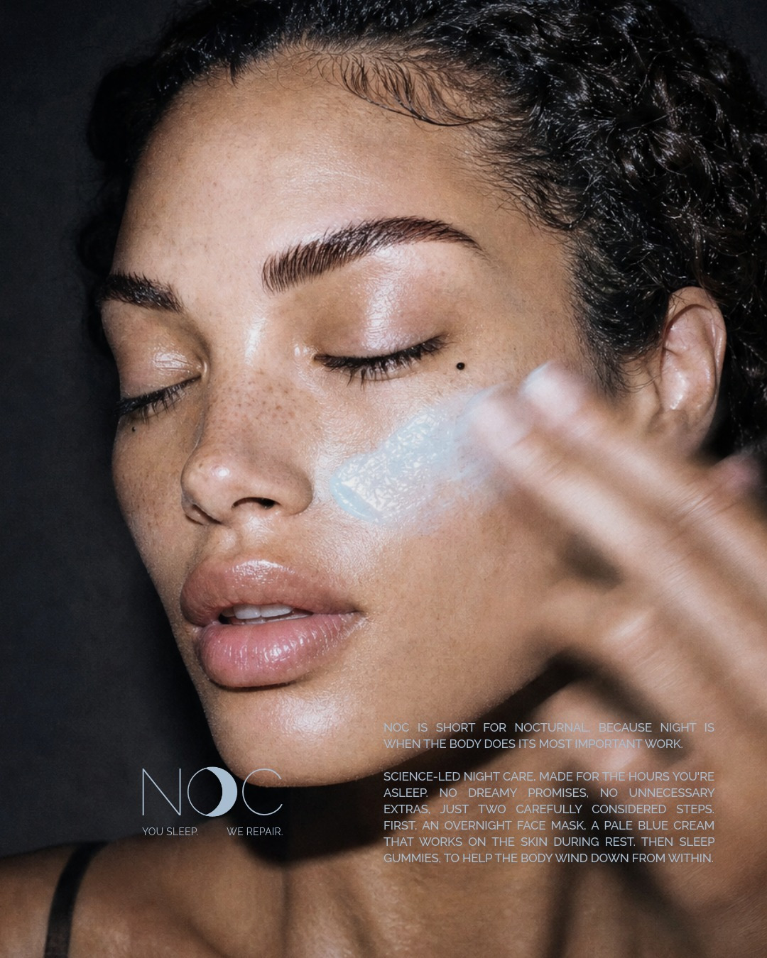
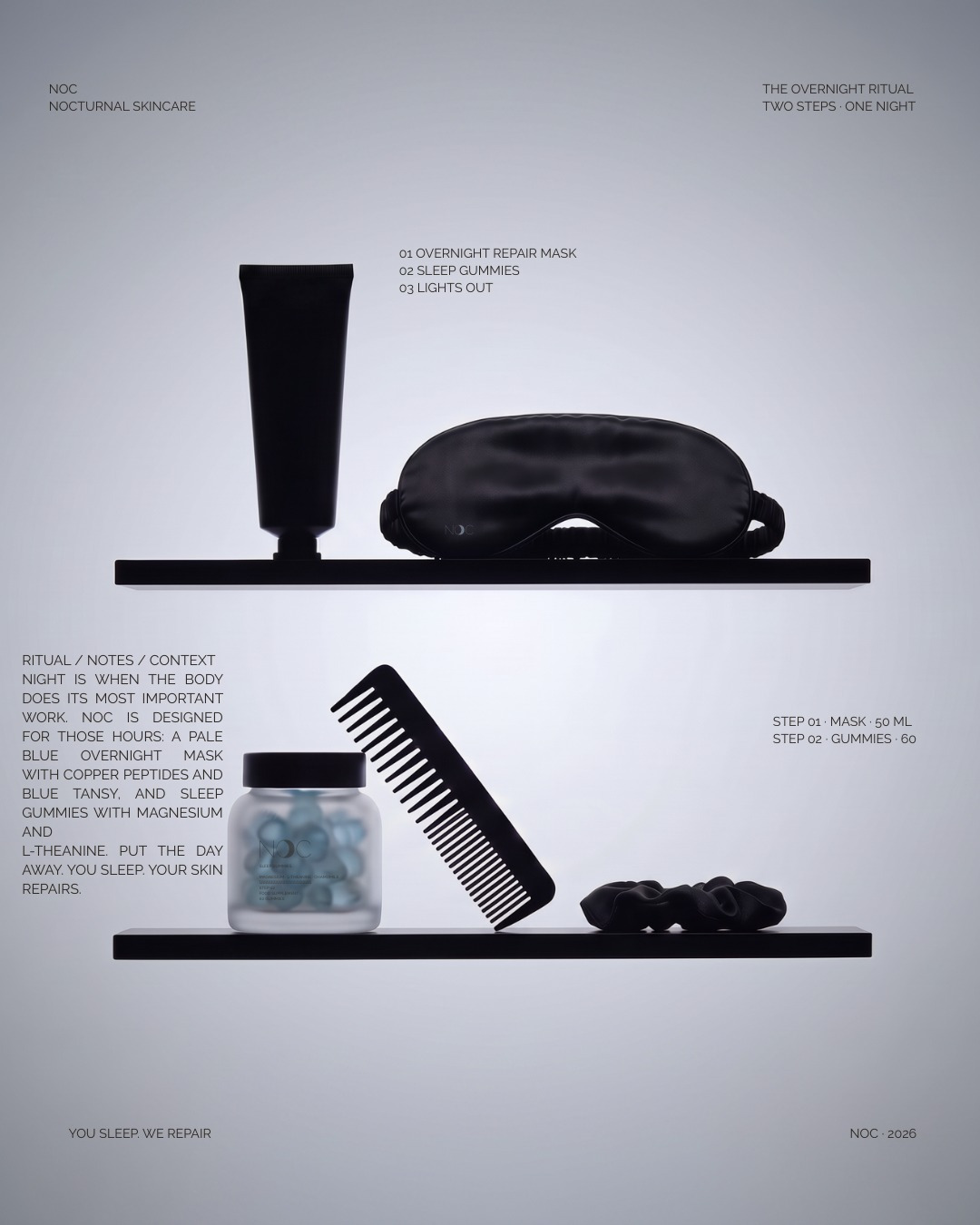
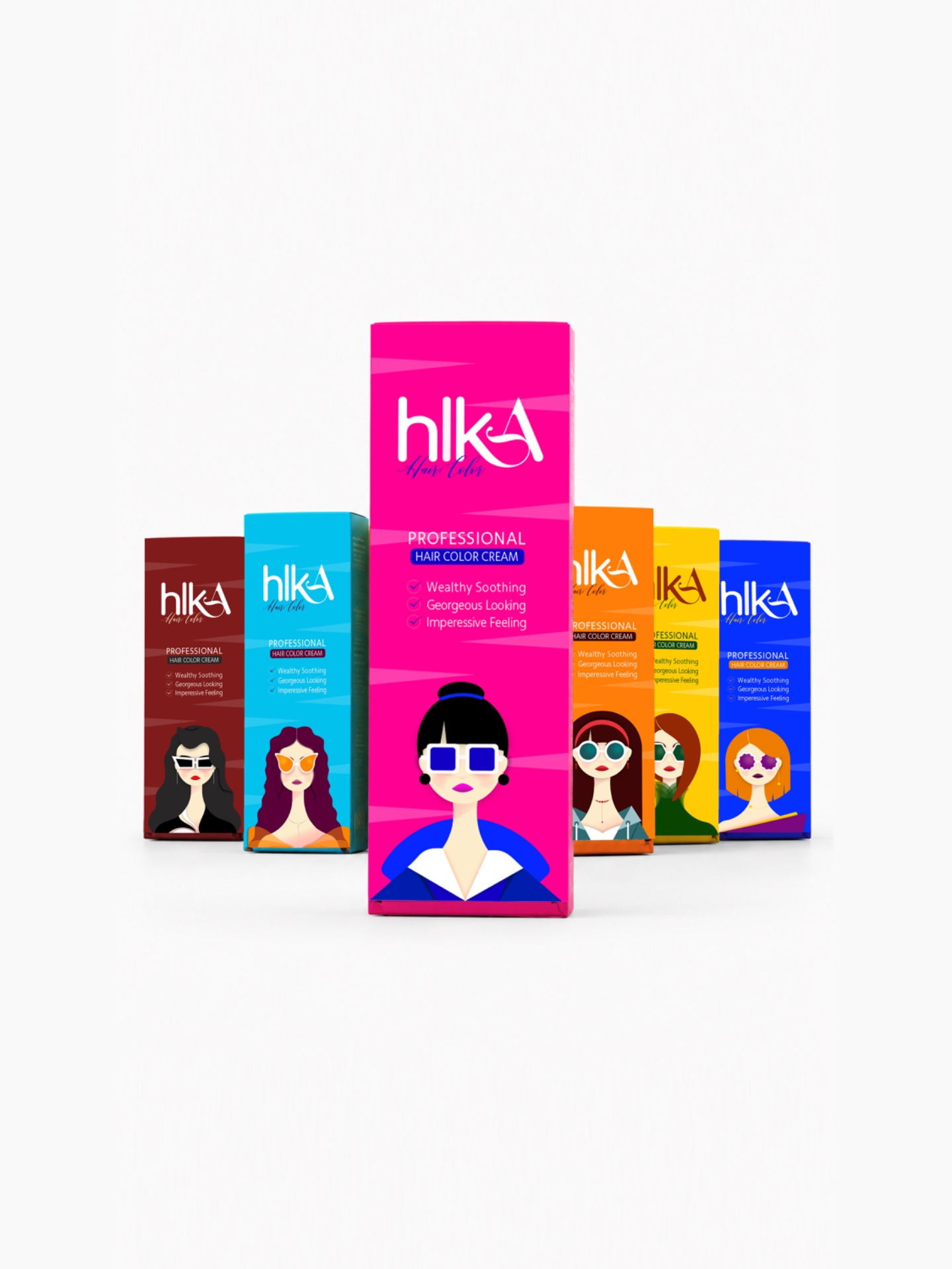
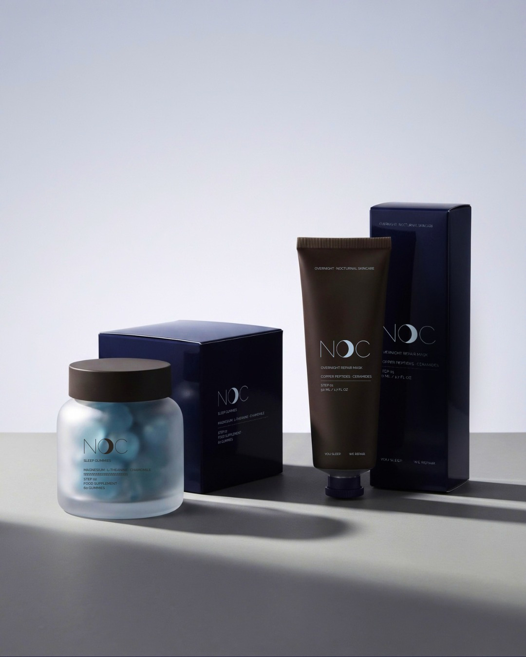
To create a brand identity and packaging for a night-time skincare brand built around overnight repair. The packaging needed to feel calm, restorative and premium, so the brand comes across as quiet and trustworthy without losing its sense of luxury.
How did the idea come about?
The idea started with the stillness of night. Skincare that works while you sleep should feel like part of a calm bedtime ritual, not another loud product on the shelf. The name NOC comes from “noc”, the word for night in several Slavic languages, and the tagline I wrote, “You sleep. We repair.”, sums up the whole brand: the product does the work overnight, so you don’t have to. From there, every design decision followed the idea of the hours between dusk and morning.
Why that material or style?
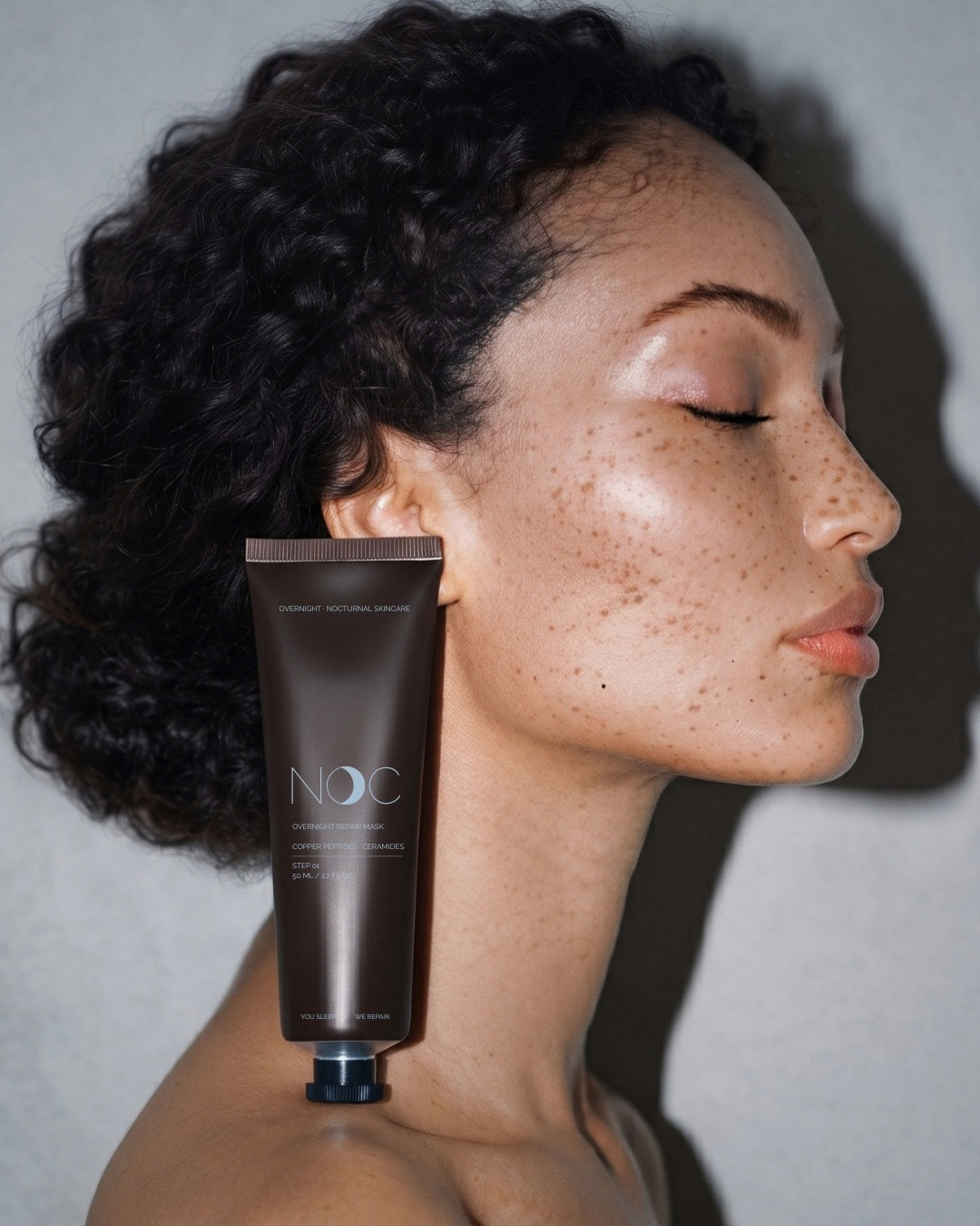
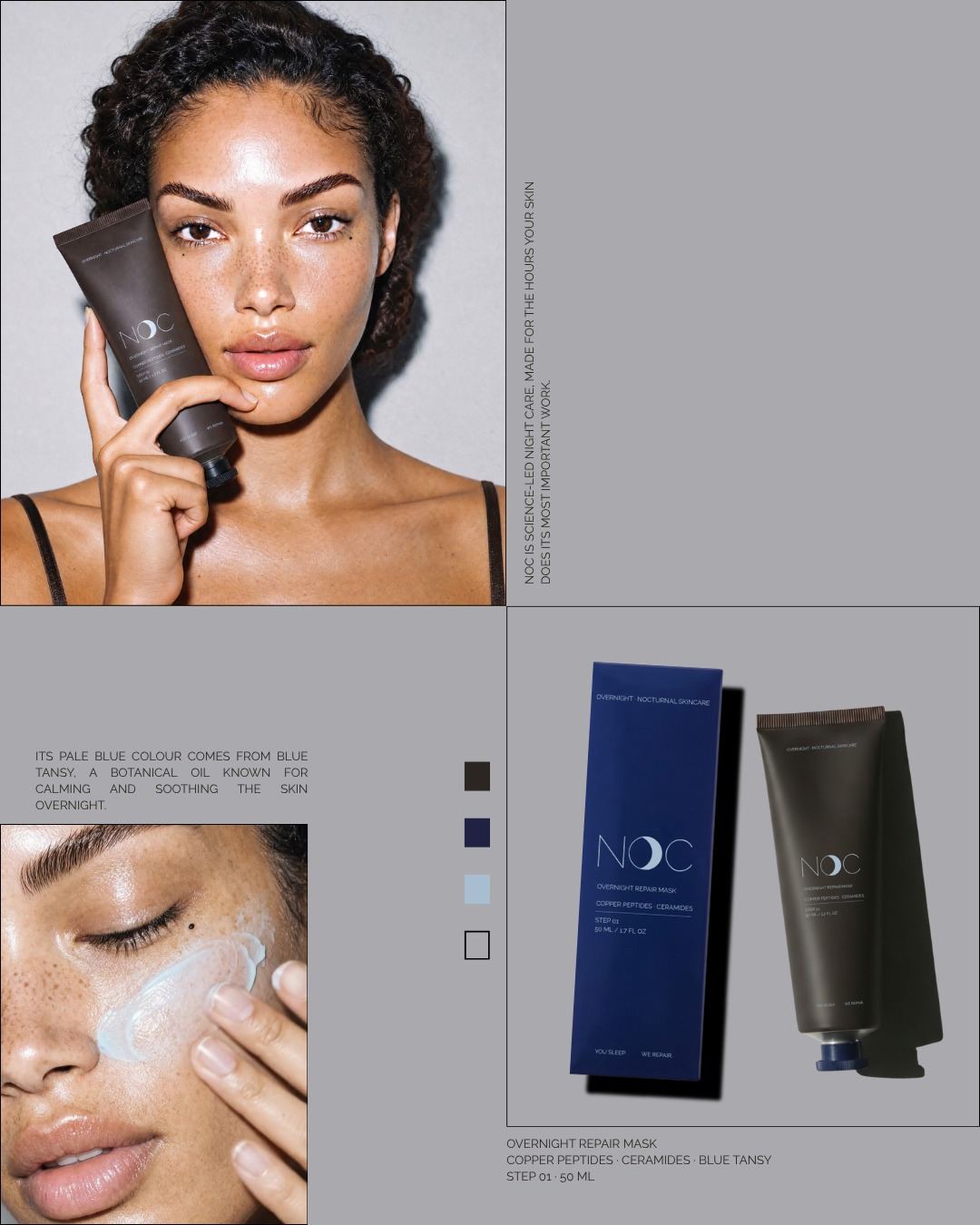
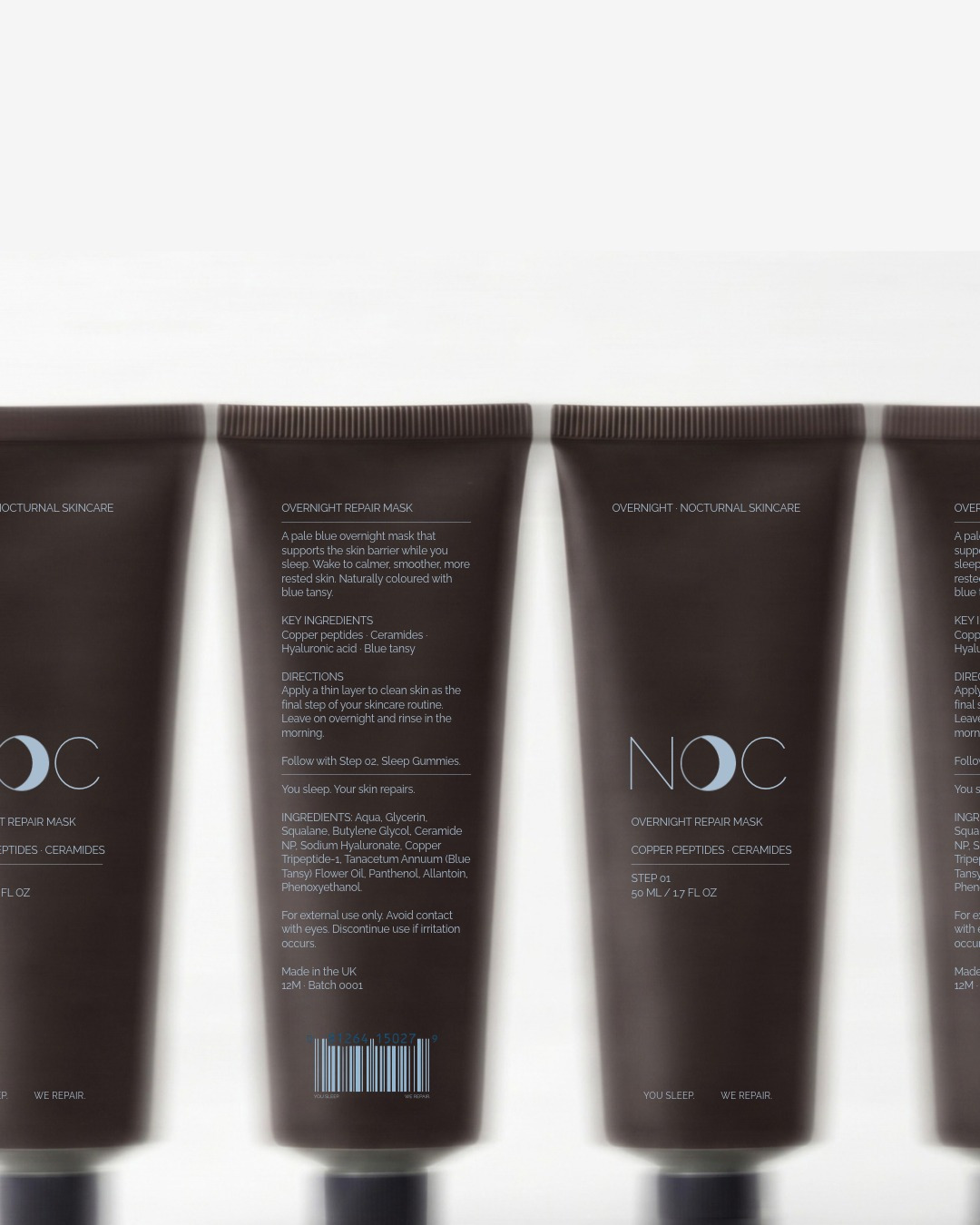
I chose a soft, matte tube in deep cocoa so the product feels rich, warm and comforting in the hand, more like a night-time treat than a clinical product. The matte finish keeps it calm and understated, with no shine or glare, just like a dark room at night. The palette comes from the night sky: deep cocoa and midnight navy give the brand weight and quality, while dusk blue and moon grey bring in a sense of rest. A thin, spaced-out wordmark and minimal text keep the packaging quiet and confident. Nothing on it shouts, because the brand is about rest.