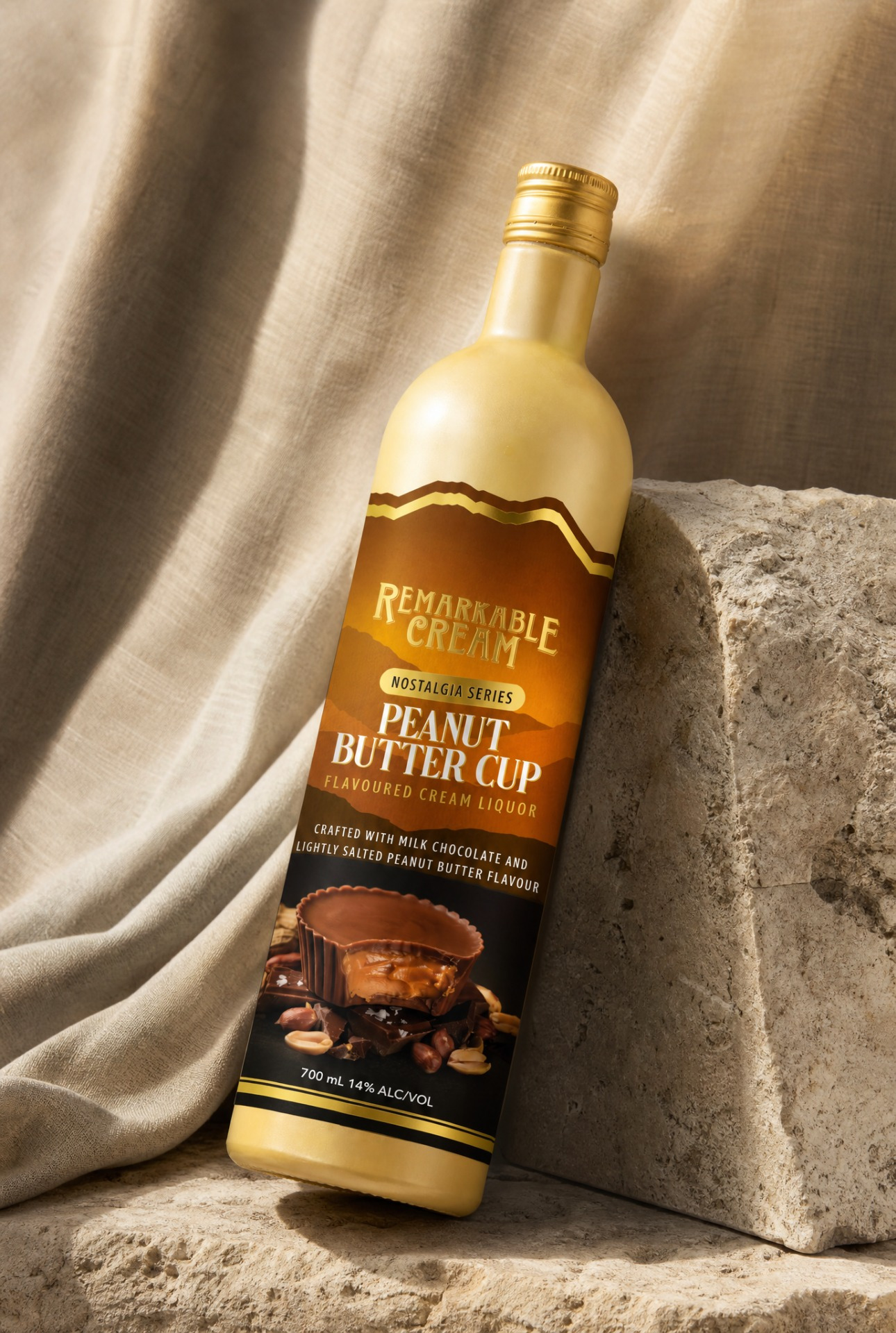
Remarkable Cream Peanut Butter Cup Liquor
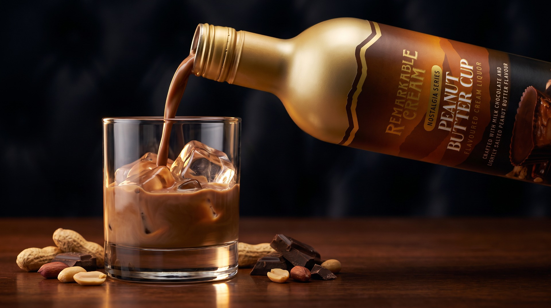
Peanut Butter Cup is the newest addition to the Remarkable Cream range — a generational family business producing premium cream liqueurs for the New Zealand market. The brand has a strong, recognisable identity built around its iconic bottle and label shape, with a genuine point of difference: a signature aluminium bottle format that sets it apart from anything else on shelf.
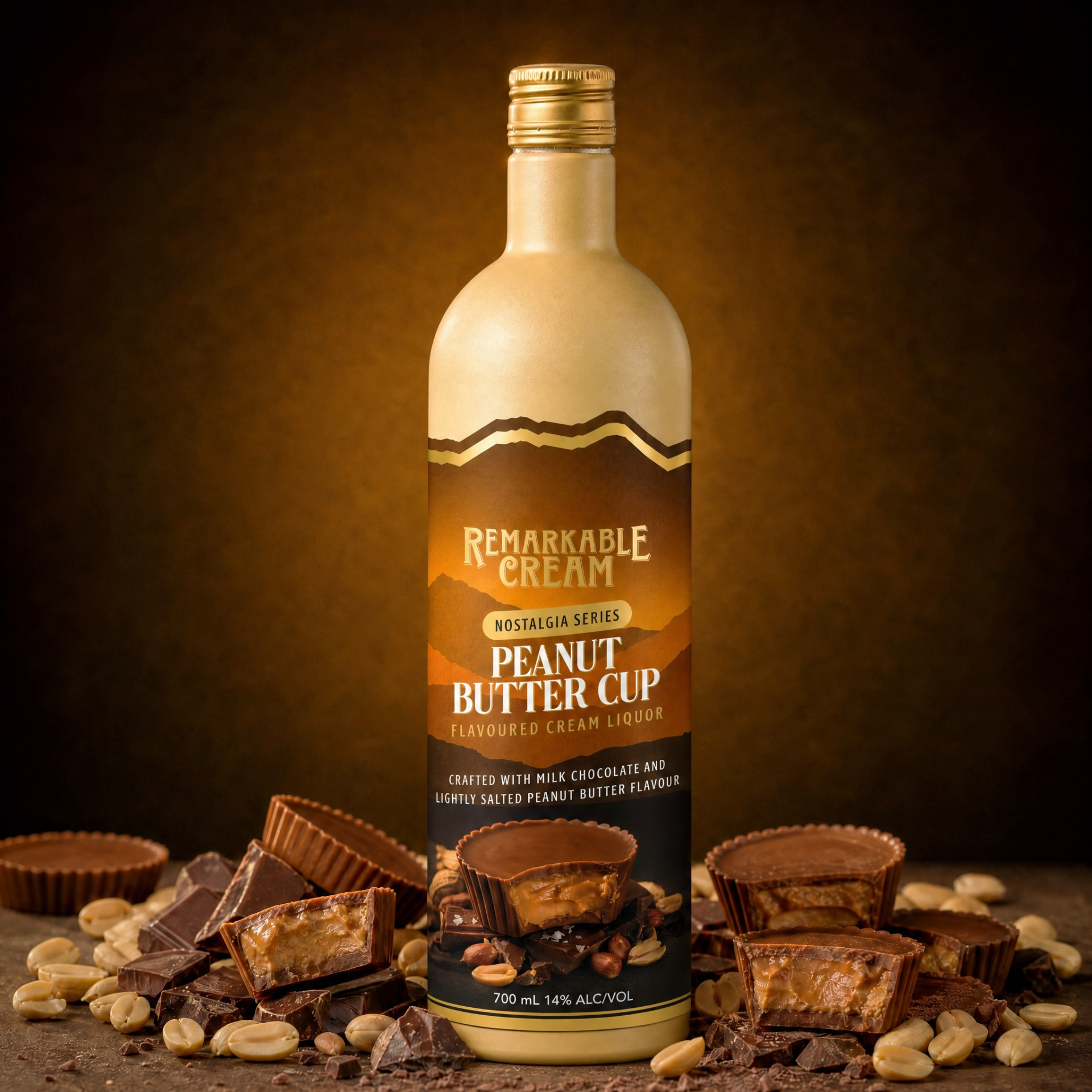
Knowing this SKU would sit in the cream bottle rather than the silver, I kept that distinction front of mind from the very beginning of the design process. Earlier labels had lost some of their edge, quite literally — with the gold shape running right to the label boundary and softening the overall impact. For this label, I deliberately pulled that shape inward so the rich brown of the label creates a strong, striking border that commands attention.
The founder wanted mountains incorporated into the design. Rather than placing them as an obvious graphic element, I used shape and tonal contrast to build depth into the front panel — giving them presence without competing with the hero flavour cues. The peanut butter cup and chocolate elements remain the clear focus; the mountains live in the structure of the design itself.
Spot UV on the ingredients element on front and gold foil on the logo and select text reinforce the premium positioning, adding tactile signals of quality that work at point of purchase.