

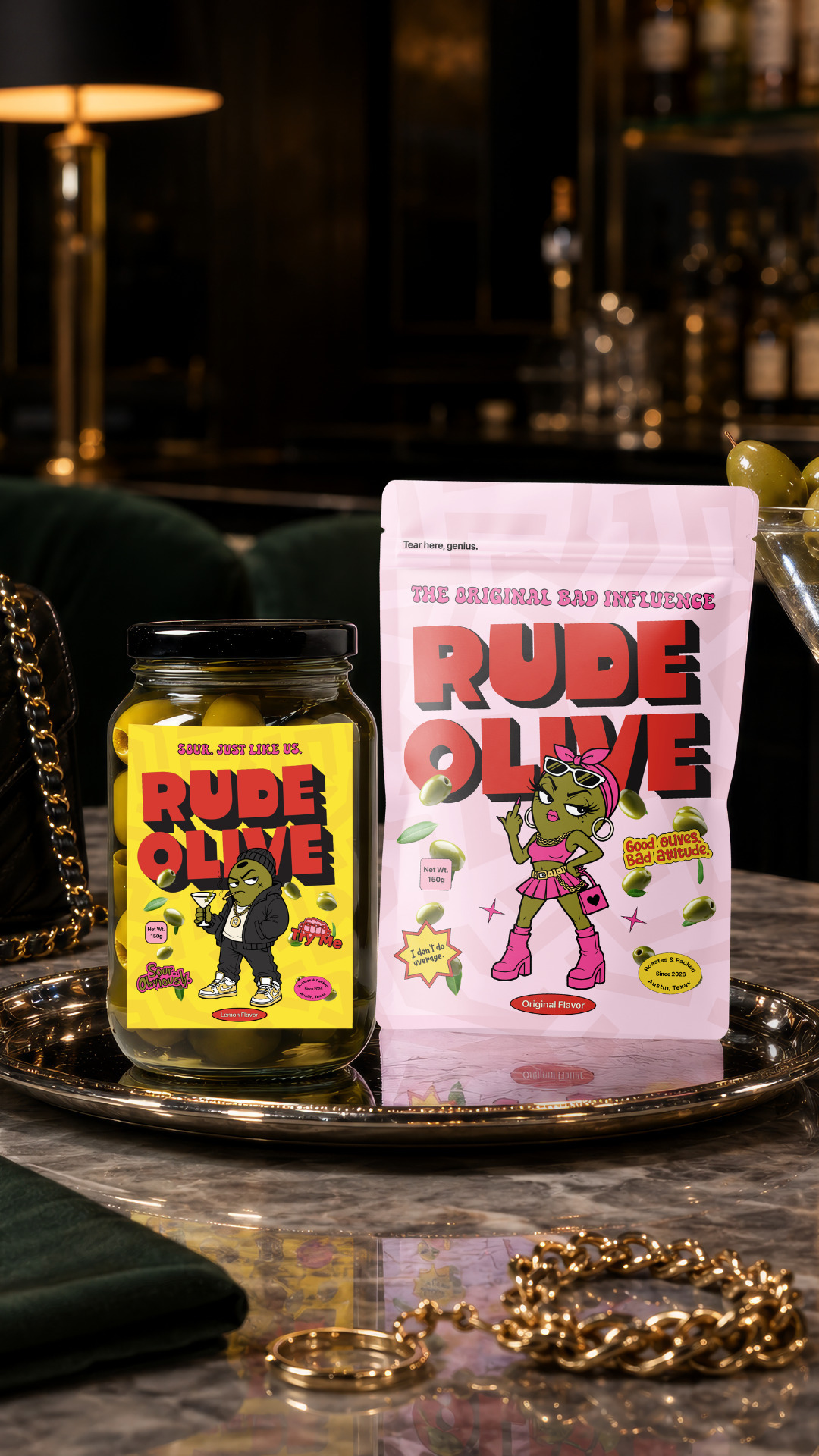
Rude Olive— Brand Identity & Packaging Design
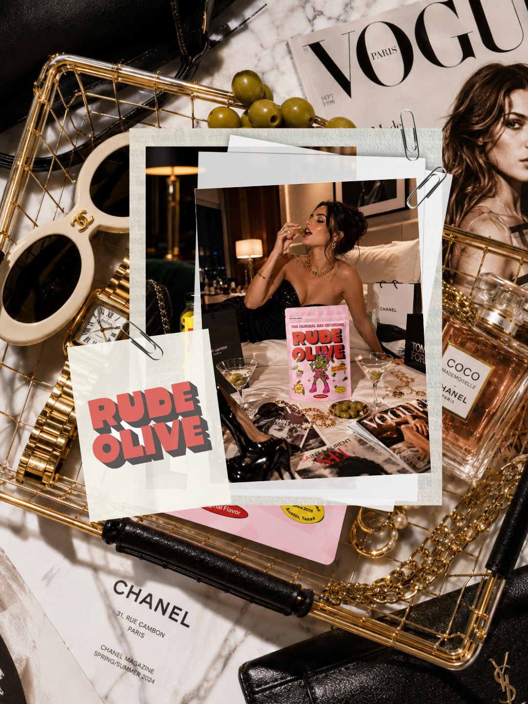
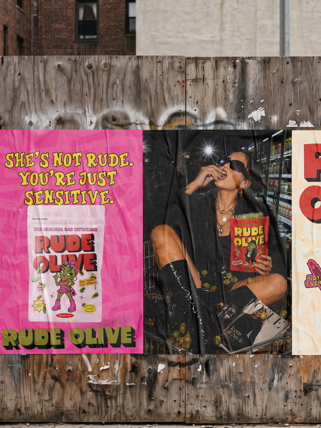
Most olive brands look like they belong in a health food aisle. This one belongs at the after-party.
That was the positioning decision that changed everything.
Rude Olive isn’t a premium artisan product. It’s not trying to be wholesome. It’s a snack for people who already know they like olives and want the brand to have as much personality as they do.
So I didn’t design something elegant. I designed something with a face.
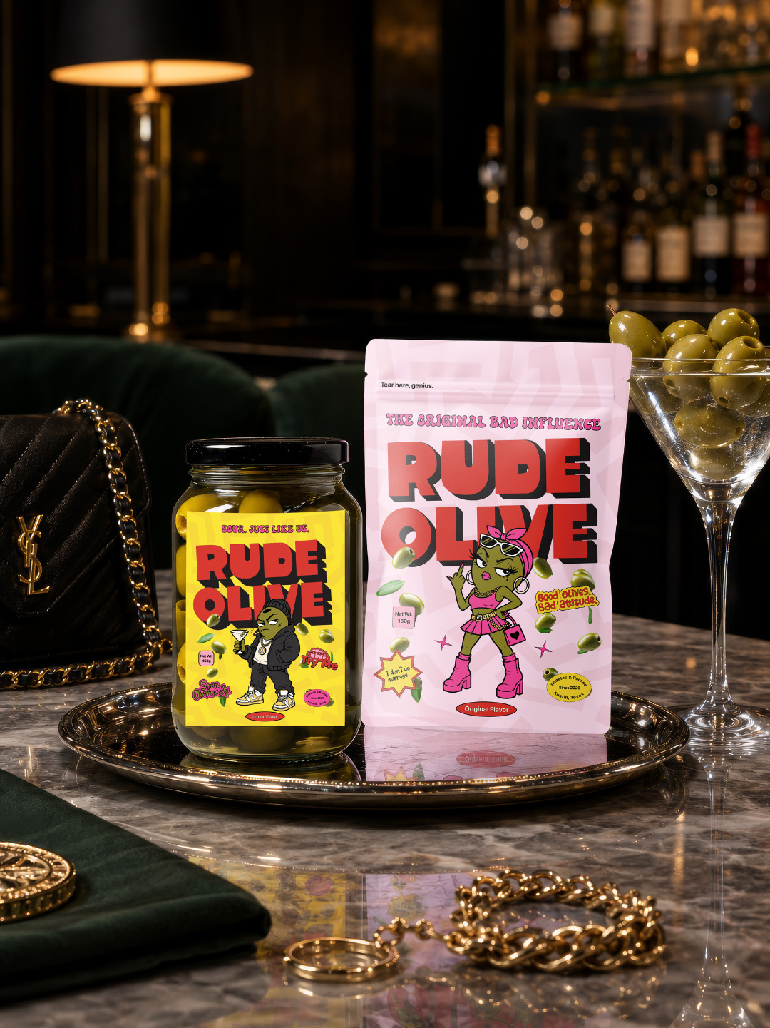
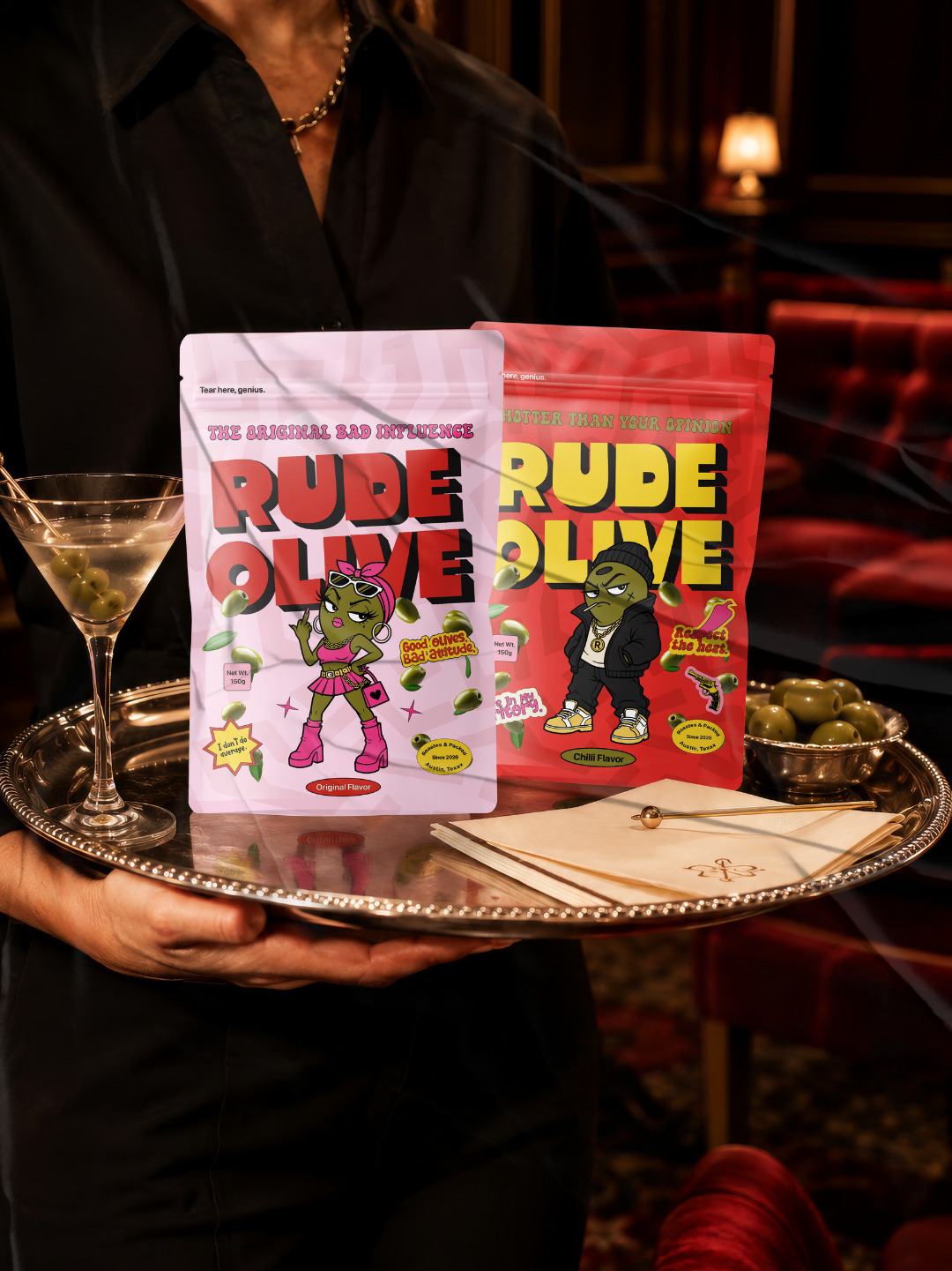
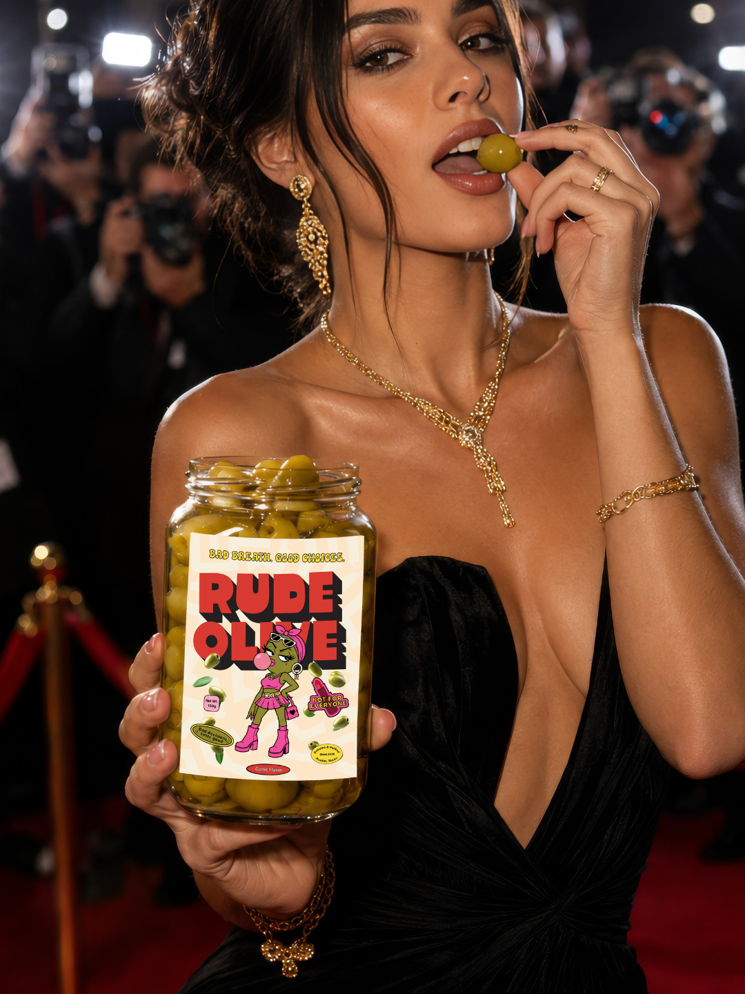
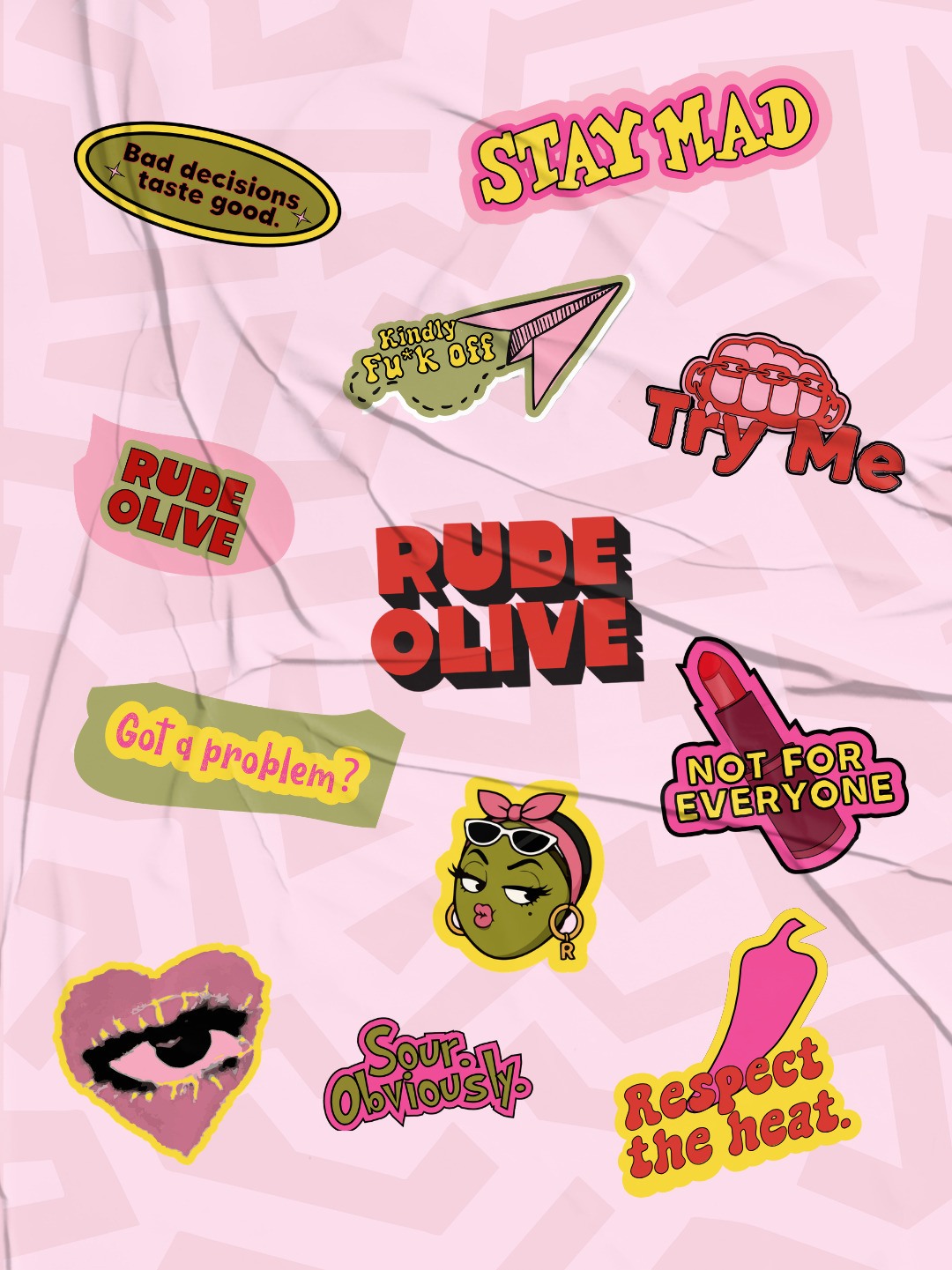
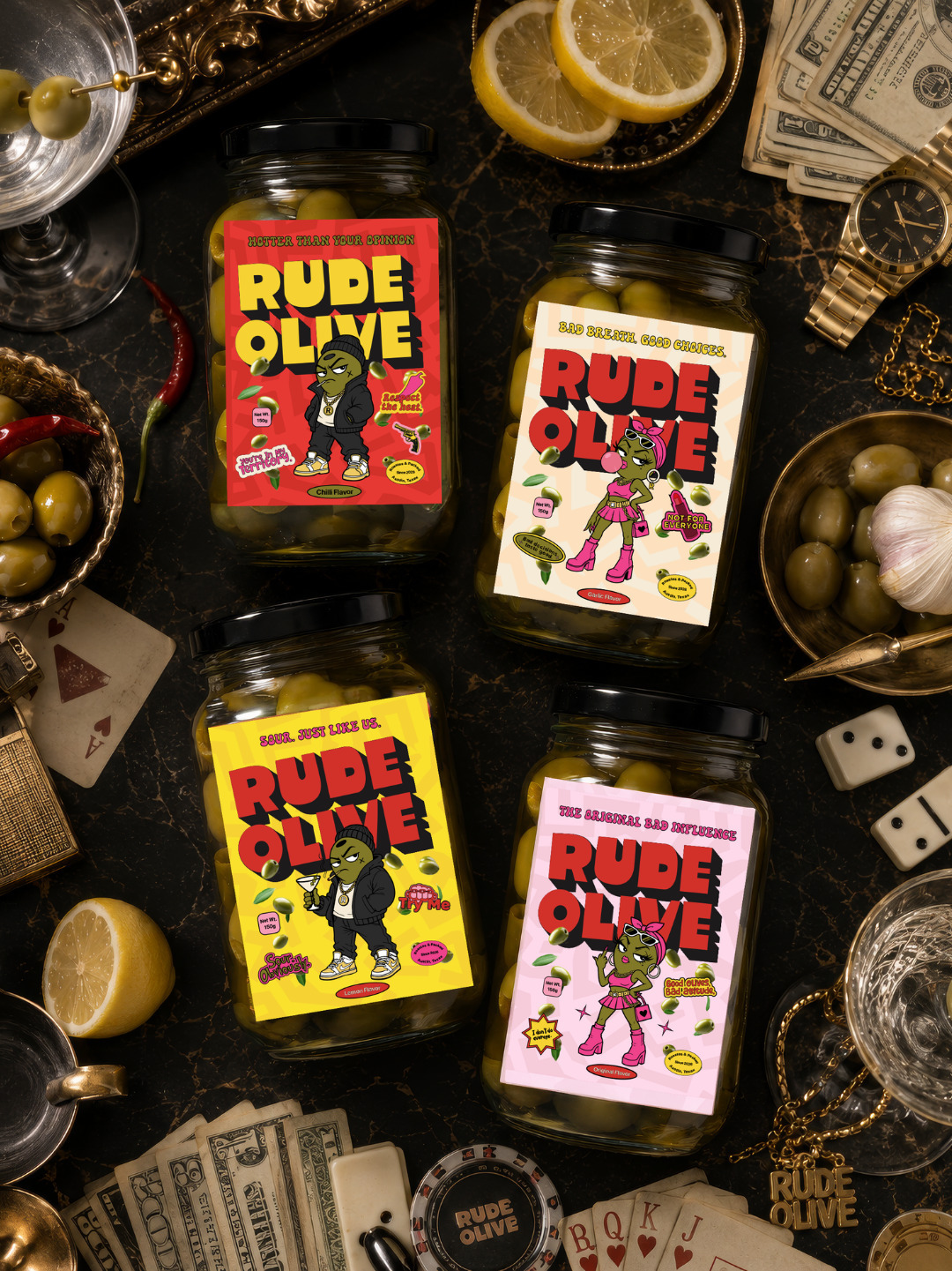
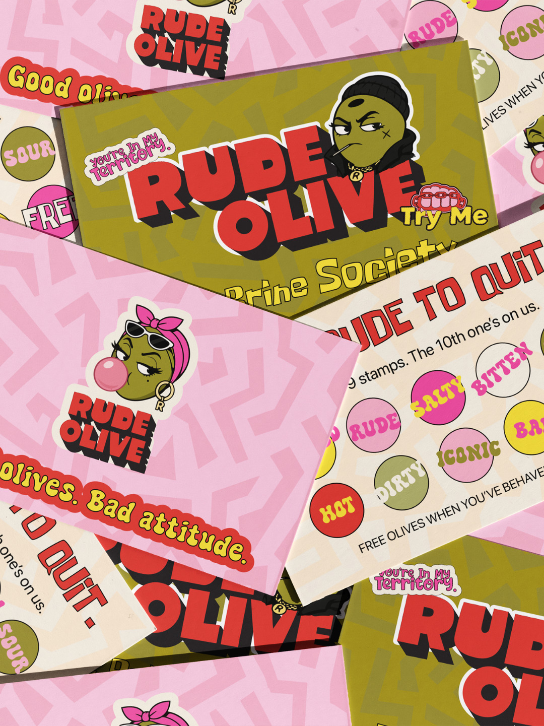
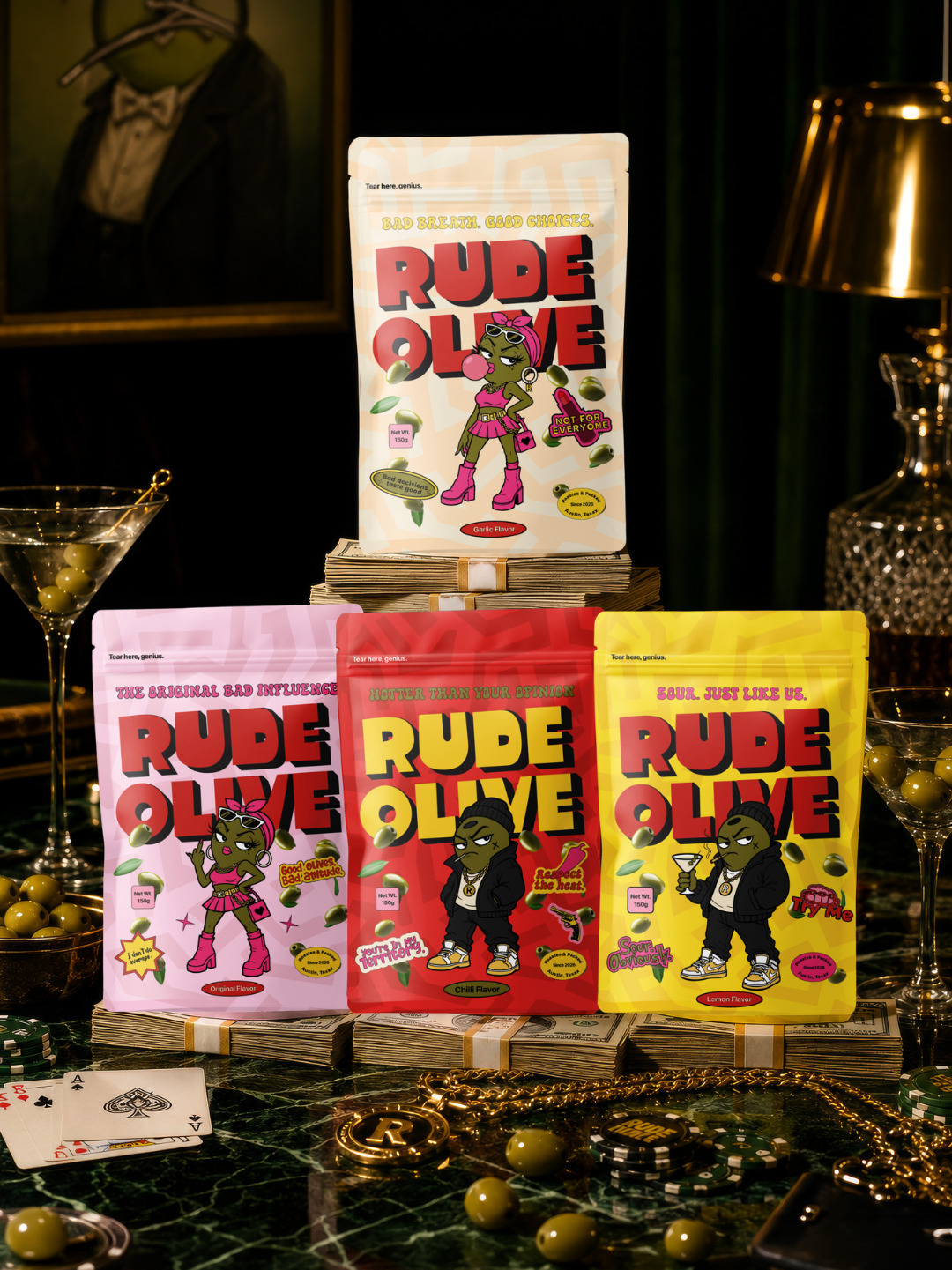
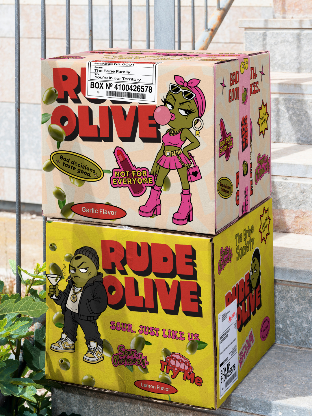
Four mascots, one per flavour, each carrying a different kind of rude energy. The chilli guy who looks at you like you stepped in his territory. The lemon one who’s sour and knows it. The garlic girl giving absolutely zero apologies.
The mascots do the work copy can’t. You see them before you read a single word, and you already have a feeling.
People think trust comes from looking polished. It doesn’t. It comes from being exactly what you say you are, and Rude Olive says it loud.
Good olives. Bad manners.





This brand is so cool, I love the olive characters they have so much fun personality!