


Simple energy – protein bar
Company
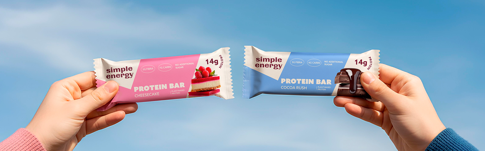
Simple Energy is all about giving people natural power through plant-based protein – no unnecessary ingredients, no complicated design.
Logotype
The logo was designed to be bold but simple. The lowercase letters and clean shapes make it friendly and easy to remember. The name itself already carries the message – “simple energy”- so the design had to look straightforward and honest.
Packaging
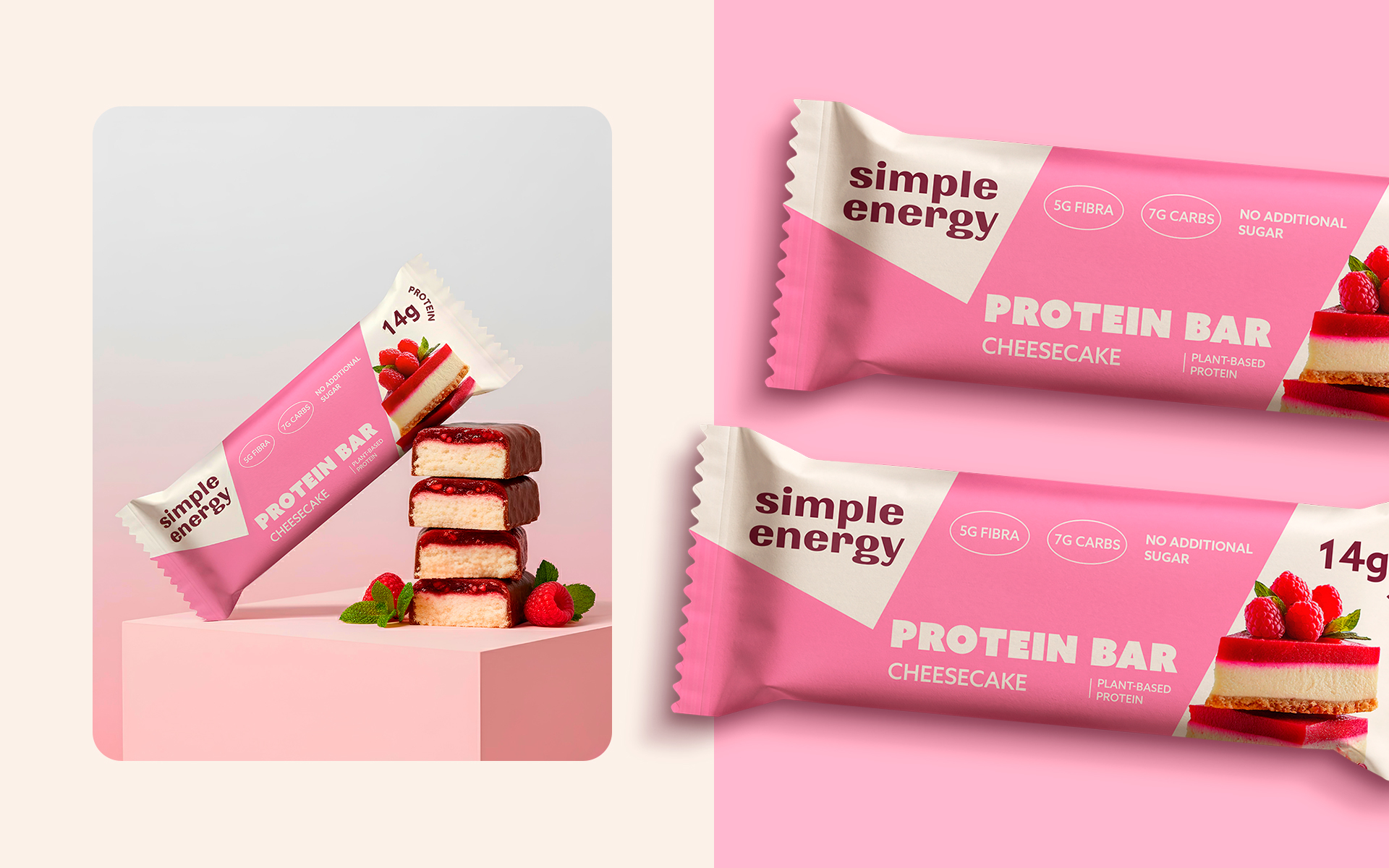
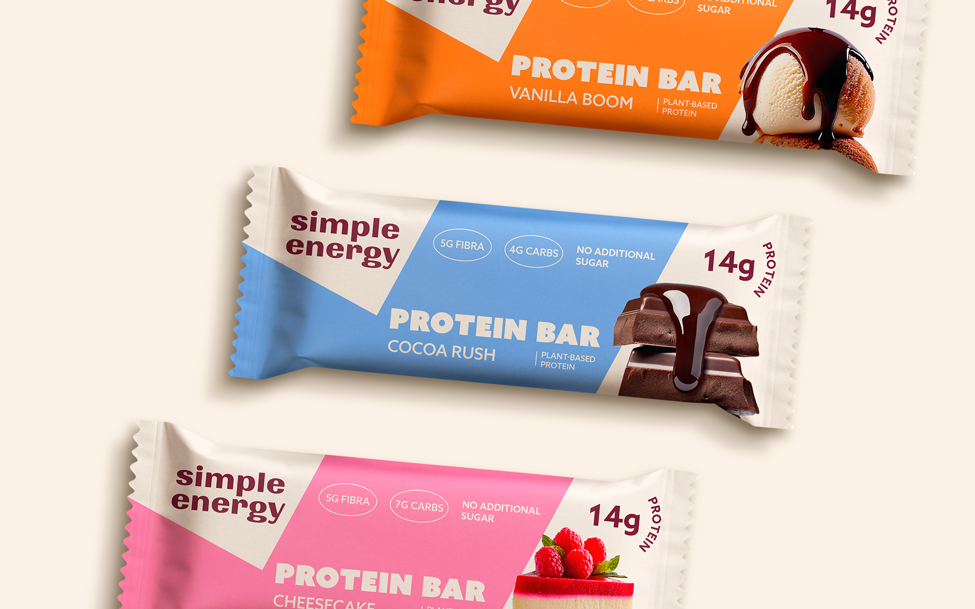
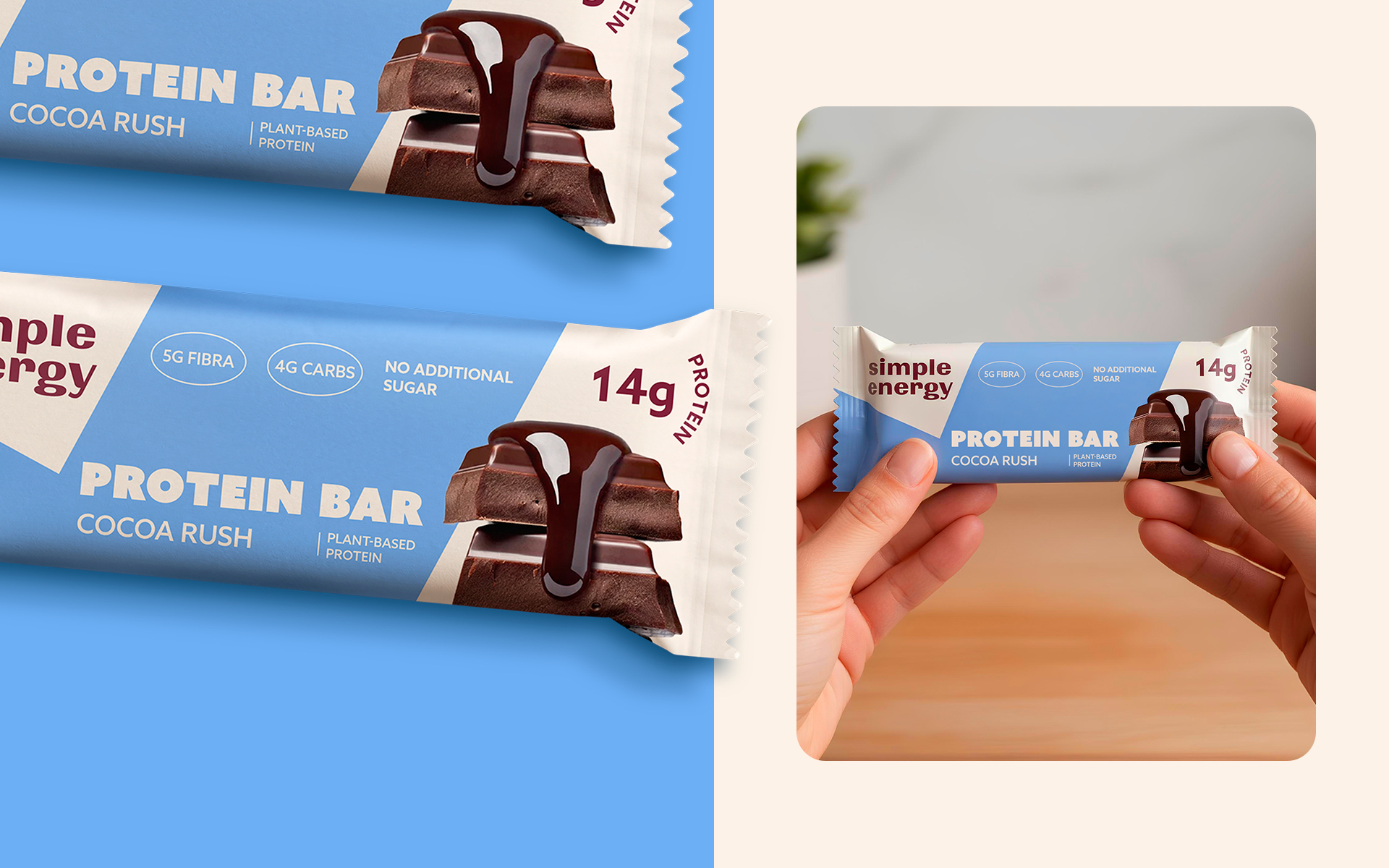
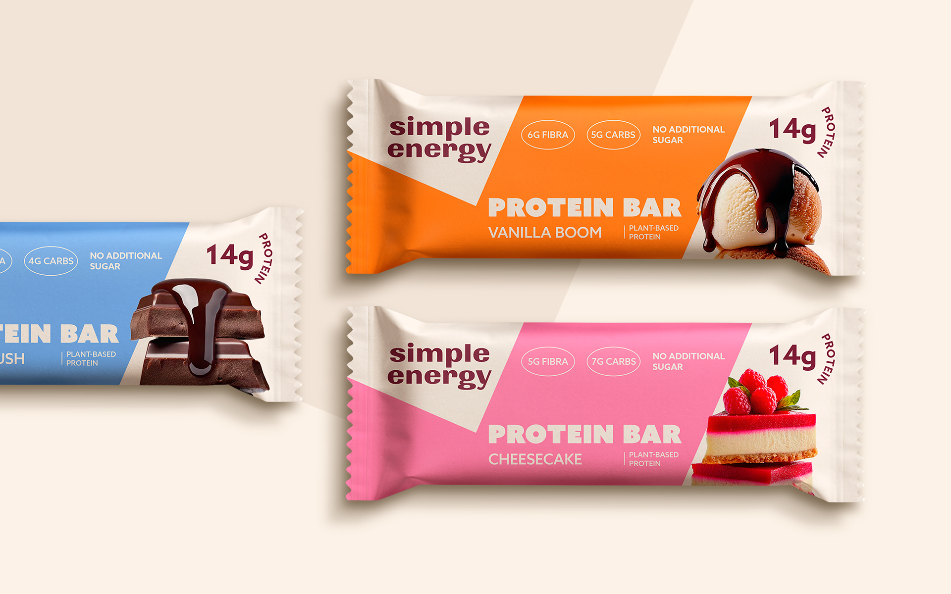
For the packaging, I focused on a minimal, colorful style that stands out on the shelf. Each flavor has its own bright color to make it easy to recognize. The result is a fresh, positive, and honest look that matches the brand’s message: simple, natural energy for everyday life.
Related Posts







Leave a Comment