The Beekeeper’s Season Honey Brand Identity & Packaging
We don’t preserve honey. We preserve summers.
Every Jar Is an Archive of Summer
Some summers stay with us forever.
The smell of warm grass. Bees humming somewhere beyond the garden fence. Apples ripening in the orchard. A jar of honey on the kitchen table. Homemade soap drying by the window. Walnuts preserved in honey in the pantry.
The Beekeeper’s Season is a conceptual identity and packaging system inspired by childhood memories of summers spent in the countryside. It is a small-batch honey and apothecary brand built around a simple idea:
The Challenge
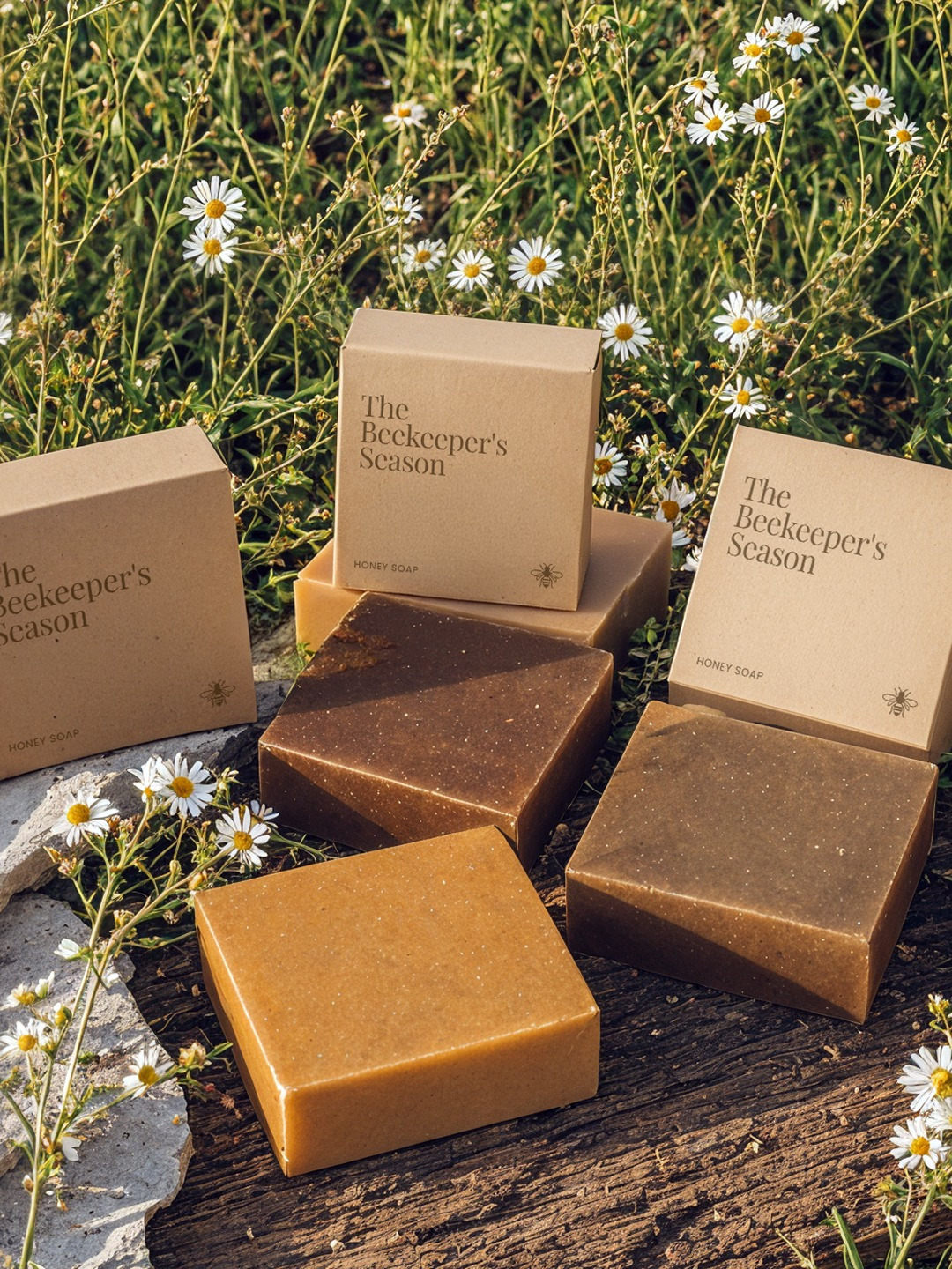
Most honey brands communicate nature through generic rustic visuals or overly premium aesthetics.The goal was to create a brand that feels both authentic and emotionally meaningful, transforming honey from a commodity into a carrier of memories, stories and seasonal rituals.The identity needed to connect traditional beekeeping with contemporary design while supporting an expandable product line including honey, honey granola, nuts preserved in honey and handcrafted soap.
The Concept
The entire brand is built around the idea of archiving seasons.Every harvest is unique because every summer is unique. Different flowers bloom. Different weather shapes the landscape. Different bees collect nectar from different places.Instead of presenting honey as a product, The Beekeeper’s Season presents it as a record of a particular summer.Each jar tells the story of a season, a landscape and the people who harvested it.
Visual Identity
The visual language combines the warmth of traditional countryside life with the refinement of contemporary artisanal packaging.
The typography draws inspiration from old apothecary labels, agricultural archives and family recipe books. Large serif headlines create a sense of heritage, while detailed secondary information reinforces the idea of documentation and seasonal records.
A palette of honey gold, beeswax beige, olive green and sun-faded earth tones reflects the landscapes where the harvest begins.
Packaging System
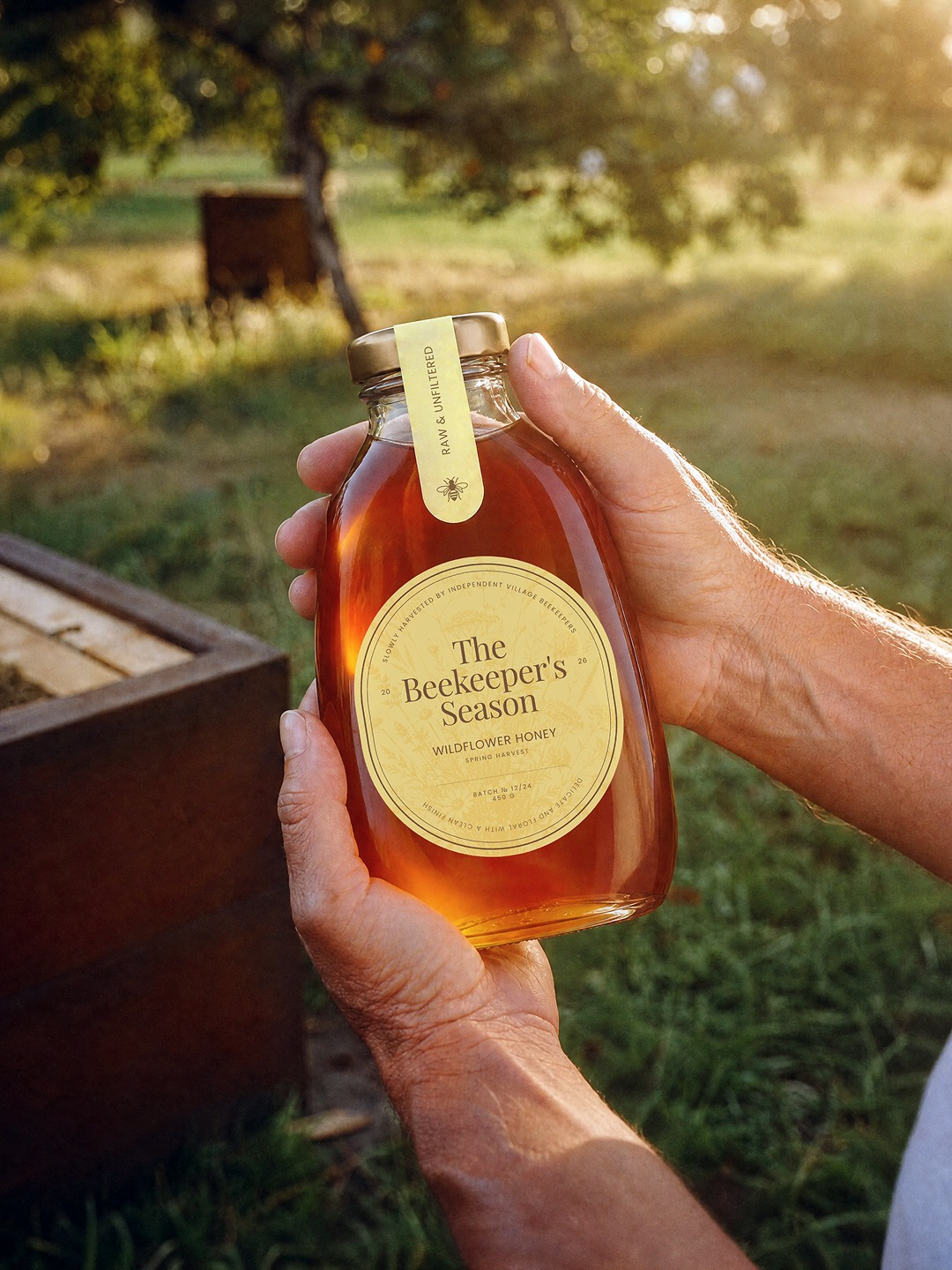
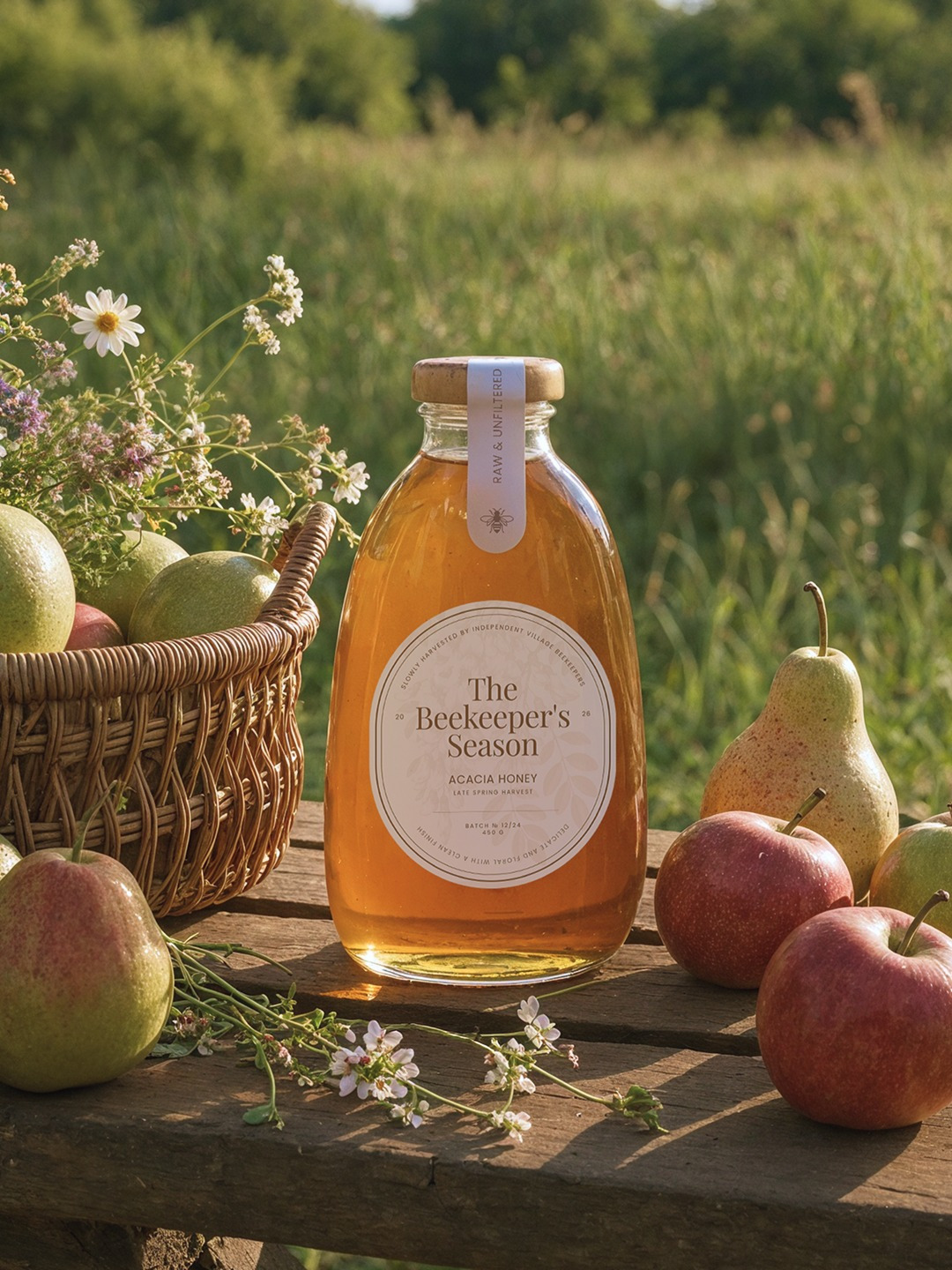
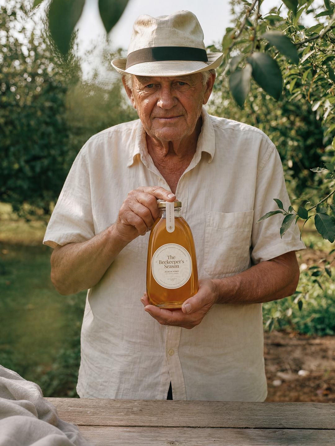
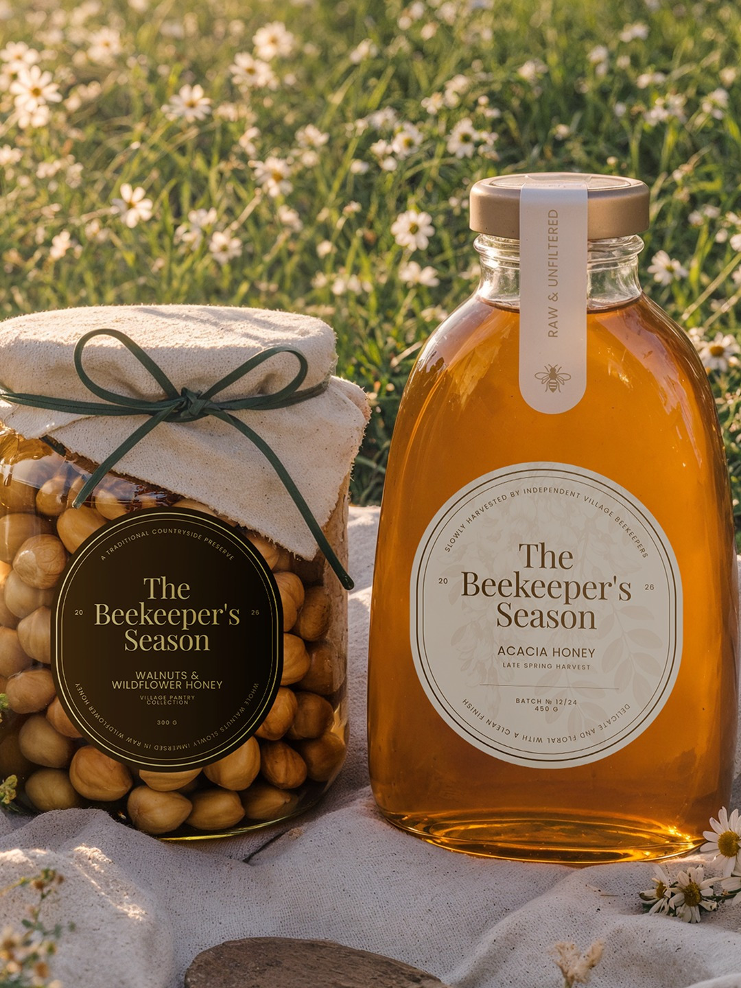
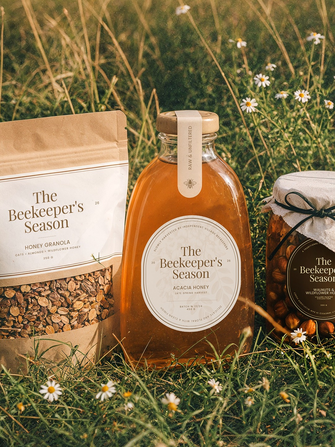
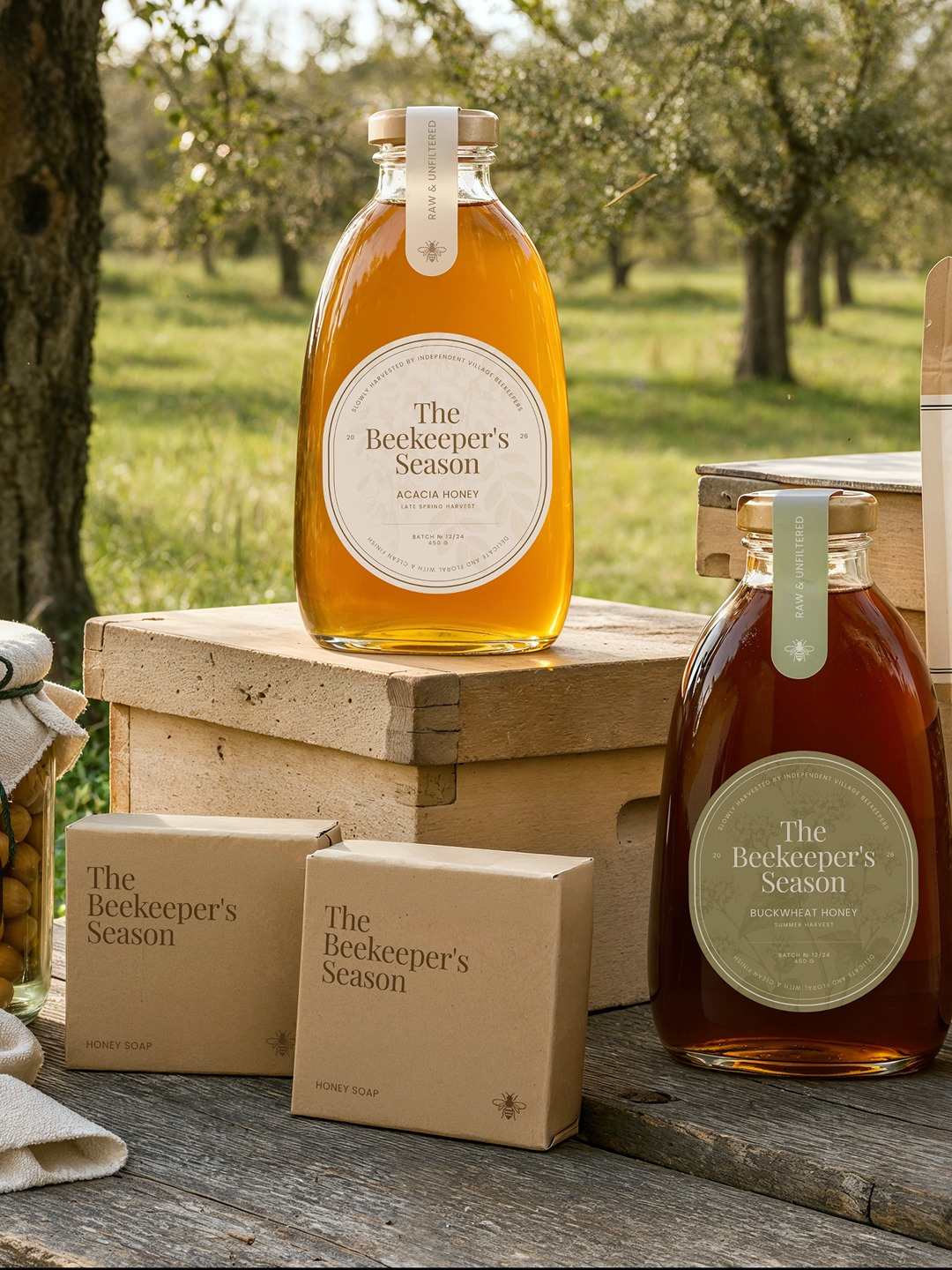
The hero product is a reusable glass honey bottle designed to feel like an object worth keeping long after the honey is gone.The packaging combines circular archival labels, harvest information, seasonal storytelling and tactile finishes. Fabric-covered lids and textured materials reference traditional preserving methods found in rural households.
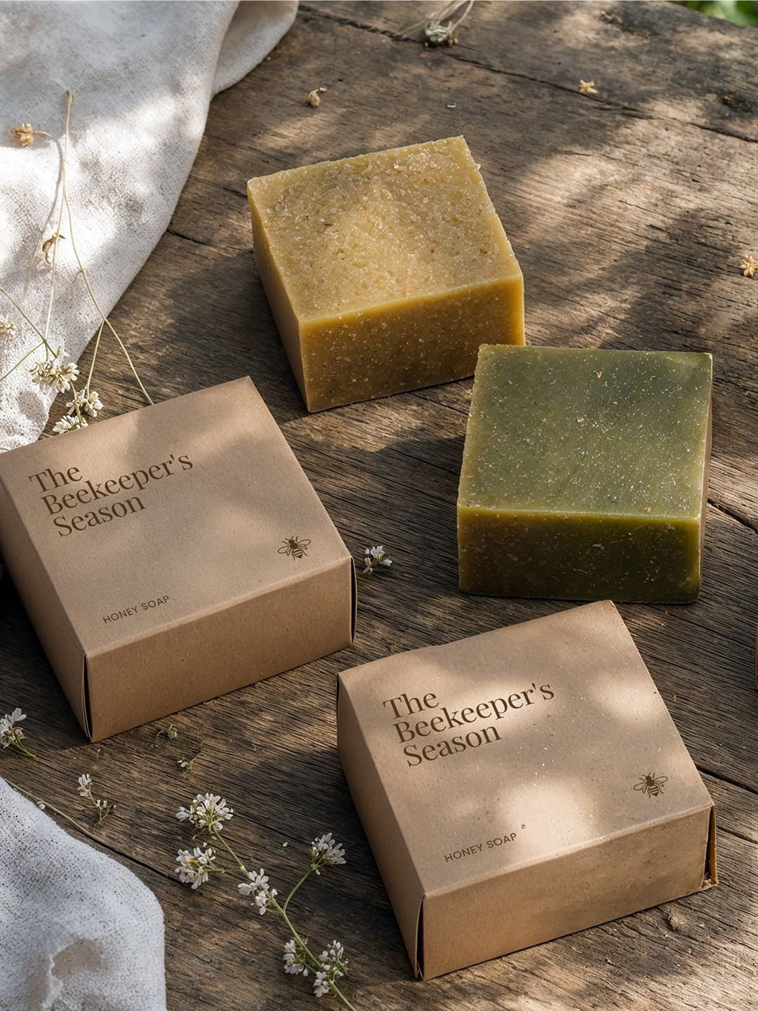
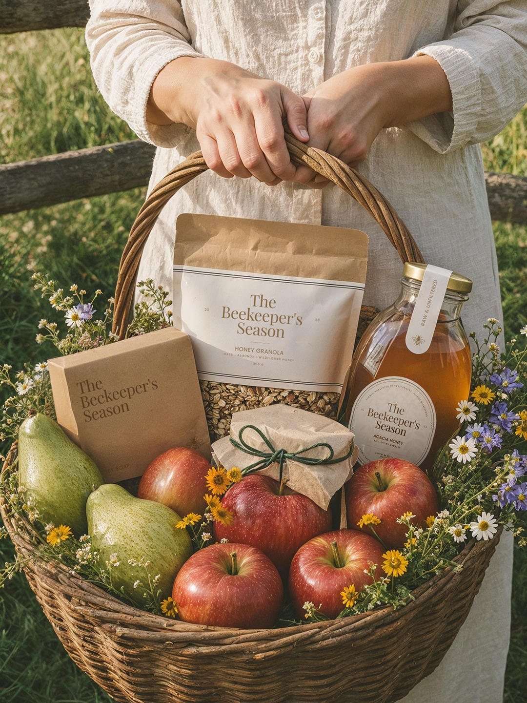
The identity expands naturally across additional products:
- Raw Honey
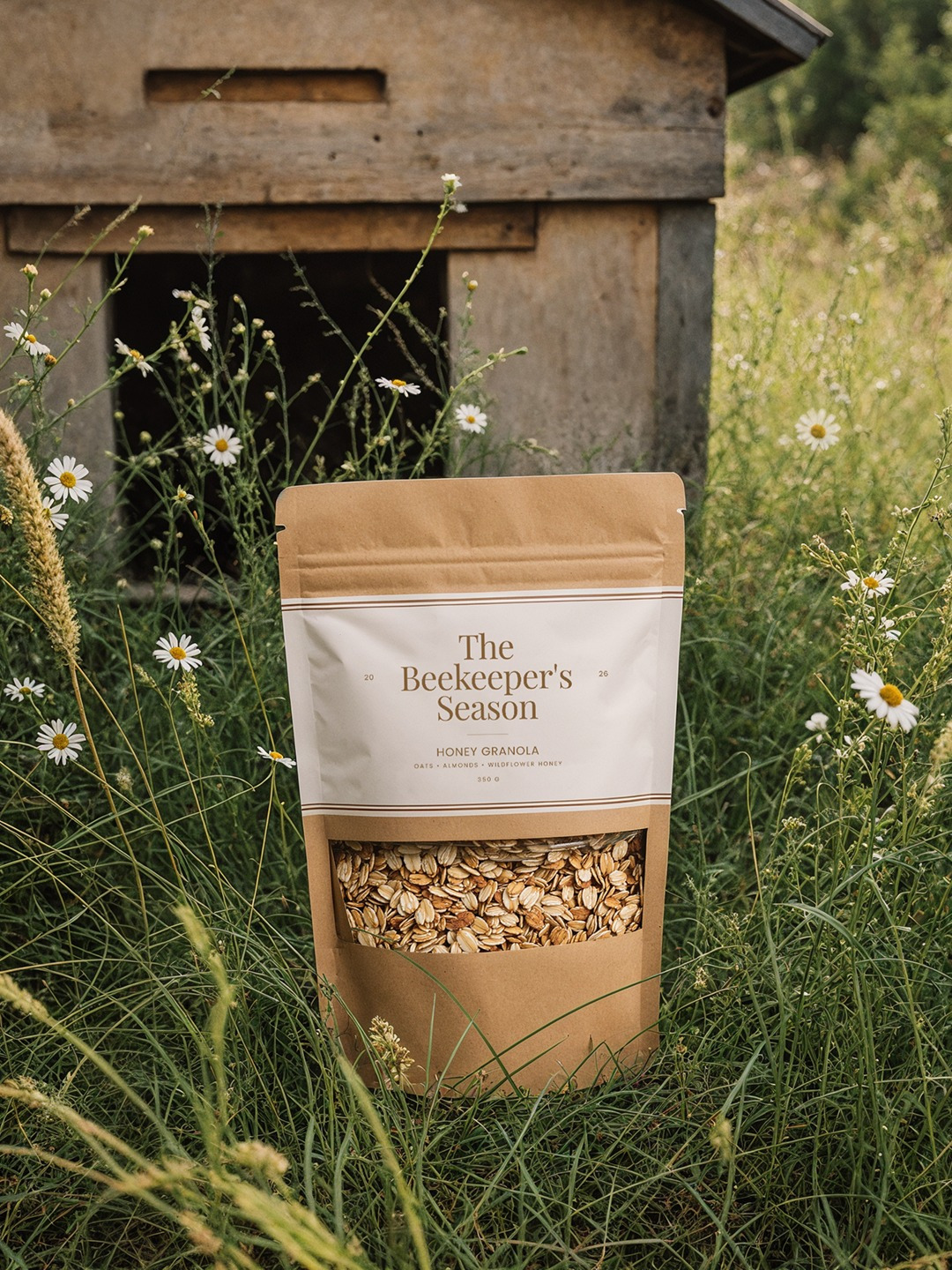
- Honey Granola
- Nuts in Honey
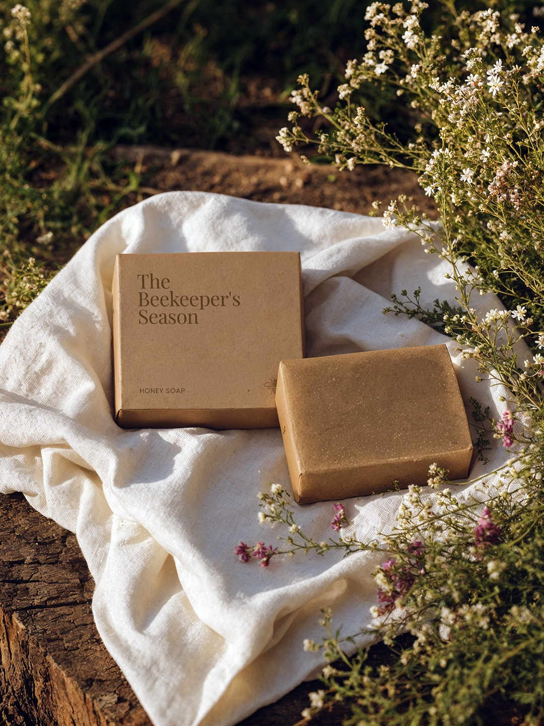
- Handcrafted Honey SoapTogether they create a modern interpretation of a countryside pantry.
Photography Direction
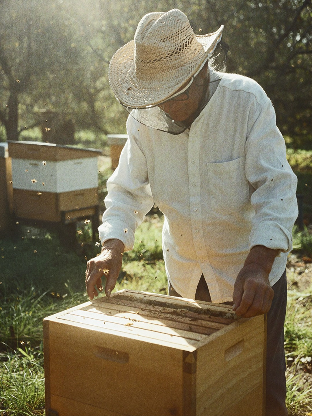
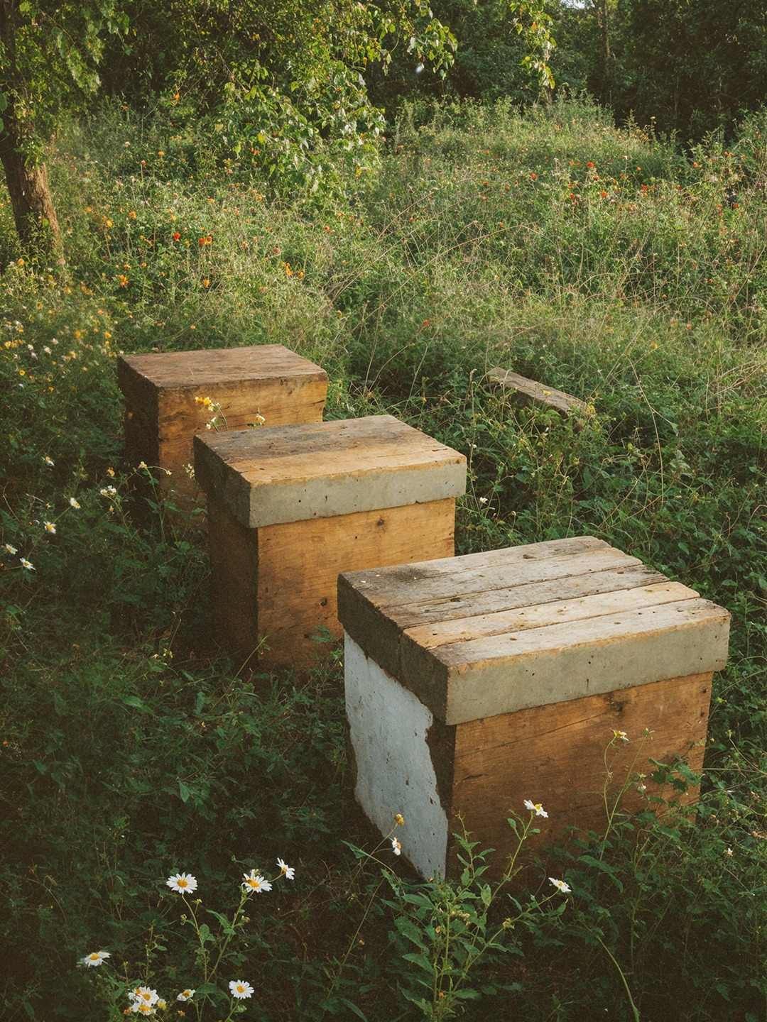
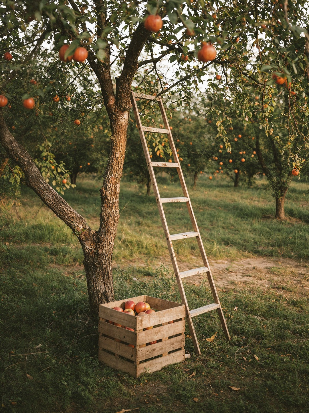
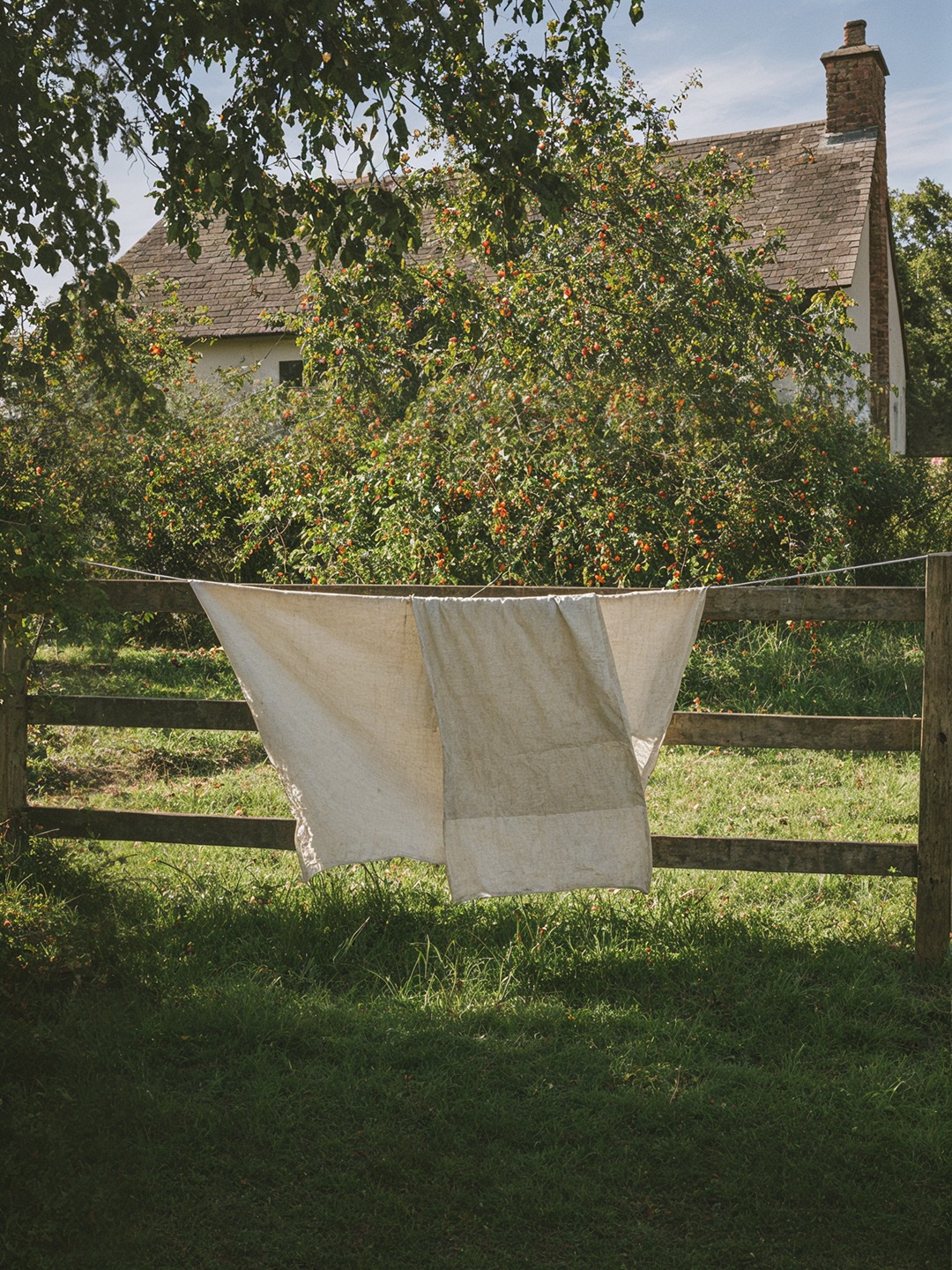
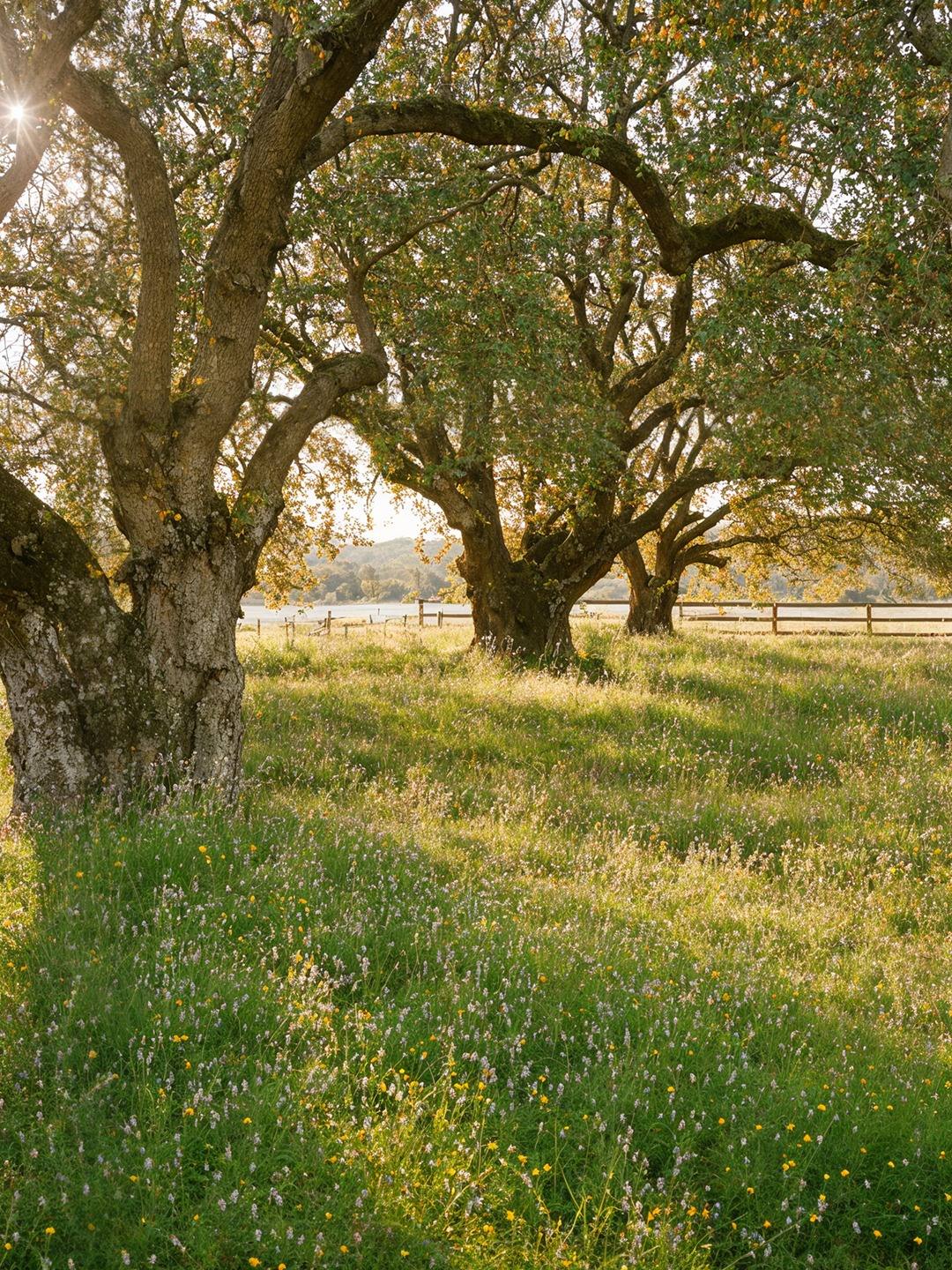
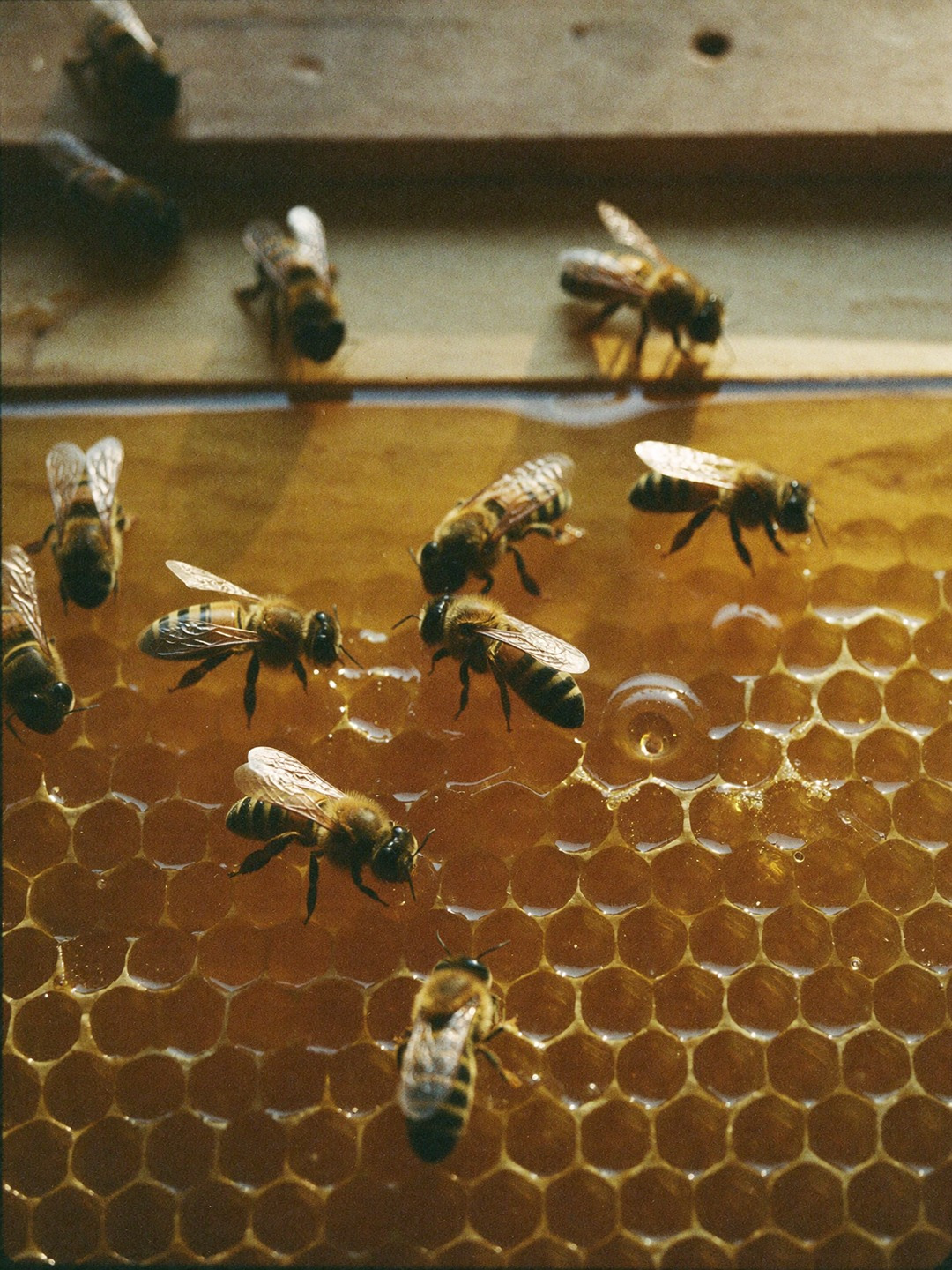
The photography focuses on memory rather than perfection.Sunlit orchards. Wooden ladders. Wildflowers. Weathered hands. Bees at work. Honeycombs fresh from the hive.The imagery captures the beauty of real production and the quiet rituals surrounding it.Each photograph feels less like advertising and more like a page from a family archive.
The Beekeeper’s Seasonis not simply about honey
It is about preserving the feeling of a summer that never completely leaves us.