True Nuts — Brand Identity & Packaging Design for an Organic Snack Brand
ABOUT
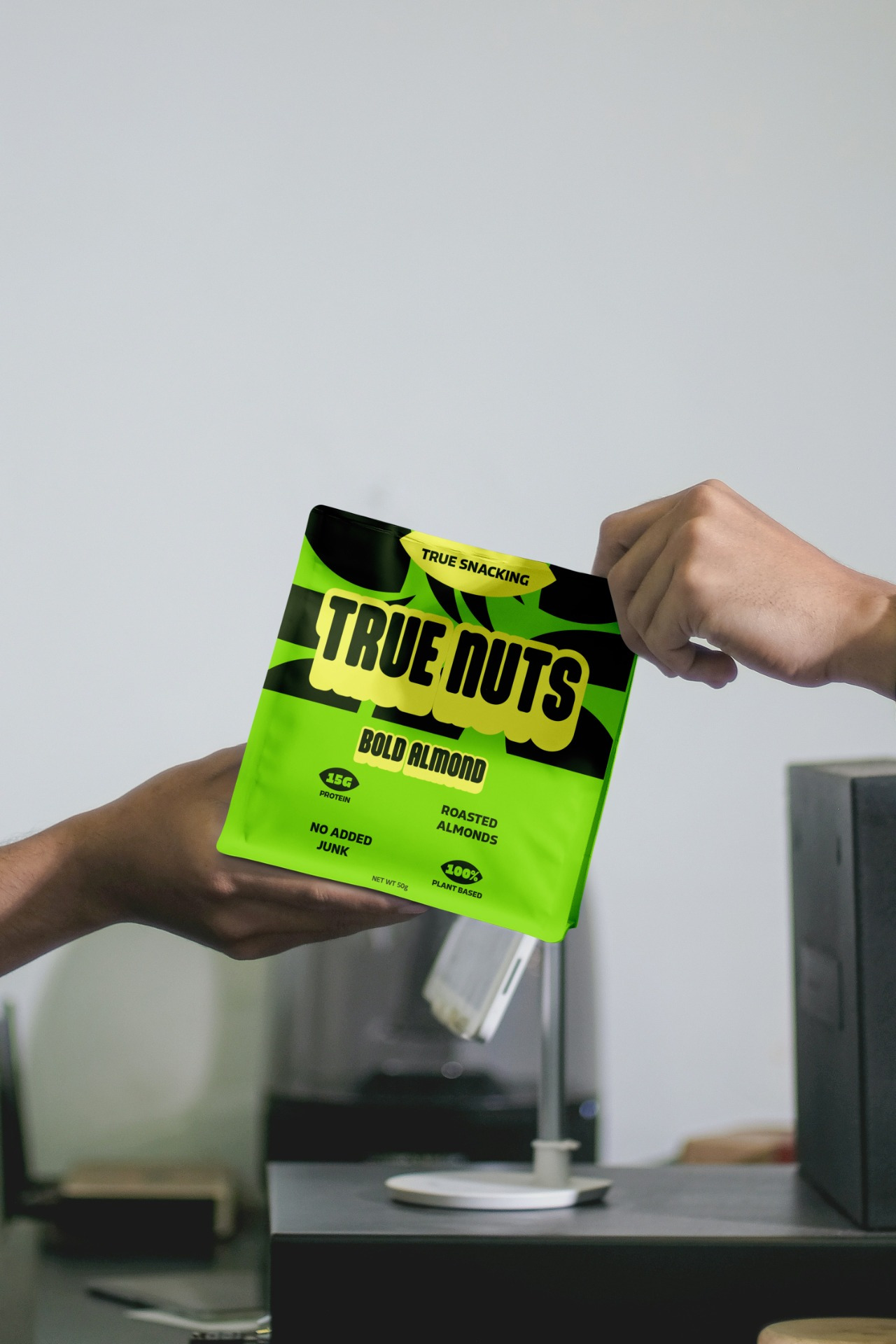
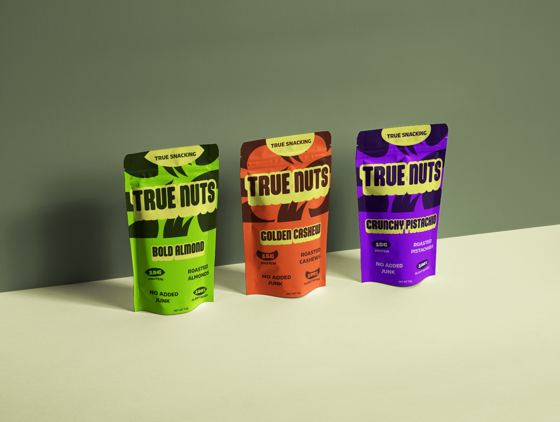
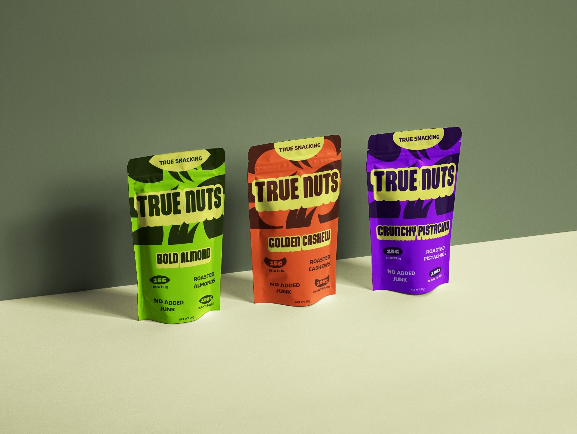
True Nuts is a conceptual brand identity and packaging project created for a modern organic snack brand that challenges the conventional natural food category. Instead of relying on muted colors and rustic aesthetics, the project explores how bold typography, vibrant packaging, and energetic layouts can transform healthy snacking into an exciting and memorable brand experience.
The concept is built around four core principles—Bold, Organic, Fresh, and Disruptive—creating a visual identity that immediately stands out on the shelf while remaining rooted in clean, plant-based ingredients.
SOLUTION
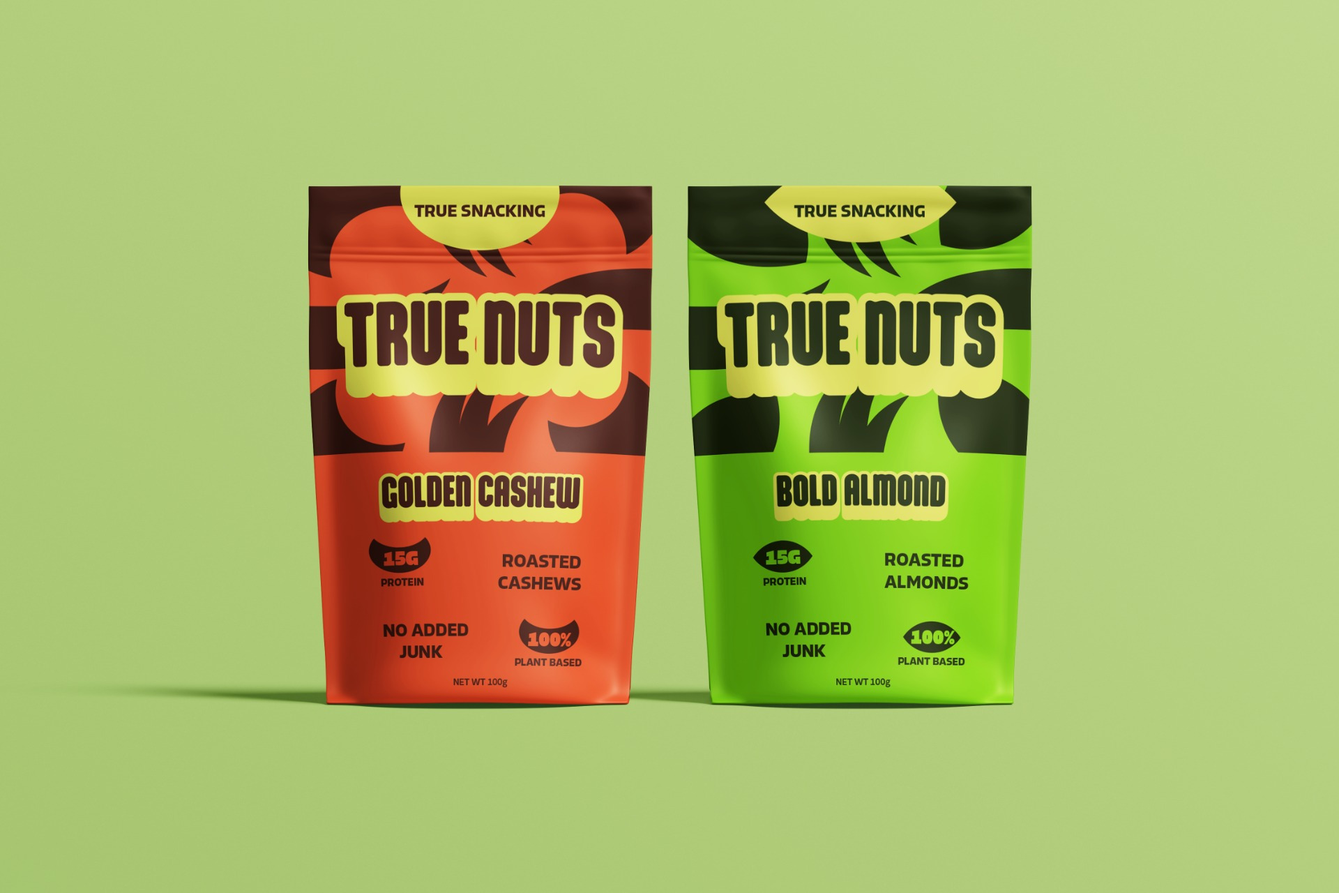
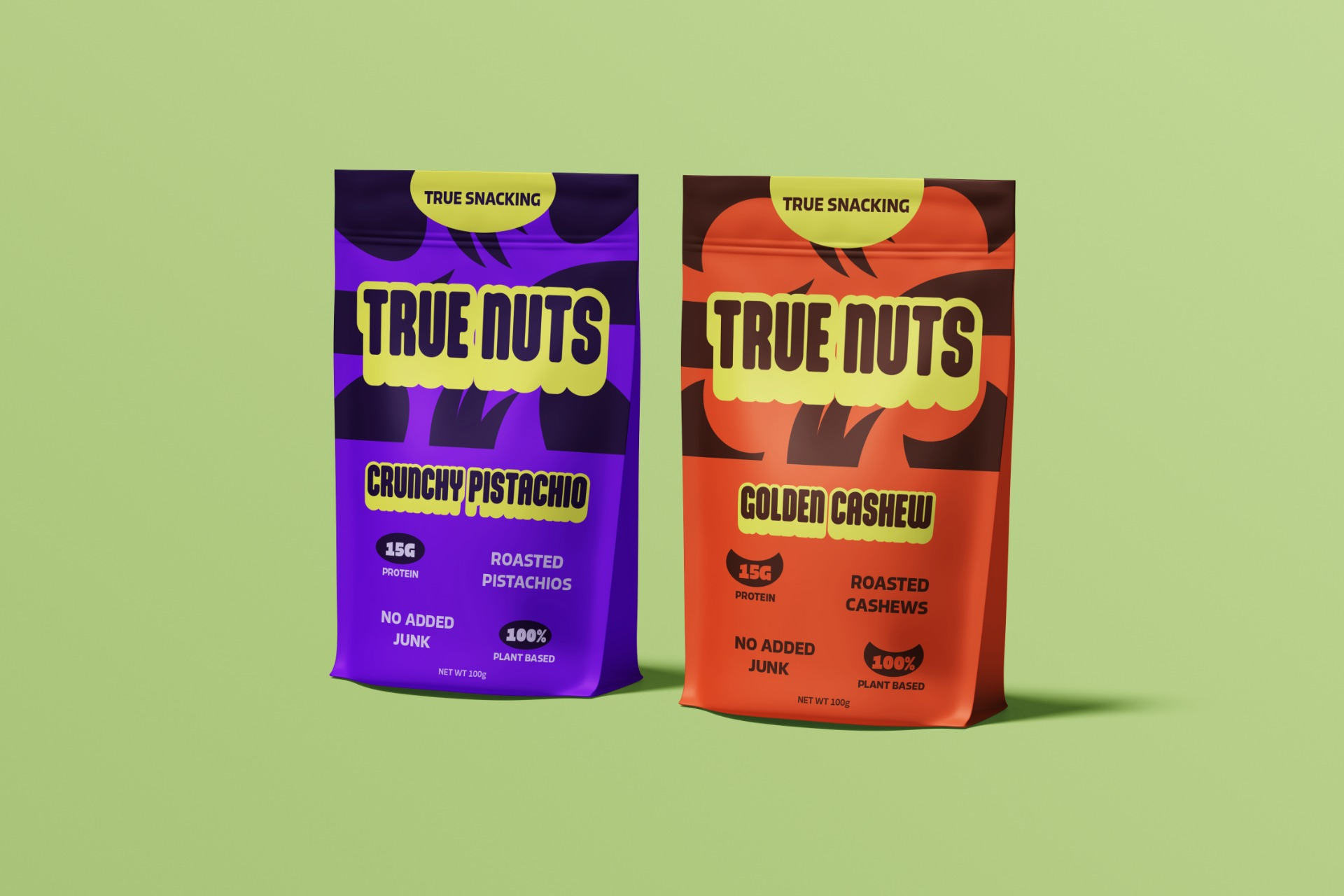
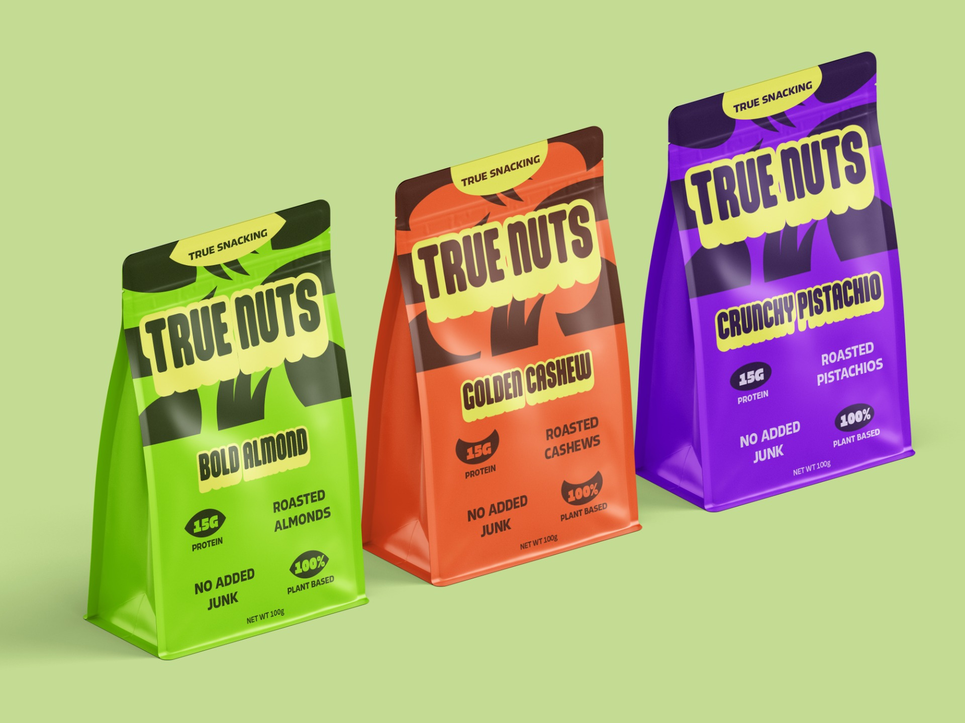
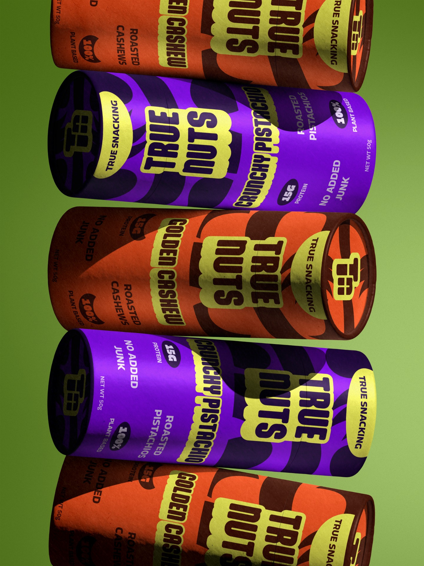
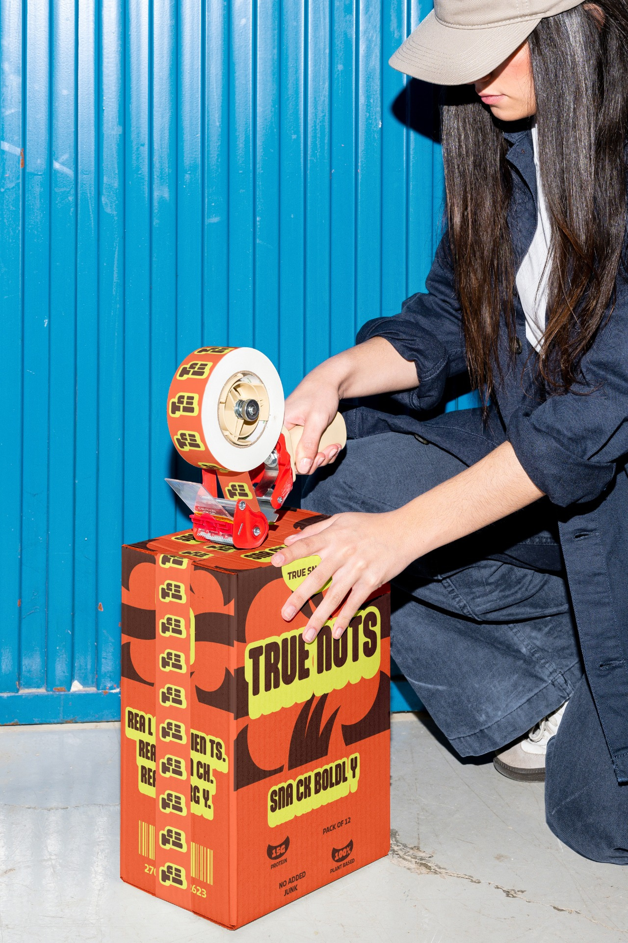
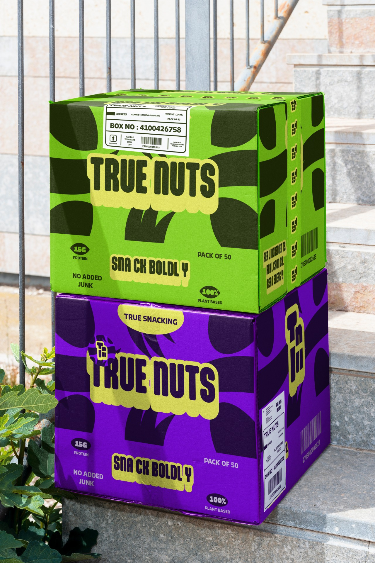
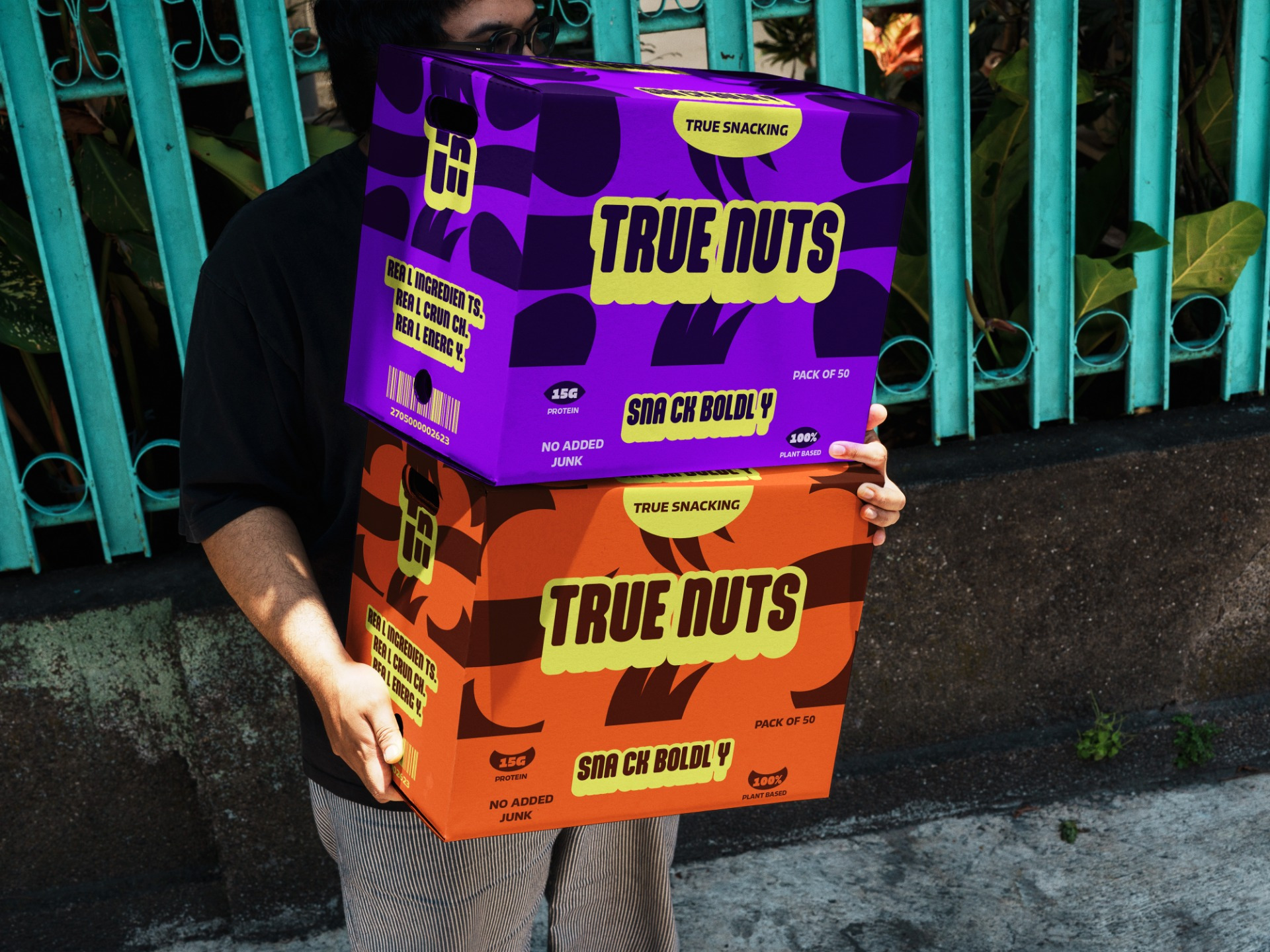
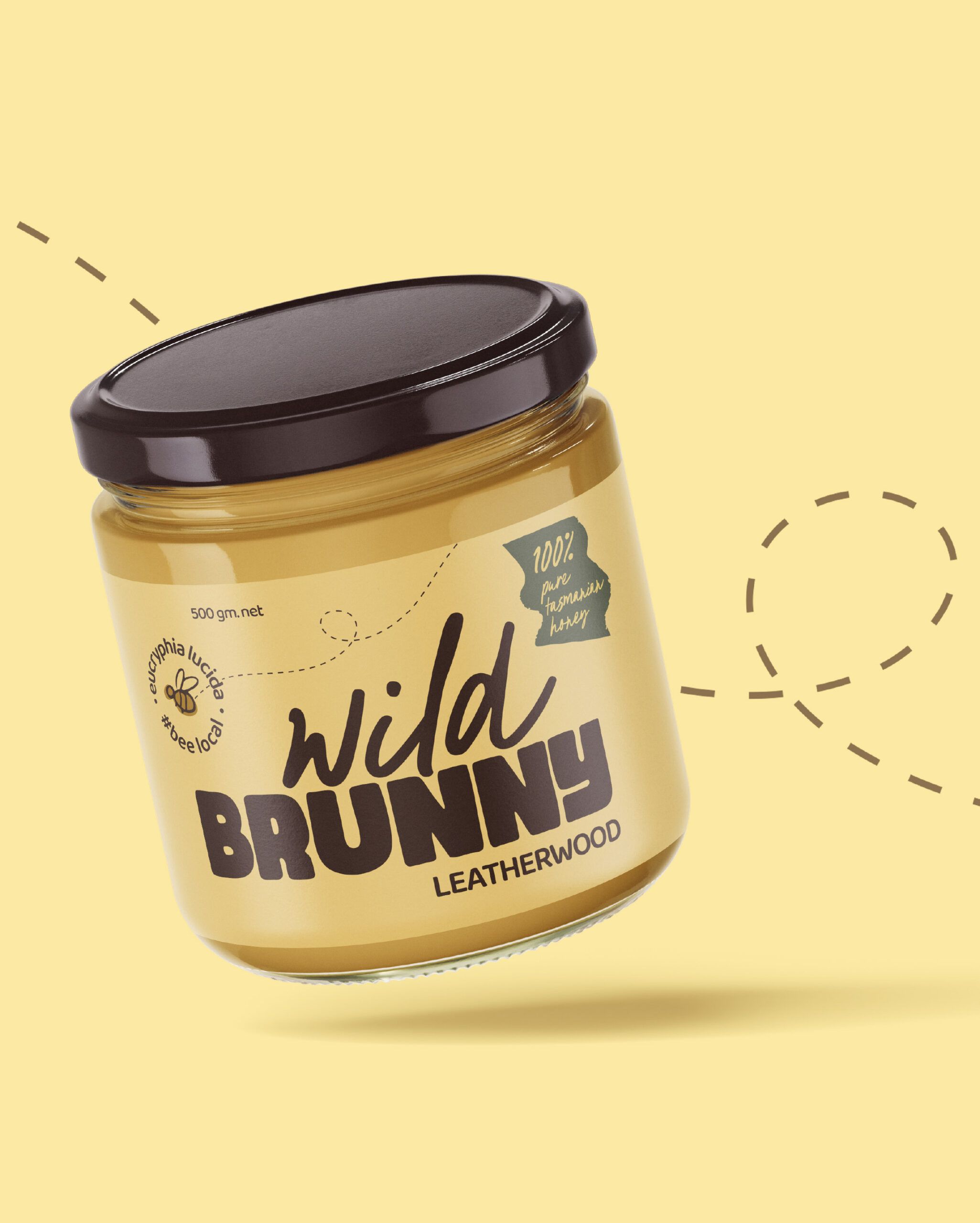
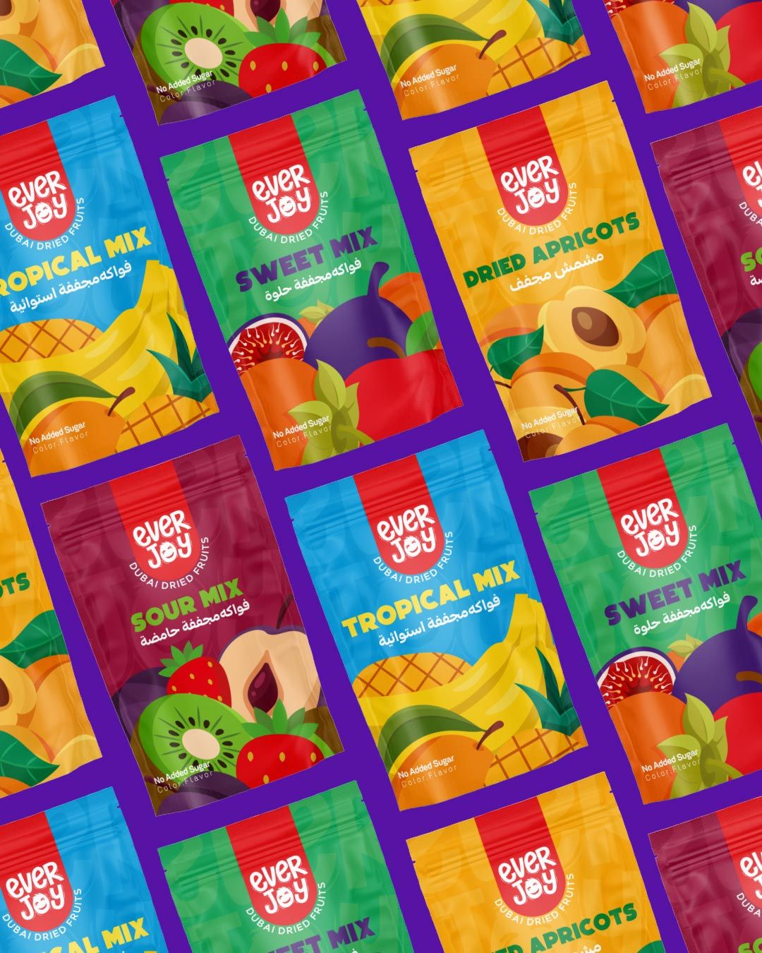
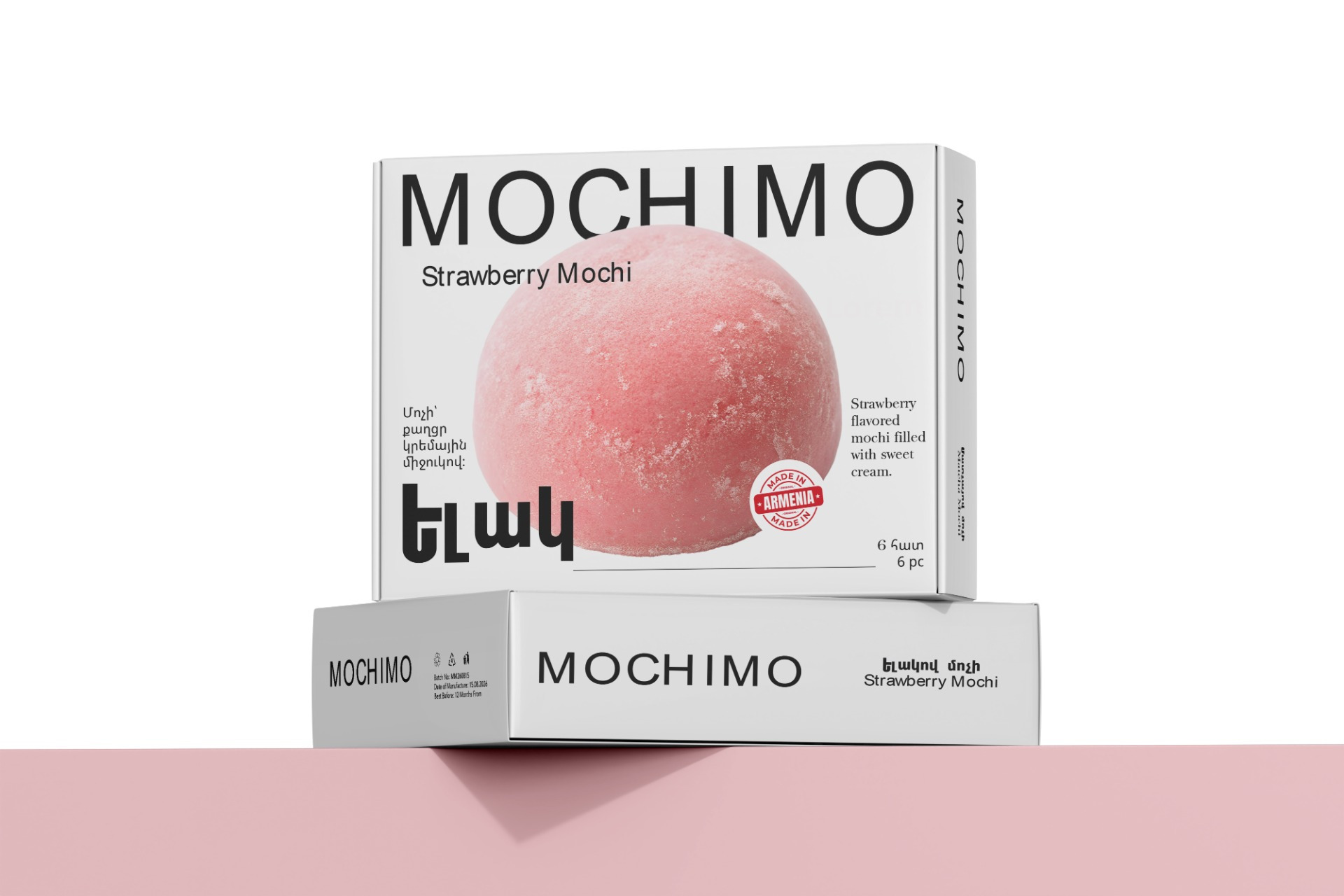
The packaging system is designed to maximize shelf impact through oversized typography, high-contrast color palettes, and expressive graphic compositions. Each product variant is differentiated using vibrant colors while maintaining a consistent visual structure across the entire range, creating both recognition and flexibility.
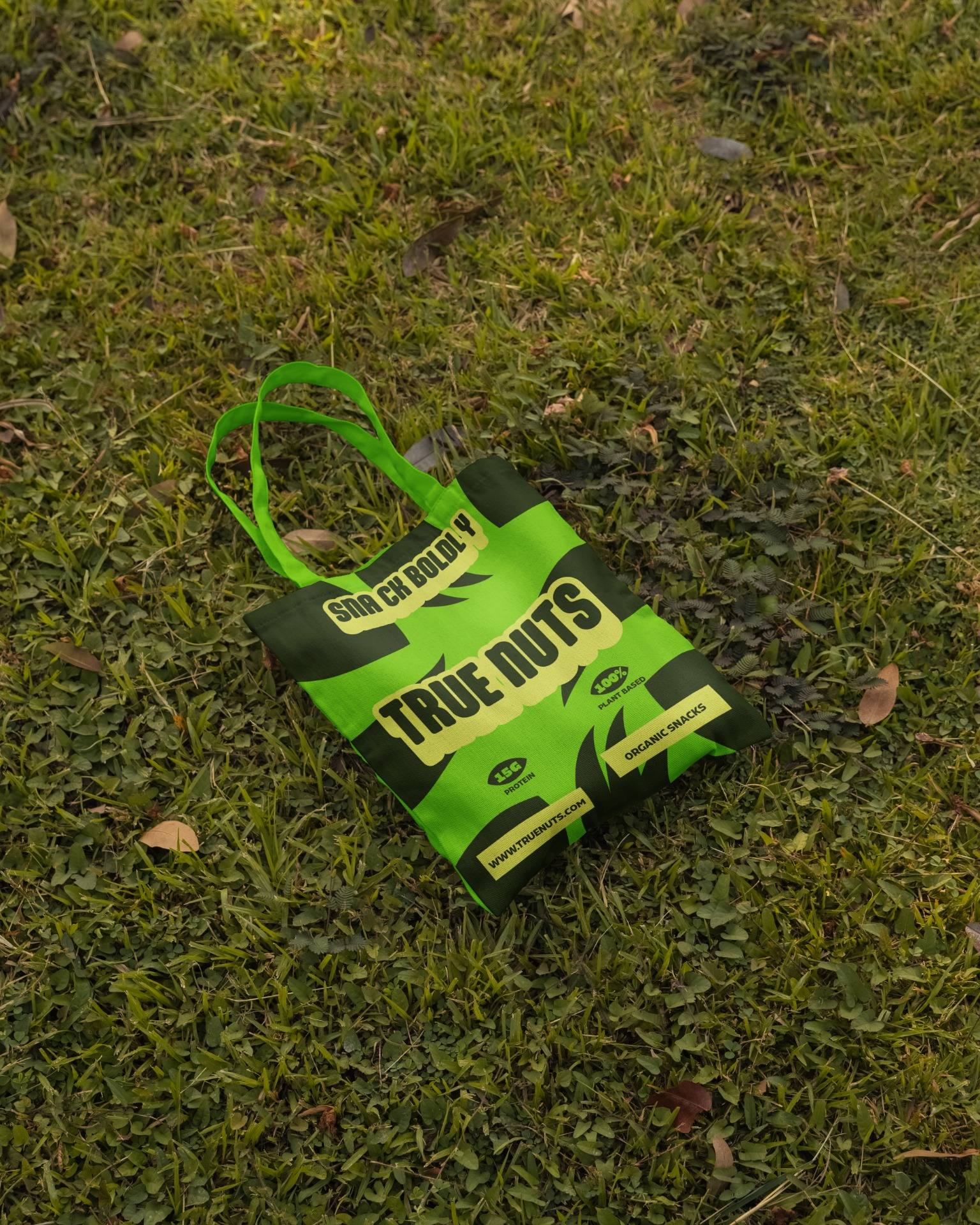
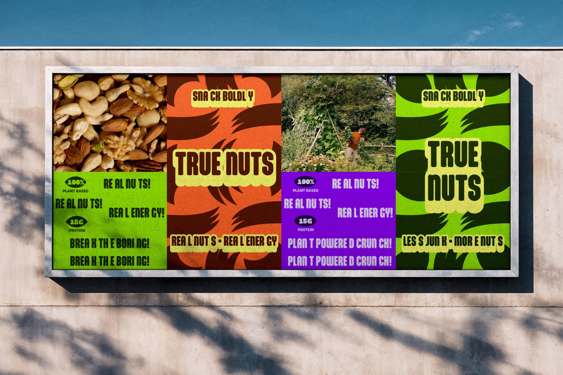
Beyond the primary packaging, the identity extends into shipping boxes, retail displays, promotional graphics, and branded merchandise, demonstrating how the system scales across multiple customer touchpoints while maintaining a cohesive visual language.
RESULT
True Nuts reimagines what an organic snack brand can look like by replacing predictable natural food aesthetics with a confident, contemporary identity. The result is a packaging system that is distinctive, memorable, and highly recognizable, proving that clean, plant-based products can be just as bold and expressive as they are natural.