Patcha Organic Juice Visual Identity & Packaging
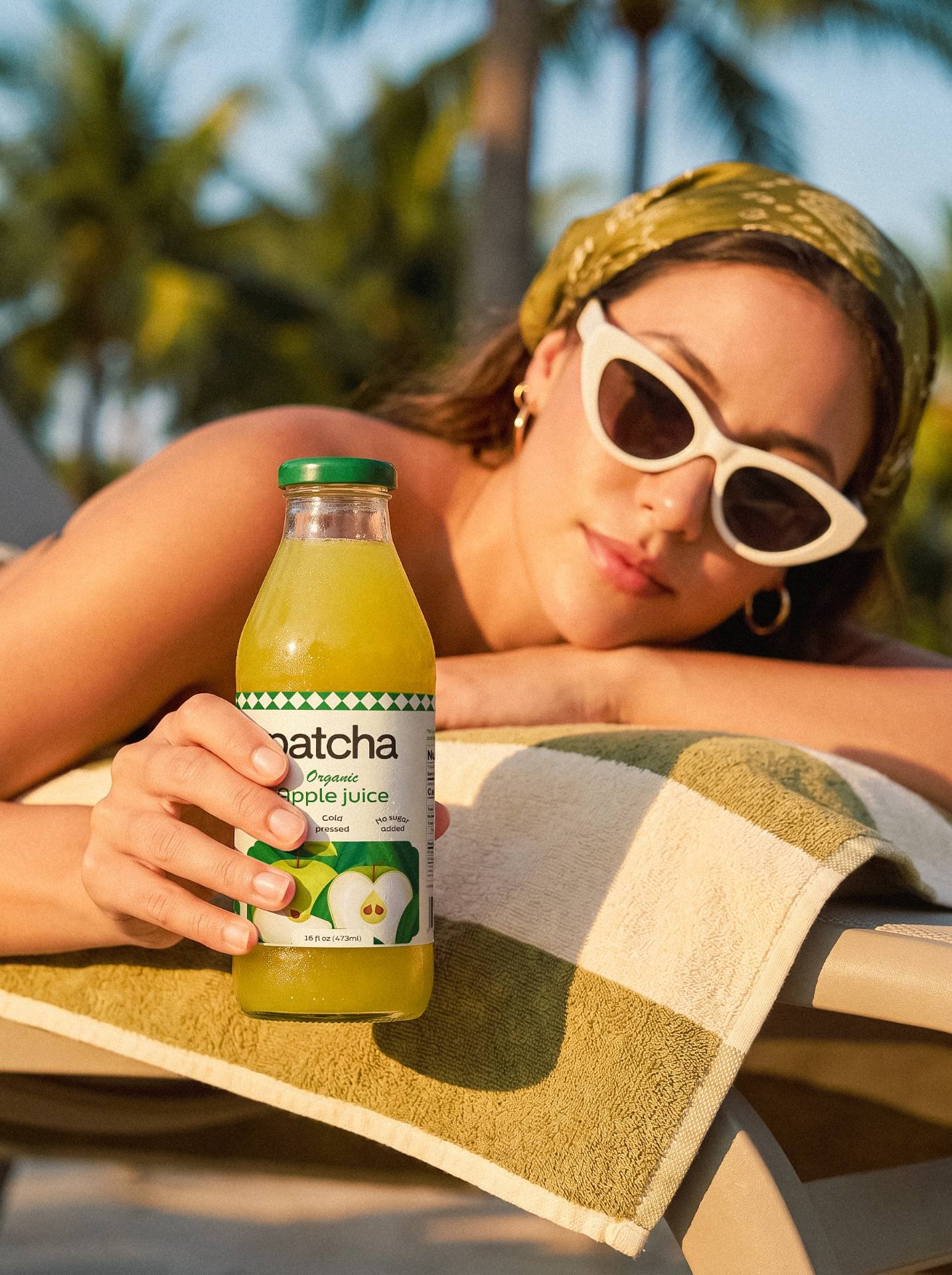
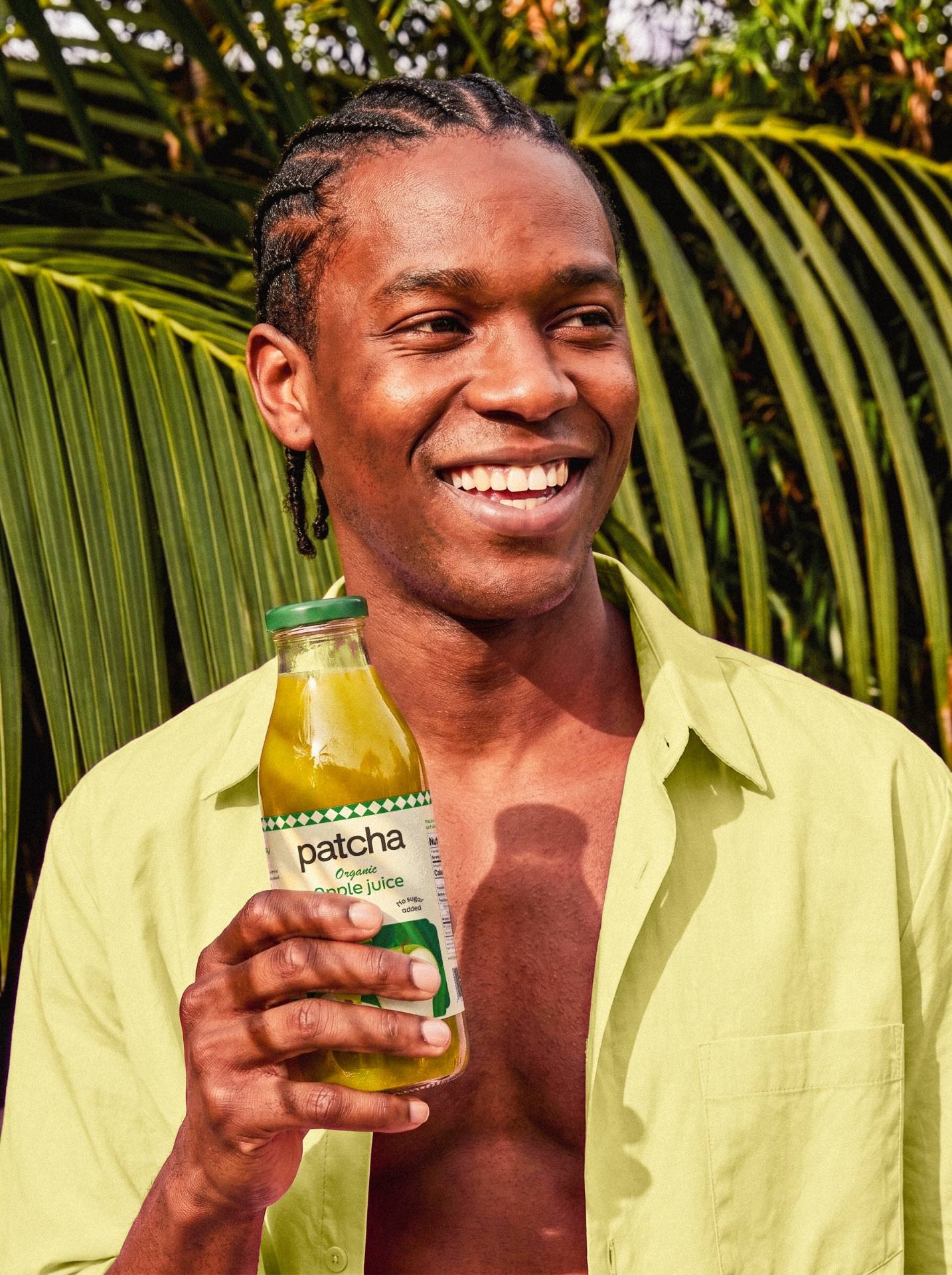
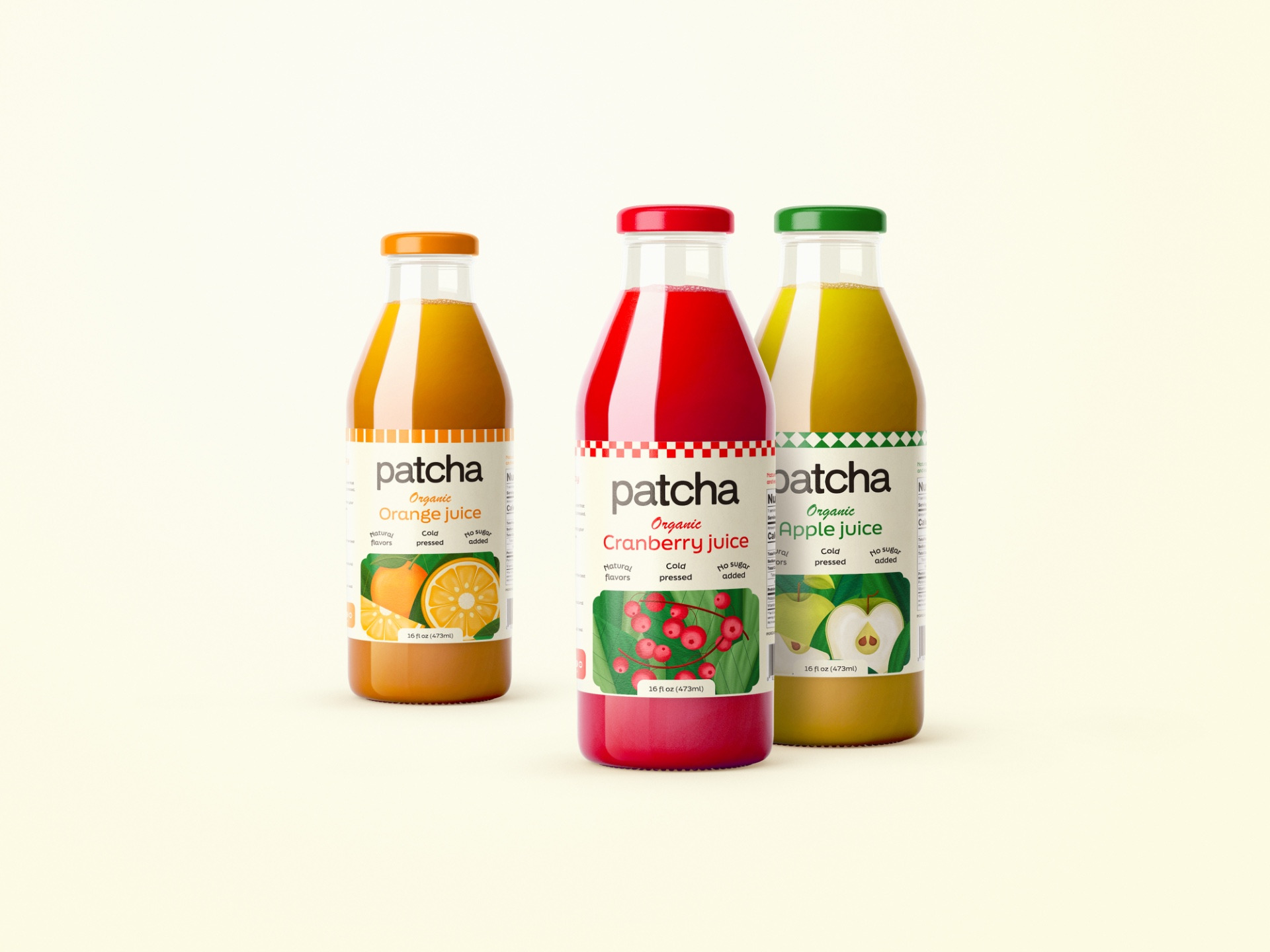
Patcha is an organic juice brand built around a simple idea: choosing something natural should not have to feel like a lifestyle statement. Within a category that often leans heavily into wellness, fitness, and health-focused communication, Patcha takes a more everyday approach. The product is natural, organic, cold pressed, and made to fit easily into people’s routines.
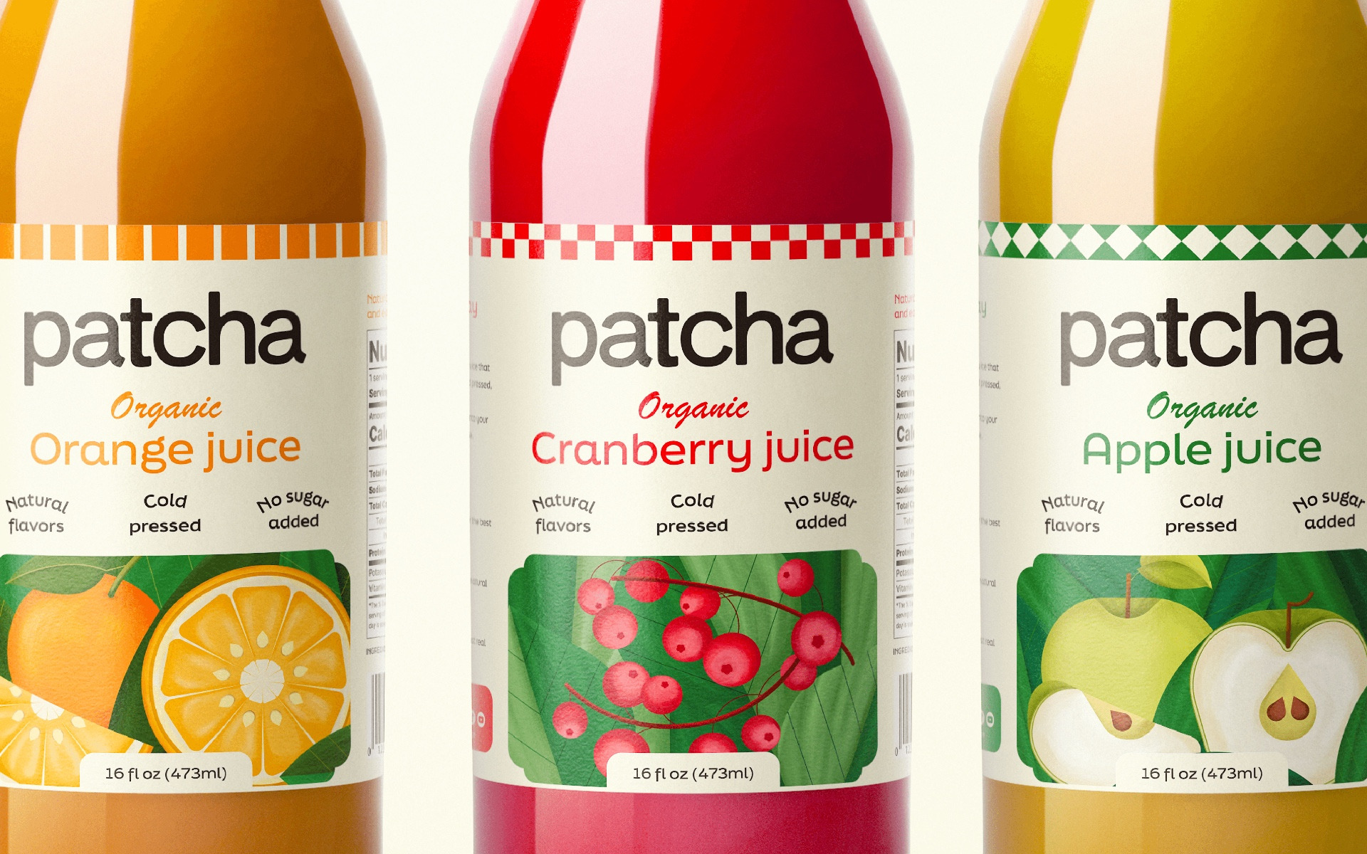
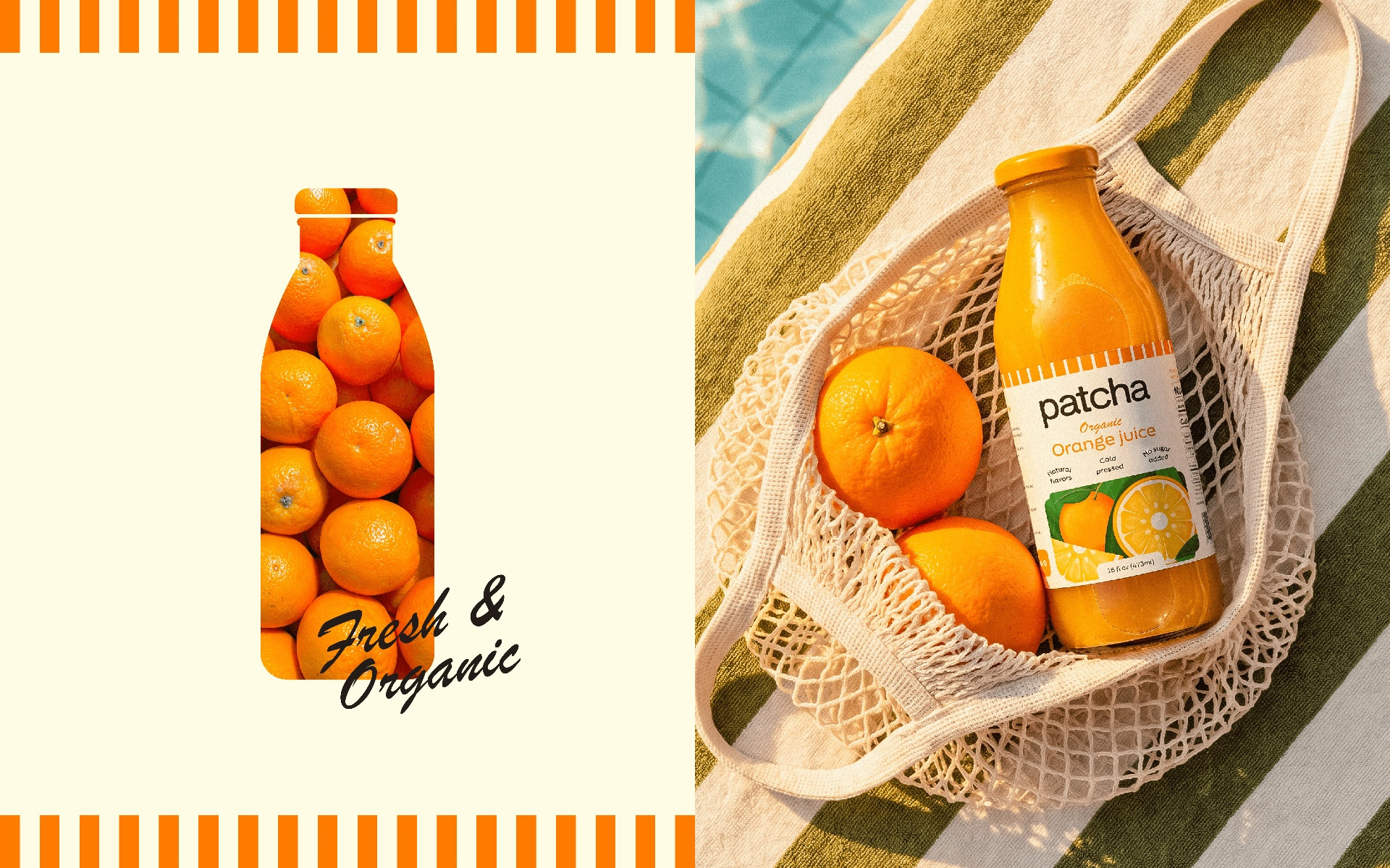
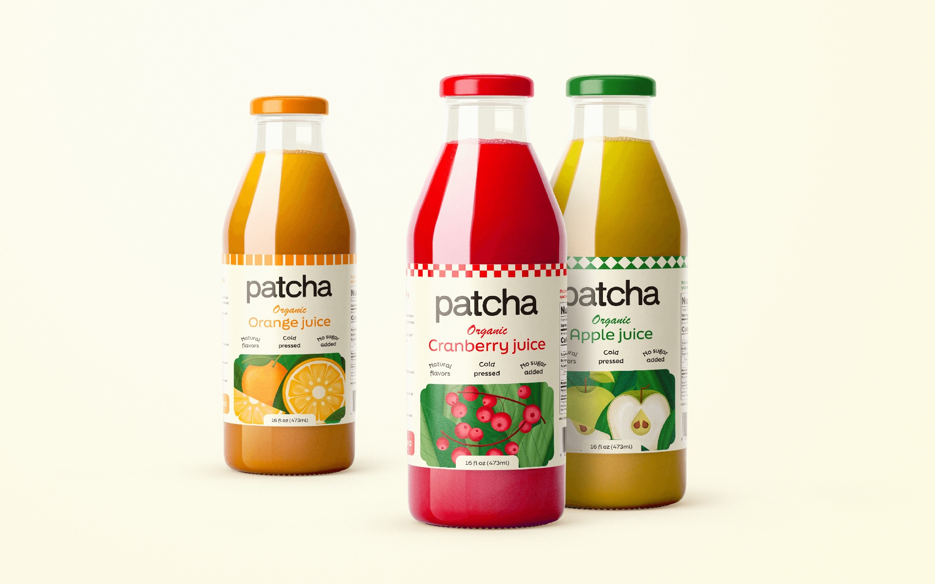
That positioning shaped the visual direction from the start. Instead of following the usual codes of the category, I brought in subtle retro references to give the brand a more familiar and approachable character. The visual language was built around vibrant colors, clean typography, and textured illustrations that make each flavor easy to recognize at a glance.
The illustrations became an important part of the packaging system. Each one was developed around the fruit itself, giving Orange, Green Apple, and Cranberry their own visual personality while keeping the three bottles connected as a collection.
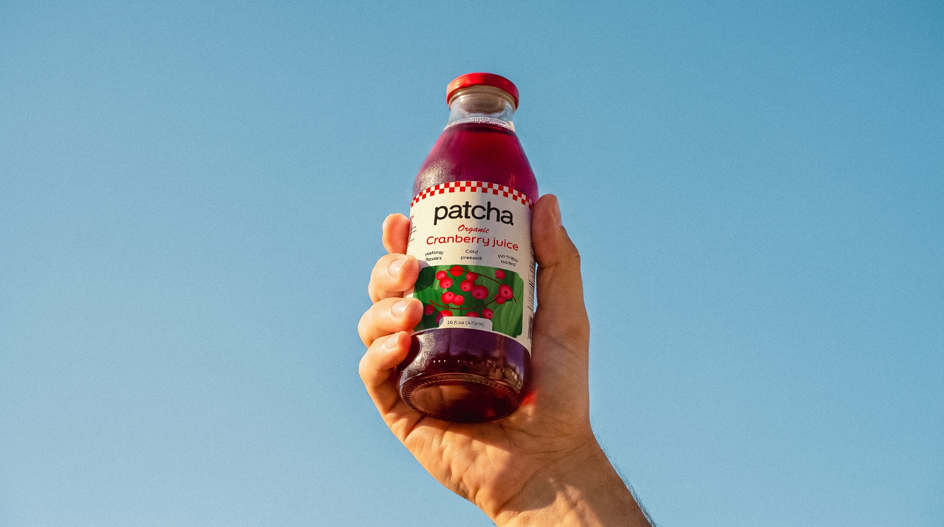
The goal was to make Patcha stand out on the shelf without making it feel overly polished or overly playful. The result is a visual identity that feels fresh, confident, and easy to connect with, while staying true to what the product actually is. A natural juice brand that does not need to overstate its values because they are already built into the product.