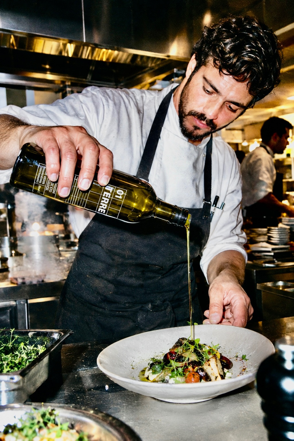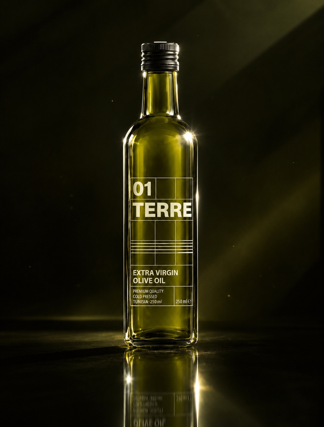
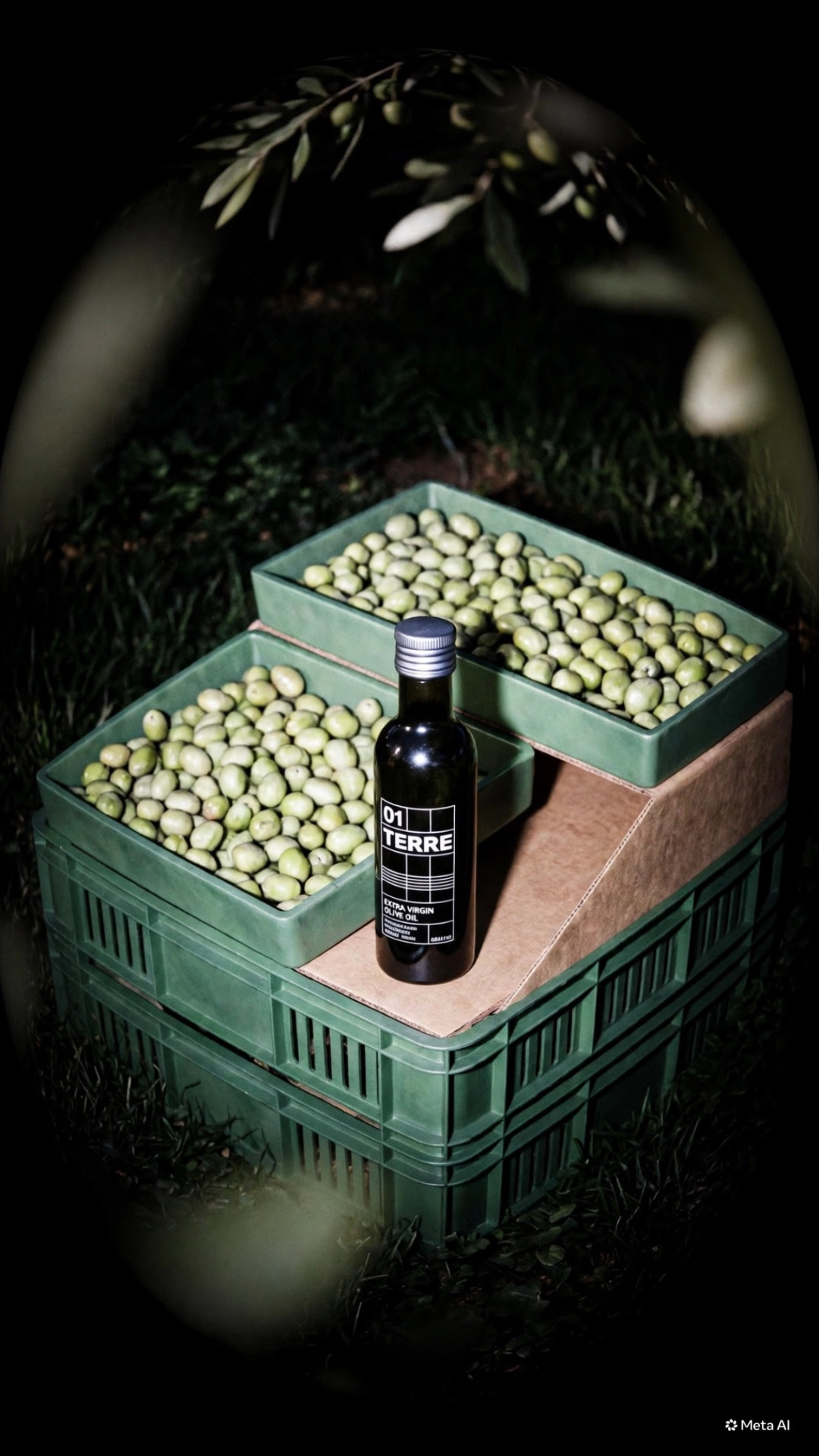
01 TERRE olive oil label
01 TERRE — LABEL CREATIVE BRIEF
01. Project
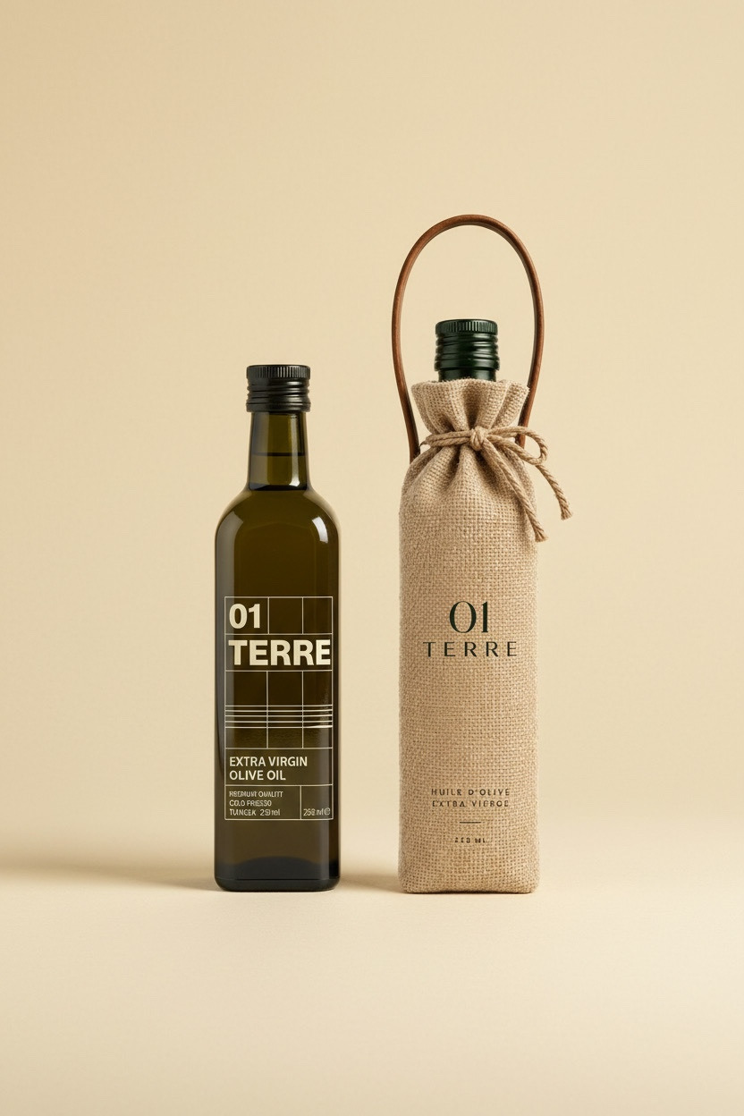
Design a premium olive oil label for 01 TERRE, a Tunisian extra virgin olive oil brand positioned around origin, land, purity, and contemporary Tunisian identity.
02. Objective
Create a label that immediately communicates premium quality and authenticity while avoiding the traditional visual codes commonly associated with olive oil.
The label should feel modern, refined, collectible, and internationally relevant.
03. Brand Concept
01 TERRE represents the relationship between the land and the olive oil.
“01” refers to the beginning — the first origin, the first harvest, the starting point.
“TERRE” places the brand at the heart of its identity: the Tunisian land.
The visual identity should transform the bottle from a simple food product into an object that represents its origin.
04. Target Audience
- Premium olive oil consumers
- Design-conscious consumers
- Young professionals
- Food & gastronomy enthusiasts
- Consumers interested in authentic Tunisian products
- International customers looking for premium Mediterranean products
05. Design Direction
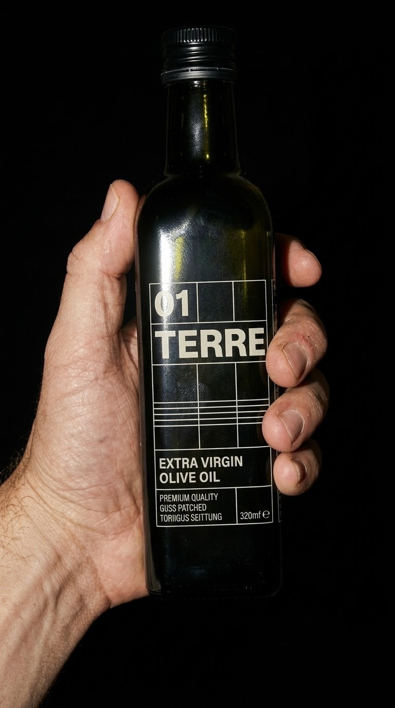
The label should follow a minimal, editorial and contemporary aesthetic.
Key characteristics:
- Strong typography
- Generous negative space
- Structured grid
- Minimal graphic elements
- High-end editorial feeling
- Clear hierarchy
- Subtle references to Tunisian heritage
- No unnecessary decorative elements
06. Color Direction
The palette is inspired by the Tunisian landscape:
- Deep olive green
- Warm cream / off-white
- Black
- Subtle natural tones
The colors should create a strong contrast with the dark olive-green glass bottle.
07. Typography
Typography should be modern and highly legible, with a condensed or editorial character.
The hierarchy should give particular importance to:
01
TERRE
EXTRA VIRGIN OLIVE OIL
TUNISIA
250 ML
The typography should make the bottle recognizable from a distance.
08. Graphic Language
The graphic system can incorporate subtle references to:
- Olive seeds
- Olive branches
- Mediterranean landscapes
- Tunisian coordinates
- Agricultural geometry
- Land contours
- Harvest information
These elements should remain secondary to the typography and overall composition.
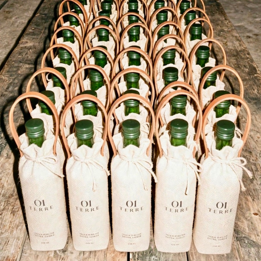
09. Packaging Format
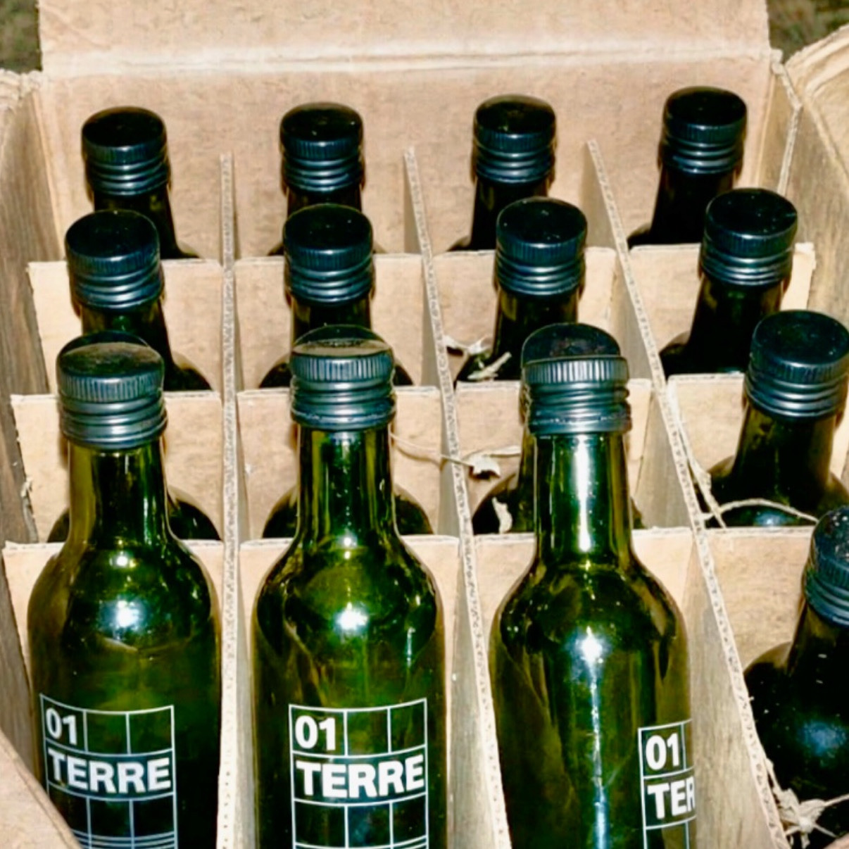
Bottle: 250 ml dark olive-green glass bottle
Label: Front-facing premium adhesive label
Positioning: Contemporary premium / limited-production olive oil
The label should work as part of the bottle silhouette rather than appearing as an isolated graphic pasted onto it.
10. Brand Feeling
The final result should communicate:
LAND. ORIGIN. TIME.
It should feel quiet, confident and authentic, rather than excessively luxurious.
The objective is not to make the bottle look expensive through decoration, but to make it feel valuable through simplicity, proportion and detail.
11. Final Design Statement
01 TERRE is a visual interpretation of Tunisian land — reduced to its essential elements and bottled as a contemporary expression of extra virgin olive oil.