CRONCHUDOS
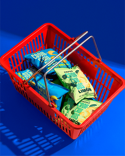
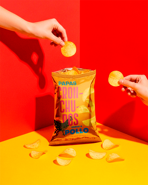
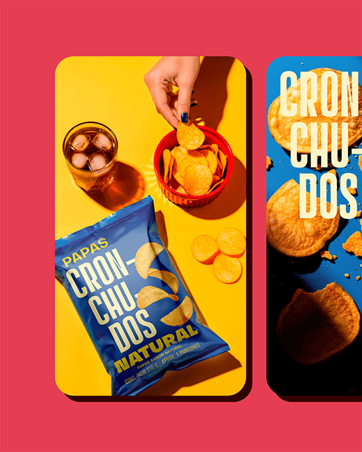
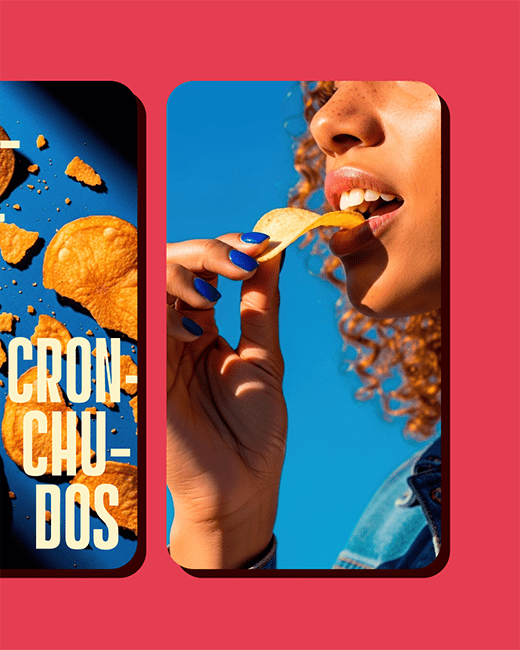
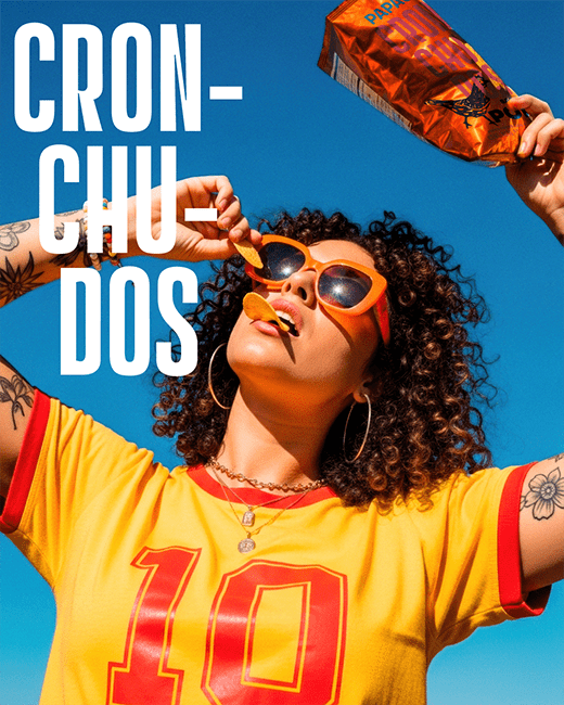
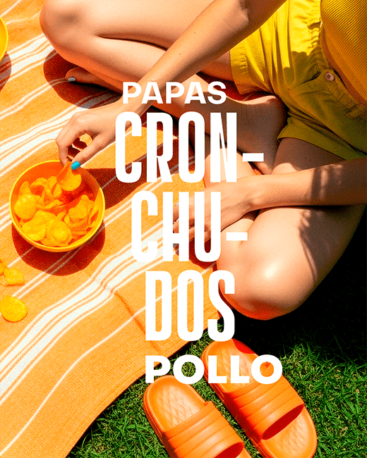
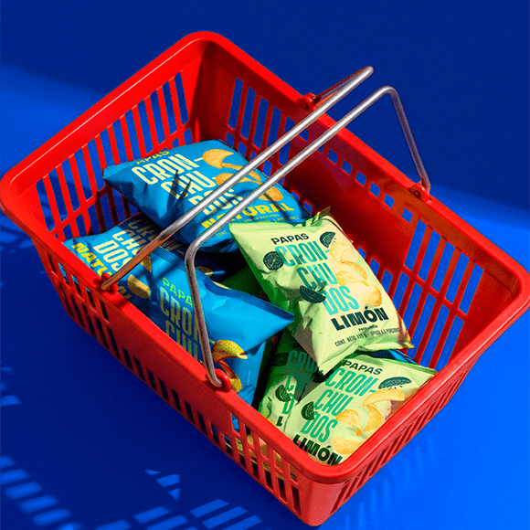
CRONCHUDOS is not your average snack brand — it’s a visual shout. We designed an identity that embraces volume, rhythm, and irreverence through typography, color, and packaging that owns the shelf.
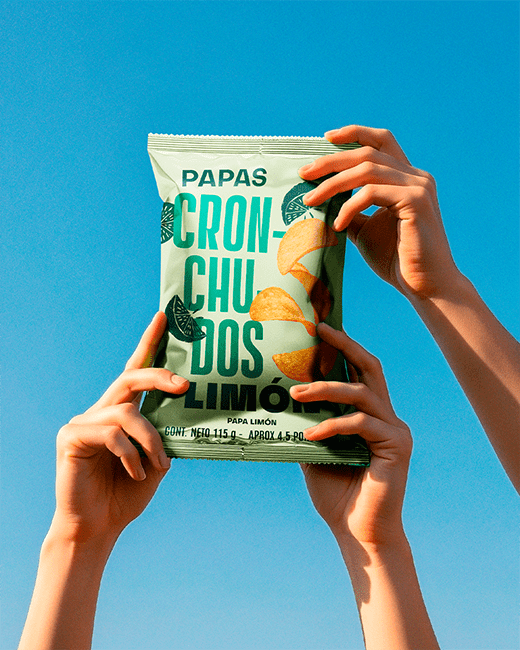
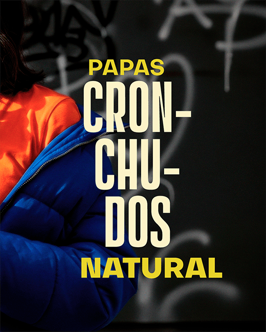
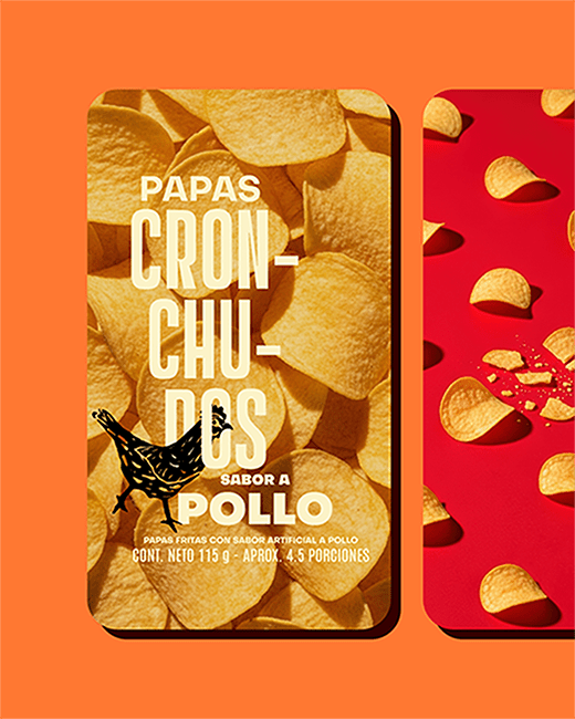
The logo itself mimics the crunch, broken into syllables to echo the sound of biting down. We pushed legibility to the edge, prioritizing impact over convention. The brand’s tone is cheeky, direct, and impossible to ignore.
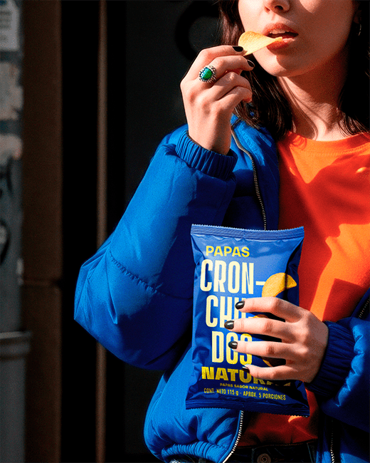
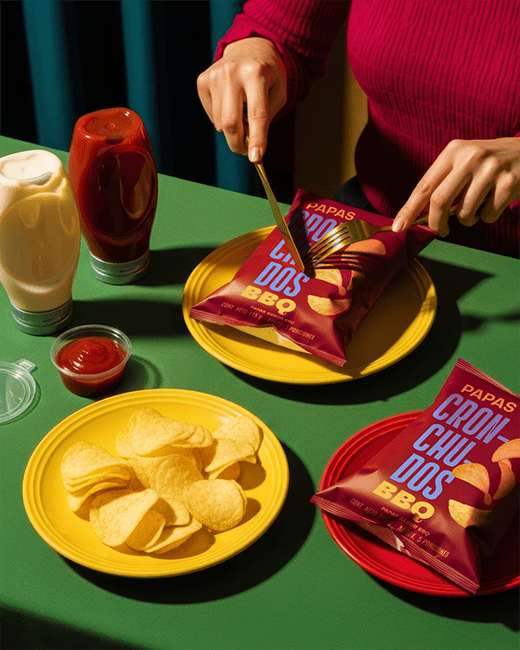
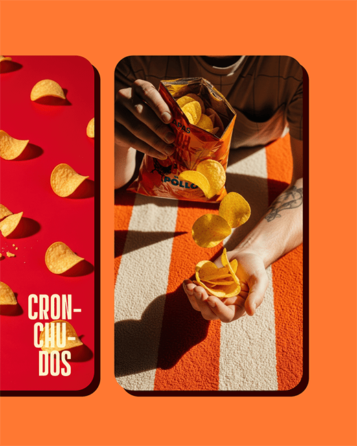
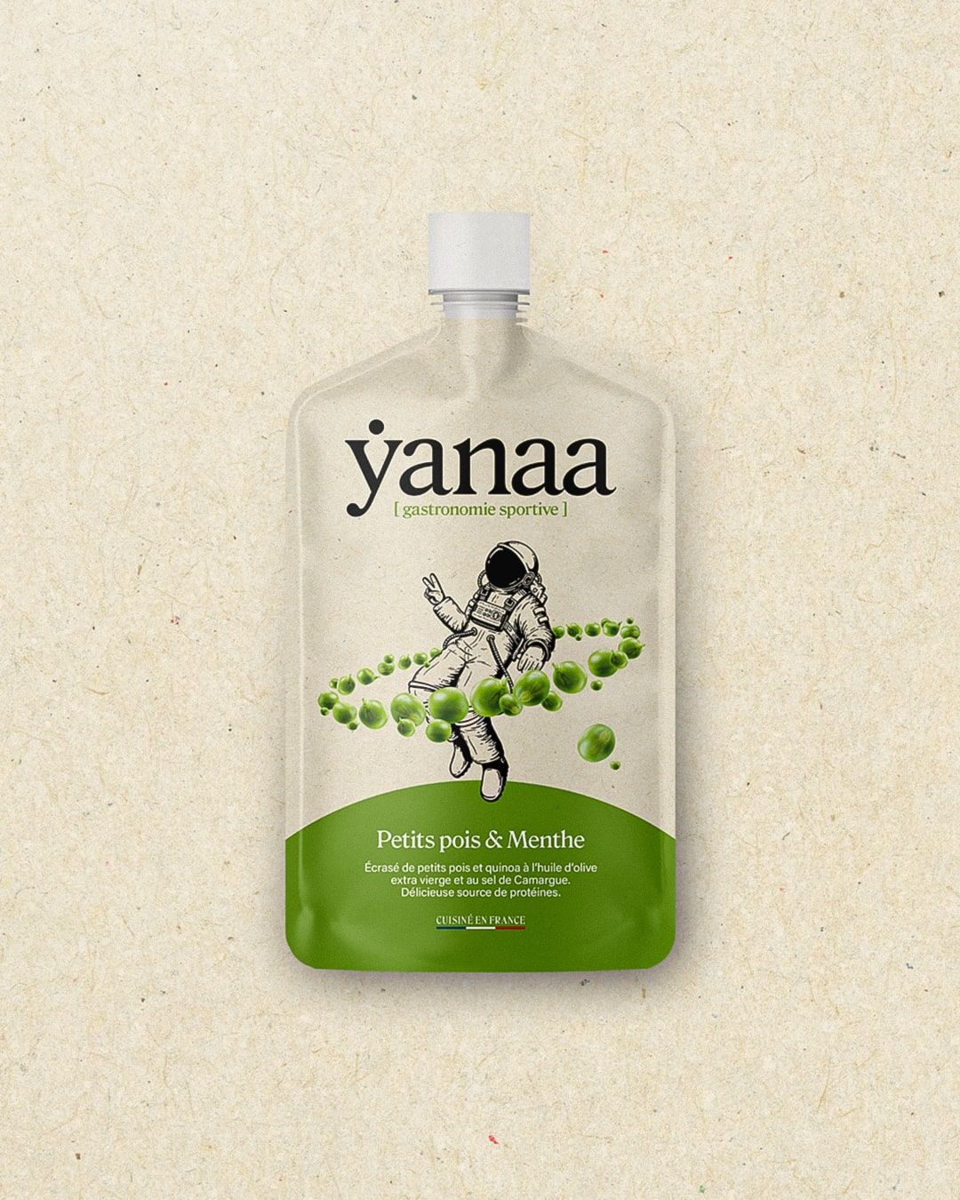
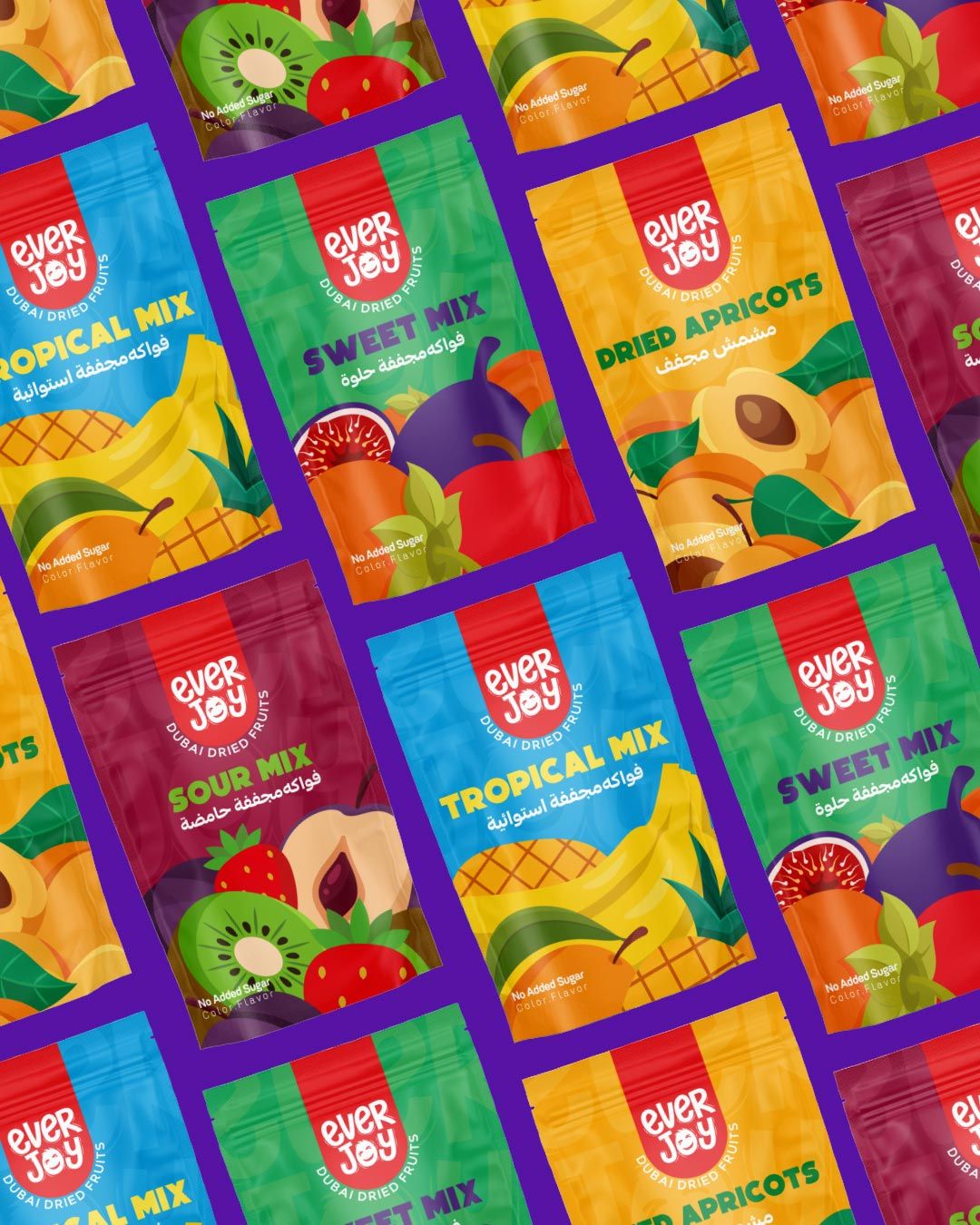
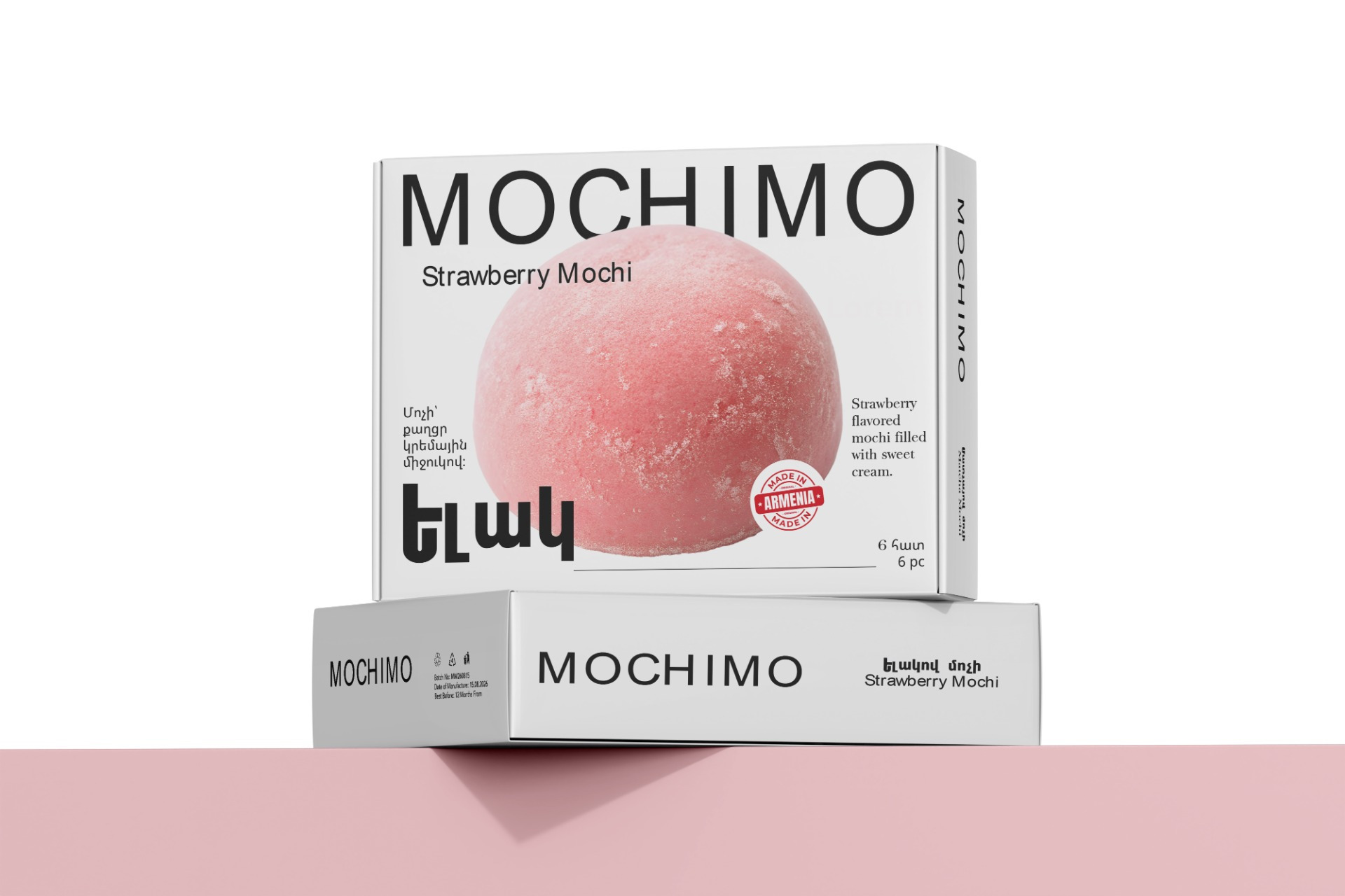
The packaging balances loudness and clarity. Oversized text commands attention, while photo elements and custom illustrations add flavor cues and context without cluttering the layout. It’s a bold, rhythmic system where the logo leads — and everything else amplifies.
This project is a celebration of bold branding, where the bag isn’t just a container — it’s the first bite.