Bisco Nuts
The Challenge & Concept
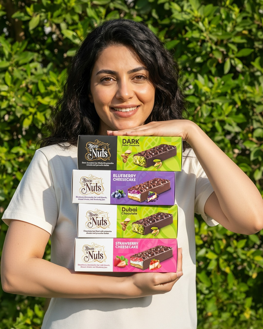
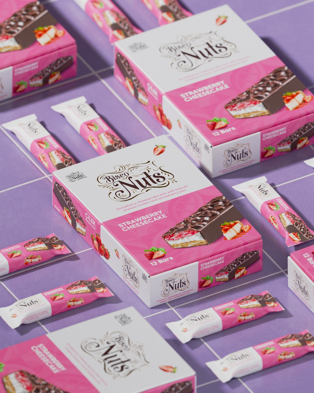
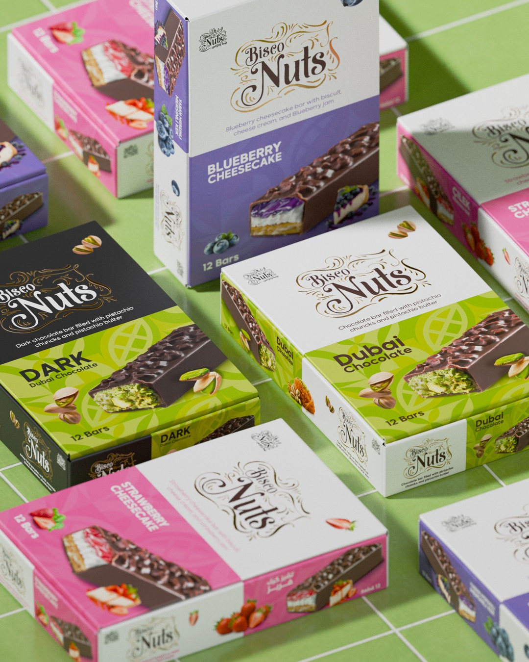
Bisco Nuts sought to expand its premium confectionery lineup from its signature pistachio-filled “Dubai Chocolate” bars into an indulgent new range of multi-layered fruit cheesecake bars. The objective was to design a packaging system that balances artisanal luxury with modern shelf appeal, positioning each bar as an elevated, high-end treat.
Design & Typography
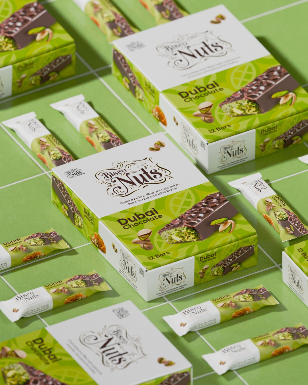
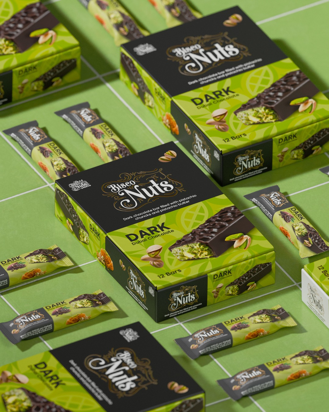
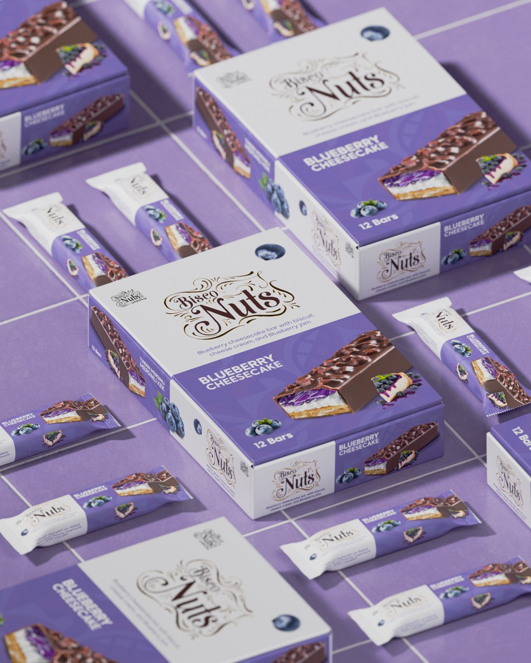
The visual identity is anchored by an elegant, custom ornamental logotype that evokes a sense of heritage and premium craftsmanship. To ensure strong readability and a contemporary edge, this classic typography is paired with clean, bold flavor titles that contrast sharply against the background.
Color Strategy & Flavor Architecture
A strategic, flavor-specific color palette was developed to create clear product differentiation while maintaining a cohesive brand family:
- The Classics (Dubai Chocolate & Dark Dubai Chocolate): Utilize a rich pistachio-green and deep matte black to immediately signal the premium pistachio-chunk and butter filling.
- The Cheesecake Extensions (Blueberry & Strawberry): Introduce vibrant pastel tones to reflect the lighter, fruity profiles. A rich lavender and purple palette defines the Blueberry Cheesecake, while a soft, romantic pink identifies the Strawberry Cheesecake.