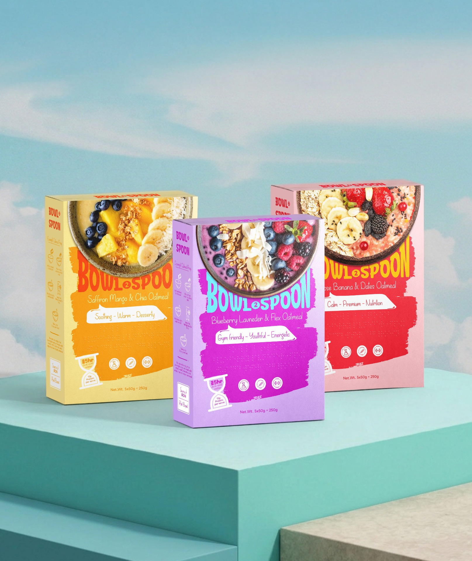
Bowl2Spoon – Inclusive Oat Meal Packaging Design
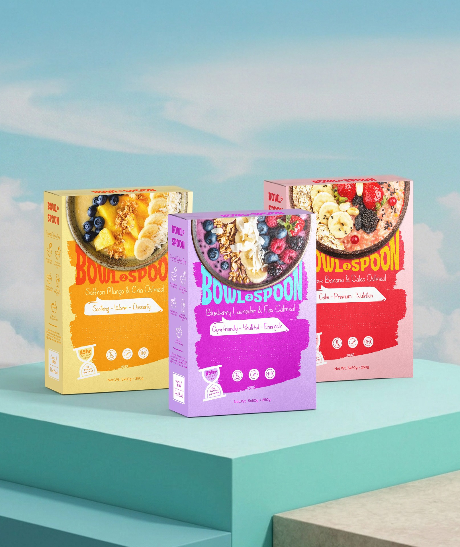
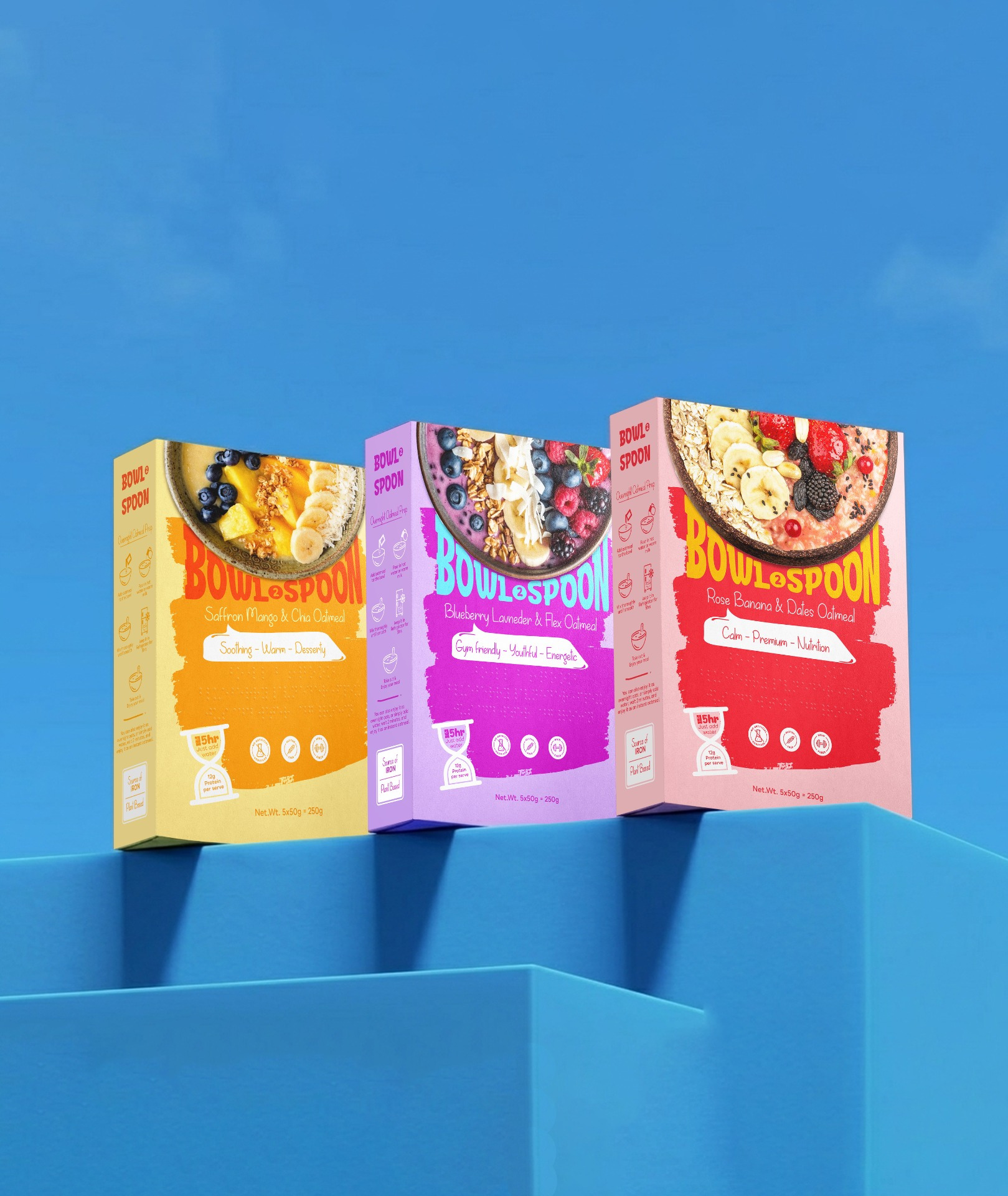
Bowl2Spoon is a contemporary oat meal brand designed to transform healthy breakfast consumption into a more inclusive and emotionally engaging experience. The product combines functional nutrition with premium flavor combinations inspired by natural ingredients and wellness-focused lifestyles. The range includes three distinctive variants:
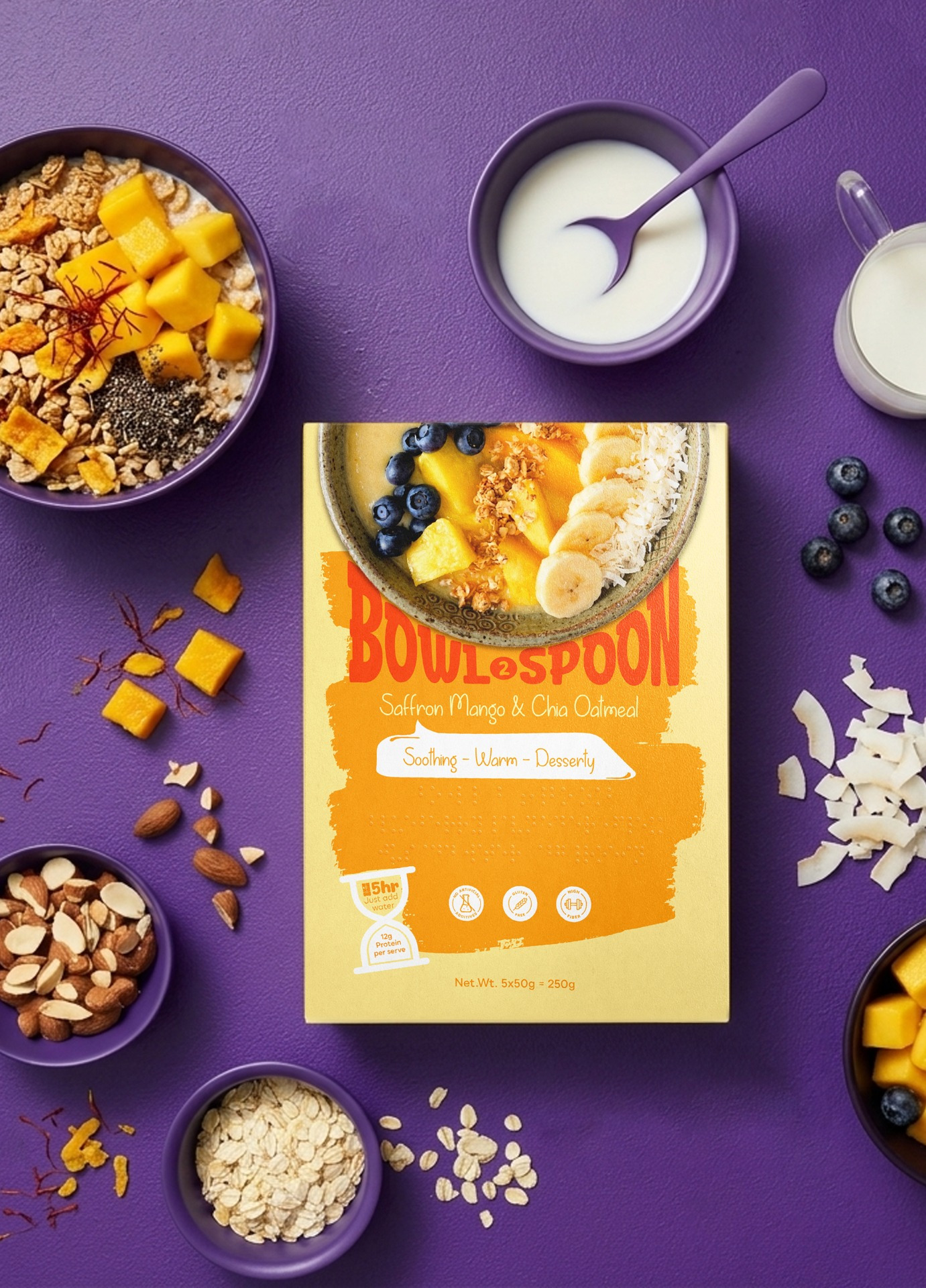
- Saffron Mango & Chia Oat meal
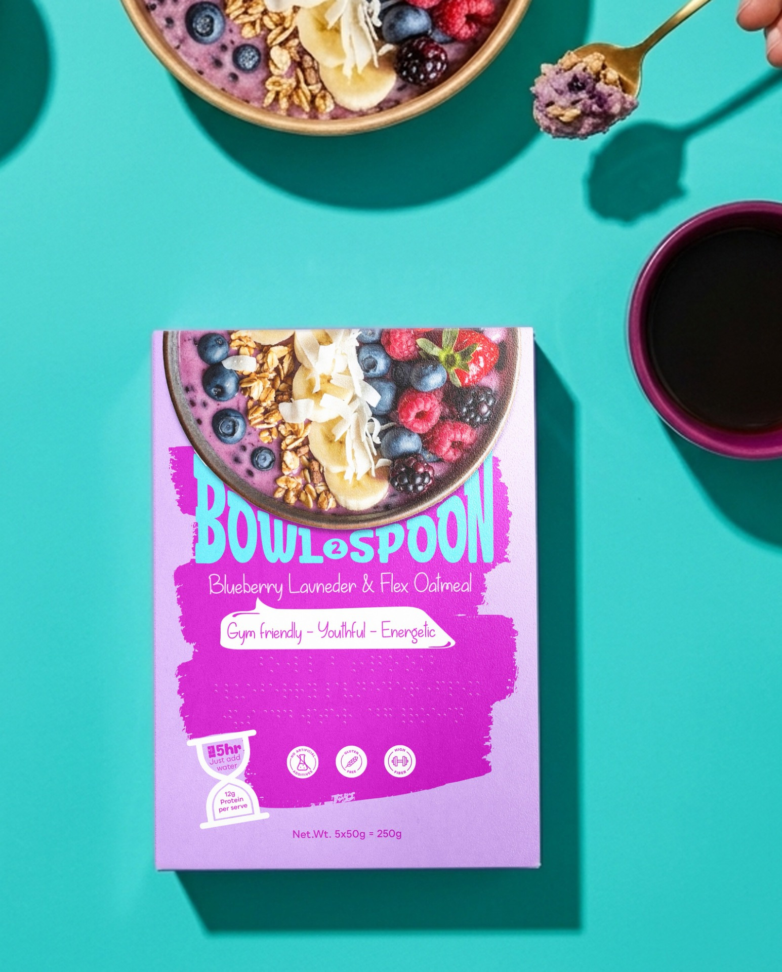
- Blueberry Lavender & Flex Oat meal
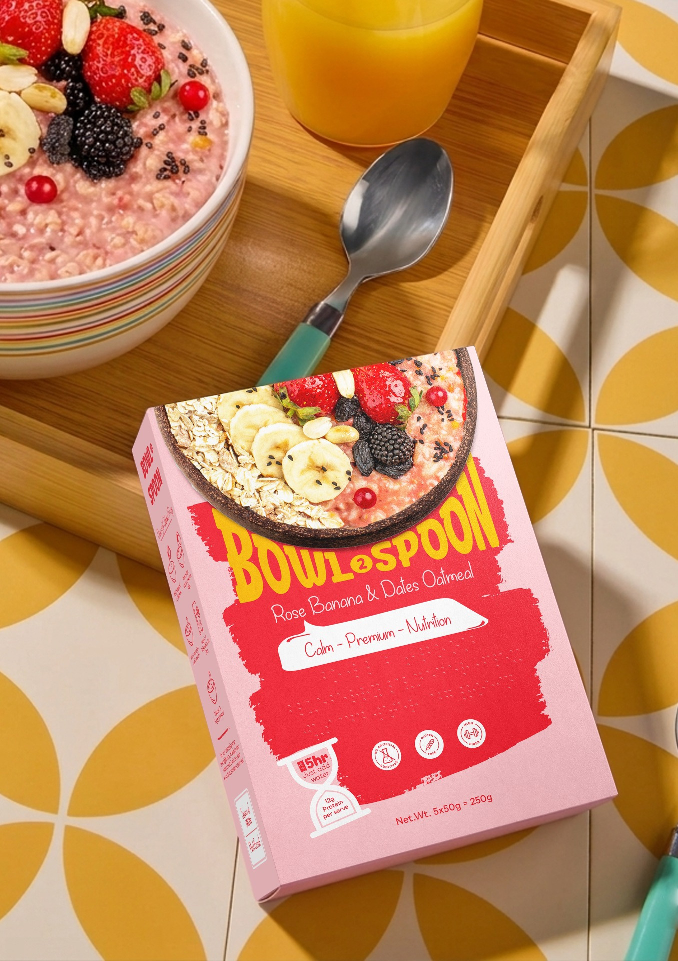
- Rose Banana & Dates Oat meal
The brand is positioned as a modern wellness product that balances nutrition, accessibility, and elevated sensory storytelling through packaging design. The concept behind Bowl2Spoon was built around the idea that healthy food packaging should be accessible, usable, and emotionally welcoming for everyone regardless of age, ability, or cultural background. Most breakfast packaging today relies heavily on visual communication systems, which can create barriers for visually impaired users and reduce accessibility in everyday product interaction. Bowl2Spoon reimagines oat meal packaging through an inclusive design approach by integrating braille communication directly into the front packaging panel while maintaining a premium contemporary visual identity. The design combines wellness aesthetics with accessibility-focused functionality to create a packaging system that is both visually appealing and socially thoughtful. The packaging system was designed to improve accessibility while maintaining strong shelf appeal and modern FMCG branding standards. Each flavor uses:
- distinct color systems
- ingredient-inspired visual storytelling
- braille-based informational elements
- high-visibility typography
- minimal and calming visual layouts
Braille communication elements are integrated into the front panel to support product recognition and accessibility for visually impaired consumers. The overall system creates a packaging experience that prioritizes inclusivity without compromising aesthetics or commercial appeal. The visual identity was developed using a minimal wellness-inspired design language combined with tactile accessibility features. Key design techniques include:
- Braille-integrated front panel communication
- Soft premium color palettes inspired by ingredients
- Ingredient-led visual compositions
- Minimal typography hierarchy for improved readability
- High-contrast information placement
- Structured layout system for scalability across flavors
- Contemporary wellness-focused packaging aesthetics
The braille system was incorporated as part of the visual architecture rather than treated as an additional accessibility label, allowing inclusivity to become a core element of the brand identity. Unlike traditional breakfast packaging that focuses only on visual branding, Bowl2Spoon introduces a more inclusive and human-centered packaging experience. The packaging combines accessibility, emotional wellness aesthetics, and modern FMCG design into a unified system. Key differentiators include:
- Braille-based front panel communication
- Inclusive packaging approach
- Wellness-inspired visual identity
- Flavor storytelling through calming ingredient systems
- Readable and accessible information hierarchy
- A balance between functionality and premium aesthetics
The project demonstrates how accessibility features can become an integrated part of contemporary packaging design rather than a separate functional addition. Bowl2Spoon transforms conventional oat meal packaging into a more inclusive consumer experience by combining accessible communication with premium wellness branding. The project encourages broader conversations around inclusive FMCG packaging while presenting a commercially scalable solution for modern health-focused consumers. By integrating braille communication and accessible design thinking into the packaging system, Bowl2Spoon creates a product experience that is usable, visually engaging, and welcoming to a wider audience. The result is a packaging identity that supports both emotional connection and functional accessibility within the breakfast and wellness category