BRUSKA — Gourmet Spread Packaging design
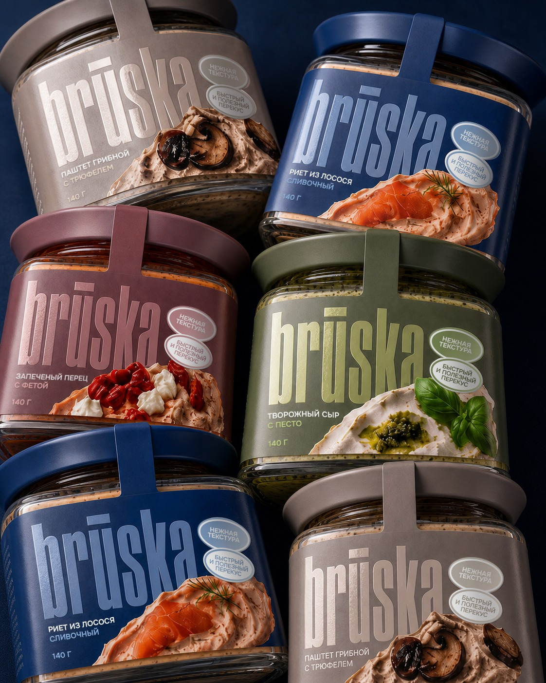
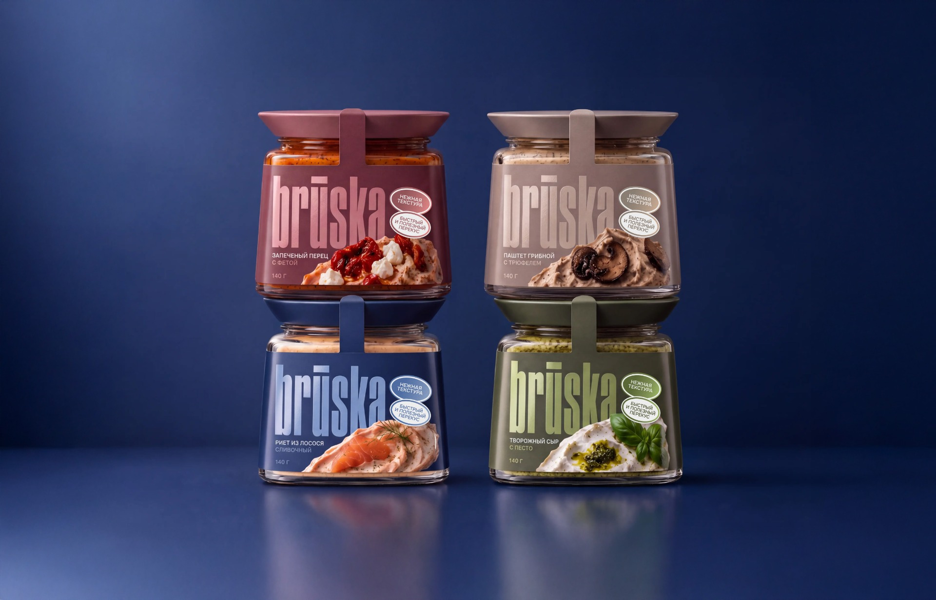
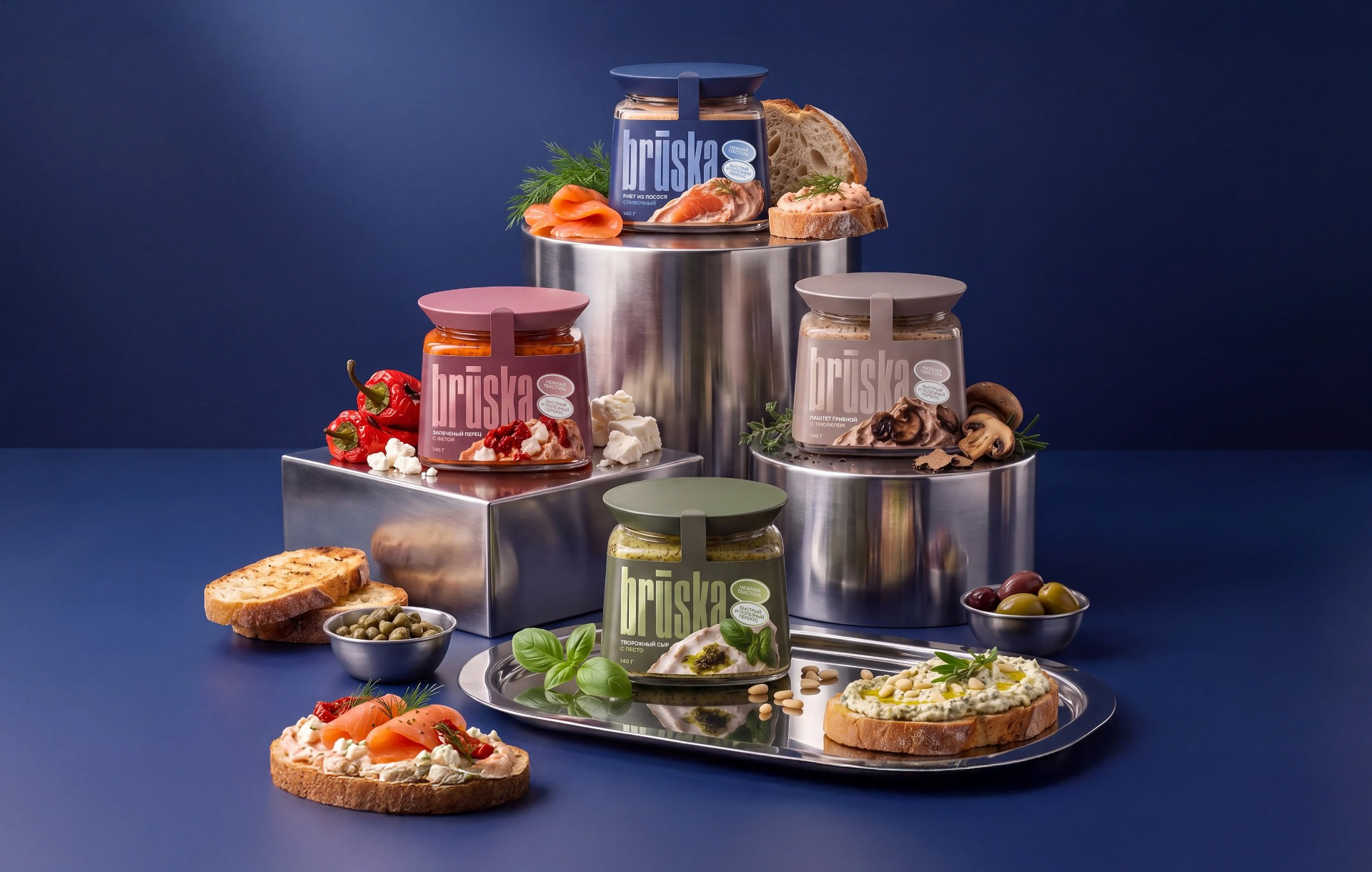
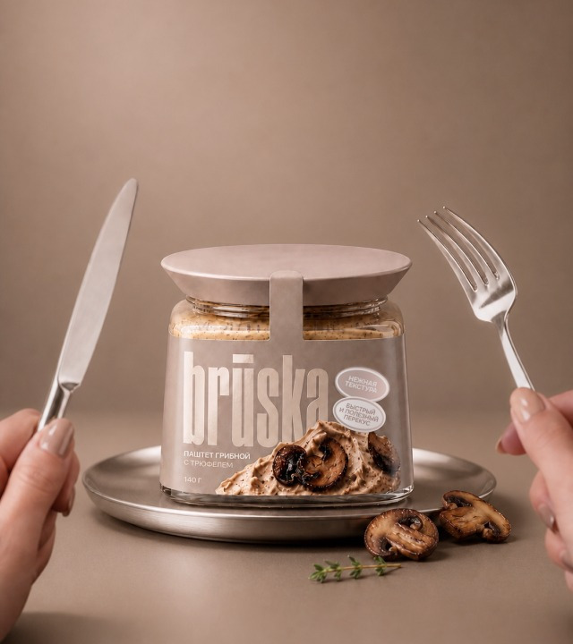
BRUSKA is a contemporary gourmet spread brand created for convenient everyday eating without compromising on taste. The range combines familiar products with more distinctive flavor pairings, including salmon rillettes, cream cheese with pesto, roasted pepper with feta, and mushroom pâté with truffle.
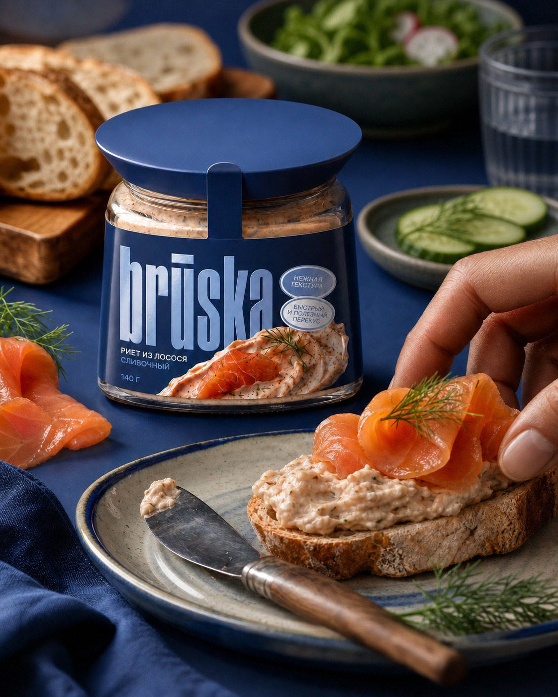
The packaging concept was designed to move away from rustic and overloaded FMCG aesthetics. Instead, BRUSKA uses bold typography, strong color coding, and expressive food photography to create a modern, recognizable shelf presence.
Solution
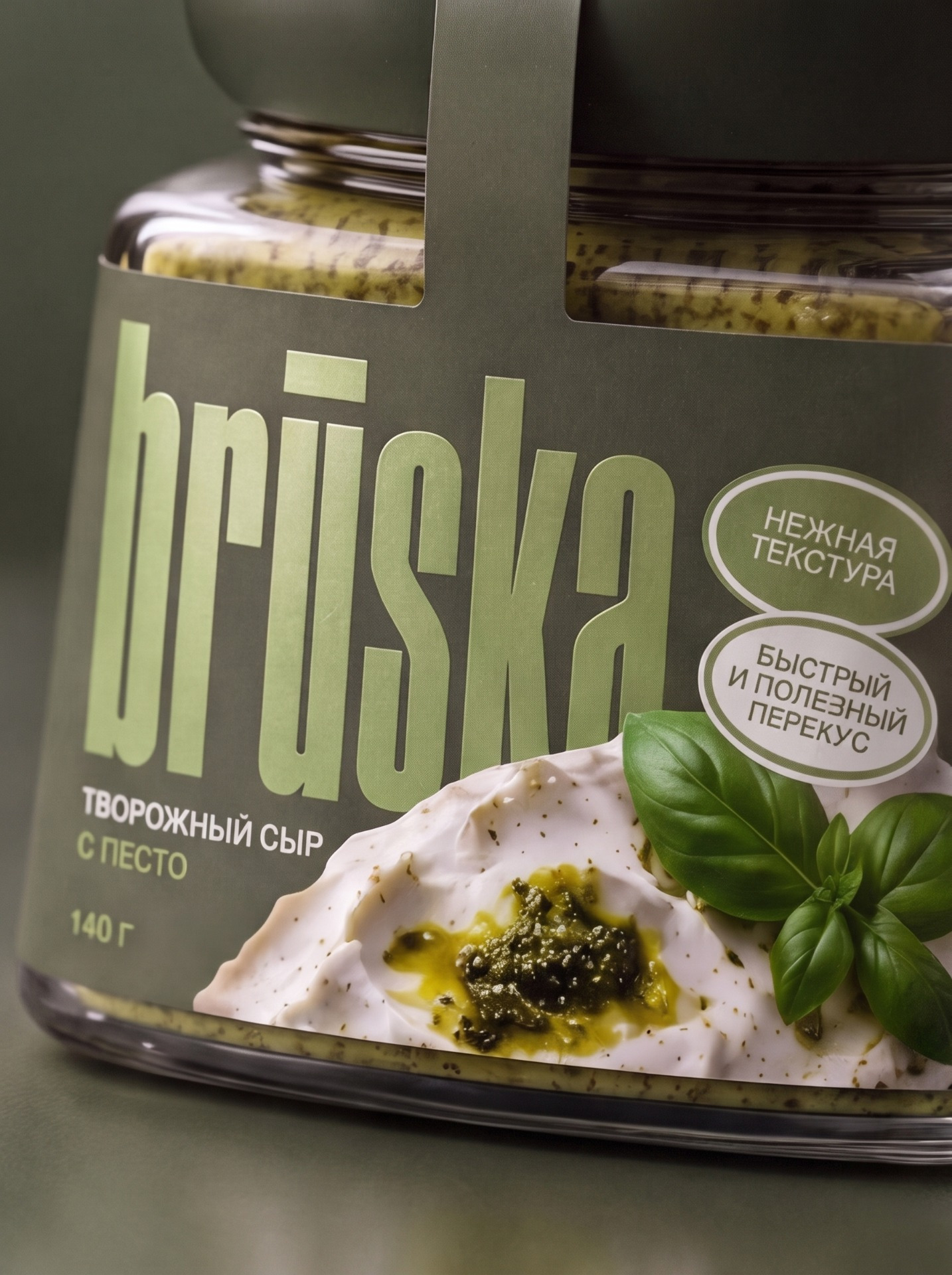
A consistent packaging system was developed for the entire range. Each SKU follows the same structure: product information at the top, an oversized BRUSKA wordmark, and a large photographic food zone overlapping the typography.
Each flavor has its own color pairing, while the composition and hierarchy remain consistent. The low faceted glass jar and wide lid reinforce the premium character of the product and give the range a distinctive physical silhouette.
Design Approach
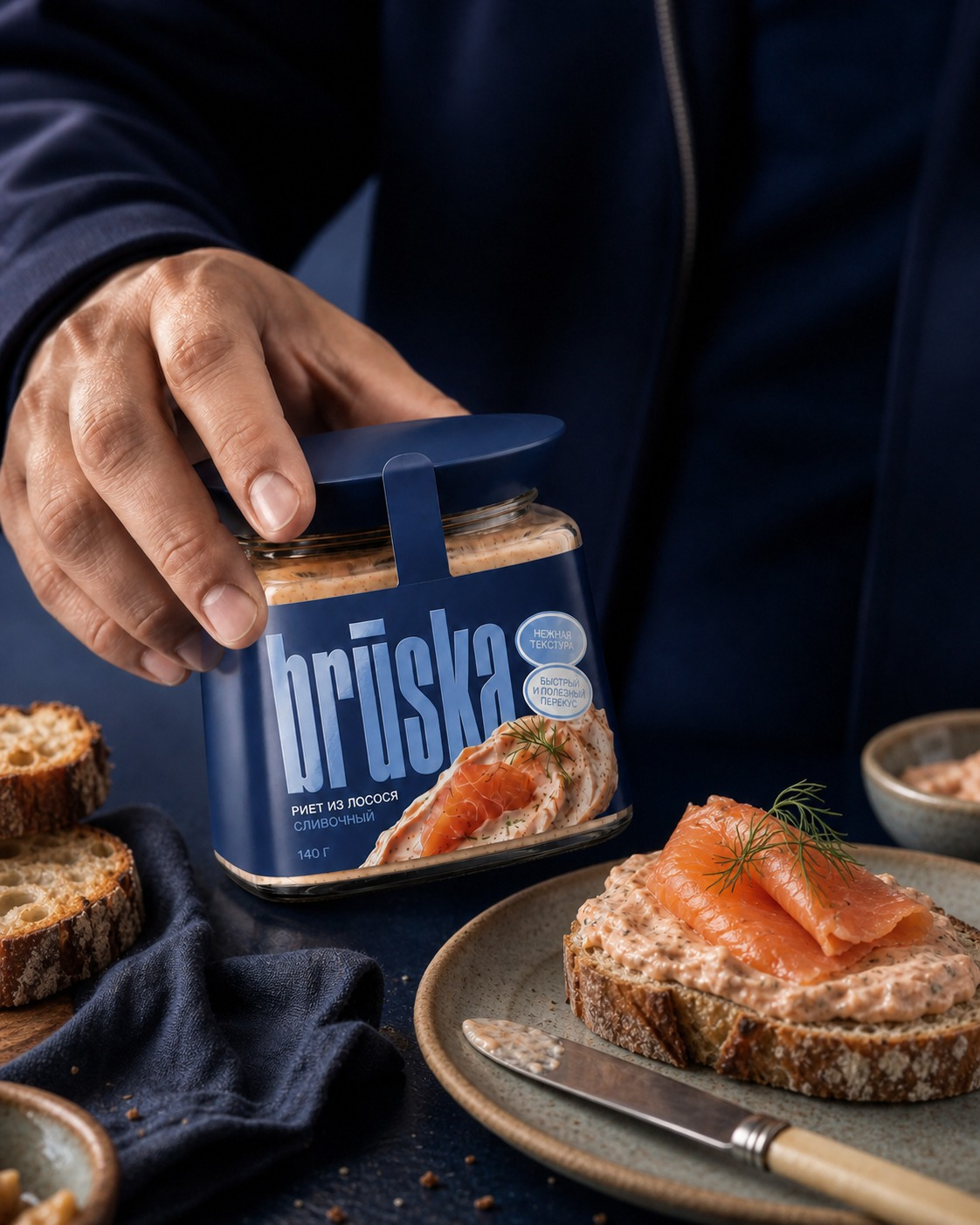
The design combines tall condensed typography with high-detail food photography. The food imagery is integrated directly into the composition rather than treated as a separate element, creating depth and making the product itself the visual focus.
Color works as both an expressive device and a navigation system, helping distinguish SKUs while keeping the range visually unified.
Result
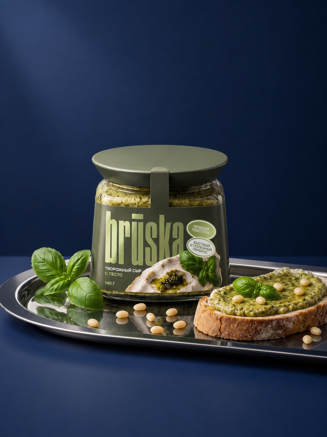
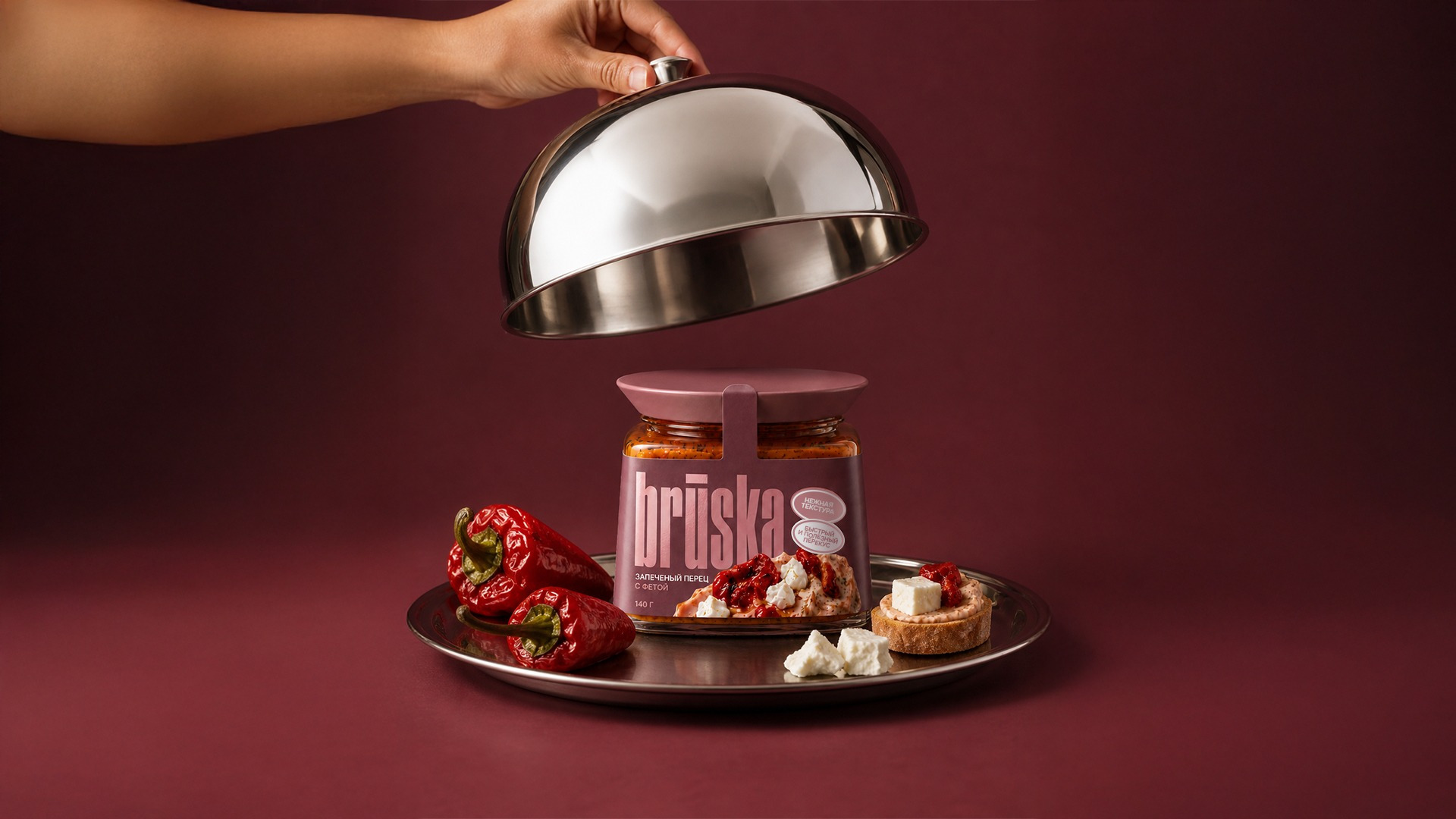
The result is a scalable packaging system with strong shelf recognition, clear SKU differentiation, and a consistent visual identity. The same design language was extended into product photography and advertising, creating a cohesive brand world across packaging, digital, and promotional communication.