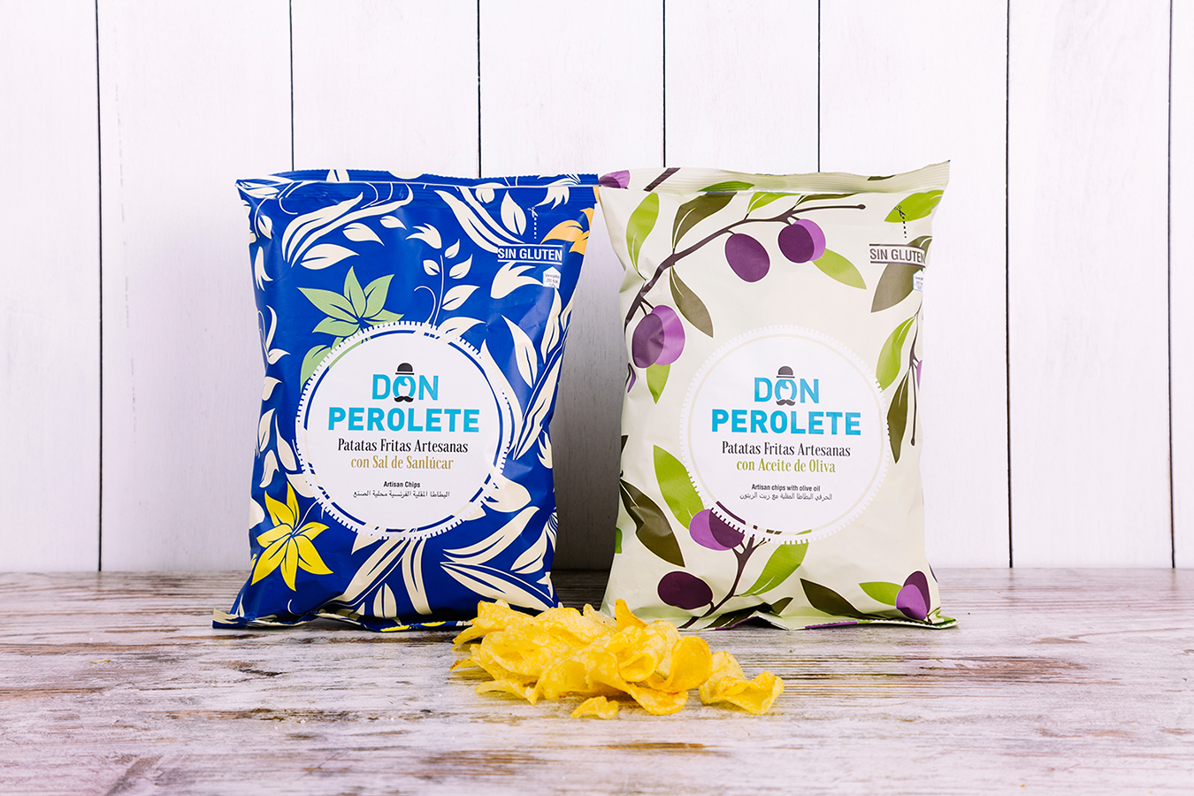
Don Perolete
Don Perolete is an artisan potato chip company located in Arcos de la Frontera (Cádiz). Its name comes from the typical Perol, an oil with which chips were historically fried. The objective was to sell their products to the international gourmet market, broadening the range and creating an original impact. To do this, our task was to redesign the brand and then create a packaging line, under the values of tradition and family.
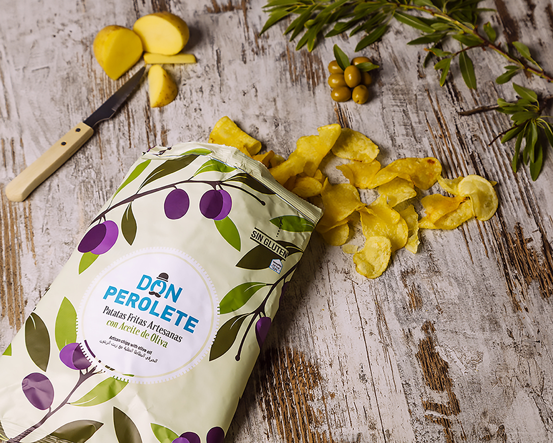
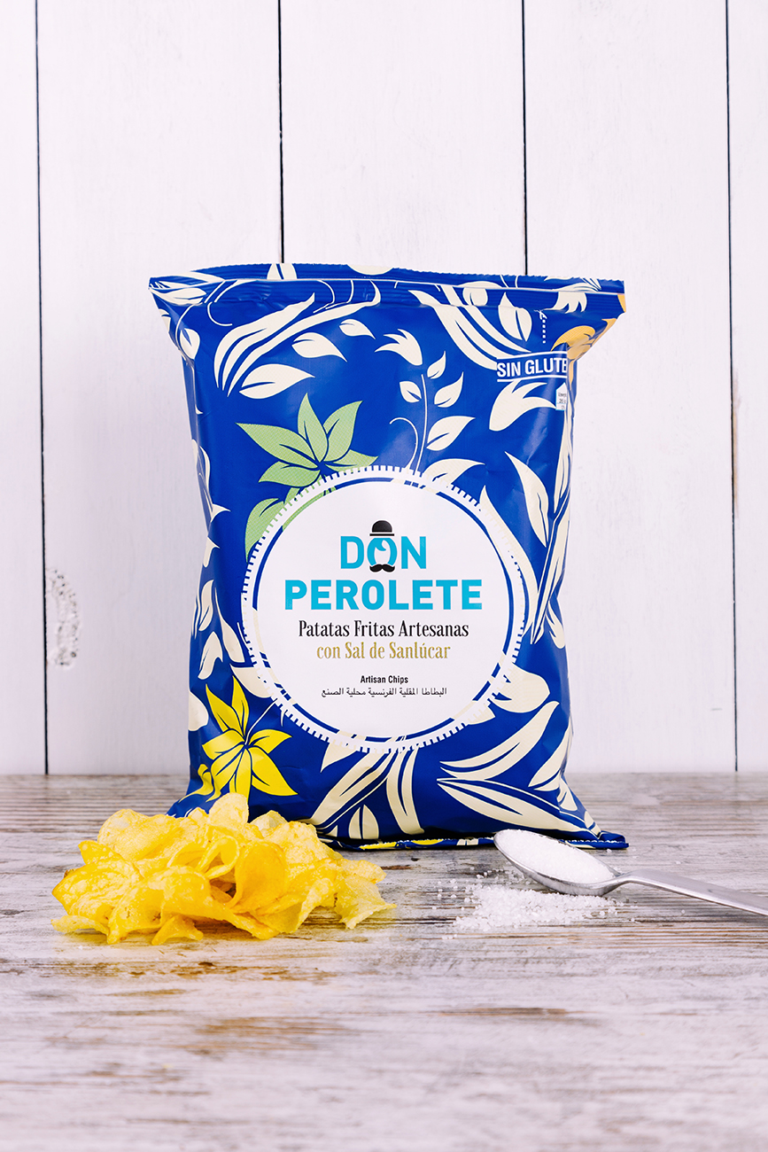
To create a solid brand, we got inspired by a fictional character recognizable to all of us, such as the typical grandfather with a bowler hat and a moustache. As a complement for the packs we included the William Morris pattern idea, adapting it to the new times in color and shape and differentiating it by its elements.
For the redesign, we chose to improve the logo’s impact: professionalizing and refining the typography and eliminating children’s drawings to compete in the gourmet market. For the tagline we added the artisan value of the typography, as opposed to the modern logo.