Euro Company, Crema d’Arachidi | Unsolicited Redesign Concept
The starting point was a quality product with packaging that couldn’t fully convey it.
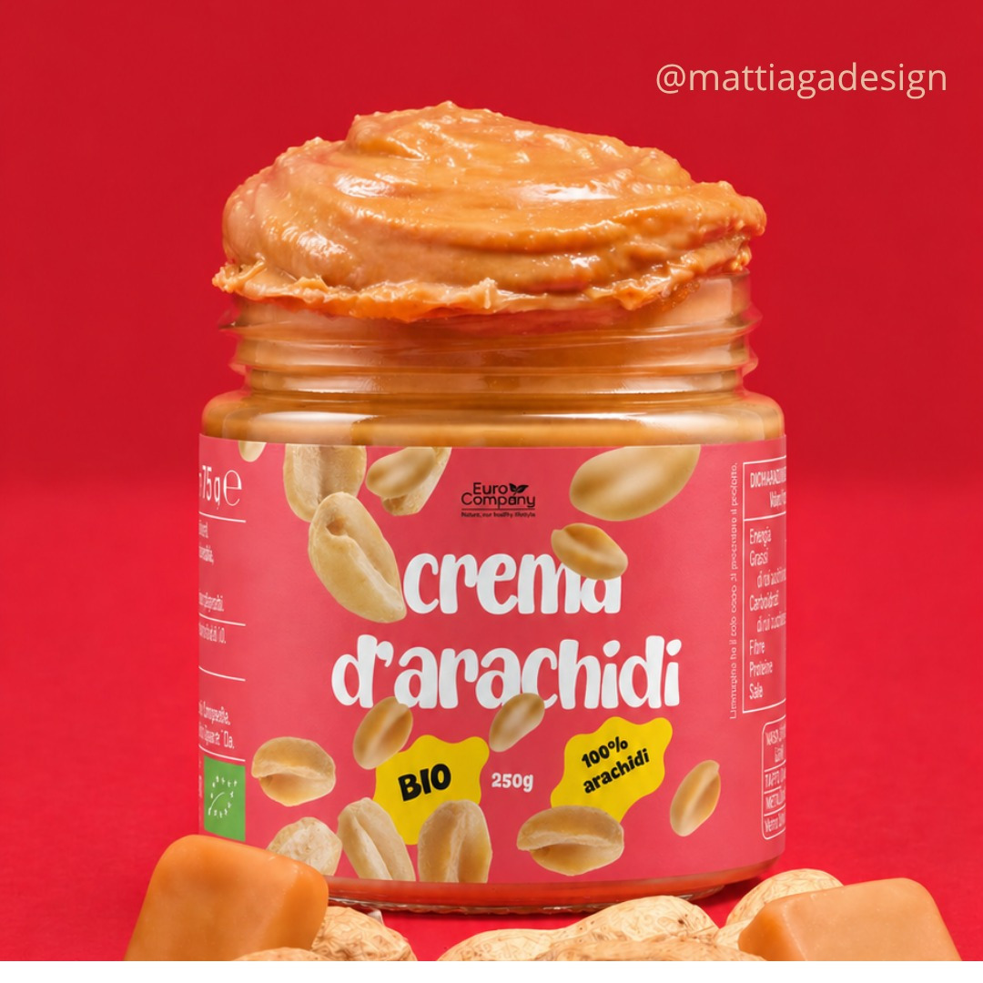
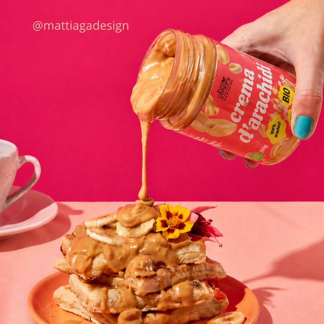
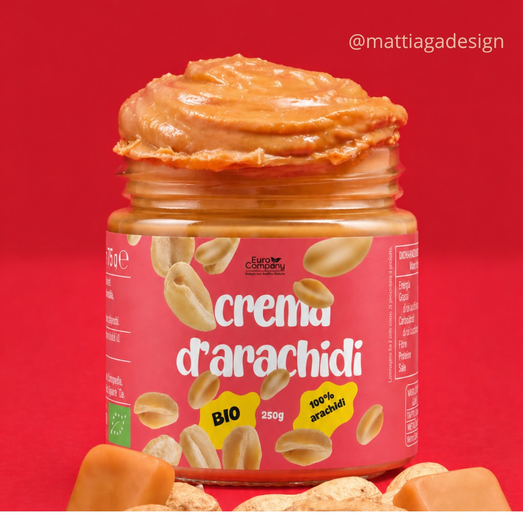
The concept focuses on a more defined and recognizable visual identity: a color palette centered on Pantone 812 C, Knockout Pink, a bright and immediate pink that conveys energy, freshness, and appeal, in line with the visual language of contemporary food lifestyles. Completing the concept are playful yet legible typography and a peanut pattern that brings the product directly to the surface of the label, visually translating the deliciousness of a 100% organic spread.
The information hierarchy has been redesigned to give more breadth to the product name and enhance the key claims, BIO and 100% peanuts, through immediately recognizable badges.
The result is packaging that maintains the clarity of the original while gaining personality and shelf appeal.