
Festive Packaging Design for Olivia
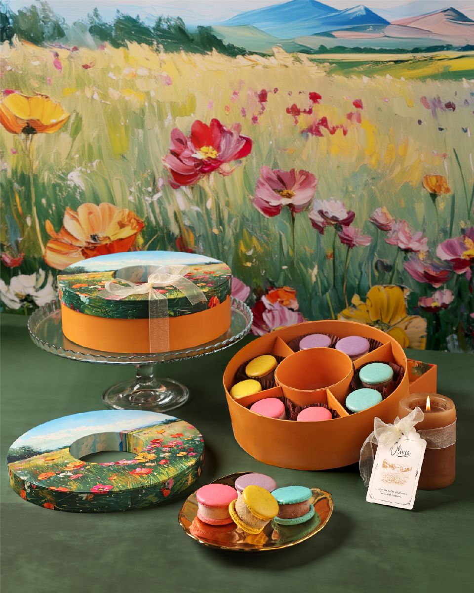
Inspired by impressionist and impasto styles, the artwork on the boxes creates a serene experience. A step away from the usual minimal and monotone style used for Olivia, this year’s packaging is vibrant, dreamy and refreshing.
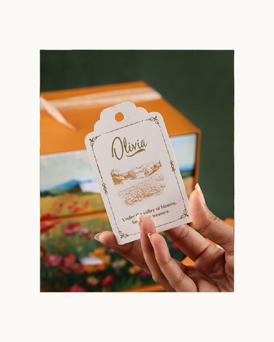
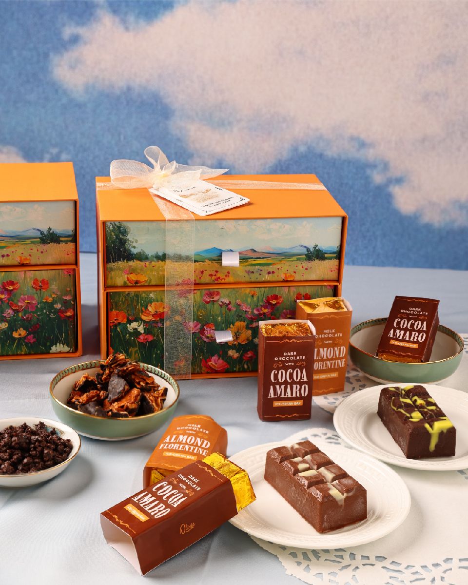
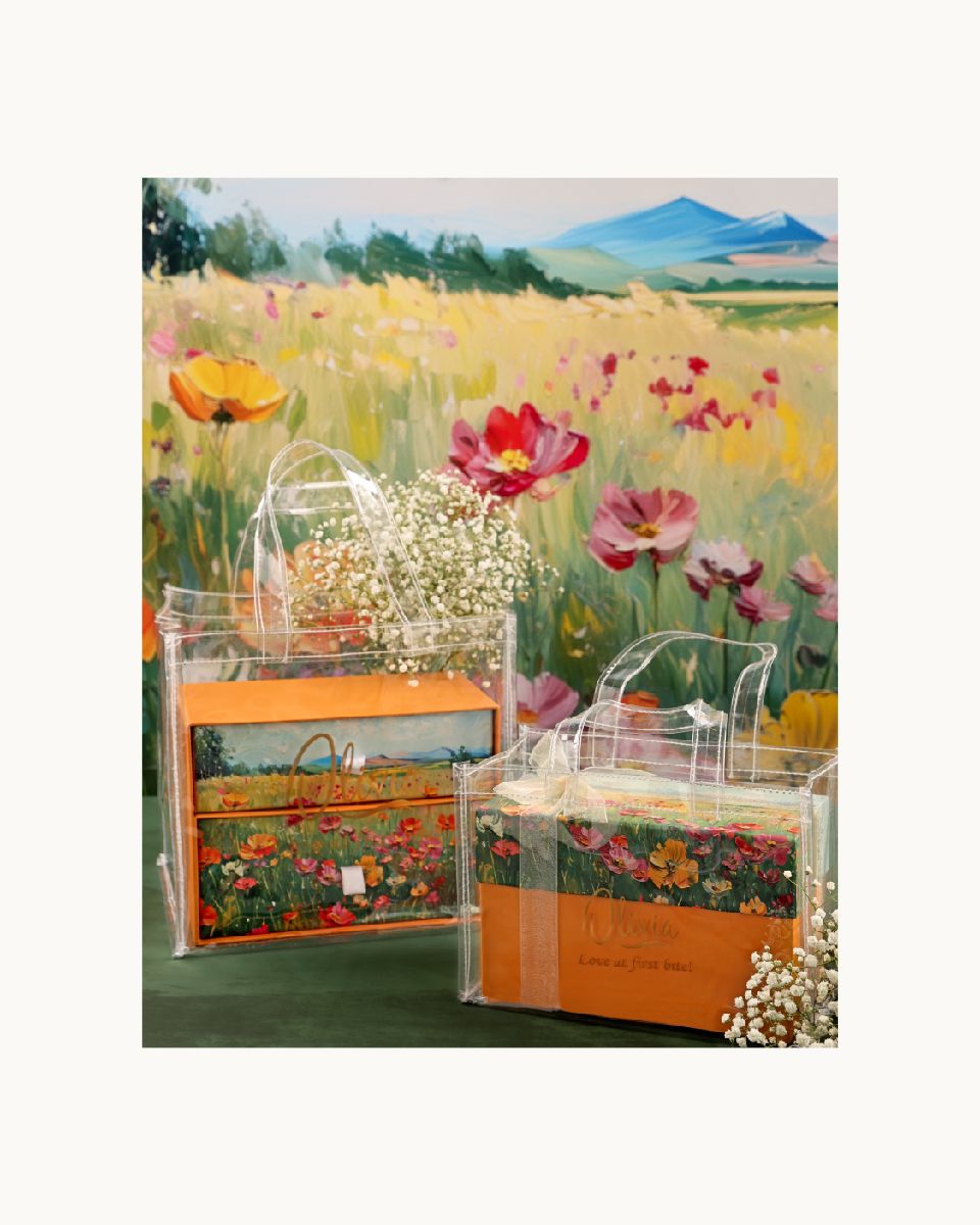
Adapting it across various shapes is what is always challenging – and this time was no different. Aside the usual rectangle and round boxes we also experimented with the new ‘drawer boxes’. Complete with a translucent ribbon and a gold foiled tag, what adds the final oomph to are the transparent bags, which not only allow for the design to be viewed clearly, but are also a break from the classic striped bags.
P.S. – We consciously avoided placing the brand logo prominently on the box – so it feels more like a treasured gift and less like a product, allowing the receiver to use it on special occasions. And the best part? the client was completely on board with this!