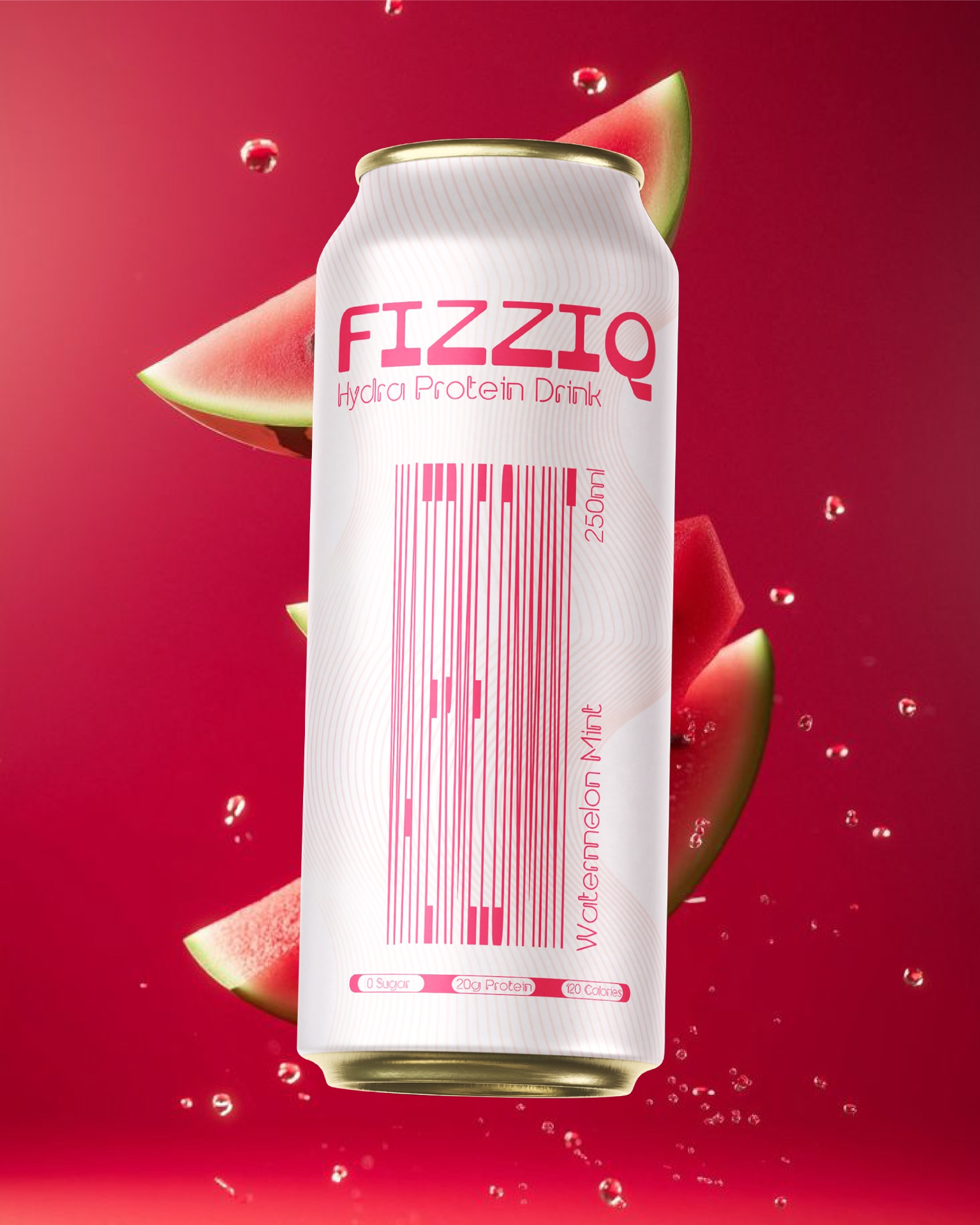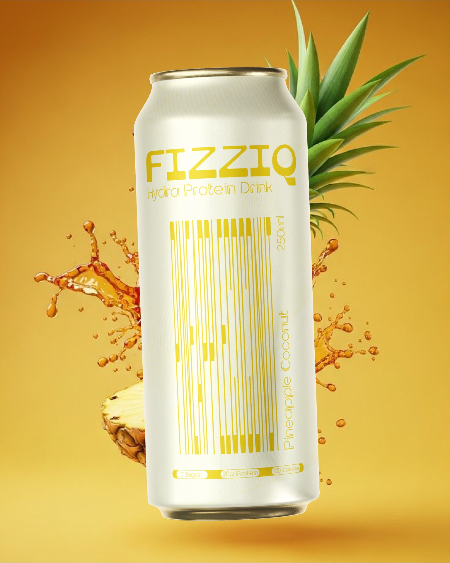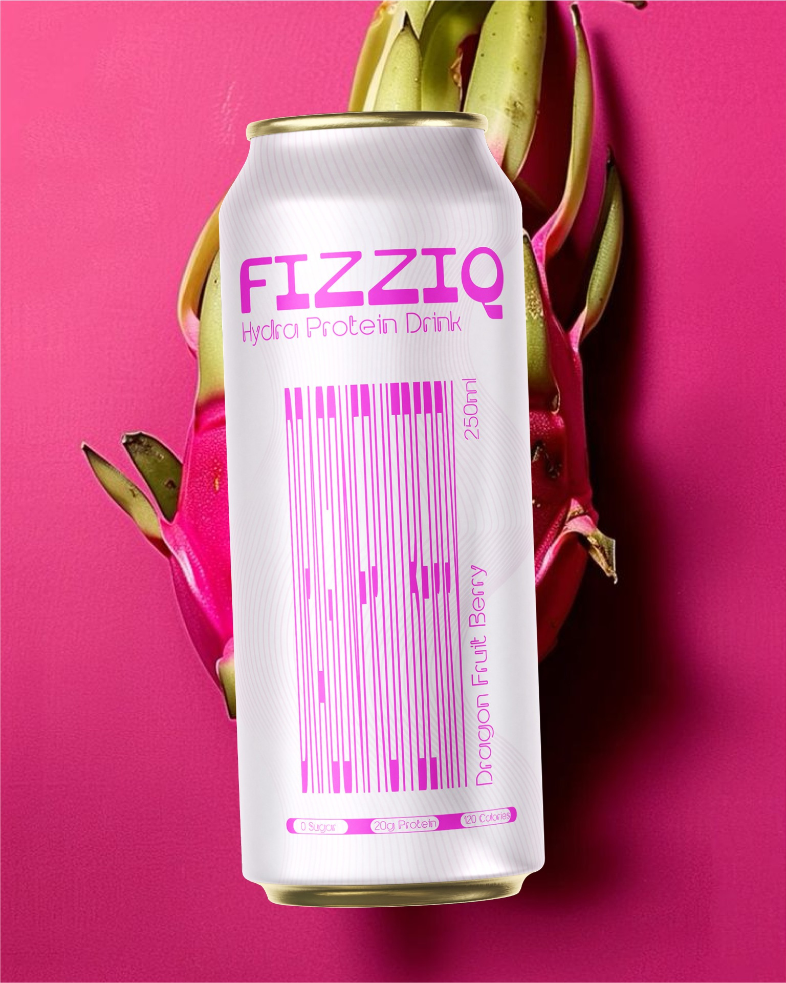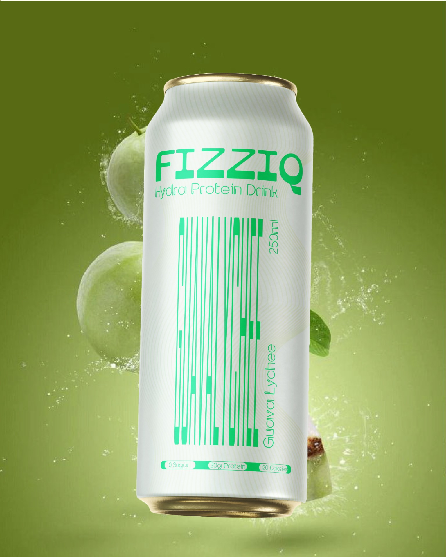
FIZZIQ – Hydra Protein Drink Packaging Design
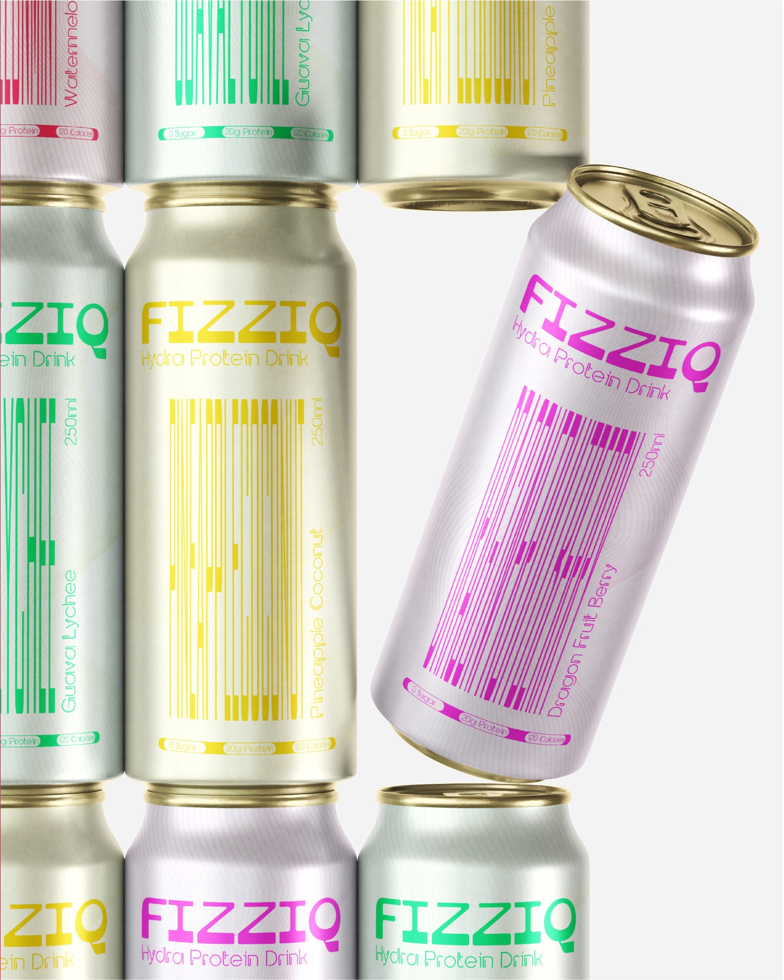
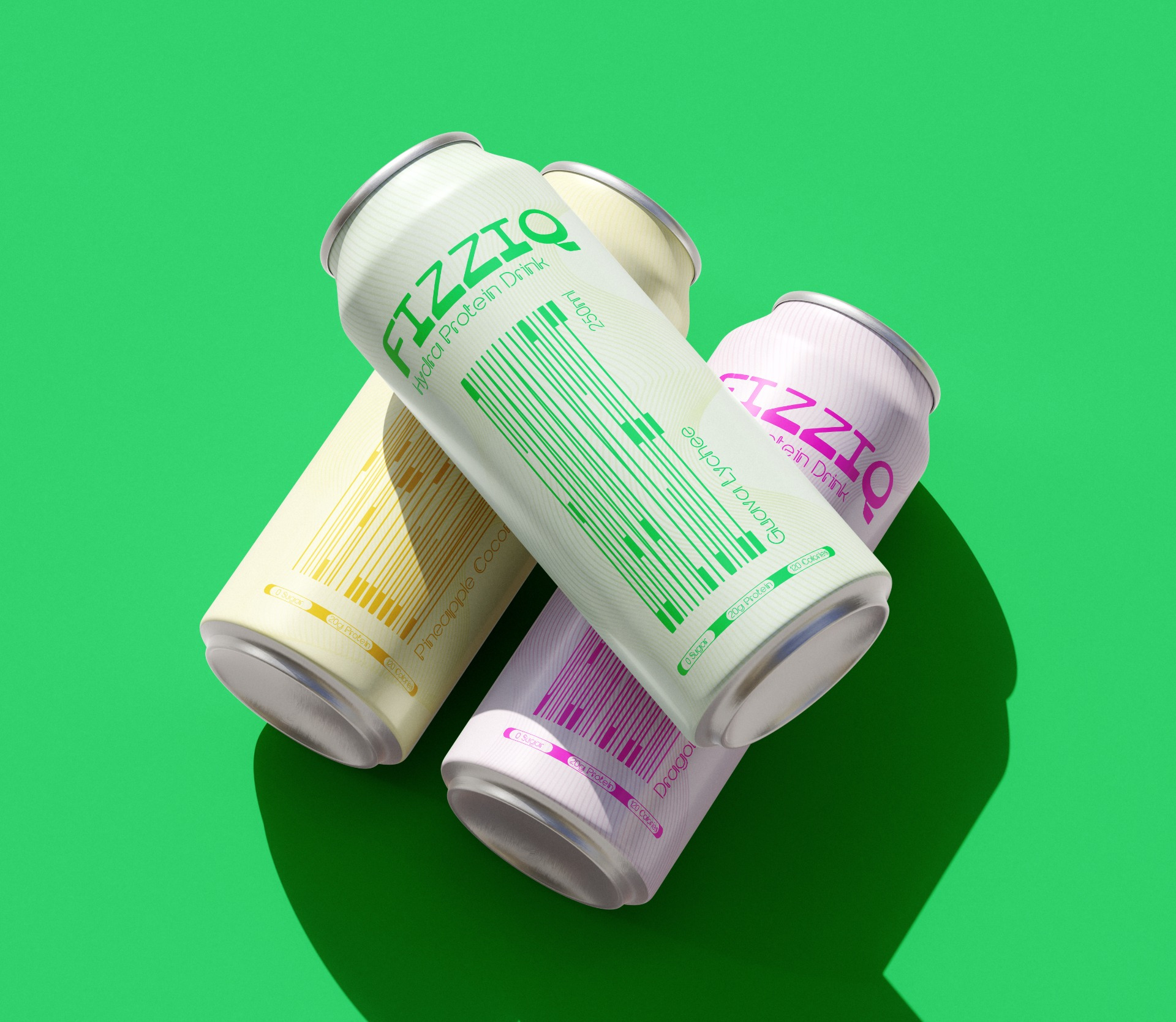
FIZZIQ is a modern functional beverage brand that combines hydration and protein into a refreshing ready-to-drink experience. Designed for a younger health-conscious audience, the product offers a vibrant alternative to traditional protein beverages by focusing on tropical flavors, visual energy, and clean nutritional positioning.
The beverage range includes four flavors:
Pineapple Coconut
Guava Lychee
Dragon Fruit Berry
Watermelon Mint
Each variant is designed to feel refreshing, expressive, and instantly recognizable both on shelf and in digital environments.
The concept behind FIZZIQ was to transform flavor communication into a visual experience rather than relying on conventional fruit imagery alone.
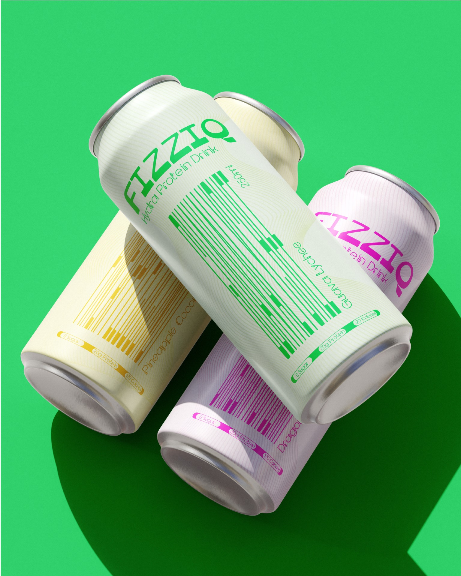
Instead of placing standard flavor illustrations on the packaging, the flavor names themselves become illustrative graphic elements. Typically the flavour is seen when you hold the tin is tilted in a way you drink. The typography is manipulated and structured to visually represent the feeling, texture, and energy of each flavor profile.
The packaging system was designed to merge functionality and freshness while creating strong shelf visibility through minimal layouts, bold color coding, and expressive typographic storytelling.
The design solution focused on creating a scalable visual system that communicates flavor, functionality, and brand recognition with minimal visual clutter.
A clean white base for premium contrast bold color-coded flavor differentiation illusion flavor typography minimal nutritional communication strong vertical layout hierarchy
The illusion flavor typography style acts as both a functional identifier and a graphic storytelling element, reducing dependence on excessive imagery while increasing memorability.
The overall system was designed to create immediate flavor recognition in retail environments while maintaining consistency across the product range.
The packaging system was developed using a combination of minimal branding principles and expressive typographic experimentation.
Key design techniques include:
Illusional typography integrated into flavor naming
Minimal front-panel hierarchy for enhanced shelf visibility
Controlled use of fruit imagery to support flavor identity without overpowering the design
Unlike traditional functional beverages that often rely on aggressive fitness aesthetics or cluttered nutritional communication, FIZZIQ introduces a cleaner and more expressive packaging approach.
The most distinctive element of the system is the use of flavor names as illustrative graphic forms, allowing typography itself to become part of the flavor storytelling experience.
Key differentiators include:
Illustrative flavor typography system
Minimal and high-visibility layout
Flavor-first visual communication
A youthful and digitally driven aesthetic
Fusion of hydration and protein positioning
Strong scalability across multiple variants
The packaging creates a balance between wellness functionality and contemporary lifestyle branding.
FIZZIQ reimagines the functional beverage category through a packaging system that feels visually refreshing, expressive, and culturally relevant for modern consumers.
By combining bold flavor differentiation, illustrative typography, and minimal structural hierarchy, the project creates strong shelf presence while maintaining clarity and scalability across the product line.
The result is a packaging identity that positions functional nutrition as energetic, approachable, and visually engaging rather than clinical or performance-focused.