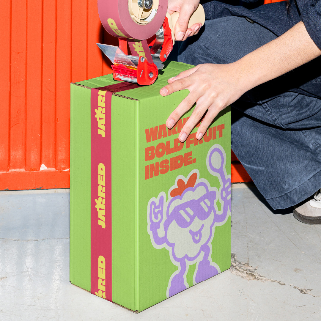
Jarred I Branding & Packaging design
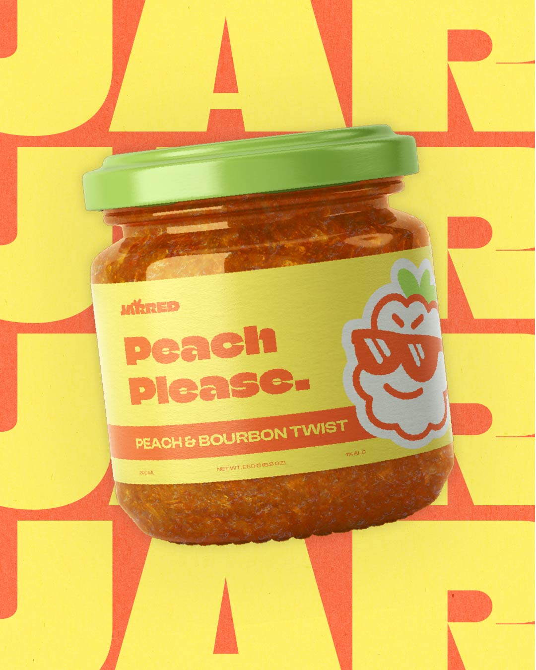
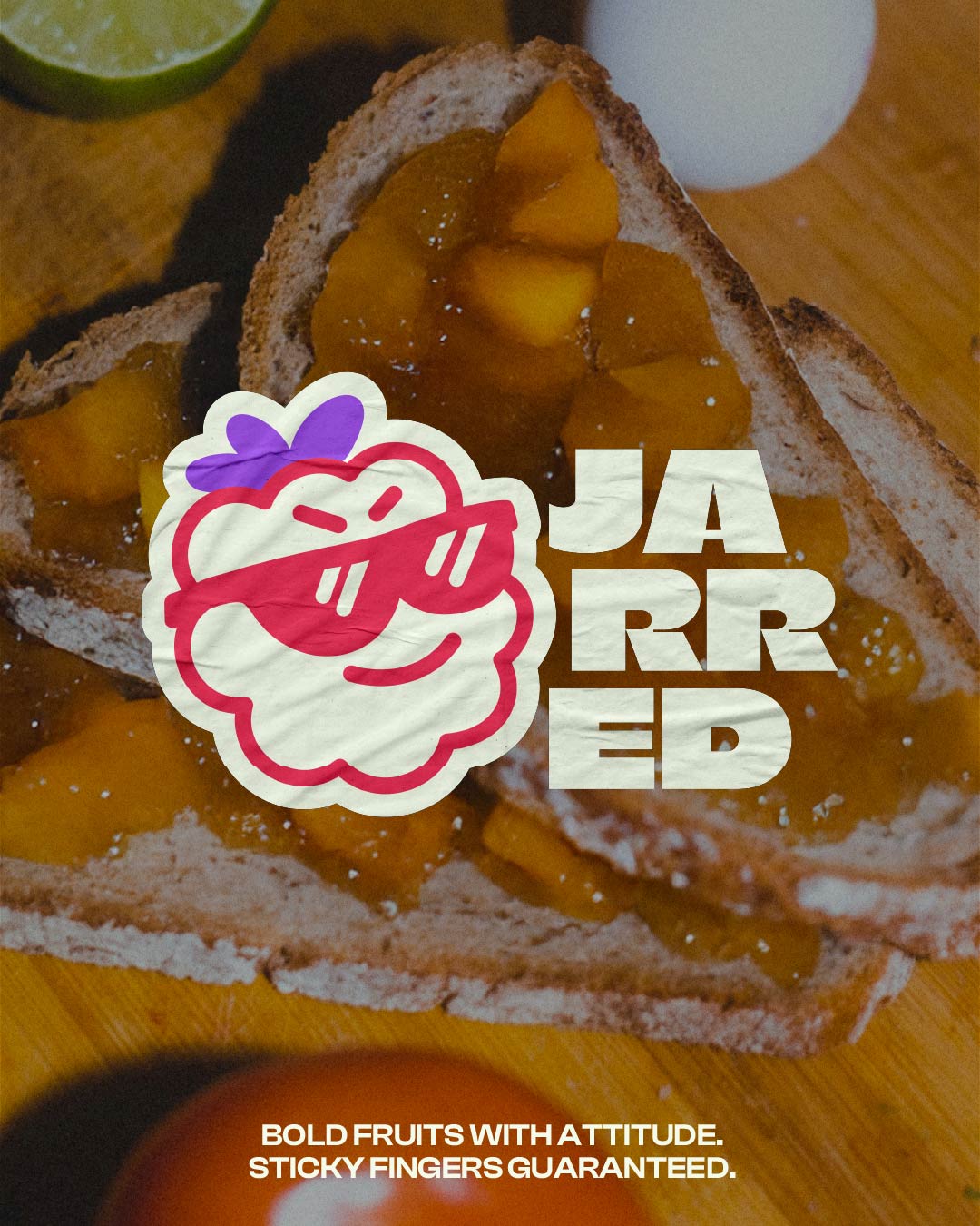
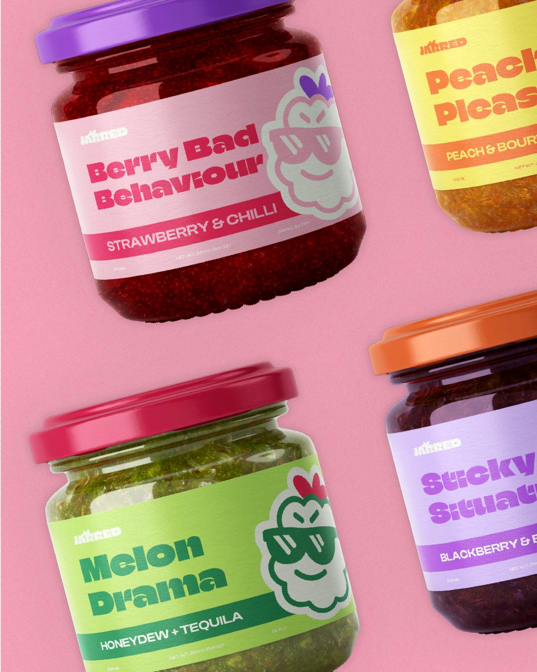
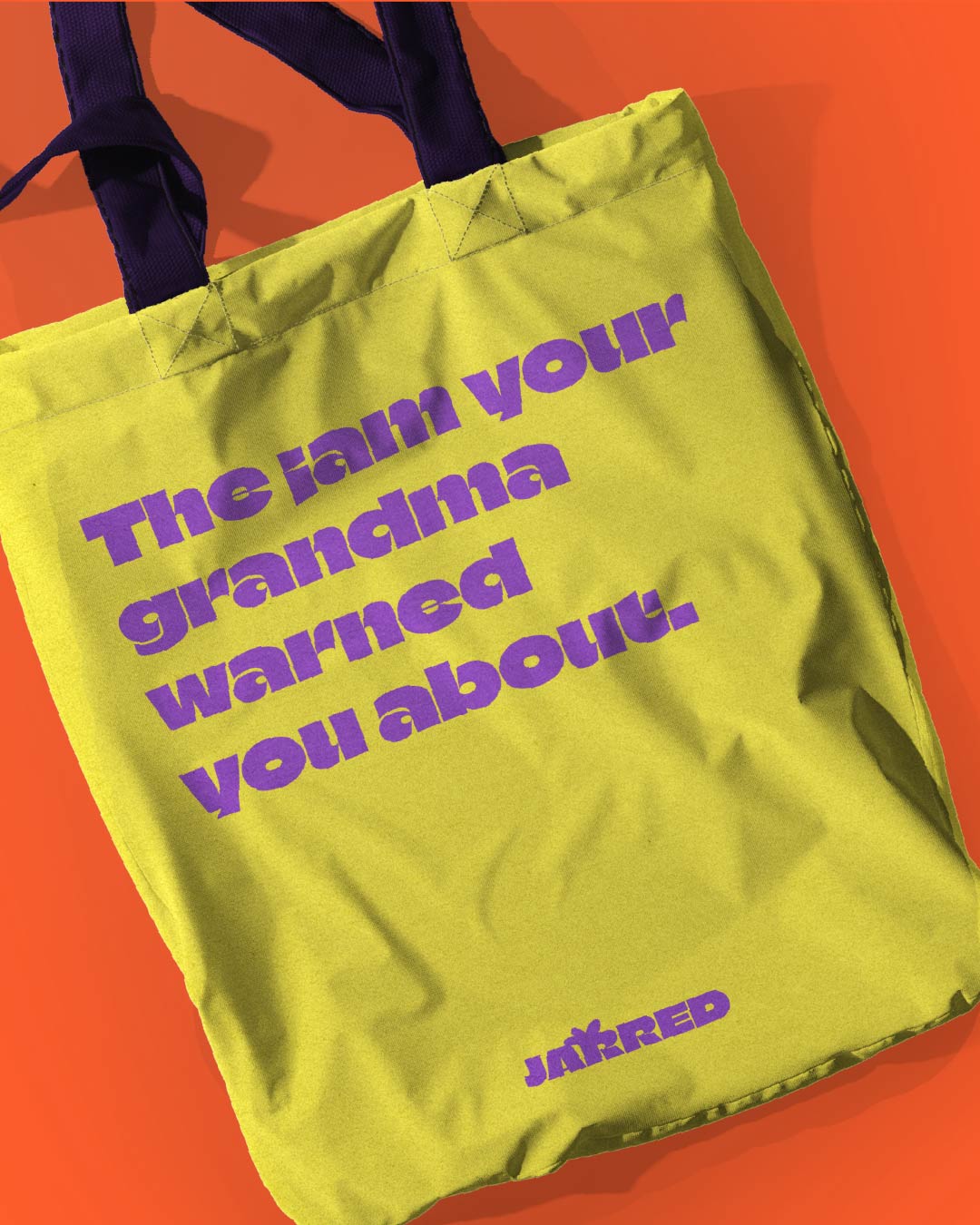
Jarred is a jam with attitude. It’s bold, fruity, and cheeky in all the right ways. Think sticky spoons, toast at midnight, and flavours so good they demand centre stage. This isn’t your grandma’s gingham-lidded jar. Jarred flips the script on jam with a modern, design-conscious edge. Playful enough to grab attention, but polished enough to earn a permanent spot on the shelf.
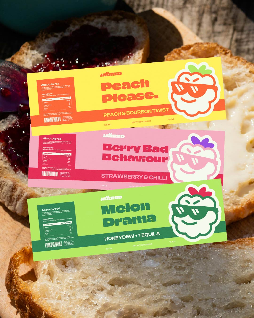
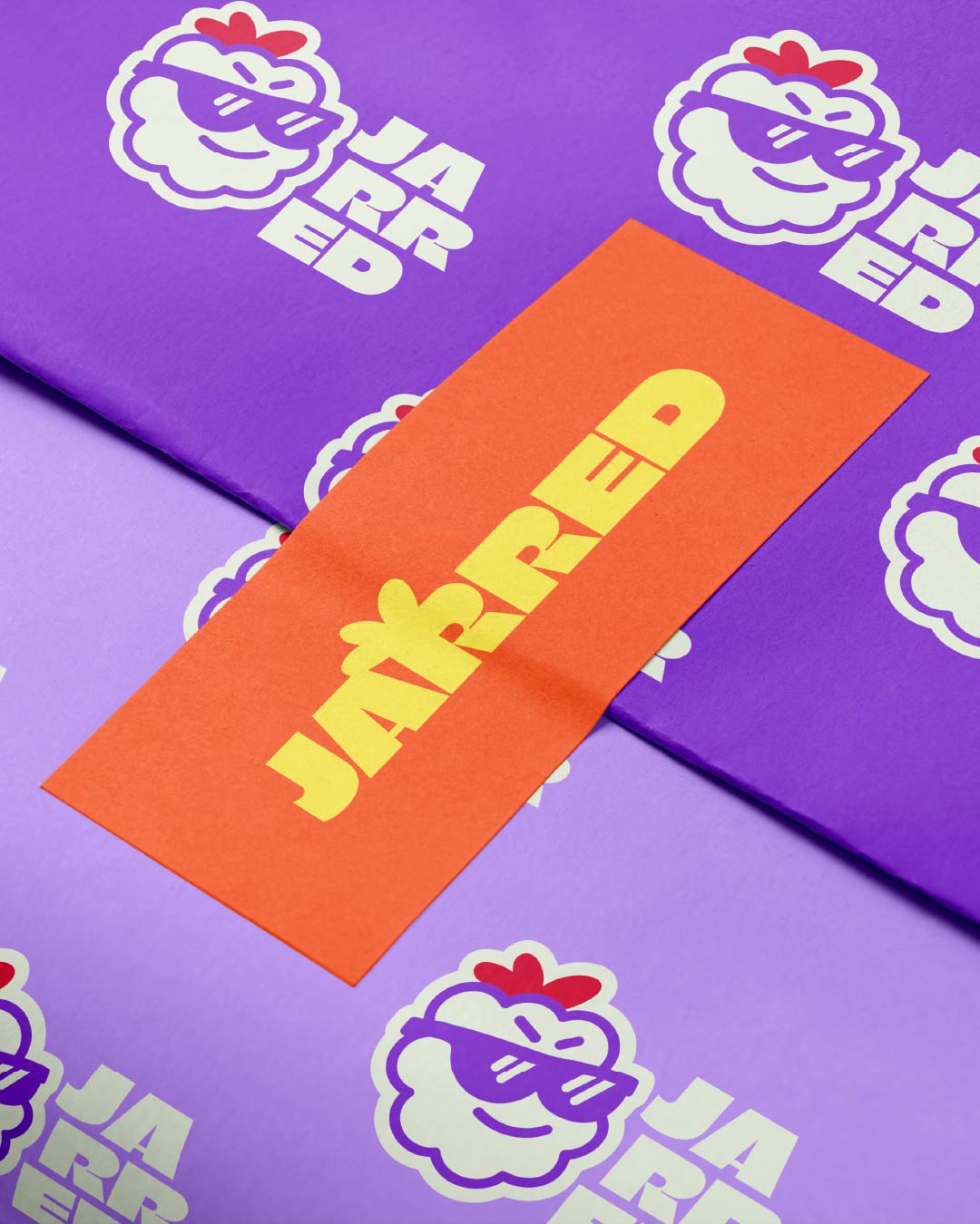
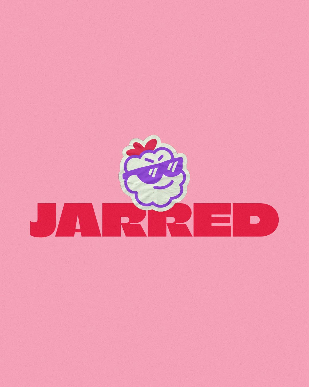
My goal was to create a bold, flavour-driven identity and packaging system that balances playfulness with polish – giving the brand strong shelf presence and social appeal. I explored two directions: a bold, cheeky aesthetic with strong contrasts and confident typography and a softer, playful direction with pastels and hand-drawn elements. The first direction (bold, cheeky, and attitude-driven) was chosen for its striking visual punch and distinctive character.
The final identity brought Jarred’s personality to life with confidence and charm. The packaging stands out instantly on shelves and in photos, while the bold tone and playful visuals help the brand connect with modern consumers who value both taste and design. Jarred now feels unmistakably fresh – equal parts flavour and fun.