Junday Bamboo
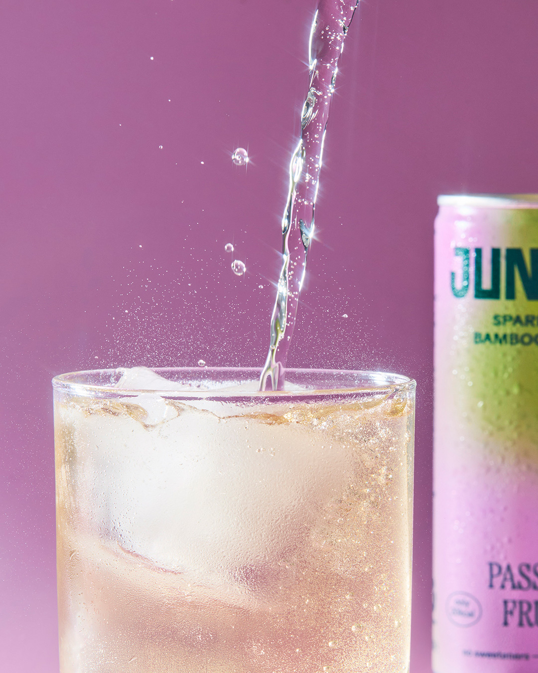
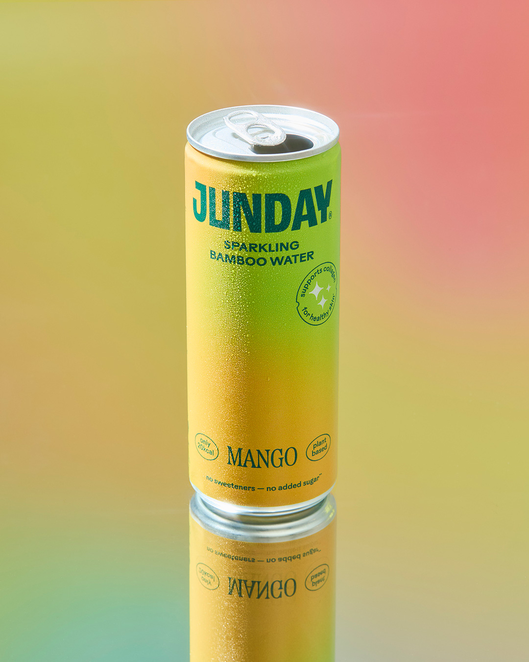
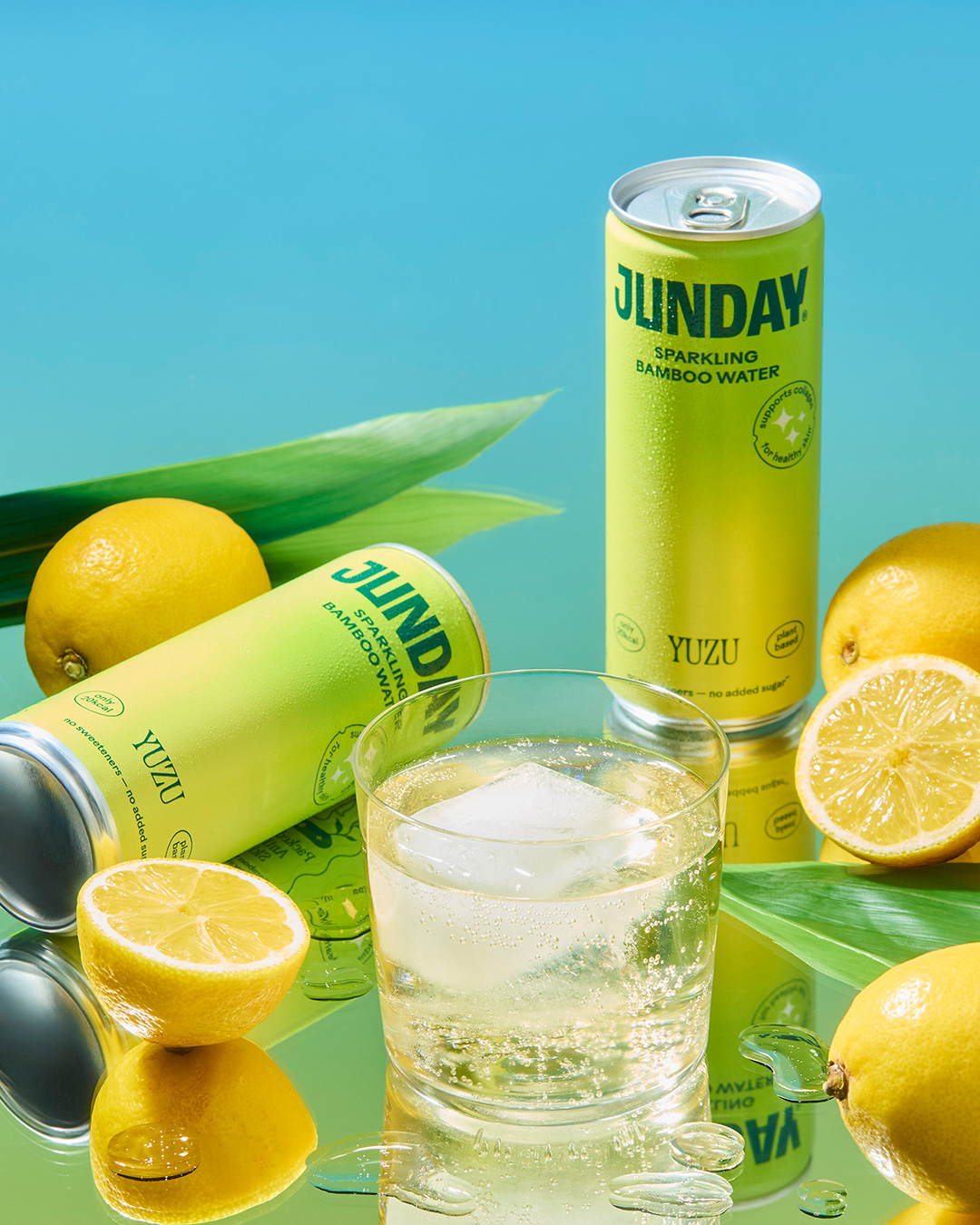
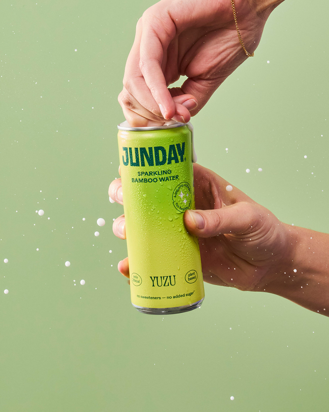
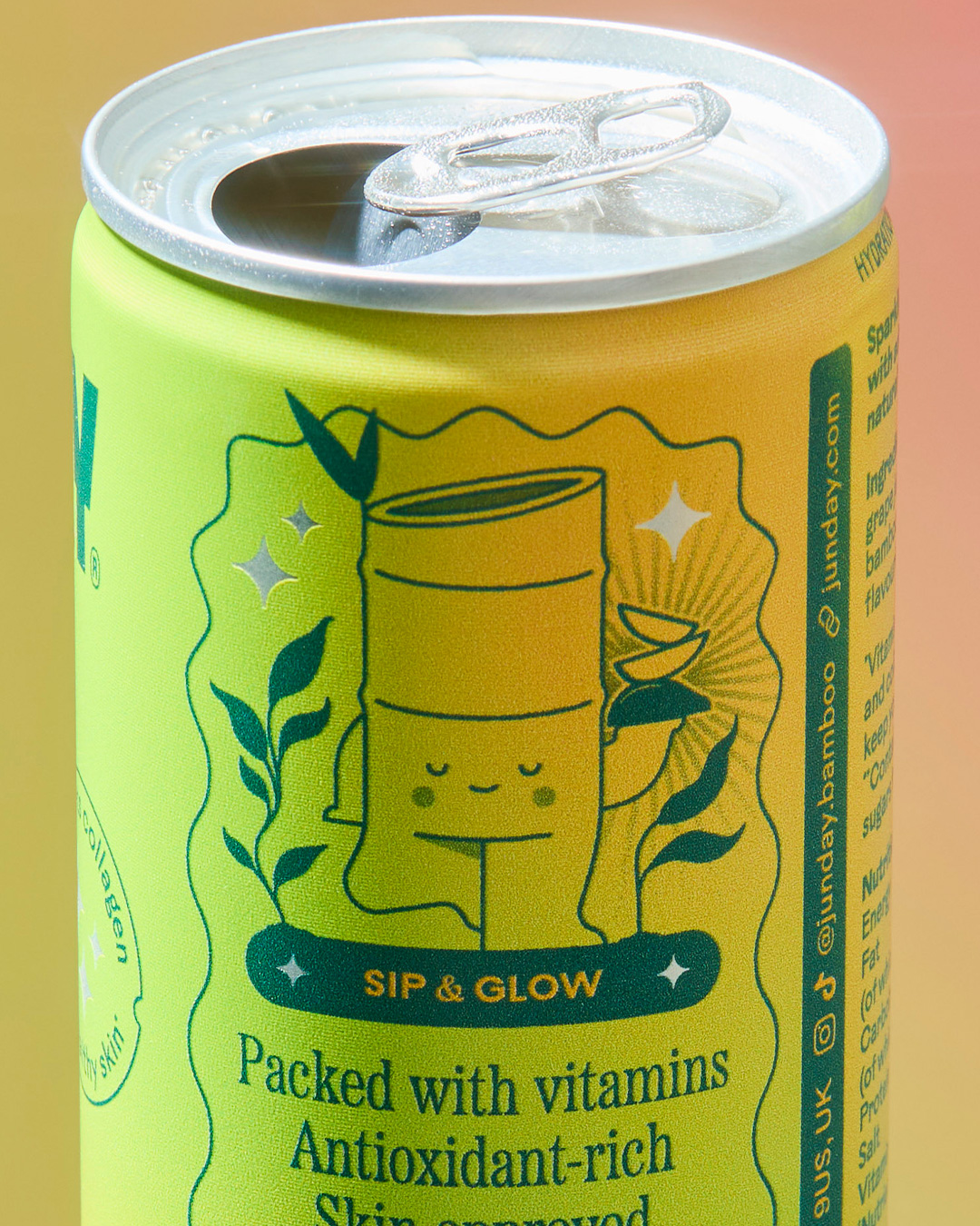
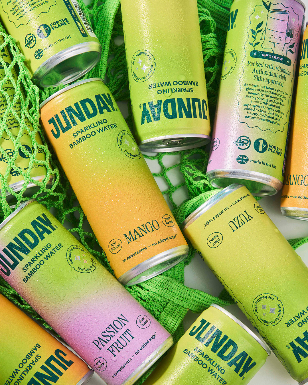
Brand identity and packaging for the world’s first wellness brand, powered by bamboo. Bold, bright and brimming with positivity, JUNDAY is designed to fit seamlessly into everyday life. There’s a modern functionality to the brand that shines with calm confidence — from images of real people and natural ingredients to a vibrant colour palette that’s hand-picked from nature itself.
Expansion beyond the UK, beyond drinks, and with a bigger ambition, they needed a name that could grow with them (and could be globally trademarked). The meaning? “JUN” — Japanese kanji for pure, clean and simple. “DAY” — wellness should be a daily ritual.
Just like the name change, this was all about brand evolution rather than reinvention so existing drinkers could still easily recognise products on-shelf, whilst attracting new customers with a clearer proposition. Building on what people loved about them already, I developed the visual language and tone of voice, setting the brand’s foundations for years to come.