KUMOO MATCHA HOUSE by Sofiia Oswald Design
Meet Kumoo – a modern matcha house in London, created around the beauty of slowing down!
Kumoo was born from a simple idea: matcha can be more than just a drink. It can become a small daily ritual, a moment to pause, reset, hold something warm, and give your mind a little space.
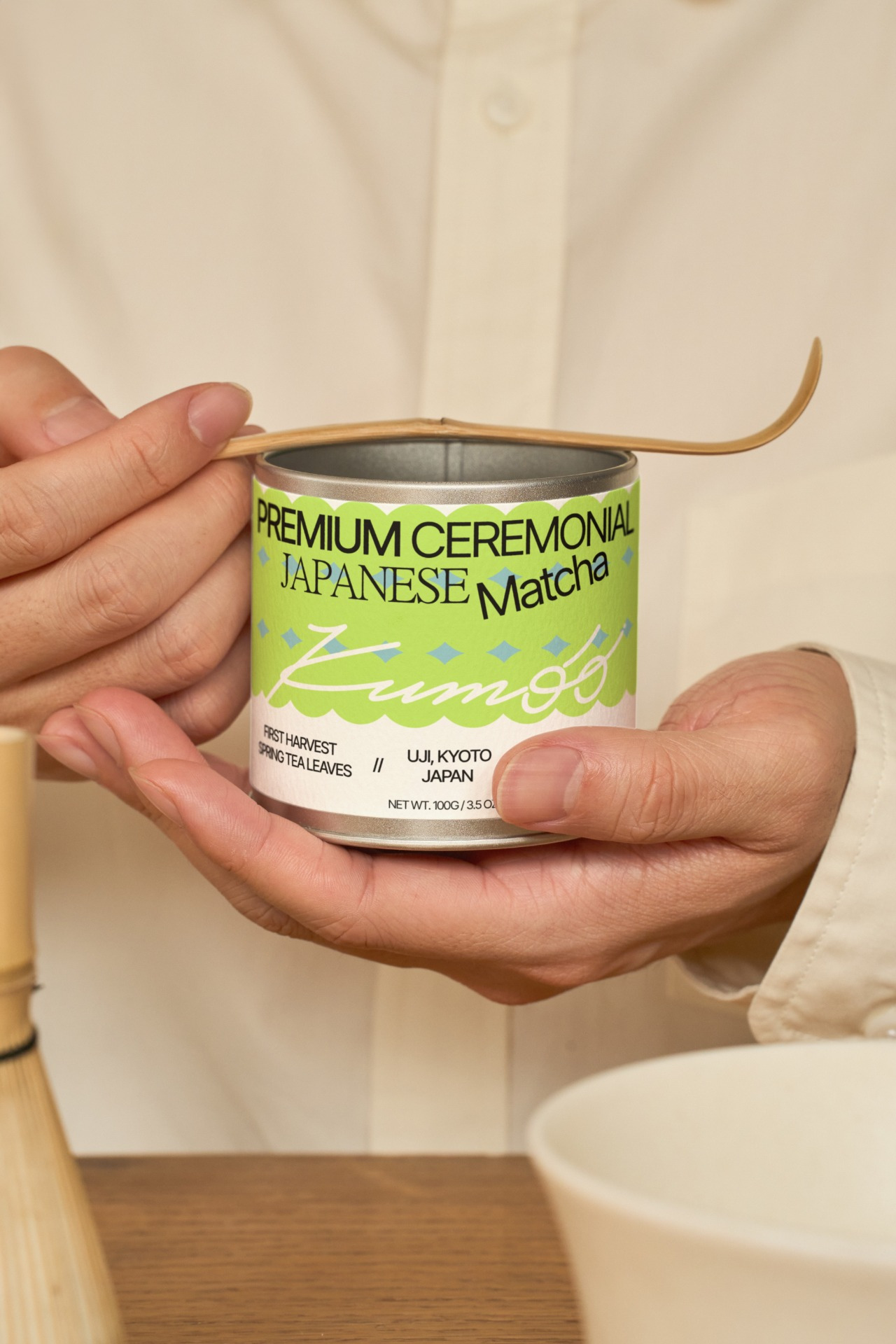
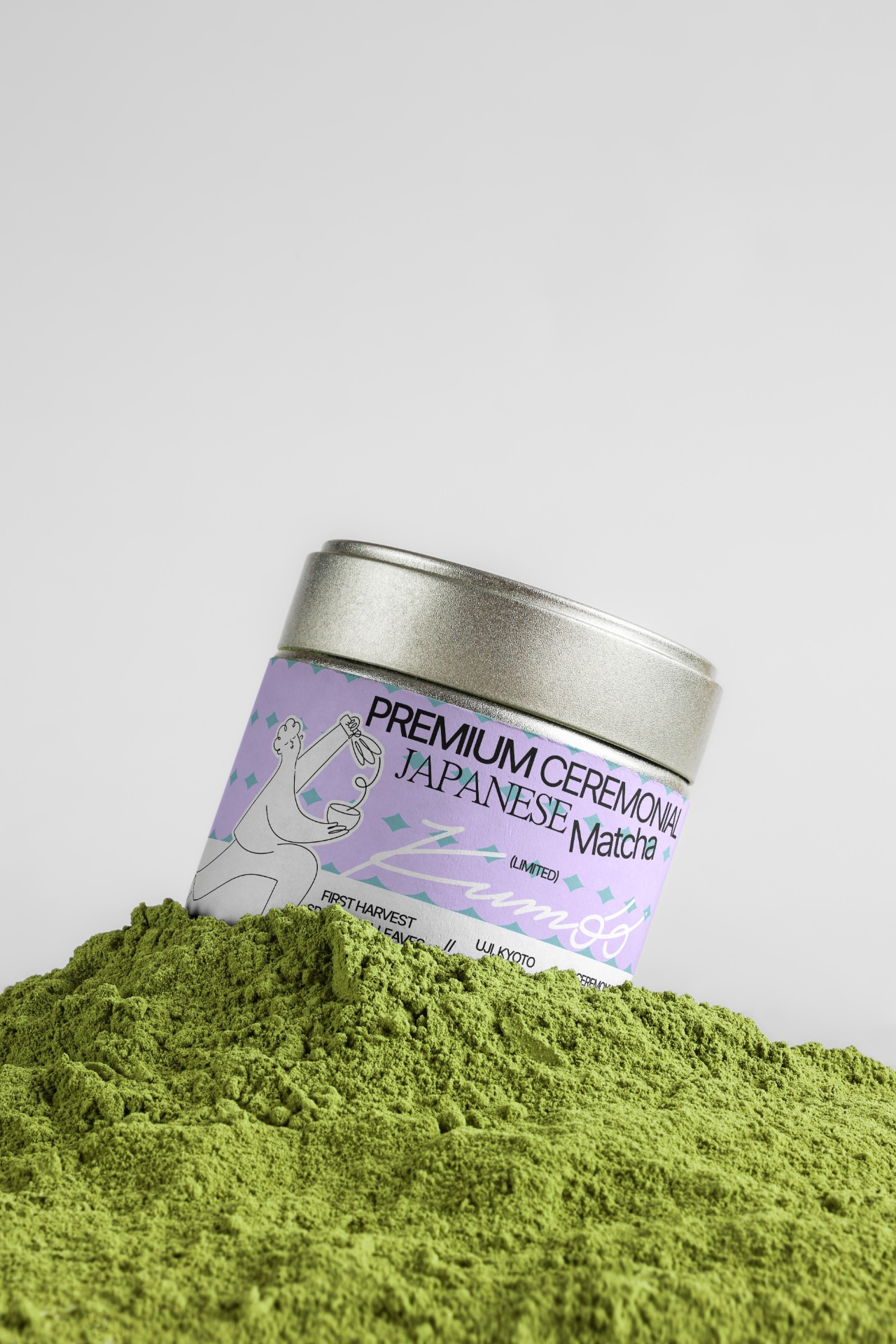
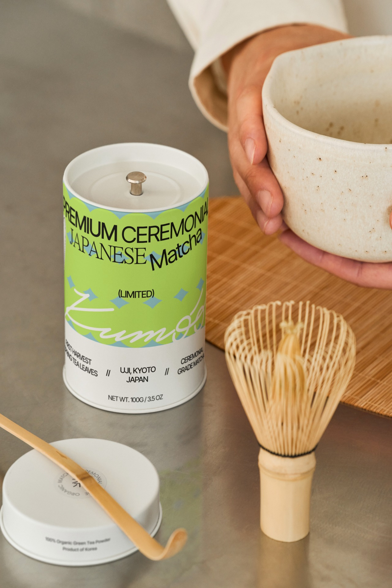
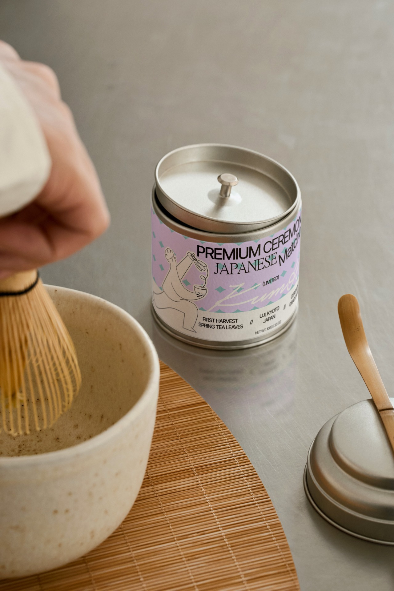
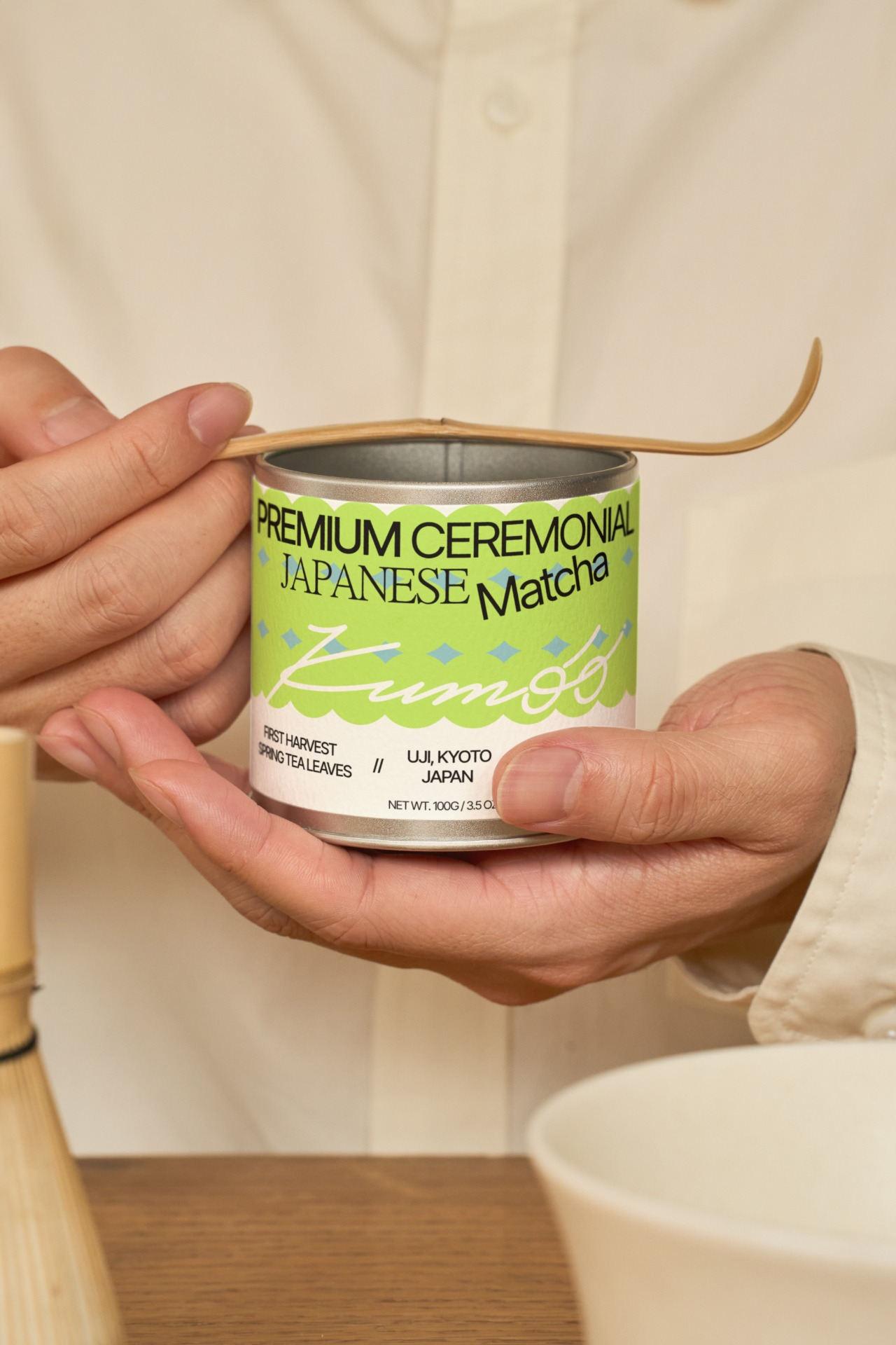
The brand brings together premium ceremonial Japanese matcha with a playful and contemporary café atmosphere. Rather than leaning into something overly traditional or minimal, Kumoo creates a softer and more expressive world, calm, memorable and full of personality.
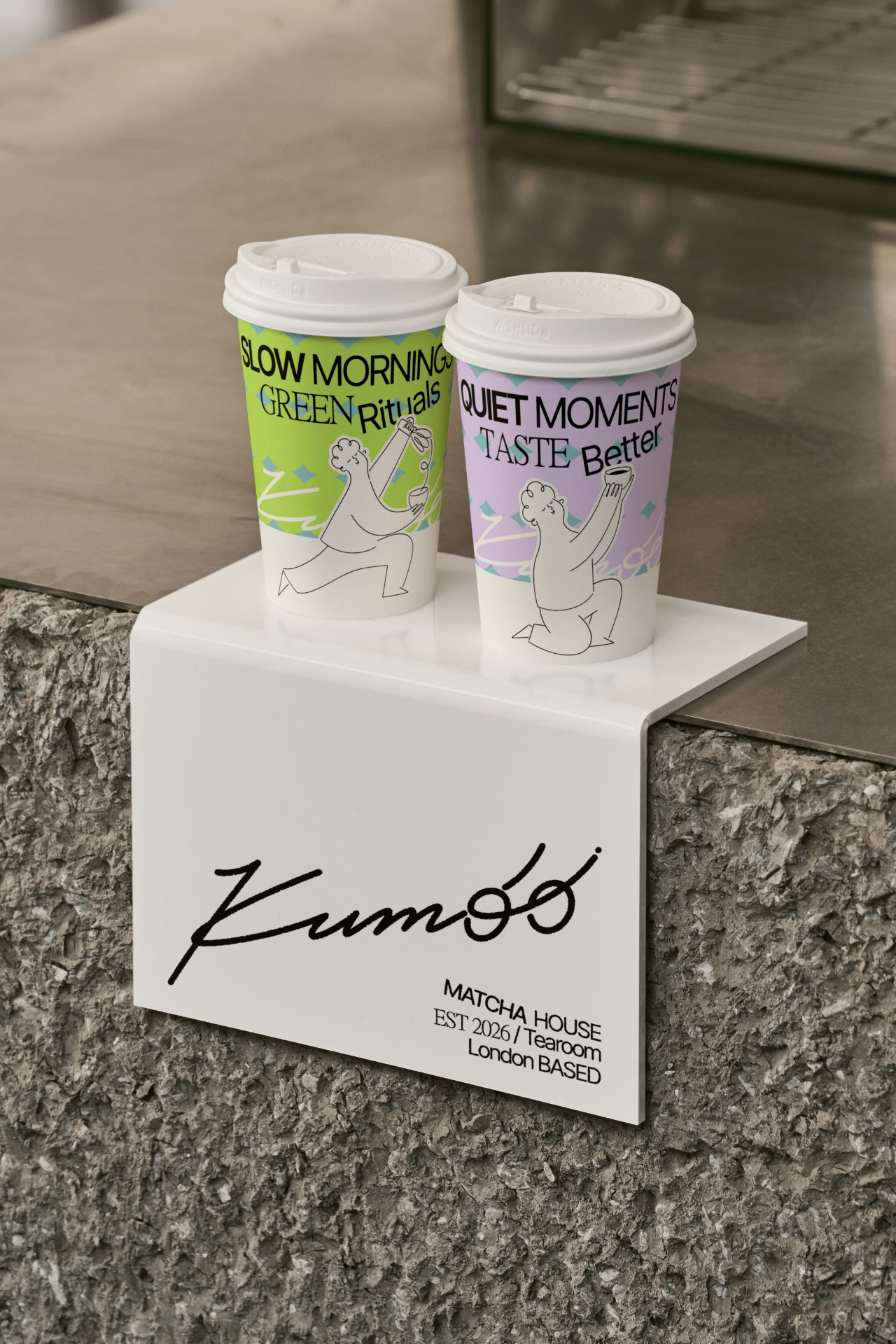
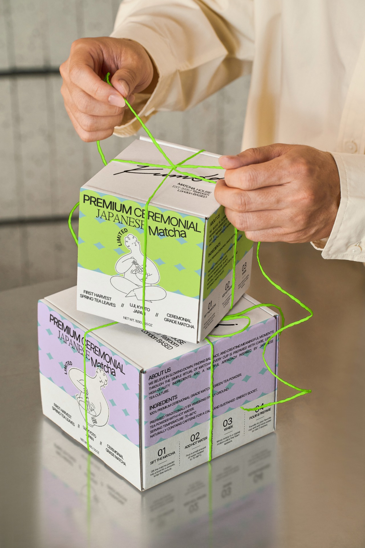
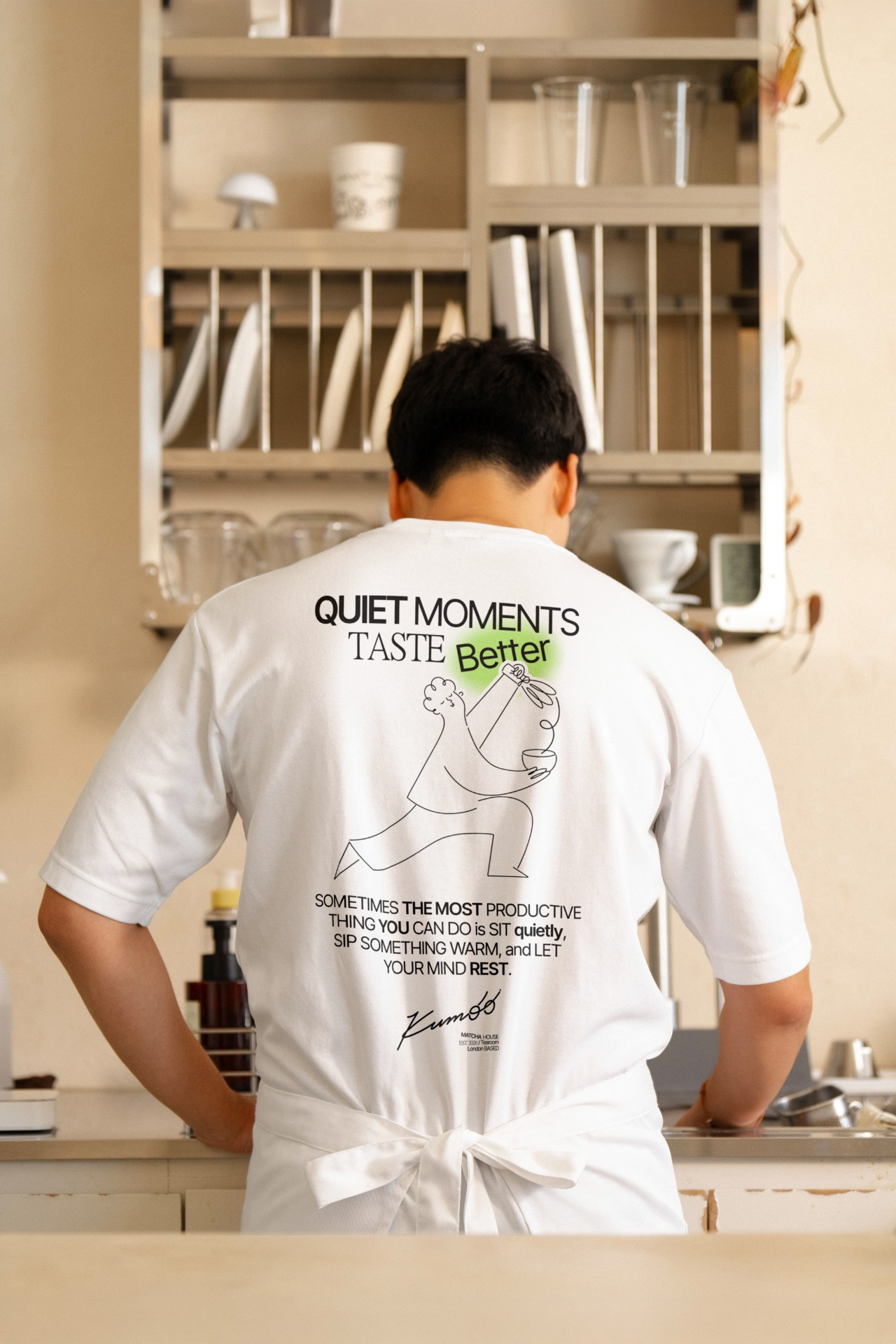
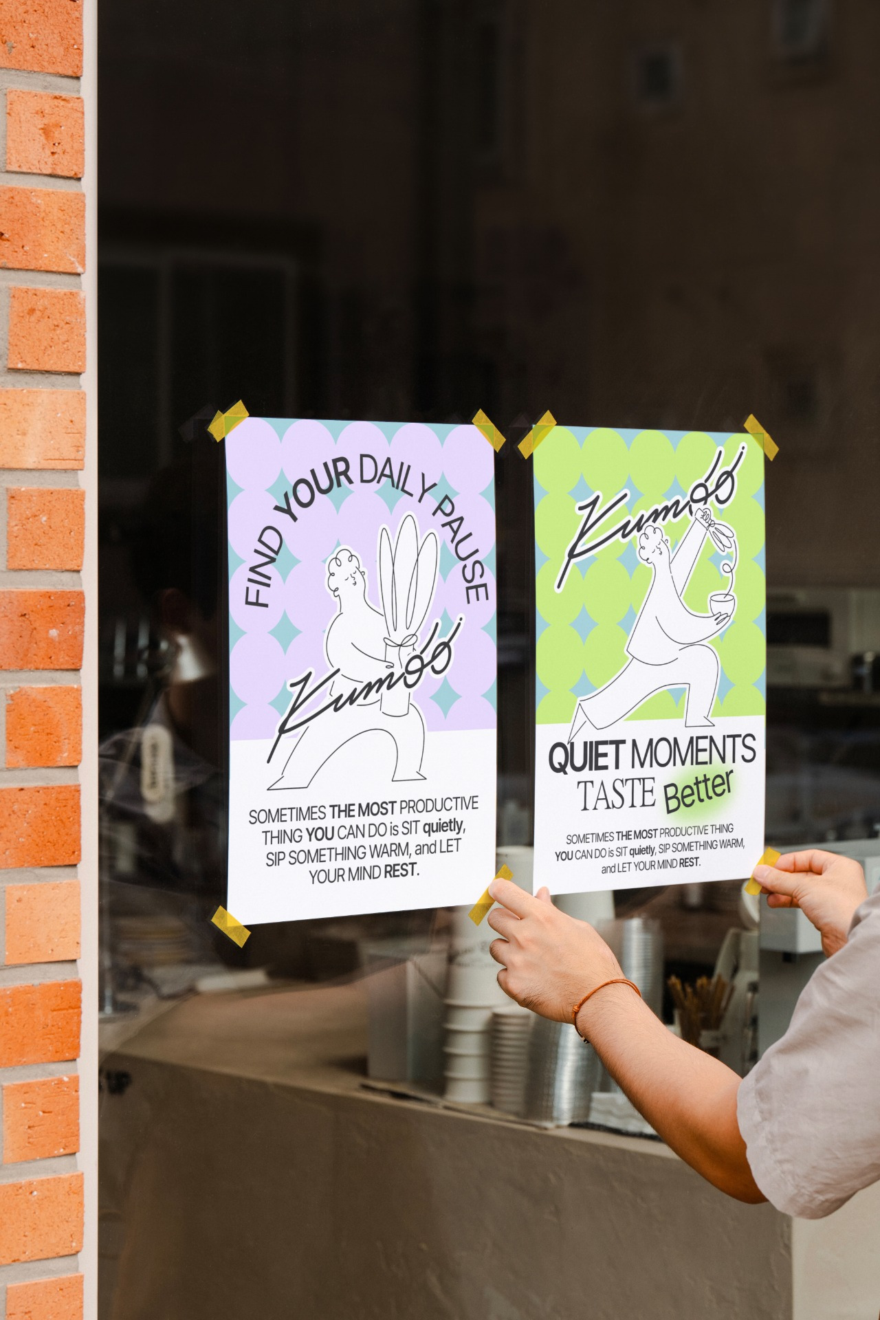
The visual identity is built around the contrast between quietness and energy, softness and confidence. Fresh matcha green, lavender and pale blue create a distinctive colour palette, while custom line-art characters capture small everyday rituals and bring a human, slightly humorous feeling into the brand.
Typography combines bold contemporary forms, elegant serif details and a fluid handwritten logotype, creating a flexible identity that can live across packaging, cups, merchandise, posters and the café space itself.
Brand identity, packaging & illustration by Sofiia Oswald.
Mockups – @mockup.asia & @scenenumber.mockup