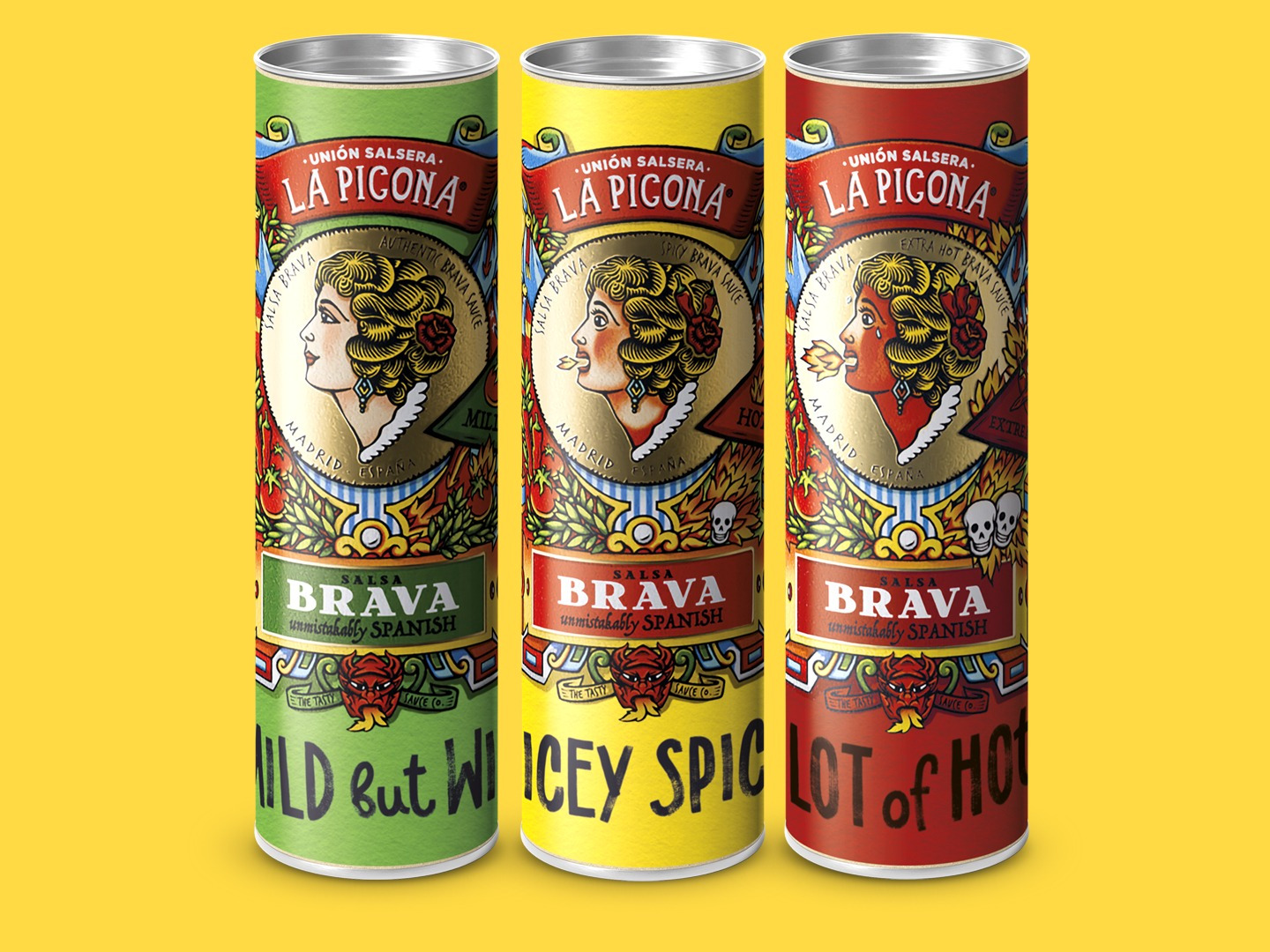
La Picona. A lot of Hot
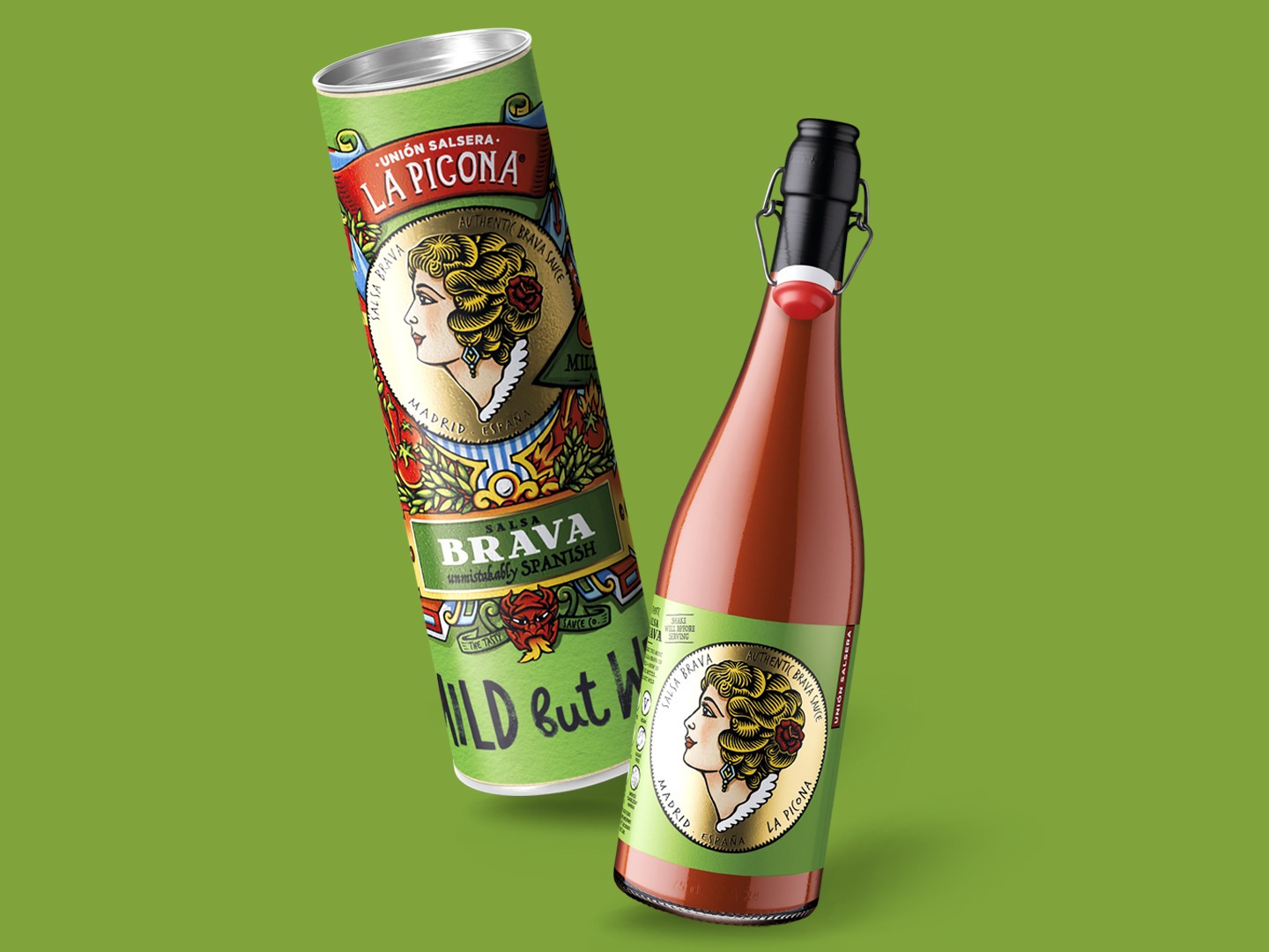
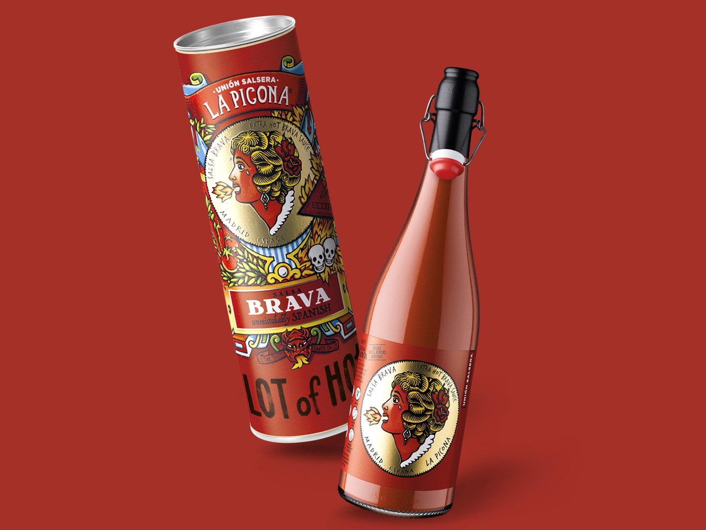
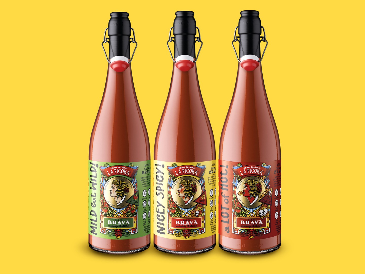
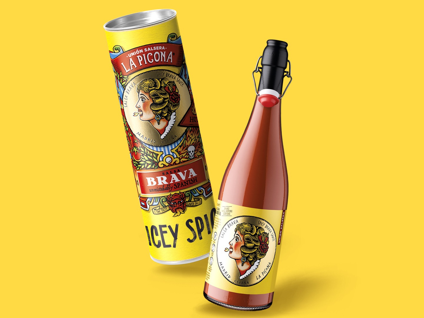
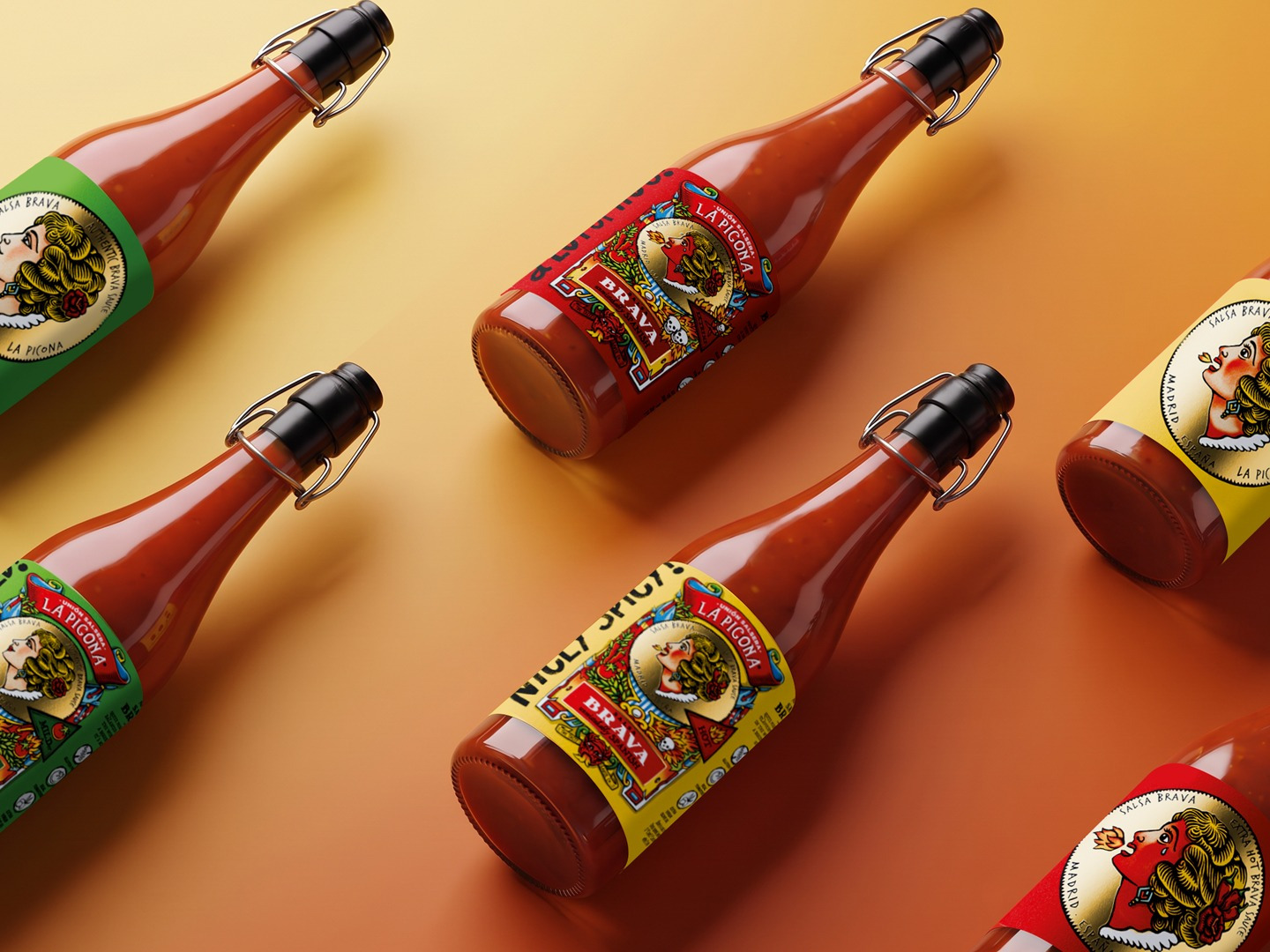
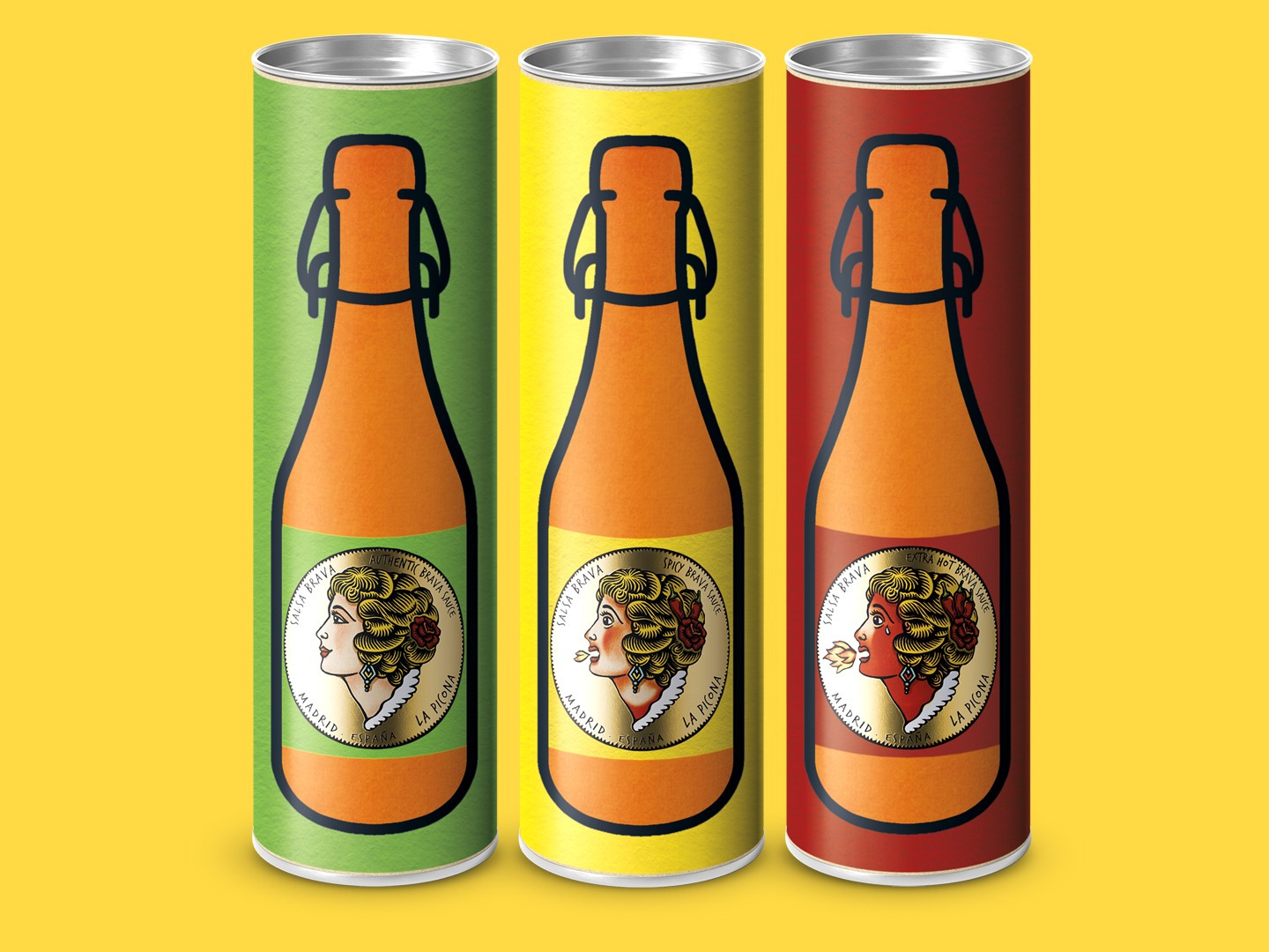
Driven by growing demand from its followers and the opportunity to expand into new territories, the brand commissioned us to create a special large-format edition (75cl), designed to maximise visual impact and international presence. The graphic concept maintains the brand’s bold, pop-art spirit. We developed a labelling system using silver-finish paper with a white underprint (white mask), allowing the logo to shine with a distinctive gold-like lustre. The large-format bottles act as a powerful draw at the point of sale, while the detail-rich illustrations guide the consumer through the brand experience. A clever visual device communicates the heat level: the central character on each label progressively turns red according to the intensity of the variety (A Lot of Hot, Mild but Wild, and Nicey Spicy). The result is a special edition that has successfully captured foreign markets, confirming the brand’s appeal beyond its borders. Client: Union Salsera Studio: Narrow House Packaging, Branding & Diseño