Milkish Brand Identity & Packaging
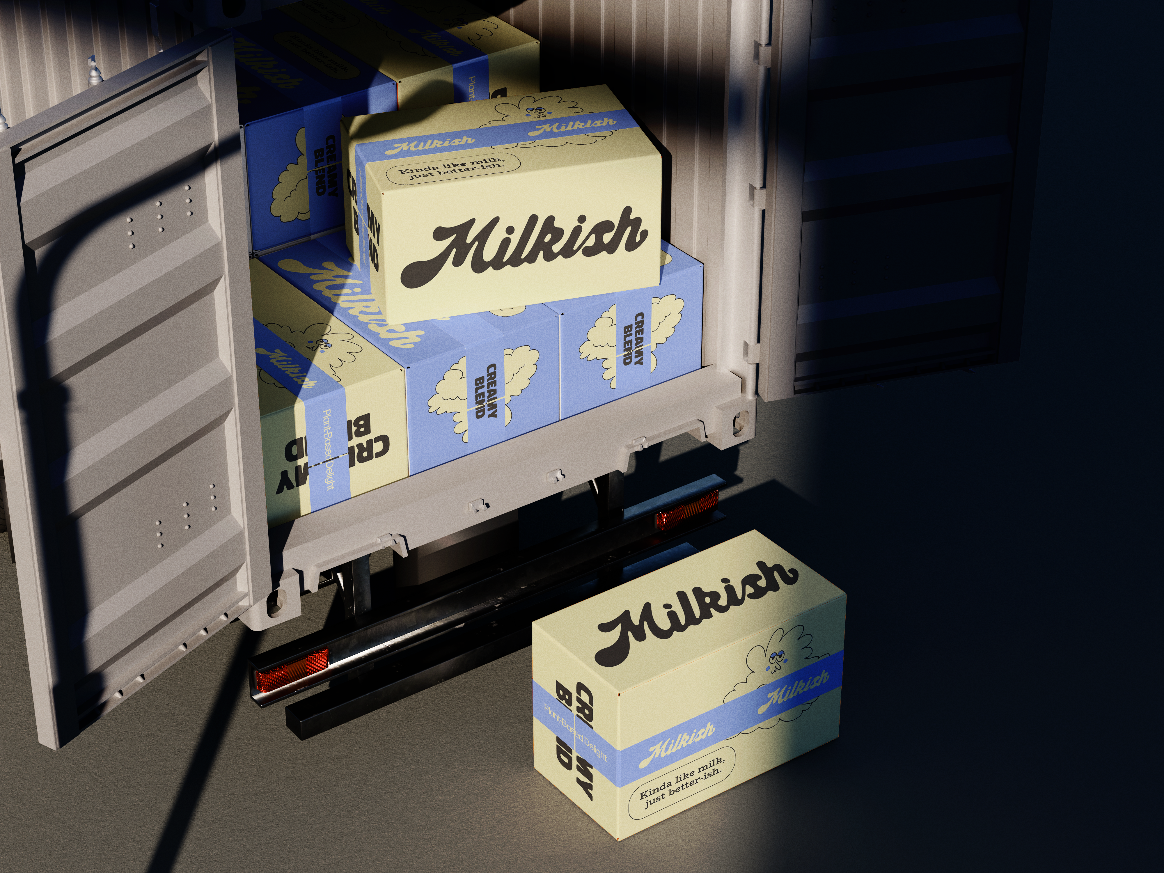
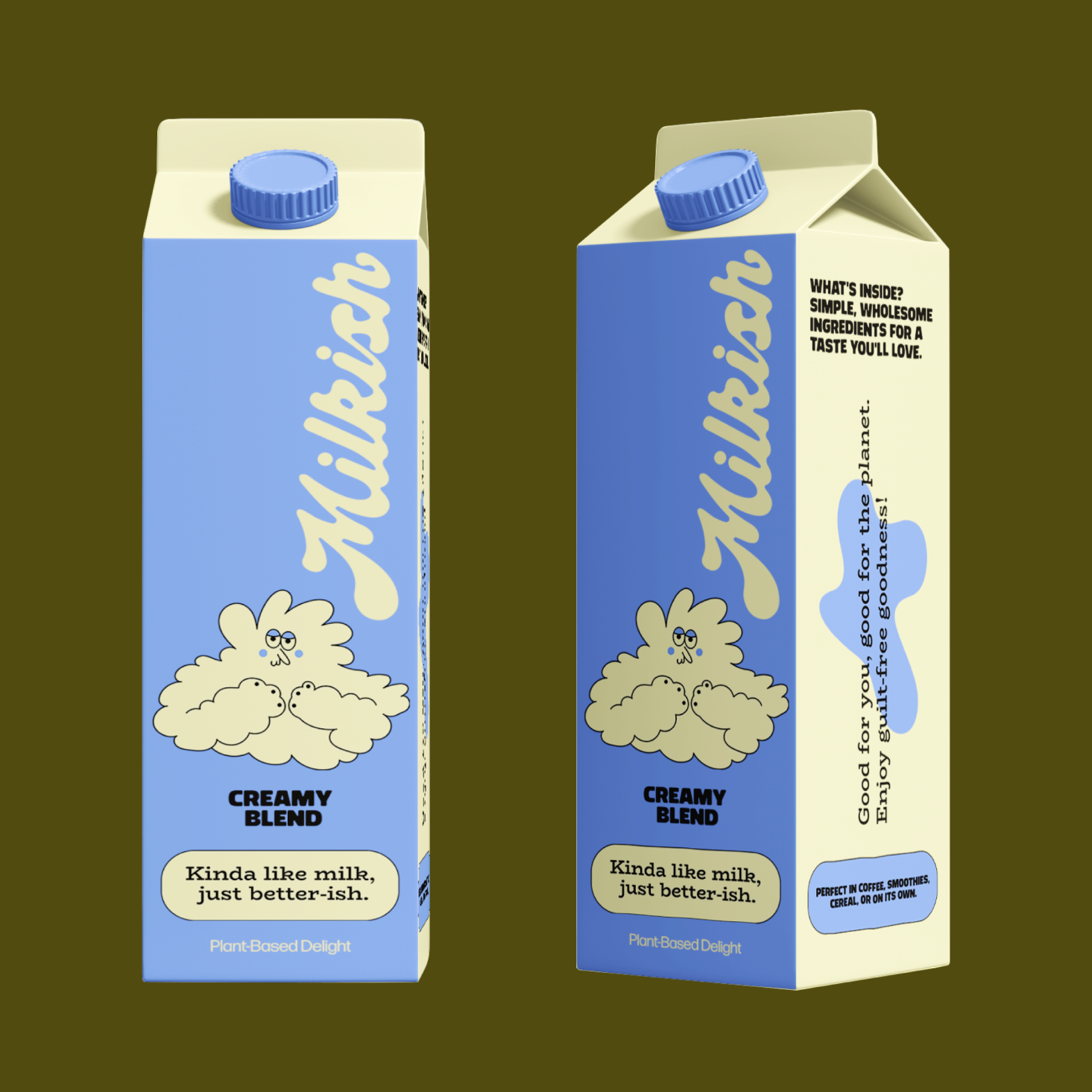
My brand identity and packaging design entry for Milkish, a plant-based milk.
Thank you to @designerbriefs & @theoryofours for hosting this challenge!
Design Approach & Mascot:
The main goal was to make Milkish feel friendly, simple, and honest, moving away from typical, serious plant-milk packaging.
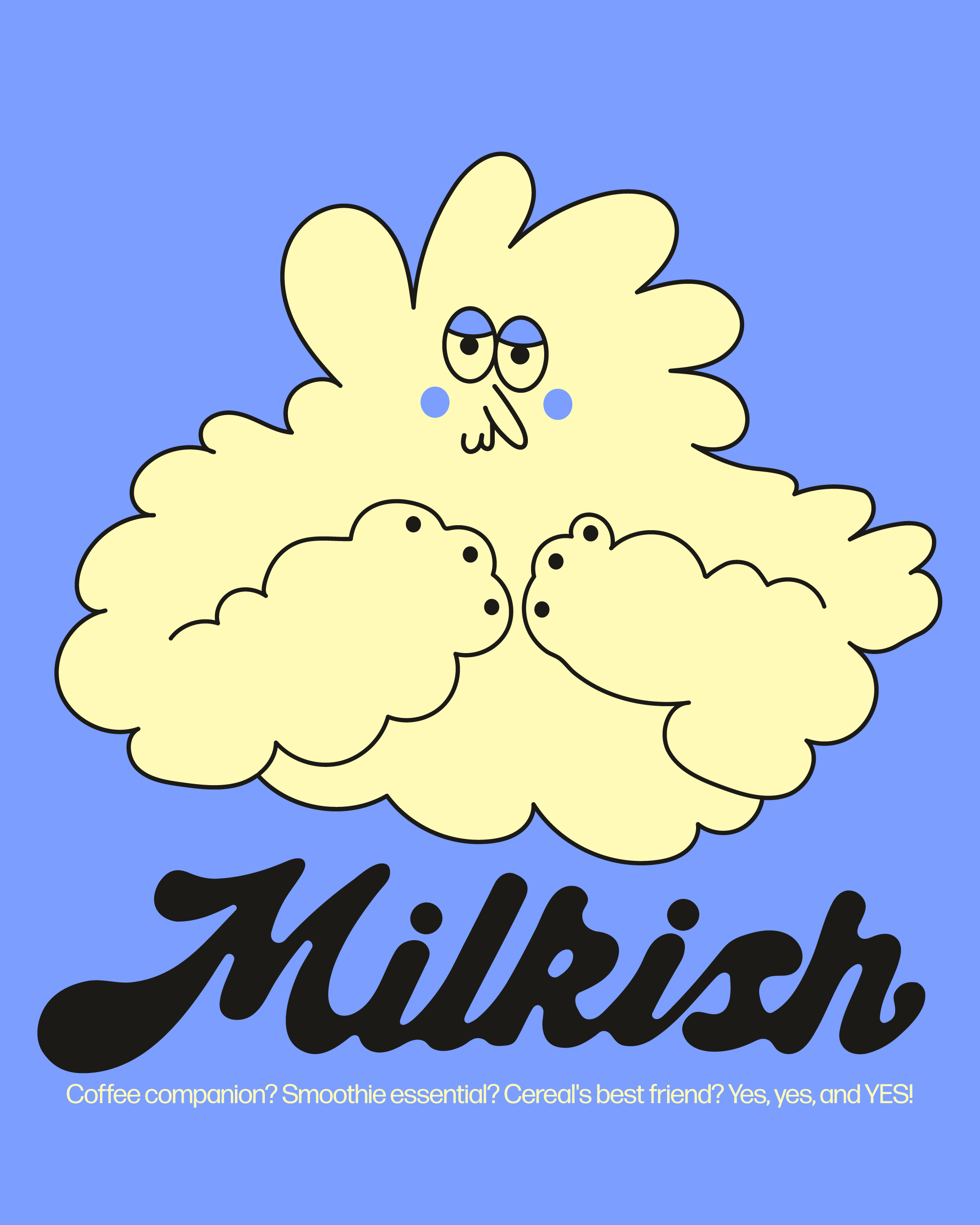
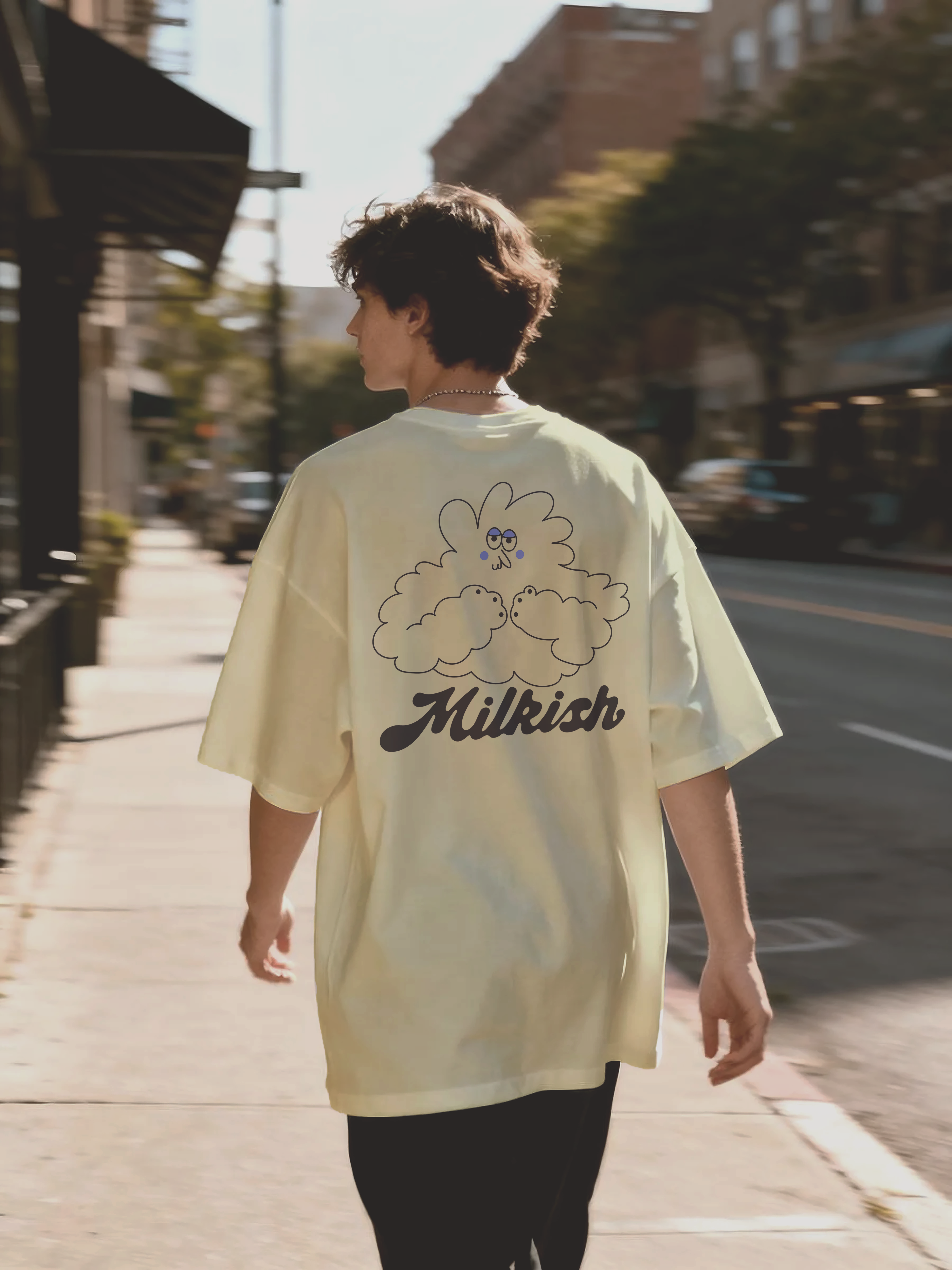
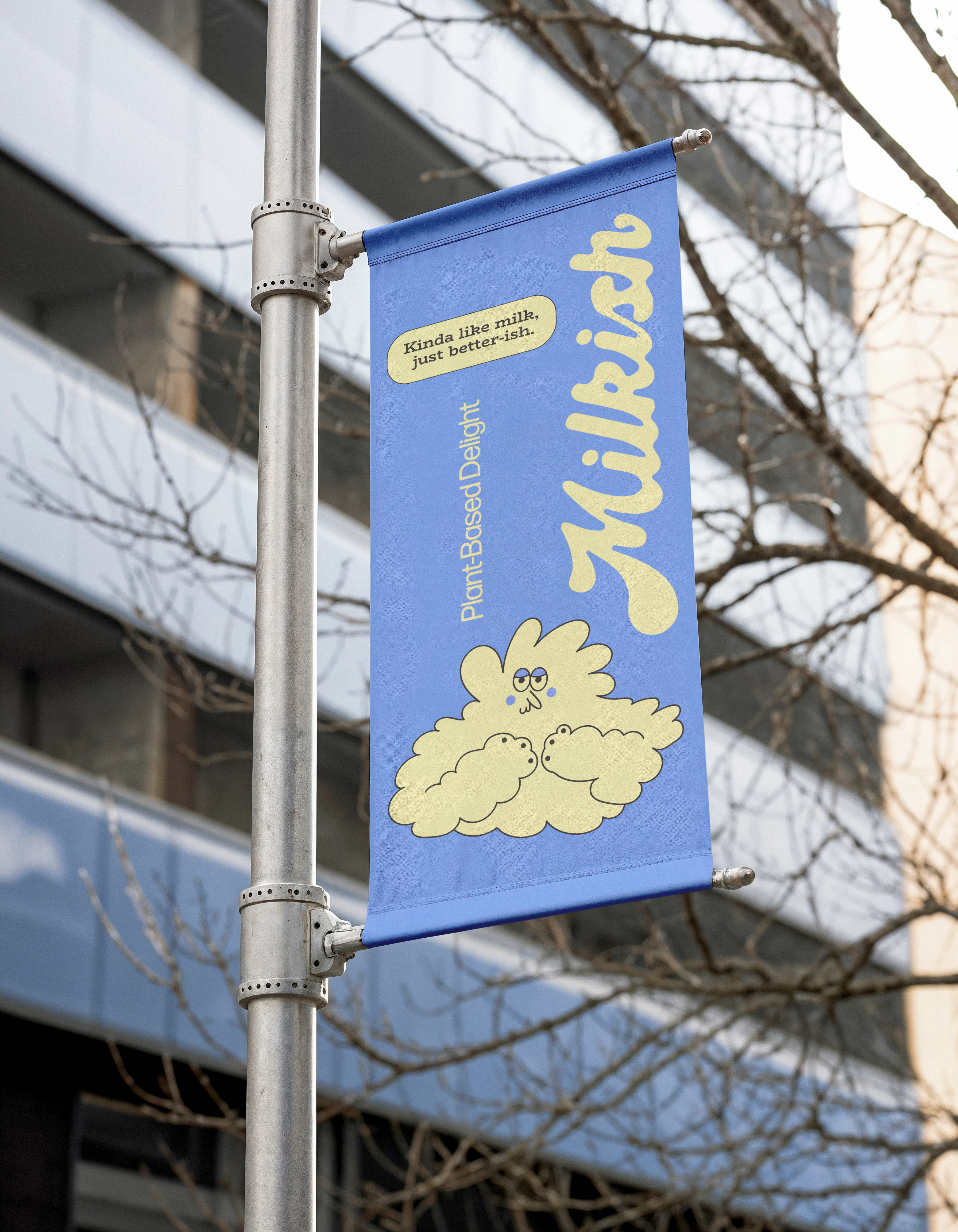
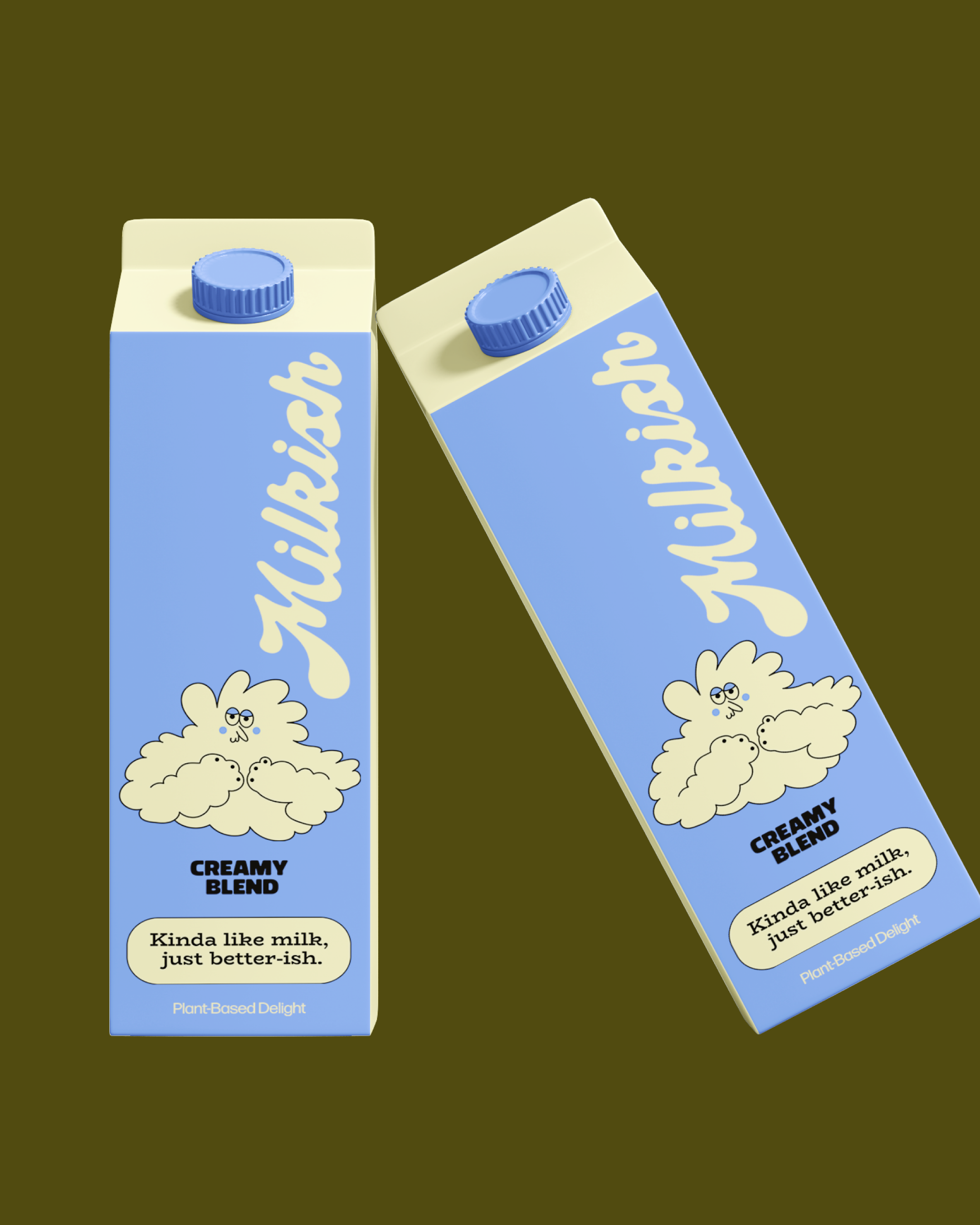
The Creamy Cloud Mascot: I created this cloud character to be the face of the brand. Its soft, rounded shape and gentle expression are meant to represent the product’s creamy texture and simple, wholesome ingredients. It brings a playful, approachable feel to the cartons and all marketing materials.
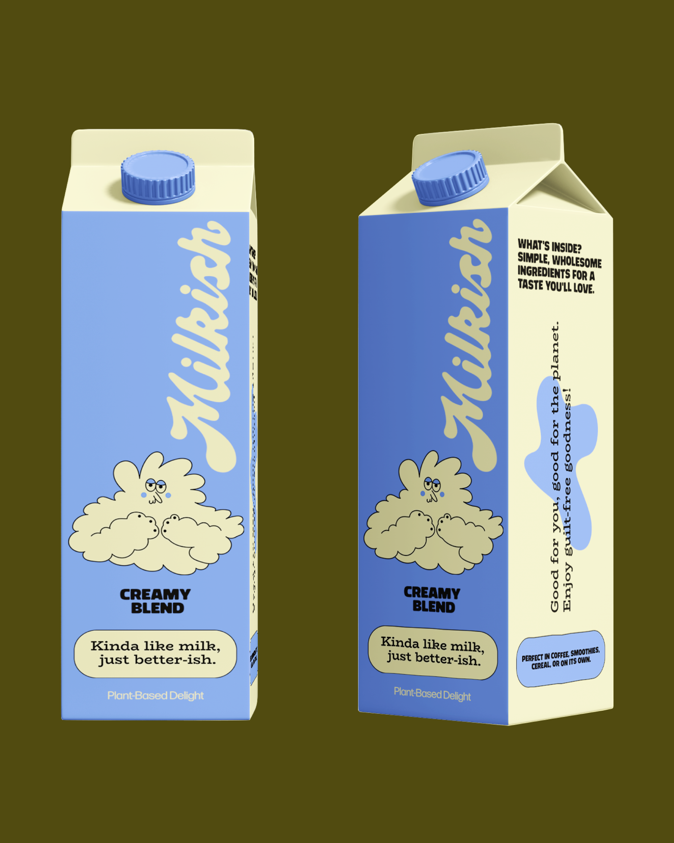
Color Palette: I chose a light cornflower blue and a calming pale yellow. This combination is cheerful, fresh, and designed to look unique and memorable on the store shelf.
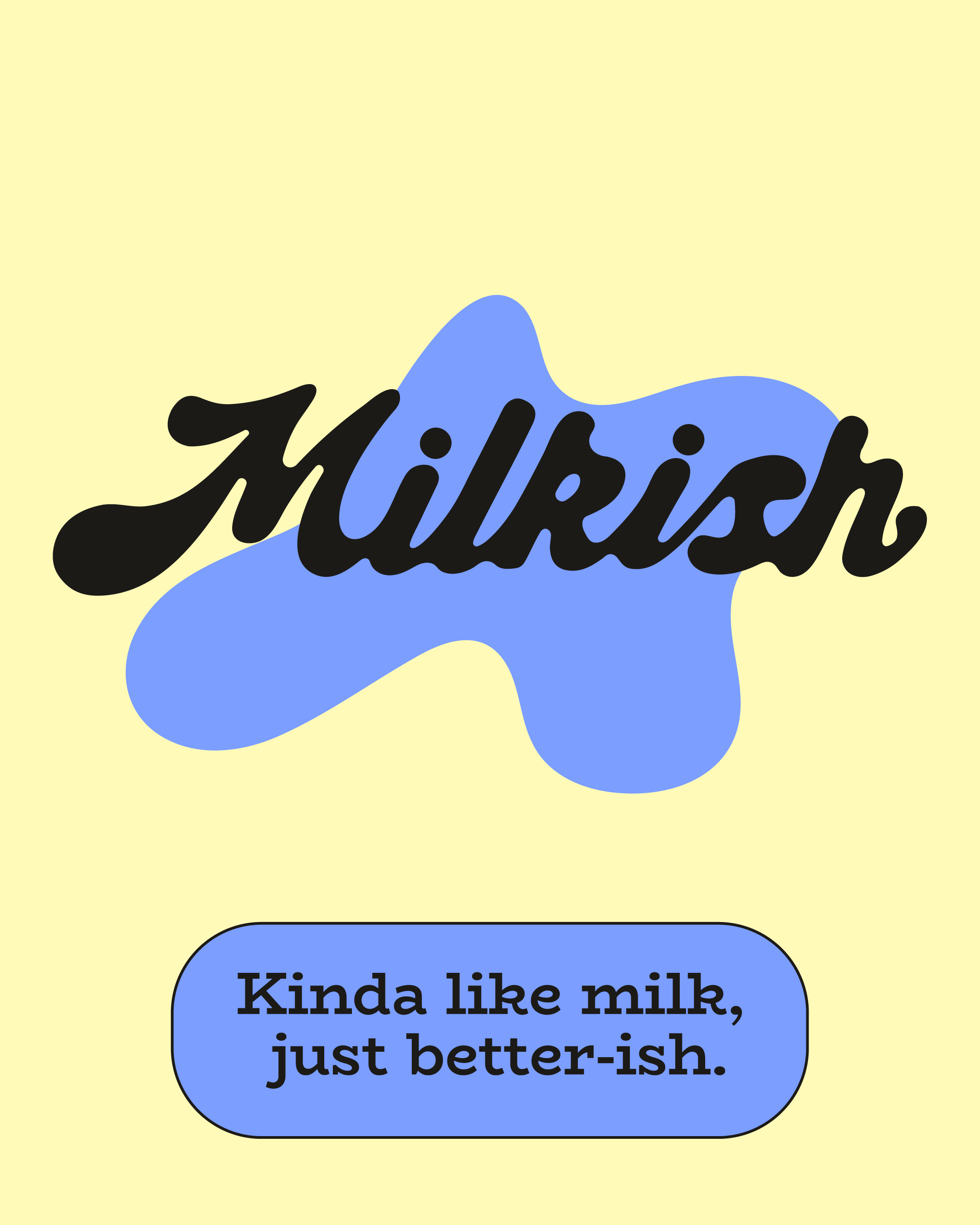
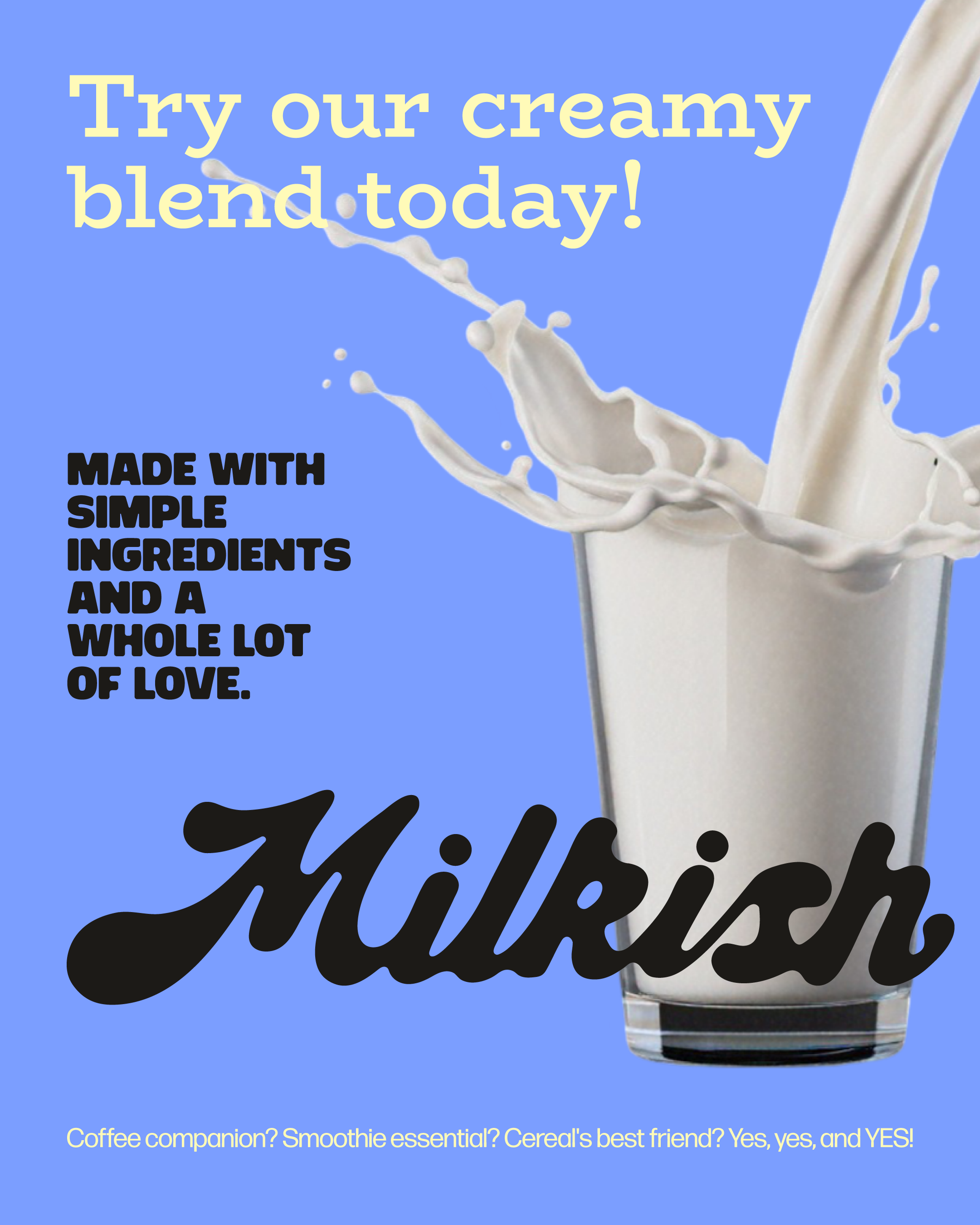
Typography: The main Milkish logo uses a flowing, comfortable script font. This is balanced by clean, clear sans-serif text for all product information, making it easy to read while keeping the fun tone consistent.
Key Messages: The design emphasizes that this is a «Creamy Blend» made with simple, wholesome ingredients.