

Oaten — Oat Porridge Branding
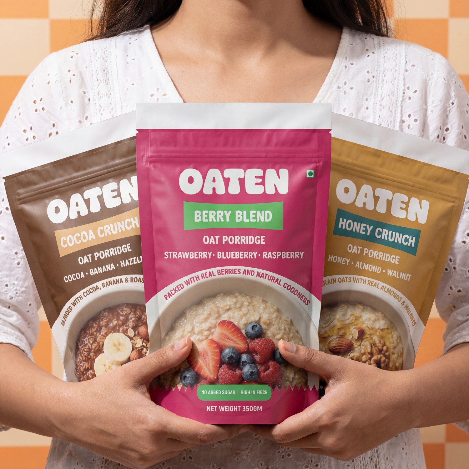
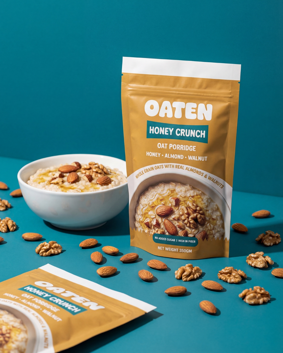
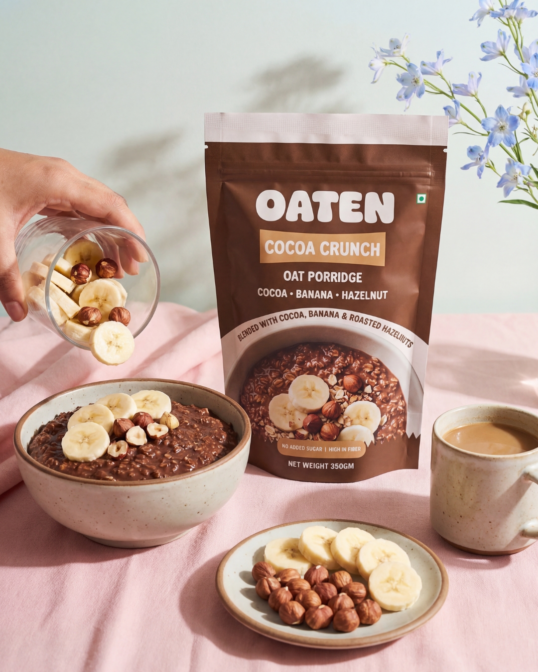
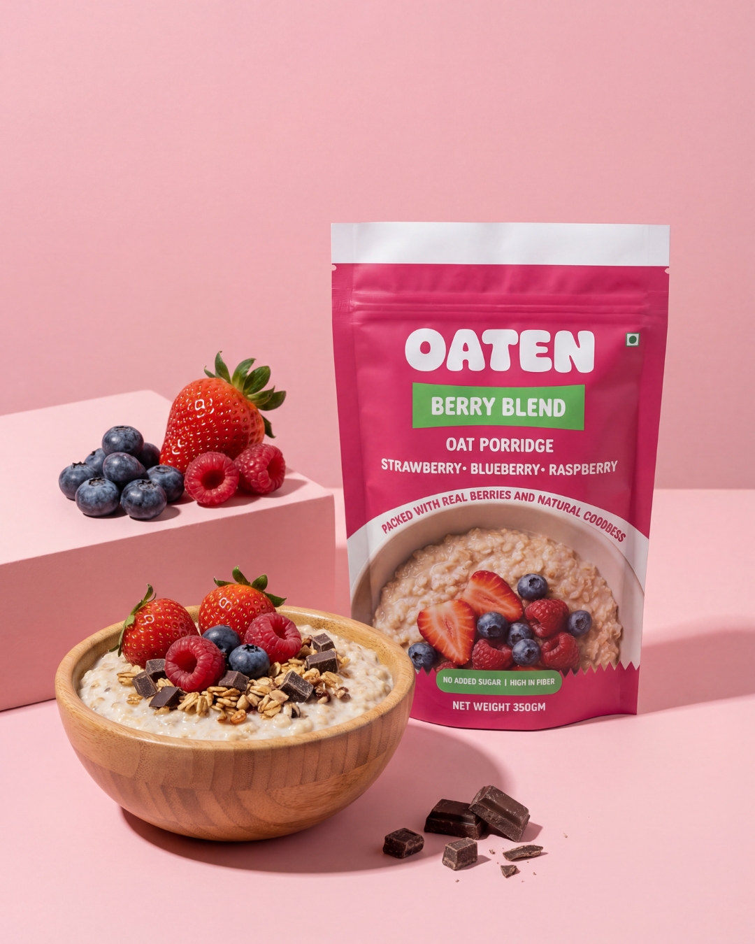
Oaten is a modern oat porridge brand created to make everyday breakfasts simple, nutritious, and visually appealing. The packaging system focuses on bold color blocking, clear hierarchy, and appetizing food imagery to create strong shelf presence while maintaining a clean and friendly brand personality.
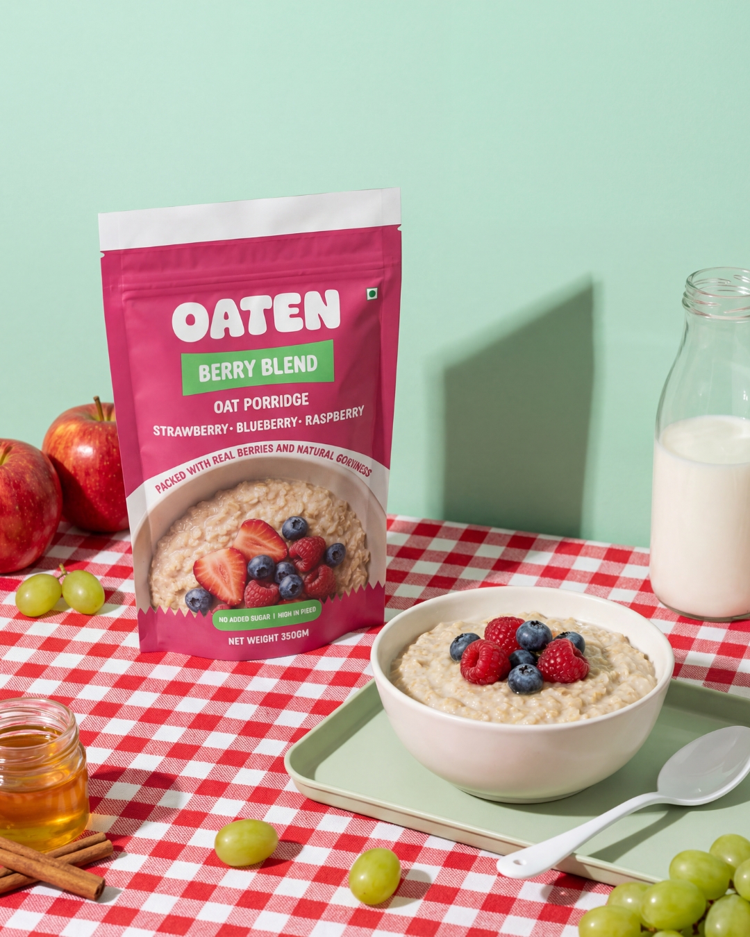
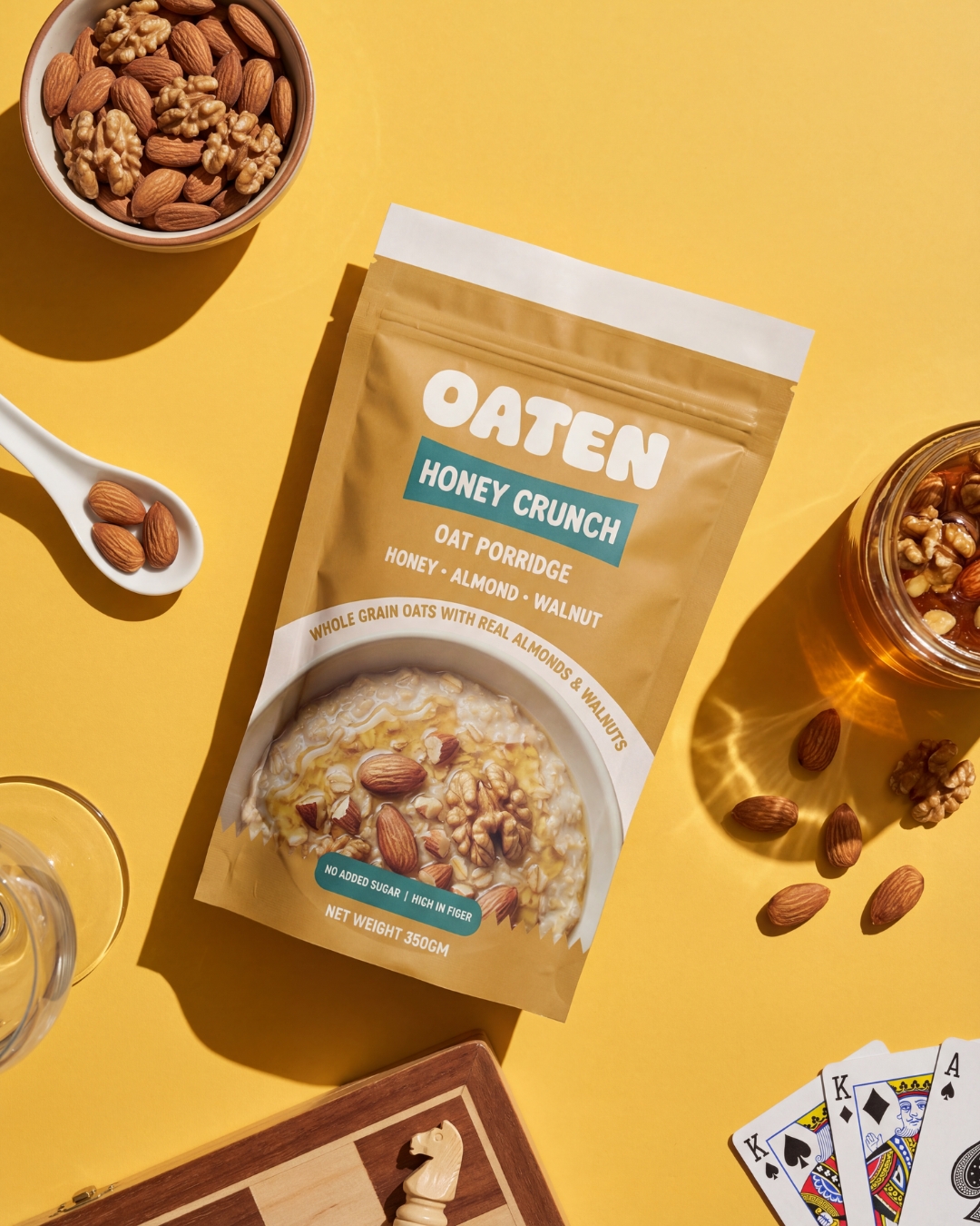
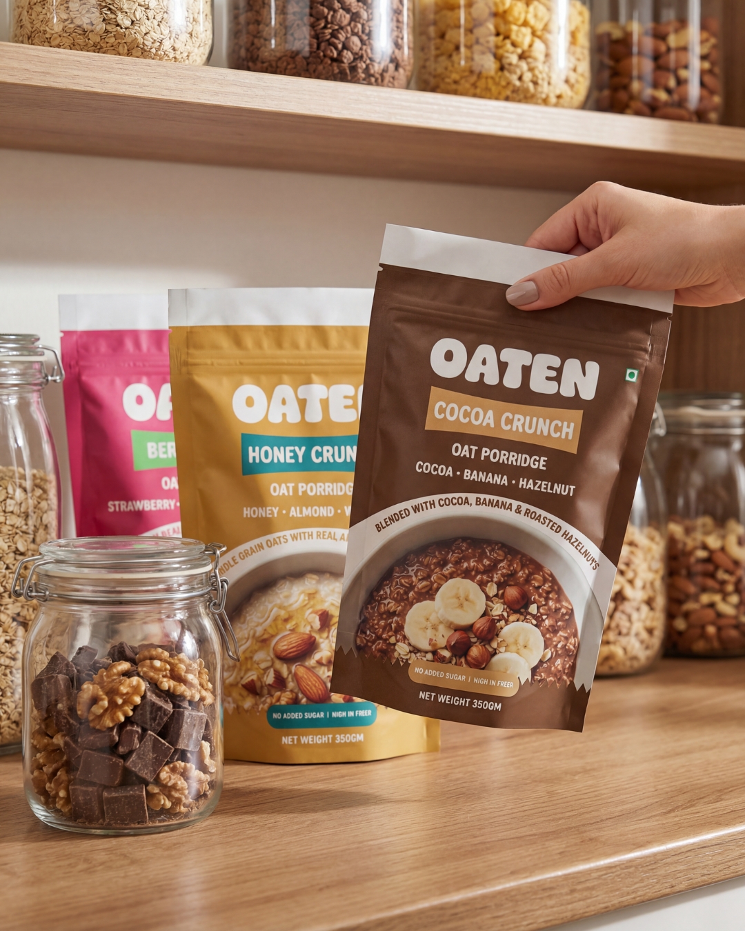
Each flavor is differentiated through distinct color palettes while keeping the overall structure consistent across the range. The design highlights key ingredients, nutritional benefits, and the comforting experience of a warm bowl of oats. Real ingredient visuals and minimal yet playful typography help communicate the product clearly and make the packaging approachable for modern consumers.
Related Posts









Leave a Comment