Oaten — Porridge Branding & Packaging
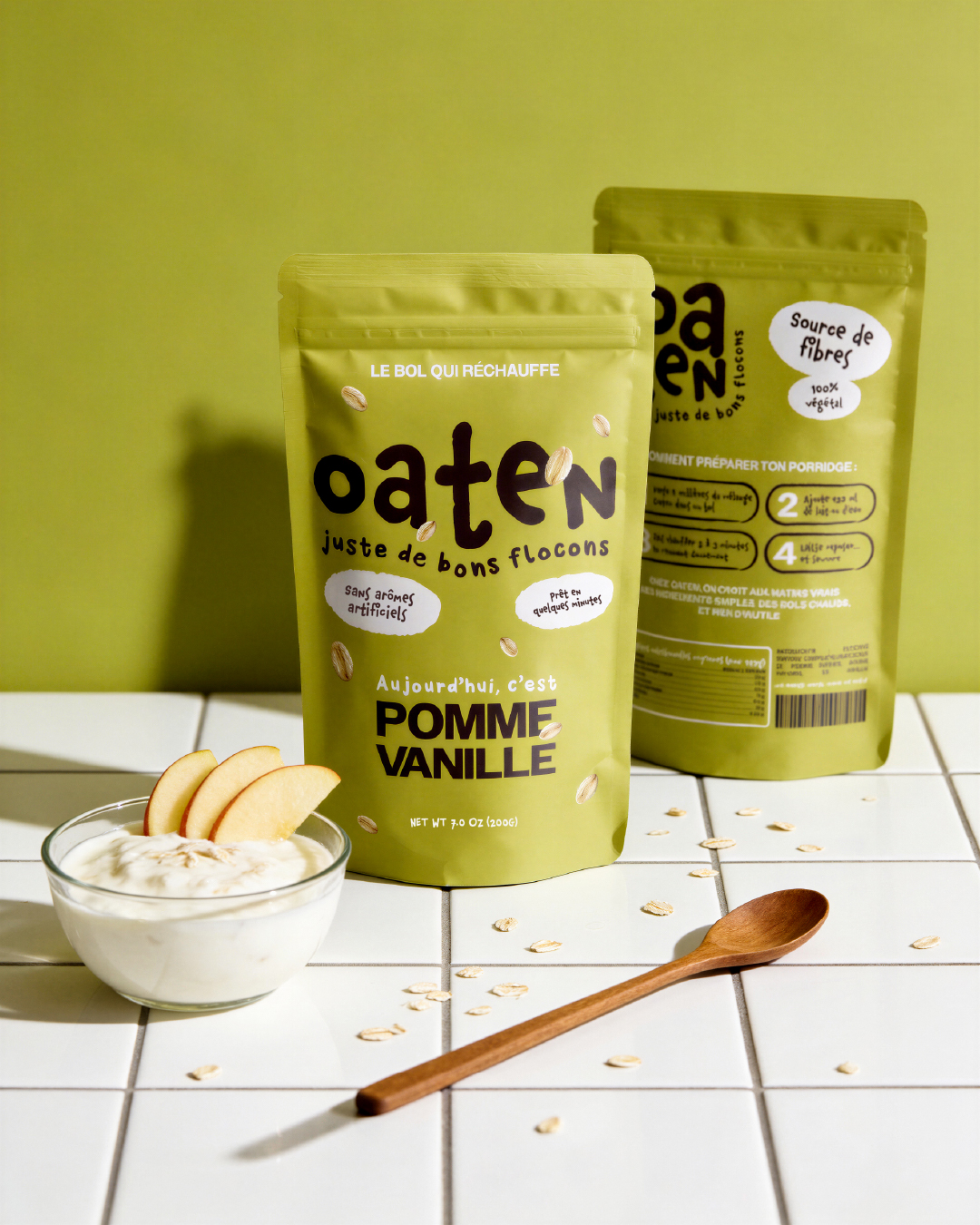
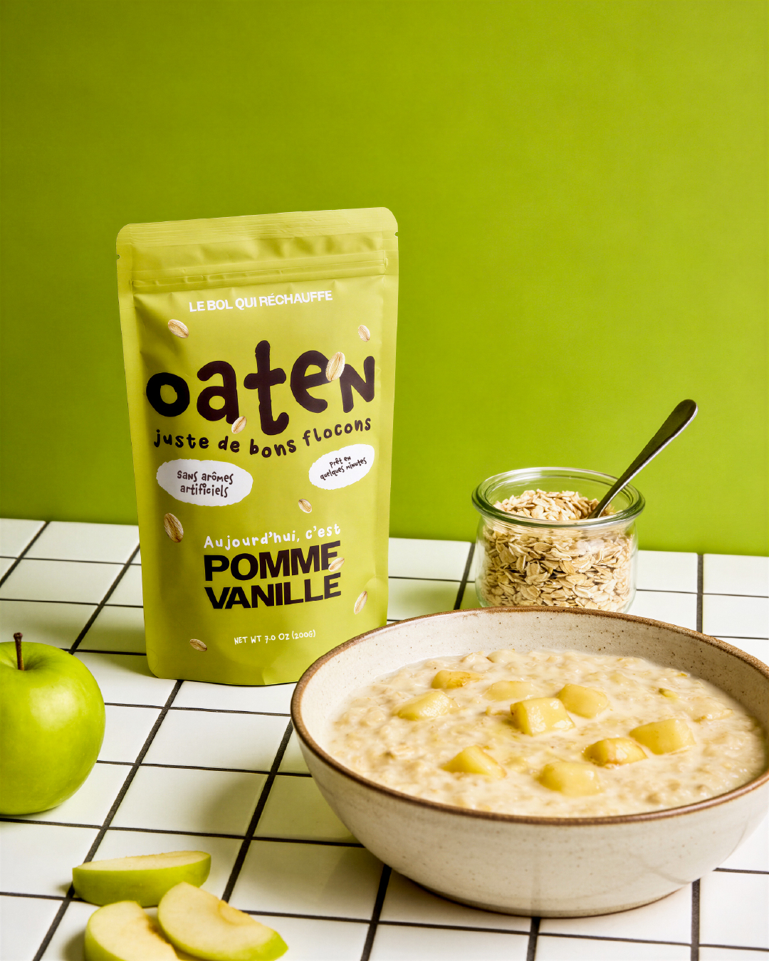
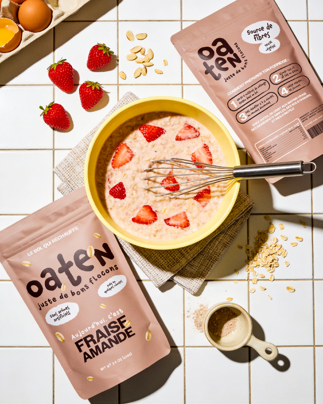
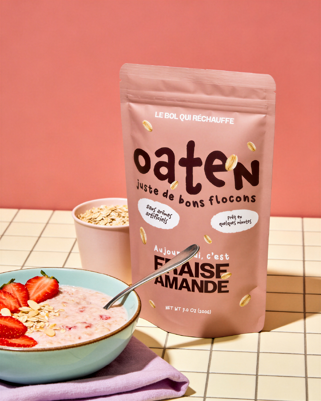
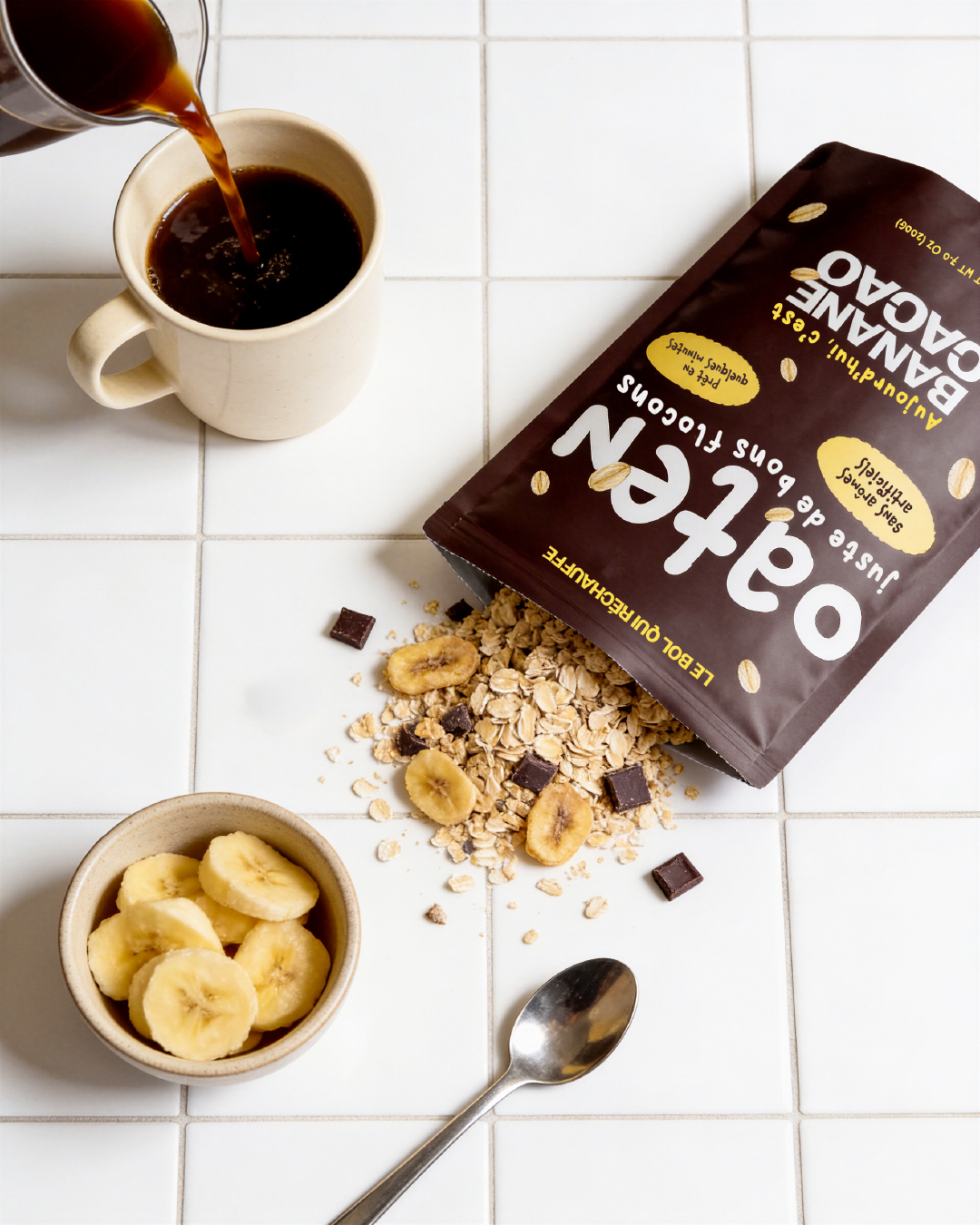
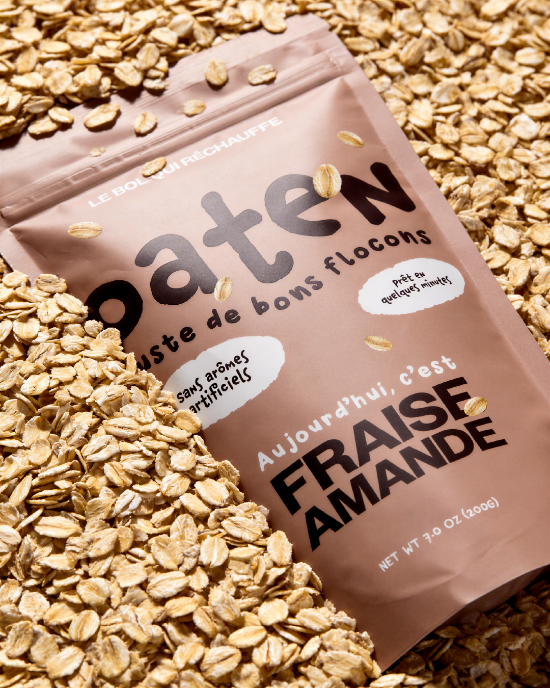
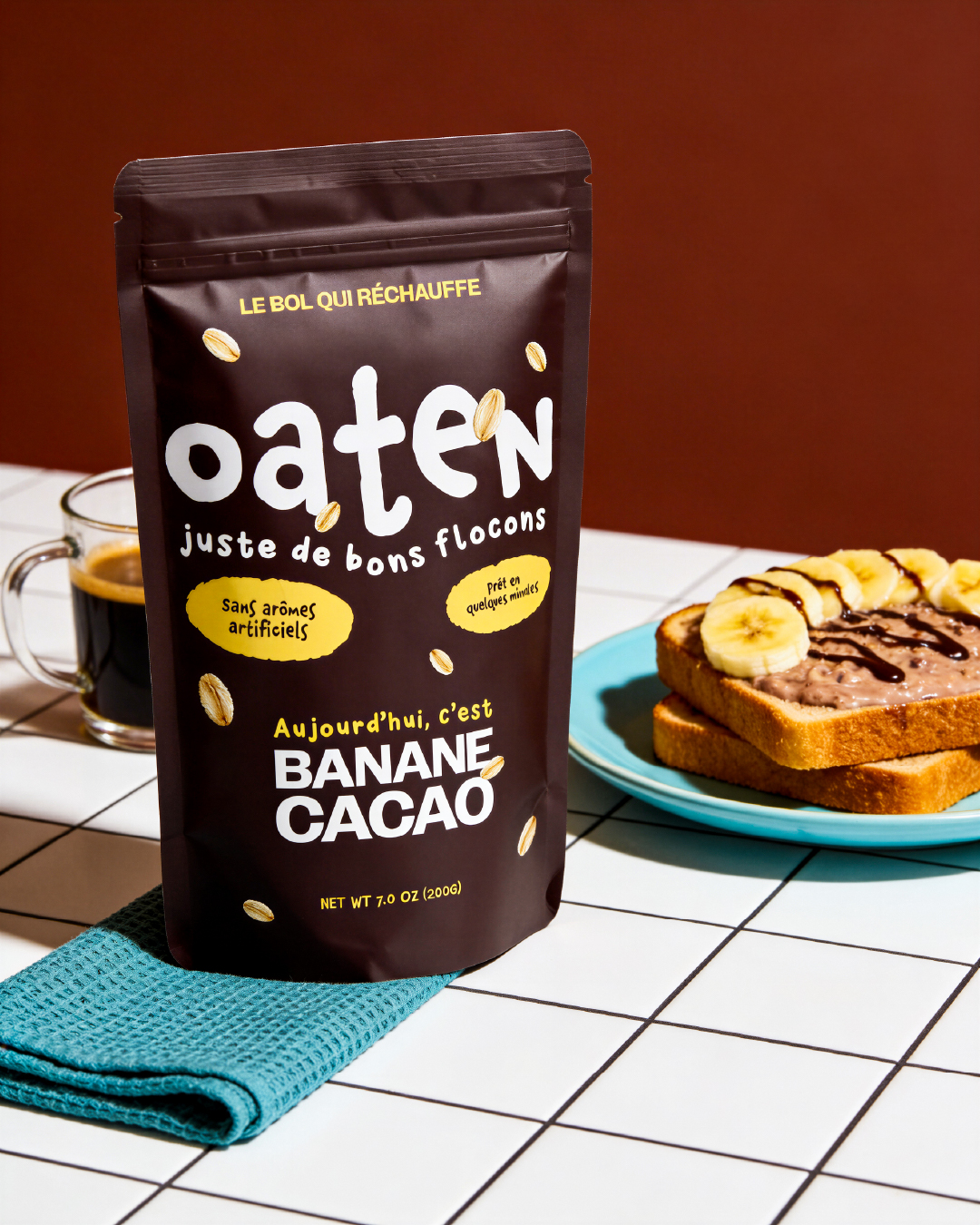
Oaten is a fictional porridge brand concept built around warmth, simplicity and everyday comfort. The project explores a soft and honest visual identity through hand-drawn typography, a color-coded packaging system and a cohesive art direction designed to feel approachable and real.
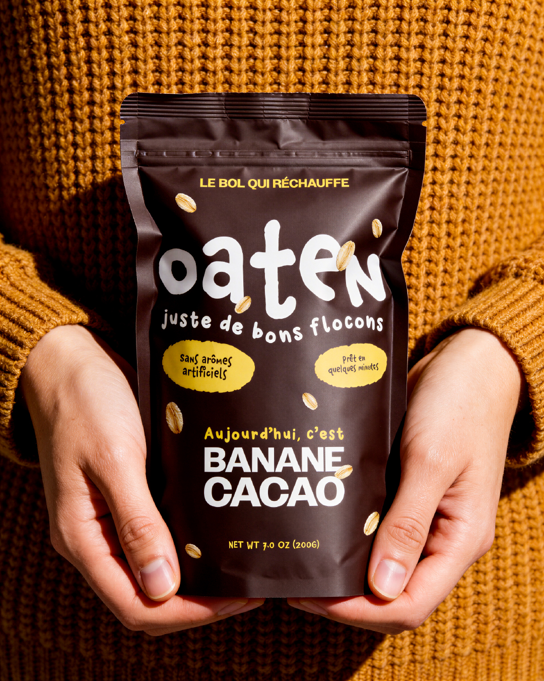
The goal was to create a believable food brand universe, combining branding, packaging design and AI-directed visuals. Each flavor is represented by a distinct color while maintaining strong consistency across the range, allowing the brand to feel both playful and structured.
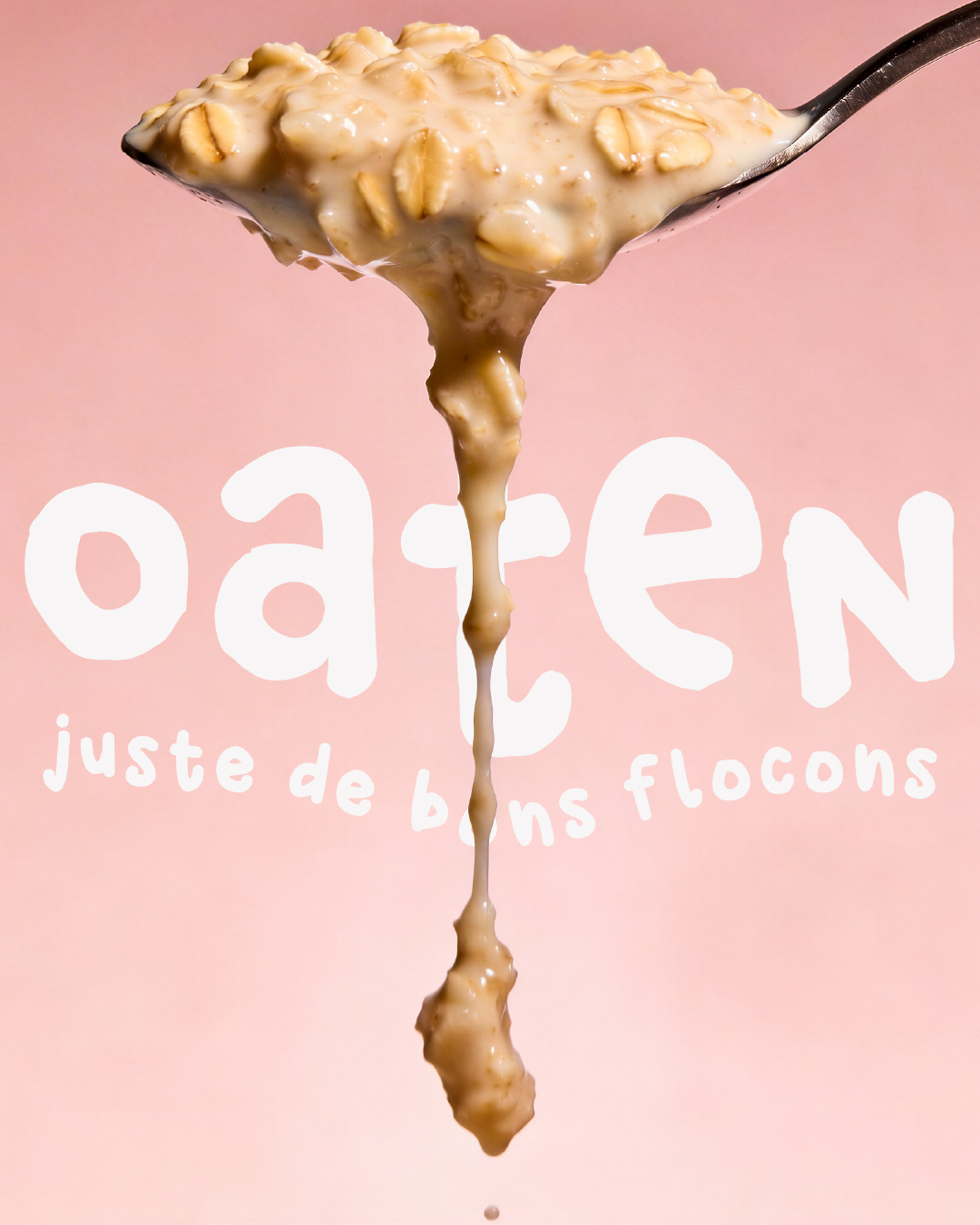
Through lifestyle compositions, product-focused imagery and tactile textures, this project reflects my approach to modern food branding: creating identities that feel human, warm and designed for real-life moments rather than trends.