Oolio-Olive Oil Packaging and Identity
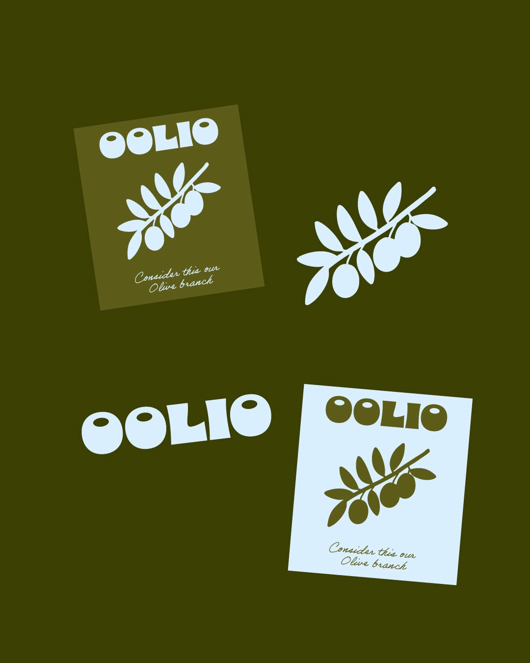
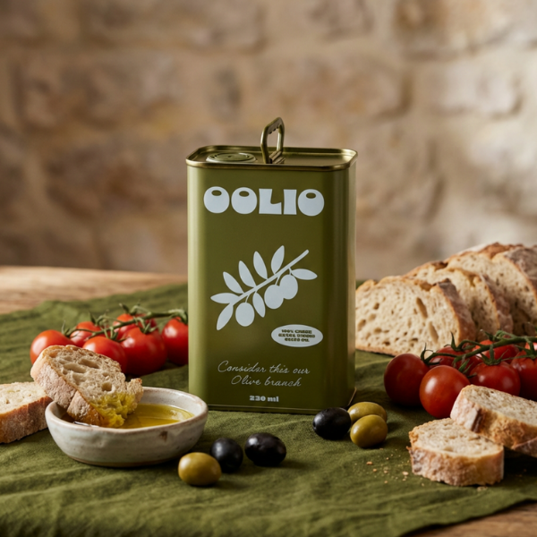
Oolio is a modern olive oil brand inspired by Greek heritage, everyday ritual, and the quiet beauty of Mediterranean living. The identity is built around the idea that every drop tells a Greek story honouring tradition through a clean, contemporary lens.
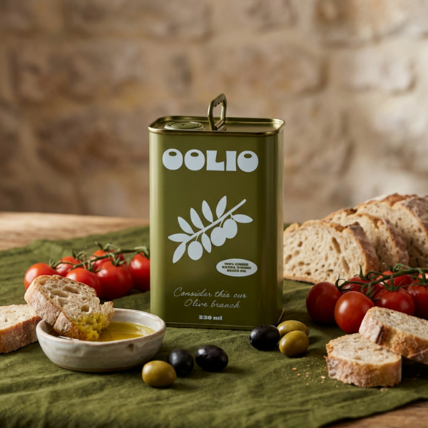
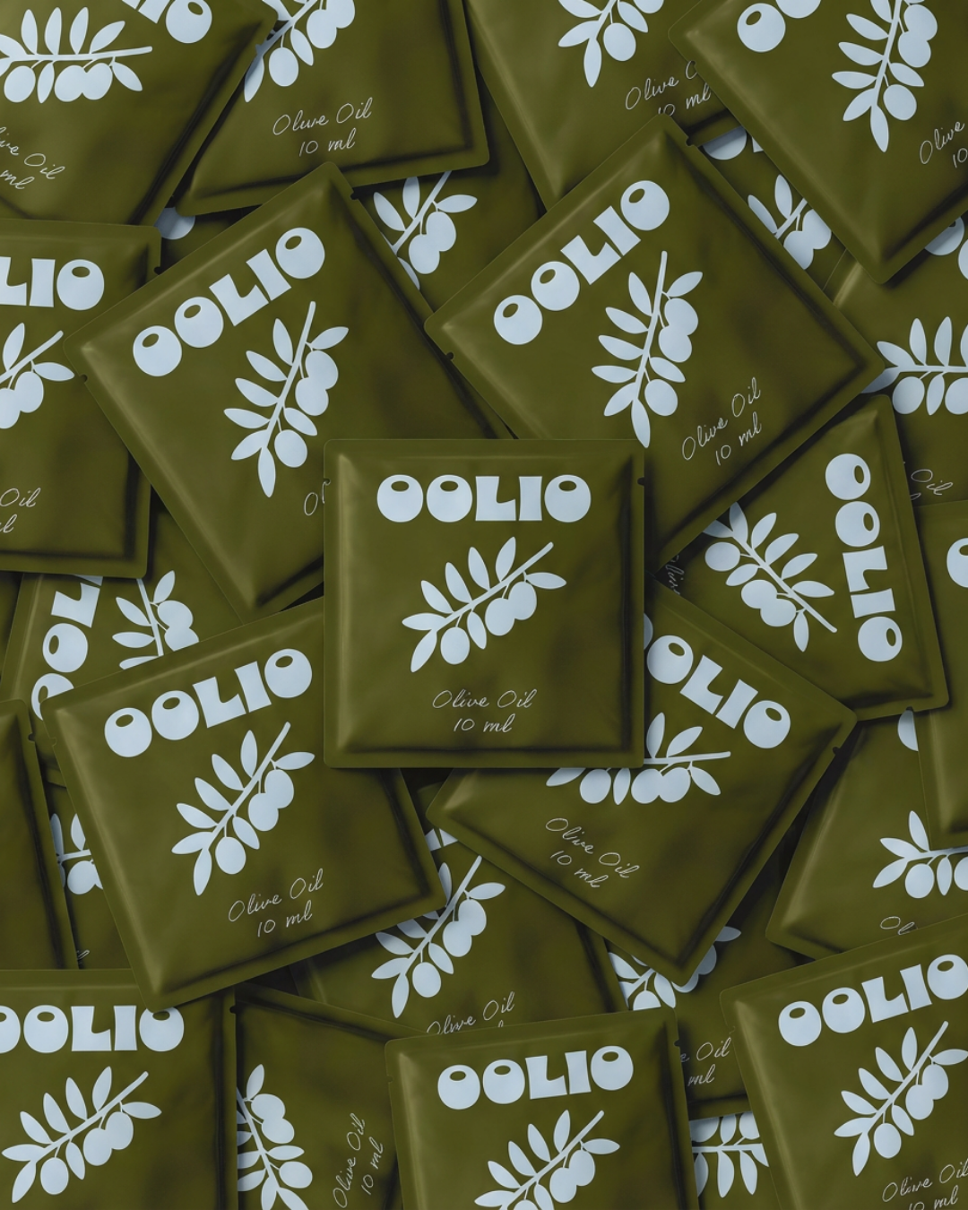
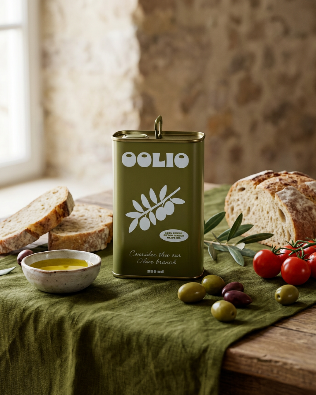
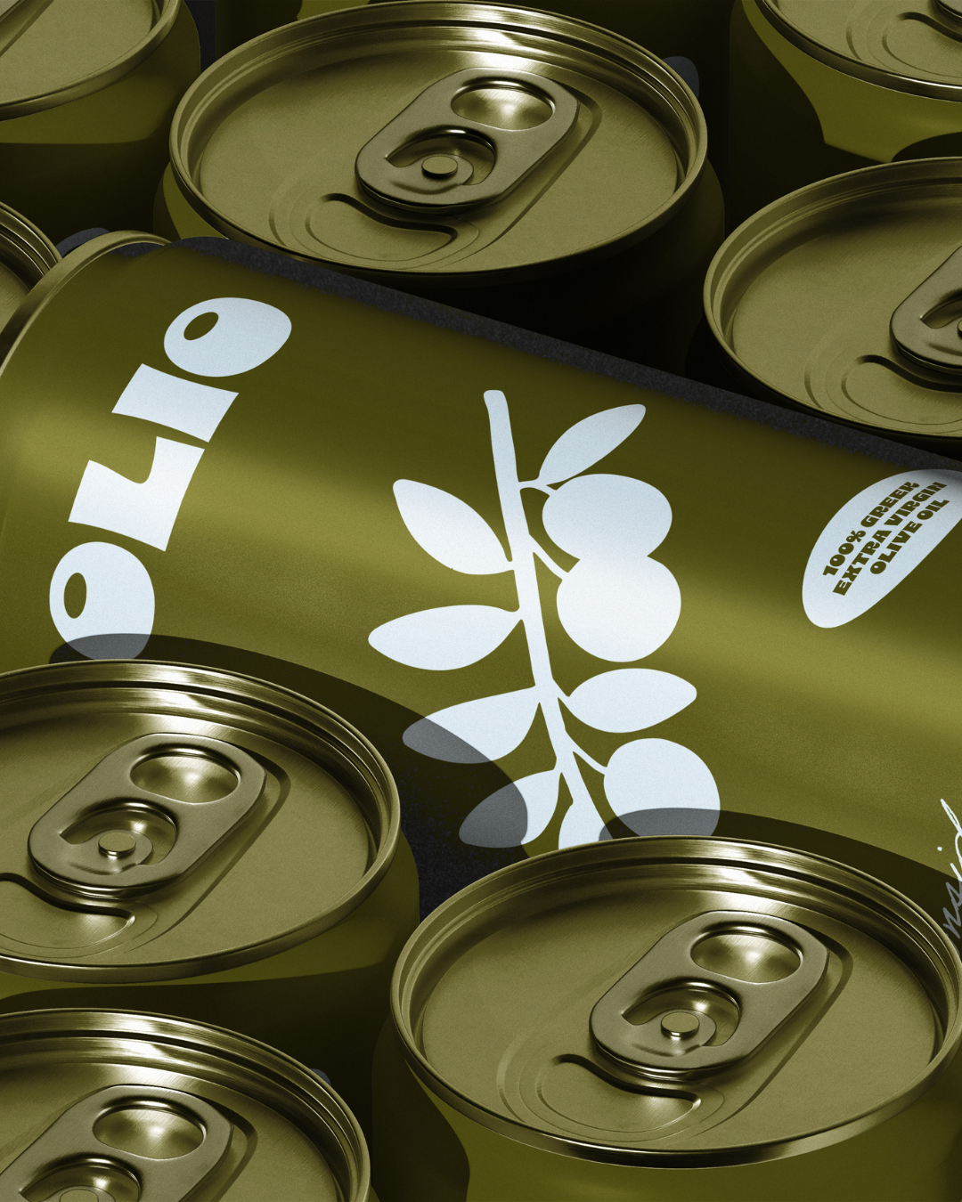
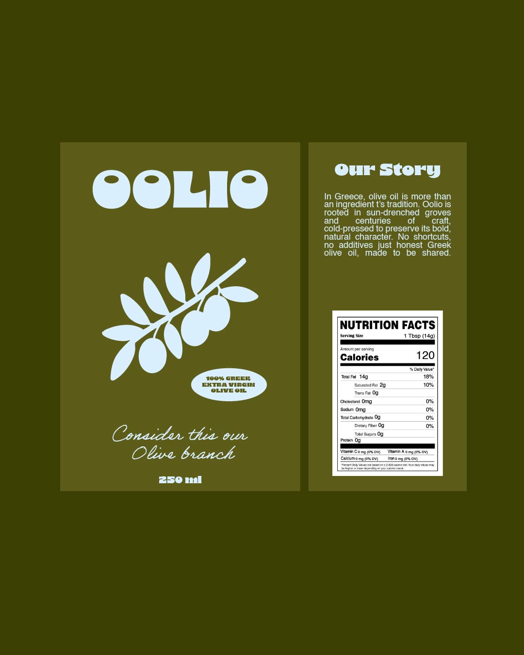
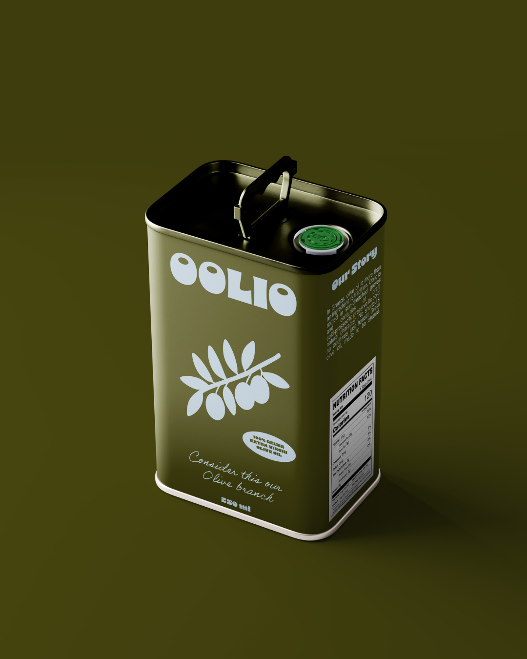
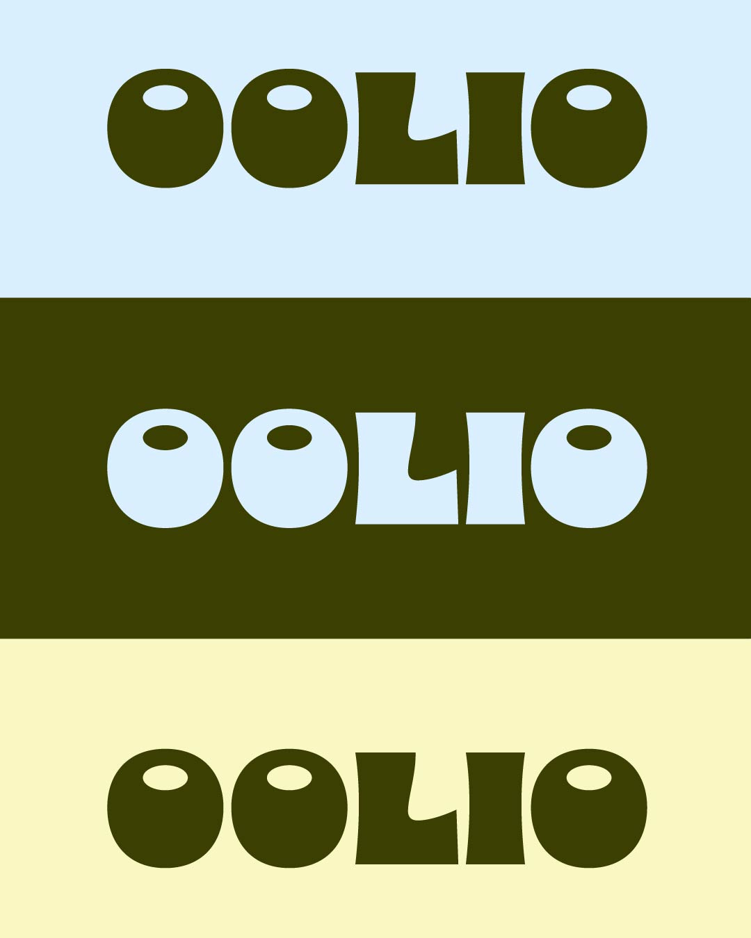
The visual system combines bold, rounded typography with a simplified olive branch symbol, creating a mark that feels both friendly and distinctive. A muted palette of olive green, soft blue, and warm beige reflects natural landscapes from sun-drenched groves to sea air and stone.
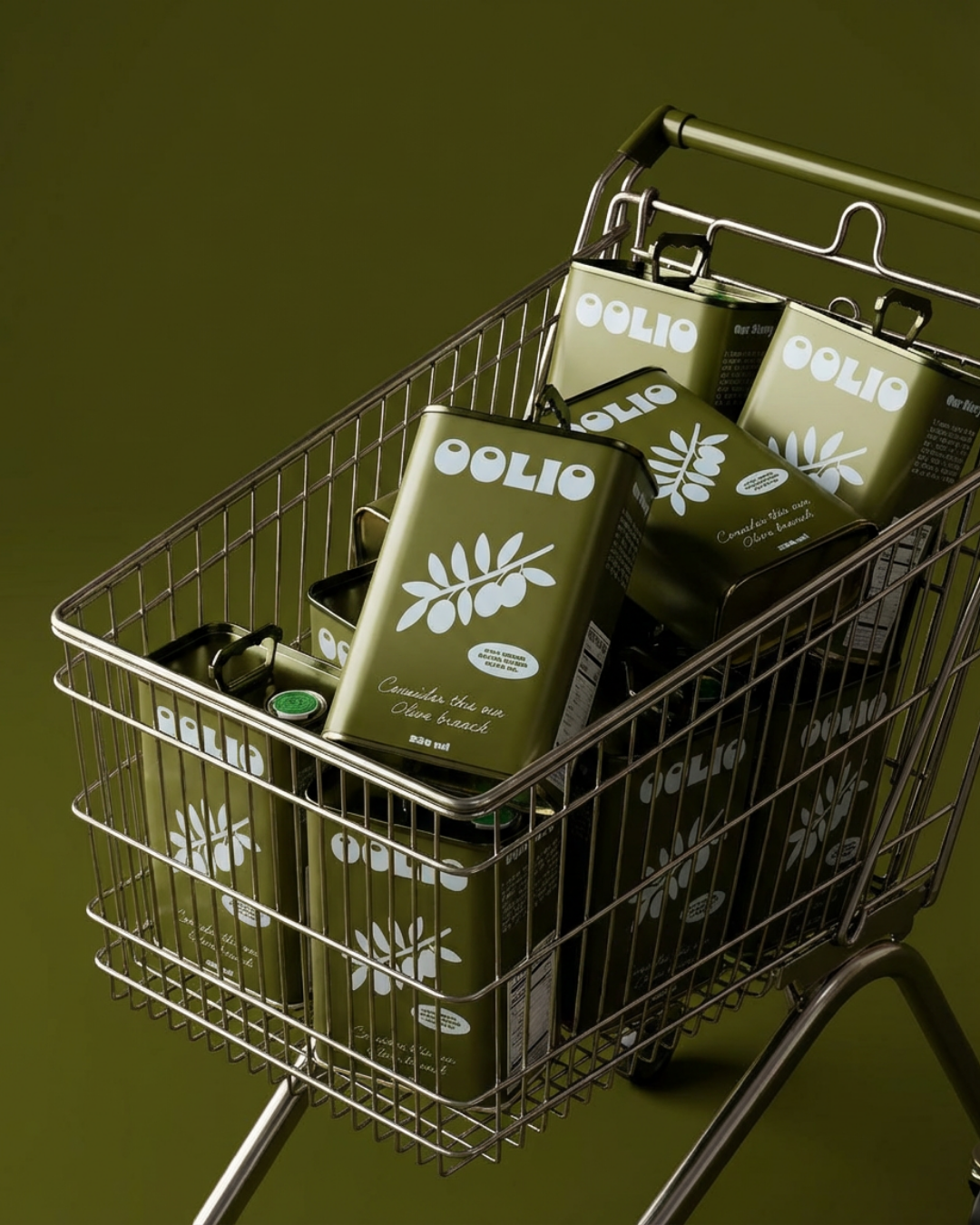
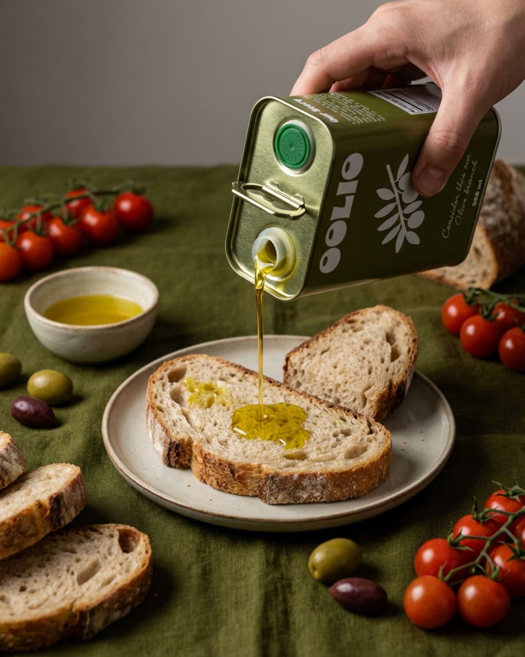
The packaging is minimal yet expressive, balancing modern structure with soft, human touches through script details and subtle storytelling. From the main tin to single-serve formats, the identity carries consistently across every touchpoint.
A brand rooted in craft, simplicity, and sharing designed to stand out while staying true to its origins.