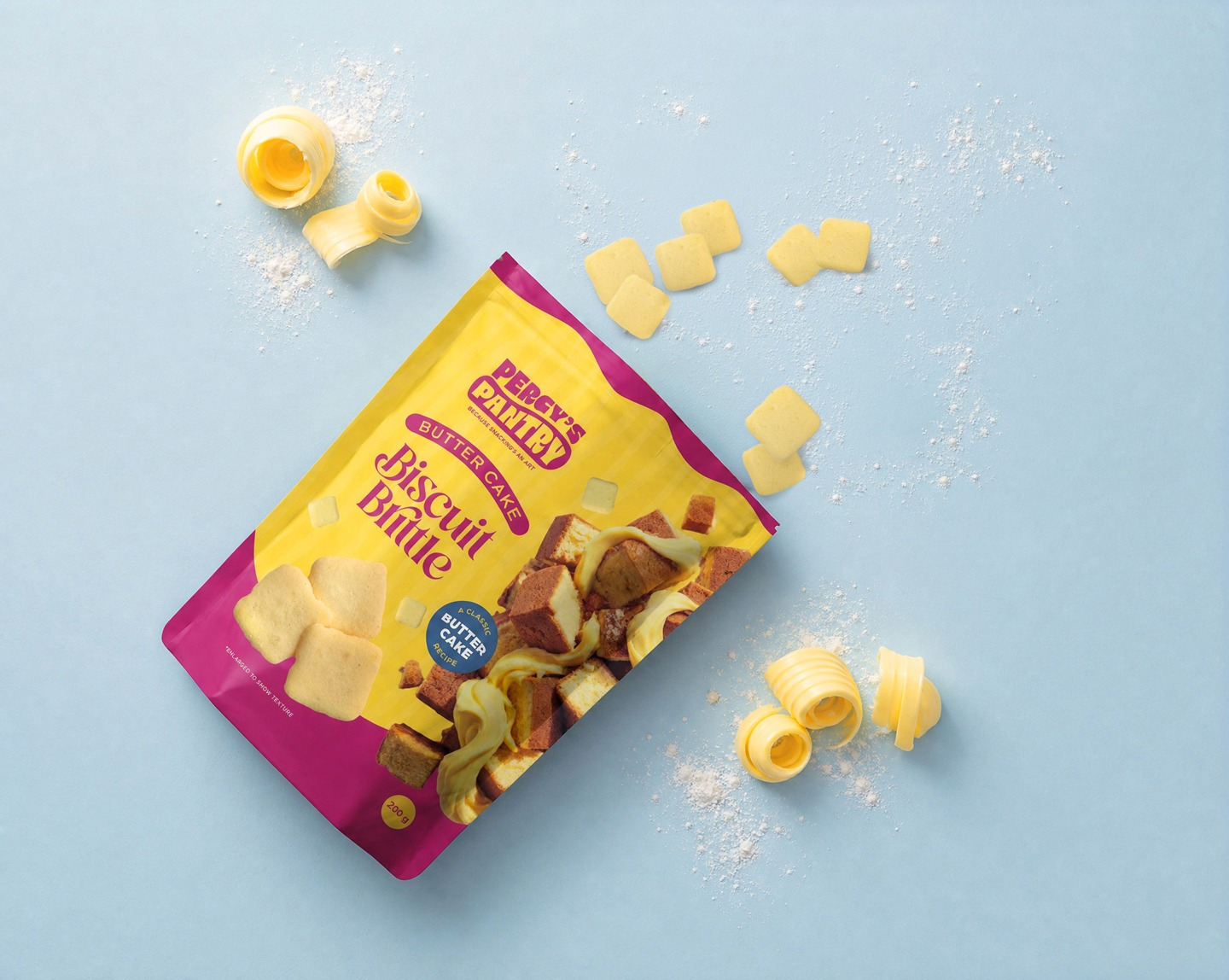
Percy’s Pantry Butter Cake Biscuit Brittle
The brief for Percy’s Pantry Buttercake Brittle was about as high-stakes as briefs get. A completely new product with zero sales history aiming to go straight to shelf in Costco Australia and New Zealand. Just a product sample and packaging to do the heavy lifting convincing the Costco buyers that it was worth a shot.
A full range was developed across flavour variants. Costco selected the Buttercup option for ranging.
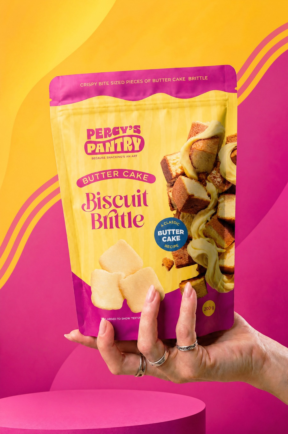
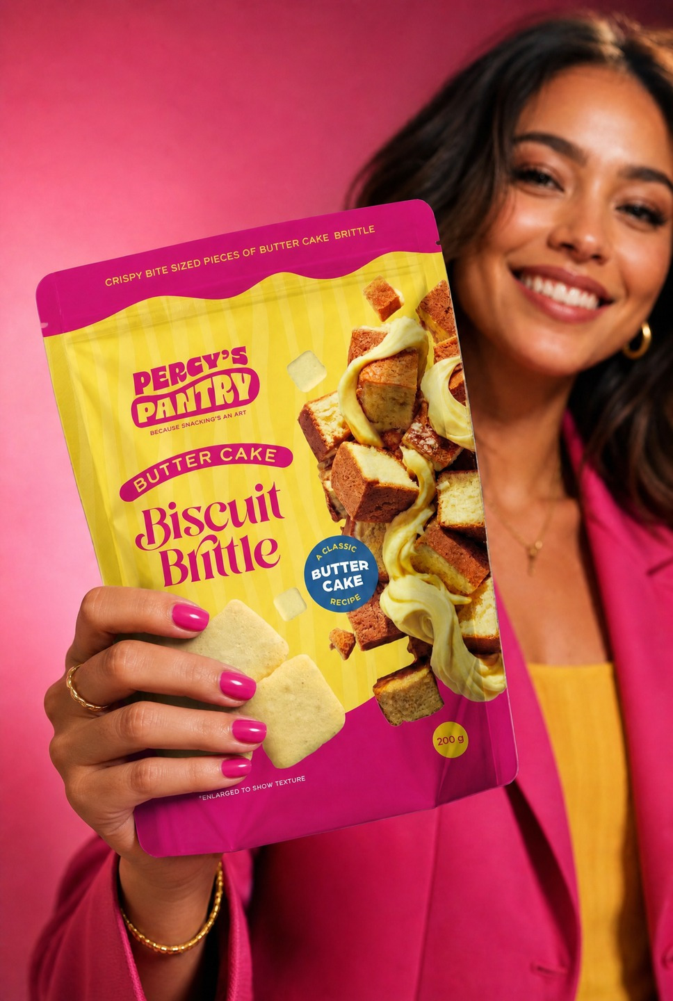
Costco’s shop floor is loud, busy and relentless to a shopper. Shelf impact from a distance isn’t a nice-to-have, it’s the baseline. The design leads with bold, bright colour built to cut through the visual noise from across the floor, and that impact has since been confirmed in-store footage showing the pack holding its own at distance.
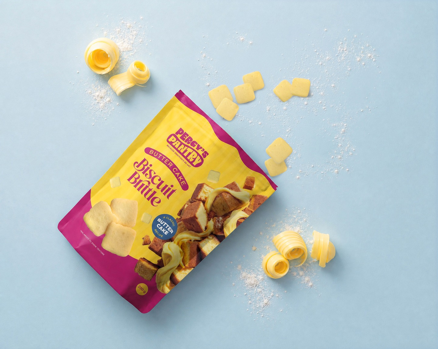
The secondary challenge was familiarity. Biscuit brittle is not a product most shoppers will be too familiar with in either of these markets. The design shows the product on the front so there is no guesswork about what is inside, while strong flavour-variant imagery to build that appetite appeal fast, because in Costco you only really get one shot.