

Puerta Palma Wine
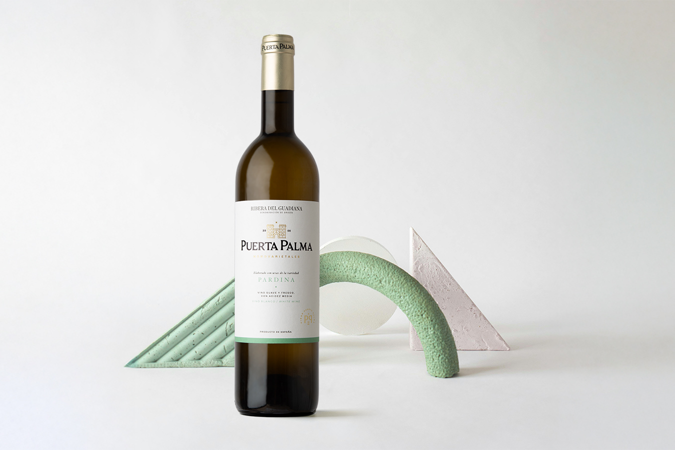
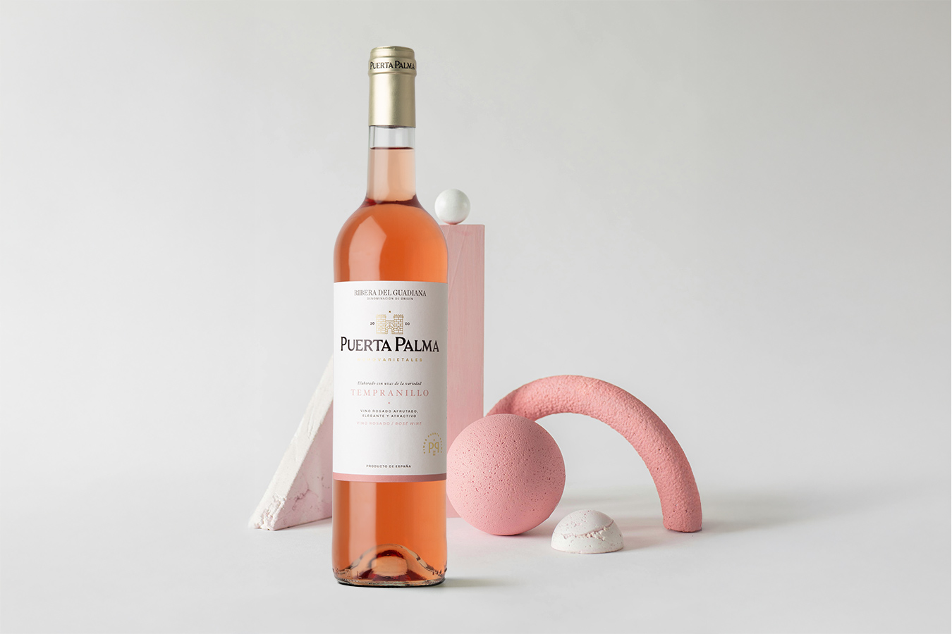
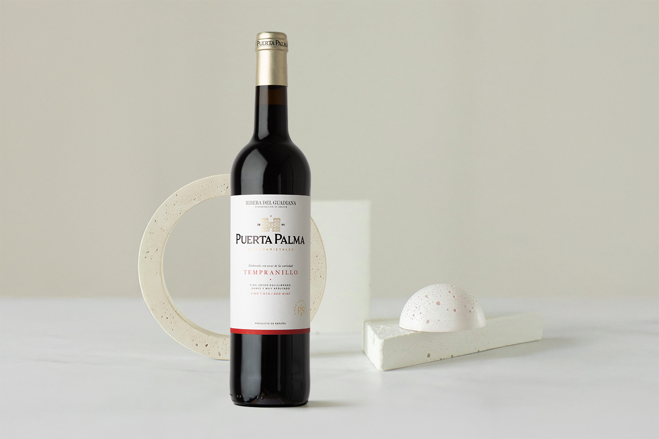
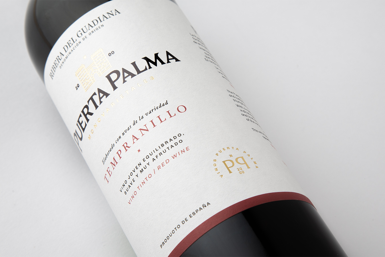
A packaging redesign that brings coherence and elegance to the brand.
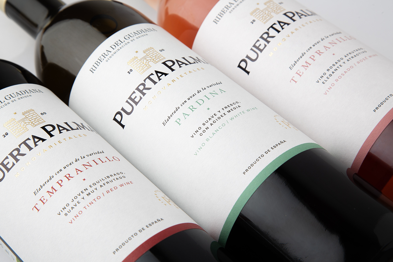
This project completes the renewal of Puerta Palma’s visual identity, aligning its wine range with the cava collection under a unified, refined aesthetic.
Inspired by the historic Puerta de Palmas in Badajoz, the design evokes heritage, authenticity, and prestige through balanced typography, gold stamping, and subtle color differentiation.
A contemporary expression of tradition and legacy.
Related Posts






Leave a Comment