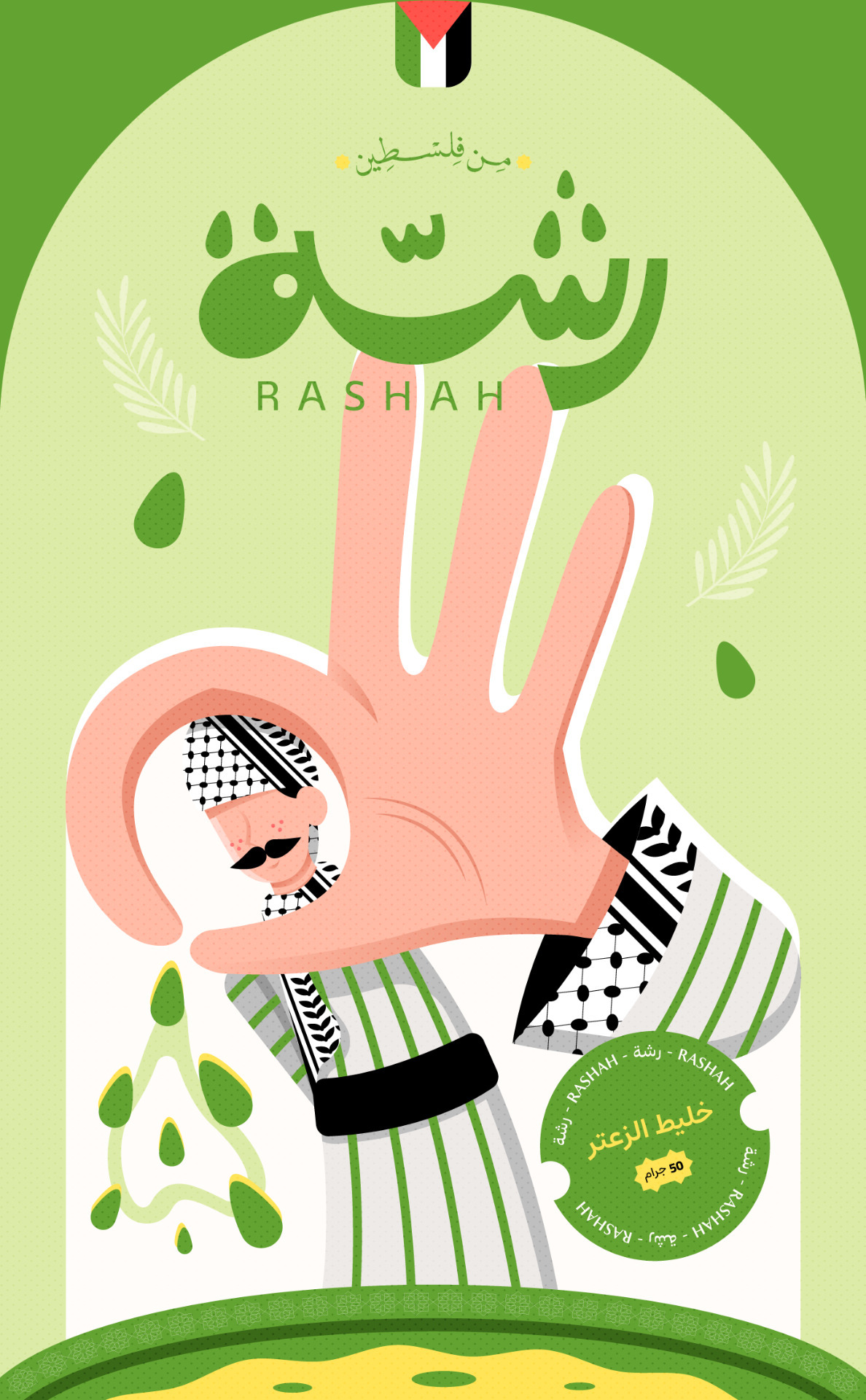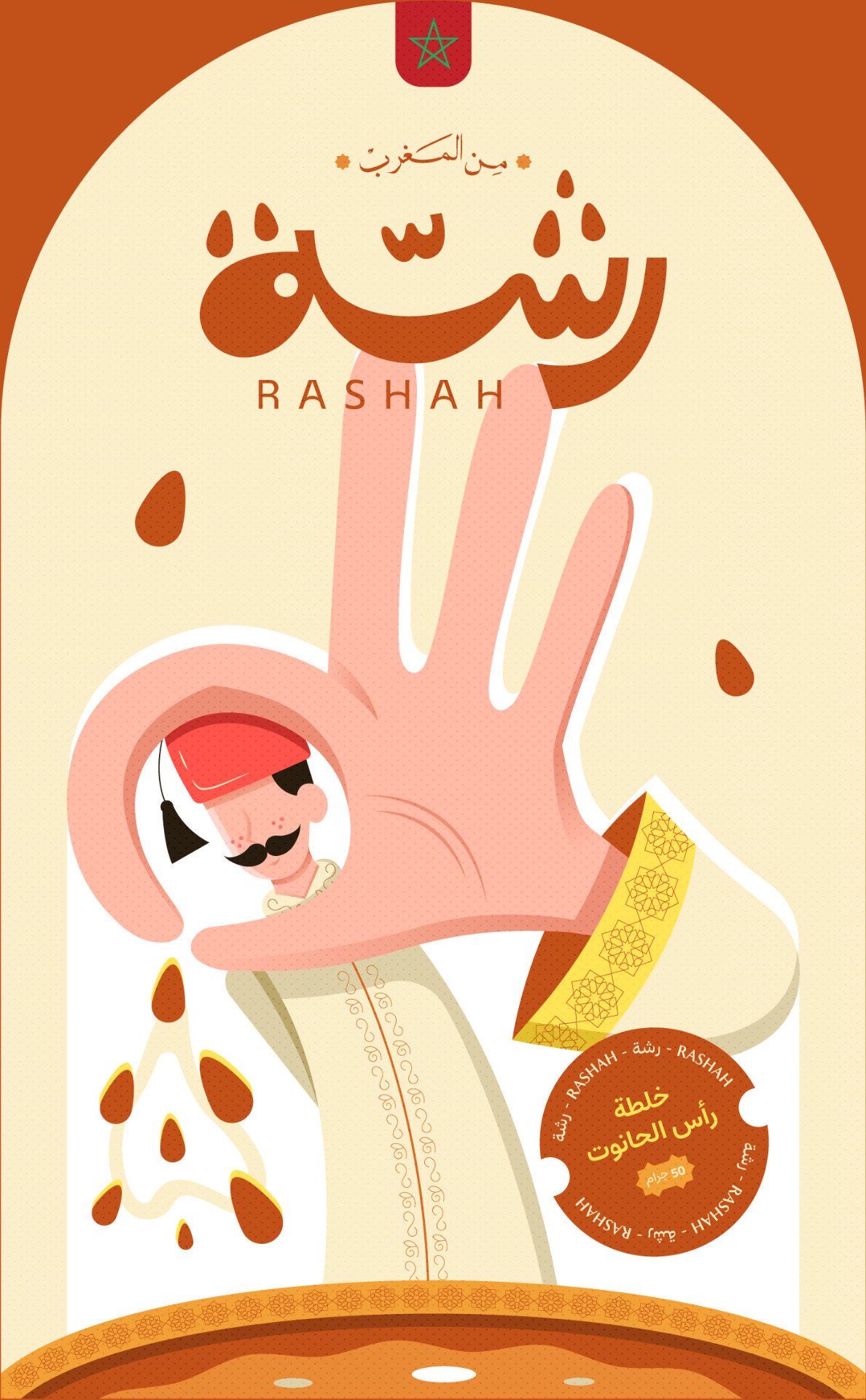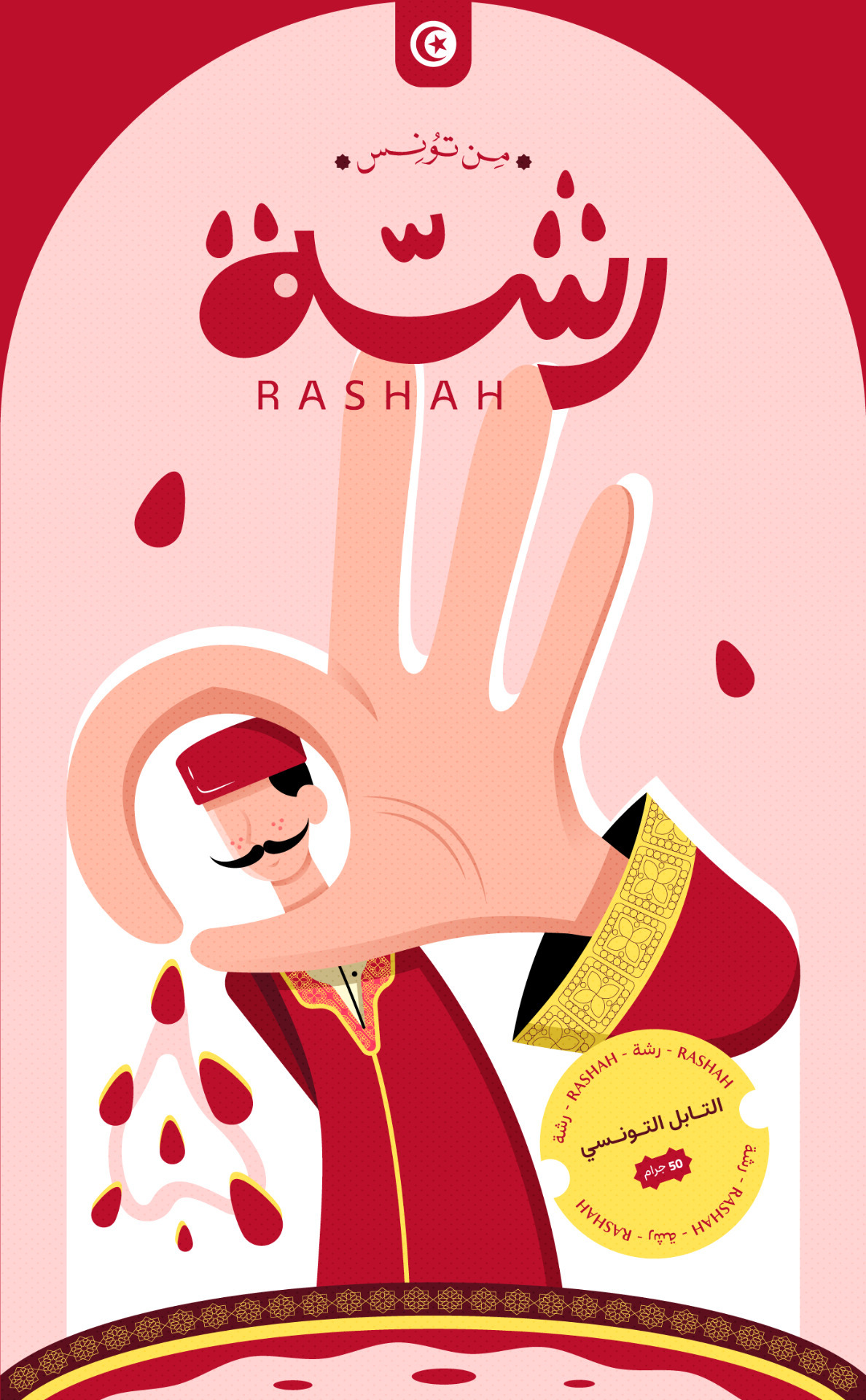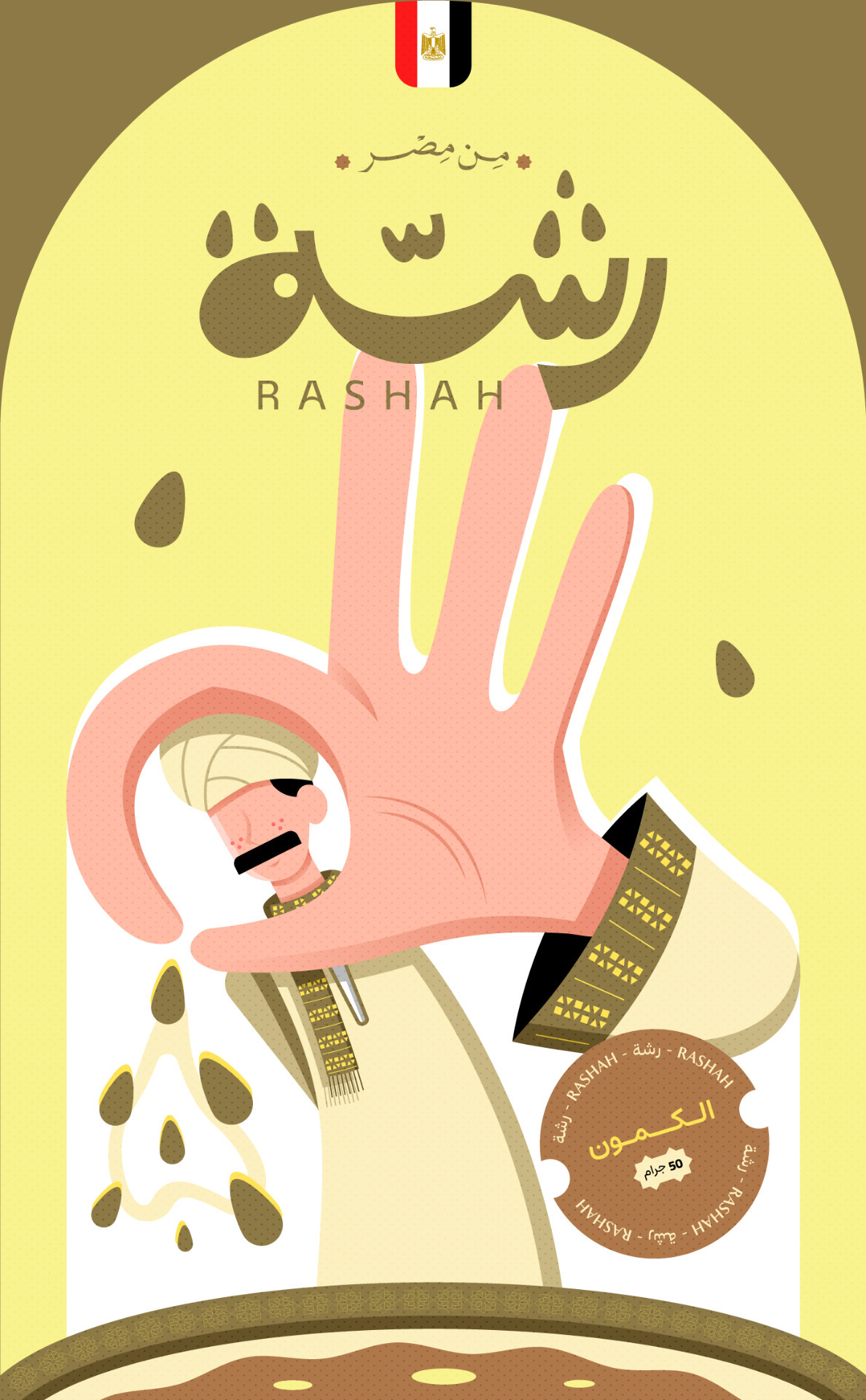
Rashah: Cultural Storytelling Through Spice Character Packaging Design
Rashah – رشّـة .
Rashah is a culturally rooted Egyptian brand built on a deep understanding of the spice market and the emotional power of storytelling.
From the outset, we didn’t set out to sell spices, we set out to evoke places, memories, and identities through flavor and design.
Our strategy began with a simple question: How can a single sprinkle carry the soul of a culture?
– We studied regional culinary habits, emotional triggers, and packaging behavior across diverse markets. What we found was clear, people don’t just buy spices, they buy connection. They crave authenticity, and they want to feel transported.
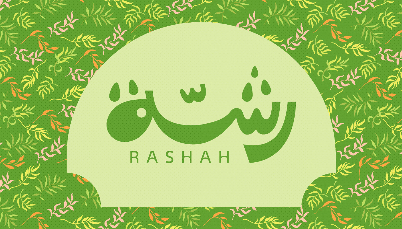
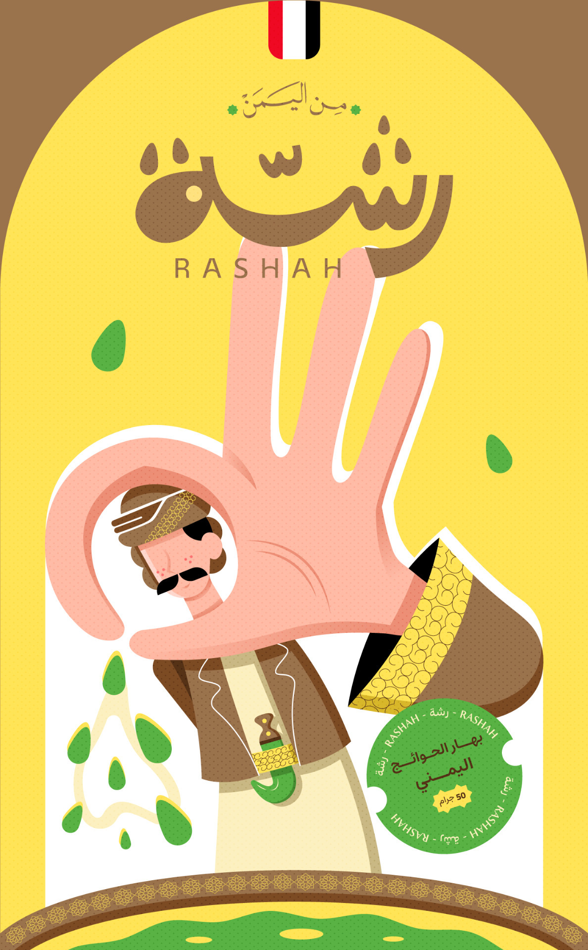
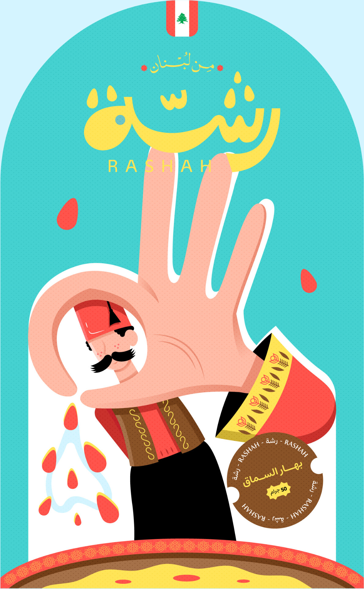
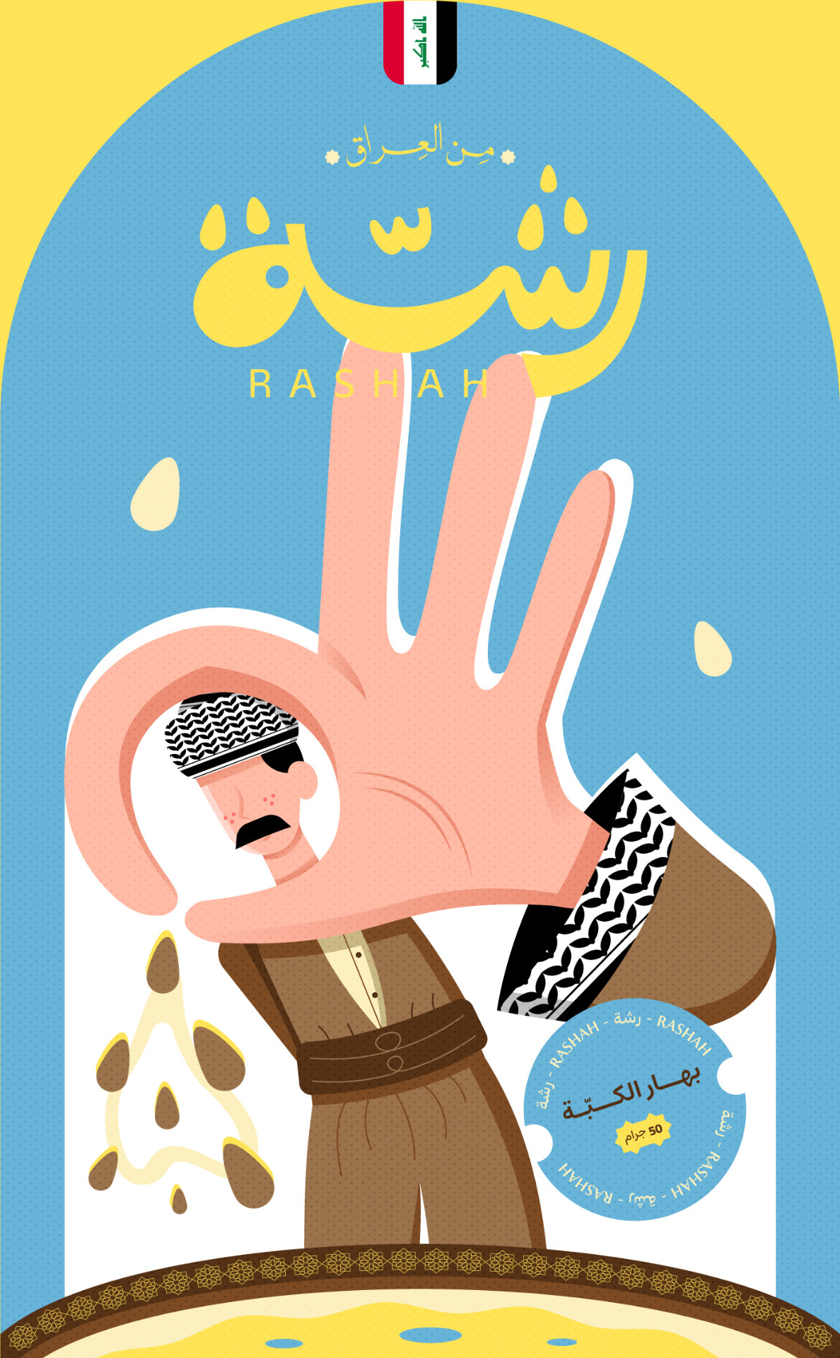
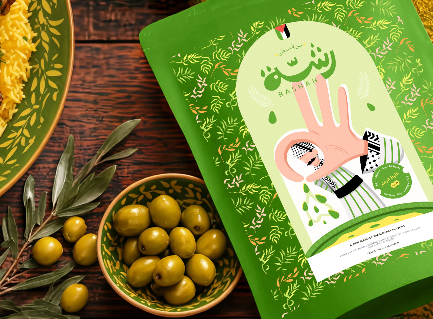
That’s why Rashah was born as a multi-layered experience. The name itself, “رشّة”, was designed in expressive Arabic typography that visually mimics the motion of sprinkling, each dot and curve echoing the rhythm of flavor.
This wasn’t just aesthetic; it was intentional. It became the foundation of our brand language.
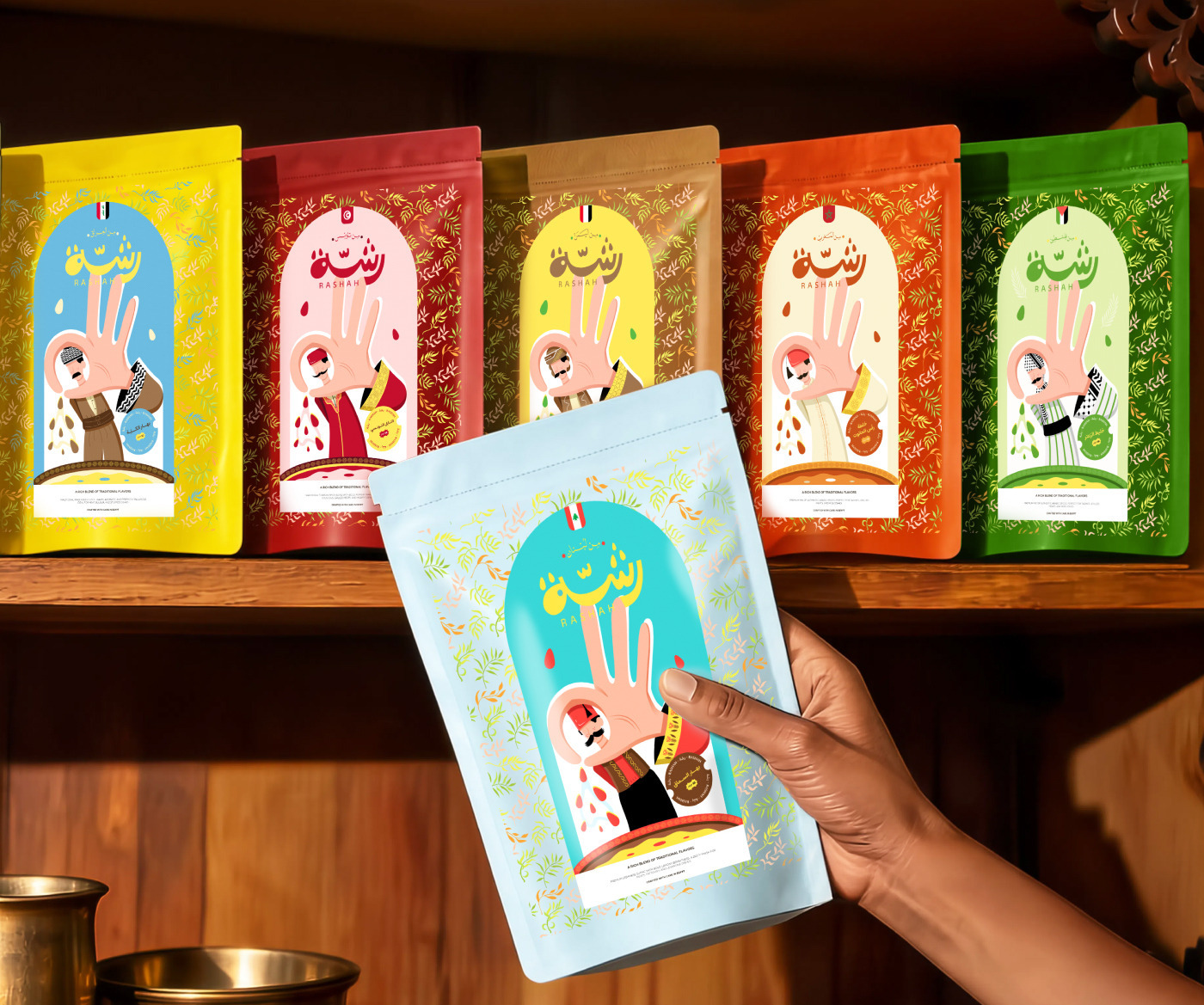
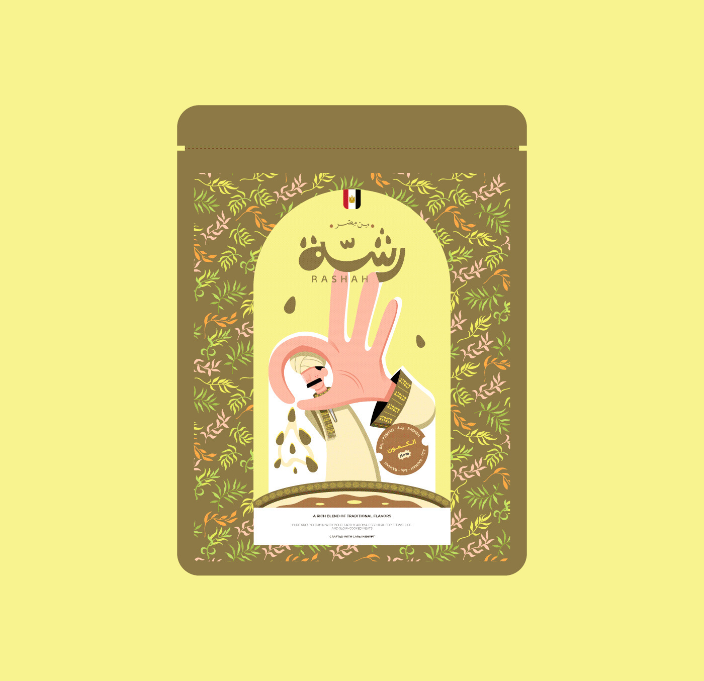
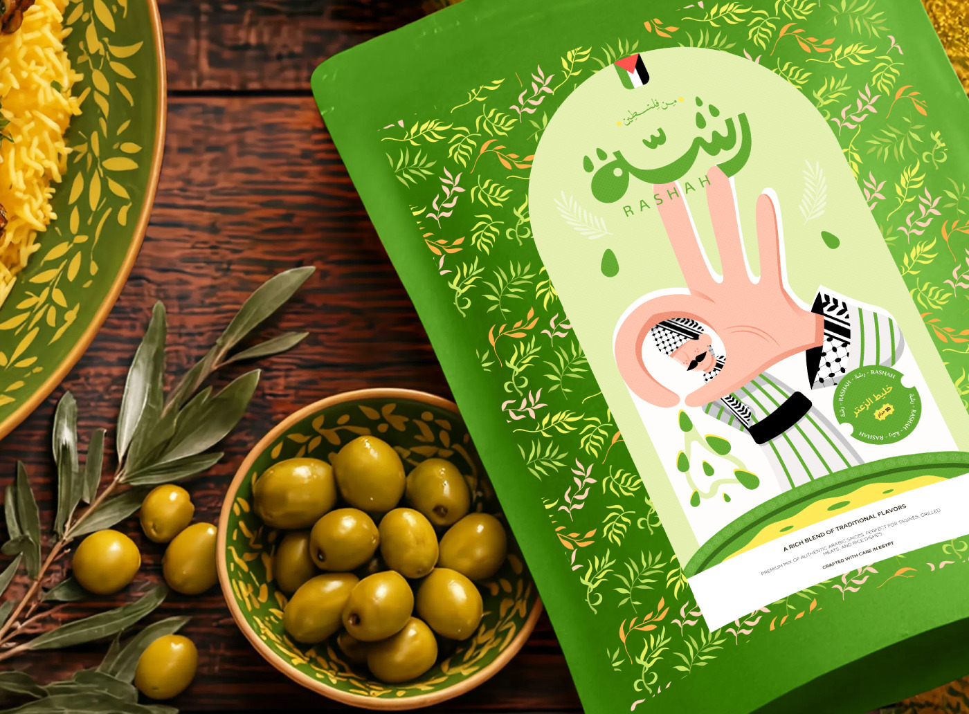
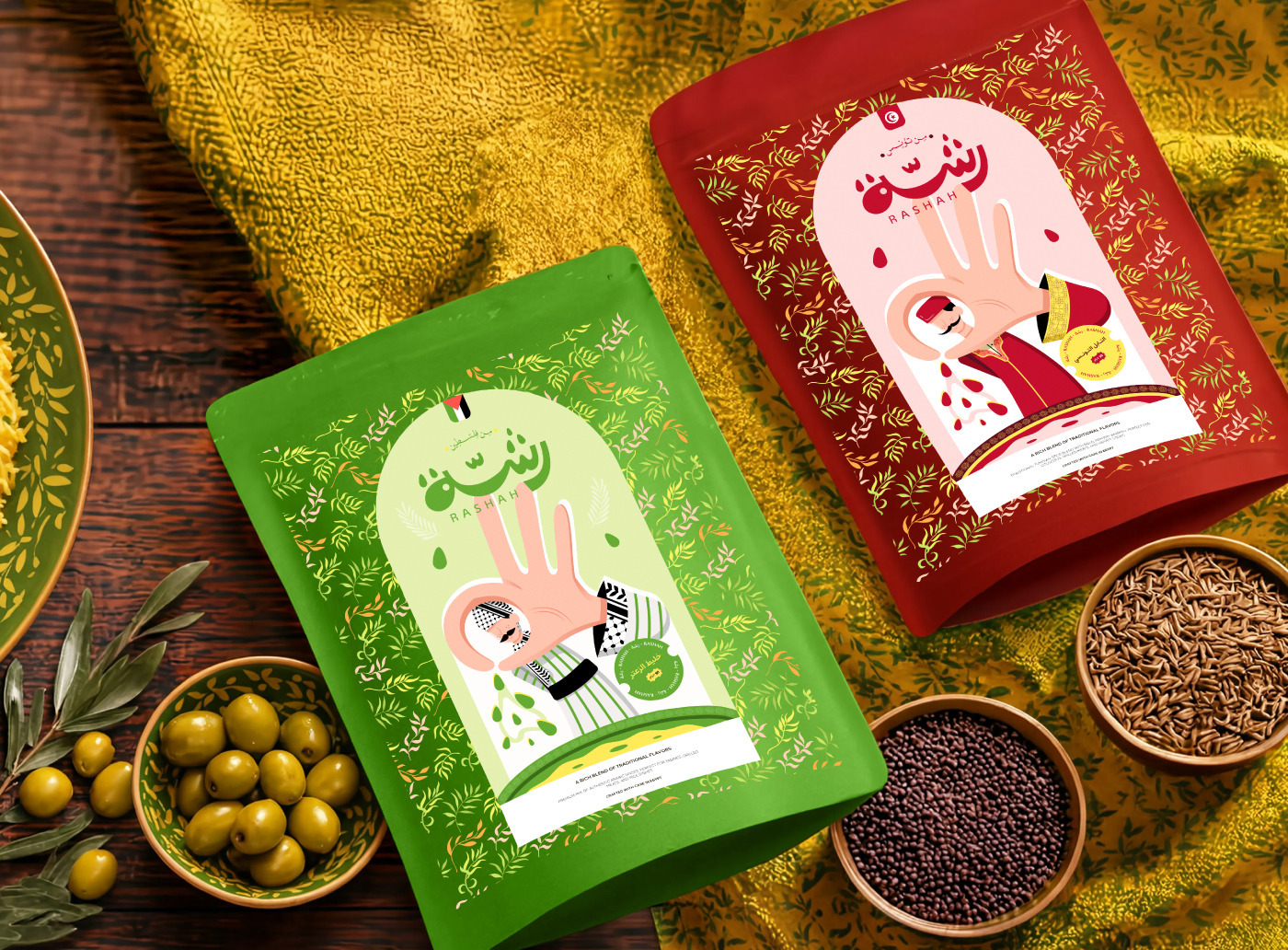
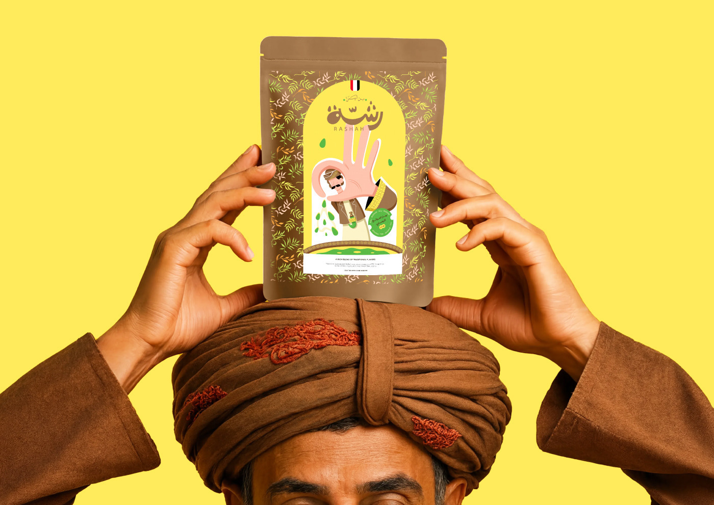
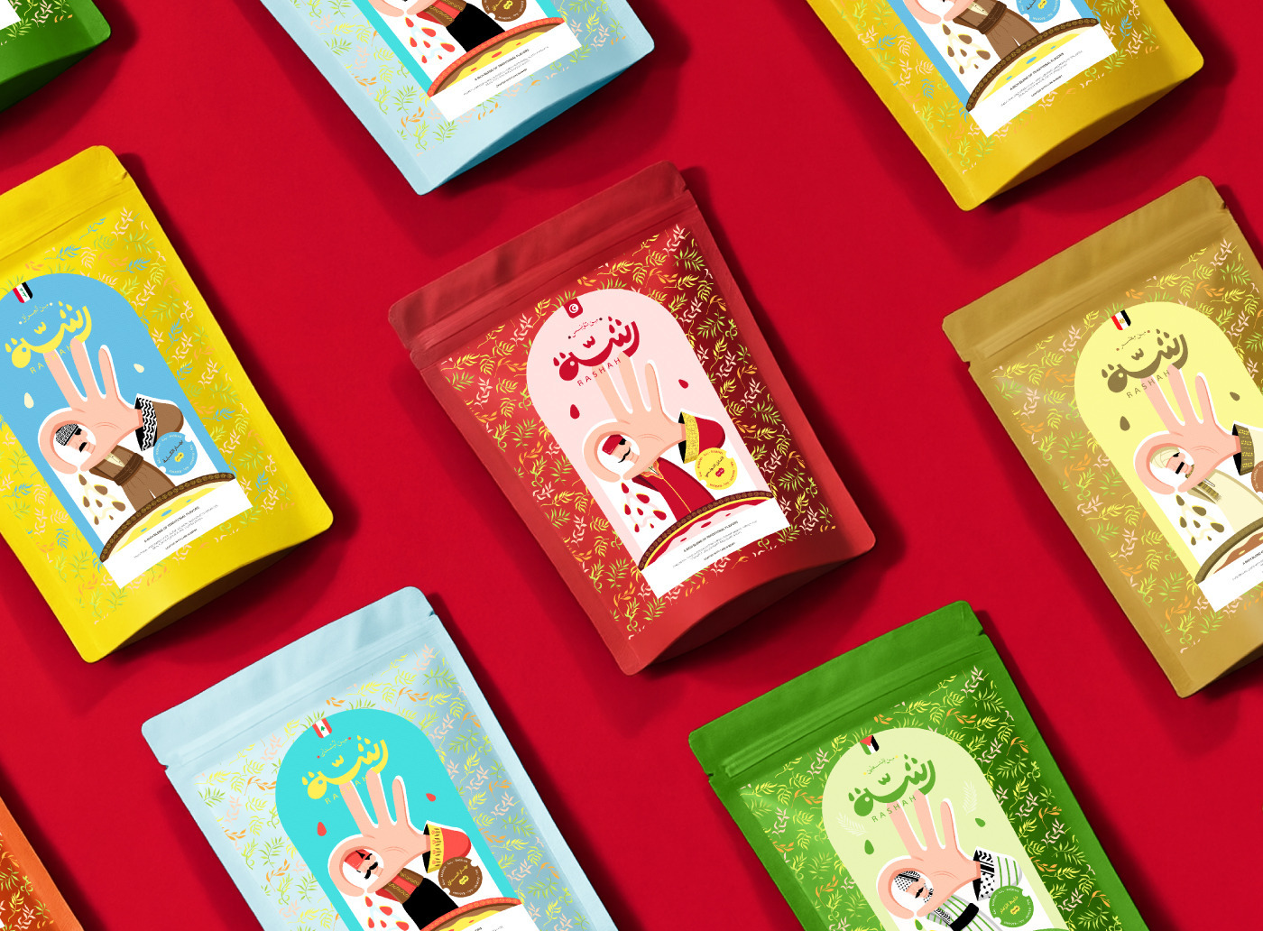
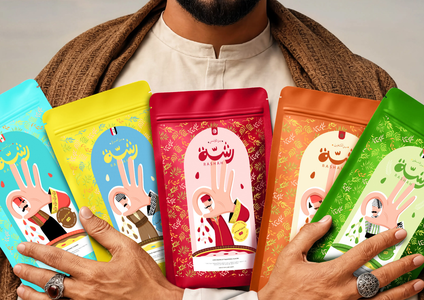
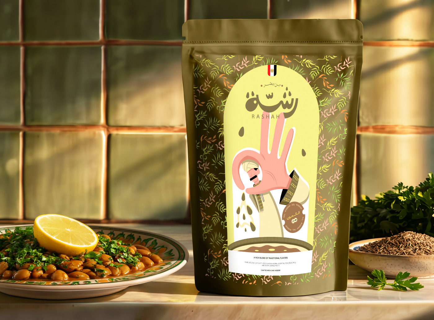
Our packaging reflects this philosophy. Clean, modern illustrations are paired with subtle cultural cues.
A hand mid-sprinkle frames a character whose features, whether in dress, gesture, or detail, hint at the heritage behind the blend.
no clichés, just quiet, confident storytelling through form and color.
Rashah is not just a brand. It’s a curated journey. Built with strategy, shaped by culture, and designed to resonate.
Credits :
illustration: Ahmed Badr
Art Director: BDR.Design