

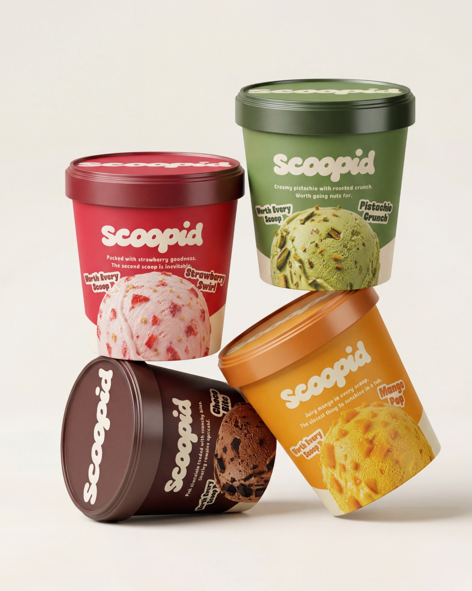
Scoopid | Ice Cream Branding & Packaging
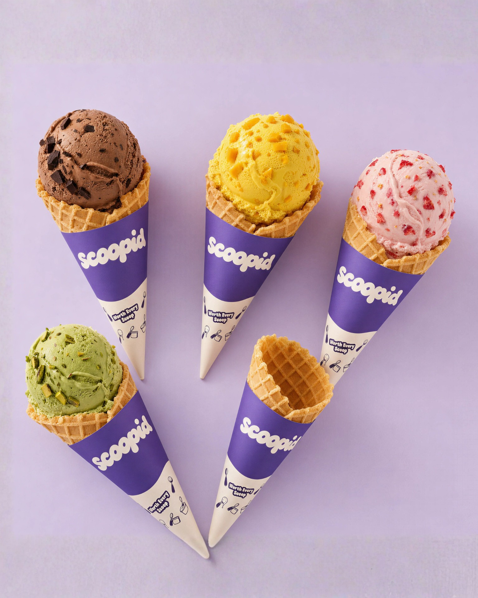
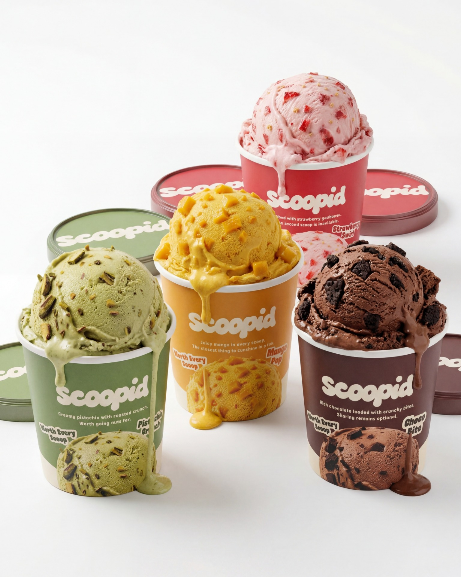
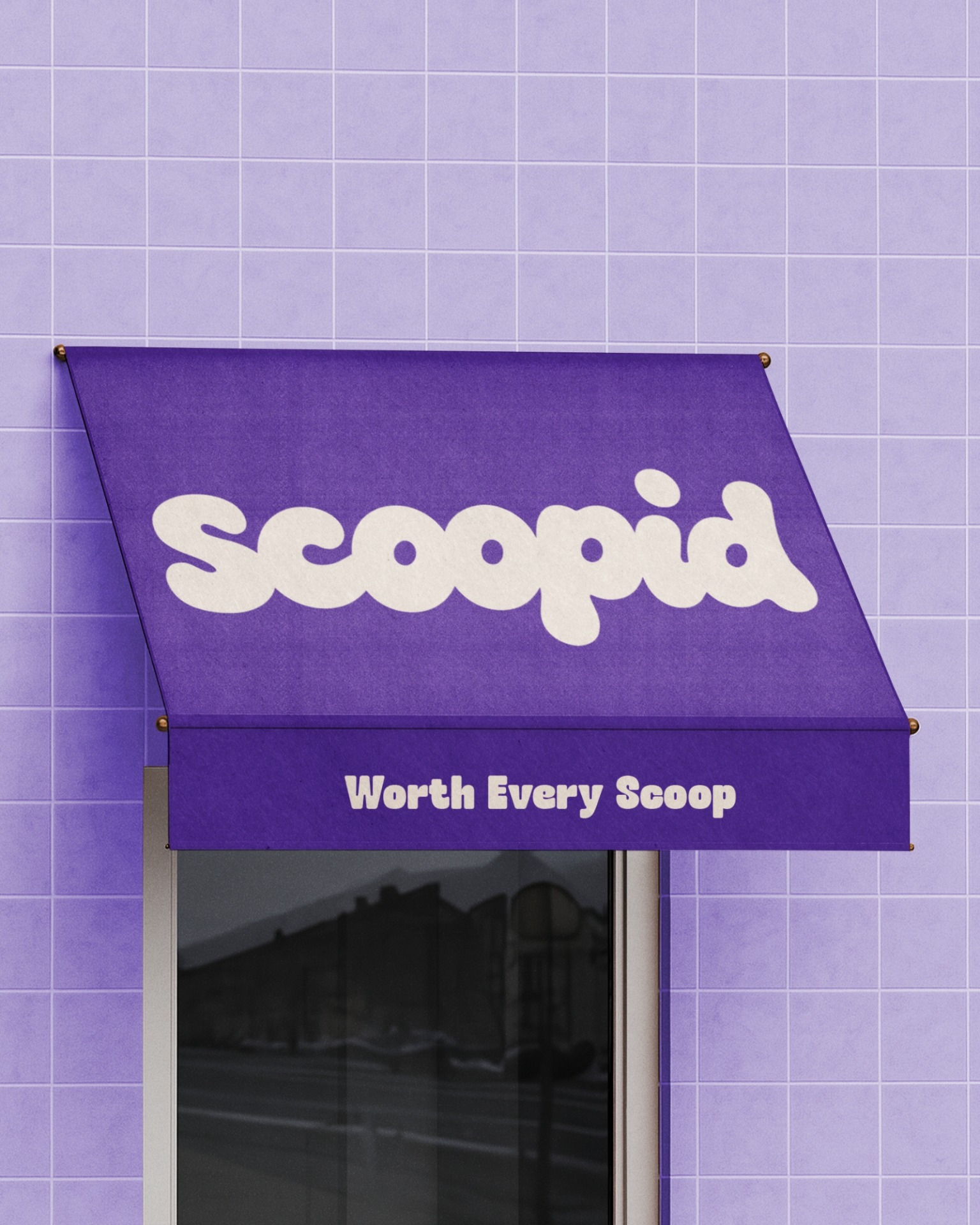
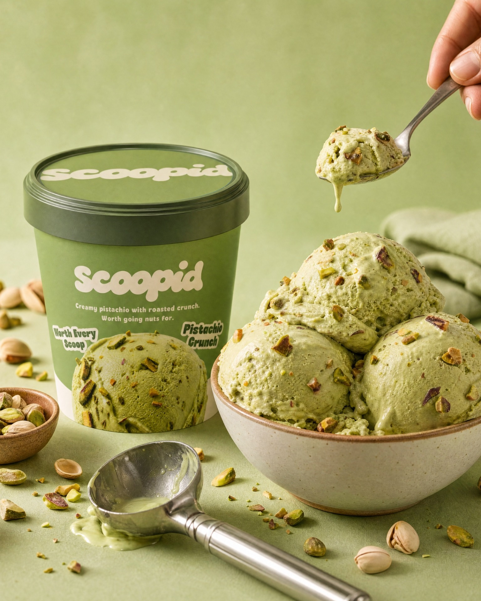
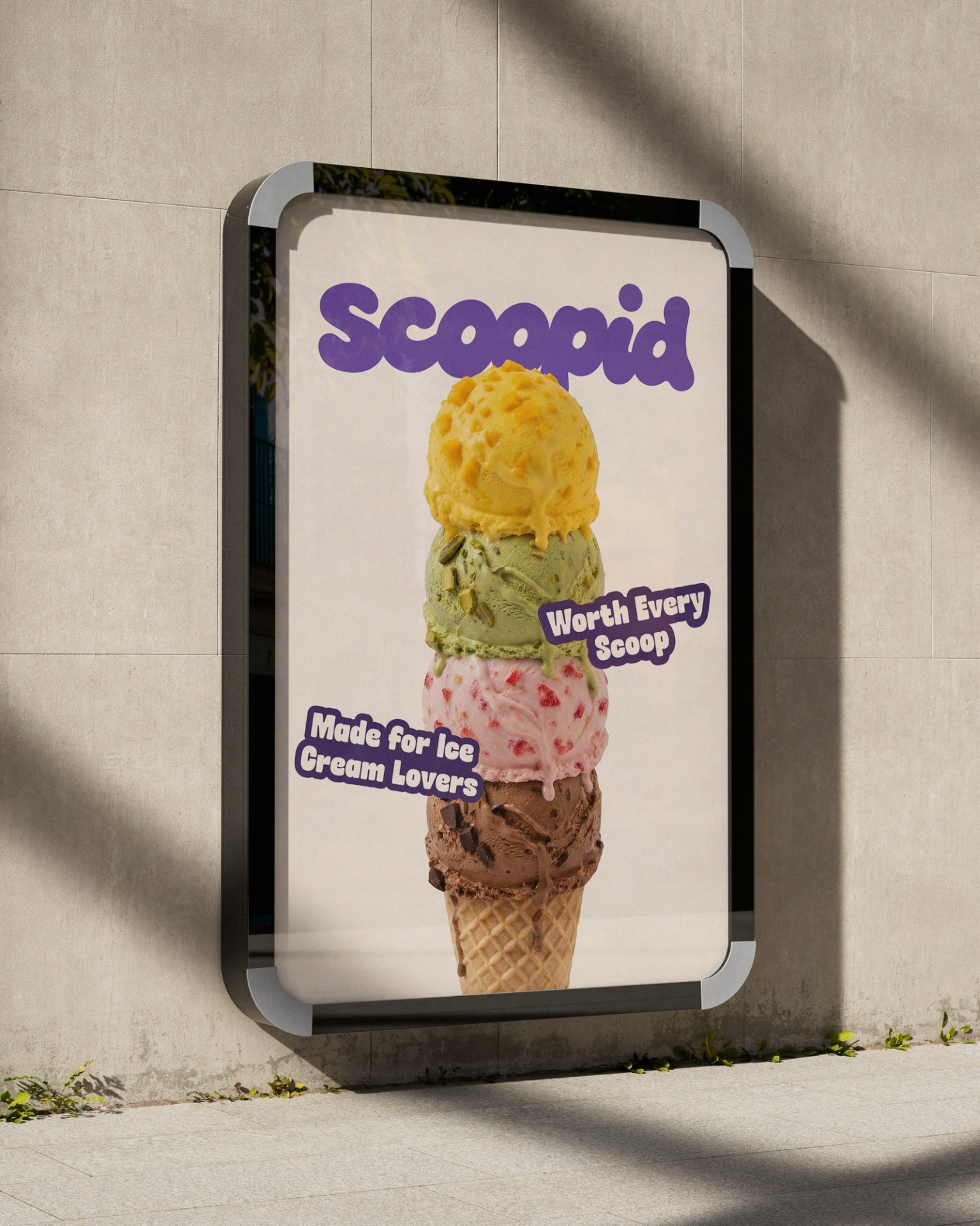
Scoopid is a conceptual ice cream branding project created to explore how a playful visual identity can extend beyond packaging into a complete brand experience. The identity is built around a custom rounded wordmark inspired by the soft, creamy nature of ice cream, paired with a bold flavor-first color system that gives each product its own personality while maintaining a consistent brand architecture. The project includes logo design, visual identity, packaging, cone wrappers, flavor illustrations, campaign visuals, outdoor advertising, and brand applications, demonstrating how a single identity can scale across multiple touchpoints while remaining cohesive and instantly recognizable.





Related Posts










Leave a Comment