

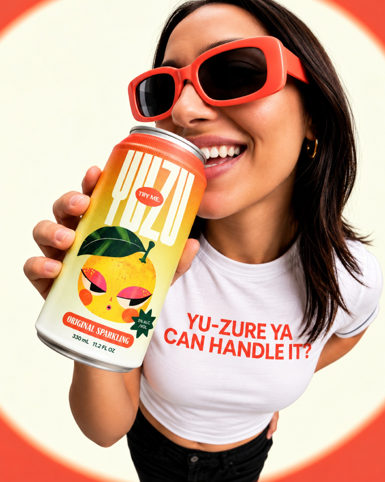
YUZU – Sparkling Citrus Drink
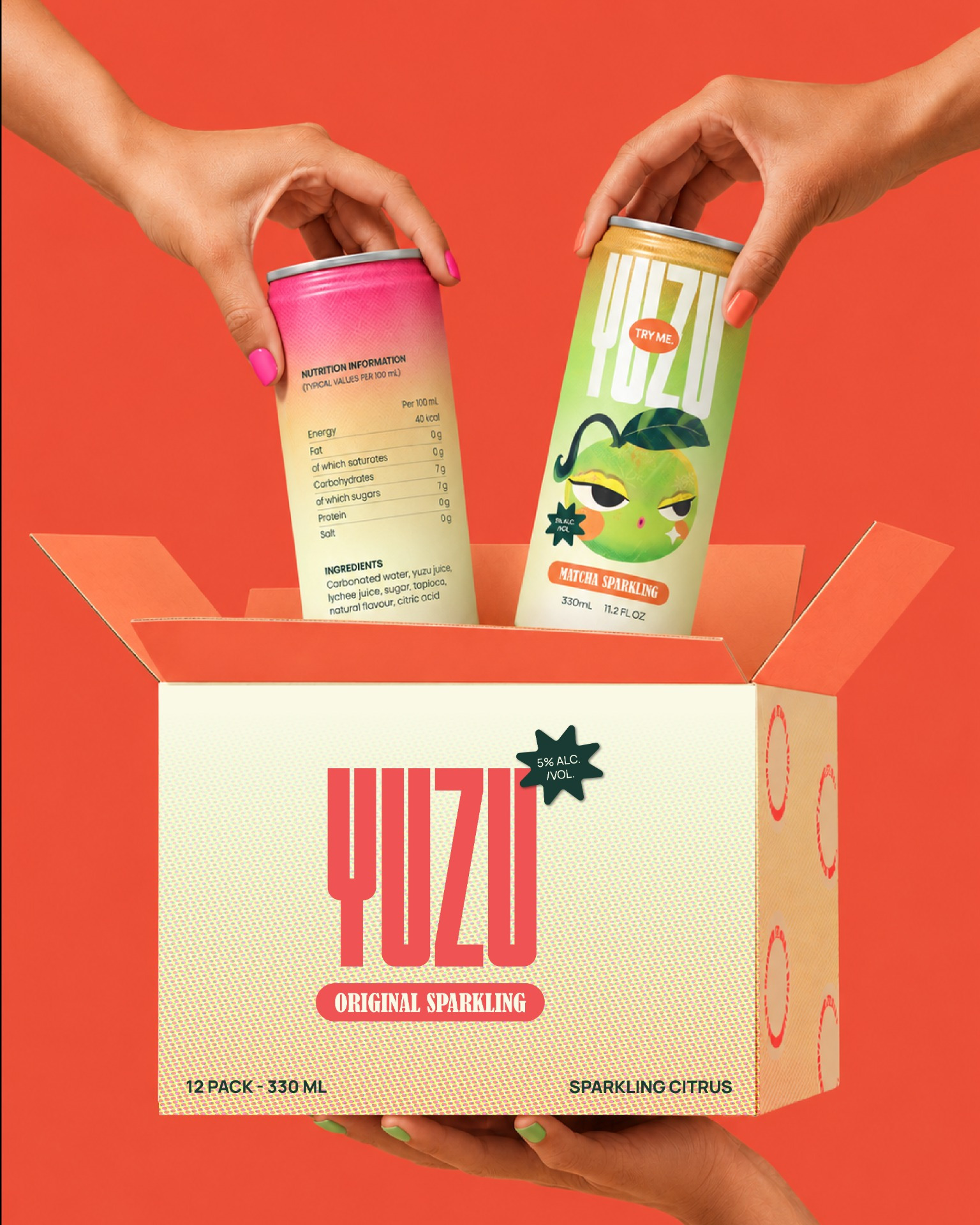
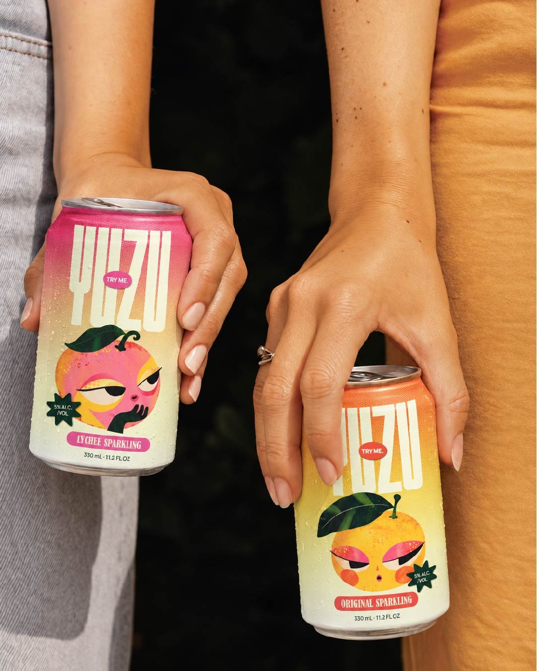
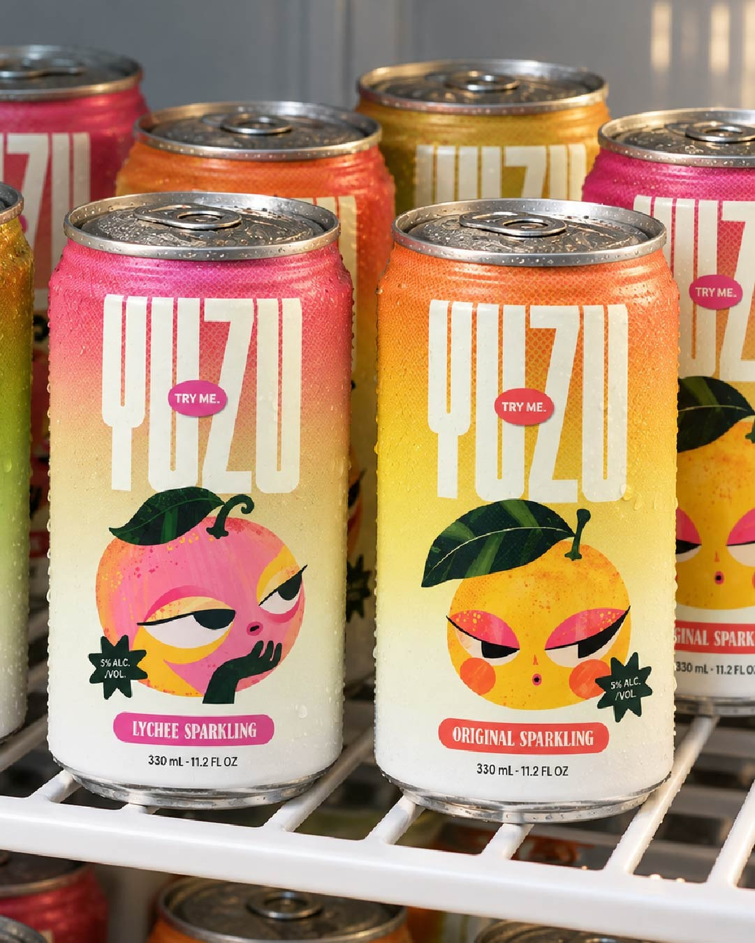
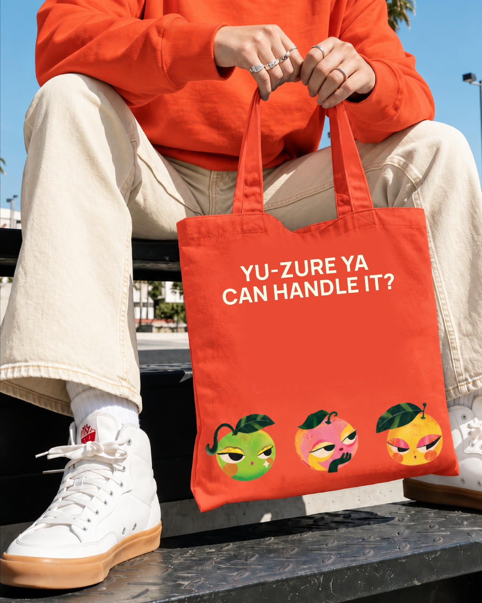
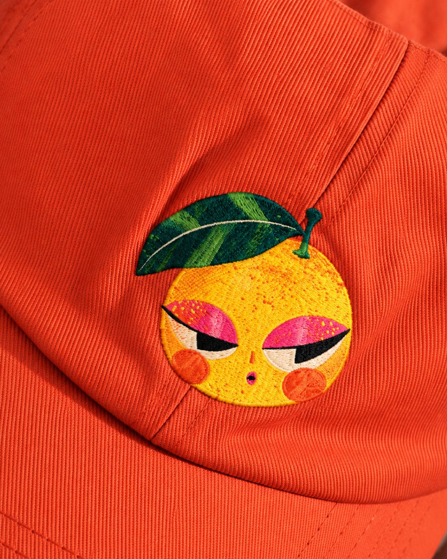
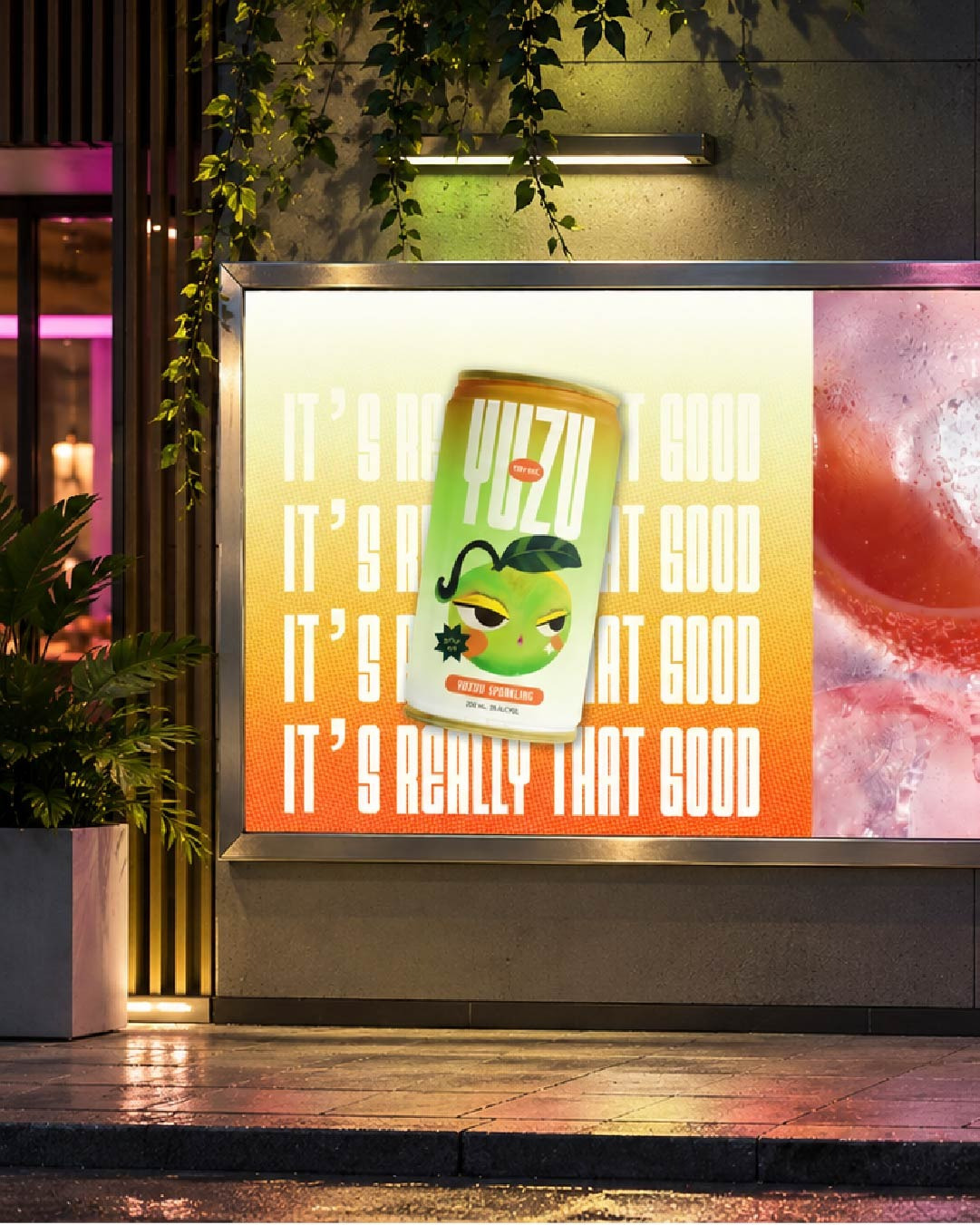
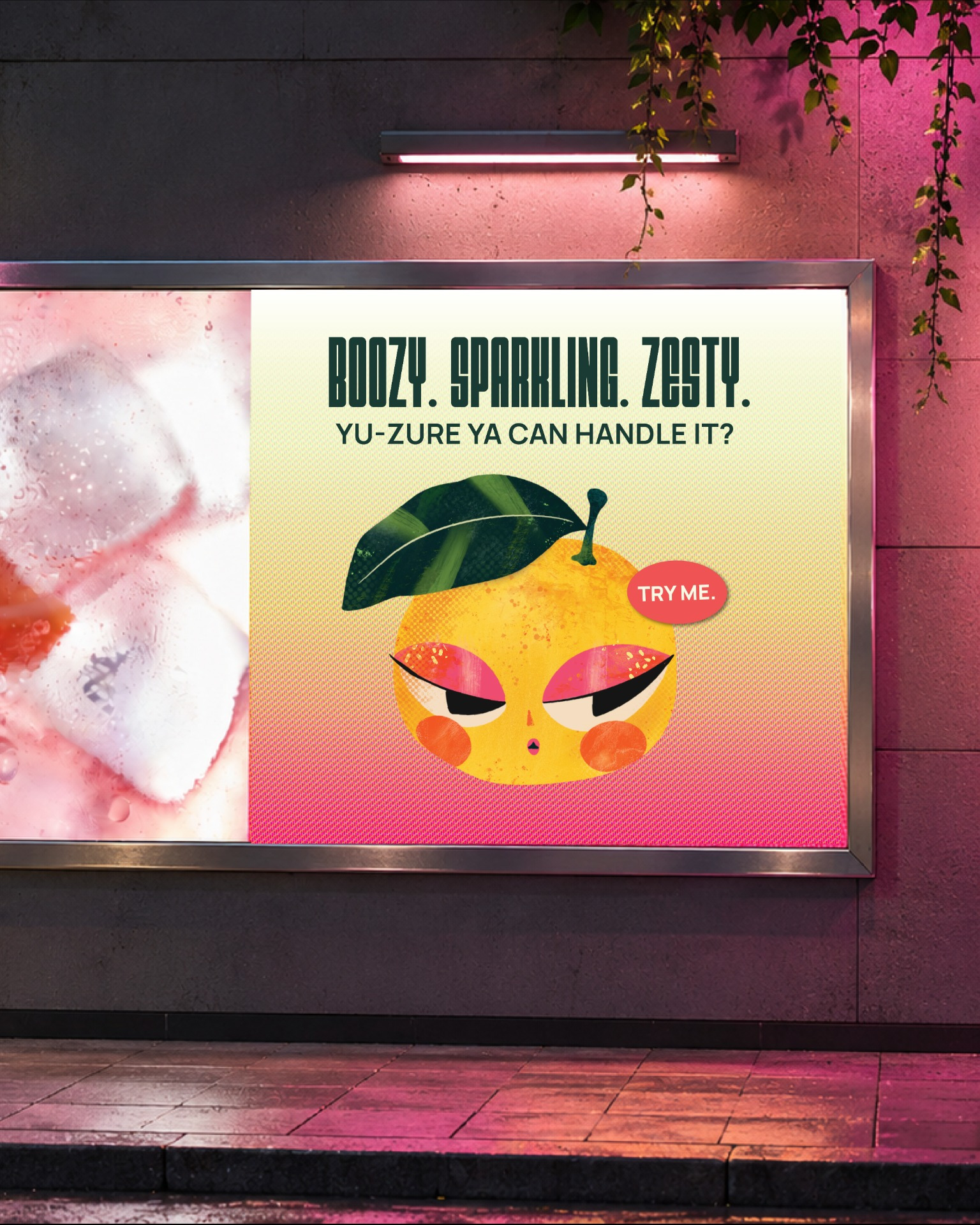
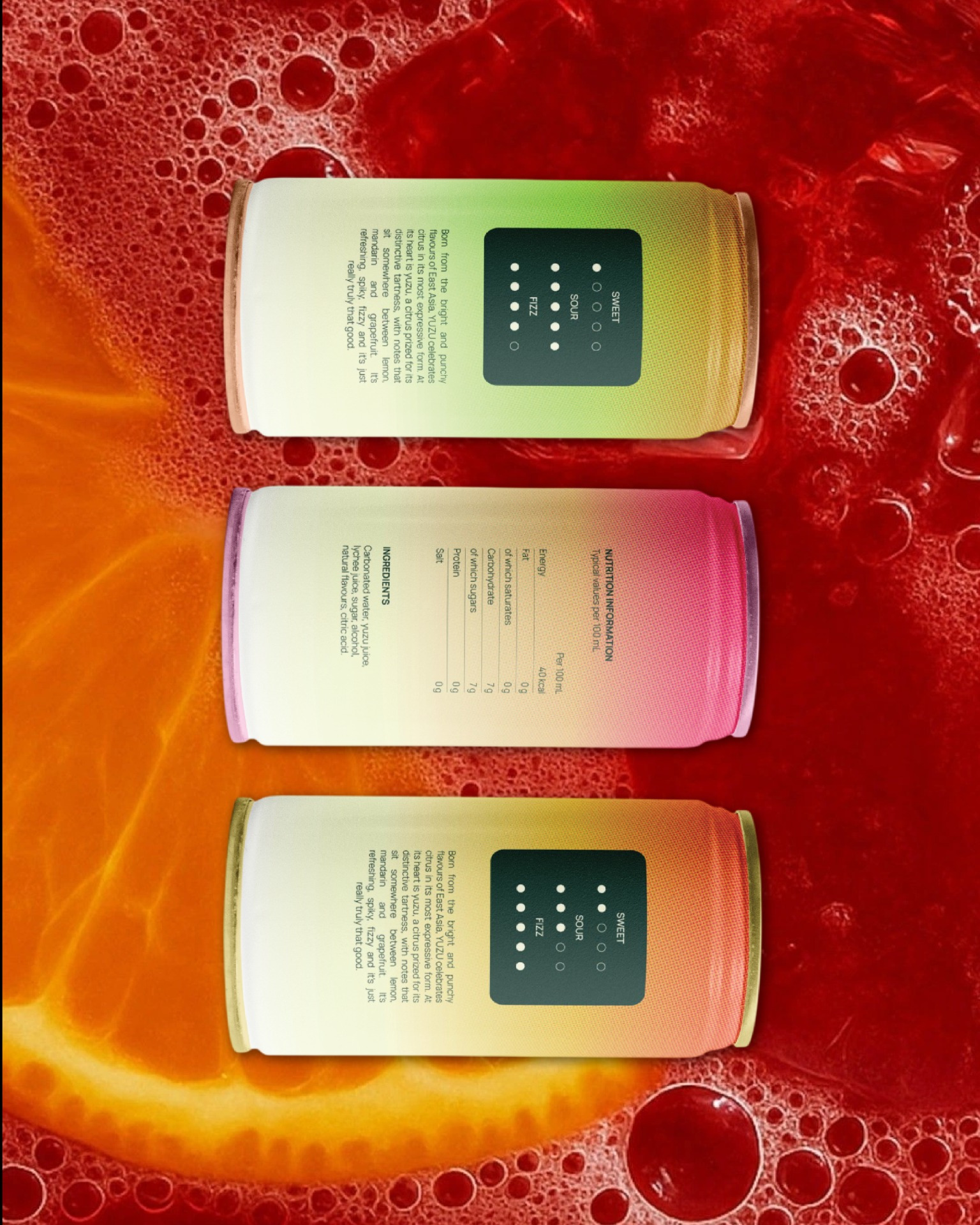
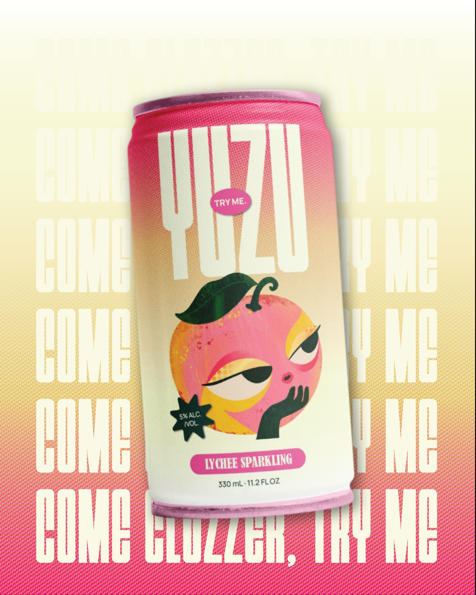
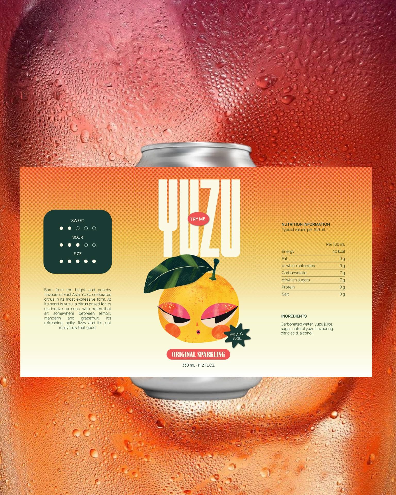
YUZU needed a visual identity that could carry the energy of the drink without falling into the usual tropical or Japanese-inspired clichés. I explored character, colour, typography and texture as the main building blocks, looking at how East Asian character design uses exaggerated expressions, makeup and surface detail to create personality. The final direction paired these expressive characters with a bold citrus palette, layered textures and strong graphic layouts. I deliberately balanced the louder elements with clean typography and simple compositions, allowing the identity to work across cans, packaging, apparel and campaign applications while keeping the characters at the centre.
Related Posts







Leave a Comment