

ANUSH — Spring Water
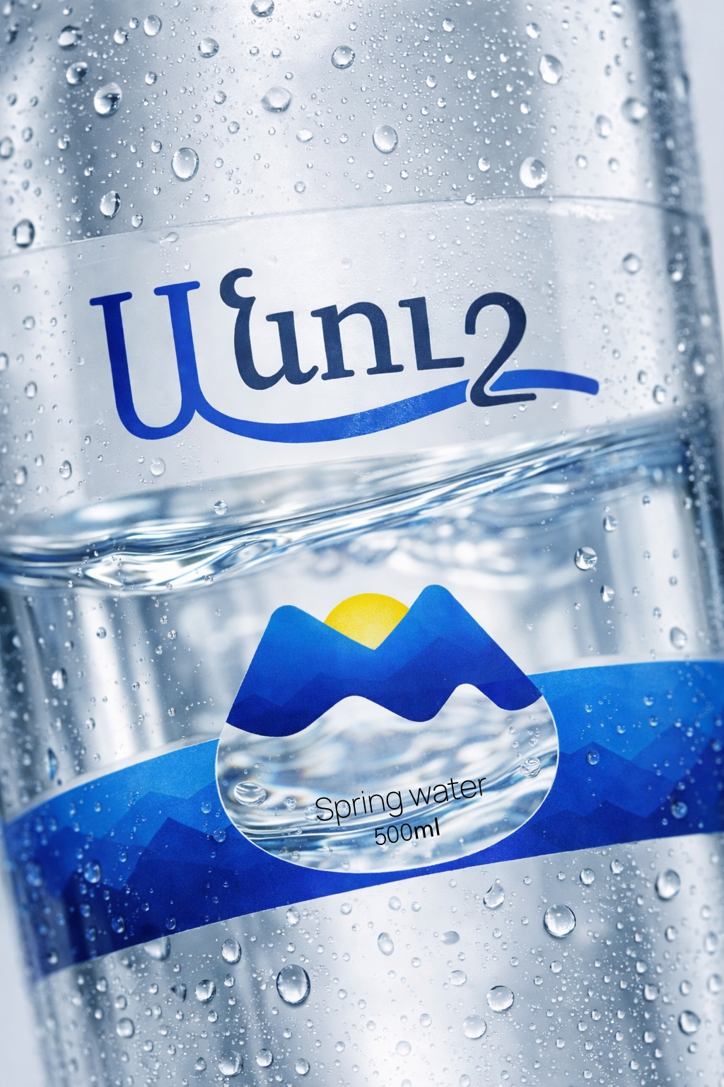
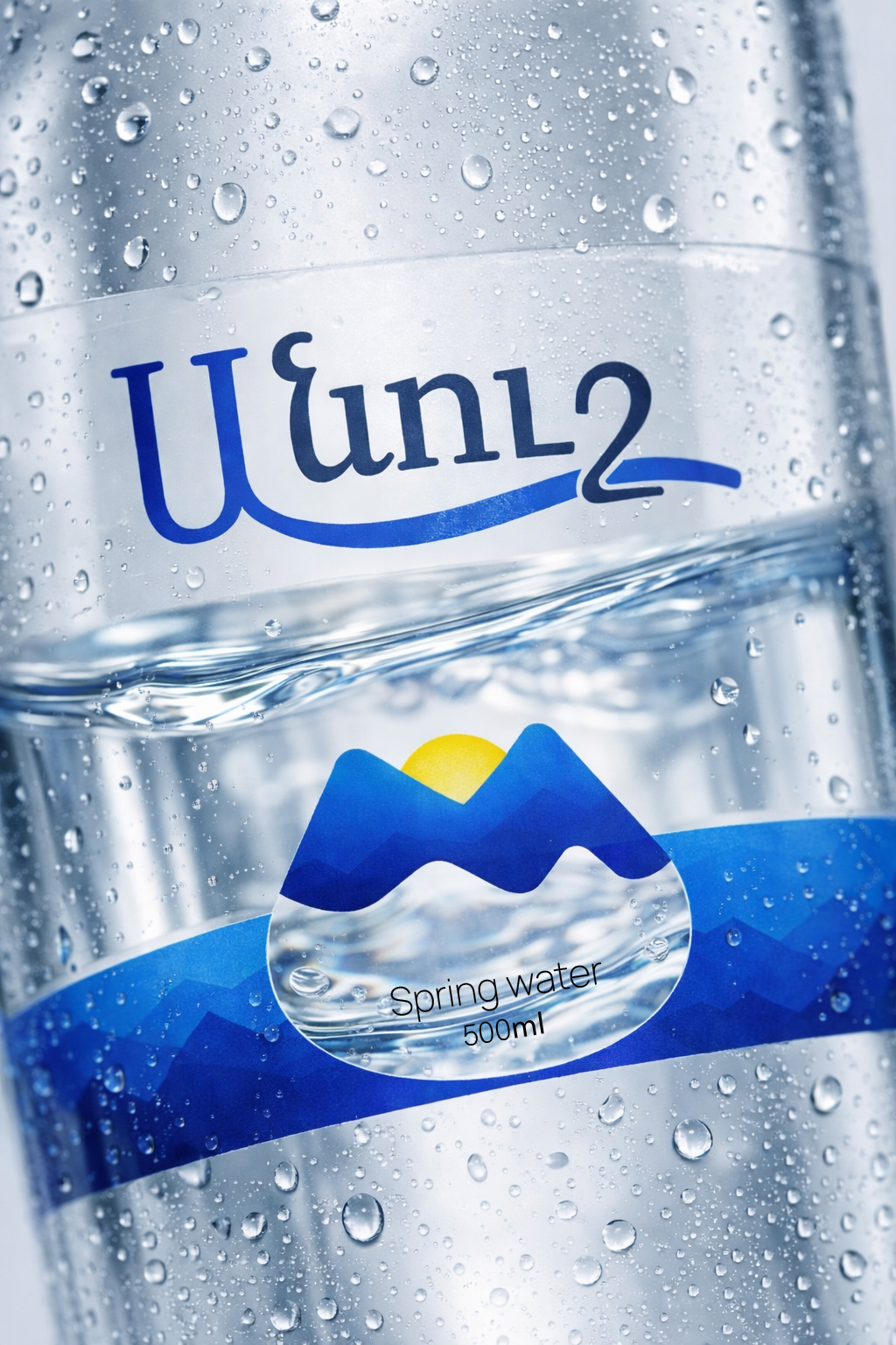
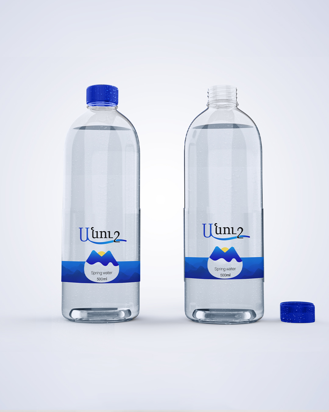
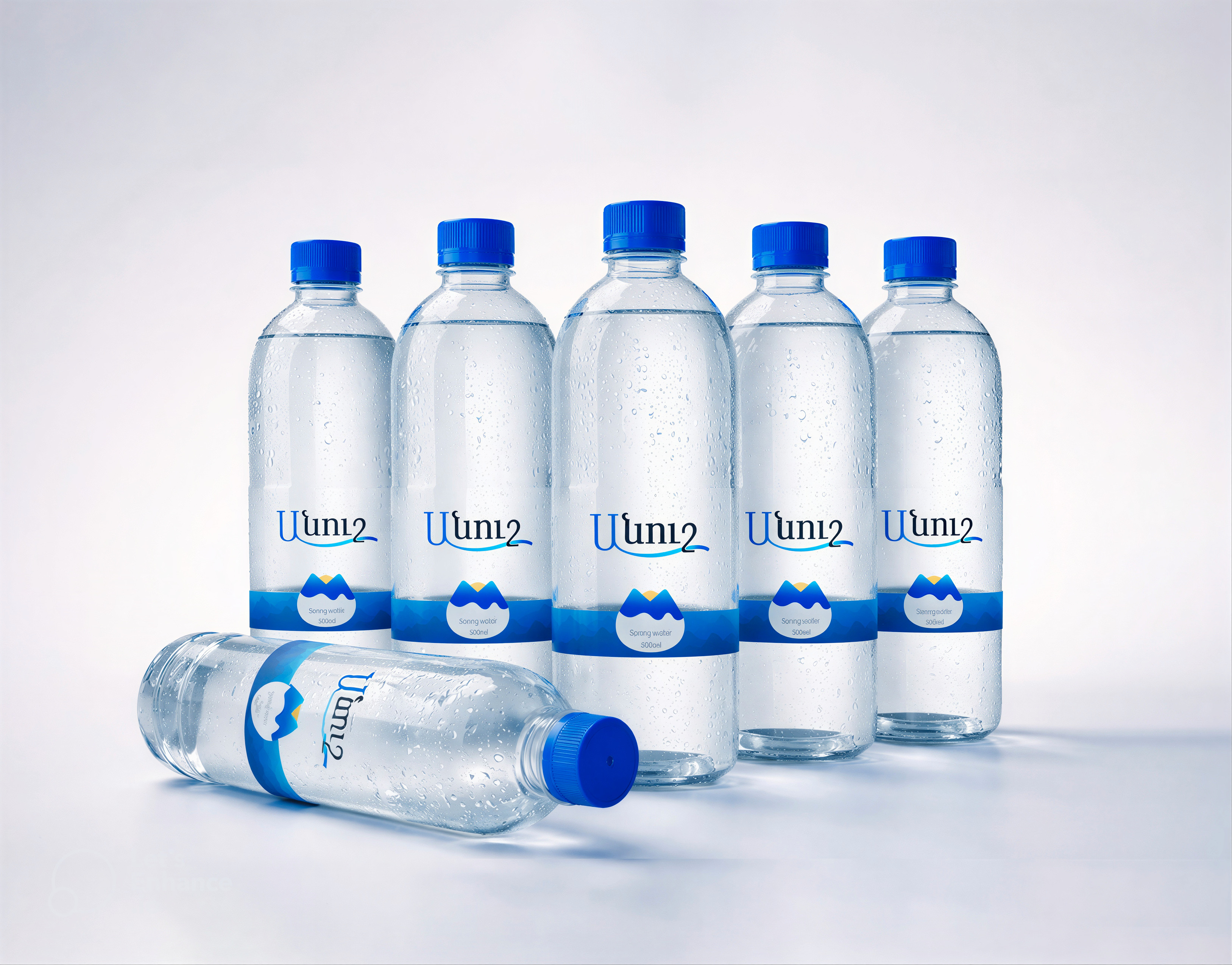
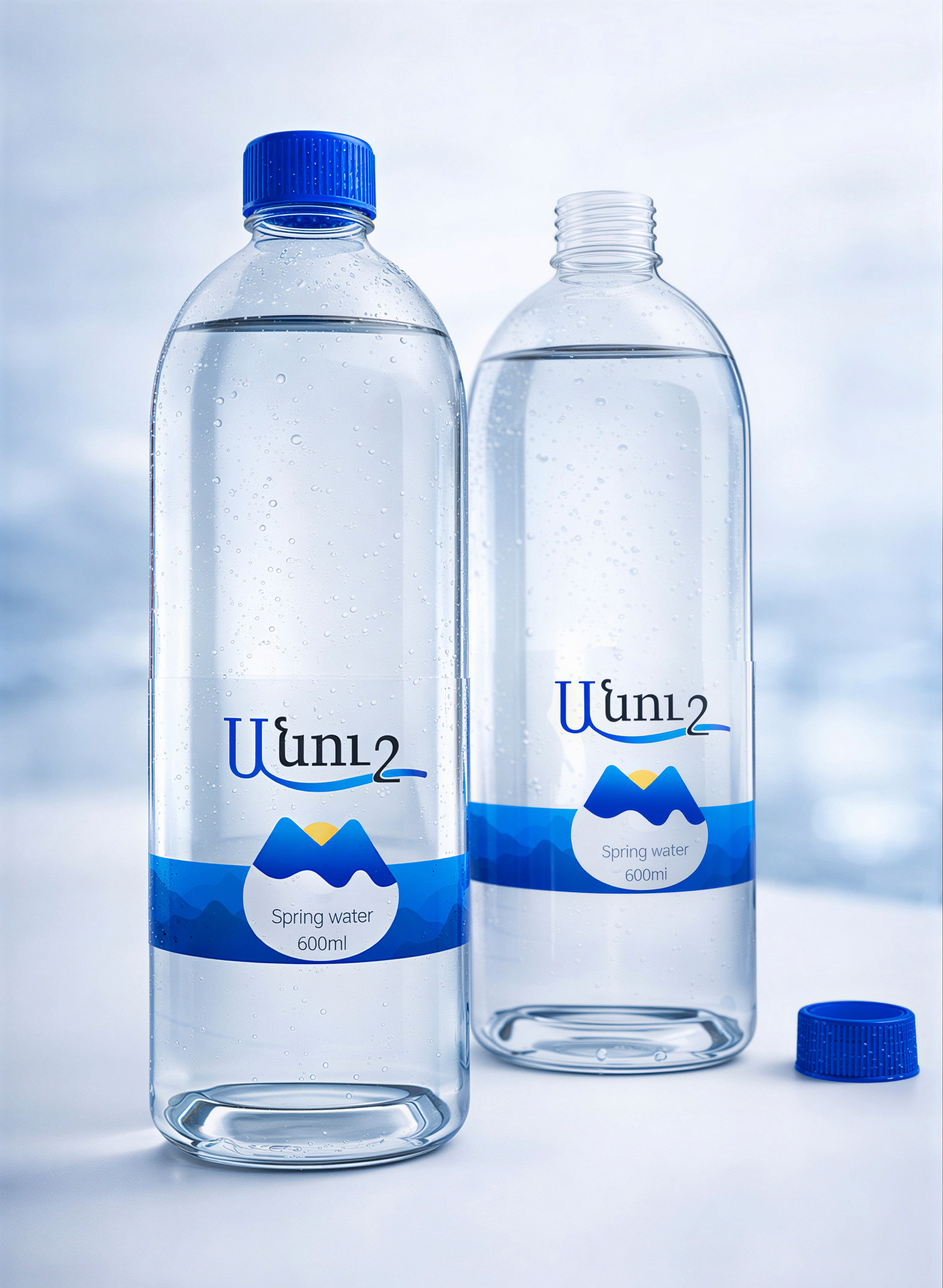
The design of “Anush” (meaning “sweet/pleasant” in Armenian) is a tribute to the pristine purity of the Armenian mountains. The goal was to create a visual identity that speaks to the consumer through minimalism and a unique interactive element.
Key Design Features:
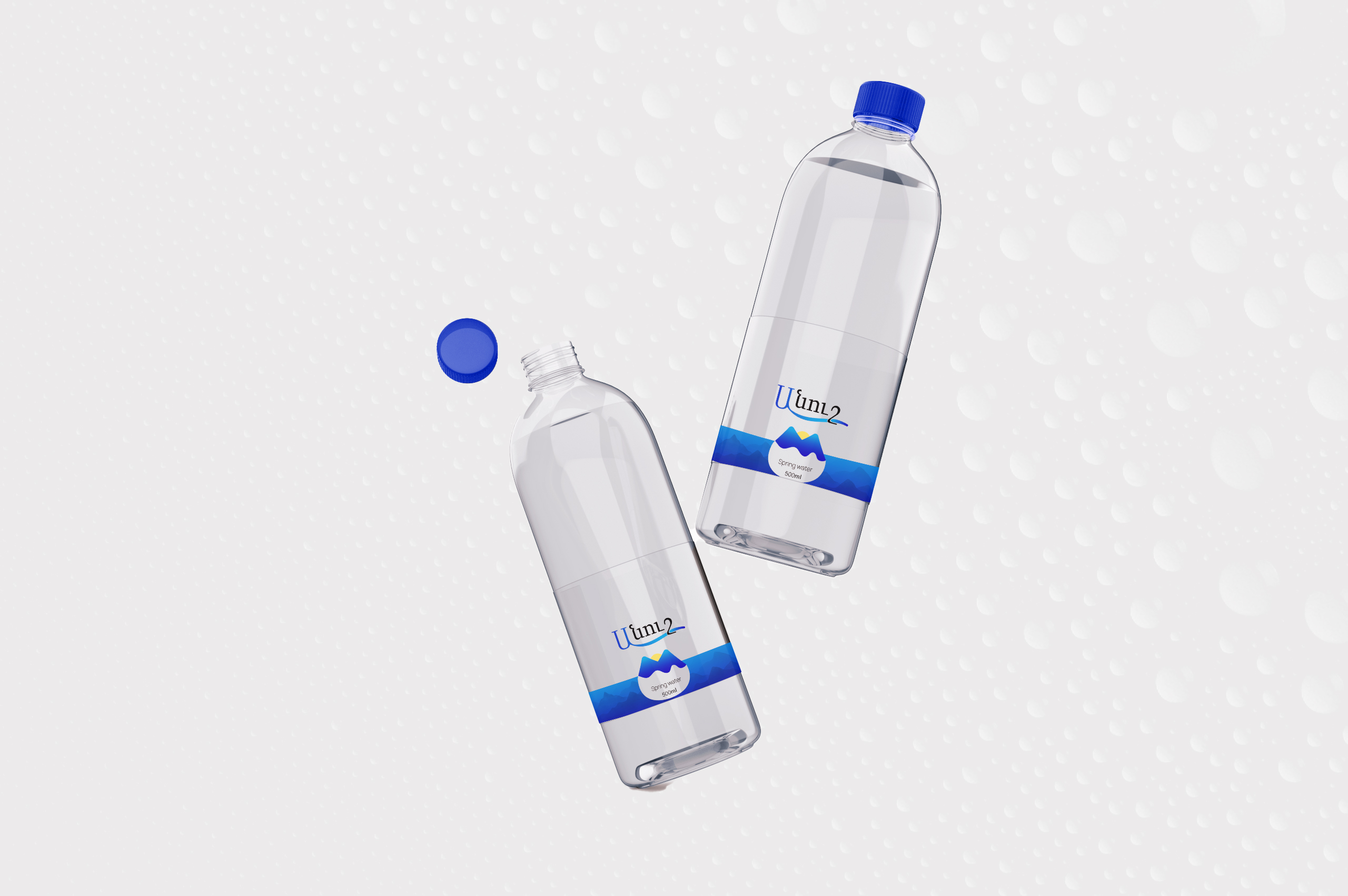
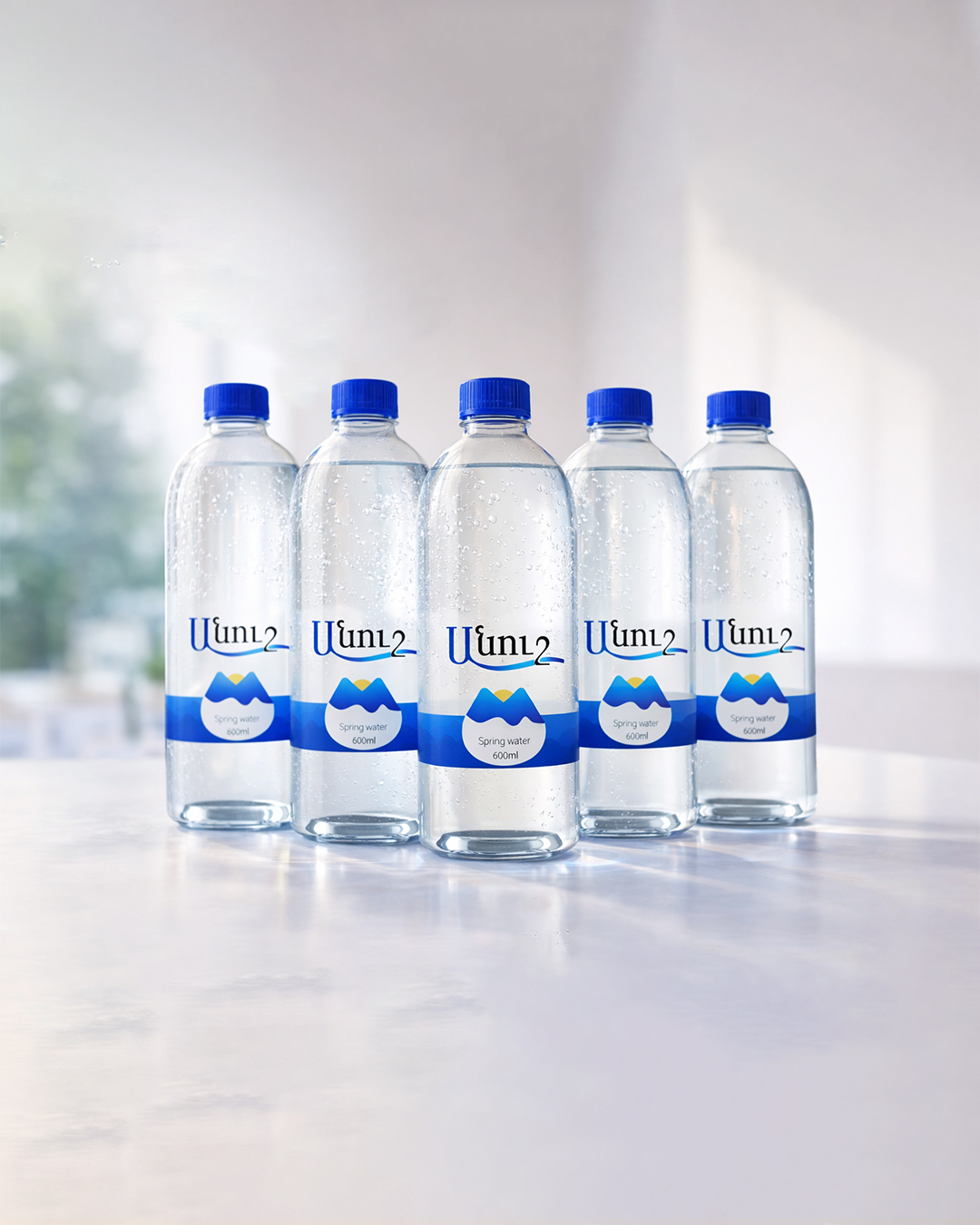
- The “Living” Drop: The core of the design is a die-cut mountain silhouette. The lower part of the mountain is transparent, forming a water drop shape that reveals the actual clarity of the product inside.
- Minimalist Typography: A custom logo where the letter “Ա” flows into a gentle water wave, symbolizing the continuous flow of a natural spring.
- Color Palette: Deep royal blue represents the depth and coldness of the mountain springs, while the sun yellow adds a touch of warmth and life.
- Premium Texture: Designed for a matte-finish label with Spot UV coating on the logo and the blue base to create a tactile contrast.

Related Posts





Leave a Comment