
Arrels: A New Identity Rooted in Water and Territory
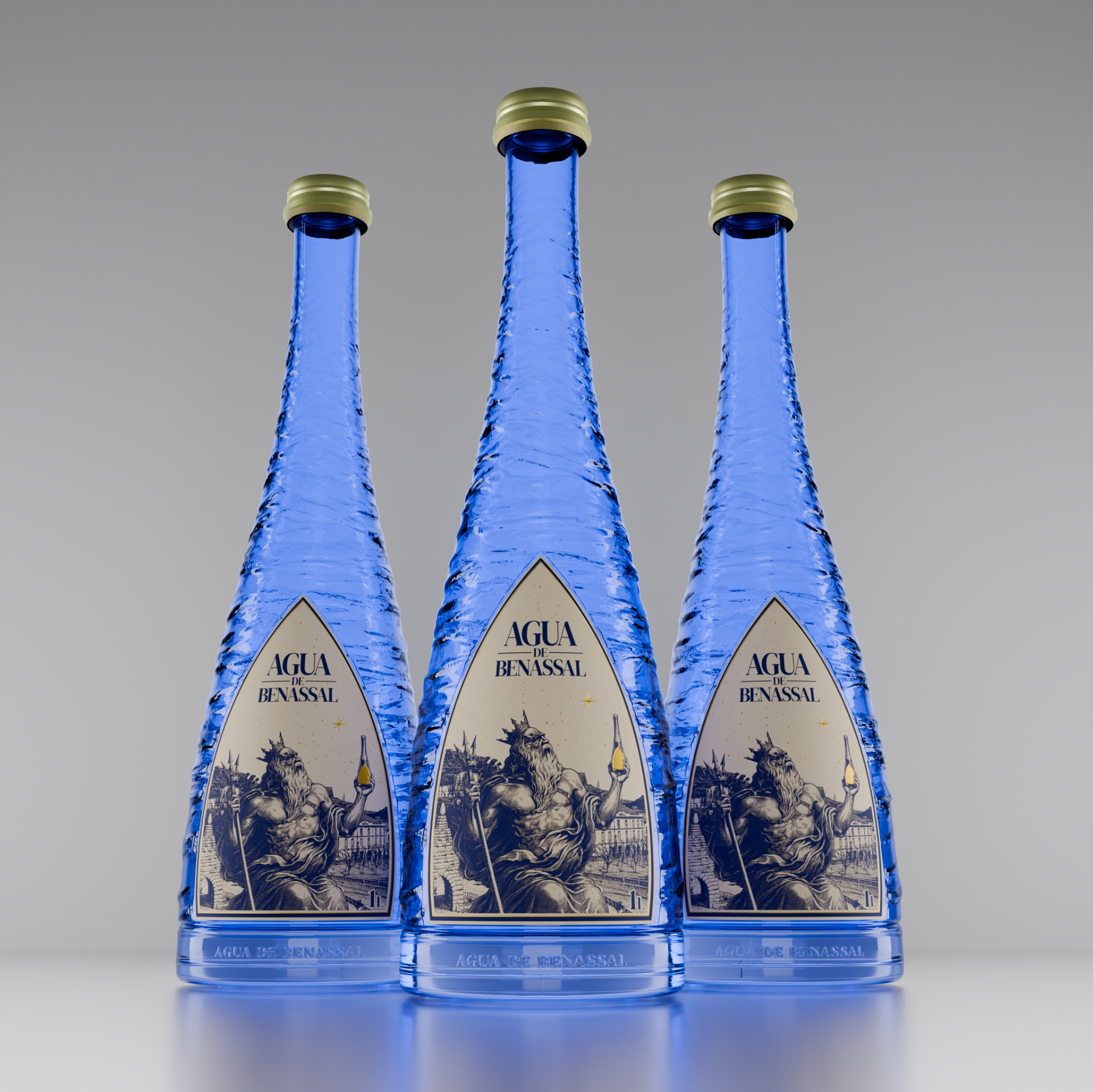
Arrels is a complete packaging and brand identity redesign for Agua de Benassal, created to reconnect the brand with its origins, history, and territory.
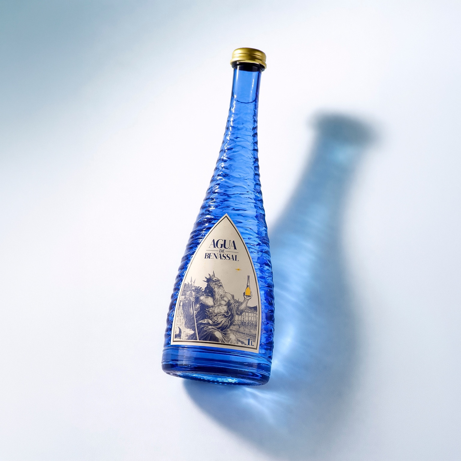
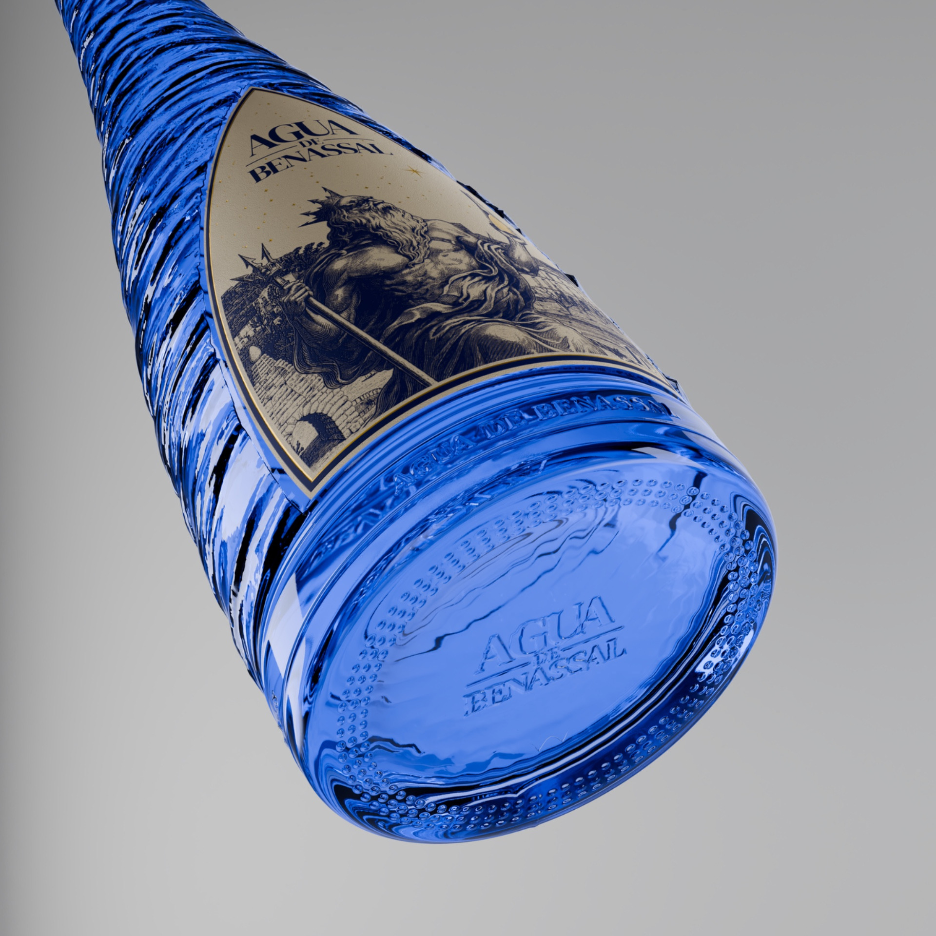
The new bottle uses recycled blue glass, evoking the water itself while reducing its environmental impact. Its wave-like relief represents the movement of water while improving grip, protecting the bottle, and reducing friction and vibration during transportation.
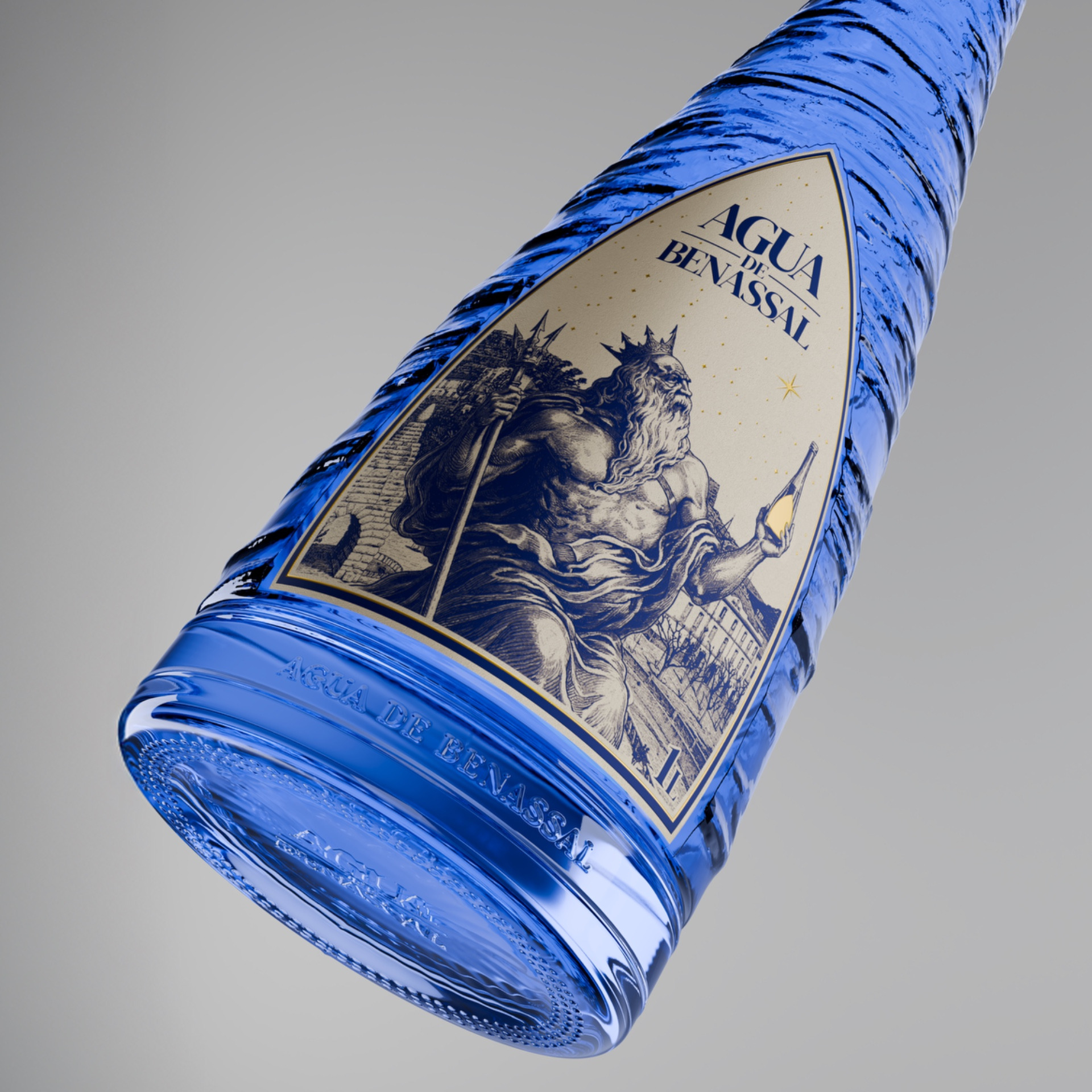
The label takes inspiration from the historic entrance to the Benassal spring, incorporating the village into its background. At its center, Neptune preserves one of the brand’s most recognizable symbols, reinterpreted as a guardian of the water and its origins.
The identity is completed with a refined new logo, 100% recycled rice paper, a single blue ink, and subtle golden details inspired by Benassal’s starry summer nights. The bottle is also designed to be fully reusable.